What is CSS focus Selector?
 FREE
FREE

The focus selector in CSS is a user action pseudo-class selector. It responds with some action when the user performs some interaction. The selector and :focus pseudo-class of CSS is used to apply effects to an element that is targeted by the keyboard or focused on by the mouse.
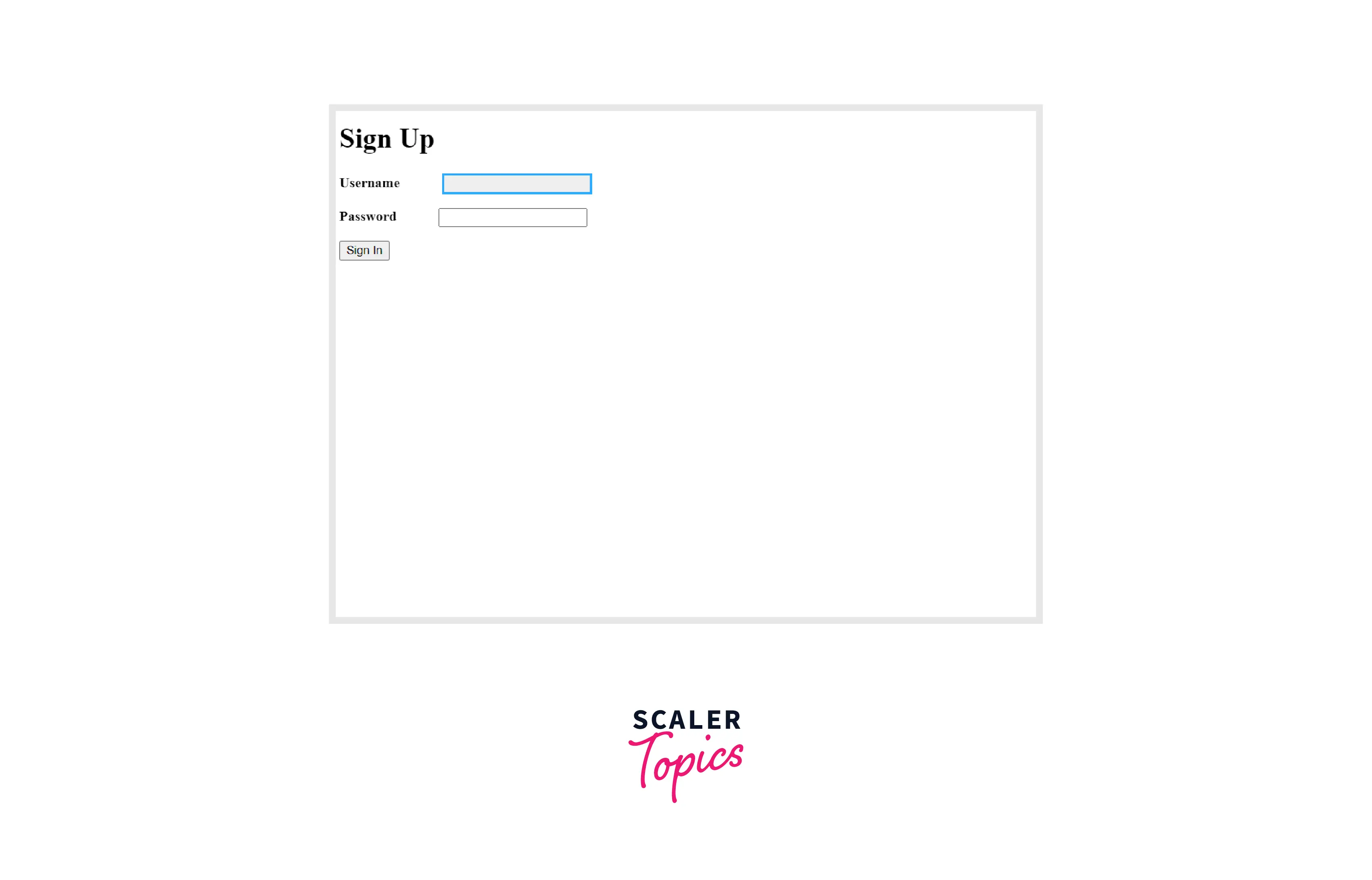
It can be used with all the buttons, text boxes, radio buttons, etc., and various other elements of the web page where we can expect a user interaction. A very common example of a focus CSS effect is while filling the login page or forms the textbox in which we are entering data is highlighted with a border as below.
Syntax
The focus CSS selector can be defined as follows, all the properties can be mentioned inside the curly brackets like color, action, etc.
Example
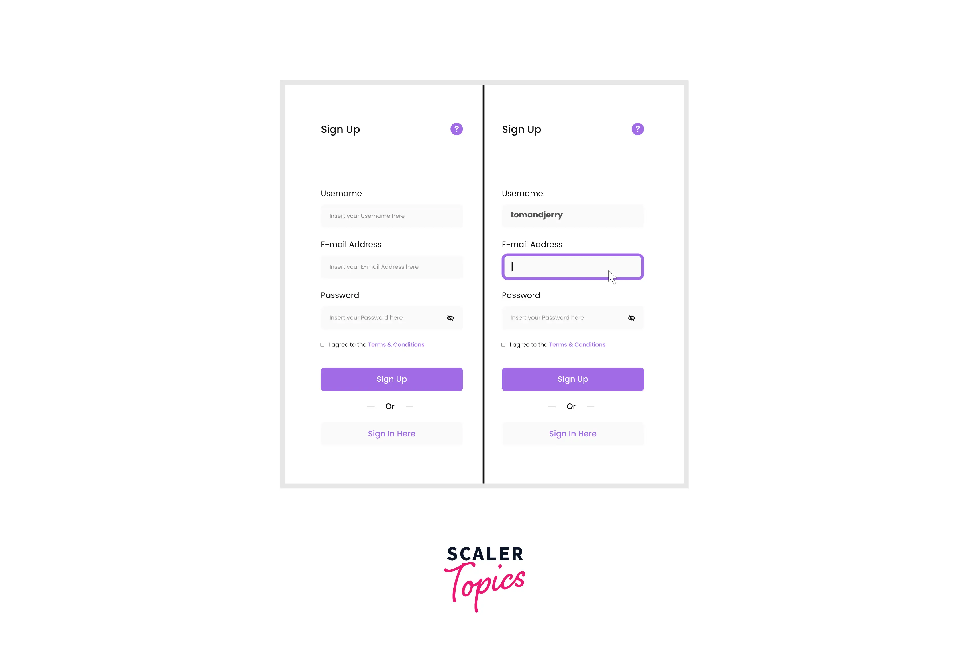
Let us apply the focus CSS effect to the textbox in a signup form.
HTML :
CSS :
Output :
Here we are creating a form using HTML form. It has 2 labels, 2 text boxes, and one button to keep it simple. The example is a class we apply to the form. This class has a focus CSS method for the object. It gives a background color, a solid border, colored, and with a thickness of 3px and an outline equal to 0. The tab is used to give multiple spaces between the label and the textbox in the form.
Tabbing
Many browsers have a default state like a dotted outline or solid thin outline for tab selection. When we press the tab on the keyboard we can navigate all the items present on the webpage one by one. We can highlight the selected item using a focus in CSS.
Let us see an example with various objects such as textarea, buttons, paragraphs, etc.
HTML :
CSS :
Output :
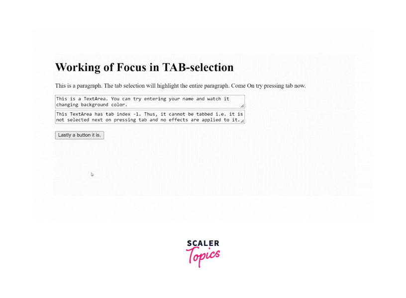
In the example above the focus is implemented using the TAB selection. As the item is selected it is highlighted and the background is changed to a different color. Various components such as textareas, buttons, etc. are used. Each element is given a tab index that tells which item is to be selected and when. Items are selected by ascending order of tab index. If the tab index is negative the item is not selected or highlighted.
Accessibility Concerns
While applying focus effects we need to make sure that people with low vision can also view it. Also, it should be visible to people viewing the website in brightly lit spaces like under the bright sun. The visual focus indicator should be at least 3 to 1 as per the WCAG Non-text Contrast Compliance.
Note :
-
Never simply remove the focus outline i.e. visible focus indicator without adding a new outline that passes WCAG guidelines.
-
The Web Content Accessibility Guidelines (WCAG) international standard documents explain how to make web content more accessible to people with disabilities.
Browser Compatibility
The CSS focus selector is compatible with the following browsers :
- Chrome
- Opera
- Firefox
- Safari
- Samsung Internet
- Edge
- WebView Android
Conclusion
- The CSS focus selector is a pseudo-class selector that responds to user actions such as keyboard selection or mouse click.
- Tabbing is selecting items by pressing the TAB key from the keyboard. It is important to highlight the item that is selected by the TAB thus, focus CSS can also be used for highlighting or focusing on the elements.
- It is important to note that the highlight should be visible to people with low vision and even in bright light areas. It should also meet WCAG criteria.