CSS Justify Content
 FREE
FREE
Overview
CSS justify-content is used to describe the alignment of items along the main axis of a flexbox container or the inline axis of a grid container. It is generally used to define the horizontal justification of items within a flexbox container. Justify content css distributes free space within a flexbox container, i.e. it can only be used if there is free space within a flexbox with the children of the box being non-flexible or having available space even if the children have reached their maximum size.
Syntax
The justify-content in CSS can be specified using the following syntax:
It can take a number of keywords as input and is declared in the following ways:
The default value of CSS justify-content is flex-start
Justify Content in CSS
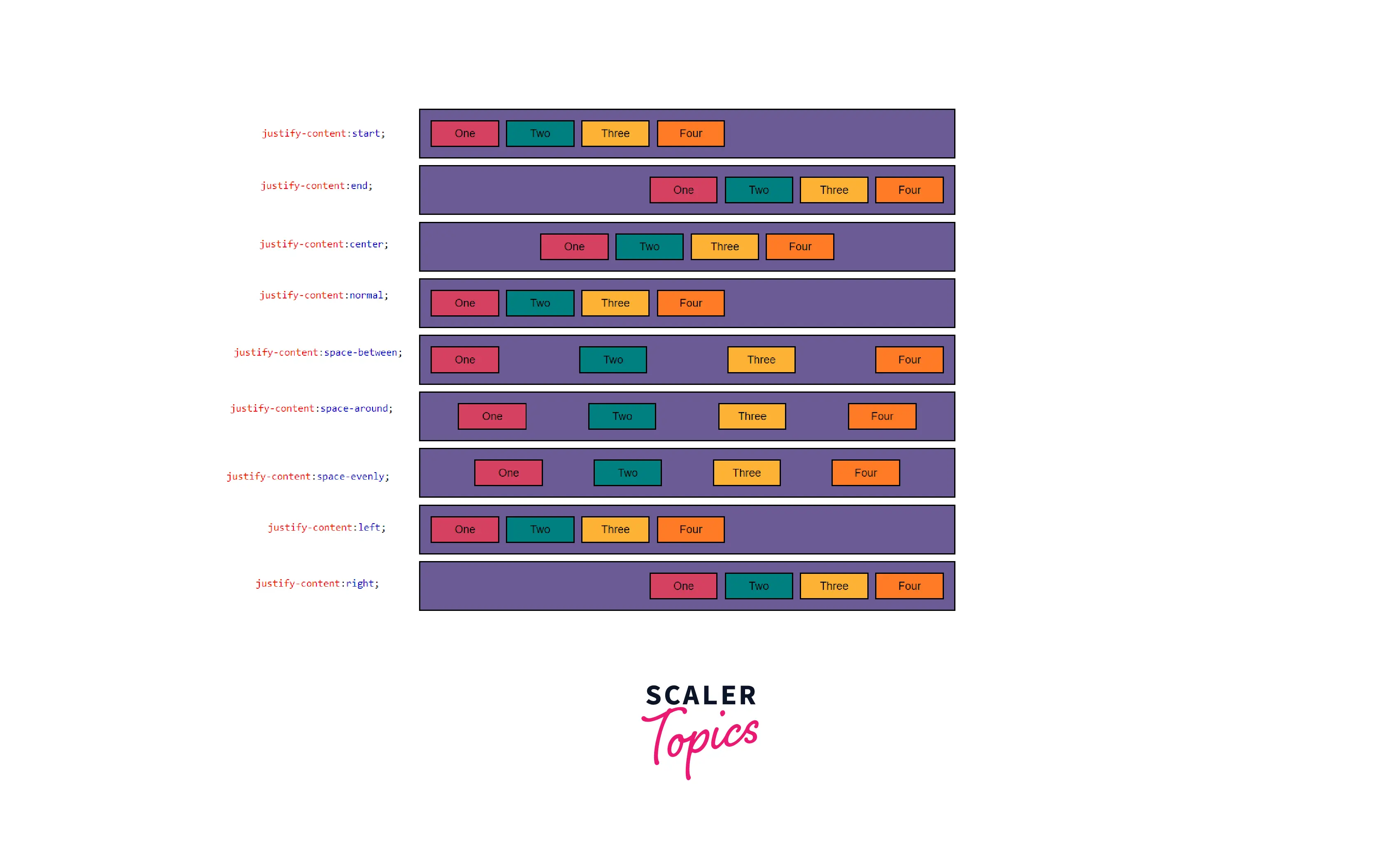
Positional Alignment
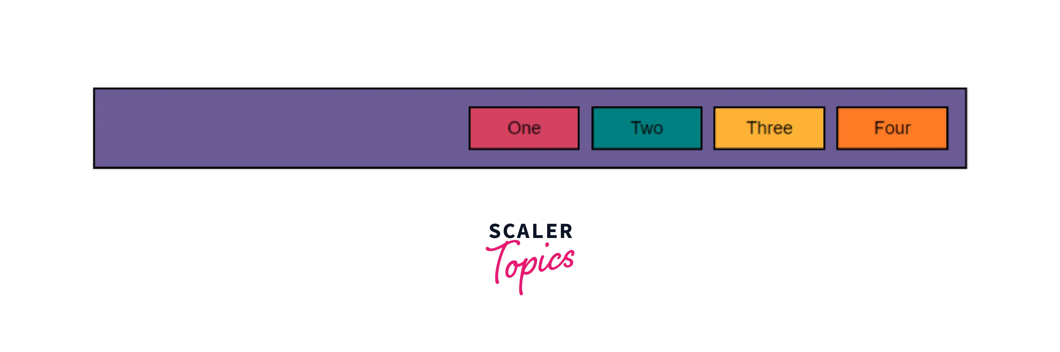
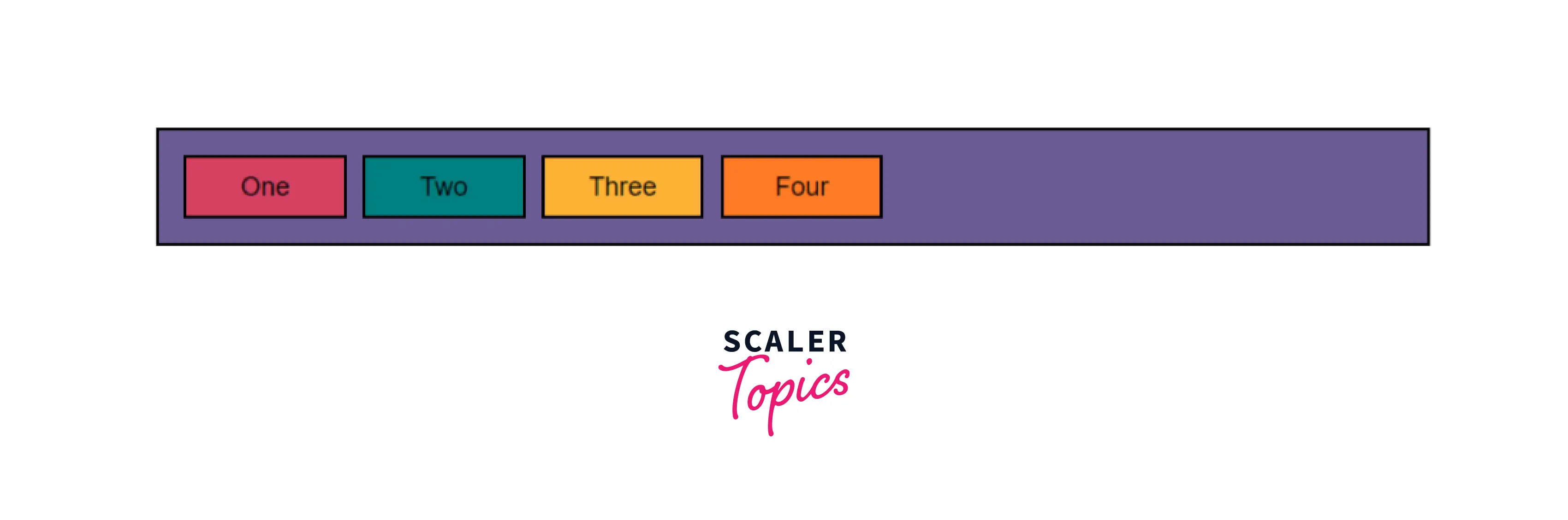
Start: CSS justify-content: start is used to put items flush toward the start of the alignment container. That is, it places all elements of a flexbox at the start of the flexbox container and places all the free space at the end. It is declared using the following line:
A flex-box container with its content set to start produces an output as such:
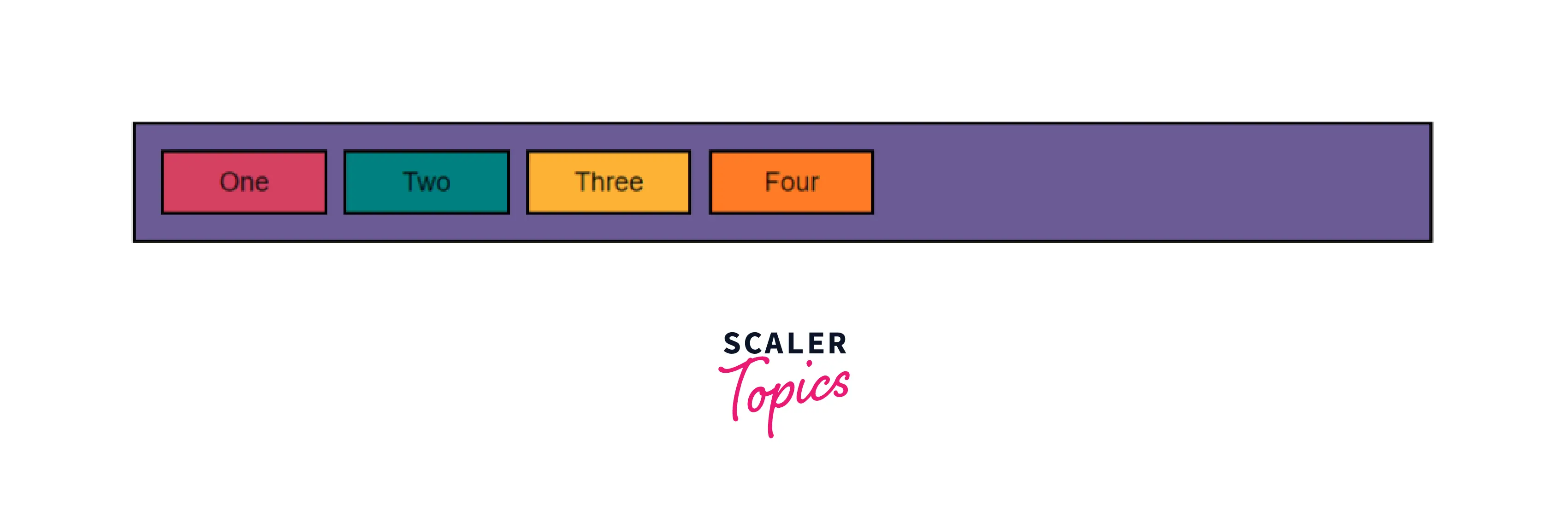 As you can observe from the above output, the four elements of the flex-box container are
placed at the start of the box, which is the right as the flex-flow has been declared to be row wrap.
As you can observe from the above output, the four elements of the flex-box container are
placed at the start of the box, which is the right as the flex-flow has been declared to be row wrap.
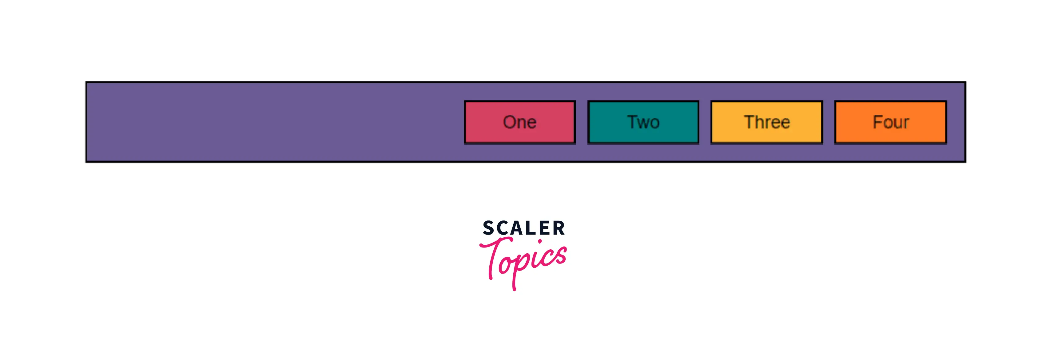
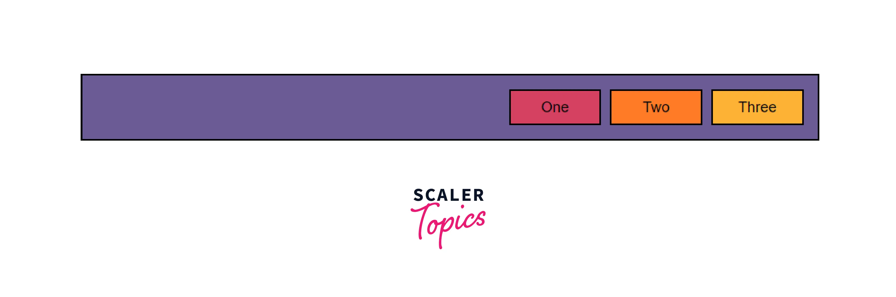
End: CSS justify-content: end is used to place items flush toward the end of the alignment container. That is, it places all elements of a flexbox at the end of the flexbox container and places all the free space at the start of the container. It is declared using the following line:
A flex-box container with its content set to end produces an output as such:
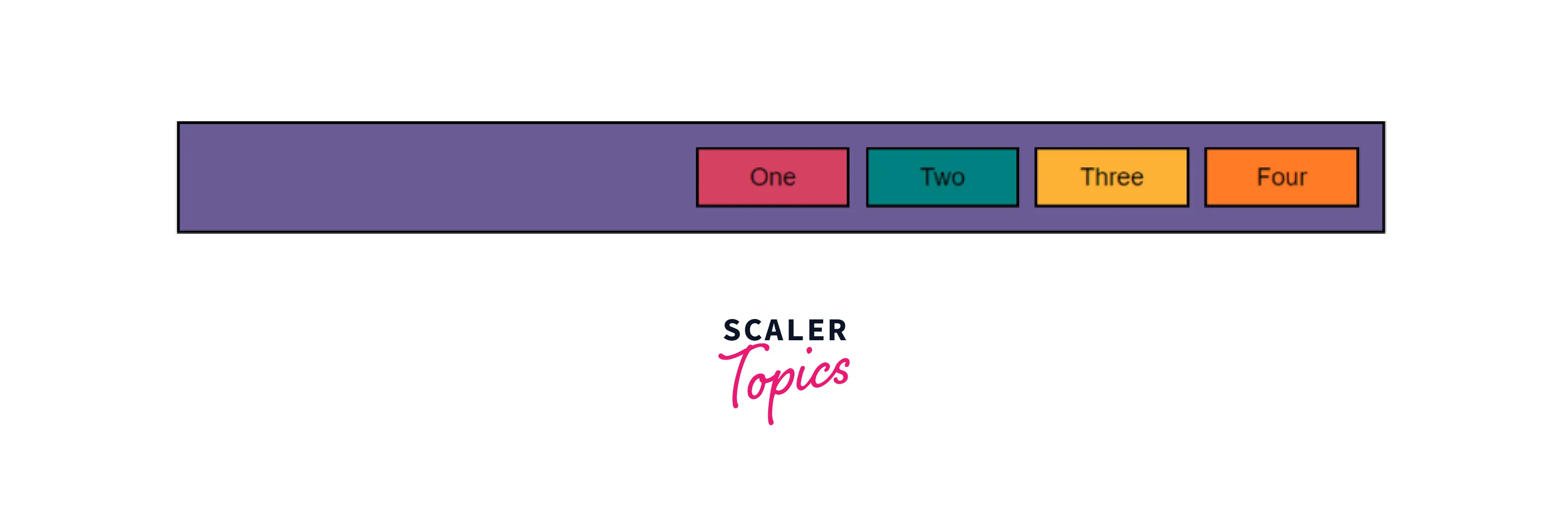
As you can observe from the above output, the four elements of the flex-box container are placed at the end of the box, which is the left as the flex-flow has been declared to be a row wrap.
Flex-start: CSS justify-content: flex-start is used to place items together at the start of the flexbox's main axis. Flex-start is only applied to the flex layout items and for items that are not the children of a flexbox, it is considered the same as start. It is declared using the following line:
A flex-box container with its content set to flex-start produces an output as such:
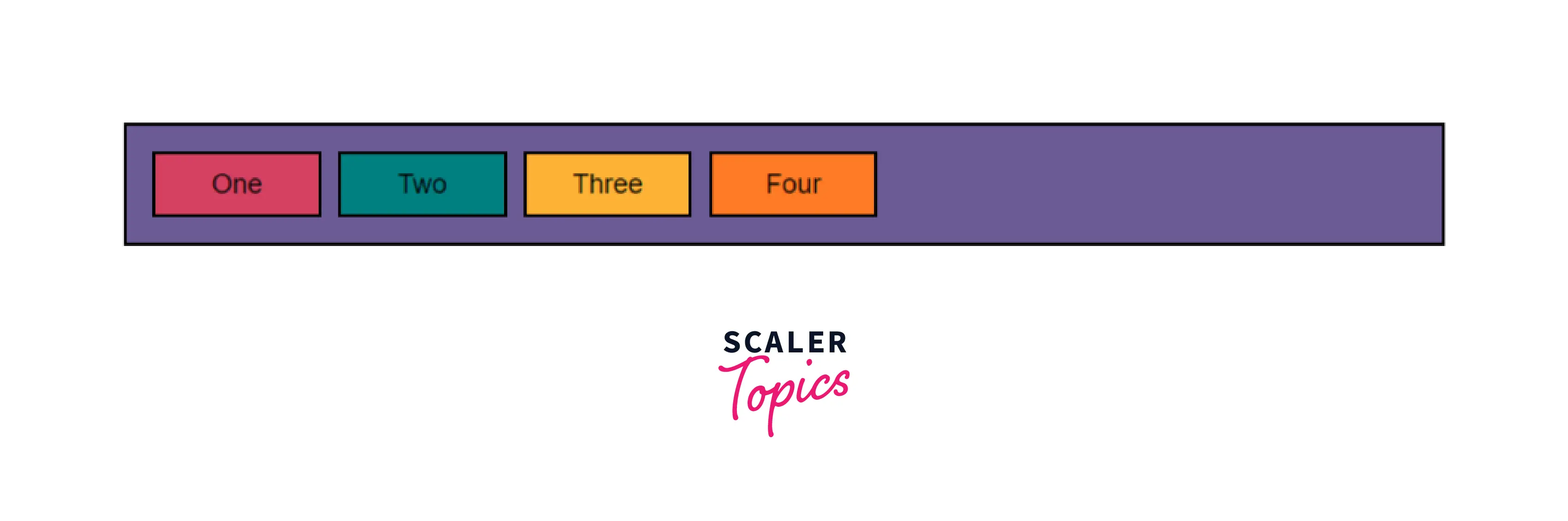
As you can observe from the above output, the four elements of the flex-box container are placed at the start of the box, which is the right as the flex-flow has been declared to be row wrap.
Flex-end: CSS justify-content: flex-end is used to place items together at the end of the flexbox's main axis. Flex-end is only applied to the flex layout items and for items that are not the children of a flexbox, it is considered the same as end. It is declared using the following line:
A flex-box container with its content set to flex-end produces an output as such:
As you can observe from the above output, the four elements of the flex-box container are placed at the end of the box, which is the left as the flex-flow has been declared to be a row wrap.
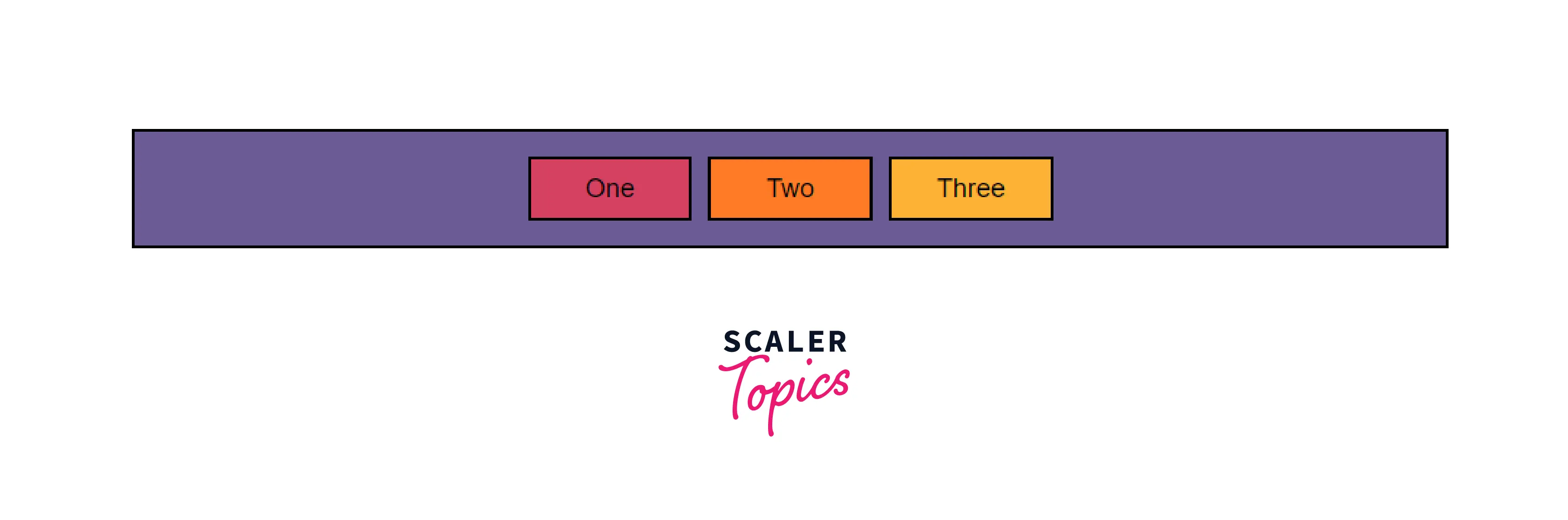
Center: CSS justify-content: center is used to place items flushed together at the center of an alignment container. That is, it places all elements of a flexbox in the center of the flexbox container and places all the free space around the elements of the container. It is declared using the following line:
A flex-box container with its content set to center produces an output as such:
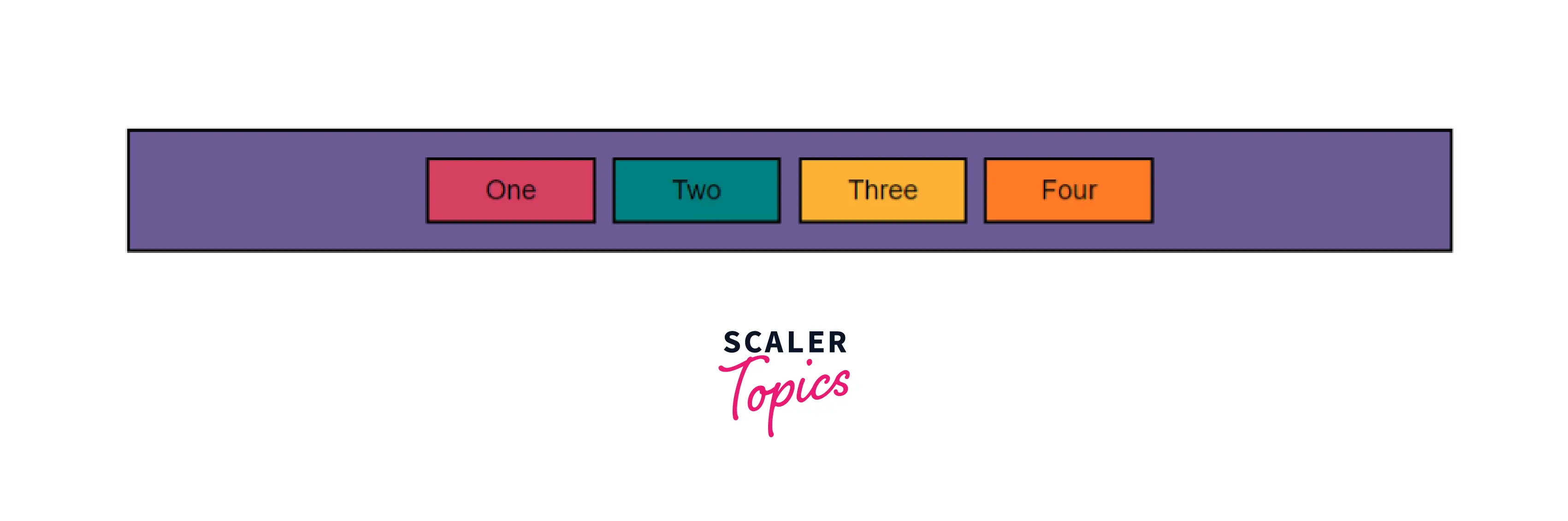
As you can observe from the above output, the four elements of the flex-box container are placed at the center of the box and the free space is placed on either side of the container.
Left: CSS justify-content: center is used to place items towards the left edge of the alignment container. That is, it places all elements of a flexbox to the left of the flexbox container and places all the free space towards the right. It is declared using the following line:
A flex-box container with its content set to left produces an output as such:
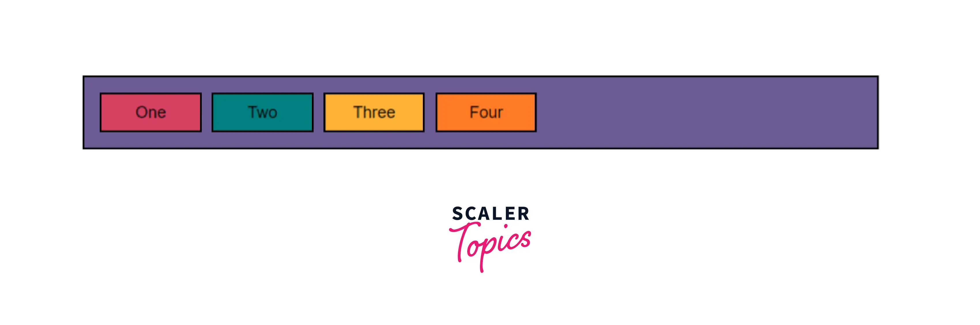
As you can observe from the above output, the four elements of the flex-box container are placed at the left of the box and the free space is placed toward the right.
Right: CSS justify-content: right is used to place items towards the right edge of the alignment container in the appropriate axis. That is, it places all elements of a flexbox to the right of the flexbox container and places all the free space towards the left. It is declared using the following line:
A flex-box container with its content set to right produces an output as such:
As you can observe from the above output, the four elements of the flex-box container are placed at the right of the flexbox container and placed all the free space towards the left.
Normal Alignment
Normal: CSS justify-content: normal is used to place items in their default position as if no justify-content value was set. It is declared using the following line:
A flex-box container with its content set to normal produces the following output:
As you can observe from the above output, the four elements of the flex-box container are placed at the start of the flexbox which is the default position of the elements as the flex-flow has been set to row wrap.
Distributed alignment
Space-between: CSS `justify-content: space-between is used to place free space from within a container in between the elements of the container. The leftmost and rightmost elements are flushed to the two ends of the container and the remaining space is evenly distributed and placed in between the elements. As such, the spacing between adjacent elements is equal. It essentially distributes free space to put an equal amount of space between any two elements. It is declared using the following line
A flex-box container with its content set to space-between produces the following output:
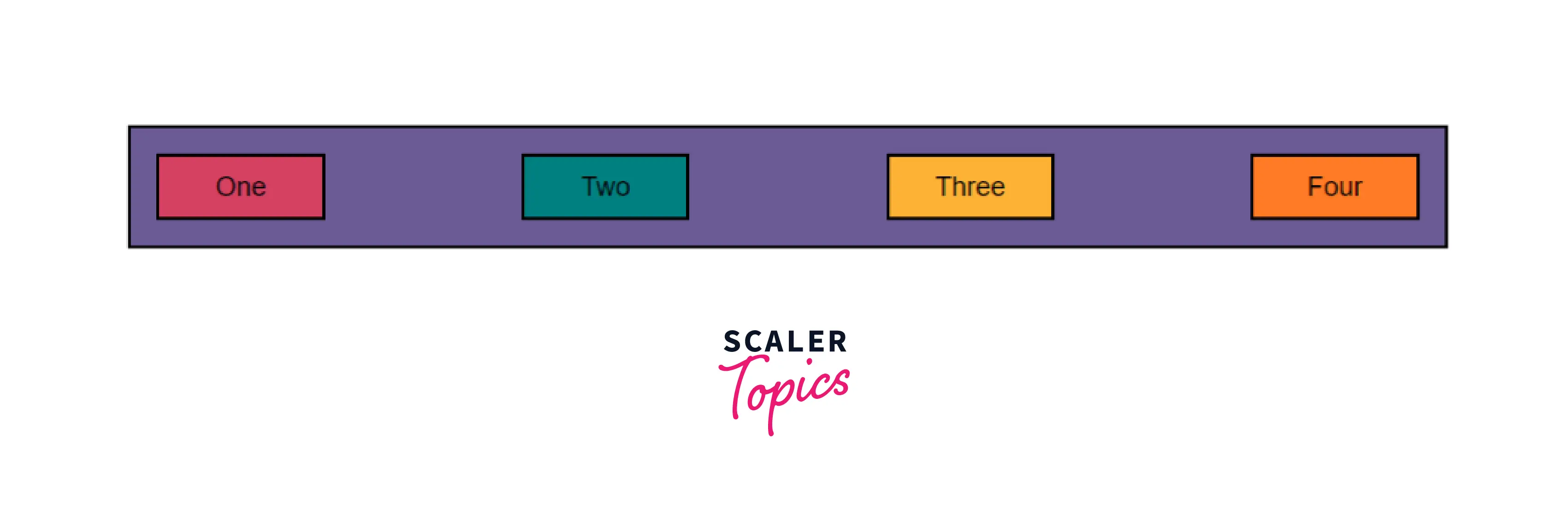
As you can observe from the above output, the free space in the flex-box is distributed and placed between any two elements, and the first and last elements of the flexbox are placed at the very start and end of the flex box respectively.
Space-around: CSS justify-content: space-around is used to distribute free space from within a container evenly around the elements of the container. All elements are placed at equal distances from one another and the space between the start of the container and the first element as well as the space between the end of the container and the last element is half of the distance between any two elements. It essentially distributes free space to put an equal amount of space around each element. It is declared using the following line
A flex-box container with its content set to space-around produces the following output:
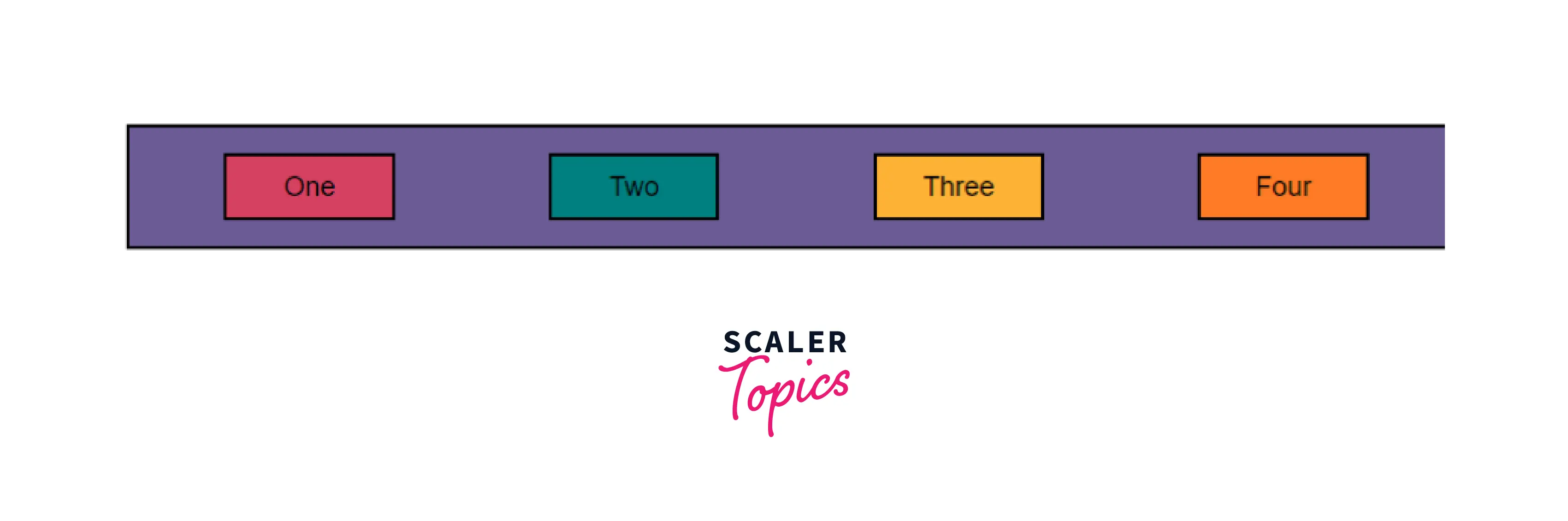
As you can observe from the above output, the free space in the flex box is distributed in a way such that all elements have the same amount of space on it's either direction along the main axis.
Space-evenly: CSS justify-content: space-evenly is used to distribute free space from within a container evenly such that each element is equally spaced from the edges of the container as well as each other. All distances; between two elements as well as an element and an edge; are equal. It essentially distributes free space such that each element is placed at an equal distance from the container as well as each other. It is declared using the following line
A flex-box container with its content set to space-evenly produces the following output:

As you can observe from the above output, the free space in the flex box is distributed in a way such that all elements are at equal distances from each other and the box itself.
Stretch: CSS justify-content: stretch is used to stretch the elements of a container so as to fill up the open spaces within a container. When a box' computed width/height (as appropriate to the axis) is auto and neither of its margins (in the appropriate axis) is auto, it sets the box’s used size to the length necessary to make its outer size as close to filling the alignment container as possible while still respecting the constraints imposed by min-height/min-width/max-height/max-width.
Unless otherwise specified, this value falls back to flex-start and as such is rarely used. Instead, flex-grow can be used to make a flex-box increase its size and fit the container it was placed in.
Overflow alignment
Safe: Justify content CSS, safe keyword is used alongside an alignment keyword. In case of the alignment, the keyword causes an overflow and consequent data loss, using the safe keyword causes the alignment to revert to flex-start.
The safe keyword is still a working draft, and not many (if any) browsers support it yet, so to get the same effect, cross-browser, auto margins can be used, which should be set on the flex item.
Unsafe: Justify content CSS, unsafe keyword is used alongside an alignment keyword. Using this keyword causes the alignment mentioned to be strictly enforced irrespective of a loss of data due to overflow.
Applying conditionality
Hover, focus, and other states
Justify content CSS may also be used with action states like hover, focus, and other states to conditionally apply justification. For example:
The above CSS causes elements of class a to change alignment from center to left on hover. Similar conditionality may be applied to other states like focus, active etc as well.
Breakpoints and media queries
CSS justify-content may also be used on specific breakpoints with media queries to change alignment with a change in screen size. For example:
Using the above CSS, we can set separate alignment for larger screens and separate alignment for screens that are smaller than 800px.
Example
Let us take a simple web page with three divs within a div.
Setting Flex item distribution
The outer div is set as a flexbox using the following css.
In this case, CSS justify-content as been set to the default value of flex-start. It produces the following output:
Setting justify-content to flex-end
We can set the content of the flexbox to be aligned to the end of it by adding the following css to the above code.
It produces the following output:
Setting justify-content to center
We can set the content of the flexbox to be center aligned by adding the following css to the above code.
It produces the following output:
Browser Support
The browser supported by CSS justify-content property is as follows:
- Google Chrome 29.0, 21.0 -webkit-
- Internet Explorer 11.0
- Microsoft Edge 12.0
- Firefox 28.0, 18.0 -moz-
- Opera 17.0
- Safari 9.0, 6.1 -webkit-
Conclusion
- Justify content CSS is used to align items along the main axis of a flexbox container or the inline axis of a grid.
- CSS justify-content takes on a number of keywords like start, end, center, space-between etc to justify-content.
- CSS justify-content can be used to distribute free space within an HTML container around the contents of the container.
Related Properties
- CSS flexbox
- CSS flex-direction
- CSS flex-flow
- CSS align-items
- CSS align-content