How to Make Rounded Corner Using CSS?
 FREE
FREE

Overview
CSS is all about making our HTML documents aesthetically pleasing. While developing a web page, there might be instances where we want some elements or images to have rounded corners. Here, the CSS border-radius property comes into play.
- We can use the border-radius property to add CSS rounded corners to any element.
- We may often refer to the rounded borders as "friendly rectangles" because they imply comfort, security, and reliability, all of which enhance our user experience.
- To add CSS rounded corners to an element, image, or border, we can use the border-radius property and specify the radius value in pixels, percentage, or em.
- The border-radius property can have one to four values.
- We can independently specify the border-radius for each corner by using the constituent properties like border-top-left radius, border-bottom-right radius, etc.
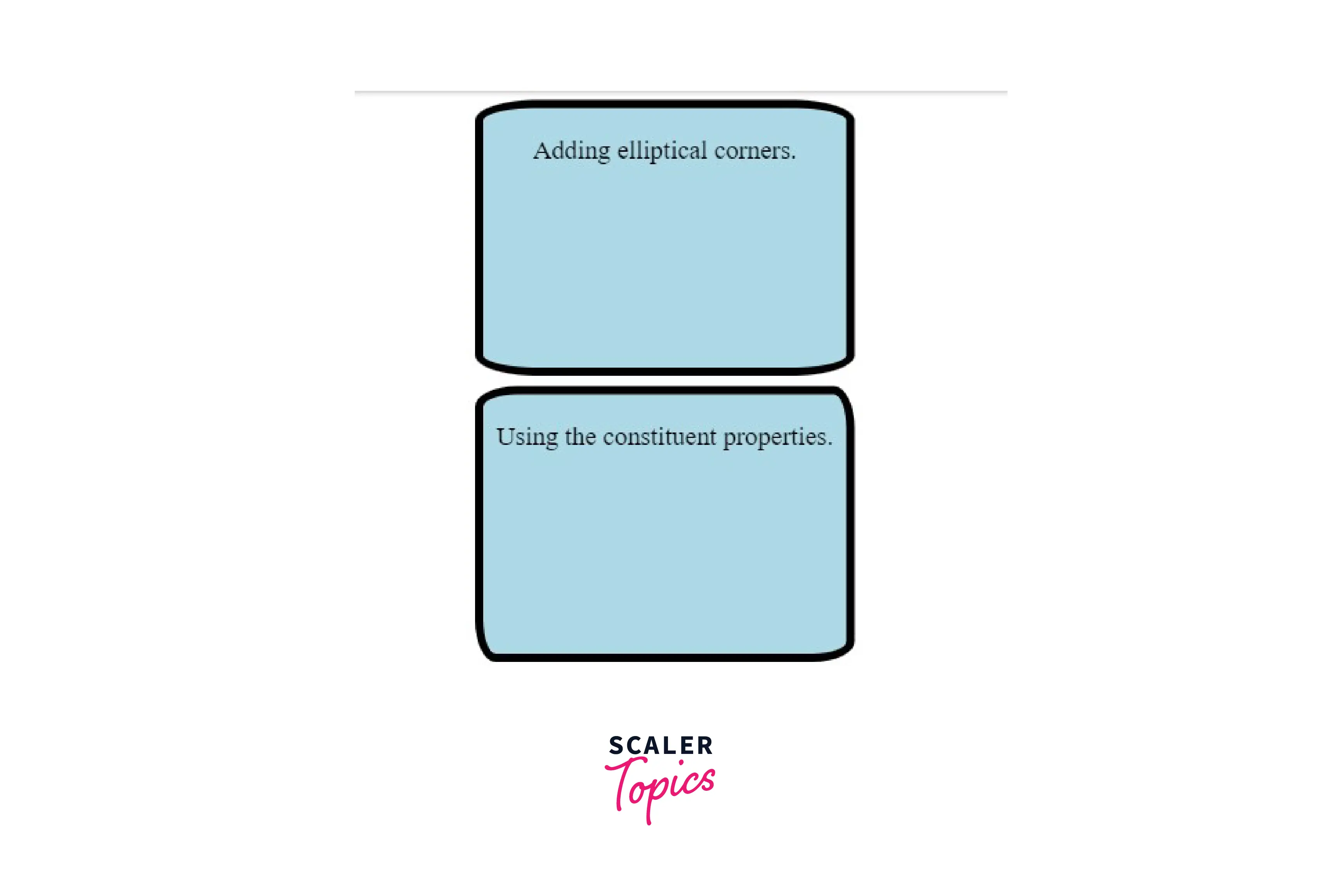
- We can also use the border-radius property to create elliptical borders.
This article will help us understand how to use border-radius property to give an element CSS rounded corners.
Pre-requisites
Make sure you understand the fundamental ideas of border property before continuing.
Syntax
The CSS border-radius property is a shorthand property that rounds all the corners of the element uniformly. We can specify the border-radius in pixels or percentages.
The Possible Values for Rounded Corners
| Value | Description | Example |
|---|---|---|
| length | We can use the length values to indicate the radius. | border-radius : 10px ; |
| percentage | We can use percentage values to indicate the radius. | border-radius: 5% ; |
Negative values are invalid .
Standard
For different browsers, including Chrome and Firefox, we may define the CSS rounded corners using the border-radius property by prefixing the property with -webkit and -moz. "-webKit" and "-moz" are vendor prefixes in CSS offered by Chrome and Firefox rendering engines, respectively. These prefixes enable us to use the CSS features without introducing inconsistencies.
| Standard | Mozilla Equivalent | Webkit Equivalent |
|---|---|---|
| border-radius: 10px; | -moz-border-radius: 10px; | -webkit-border-radius: 10px; |
We only need the standardized version since all the browsers support the official CSS syntax. It is not essential, but we may prefix the property with "-webKit" and "-moz" to allow complete legacy browser support.
Individual Corners
The border-radius property is a shorthand property that defines the radius for all the corners of the element. We can independently specify the border radius for each corner by using the following constituent properties :
| Constituent Property | Mozilla Equivalent | Webkit Equivalent | Description | Example |
|---|---|---|---|---|
| border-top-left-radius | -moz-border-radius-topleft | -webkit-border-top-left-radius | Rounds the top-left corner of an element. | border-top-left-radius : 10px ; |
| border-top-right-radius | -moz-border-radius-topright | -webkit-border-top-right-radius | Rounds the top-right corner of an element. | border-top-right-radius : 10px ; |
| border-bottom-right-radius | -moz-border-radius-bottomright | -webkit-border-bottom-right-radius | Rounds the bottom-left corner of an element. | border-bottom-right-radius:10px; |
| border-bottom-left-radius | -moz-border-radius-bottomleft | -webkit-border-bottom-left-radius | Rounds the bottom-right corner of an element. | border-bottom-left-radius:10px; |
Shorthand Property
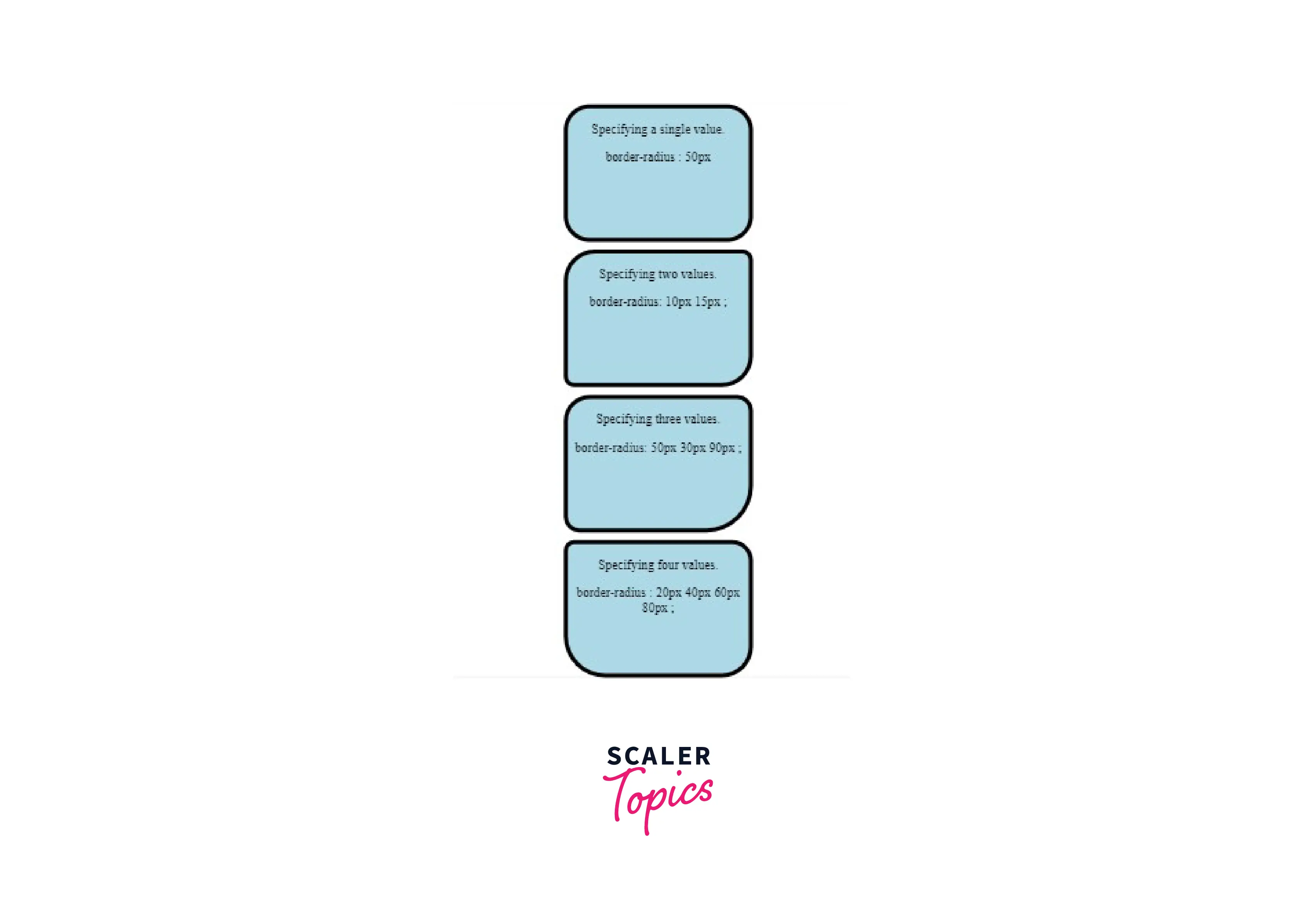
- We can specify a single value if we want to round the corners uniformly.
- We can specify two values. The first value sets the top-left and bottom-right corners, while the other applies to the top-right and bottom-left corners.
- We can specify three values. The first value applies to the top-left corner, the second value applies to the top-right and bottom-left corners, and the third value applies to the bottom-right corner.
- We can even specify four values. The first value applies to the top-left corner, the second value applies to the top-right corner, the third value applies to the bottom-right corner, and the fourth value applies to the bottom-left corner.
- The shorthand property for the Mozilla equivalent is as follows :
Elliptical Rounding
There may be situations in which we prefer elliptical corners over completely symmetrical ones. We can specify the horizontal and vertical radiuses with a slash in between to create such corners.
SYNTAX
Example
- A single pair of values for both the horizontal and vertical radiuses rounds all four corners.
- If we want a more complex shape, we can use four values each for horizontal and vertical radiuses. Example
- The constituent properties remain the same for elliptical rounding. We can specify the border radius for each corner individually using space-separated values instead of slash-separated ones. Example
Elliptical Rounding (Firefox 3.5+)
SYNTAX
We need the -moz-prefix since Mozilla Firefox 3.5 only allowed round corners. However, more recent versions of Firefox also enable elliptical corners.
This syntax also applies to the other constituent properties.
Example
Elliptical Rounding Shorthand (Firefox 3.5+)
- A single pair of values for both the horizontal and vertical radiuses rounds all four corners.
- We can even specify four values each for horizontal and vertical radiuses. These values represent the top-left, top-right,bottom-right, and bottom-left corners.
WebKit Elliptical Rounding
-
All corners Browsers like Chrome and Safari support WebKit elliptical rounding. We can use the following shorthand property to elliptically round all the corners.
SYNTAX
Example
-
Right corners only To elliptically round the right corners of the elements, we will use the following syntax : SYNTAX
Example
Using the following examples, let's learn how to add rounded corners to elements:
Examples
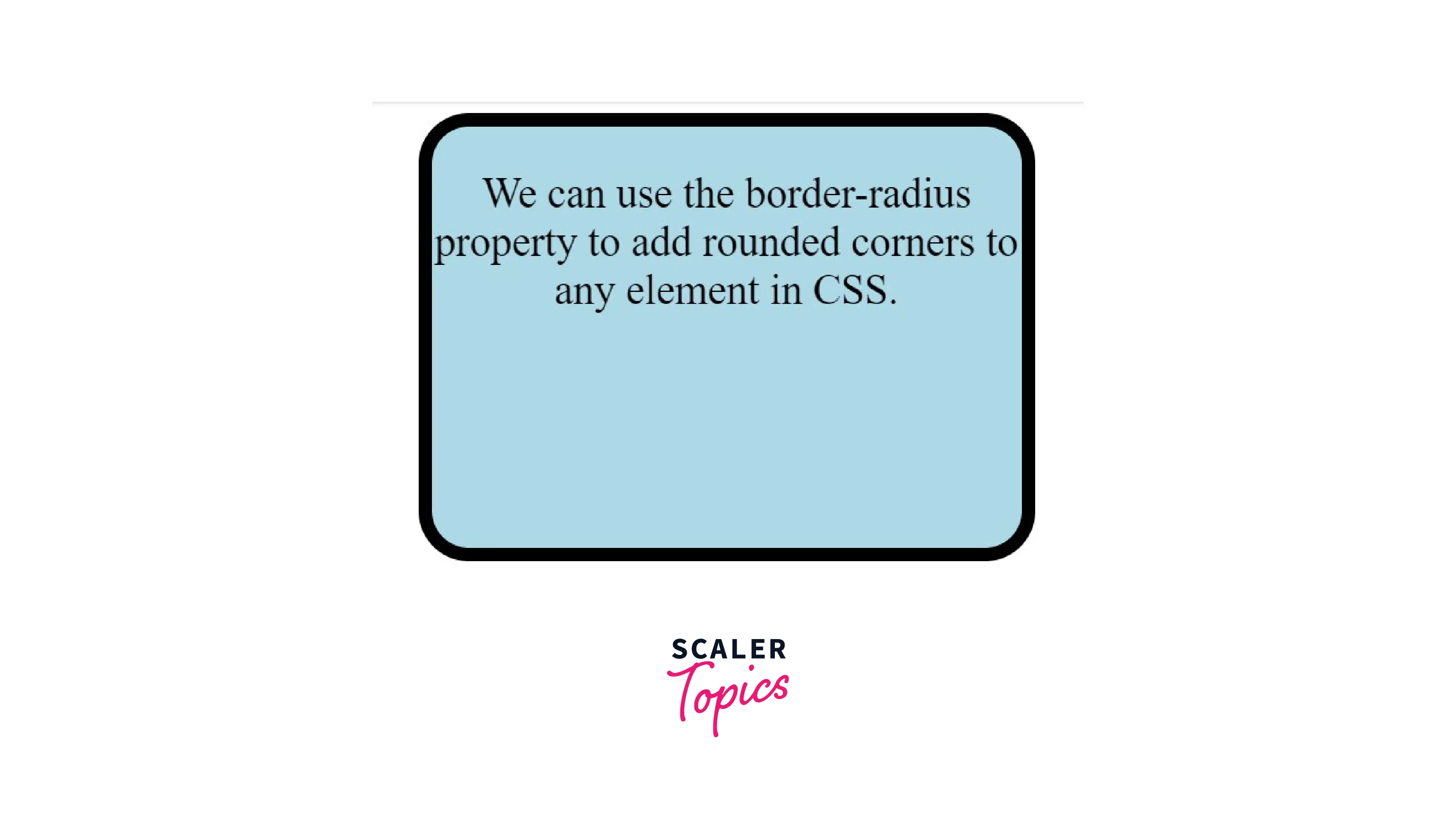
Example 1: This Example Describes the Border-Radius Property to Create Css Rounded Corners
HTML
CSS
Output
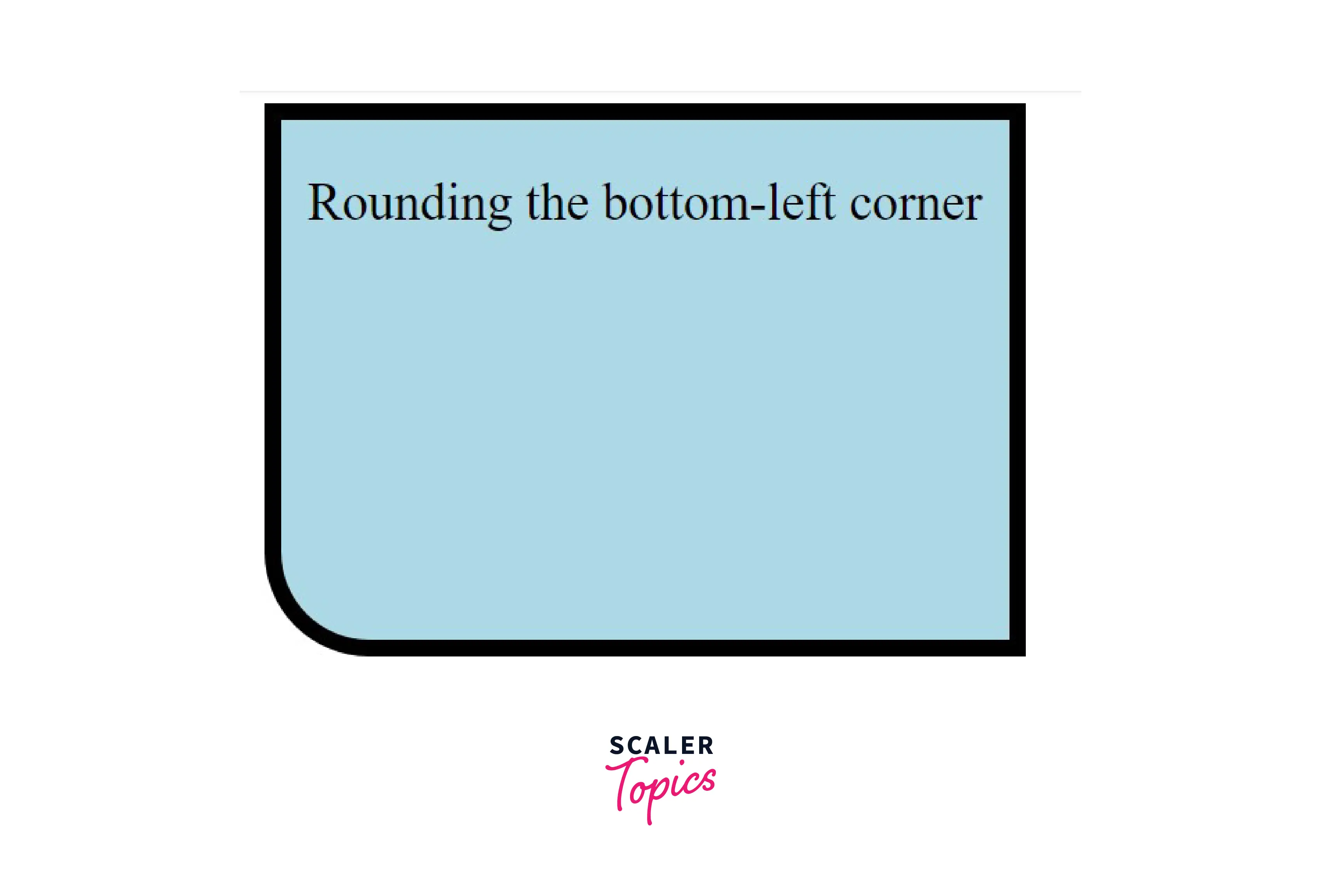
Example 2: This Example Describes the Use of The Border-Bottom-Left-Radius Property
HTML
CSS
Output
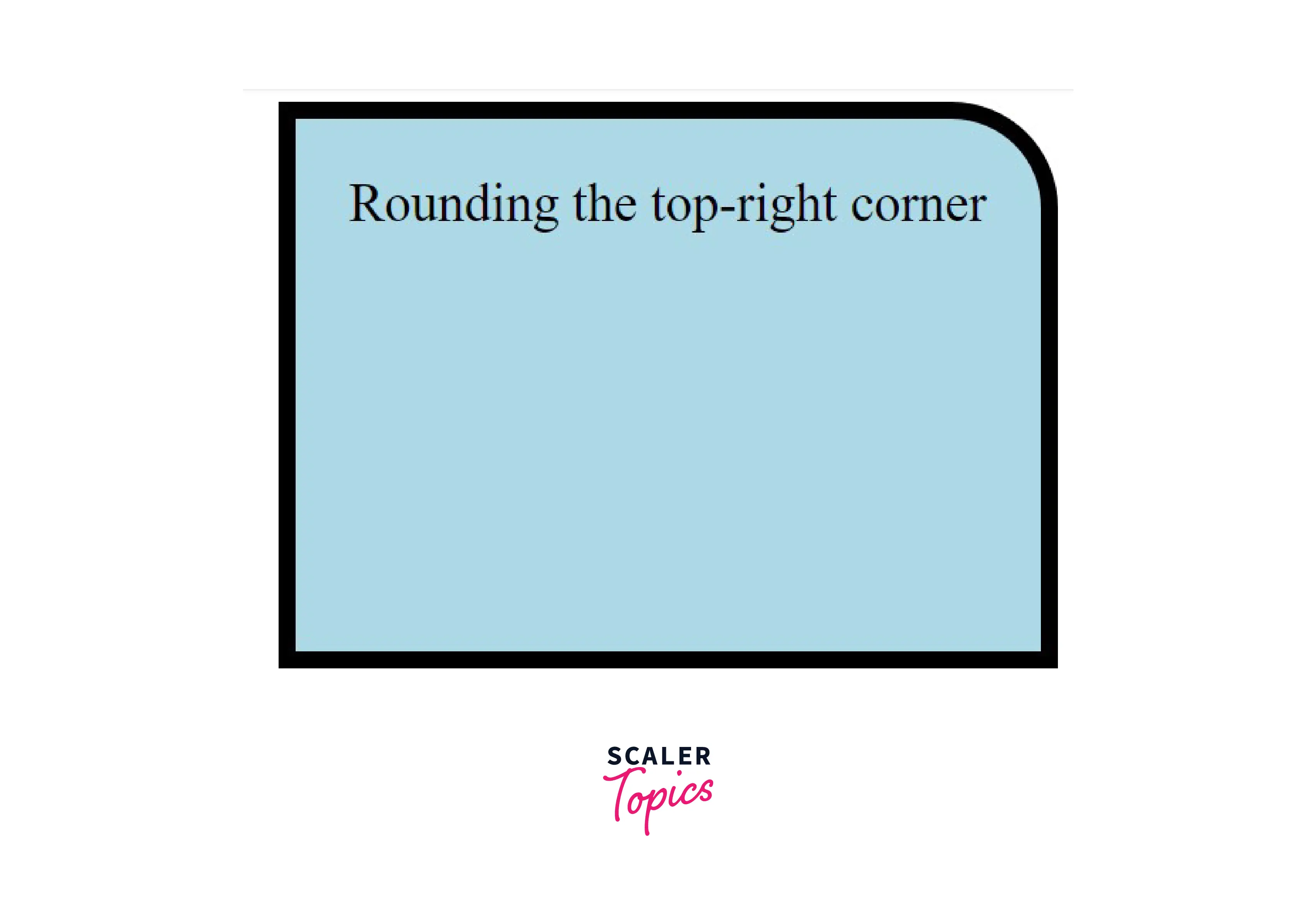
Example 3: This Example Describes the Use of The Border-Top-Right-Radius Property
HTML
CSS
Output
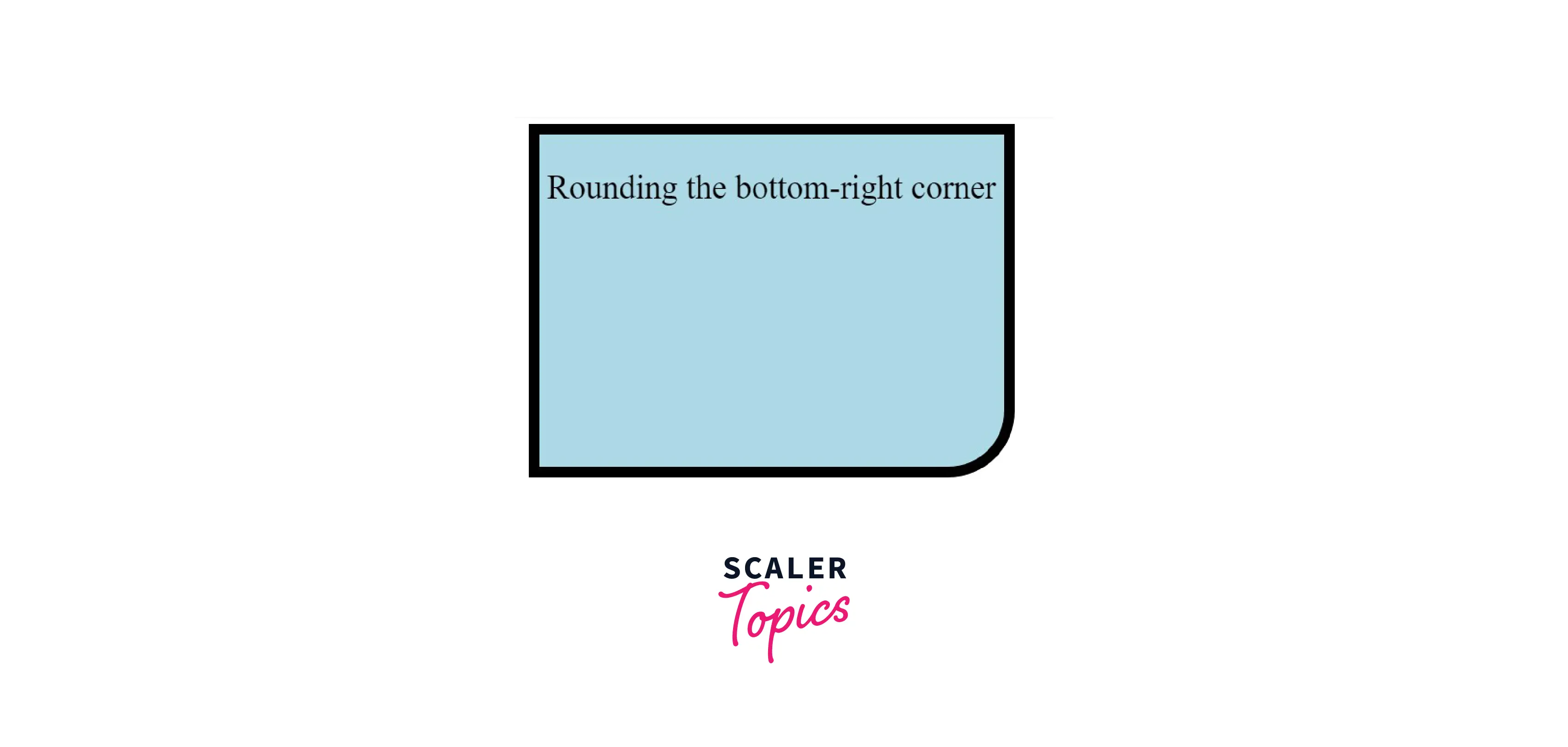
Example 4: This Example Describes the Use of The Border-Bottom-Right-Radius Property
HTML
CSS
Output
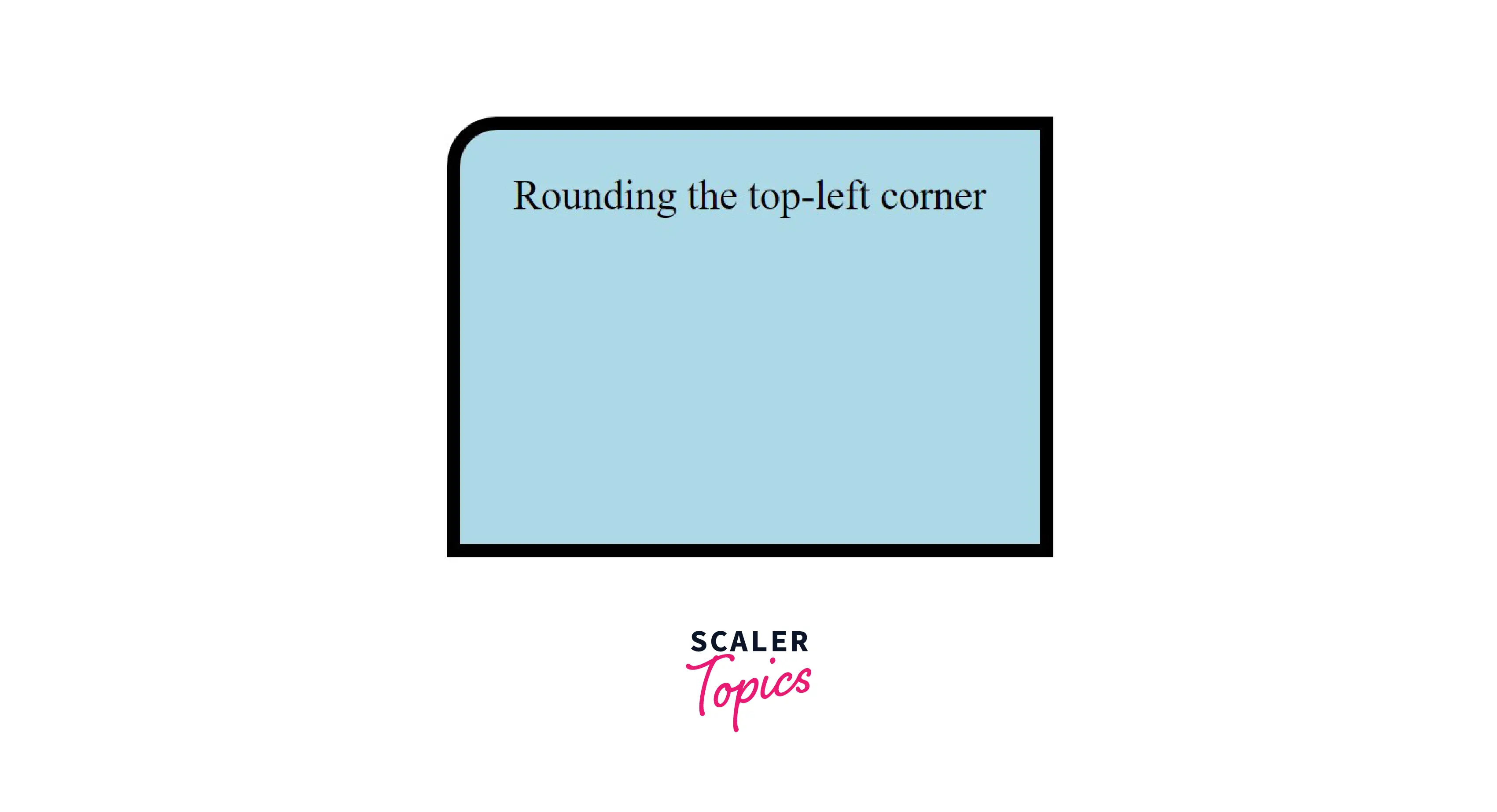
Example 5: This Example Describes the Use of The Border-Top-Left-Radius Property
HTML
CSS
Output
Example 6 : This Example Describes the Use of Shorthand Properties
HTML
CSS
Output
Example 7 : We Can Learn how To Add Elliptical Corners with The Help of This Example
HTML
CSS
Output
Conclusion
- We can use the border-radius property to add CSS rounded corners to any element.
- We can specify the border-radius in pixels or percentages.
- We can independently specify the border radius for each corner by using the constituent properties.
- We can also use the border-radius property to create elliptical borders.
- It is not essential, but we may prefix the property with "-webKit" and "-moz" to allow complete legacy browser support.