CSS Gradients

Overview
Adding just a single color to your website sometimes doesn't look attractive. Therefore there is a way where you can make your website more interesting by combining two or more colors and displaying the smooth transition in your website, which is known as CSS Gradients.
What are CSS Gradients?
Gradients are the combination of two or more colors (where one color fades into another) and display the smooth transition between the nearest points of colors on our website. With CSS Gradients, we can control the direction and the changes that must occur in the colors.
CSS Gradients are background images set in three forms that are: -
- linear-gradient - The transition between two or more colors occurs along a linear direction in a linear gradient.
- radial-gradient - The color gradient begins from the center of its radial gradient.
- conic-gradient - The transition between colors occurs around the center.
Well, this might be confusing. How do we set the direction of the colors? Let's understand it with the following image.
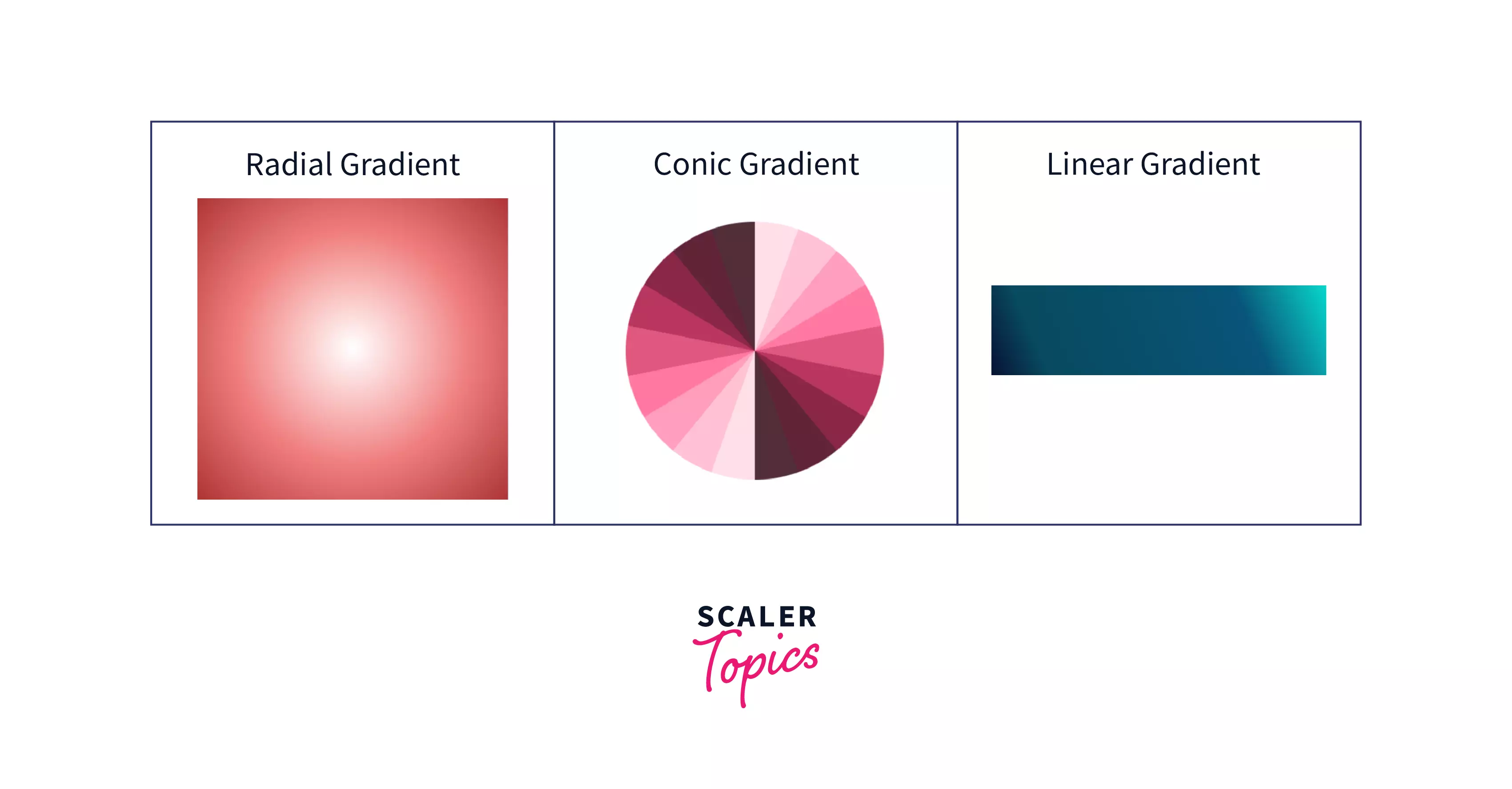
We can add a gradient in three ways, as shown in the image above.
Let's deal with this in detail in the upcoming sections.
Why CSS Gradient?
- CSS Gradients provide better visibility over the images while the page is zoomed in because it is generated by the browser itself.
- It is the better way to create responsive websites where the size of the page changes.
- You can reduce the bandwidth and download time usage to just the download time of the background CSS Gradient.
- Instead of using background images for the gradient effect, we use CSS3 Gradient, which makes the transition of the colors smooth.
The Three Types of CSS Gradients
As we saw above that, there are three ways by which we can add the transition to the colors. They are: -
- Linear Gradient
- Radial Gradient
- Conic Gradient
Let us understand this in detail.
CSS Linear Gradient
Linear Gradient is the most common type of gradient. We can set the gradient axis from top to bottom, left to right, diagonally, or at any angle we want.
Syntax
The first parameter the syntax takes is the direction that is the direction we want to give to the gradient, i.e., to the right, to the bottom right, etc. The other parameters are colors separated by a comma and can have hex, named colors, rgba, hsla values.
The default direction for linear gradient is top to bottom.
Example
In this example, we will combine 4 colors.
CSS code
Complete HTML Code
Output
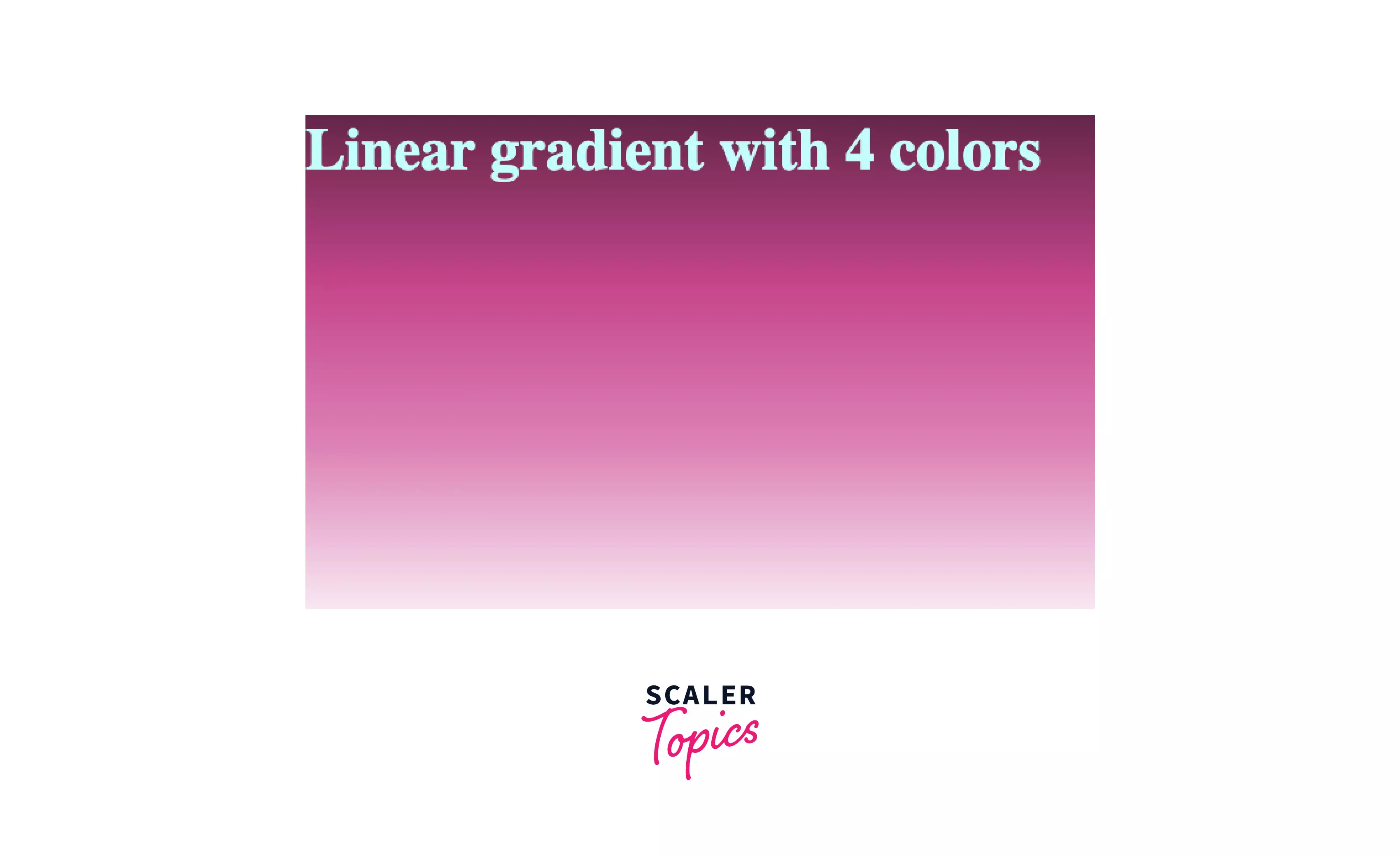
We can see that when the gradient direction is empty, it takes the top to bottom direction by default. 4 hex color codes are added just by separating them by a comma.
CSS Radial Gradient
Radial Gradient starts from the center. We don't have to specify the angle in radial gradient as we did in linear gradient. Instead, we have to specify the position and ending shape like circle, ellipse, etc. By default, if we don't mention the shape radial-gradient() function sets the circle or ellipse according to the box size.
Syntax
Let's understand it with a simple example by combining blue and white without mentioning the shape or position of the color transitions.
Example
Output
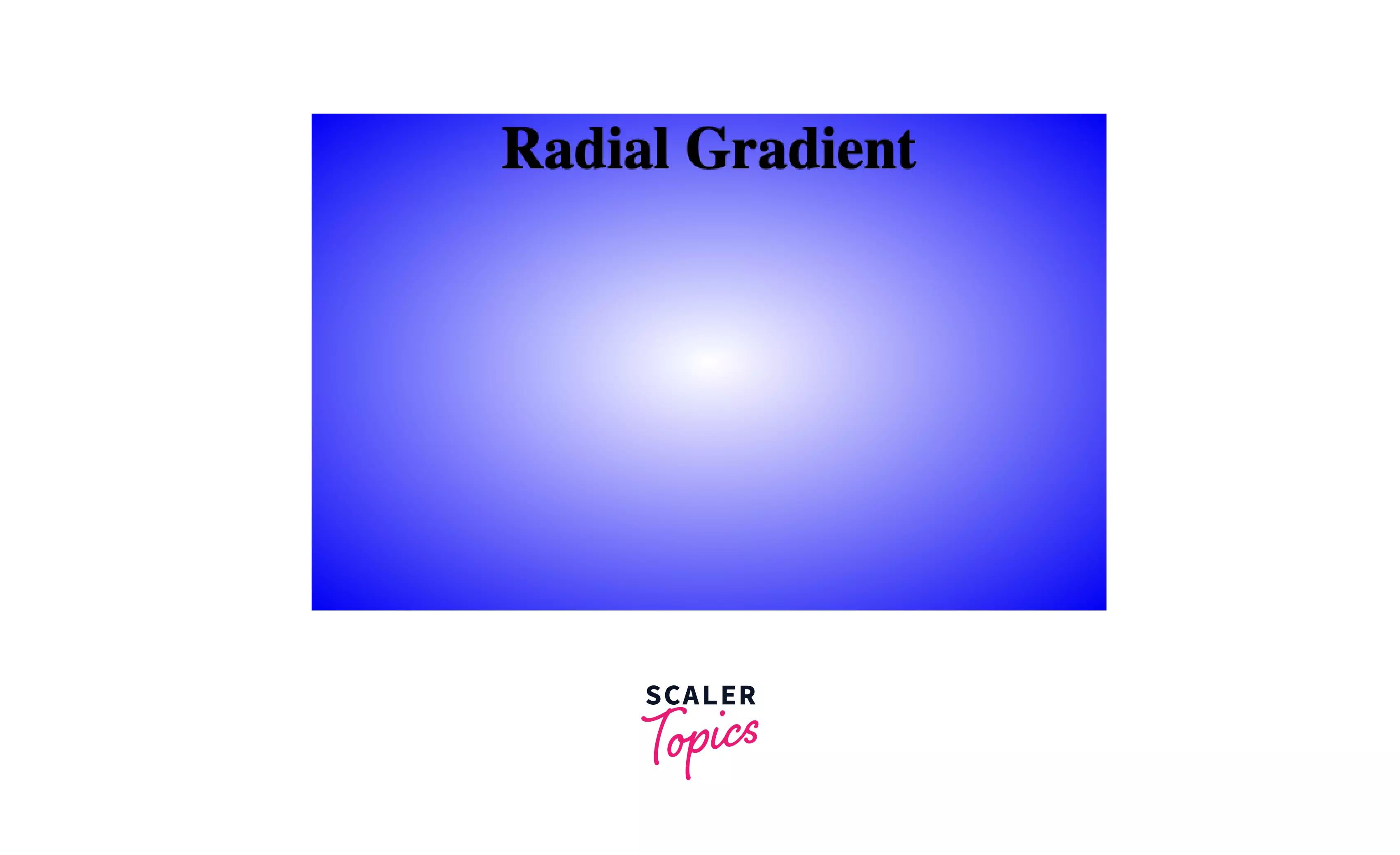
As we can see in the output, the shape takes an ellipse according to the width and height mentioned for the box.
By default, the radial-gradient() takes an ellipse as the default shape, a position as the center, and size as the farthest-corner.
CSS Conic Gradient
To set the shape of the cone, we have to rotate the shape from the center. To do that, we will use the conic-gradient() function. It is slightly different from radial-gradient because the transition between colors is placed around the circle, while in radial, it emerges from the circle. When we view it from above, the shape looks like a cone, as shown in the image; therefore, it is called a conic gradient.

Syntax
Example Let's mix five colors using a conic gradient without specifying an angle.
CSS code
Complete HTML Code
Output

From the output, we can see that colors emerge from the center, and a transition between the colors occurs around the circle.
To make a pie chart, we can set the border as 50%, and our conic gradient will look like a pie chart.
Repeating and Mixing
We can repeat colors in all three types of gradients, for example repeating-linear-gradient() function. Let's see them in detail.
Repeating Linear Gradient
We can repeat colors in a linear gradient using the repeating-linear-gradient() function. Also, specify the space for each color, as shown in the example.
Example
Let's repeat the pink and white colors linearly.
Output

From the output, we can conclude that pink and white colors are repeated at regular intervals.
We can also specify the angle we want the transition to occur, as shown in the following image.
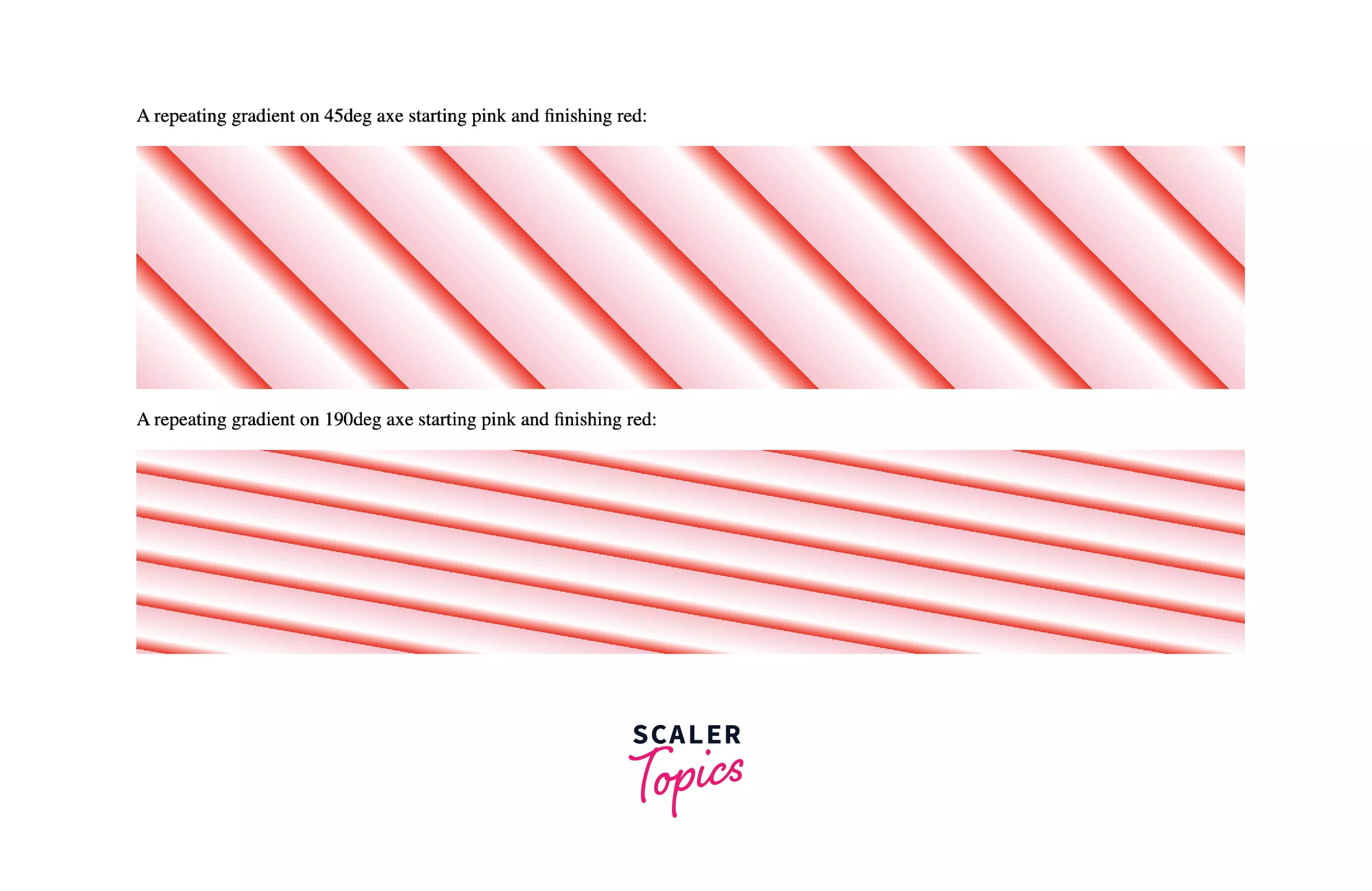
To get the above output we will specify the angle.
In this image, the linear gradient starts with pink and ends with red.
Repeating Radial Gradient
We can repeat radial gradient using repeating-radial-gradient() function.
Example In this example, let's repeat the pink and white colors.
Output

From the output, we can see that just by replacing linear with radial from the previous example we get the repeating radial gradient.
Repeating Conical Gradient
To make a repeating conical gradient, we use the repeating-conic-gradient() function.
Example
Let's make a color wheel of three colors that are repeated at regular intervals.
Output

Here, the color wheel starts with purple color combined with pink and ends with white color.
Conclusion
- CSS Gradient is the smooth transition between colors that are set as a background image for the website.
- There are three types of gradients - linear, radial, and conic.
- We can specify top to bottom, left to right, diagonal, or any angle as Linear gradient direction.
- Radial Gradient takes two shapes, circle and ellipse, where ellipse is the default value.
- In Conic Gradient, the transition occurs around the circle.
