Cursor Pointer and Other Classes for Bootstrap
Overview
The bootstrap cursor classes are used to change the appearance of the cursor when it is hovered over that item. By default, Bootstrap doesn't include the cursor pointer class or the CSS properties. But this can be done manually with the help of predefined cursor pointer bootstrap classes. We have plenty of options available to play with and let the users have a better experience. The cursor can be used to provide visual feedback on the element's behavior when it is hovered.
Cursor Pointer and other classes
Below give is a table that contains a category of the cursor's classes available. The second column is the CSS property that can be directly added to any element to change the appearance of the cursor. Bootstrap provides built-in easy to use classes which can directly be added to elements which are mentioned in the third column
| Category | CSS Property | Class |
|---|---|---|
| General | cursor: auto | cursor-auto |
| cursor: default | cursor-default | |
| cursor: none | cursor-none | |
| Links & status | cursor: context-menu | cursor-context-menu |
| cursor: help | cursor-help | |
| cursor: pointer | cursor-pointer | |
| cursor: progress | cursor-progress | |
| cursor: wait | cursor-wait | |
| Selection | cursor: cell | cursor-cell |
| cursor: crosshair | cursor-crosshair | |
| cursor: text | cursor-text | |
| cursor: vertical-text | cursor-vertical-text | |
| Drag & drop | cursor: alias | cursor-alias |
| cursor: copy | cursor-copy | |
| cursor: move | cursor-move | |
| cursor: no-drop | cursor-no-drop | |
| cursor: not-allowed | cursor-not-allowed | |
| cursor: grab | cursor-grab | |
| cursor: grabbing | cursor-grabbing | |
| Resizing & scrolling | cursor: all-scroll | cursor-all-scroll |
| cursor: col-resize | cursor-col-resize | |
| cursor: row-resize | cursor-row-resize | |
| cursor: n-resize | cursor-n-resize | |
| cursor: e-resize | cursor-e-resize | |
| cursor: s-resize | cursor-s-resize | |
| cursor: w-resize | cursor-w-resize | |
| cursor: ne-resize | cursor-ne-resize | |
| cursor: nw-resize | cursor-nw-resize | |
| cursor: se-resize | cursor-se-resize | |
| cursor: sw-resize | cursor-sw-resize | |
| cursor: ew-resize | cursor-ew-resize | |
| cursor: ns-resize | cursor-ns-resize | |
| cursor: nesw-resize | cursor-nesw-resize | |
| cursor: nwse-resize | cursor-nwse-resize | |
| Zooming | cursor: zoom-in | cursor-zoom-in |
| cursor: zoom-out | cursor-zoom-out |
The most commonly used ones are default, zooming, drag and drop, and link and status ones. We can also manually create these classes by using the CSS cursor and respective property.
The most commonly used cursor classes are:
- cursor-auto: This refers to the default cursor of the browser and assigns it to the current class.
- cursor-pointer: This changes the cursor to a hand, giving an intuition that the given element is clickable.
- cursor-not-allowed: Sets the cursor to the no-entry symbol usually used to show disabled or non-clickable elements.
- cursor-wait: During buffering or loading cursor is changed to the hourglass so that the user gets the idea that it is processing and the user is not supposed to click randomly on the page.
- cursor-move: For draggable elements, move cursor is used. The elements can be dragged and placed in some other place.
- cursor-resize: Resize cursor indicates that the given element can be resized and is usually represented by an arrow.
- cursor-text: Sets the cursor to a text cursor or "I-beam", suggesting that the element is the text that can be selected or edited.
It is essential for developers to understant that certain cursor styles may enhance visual design, it must not affect users with disabilities. Developers have to carefully consider all types of audiences to avoid unintentional accessibility barriers, ensuring a universally accessible and user-centered interface for all the users irrespective of their abilities or impairments.
Example: Add .cursor-pointer class to set a pointer cursor
Example 1 - Pointer Cursor
Output:
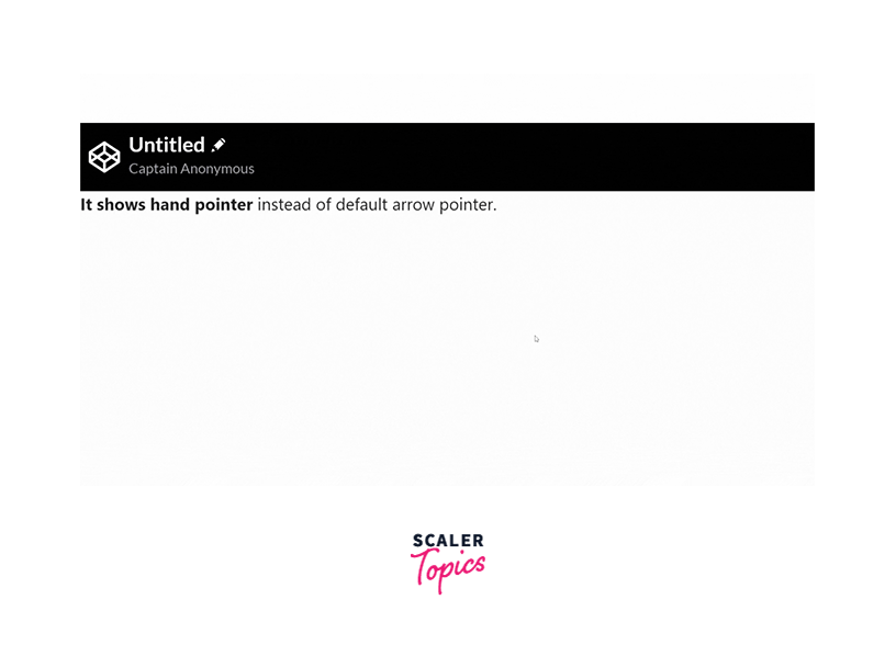
Explanation: The class cursor-pointer changes the cursor to a pointer when it is hovered over the element.
Example 2 - Zoom IN and OUT
Output:
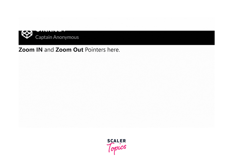
Explanation: Similarly, for zoomable elements, we can make the cursor zoom in initially and zoom out when the element is zoomed in. This makes it easier for the user to understand what will happen when they click on elements. Alternative Way: The similar output can also be achieved if we use the css cursor property as follows:
Here, we are using inline CSS styling.
Example 3 - Copy and Move
Output:
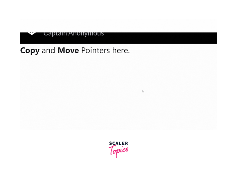
Explanation: Some elements facilitate drag and drop on the webpage. Copy, move, paste, etc. are part of this drag-and-drop utility.
Conclusion
- Bootstrap cursor pointer classes can be applied in the HTML or within Bootstrap components to change the default cursor to a pointer.
- Cursor Pointer bootstrap classes enhances user experience by providing a visual cue about an elemenet being clickable, zoomable, text only, etc.
- Bootstrap offers classes like cursor-auto for default behaviour and other classes like cursor-wait, cursor-copy, cursor-not-allowed for special purposes.