How To Customize AppBar In Flutter?
Overview
An AppBar is a Flutter widget that represents the top app bar in a Flutter application. It’s a typical UI element used to show the app’s title, actions, and navigation buttons at the top of the screen in a uniform and recognizable manner. The AppBar is often put at the top of a Scaffold widget, which offers scaffolding for building a material-design app’s basic visual layout. This article will go deeper into the Flutter app bar and its customization.
Introduction
Flutter AppBar is an app component that adheres to Material Design principles. It is often positioned at the top of the screen and can contain additional widgets inside its layout. The AppBar frequently shows branding information like as logos and titles, and it also includes buttons or other points of user interaction.We can also build custom app bar flutter. The AppBar widget in Flutter follows Google's Material Design principles, delivering a uniform and familiar design across platforms such as Android and iOS. This uniformity contributes to a more smooth user experience and gives the app the appearance of being native to each platform.
What is Flutter AppBar?
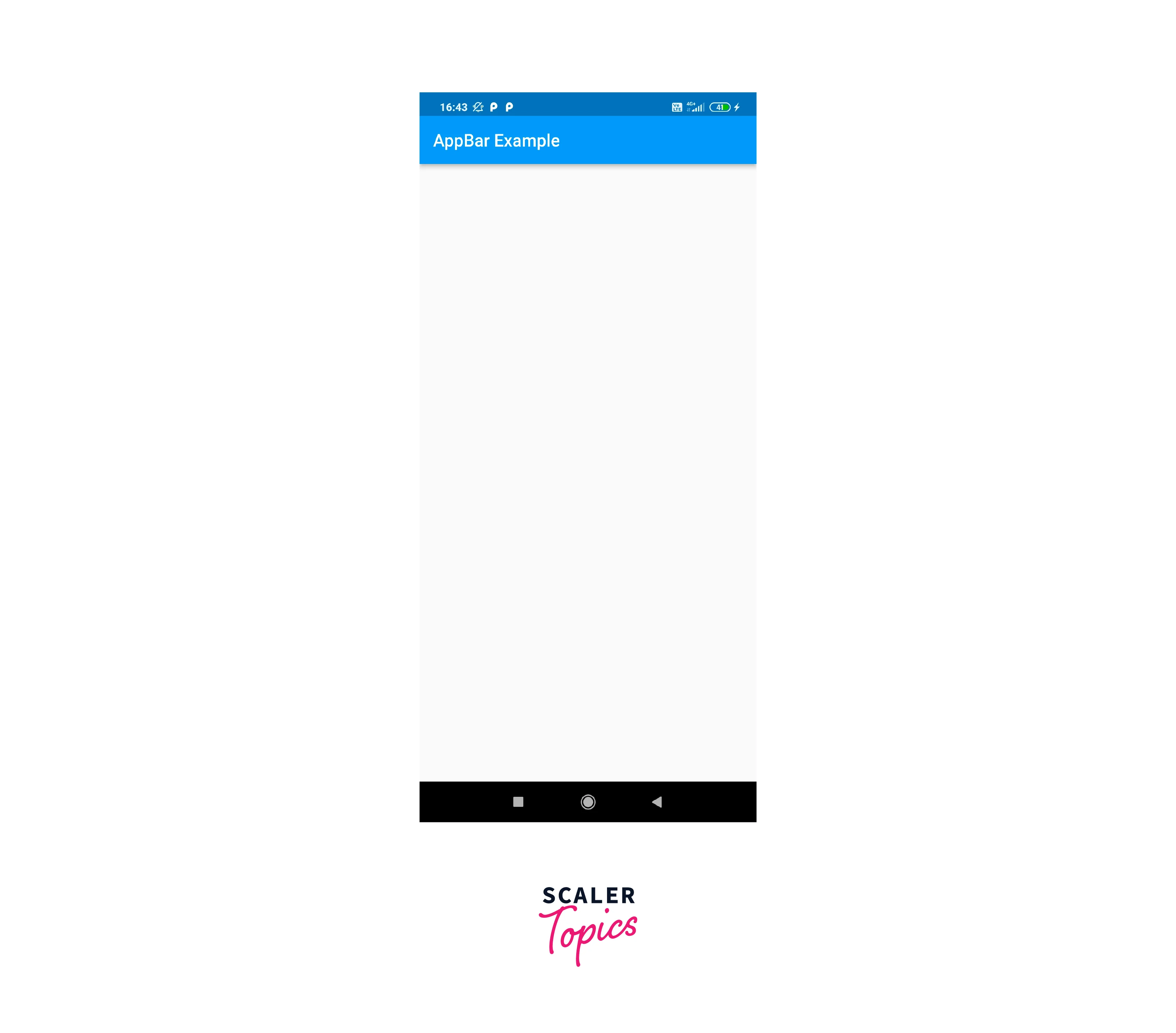
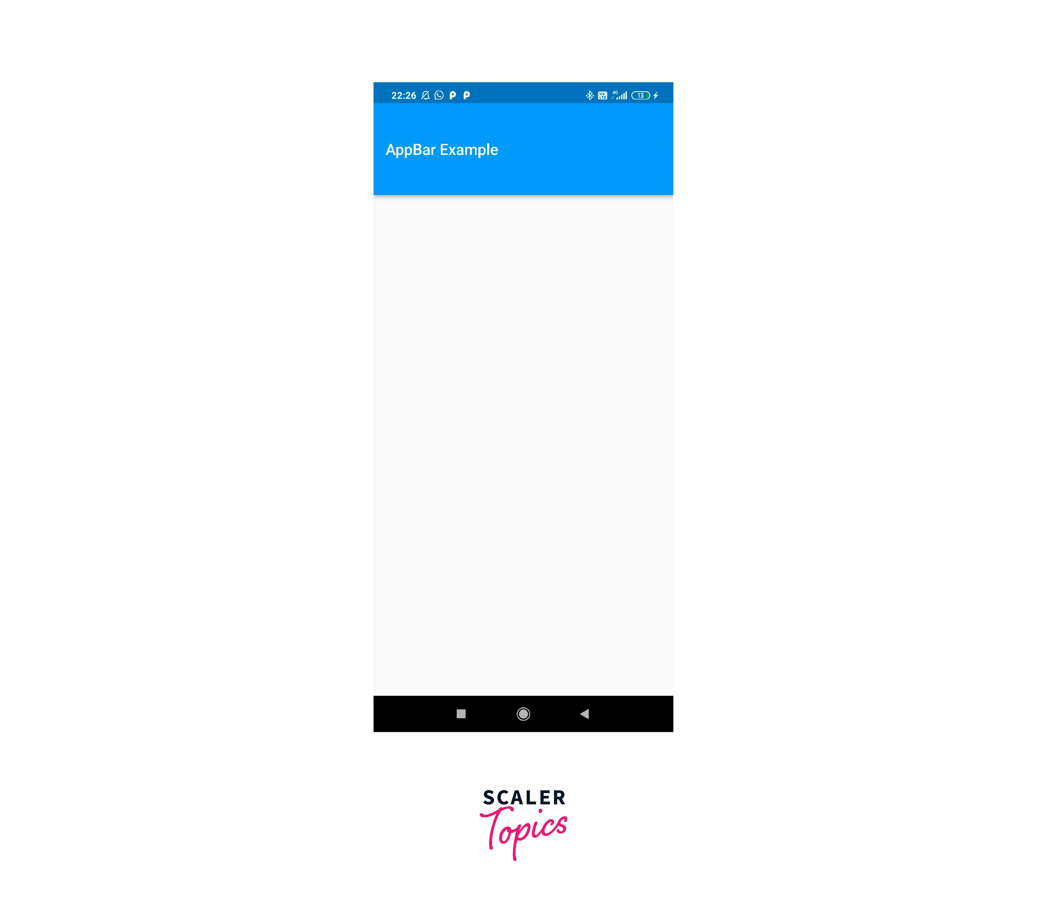
The most often utilized app component is the Flutter AppBar. The AppBar is a top app bar that shows at the top of the screen of an app. It is typically used to display critical information such as the app’s title and to give actions pertinent to the current screen. You may utilize the AppBar widget’s attributes to customize its appearance and behavior. For example, the title property may be used to provide the text that should appear in the app bar, and the actions property can be used to specify a list of widgets that should appear in the app bar. You may also use the background-color property to provide the app bar’s background color, and the leading property to indicate a widget that should appear at the beginning of the app bar. The custom app bar flutter may be customized in a variety of ways, as detailed below. Here's an example of an AppBar in action in a Flutter app:
Flutter's AppBar provides various benefits that make it a popular choice for creating app headers and navigation elements:
- Material Design Consistency:
It guarantees a uniform and familiar appearance across several platforms. This attention to design standards contributes to a more seamless user experience. - Simple Integration:
The AppBar widget integrates easily into a Scaffold, which is a key component of Flutter. - Title and Actions:
You may set a title for the AppBar that symbolizes the current screen or context. - Flexible Layout:
The AppBar may be customized to meet the demands of your app. You may alter its height, add or delete activities, change the background color, and more. - Scroll Behaviour:
When used within a Scaffold, the AppBar may automatically respond to scroll events, such as contracting and expanding in response to scrollable content.
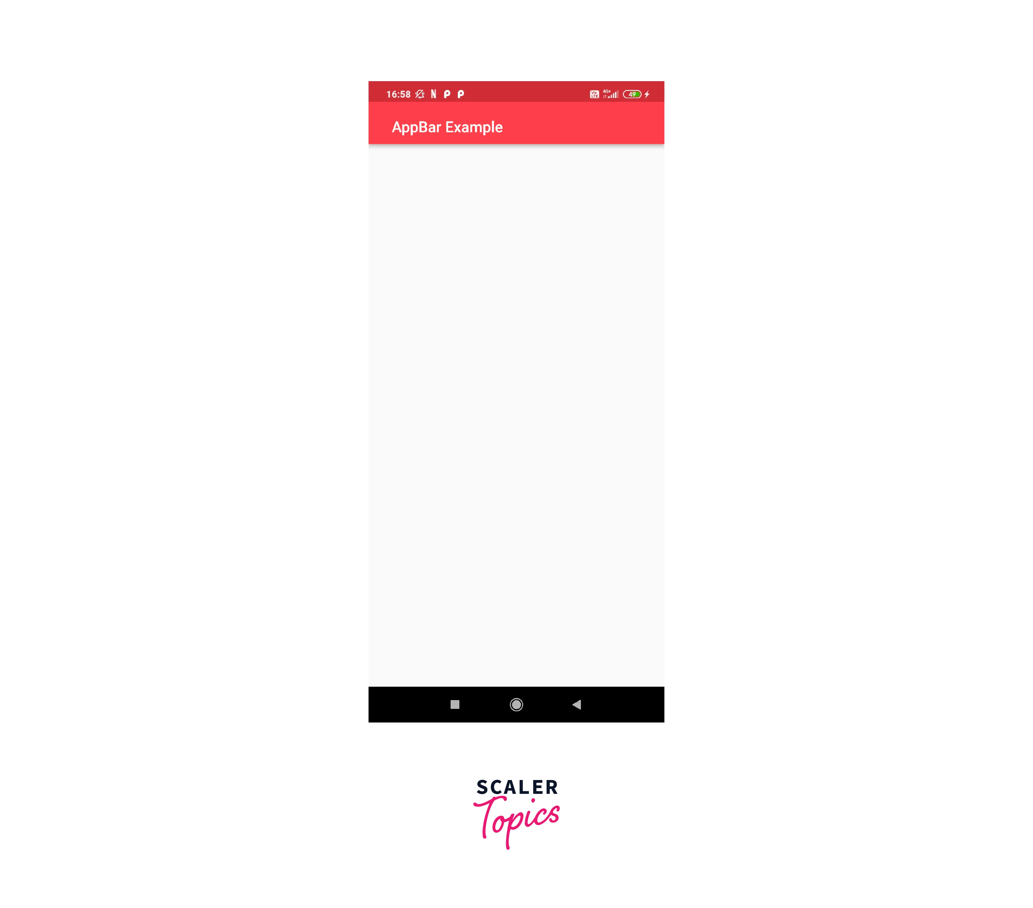
How to Change the AppBar Background Color in Flutter?
The backgroundColor attribute in Flutter may be used to modify the background color of an AppBar. Here’s an example of how to utilize the backgroundColor property to modify the color of an AppBar’s background:
In this example, the AppBar widget’s backgroundColor attribute is set to Colors.blue, resulting in a blue background color for the app bar. The backgroundColor of an AppBar can be any color value. For example, you can use a particular color code for red, such as Color(0xFFFF0000), or you can use one of the Colours class’s preset colors, such as Colors.red or Colors.blue.
Flutter AppBar Gradient Background Colour
Another option to customize the design of the custom app bar flutter is to use the flexibleSpace attribute. It lets you choose a widget that will be shown behind the app bar and extended to cover the available space. To use the flexibleSpace attribute, provide a widget in the AppBar as follows:
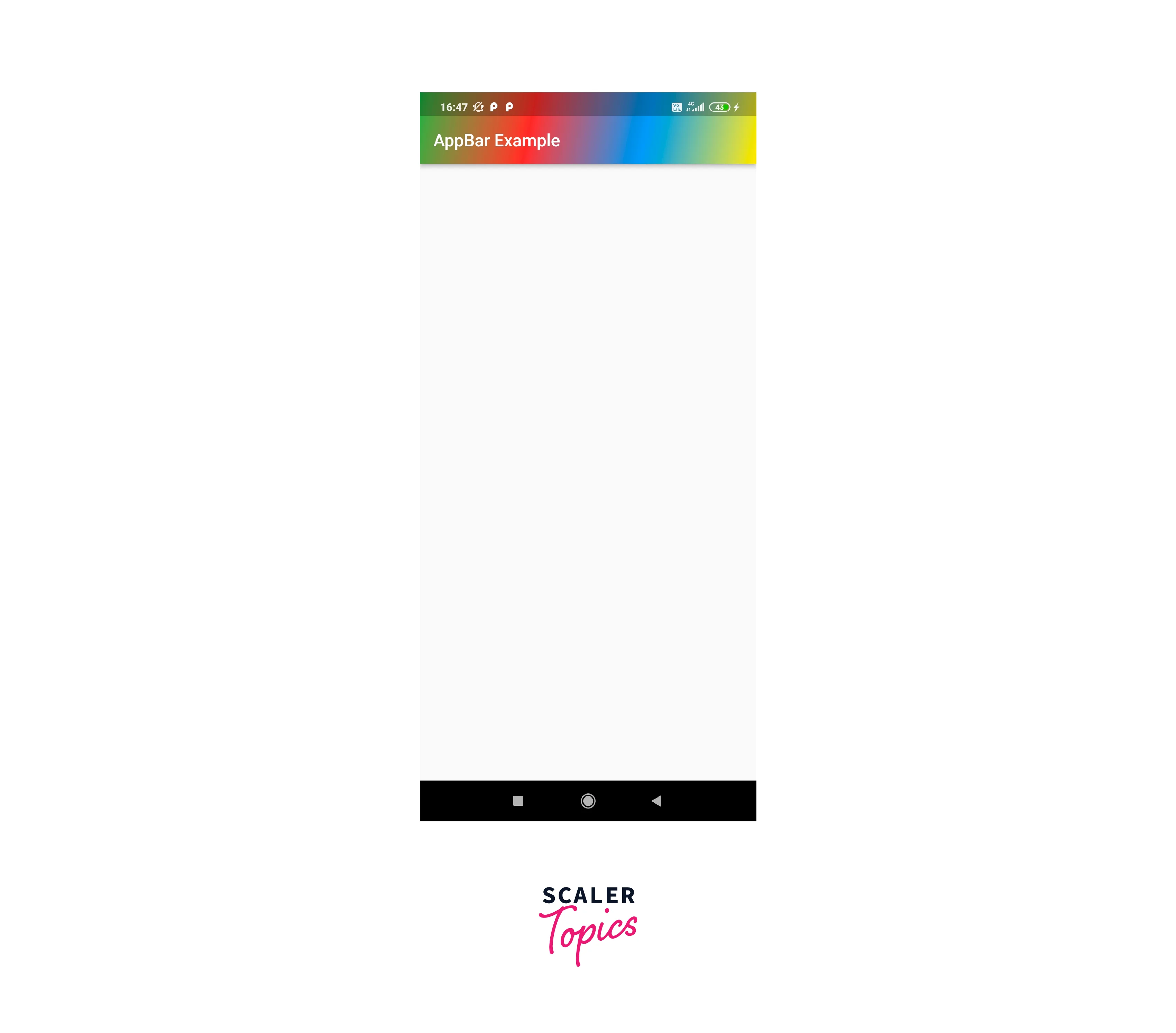
In this example, the AppBar widget’s flexibleSpace attribute is set to a Container widget with a BoxDecoration and a LinearGradient gradient. The LinearGradient’s colors property is set to a list of colors Colors.red, Colors.blue,Colors.green, Colors.yellow, which determine the gradient’s start and end colors. The LinearGradient’s beginning and end attributes determine the gradient’s start and end points, respectively.
How to Change the Text Color, FontSize, FontWeight, and FontFamily in AppBar?
To alter the title’s text color, font size, font weight, and font family in Flutter, utilize the title property of the AppBar and supply a Text widget with the necessary settings. Here’s an example of how to modify the title’s text color, font size, font weight, and font family in an AppBar:
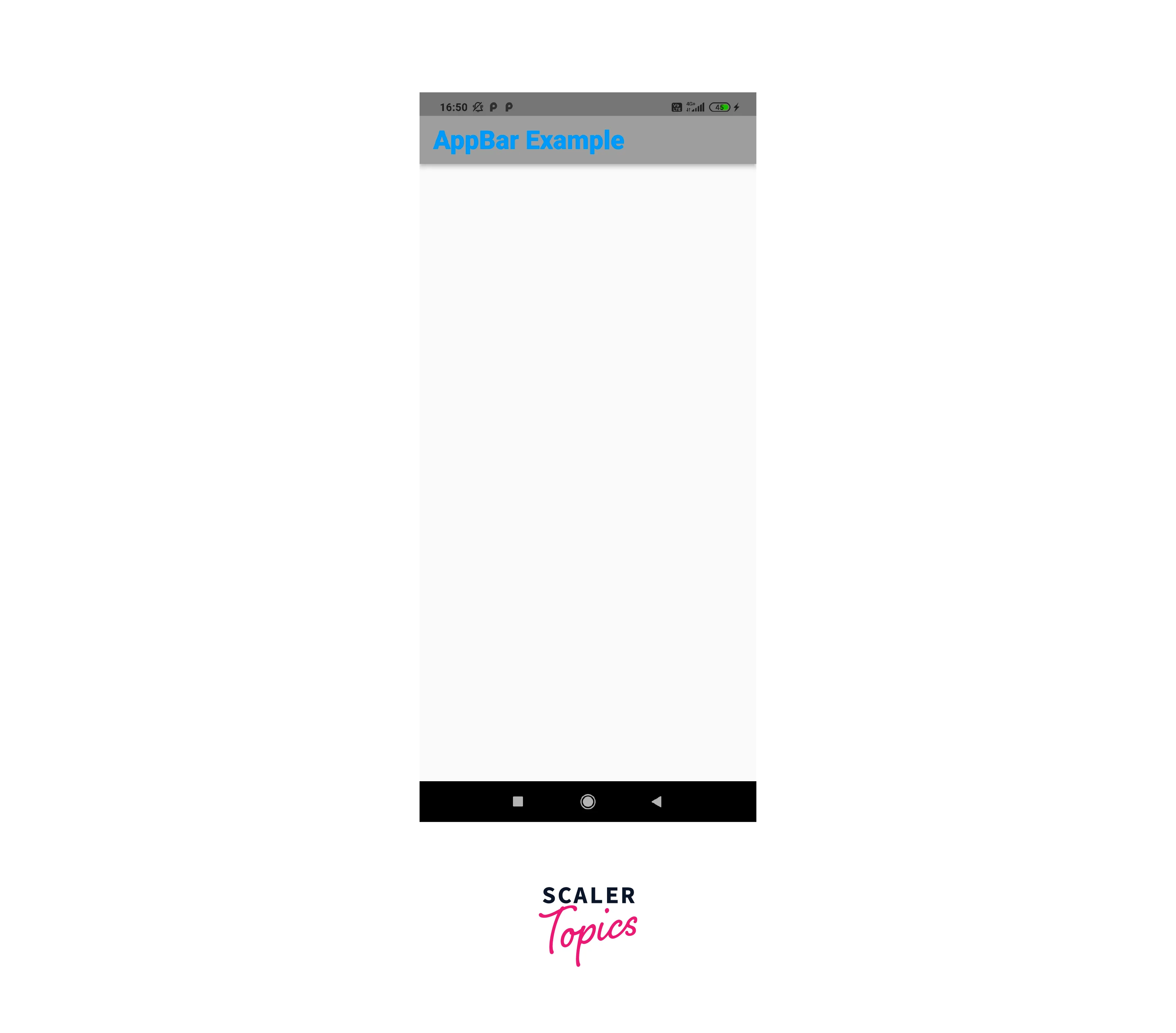
The custom app bar flutter widget in this example has a title property set to a Text widget and a style property set to a TextStyle, which defines the text color, font size, font weight, and font family.
How to Center the Title on the AppBar in Flutter?
To center the title in the AppBar in Flutter, utilize the AppBar’s centerTitle attribute and set it to true. The following is an example of how to center the title in an AppBar:
The custom app bar flutter widget in this example has the centerTitle attribute set to true, which causes the title to be centered within the app bar.
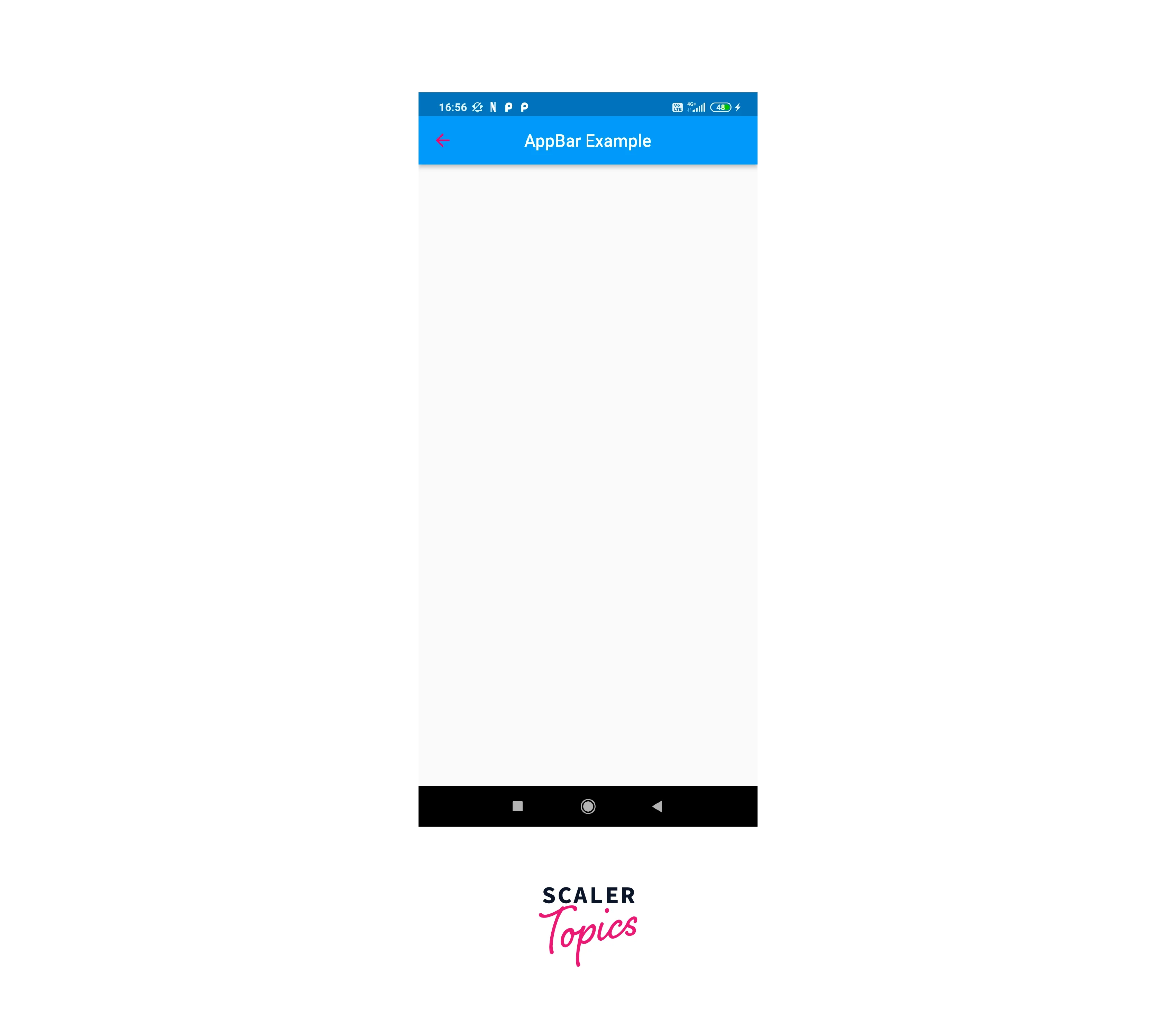
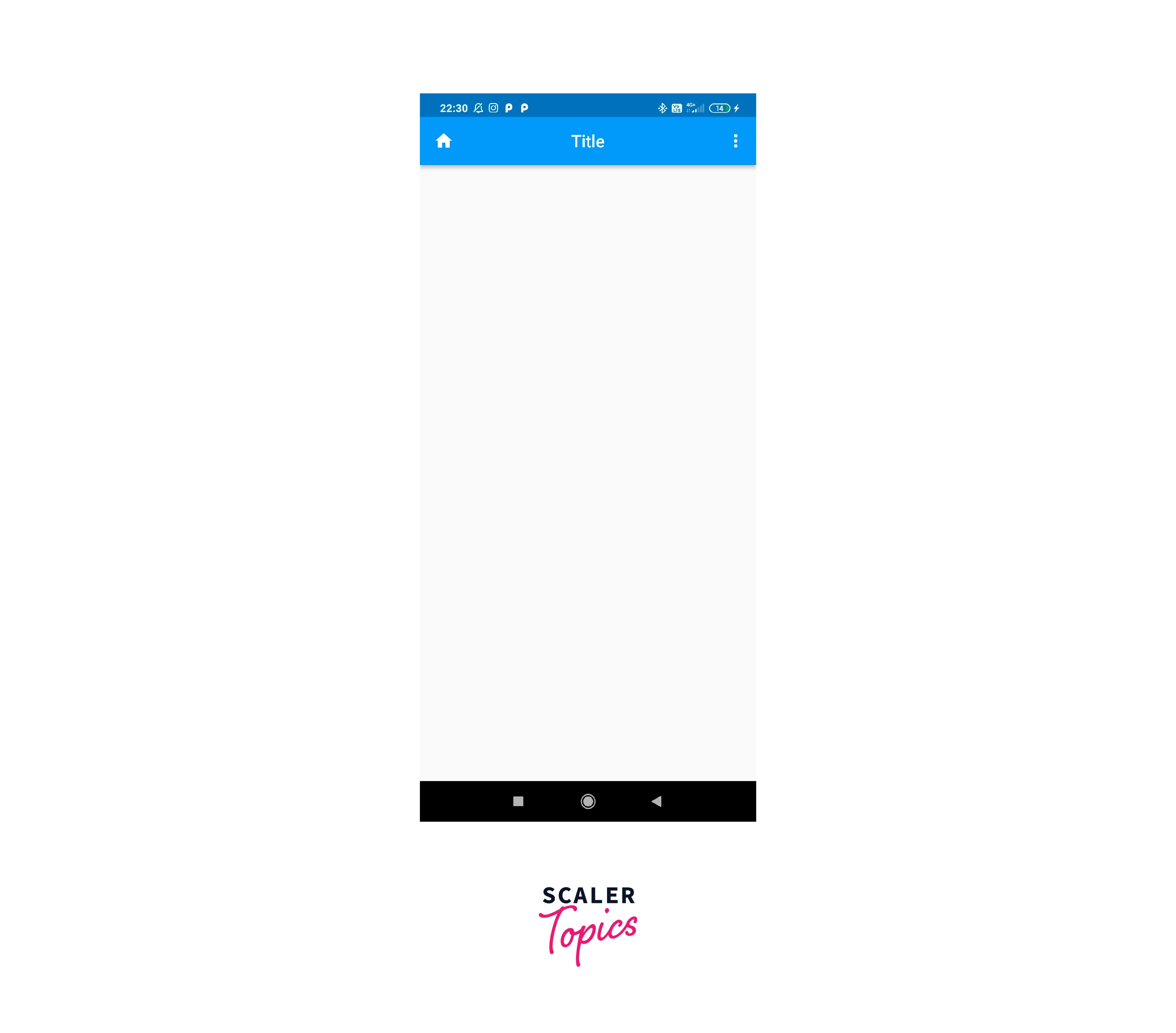
How to Add the Back Button to AppBar in Flutter?
To add a back button to the AppBar in Flutter, utilize AppBar’s leading property and provide a widget that will be displayed at the beginning of the app bar.
Back button with BackButton in Flutter
The BackButton widget, which shows a back arrow icon and handles the back button functionality, is one way to add a back button to the AppBar. Here's an example of how to add a back button to the AppBar using the BackButton widget:

When a user presses the back button, the BackButton widget handles the back button functionality automatically, which often involves moving to the previous screen in the program.
Back Button with IconButton in Flutter
To replace the BackButton widget in the AppBar and handle the back button functionality, use an IconButton widget with a custom icon and a onPressed callback. Here's an example of how to replace the BackButton widget in the AppBar with an IconButton widget with a custom icon and a onPressed callback:
The AppBar widget in this example has a leading property set to an IconButton widget with an arrow_back icon. The onPressed callback will be triggered when the user presses the icon, and you may define the appropriate back button behavior in the callback.
How to Add Padding to AppBar title in Flutter?
To add padding to the title of an AppBar in Flutter, utilize the AppBar's title attribute and wrap the title widget in a Padding widget. Here's an example of how to add padding to an AppBar title:
The AppBar widget in this example has a title property set to a Padding widget and a child property set to a Text widget. The padding attribute of the Padding widget is set to EdgeInsets.only(left: 25.0), which adds 25 pixels of padding to the Text widget's left side.
To add padding to the title in the AppBar, you may alternatively use a Container widget with a padding attribute instead of a Padding widget. To add padding to the title in the AppBar, use the Padding widget or a Container widget with a padding attribute. The decision is based on your requirements and preferences.
How to Add the Center Logo Image to AppBar in Flutter?
In Flutter, you may utilize the title parameter of the AppBar widget and set it to a Widget that displays the logo image to add a logo picture to the middle of the AppBar. Here's an example of how to accomplish it:
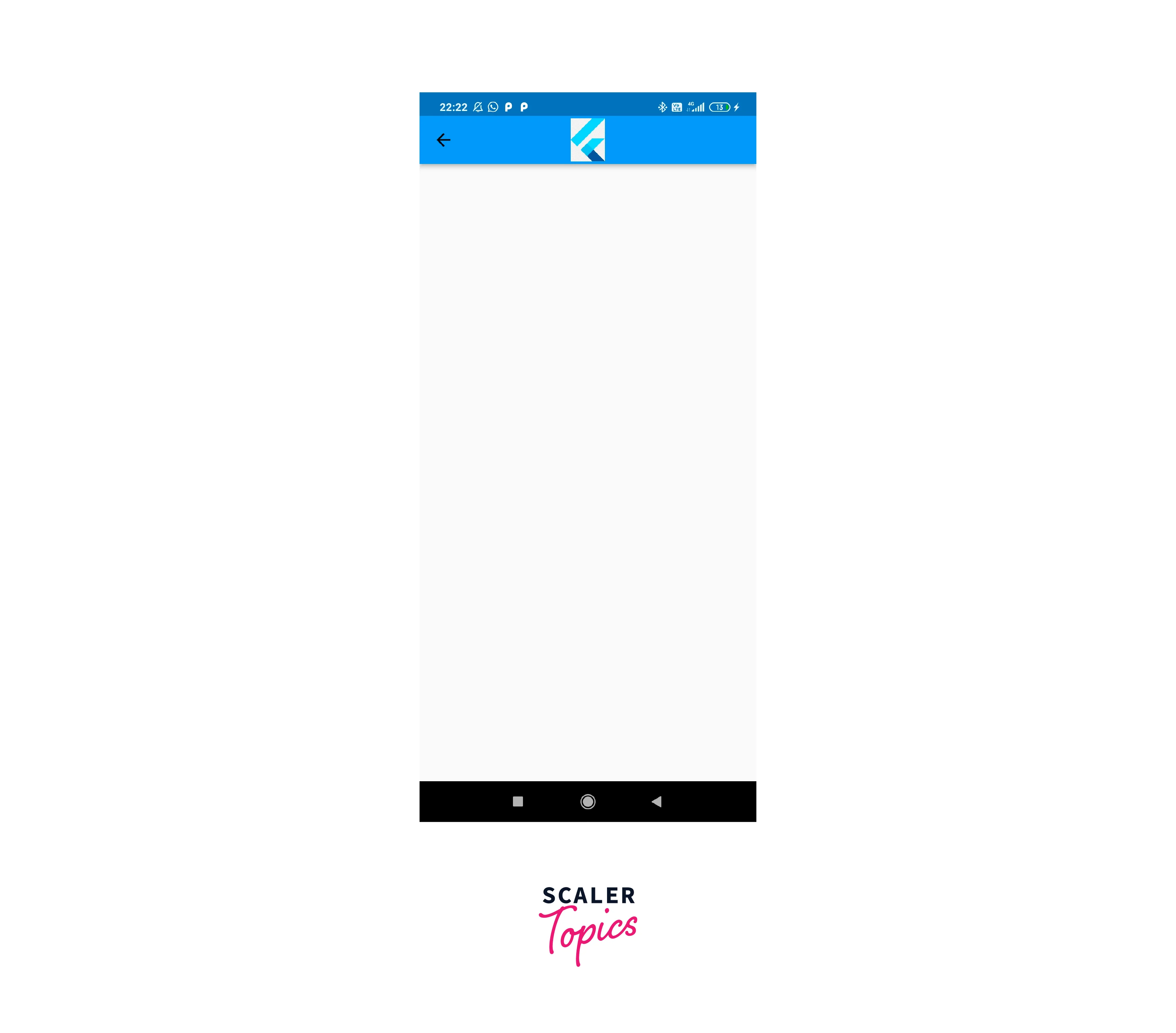
This will place the picture found at the link in the AppBar's center. You may alternatively load the picture from a URL by using the picture.network constructor. Alternatively, you may use the leading parameter to put the logo image to the AppBar's left side, or the actions parameter to add the logo image to the AppBar's right side.
Use PreferedSize to change AppBar size in Flutter
To select the desired size of the AppBar, use the PreferredSize widget. If you want to set the preferredSize depending on the dimensions of another widget, or if you want to wrap the AppBar in a parent widget that requires a specified size, this might be useful. Here's an example of how the PreferredSize widget can be used to change the size of an AppBar:
Use toolbarHeight to change AppBar size in Flutter
The toolbarHeight property in Flutter may be used to modify the size of an AppBar. This parameter specifies the height of AppBar's toolbar, including the title and any actions. Here's an example of how toolbarHeight may be used to adjust the height of an AppBar:
How to Add Actions Buttons to AppBar in Flutter?
The actions property in Flutter may be used to add action buttons to an AppBar. This property accepts a list of widgets that will be shown as action buttons in the AppBar. Here's an example of adding action buttons to an AppBar:

App Bar Home Button, Title, and Actions Buttons in Flutter
The Flutter AppBar widget lets you customize the design and behavior of the app bar at the top of your app. You may customize the AppBar’s home, title, and action buttons to provide your customers quick access to common tasks and navigation choices. The leading property may be used to configure the AppBar’s home button. This property accepts a widget that will be shown as AppBar’s home button. The home button is generally an app icon or a back arrow to return to the previous screen. Here’s an example of how to customize the AppBar’s home button:
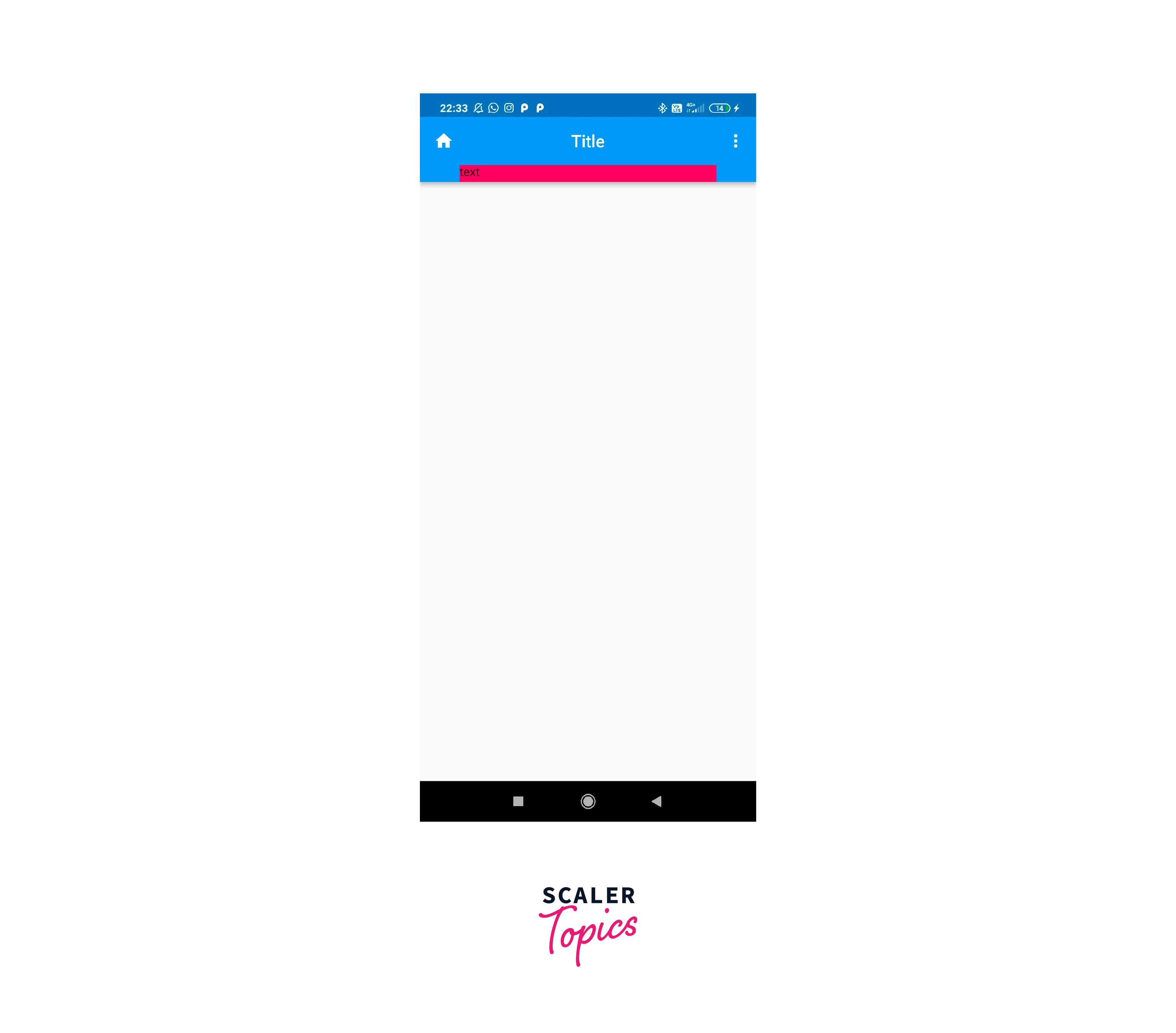
Appbar with Bottom Element in Flutter
In Flutter, the bottom property of the AppBar widget allows you to add a bottom element to the AppBar. This is handy if you wish to display additional information or controls underneath the AppBar's primary toolbar. The bottom property accepts a widget, which will be shown as AppBar's bottom element. The AppBar's height will be changed to suit the bottom element. Here's an example of how to use the AppBar's bottom property:
Appbar with PopupMenuButton in Flutter
To add a PopupMenuButton to an AppBar in Flutter, utilize the AppBar's actions property and include the PopupMenuButton as one of the action buttons. The PopupMenuButton widget shows a dropdown menu with a list of things from which the user may choose. When a user picks an item, the PopupMenuButton's onSelected callback receives the value of the selected item. Here's an example of adding a PopupMenuButton to an AppBar:
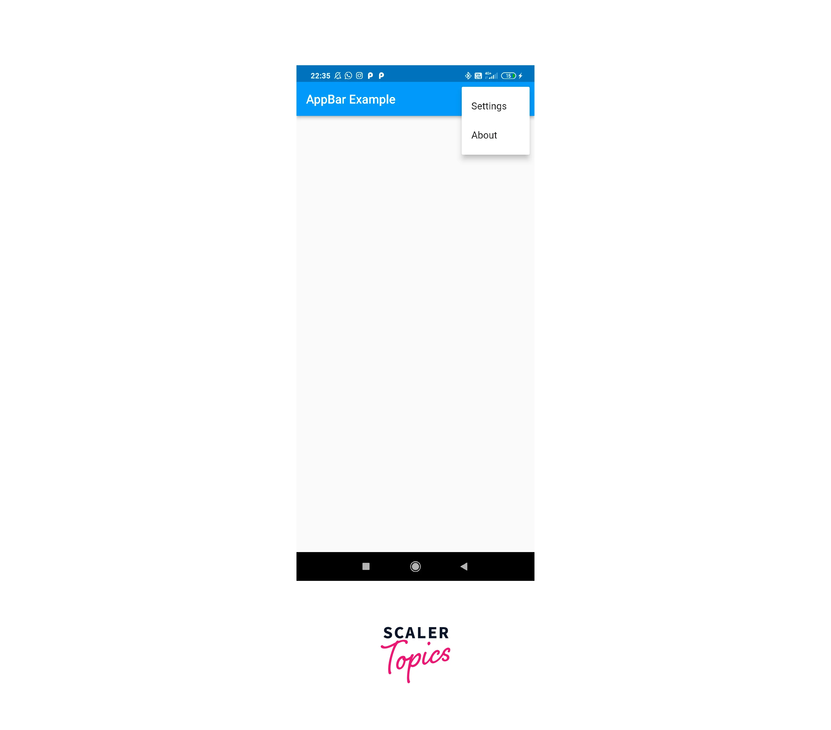
The AppBar in this example features a PopupMenuButton with two options: settings and about. When the user picks one of the choices, the onSelected callback is triggered and the value of the selected option is sent to it.
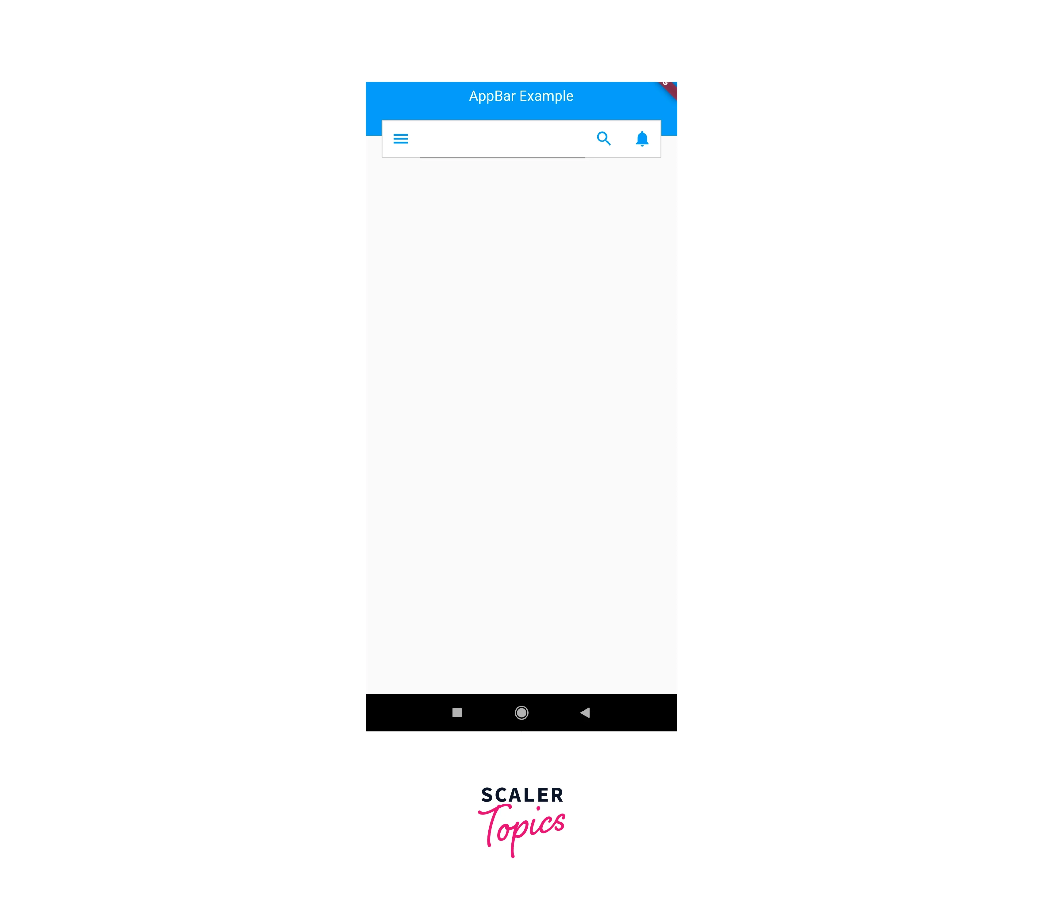
Search Field in AppBar in Flutter
The code below builds a custom search bar, but it does not make use of AppBar's components. Instead, all of the components are included within the Scaffold's body section.
Conclusion
- The Flutter AppBar is a top app bar that displays critical information such as the app's title and actions pertinent to the current screen.
- It can be customized using various attributes, such as the title property, actions property, backgroundColor property, leading property, elevation property, and centerTitle property.
- To change the text color, font size, font weight, and font family in an AppBar, use the title property of the AppBar and supply a Text widget with the necessary settings.
- To add a back button to the AppBar, use the leading property and provide a widget displayed at the beginning of the app bar.