How to Create a Dashboard in Excel?
Overview
Dashboard in Excel enables users to create interactive, data-driven visual interfaces that provide valuable insights into their data. dashboard in Excel utilizes various features like Pivot Tables, charts, and conditional formatting, to compile, analyze, and display data in a concise and meaningful way. These dashboards can be customized to track key performance indicators (KPIs), identify trends, and make data-driven decisions. This functionality, combined with Excel's widespread use and compatibility, makes dashboard development in Excel an essential skill for business analysts, managers, and anyone needing to present or interpret data effectively.
What is a Dashboard in Excel?
You can quickly examine and analyze your data in one location using a dashboard in Excel, which visually depicts key parameters. Users using dashboards can filter the data to present only the information that is relevant to them, offering a self-service business intelligence opportunity in addition to providing aggregated data perspectives. In the past, Excel reporting frequently needed you to produce several reports for various people or departments following their requirements.
A dashboard in Excel is a clear visual depiction of KPIs, important business measures, and other complicated data. Let's face it, raw statistics and figures are necessary. They are also extremely dull. You must therefore make that information available.
What's the difference between the two?
- Static dashboard in Excel only displays data from a certain period. It stays the same.
- On the other hand, dynamic dashboards in Excel are updated daily to reflect changes.
What are the advantages of developing an Excel dashboard, then?
Let's have a look at some of the features that are similar to Google Sheets dashboards:
- It provides you with a thorough overview of the key performance indicators for your organization at a glance.
- creates a sense of accountability by allowing many departments to recognize the areas that need improvement.
- offers strong analytical talents and difficult calculations,
- enables you to decide more wisely for your company
Your spreadsheet's normally complex data is simplified by a dashboard, which turns it into a visual format that is simple to comprehend and use.
Dashboards in Excel are useful for various tasks, including project management, budgeting, and reporting on sales or marketing.
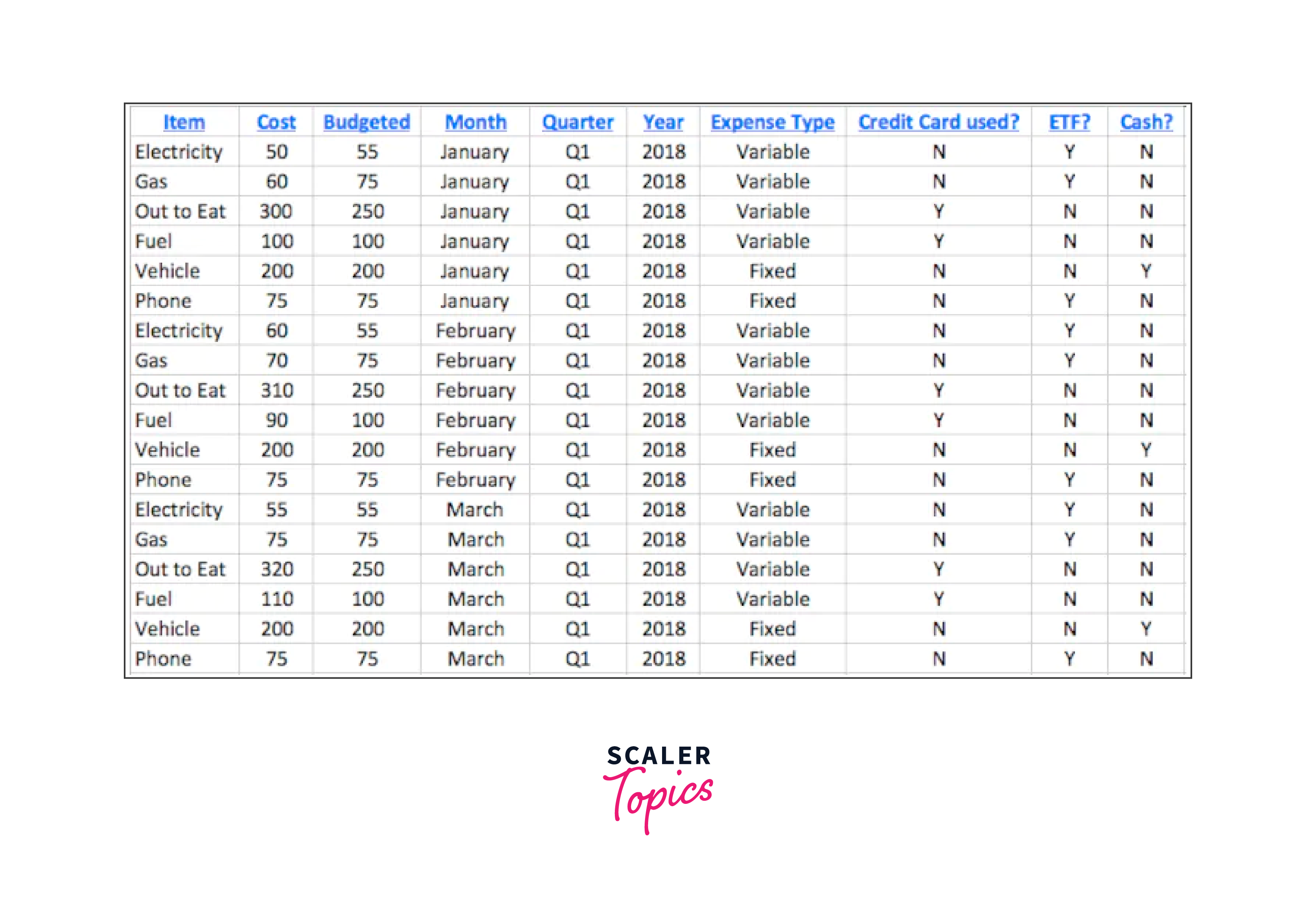
For a simple example, I changed this spreadsheet of first-quarter spending using a dashboard in Excel:

Into this fast pie chart, which shows a breakdown of January's spending, go the following information:
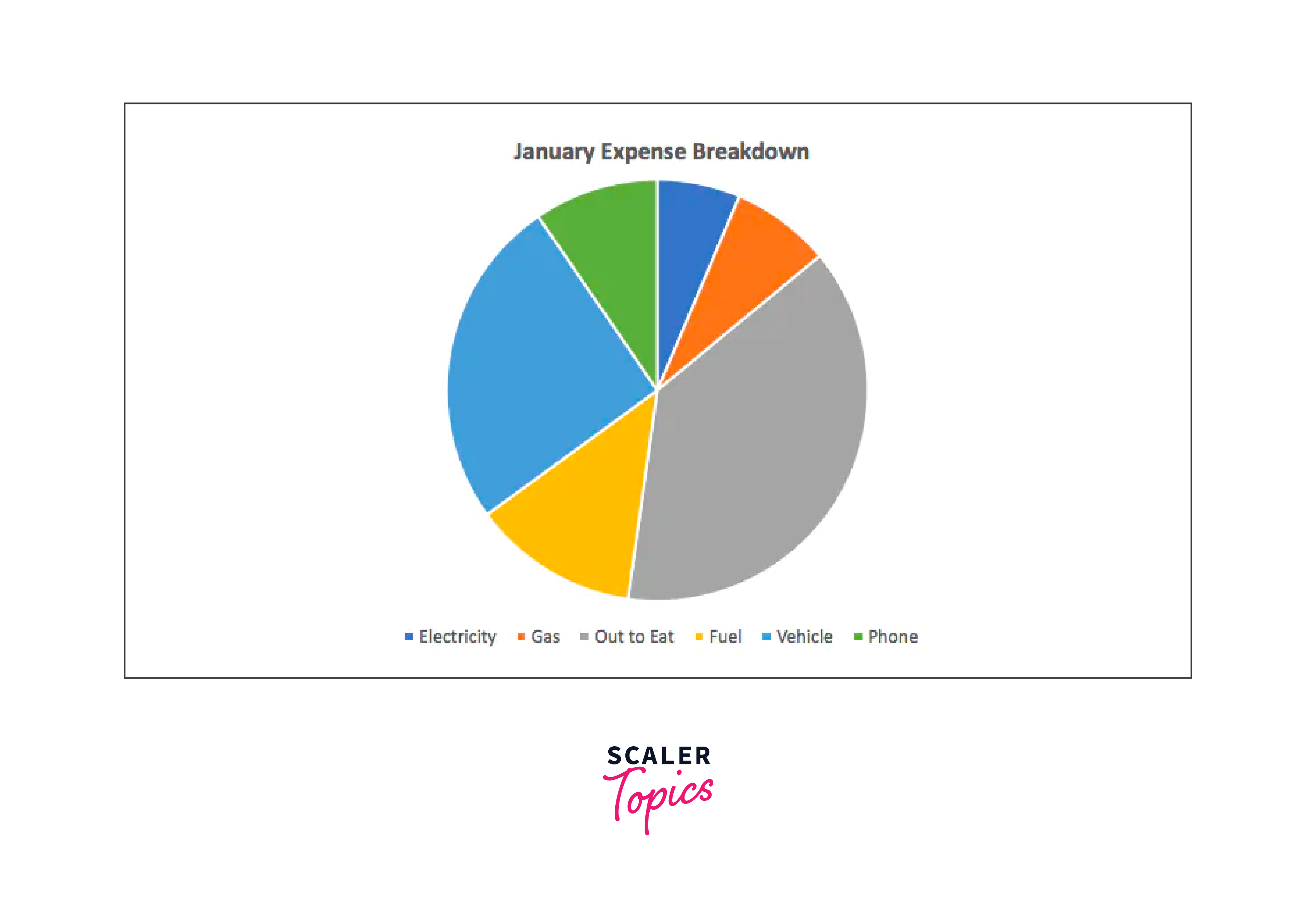
The example provided is really simple. However, Excel has many features that you can use to build any dashboard in Excel you need.
Before Building the Dashboard: What you should Know?
Doesn't data visualization seem like a real party? As we can see, you seem eager and prepared to begin creating your dashboards.
However, it's imperative that you first create the proper foundation for the dashboard in Excel design. You should do the following actions before beginning:
1. Import Your Data into Excel
- Your data must first be in Excel to construct a dashboard. There is nothing else you need to do with this step if it is already there, which is excellent.
- If it still needs to be added to Excel, you must import your data source into an Excel workbook, preferably into an Excel table. Using legitimate Excel tables as your source data will make it much simpler to generate a dynamic chart, which is the main benefit.
- Depending on where your data is located, there are various ways to accomplish this with varying degrees of complexity. Learning to import your particular data format is the best course of action.
2. Clean Your Data
- Each data item must have its cell while working with data in Excel.
- If your current spreadsheet needs to be more organized, clean it up and ensure everything is arranged into the correct rows and columns. Reviewing your data to ensure everything is correct quickly is a good idea.
- Because each row of data needs to be distinct to use the dashboard feature—otherwise, you'll be double counting—now is also a great opportunity to look for any duplicate data that needs to be eliminated. Do you want to look for duplicates quickly? Click the "Remove Duplicates" button after selecting your full dataset in the selection box.
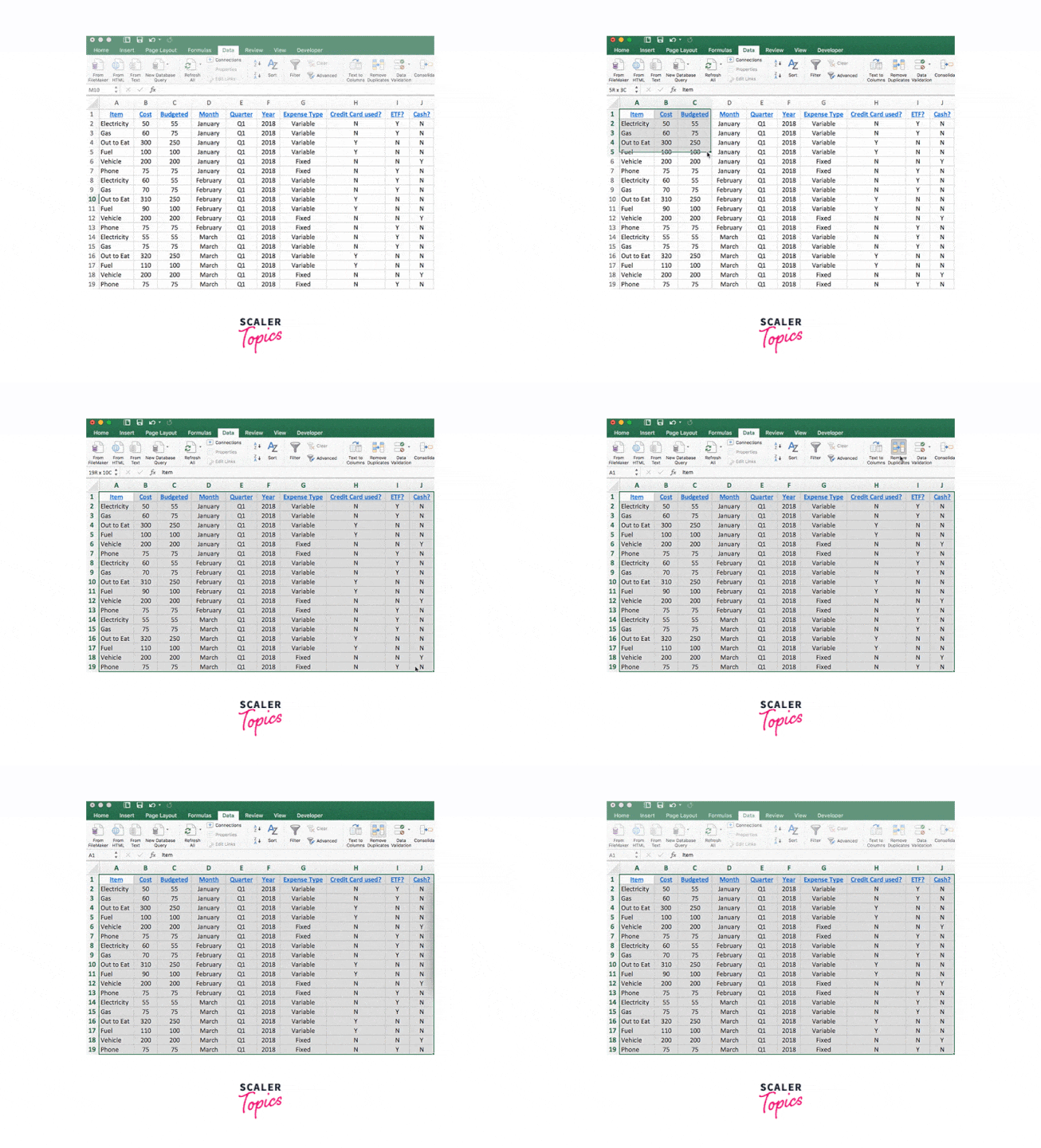
It's best to store your original dataset in a different location. In this manner, you can recover the original data if you make a mistake.
3. Set Up Your Workbook
- You'll require three separate sheets (or tabs) in your Excel spreadsheet to build a dashboard.
- Name your first tab containing all of your raw data with a name you'll remember, like "Data" or "Raw Data".
- And after that, make a second tab called "Chart Data". Only the data needed to be inserted into the various dashboard charts will be stored in that tab. Create a tab called "Dashboard" to house your charts.
- You can now empty those last two tabs! Simply getting your workbook organized and ready to use is crucial.
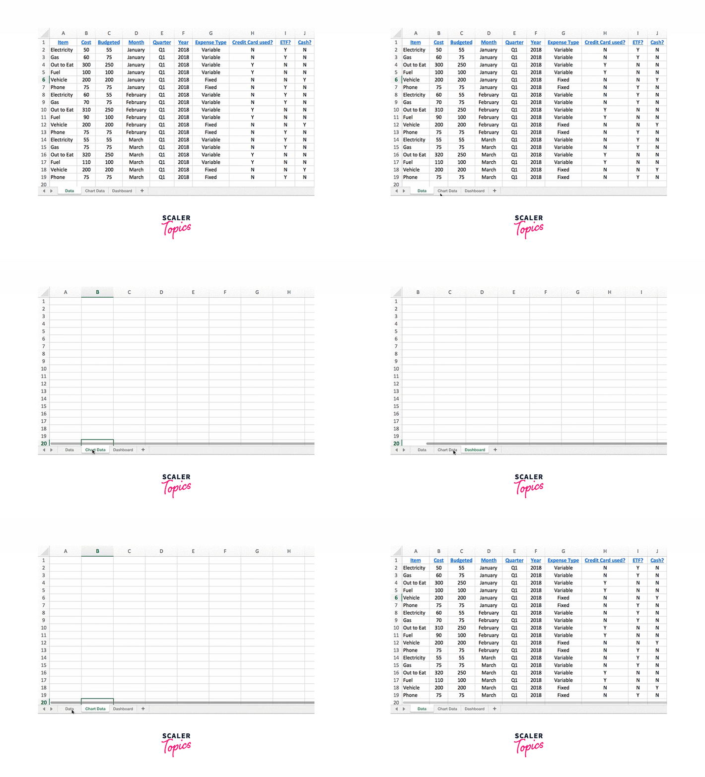
4. Understand Your Requirements
You'll immediately discover that there are many alternatives when you start getting familiar with dashboards in Excel. This can indeed be overwhelming. Therefore, it's critical first to understand the purpose of your dashboard.
What is the purpose of this dashboard? Do you require progress monitoring? study a budget? Determine trends?
You may create a dashboard that meets your demands by putting that front and foremost—along with factors like who you'll need to share it with and the format it must be in.
How to Create Dashboard in Excel?
1. Figure Out Which Charts Best Represent Your Data
Do you recall how we said you'd have many data representation options? There are bar charts, column charts, pie charts, line charts, scatter plots, waterfall charts, and many other types.
- Not all of them will be the most appropriate fit for the data you want to portray. For instance, a line chart is great for analyzing patterns, whereas a pie chart works well for viewing a moment.
- Which chart would be the best option for you? Your best option is to experiment. Choose the charts that make the most sense for understandably presenting your data after creating a few alternative ones and analyzing the outcomes.
- We couldn't go into every chart type in depth here due to the abundance of options. Instead, we'll take a step-by-step approach to construct one particular form of the chart—a column chart—to dip our toes into the dashboard waters.
- We'll continue using the same budget data as we used earlier. In the first quarter, we want to construct column charts that show how much money we spend on each particular budget line item monthly. As a result, we'll have distinct charts for things like gas, phone, and electricity.
Ready? Let's get going.
2. Filter Your Data
You won't need to use all of your data at once while making a chart; instead, you'll need to sort through it to concentrate on only the parts you need right now.
The "Filter" option in Excel is the simplest way to accomplish this. For instance, we only want to filter by item type to get data on our electricity costs.
We will select the complete data set, select the "Data" ribbon in the toolbar, and then select the "Filter" button to accomplish so. You'll notice that tiny arrows emerge next to your column heads when you do this. You can filter your data using the drop-down menu when you click one of those arrows.

Select all of the data cells once you've narrowed your search to only the information you need, click "copy", and then paste just those rows into your workbook's "Chart Data" tab. You'll use that tab to get the data you need for your charts.
Why can't you choose data from the default "Data" tab? Simply put, because those other irrelevant rows are still present in the data (albeit hidden), your chart will be affected by their presence even after you've filtered it.
3. Build Your Chart
You are now prepared to create your chart because you only have the required information.
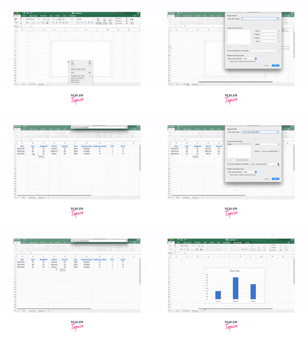
To insert a chart, pick the "Insert" button from the toolbar, click your worksheet's "Dashboard" tab, and then choose the desired chart type from the drop-down menu. We're going to employ a clustered column chart in this instance.
The box will be empty when you insert the chart. You haven't messed anything up, so don't worry. In the following step, we'll discuss getting your data to show up there.
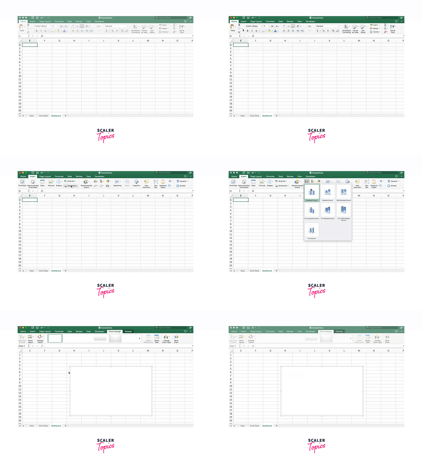
TIP:
Do you still decide which chart type works best with your data? In the "Chart Data" tab, select all of the rows of data, and then click the "Recommended Charts" button on the "Insert" ribbon. You can utilize certain charts that Excel suggests.
4. Select Your Data
It's time to get some data now that you have that blank box in your workbook's "Dashboard" tab.
- To accomplish this, right-click that box and select "Select Data". Then go to your "Chart Data" tab, where your filtered data is located, and select all the data you wish to display, excluding the column headers. The "Item" and "Cost" data are being used in this instance since the goal of my chart is to display how much money we spend on electricity each month.
- You just chose some data on the vertical axis. However, you must still choose your data for the chart's horizontal axis.
- To do that, select the data you need for the horizontal axis—in this case, the months—by clicking the button in the "Horizontal Axis" field of the "Select Data" window.
Hit the "Enter" key, select "OK", and then select the "Dashboard" tab to confirm that your chart has been updated with the new data.
5. Double-check Your Data
Now is a good time to review your chart to ensure everything seems normal quickly. Errors can occur. Therefore, it is worthwhile to take the time to make sure that your chart is successfully importing your data.
To identify where you made a mistake, conduct some troubleshooting.
6. Polish Your Chart
The enjoyable part now is when you get to polish off your chart.
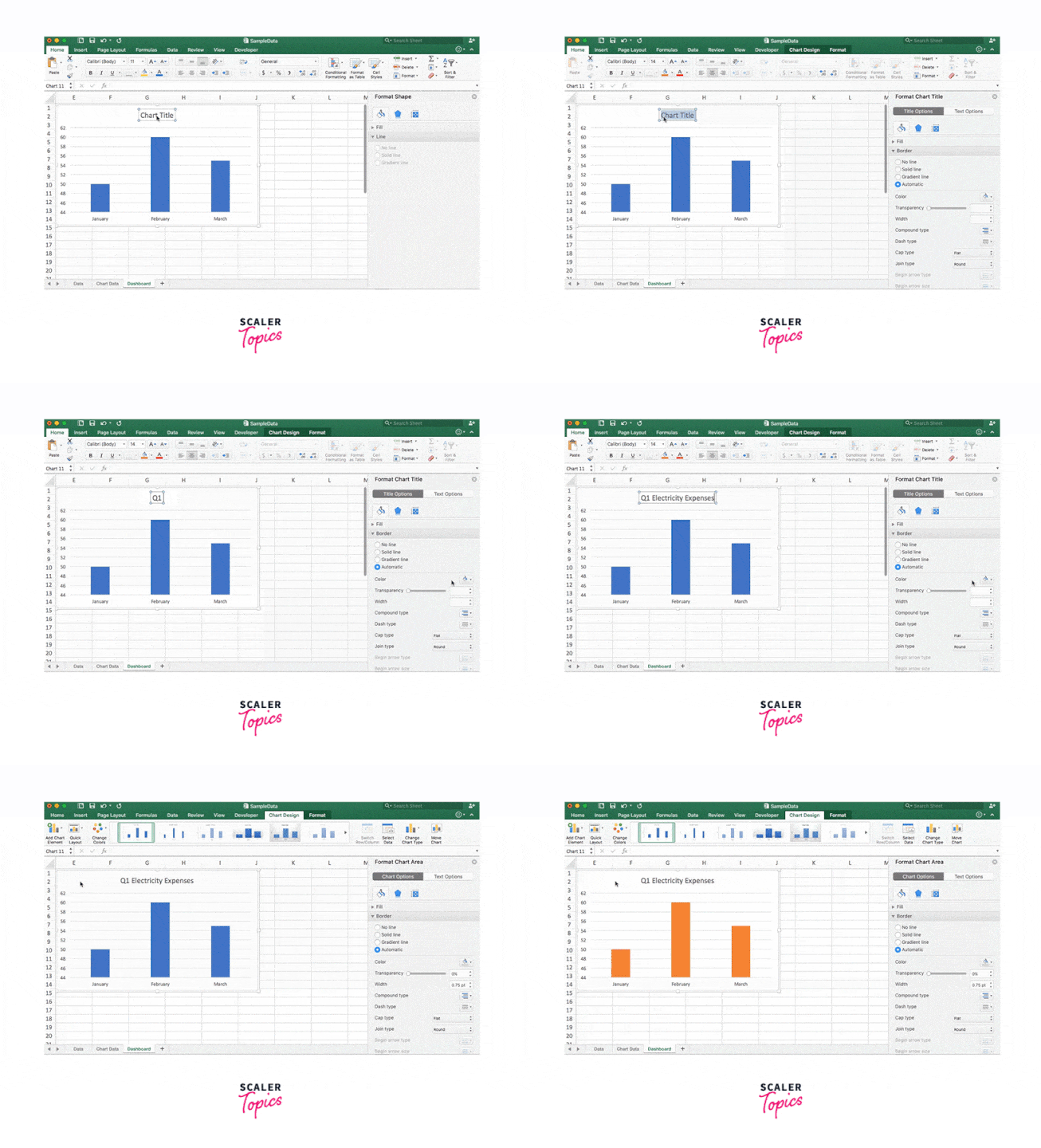
By double-clicking on the chart area and then selecting the options in the toolbar (there are buttons up there for everything from "Add Chart Element" to "Change Colours"), you can refine your chart by changing the colors to match your brand or adding labels, titles, units, or any other necessary information.
7. Repeat the Process for Other Data
True dashboard in Excel displays data using a variety of charts and gauges. Therefore, in this example, we'll repeat those procedures for the other budget line items on our dashboard, such as phone, vehicle, gas, etc.
Remember that since the data in your "Chart Data" tab fuels your charts, you don't want to erase any of it.
Therefore, rather than deleting and replacing them inside that tab, be careful to put the new data sets below each other when creating your other charts:
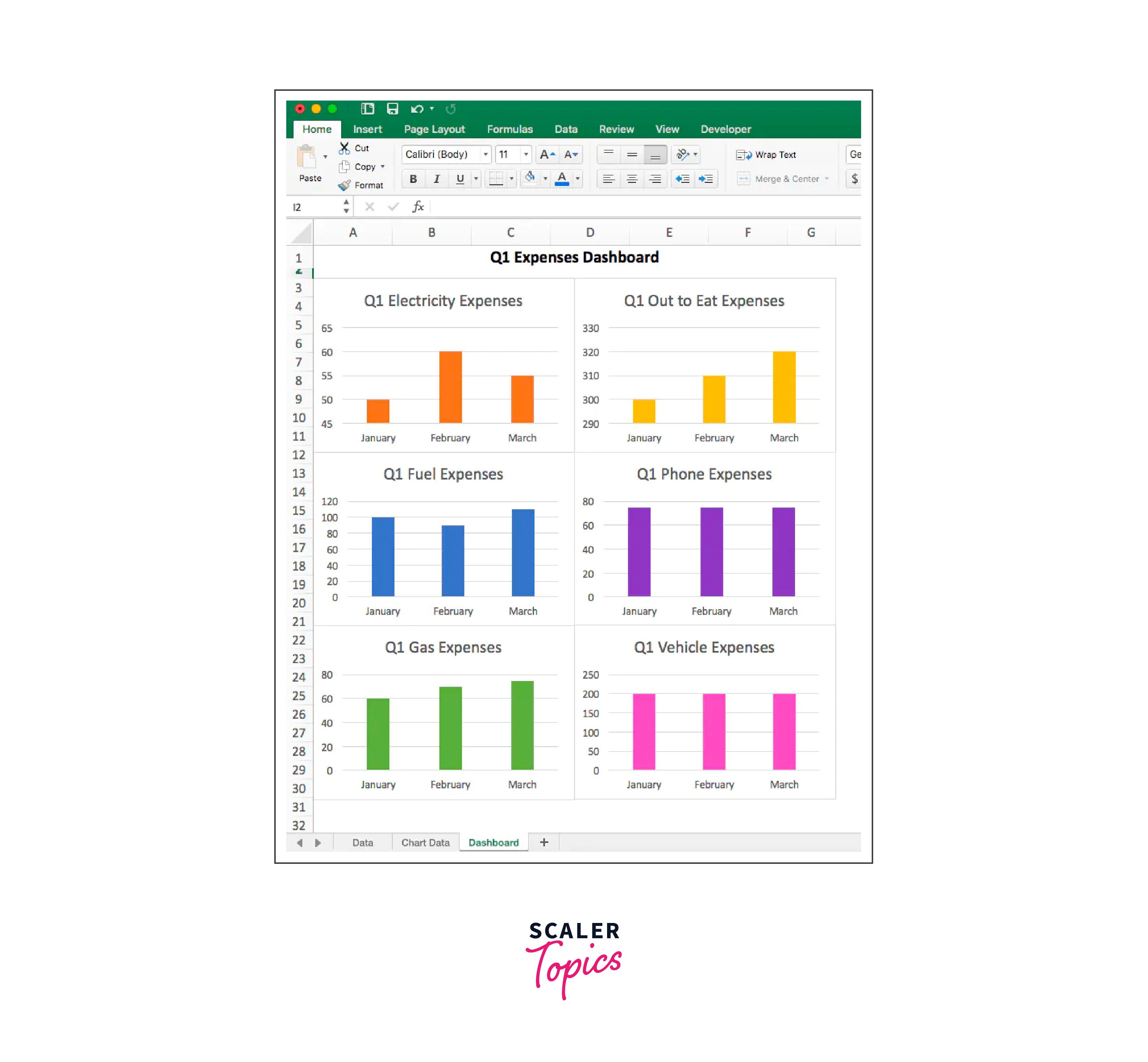
Once we've completed that? We'll end up with a tab that details our monthly spending on each item.
You see, it wasn't all that horrible.
Excel Dashboards Do’s and Don’ts
Let's begin with the Don's first!
Here are a few things you should avoid while developing an Excel dashboard. Again, they will change depending on your project and stakeholders, but they are generally true.
- Keep Your Dashboards Organised:
It doesn't necessarily mean that data and charts belong in your dashboard just because you have them. Remember that the dashboard aims to assist in problem identification or decision-making. Therefore, keep it pertinent and take out anything unnecessary. I frequently ponder whether a particular item is merely nice or necessary. I proceeded to get rid of all the nice-to-haves after that. - Use non-volatile formulas instead:
As a result, the calculations will take longer. - Keep no unnecessary information in your workbook:
Make a copy of the dashboard and preserve it as a backup if you require that data.
Let's now examine several Do’s (or best practices).
- Chart/Section Numbering:
Your dashboard is not merely a random collection of charts and data points. Rather, it is a narrative in which one thing leads to another. It is best to number these since you need to make sure your audience follows the instructions in the correct order. When someone uses your dashboard later or prints it out, it's a big assistance, even though you can direct them when presenting live. - Limiting movement near the dashboard:
Hide all rows and columns to prevent the user from unintentionally scrolling away. - Use freeze panes to keep particular rows or columns:
Visible on the dashboard when you wish to freeze important ones. - Make Charts and Shapes Stick:
Make sure that when someone hides or resizes the cells, your forms, charts, or interactive controls don't follow suit. Additionally, you can use the Excel Camera tool to create dynamic images of charts and tables that update in response to changes made to the underlying data. - Create a user manual:
It's a good idea to make a separate worksheet and highlight the steps if your dashboard is complicated. Even without you there, it will make it easier for users to use your dashboard. - Utilise combination charts: (such as thermometer charts, bullet charts, and actual vs. target charts) to conserve space on your worksheet.
- Use Symbols & Conditional Formatting:
To add a layer of analysis to your dashboard, use symbols (such as up/down arrows or checkmark/Crossmark symbols) and conditional formatting (but don't overdo it).
Dashboard Examples
These interesting Excel dashboard examples are available for download and experimentation.
Excel KPI Dashboard
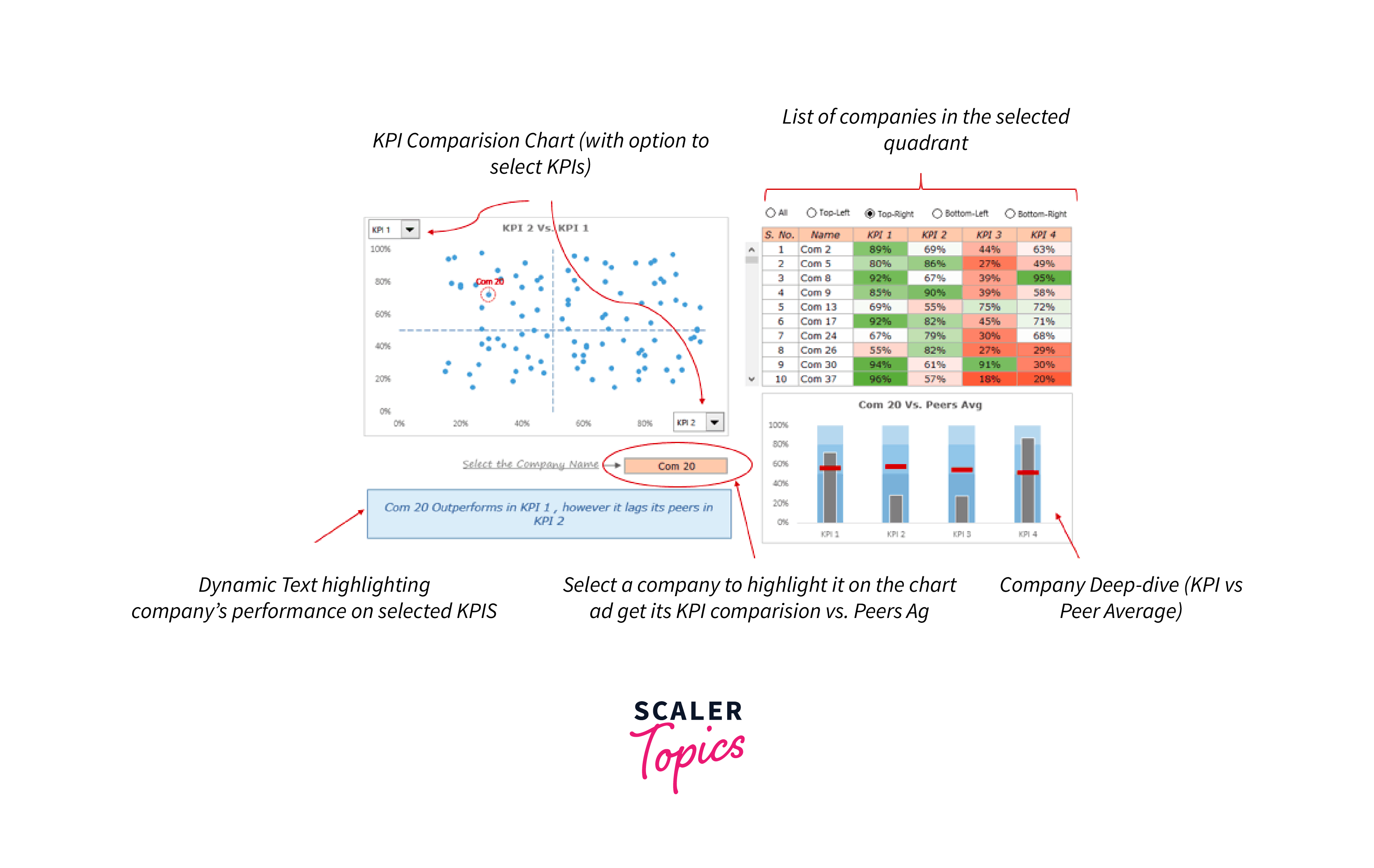
Using the dashboard in Excel, you can keep tabs on the KPIs of several businesses before diving deeply into each one's performance using bullet charts.
Call Center Performance Dashboard
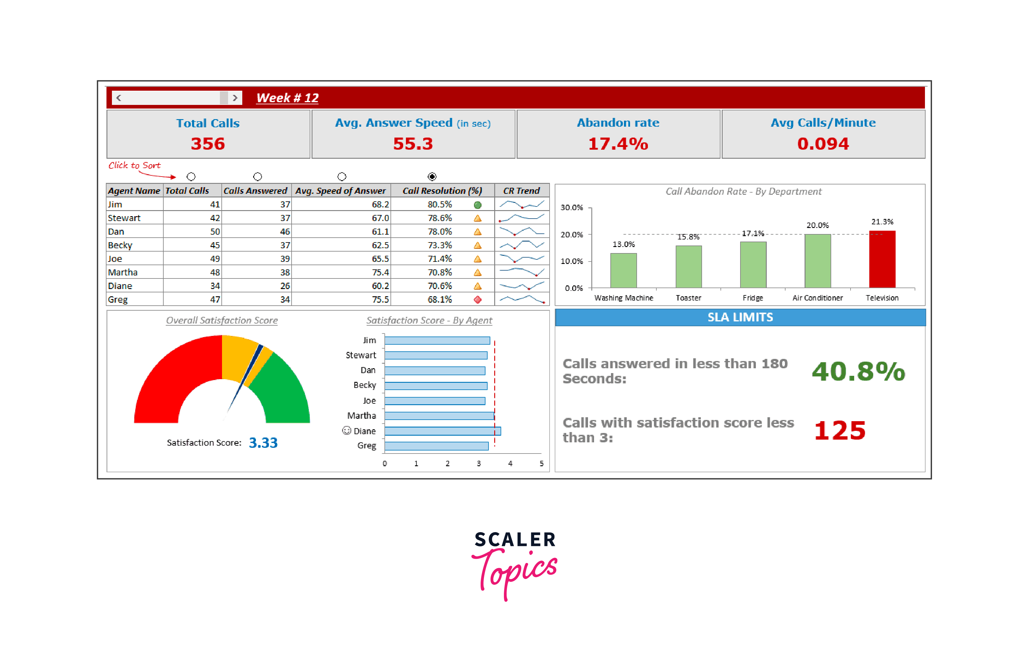
This dashboard in Excel can be used to monitor important call center KPIs. Using this dashboard, you may learn how to make combination charts, highlight particular data points in charts, sort using radio buttons, etc.
EPL Season Visualized in an Excel Dashboard
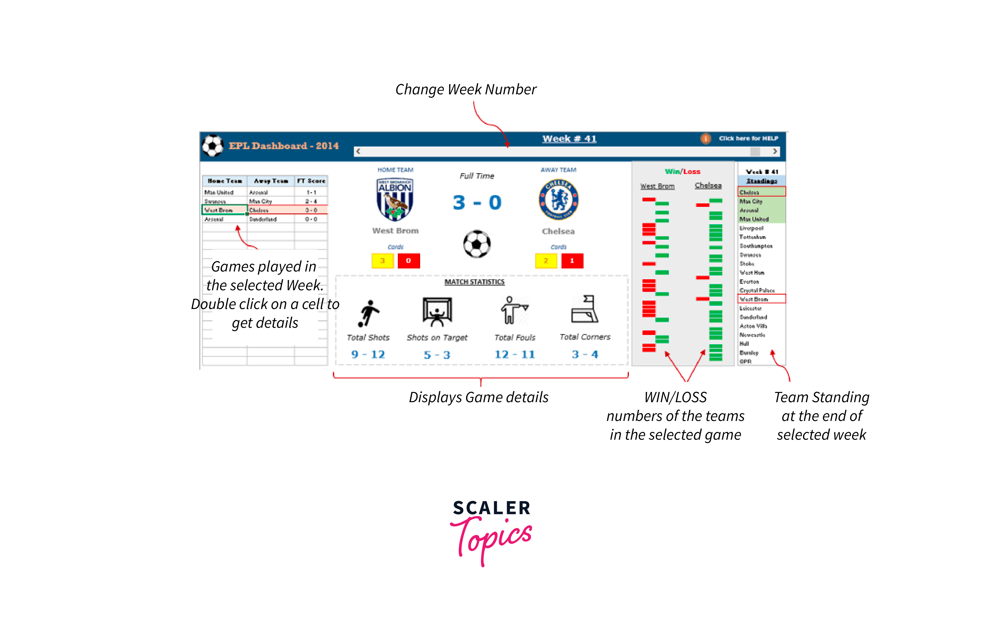
You will discover how to use VBA in Excel dashboards in this dashboard. When you double-click on the cells on the left of this dashboard, the game details are updated. VBA is also used to display a help menu to assist the user in using this dashboard.
Limitations of Using Excel Dashboards
Excel could be the preferred tool for all data types in many firms. That does not, however, make it the best medium for making dashboards. Here's why:
1. Lots of manually fed data
- Over the years, you've seen some excellent Excel worksheets.
- They are orderly and tidy, consisting only of charts and data after data.
- You see that, though.
- The person who created the Excel sheets will likely tell you that they aged twice while creating an Excel dashboard and that this made them despise their work.
- Simply said, feeding data involves far too much physical labor.
- We also live in a world where robots operate on people
2. There is a high potential for human mistakes
- Your data expands along with your business.
- More data also increases the possibility of human error.
- It's really simple to mess up data on Excel, whether it's a typo that turned the number '5' into the letter 'T' or a formula error.
- If making an Excel dashboard were that simple.
3. Limited integrations
- Adding other apps to your software allows you to multitask and broaden the scope of your job. You also don't have to waste time switching between windows.
- However, Excel's restricted direct integration capabilities prevent you from doing this.
- You're left with no choice except to use outside applications like Zapier.
- That would be similar to utilizing one app to use another.
Conclusion
- Dashboards in Excel are highly effective tools for consolidating and presenting data visually, enabling users to track key performance indicators (KPIs), analyze trends, and make informed decisions.
- Before building a dashboard in Excel, a clear understanding of the data, its structure, and the story it should tell is essential. Excel's flexibility allows users to design dashboards that meet specific needs and objectives.
- The creation of an Excel dashboard should follow certain do's and don'ts to ensure a user-friendly and meaningful interface. It should provide a balance between depth of information and ease of understanding.
- Excel dashboards find applications in various fields, from call centers to sports analysis, proving their versatility and adaptability.
- Despite the power of a dashboard in Excel, it's important to recognize its limitations, such as challenges with large datasets and real-time data updates. Nevertheless, their benefits often outweigh these constraints, making them a popular choice in data visualization.
