Data Visualization in R
Overview
Data visualization is a crucial aspect of data analysis, which involves representing data graphically to gain insights, identify patterns, and communicate findings effectively. In R, a powerful statistical programming language, data visualization is facilitated by a wide range of packages, such as ggplot2, lattice, and plotly. These packages offer a variety of charts, plots, and graphs, including bar charts, line plots, scatter plots, histograms, and more. R's data visualization capabilities enable users to customize visualizations, add labels, colours, and annotations, and create interactive and publication-quality graphics. With its extensive plotting functionalities, R has become a popular choice for data scientists, analysts, and researchers to explore and present data in a visually appealing and meaningful manner.
Data Visualization in R Programming Language
Data visualization in R is a fundamental and crucial aspect of data analysis and exploration. It involves representing data graphically to gain insights, identify patterns, and communicate findings effectively. R, as a powerful statistical programming language, provides a wide array of tools and functions for data visualization.
At its core, data visualization in R is built on its base graphics system. The base graphics system allows users to create a variety of static plots, such as scatter plots, line charts, bar charts, histograms, box plots, and more. It offers a straightforward and efficient way to generate basic visualizations without the need for external packages.
R's data visualization capabilities extend to customizing plots with different colours, line styles, markers, and text annotations. Users have the flexibility to adjust axis labels, titles, legends, and other graphical elements to enhance the interpretability of the visualizations.
Additionally, R enables users to combine multiple plots into one layout, creating complex visualizations with multiple panels for more in-depth analysis. This layout flexibility is particularly useful for examining relationships between various data dimensions.
R Visualization Packages
In addition to R's base graphics system, R offers a rich ecosystem of data visualization packages that significantly enhance its data visualization capabilities. Some of the most popular and widely used R visualization packages include:
- ggplot2: Developed by Hadley Wickham, ggplot2 is a highly versatile and widely adopted data visualization package. It follows the "grammar of graphics" philosophy, making it easy to create complex and aesthetically pleasing visualizations. With ggplot2, users can build a wide range of plots, including scatter plots, bar charts, line plots, histograms, box plots, and more. It allows for extensive customization, enabling users to modify colours, themes, labels, and other graphical elements.
- lattice: lattice is designed for conditioning data plots, where data is divided into subsets, and panels or facets are generated for each subset. This package is particularly useful for visualizing multivariate data and allows for the creation of trellis plots and other conditioned plots.
- ggvis: Developed by Hadley Wickham, ggvis extends the capabilities of ggplot2 to create interactive visualizations. It is suitable for generating web-based interactive plots with added responsiveness and interactivity.
- plotly: plotly is an interactive and web-based visualization package. It excels in creating interactive visualizations, including 3D plots, heatmaps, choropleth maps, and more. plotly visualizations can be embedded in web applications or notebooks, allowing users to interact with the data, zoom, pan, and hover over data points.
- dygraphs: dygraphs is a specialized package for creating interactive time series plots. It is ideal for visualizing and exploring time series data with zooming, panning, and interactive tooltips.
- leaflet: leaflet is a powerful package for creating interactive maps. It integrates well with R's spatial data capabilities and allows users to create customizable, interactive maps with various layers and markers.
- tmap: tmap is a package for thematic mapping, designed to visualize geospatial data with thematic overlays, choropleth maps, and bubble maps. It offers a straightforward interface for creating informative and visually appealing spatial visualizations.
These visualization packages in R complement its base graphics system, providing users with a vast array of tools to create stunning, informative, and interactive data visualizations. Depending on the specific data and visualization requirements, users can choose the most suitable package to effectively explore and communicate insights from their data.
Types of Data Visualizations in R
In R, there are various types of data visualizations that users can create using different packages and functions. Here are some common types of data visualizations in R:
Scatter Plots
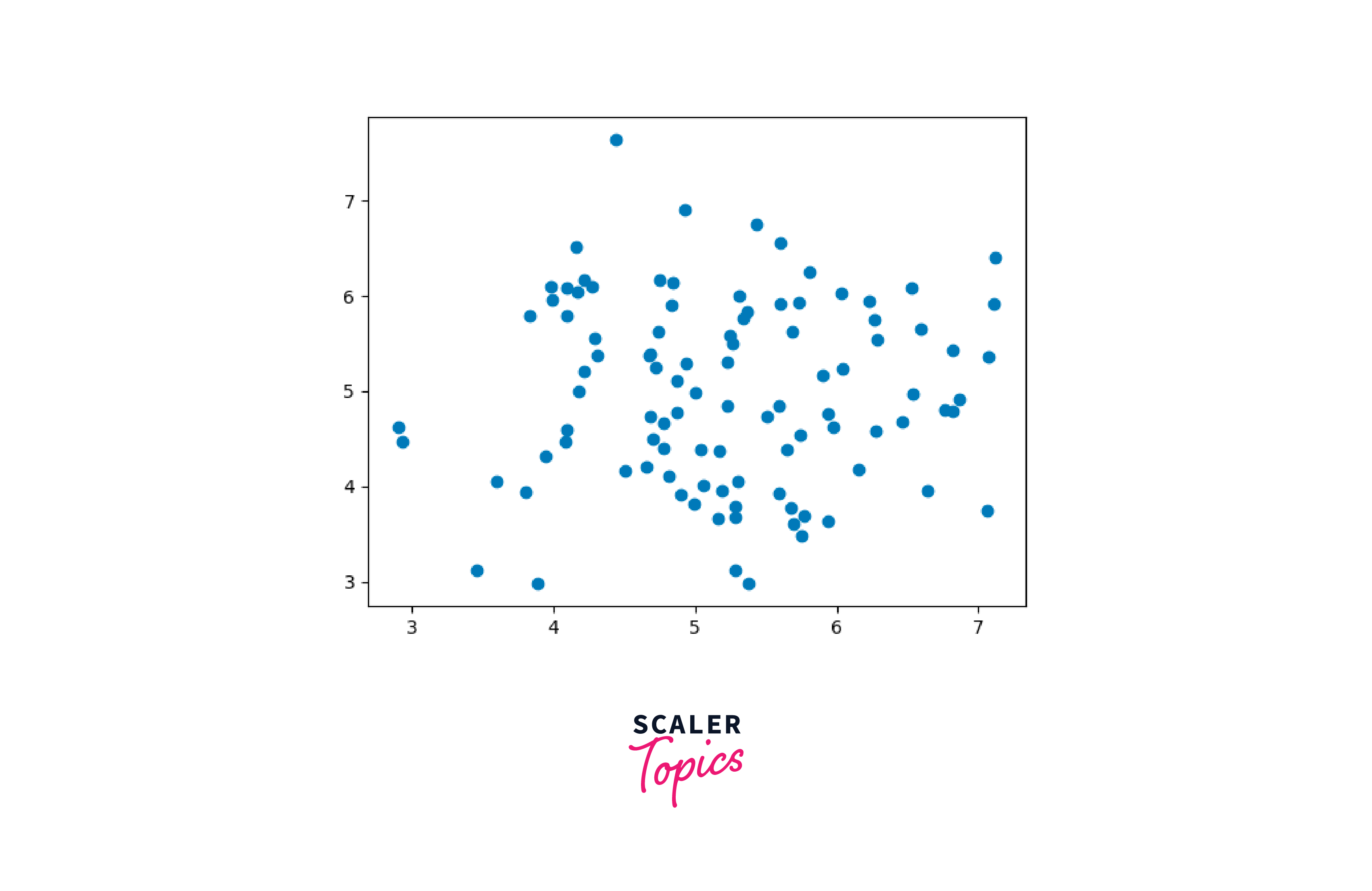
Scatter plots are used to visualize the relationship between two continuous variables. They are created using functions like plot() or ggplot().
Line Plots
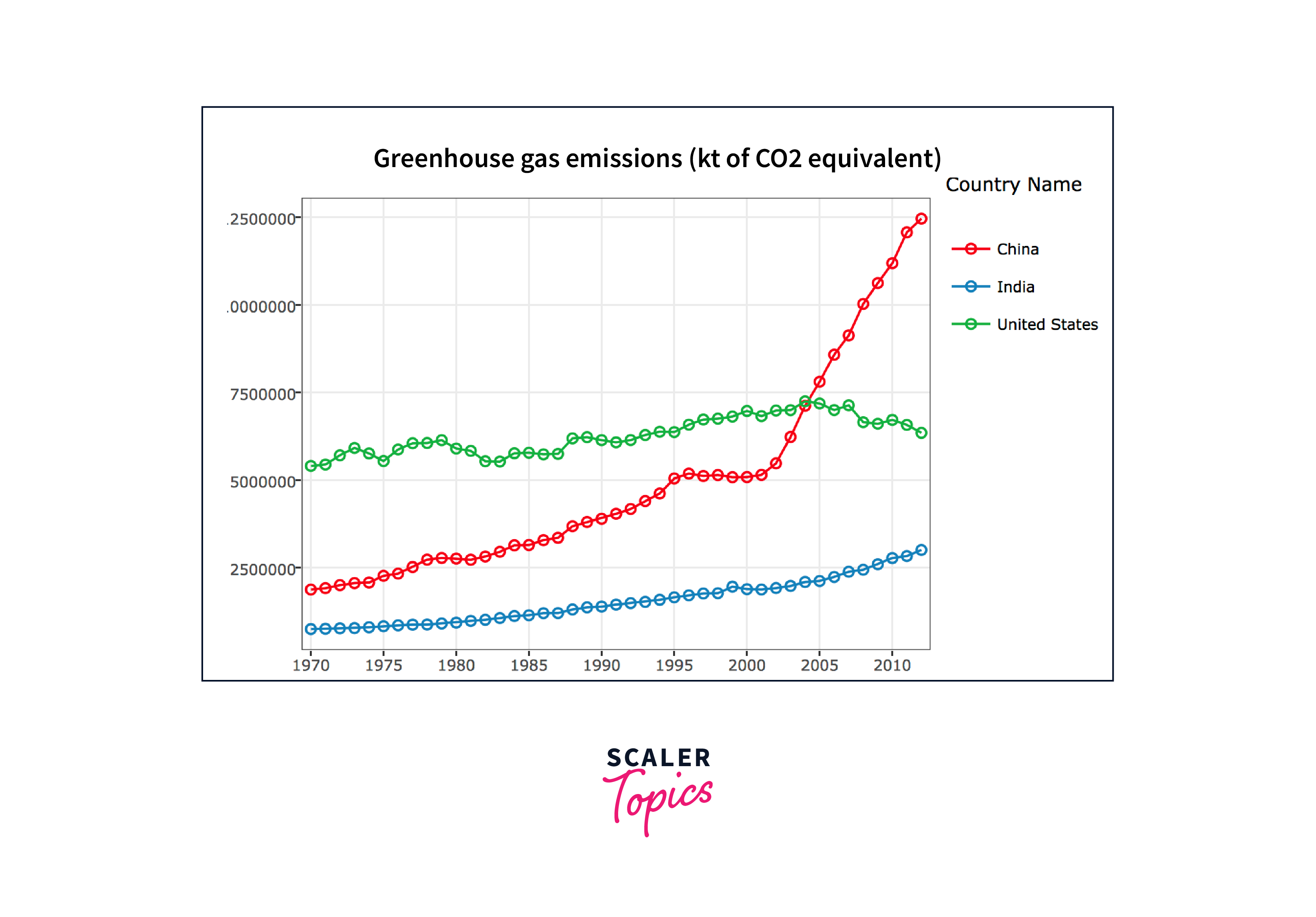
Line plots are used to display the trend or change in a variable over time or another continuous dimension. They can be created using plot() or ggplot().
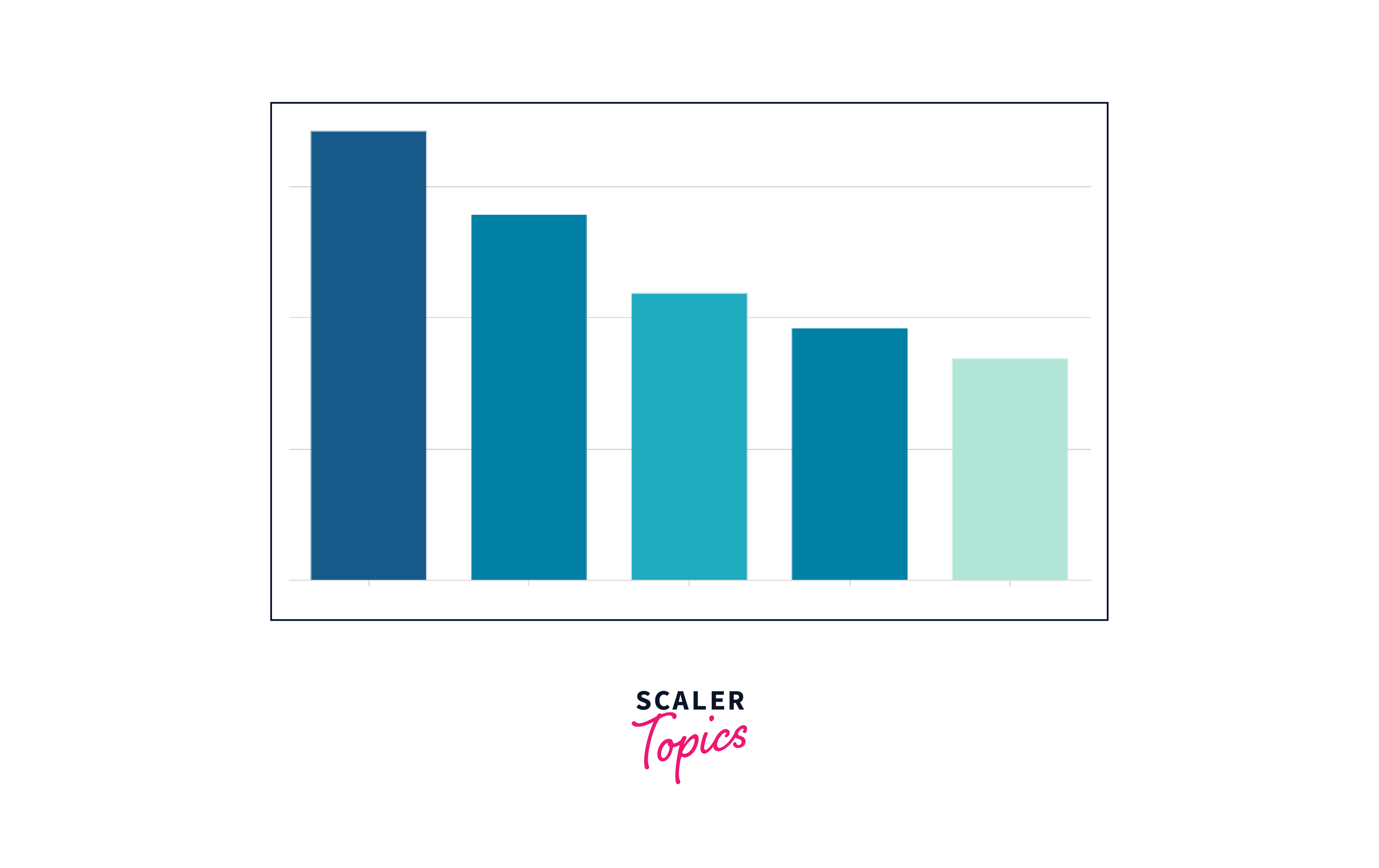
Bar Charts
Bar charts are used to compare categorical data or display the distribution of a single categorical variable. They can be created with barplot() or geom_bar() from ggplot2.
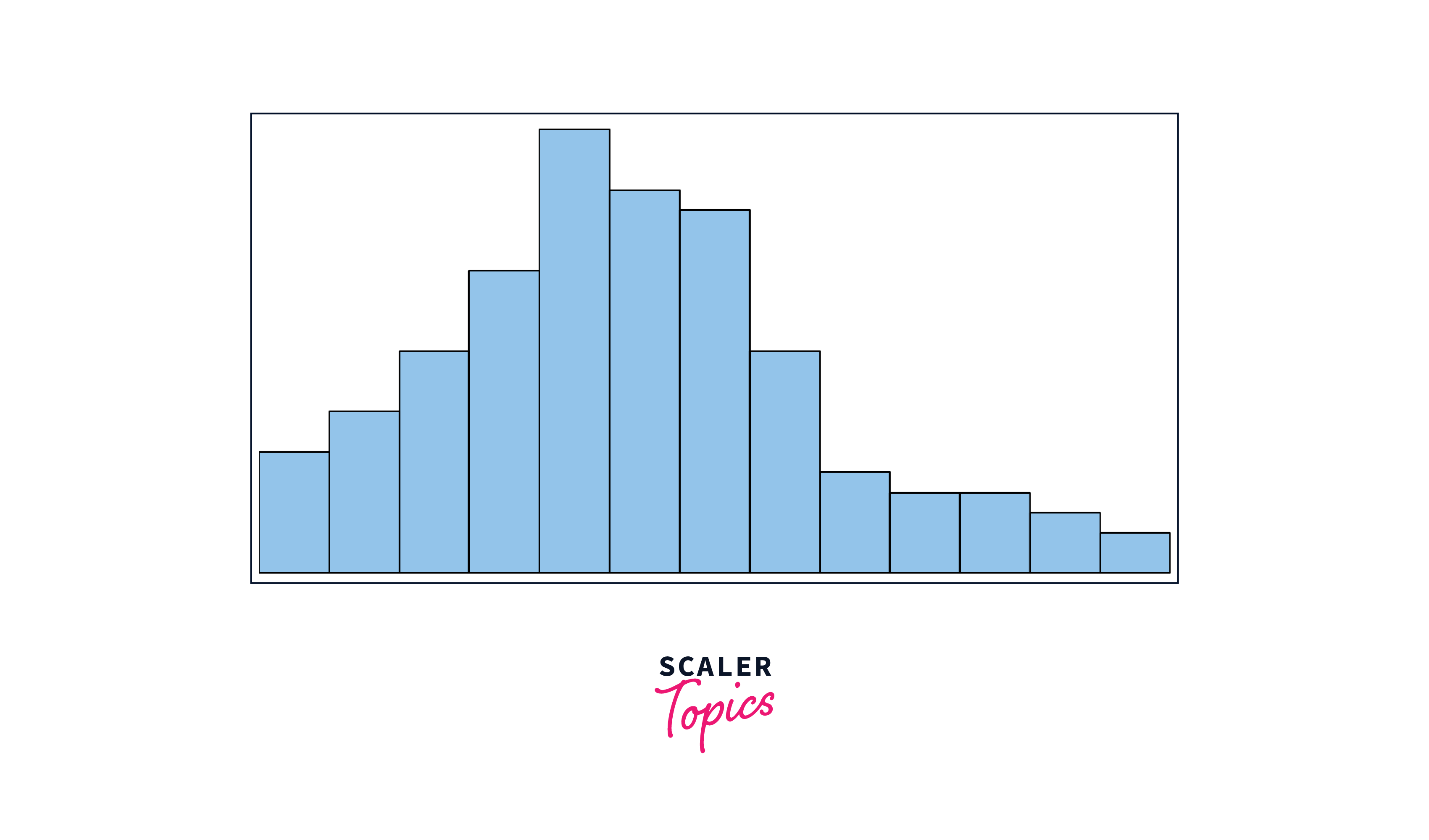
Histograms
Histograms display the distribution of a continuous variable by grouping data into bins. They can be created using hist() or geom_histogram() from ggplot2.
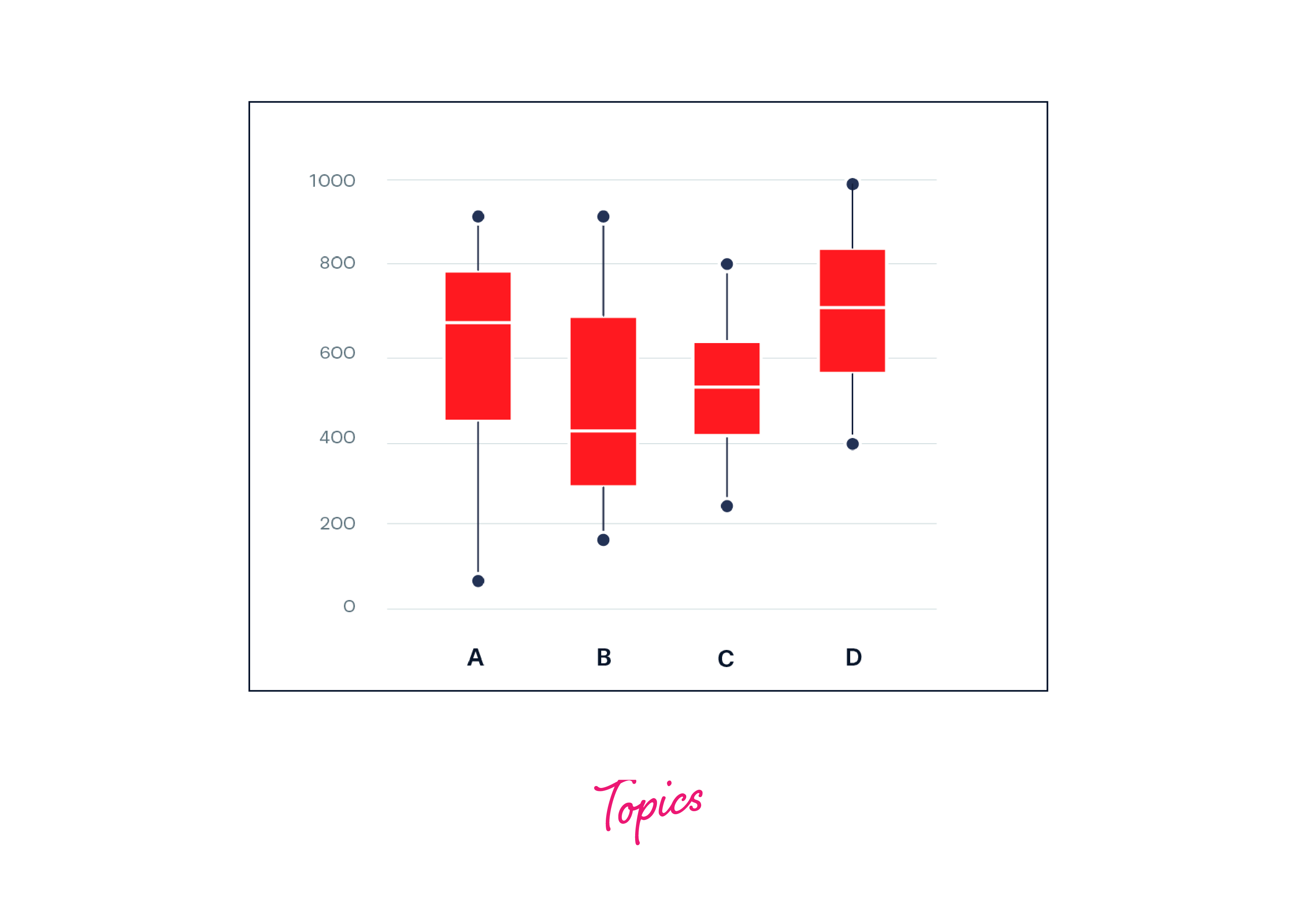
Box Plots
Box plots, or box-and-whisker plots, visualize the distribution of data and identify outliers. They can be created using boxplot() or geom_boxplot().
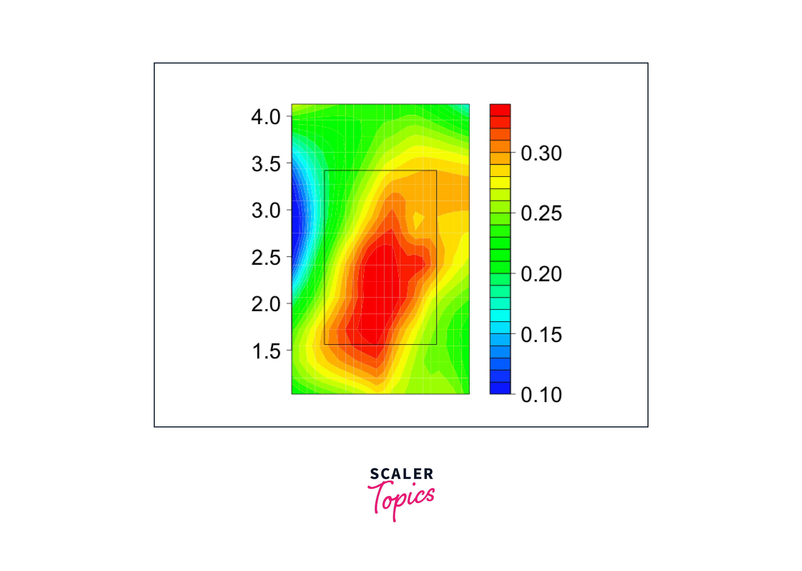
Heatmaps
Heatmaps are used to represent data in a tabular format, with colors representing values. They are often used to visualize correlations or patterns in large datasets and can be created with heatmap() or geom_tile() from ggplot2.
Pie Charts
Pie charts are used to show the proportion of different categories in a dataset. They can be created using pie() or geom_bar() with a coordinate transformation in ggplot2.

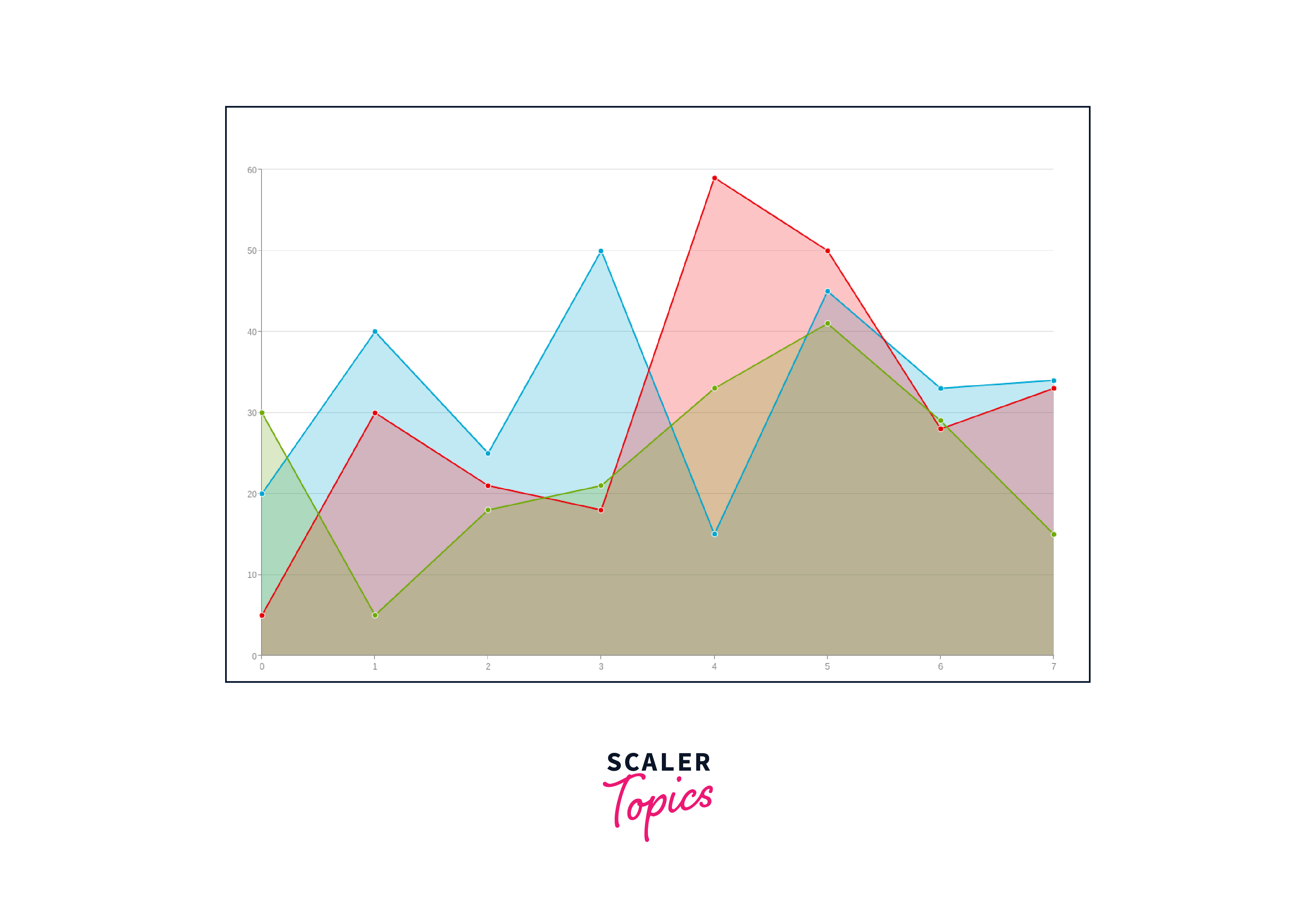
Area Plots
Area plots are used to display the evolution of a variable over time or another continuous dimension. They can be created using plot() or geom_area() from ggplot2.
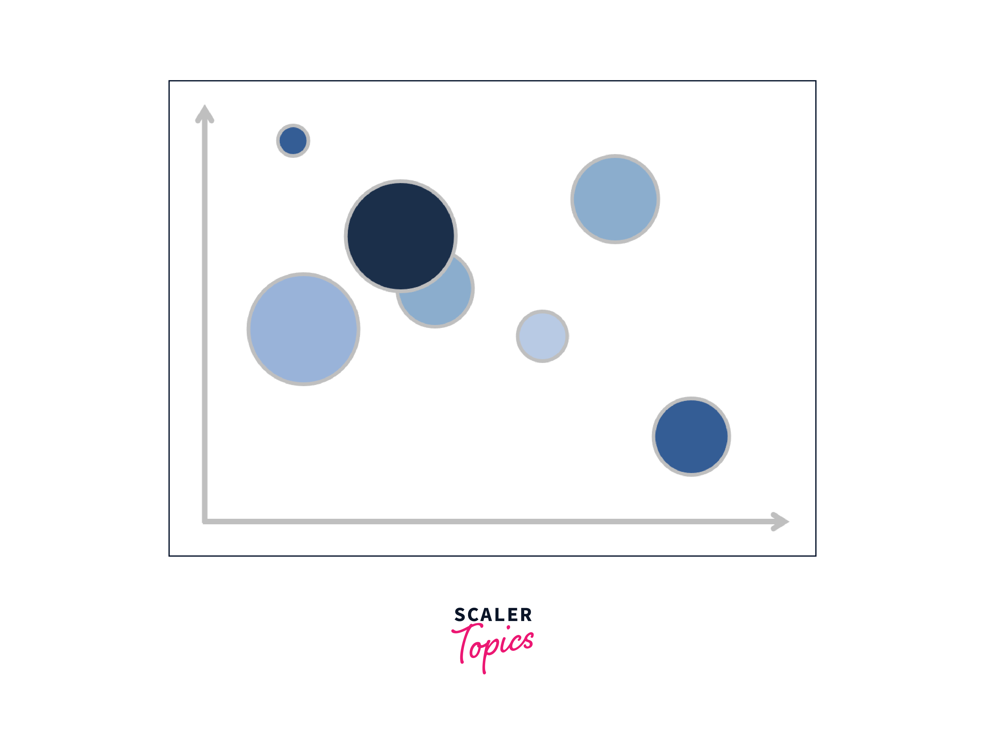
Bubble Charts
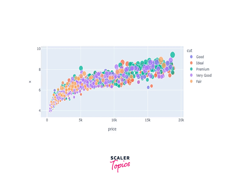
Bubble charts display data points as circles, with the size of the circle representing a third variable. They can be created using plot() or geom_point() with size specified in ggplot2.
These are just a few examples of the many types of data visualizations that can be created in R. The choice of visualization depends on the data being analyzed and the insights users want to communicate effectively.
Applications Areas of Data Visualization
Data visualization has diverse applications across various fields and industries due to its ability to present complex data in a visually compelling and understandable manner. Some of the key application areas of data visualization include:
- Business Intelligence (BI): Data visualization is extensively used in business intelligence to analyze and present key performance indicators (KPIs), sales trends, market data, and financial metrics. Interactive dashboards and visual reports help stakeholders make informed decisions and identify areas for improvement.
- Data Analysis and Exploration: Data visualization aids data analysts and scientists in exploring datasets, identifying patterns, trends, and outliers. Visualizations provide a quick understanding of data distributions, correlations, and relationships, leading to better data-driven insights.
- Data Reporting and Presentations: Visualizations play a crucial role in presenting research findings, survey results, and data-driven insights in a clear and concise manner. They enhance audience comprehension and engagement during presentations and reports.
- Geographic Information Systems (GIS): Data visualization is integral to GIS applications, enabling the representation of geospatial data on maps. This helps in visualizing patterns, spatial relationships, and making location-based decisions.
- Healthcare and Life Sciences: Data visualization is used in healthcare to represent medical data, patient demographics, and treatment outcomes. It aids in understanding disease trends, patient outcomes, and healthcare resource allocation.
- Social Media Analytics: Social media platforms generate vast amounts of data. Data visualization allows businesses to track social media metrics, sentiment analysis, and engagement levels to make informed marketing decisions.
- Financial Analysis: In finance, data visualization helps interpret stock market trends, portfolio performance, and risk analysis. It aids financial analysts in making investment decisions and communicating financial insights to stakeholders.
- E-commerce and Retail: Retailers use data visualization to analyze customer behavior, sales performance, and inventory management. It enables them to optimize pricing strategies and improve customer experience.
- Environmental Science: Data visualization supports environmental scientists in analyzing climate data, biodiversity patterns, and pollution levels. It assists in communicating environmental issues to policymakers and the public.
- Education and Training: Data visualization enhances educational materials and training programs by presenting complex concepts in a more accessible and engaging manner. It helps students grasp information effectively.
Advantages of Data Visualization in R
Data visualization in R offers numerous advantages, making it a popular choice for data analysis and communication. Some of the key advantages of data visualization in R are:
- Visual Representation of Complex Data: R's data visualization capabilities allow users to represent complex datasets in the form of charts, plots, and graphs. Visualizations provide a clear and intuitive representation of data, making it easier to identify patterns, trends, and outliers.
- Better Data Understanding: Visualizations help users gain a deeper understanding of data by providing a visual overview. They enable data analysts and scientists to explore datasets, spot insights, and make data-driven decisions more effectively.
- Facilitating Data Exploration: R's interactive and customizable visualizations enable users to interact with the data, zoom in on specific areas, and explore data from different perspectives. This dynamic exploration facilitates a deeper understanding of data relationships.
- Enhanced Communication: Data visualizations in R make it easier to communicate complex information to various stakeholders, including non-technical audiences. Visual representations are more accessible and engaging than raw data or text-based reports.
- Quick Insights: With R's data visualization packages, users can create plots and charts rapidly. This agility allows for quick data exploration, hypothesis testing, and identifying potential areas for further investigation.
- Customization and Flexibility: R's visualization packages offer a high level of customization, allowing users to tailor visualizations to their specific needs. Users can control colors, labels, titles, and other graphical elements to align with their project's objectives.
- Integration with Data Analysis: R is a comprehensive statistical programming language, and its data visualization packages seamlessly integrate with data analysis functions. Users can analyze data and visualize results in the same environment, streamlining the analytical workflow.
- Publication-Quality Output: R's data visualization packages enable the creation of publication-ready graphics with high-quality output. This is beneficial for generating visualizations for research papers, reports, and presentations.
- Support for Diverse Chart Types: R's visualization ecosystem offers a wide range of chart types, including bar charts, line plots, scatter plots, histograms, heatmaps, and more. This diversity allows users to choose the most appropriate visualization for their data.
- Reproducibility: R's emphasis on scripts and code-based workflows ensures that data visualizations are reproducible. This makes it easier for others to replicate and verify the analyses and visualizations.
Disadvantages of Data Visualization in R
While R offers a powerful and versatile platform for data visualization, there are some potential disadvantages and challenges associated with using R for this purpose. Some of the key disadvantages of data visualization in R include:
- Steeper Learning Curve: R's extensive capabilities in data visualization may lead to a steeper learning curve, especially for beginners or individuals with limited programming experience. Mastering R's visualization packages and customizing plots may require time and effort.
- Code-Based Approach: R relies on coding for creating visualizations, which may be daunting for non-programmers or those more accustomed to point-and-click interfaces. Users must be familiar with R syntax and functions to generate visualizations effectively.
- Package Dependency: R's visualization ecosystem is primarily package-driven, and different packages may have overlapping or conflicting functionalities. Managing dependencies and keeping packages up-to-date can sometimes be challenging.
- Reproducibility Challenges: While R's script-based nature promotes reproducibility, complex or highly customized visualizations may be difficult to replicate, leading to potential reproducibility issues.
- Performance Limitations: Large datasets or complex visualizations may lead to performance bottlenecks in R. Memory constraints and slower processing times could impact the rendering of visualizations.
- Limited 3D Visualization Support: R's 3D visualization capabilities are not as robust compared to specialized 3D visualization tools. Creating sophisticated 3D plots may require additional effort and customizations.
- Limited Interactivity in Base Graphics: While some packages provide interactive capabilities, R's base graphics system has limited support for interactivity compared to dedicated interactive visualization libraries.
- Visual Appeal: R's default visualizations may lack the visual appeal and aesthetics offered by some other data visualization tools. Users may need to invest time in customizing plots to achieve desired aesthetics.
- Exporting Complex Plots: Exporting complex and highly customized plots from R may be challenging due to limitations in vector graphics formats or difficulties in preserving interactive features.
- Data Security: In certain scenarios, sharing R scripts containing sensitive data for visualization purposes may raise data security concerns.
Conclusion
- Data visualization in R offers clear and intuitive representations of complex data, aiding pattern recognition and insights.
- It facilitates a deeper understanding of data, enabling analysts to explore datasets and make data-driven decisions effectively.
- R's visualization packages provide high customization and flexibility, allowing users to tailor visualizations to their specific needs.
- Integration with data analysis functions streamlines the analytical workflow, promoting efficient data exploration and hypothesis testing.
- Despite its advantages, data visualization in R may pose challenges, including a steeper learning curve for non-programmers and managing package dependencies.
- However, R's rich capabilities and seamless integration make it a popular choice for impactful data visualization tasks, benefiting data analysts and scientists alike.