How to add a Drop Shadow to an Image with CSS?
 FREE
FREE
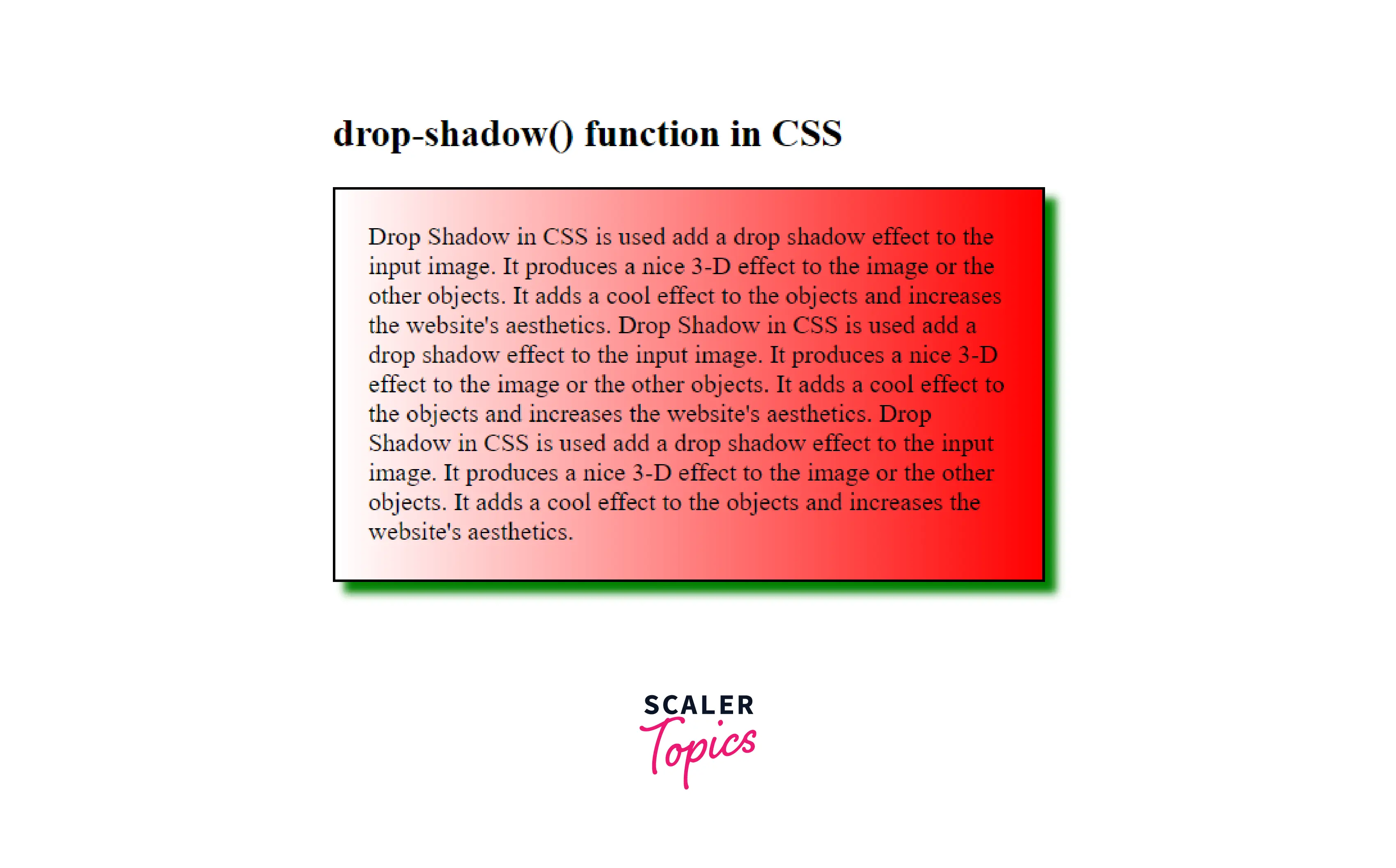
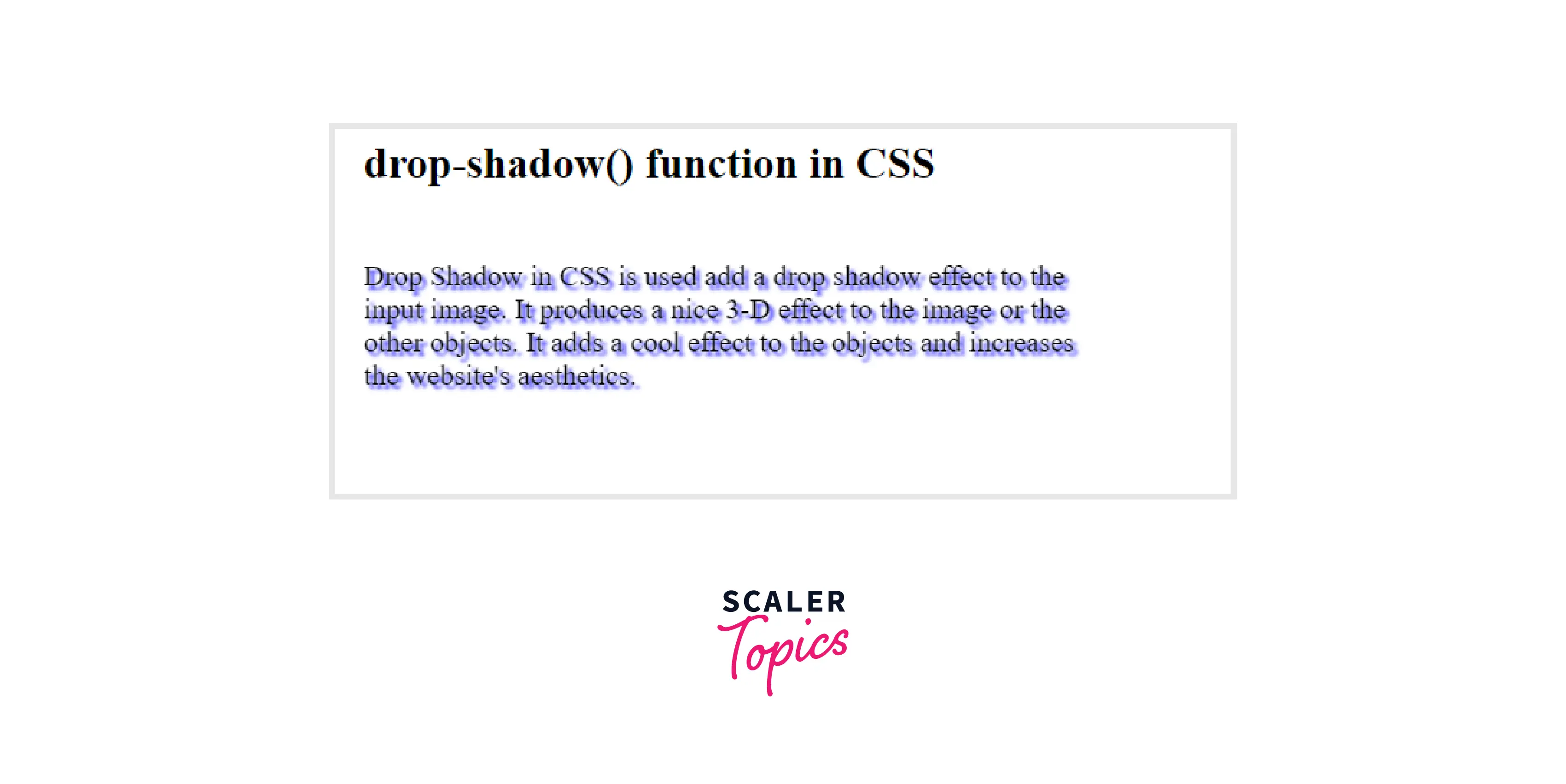
Overview
Drop Shadow in CSS is used to add a drop shadow effect to the input image. It produces a nice 3-D effect on the image or the other objects. It adds a cool effect to the objects and increases the website's aesthetics.
In this article, we will learn how to add a drop shadow to images and other objects.
Drop Shadow CSS Syntax
Let's understand the syntax of drop-shadow() in CSS. The drop-shadow() in CSS uses the parameter of type shadow having values like offset-x, offset-y, blur-radius, color.
Syntax:
Parameters of drop-shadow()
Let's understand the parameters of drop-shadow() in CSS. drop-shadow() takes the following parameters.
- offset-x: It is the horizontal distance that determines the length of the shadow from the object. Shadow depends on the following values:
- Positive value: positive value places the shadow to the right of the object by the given length.
- Negative value: negative value places the shadow to the left of the object by the given length.
- 0: Shadow is placed directly behind the object.
- offset-y: It is the vertical distance that determines the length of the shadow from the object. Shadow depends on the following values:
- Positive value: positive value places the shadow below the object by the given length.
- Negative value: negative value places the shadow above the object by the given length.
- 0: Shadow is placed directly behind the object.
- blur-radius: It is an optional parameter. It specifies the shadow's blur radius, and it specifies how the shadow will be blurred:
- The larger the value passed, the more the shadow will be blurred.
- The default value is 0, which results in unblurred edges of the shadow.
- color: It is an optional parameter that specifies the color of the shadow. If unspecified, the default value of the color property is used.
Basic Example
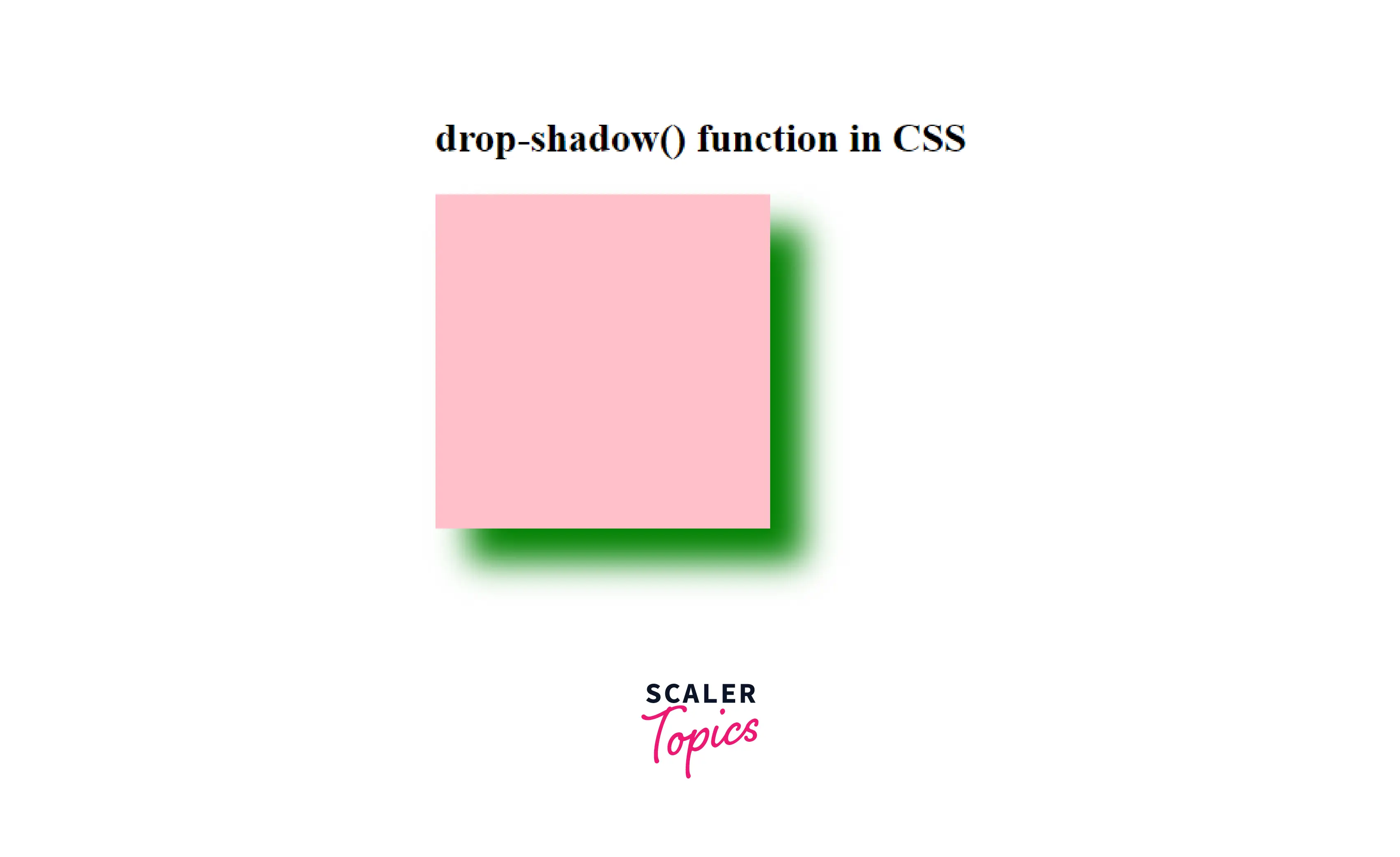
Let us take a look at a basic example of how the drop-shadow() functions in CSS.
In this example, we are simply adding a drop shadow to a div using this function.
Output:
Here in this example, we have simply added the drop shadow to an HTML div element using this function.
How to Add a Drop Shadow to an Image With CSS?
We can simply use the drop-shadow() function to add a drop shadow to an image. Let us take a look at how we can do it.
Example: Adding Drop Shadow to an Image
In this example, we are simply adding a drop shadow to an image using this function.
Output:
Here, we have added a drop shadow to the image using the drop-shadow() function
Explaining the Drop Shadow Code
In the above-used code, we have passed the following values to the drop-shadow() function:
- First value of -10px is the horizontal distance that determines the length of the shadow from the object. It is a negative value that places the shadow to the left of the object by the given length.
- Second value of -10px is the vertical distance that determines the length of the shadow from the object. It is a negative value that places the shadow above the object by the given length.
- Third value of 10px specifies the shadow's blur radius.
- Fourth parameter sets the color of the shadow.
How to Remove White Space Under images
If the image has a white space between the image and the drop shadow, then it can be because the images are inline element and it should be corrected by treating them as block element.
So, we need to change the display of the image as a block from inline:
- Make a class for images separately
- Then make that image a block element.
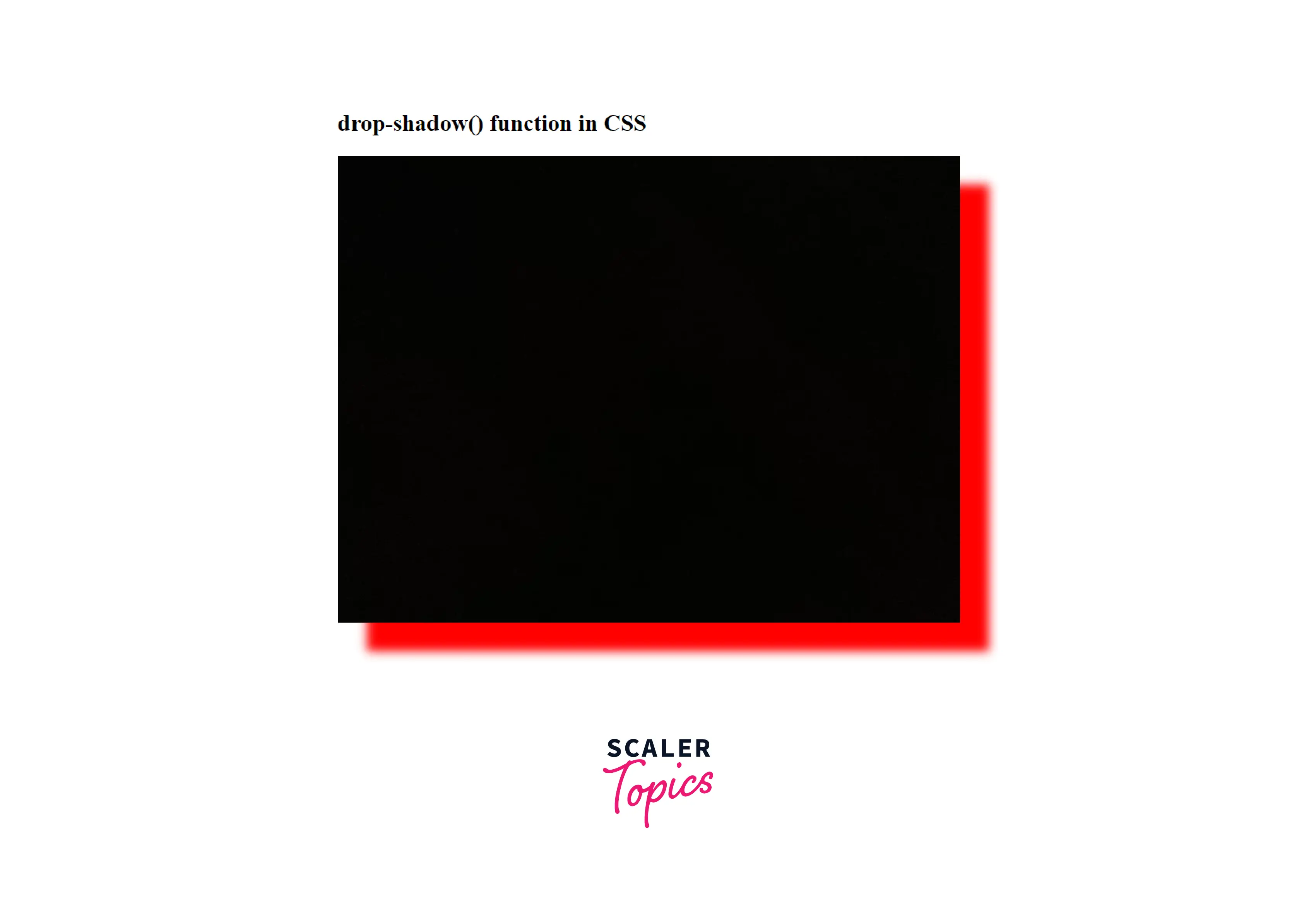
Example:
Output:
We got the red-colored drop-shadow to the image.
How to Add a Drop Shadow to a Text box
We can also add a drop shadow to a text box. For that, we will be using the box-shadow property for adding the shadow to the border of the text box.
Example: Adding a drop shadow to a text Box
Output:
Here, we got the green coloured drop-shadow to the text-box.
More Examples:
Example: How to Add Drop Shadow to the Text
We can add a drop shadow to some text so as to get a cool shadow effect on the text. For that, simply add the text in a div and give some class to that div and use the drop-shadow() function to give the shadow effect to that text.
Example: Adding Drop Shadow to a Text Box
Output:
We got a cool shadow effect on some text using the drop-shadow() function.
Limitations and Differences of Drop Shadow
Limitations:
- Drop-shadow() is not compatible with the spread parameter; hence it does not swell the shadow as the box-shadow does.
- You cannot create an outline effect using this function.
- Drop-shadow() doesn't support the inset shadows
- drop-shadow() doesn't work well with some web browsers, so it can be limited to some browsers.
Differences Between drop-shadow and box-shadow in CSS?
We have seen that drop-shadow and box-shadow are almost of the same use, but there are certain differences between both them, whether it be browser support or the parameter values.
Both can be used in certain situations according to the advantages of each one. Let's see the major differences between the both:
| Parameters | drop-shadow | box-shadow |
|---|---|---|
| Spread Parameter Support | No | Yes |
| Browser Support | Doesn't support old browsers | Supports all the Browsers |
| inset shadows | Doesn't support | Supports |
| Performance | Hardware accleration increases the performance | Not Hardware accelerated |
| Blur Radius Support | Yes | Yes |
Conclusion
- Drop Shadow in CSS is used add a drop shadow effect to the input image.
- It produces a nice 3-D effect to the image or the other objects and adds a cool effect to the objects, and increases the website's aesthetics.
- Syntax of drop-shadow() is:
- drop-shadow(offset-x offset-y blur-radius color)
- Parameters accepted by drop-shadow() are:
- offset-x
- offset-y
- blur-radius
- color
- We can do the following tasks using drop-shadow() function:
- Add a Drop Shadow to an Image
- Remove White Space Under images
- Add a drop shadow to a text box
- Add drop shadow to the text
- There are certain limitations of drop-shadow() function as discussed above in the article.
- There are many differences between drop-shadow and box-shadow as discussed above; each can be used according to the given situations.