Dropdown in React Native
Overview
Numerous third-party React Native libraries are available that offer dropdowns for your app, which have functionality that enables users to choose one thing from a list of items to fill out a form field. In this tutorial, we'll cover how to create a custom-type dropdown in React Native.
What is react-native-element-dropdown in React Native?
A customizable dropdown component for React Native apps is offered by the package known as React Native Element Dropdown (react-native-element-dropdown). Dropdown menu creation is made easier with the help of this library, which also offers a range of choices for tailoring the dropdown to the appearance and functionality of your application. It is a component that is frequently used in mobile applications and may be used to contain a variety of things as well as switch between the app's various panels.
Features
Some of the features of dropdown in react native are as follows :
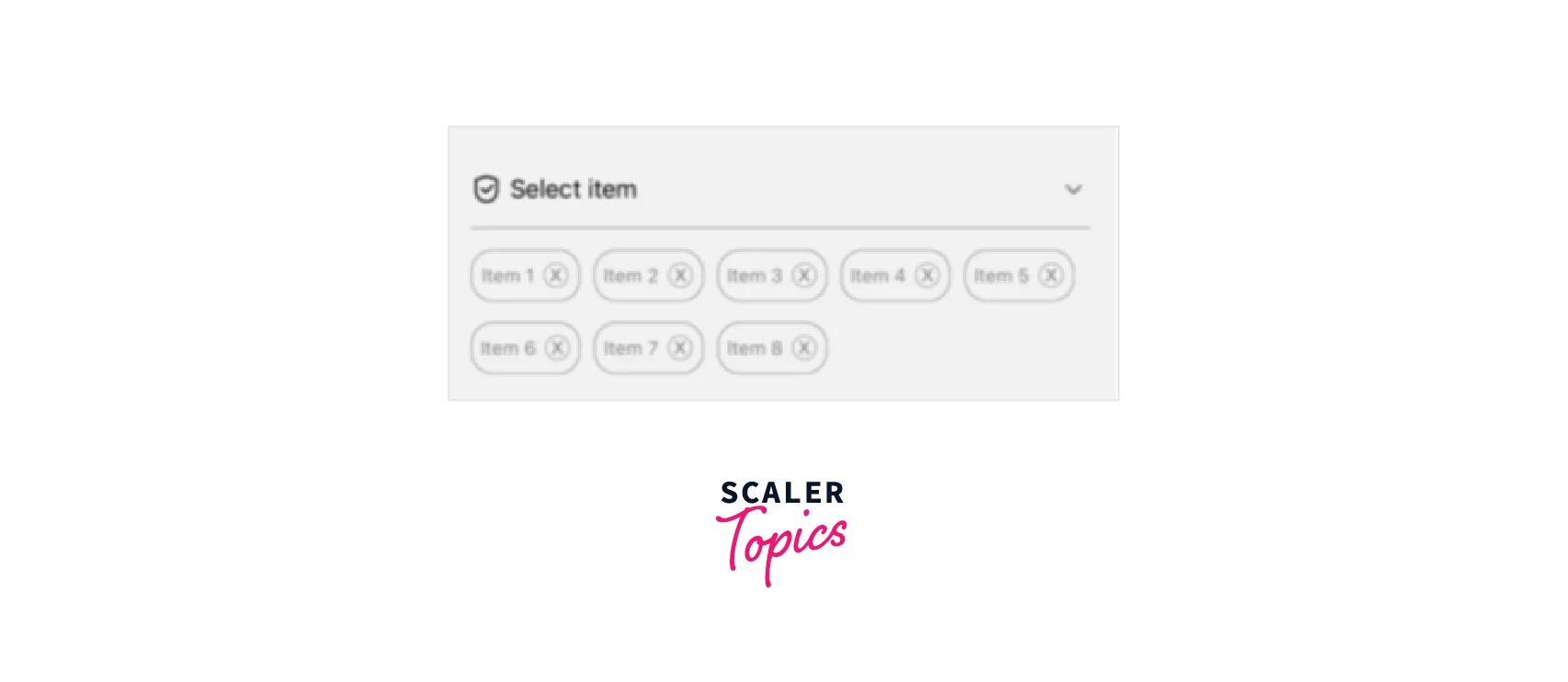
- Dropdown and multiple options can be selected in one package.
- It is simple to use.
- It has the same appearance and experience across iOS and Android.
- Font size, color, and animation duration are customizable.
- It is developed with the use of typescript.
Props
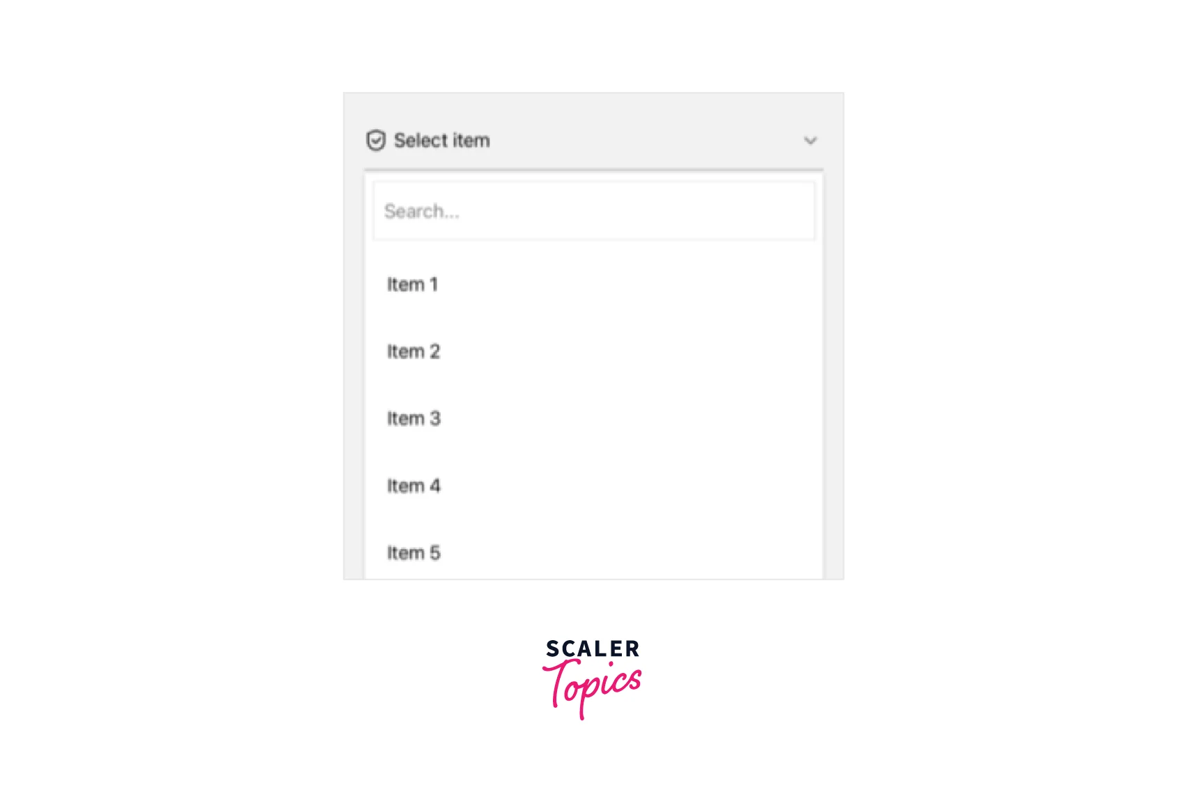
dropdown in react native
- mode: It is optional. The 'modal' mode displays the dropdown in the center of the screen.
- data: It is required. It is just the array of the data.
- labelField: It is required. Remove the label from the data item.
- value field: It is required. It is used to extract the primary key from the data item.
- searchField: It is required. Choose the data list field you wish to search in.
- onChange: It is required. It is the Selection callback.
- onChangeText : Whenever the text in the text input changes, a callback is triggered.
- value: It is optional. It is used to set the default value.
- placeholder: It is optional. The string will be shown before a drop-down selection.
- placeholderStyle: styling for placeholder text.
- selectedTextStyle: It is optional. The style for chosen text
- selectedTextProps: It is optional. Text Props for chosen text. Ex: numberOfLines={1}.
- style: It is optional. Styling for view container.
- containerStyle: It is optional. Styling for list container.
- maxHeight: Customise the list container's maximum height using maxHeight.
- minHeight: Customise the list container's minimum height using minHeight.
- fontFamily: Choose your own font family
- iconStyle: Icon styling
- icon color: Icons' color
- itemContainerStyle: Style for the list's item container
- itemTextStyle : List item text styling.
- activeColor: The background color of the list container's chosen item.
- search: Show or hide the input search box.
- searchQuery: Callback is used to narrow the list of objects using the search query.
- inputSearchStyle: Input search styling.
- searchPlaceholder: The string that will be displayed before text input.
- renderInputSearch: Customise TextInput search using renderInputSearch.
- disable: Indicates whether the Dropdown is enabled or disabled.
- dropdown position: A position in a drop-down menu. 'Auto' is the default.
- autoScroll: By default, auto scrolls to the selected item in the index.
- showsVerticalScrollIndicator: shows a vertical scroll indication when true; the default value is true.
- renderLeftIcon: Customise the dropdown's left icon.
- renderRightIcon: Customise the right icon for a dropdown using renderRightIcon.
- renderItem: a data item is taken from renderItem and rendered into the list.
- flatListProps: Customise the element of the FlatList.
- inverted: Reverses the scroll on top position mode's direction. The default is yes.
- onFocus: When the dropdown is focused, the callback function is invoked.
- onBlur: When the dropdown becomes blurry, the callback function is invoked.
- keyboardAvoiding: The default value of keyboardAvoiding is true.
- backgroundColor: Set the backdrop color.
- confirmSelectItem: Turn on confirm Select Item to enable it.
- onConfirmSelectItem: Callback for selection.
- testID: In end-to-end testing, this view may be found using the testID.
- itemTestIDField: Include this field in the data entry. DATA = [itemTestIDField: '', label: '', value: ''] is an example.
- accessibilityLabel: Add an accessibilityLabel to the view so that users of VoiceOver may identify the element they have chosen.
- itemAccessibilityLabelField: Add the itemAccessibilityLabelField to the input data. An example would be DATA = [itemAccessibilityLabelField: '', label: '', value: ''].
SelectCountry Props
- imageField: Remove the picture from the data item.
- imageStyle: Picture styling.
Methods
| API | Params | Description |
|---|---|---|
| open | () => void | Open dropdown list |
| close | () => void | Close dropdown list |
Examples
Let us check out some examples of the dropdown in react native :
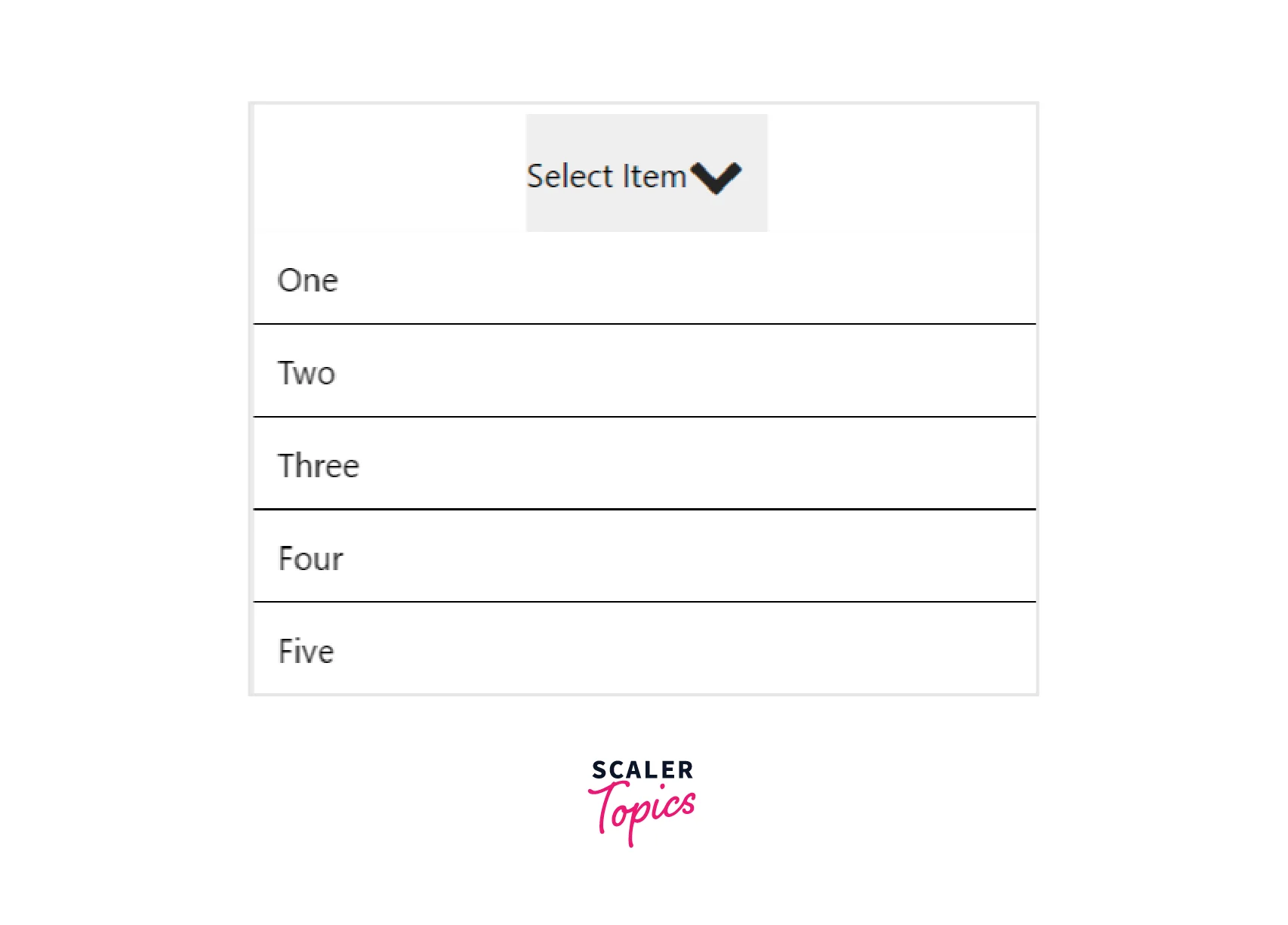
Output :
Output :
How to Create a Custom React Native Dropdown?
Dropdown Field Creation
This project was made with create-react-native-app. It has a TouchableOpacity so that you can touch to make the dropdown visible or invisible, however, the method to display the dropdown currently simply displays a few words. I simply used react-native-elements as a third-party package, and it made adding an icon to the picker straightforward.
There is just one state variable for toggle visibility, and the dropdown in react native element's location is absolute, so it opens over the remainder of the form.
I changed the App. tsx` file created by create-react-native-app to contain both the dropdown in react native component and some text it can cover when opened, but I left the rest of the file alone :
Output :
Creating Real Dropdown in React Native
This is when things start to get interesting. We'll need a couple of additional props for our component, including one for the data that will populate the dropdown's items and one to trigger when an item is selected.
Here is the updated UI for the dropdown props :
Modal for Dropdown
We will employ a Flatlist to produce the list for the drop-down. It includes built-in functionality, is convenient for uses like this, and is faster than a ScrollView.
Except for one circumstance, we could utilize just FlatList. The dropdown in react native won't immediately collapse when you click outside of it, forcing users to choose an item to make it disappear.
Thus, we must modify the renderDropdown method to look like this to obtain the functionality we need :
There are just a few available props currently in use on the FlatList:
- data: the information used to compile the list.
- renderItem: Returning the component for each item.
- keyExtractor: This attaches the keys to the objects so they can be identified. Most of the time, this function can be copied and pasted.
We set the translucent prop on the Modal in the code block. In other words, the Modal will occupy the whole screen, but any space will have a translucent overlay.
To enable us to set visible to false and conceal the Modal when clicked, we add a TouchableOpacity with 100% width and height within the Modal.
The element with the greatest style attributes is the View that envelops the FlatList and specifies the styling for the modal's viewable portion:
Visibility Toggle Function Modification
You may have noticed that the top value in the style is set with a variable in the view we just looked at.
We must determine where the button is present on the screen and set its top value to the height of the button plus the distance from the top of the screen because the modal is completely covering the screen and the dropdown in react native has an absolute location inside of it.
So, we also need the following constants :
Now we will add the reference to the button :
The dropdown's functionality remains the same even after we set its visibility to false. The button's current instance is obtained from the reference, but when the dropdown in react native is made visible, we utilize the element's measure function to get the button's height and vertical location on the screen. The dropdownTop state variable is afterward set to the total of the height and vertical position.
Rendering Items
Recall the FlatList's renderItem prop? The following function accomplishes that :
It doesn't have much to it. When the object is pushed, we need to display the label and take action.
Here is the onItemPress function:
A state variable is established in the first line to keep track of the selected object.
When a button label already exists, we then utilise that chosen item to replace it :
The onSelect prop is called in the function's next line to set the item. The option is then hidden. Each item in the list has a tiny bit of styling added to it to give it some padding and make it stand out.
App.txt files Modification
Here is the modified App. tsx file :
We also added additional props for the dropdown component, some data to experiment with, a Text element to show the selected item, and a state variable for the dropdown's selected item.
Fuel Your Full-Stack Passion! Our Full Stack Certification Course Blends JavaScript Brilliance with Back-End Craftsmanship. Ready to Dive In? Enroll Now!
FAQs
Q. What is a dropdown in react native?
A. A customizable dropdown component for React Native apps is offered by the package known as React Native Element Dropdown (react-native-element-dropdown).
Q. What are some features of dropdown in react native?
A. Some of the features of react-native-element-dropdown are as follows :
- Dropdown and multiple options can be selected in one package.
- It is simple to use.
- It has the same appearance and experience across iOS and Android.
Conclusion
- A customizable dropdown component for React Native apps is offered by the package known as react-native-element-dropdown.
- Some of the features of dropdown in react native is simple to use, the same UI in Android and iOS, etc.
- Some of its important props are mode, data , labelField , valueField , searchfield, and value etc.
- dropdown in react native also accepts multiselect props.