Excel Charts
Overview
Creating basic charts in Excel is a fundamental skill that allows users to visually represent data clearly and concisely. With Excel's charting capabilities, users can transform numerical data into various chart types, such as bar charts, line graphs, pie charts, and more. By selecting the data range and chart type, Excel generates a chart that can be customized further with labels, titles, and formatting options.
Importance of Charts in Excel
Here are several key points highlighting the importance of charts in Excel:
- Data Visualization:
Charts enable the graphical representation of data, allowing users to quickly grasp trends, patterns, and relationships that may not be immediately apparent in raw data. - Communication and Presentation:
Charts serve as an effective communication tool for presenting data to others. - Data Analysis:
Charts facilitate data analysis by providing a visual summary of information. They allow users to identify outliers, compare values, track changes over time, and detect correlations or trends.
Commonly Used Charts
Excel offers a wide variety of charts to choose from, each suited for different types of data analysis and visualization. Here are some commonly used charts in Excel, along with their features and typical use cases:
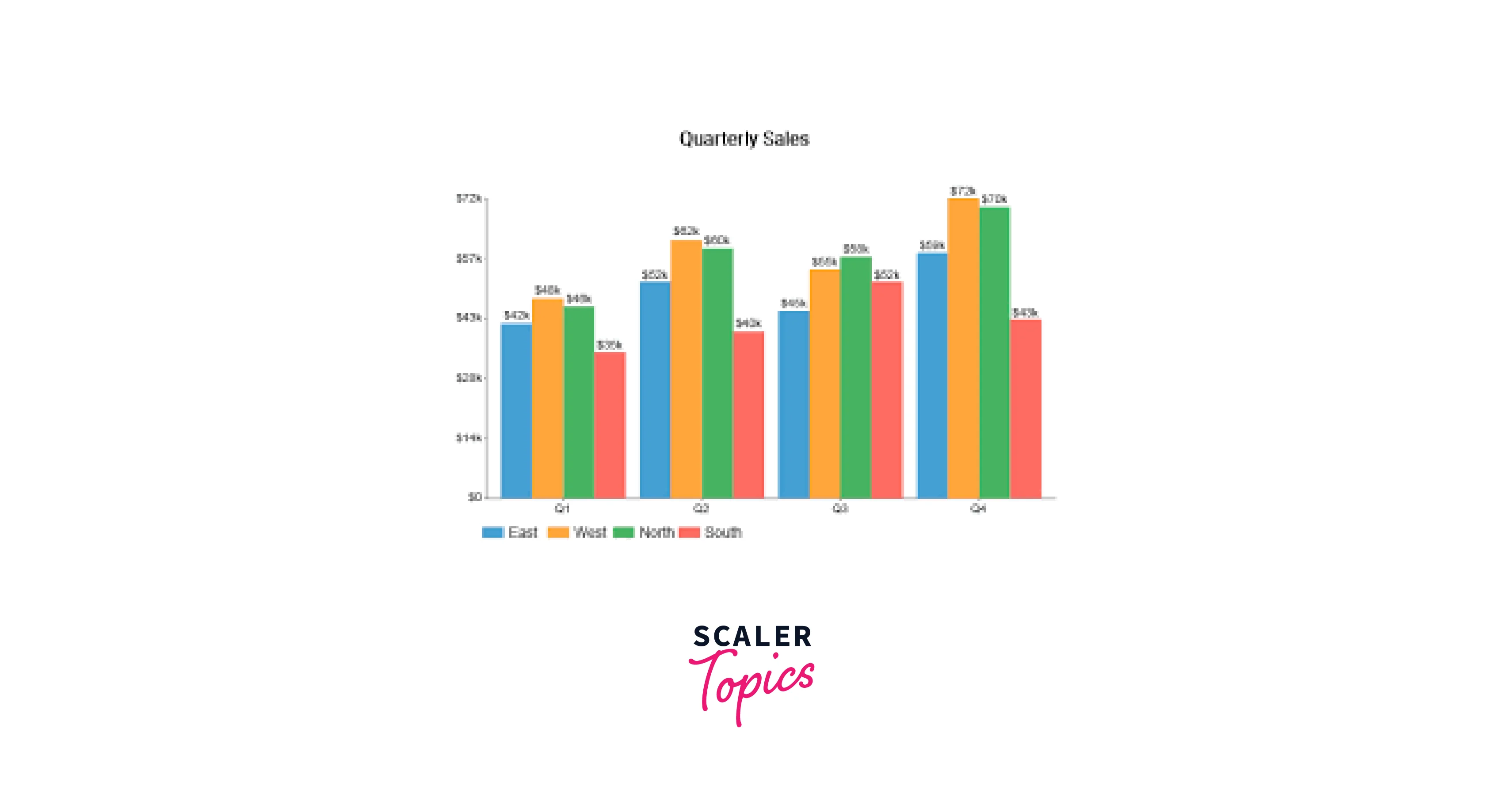
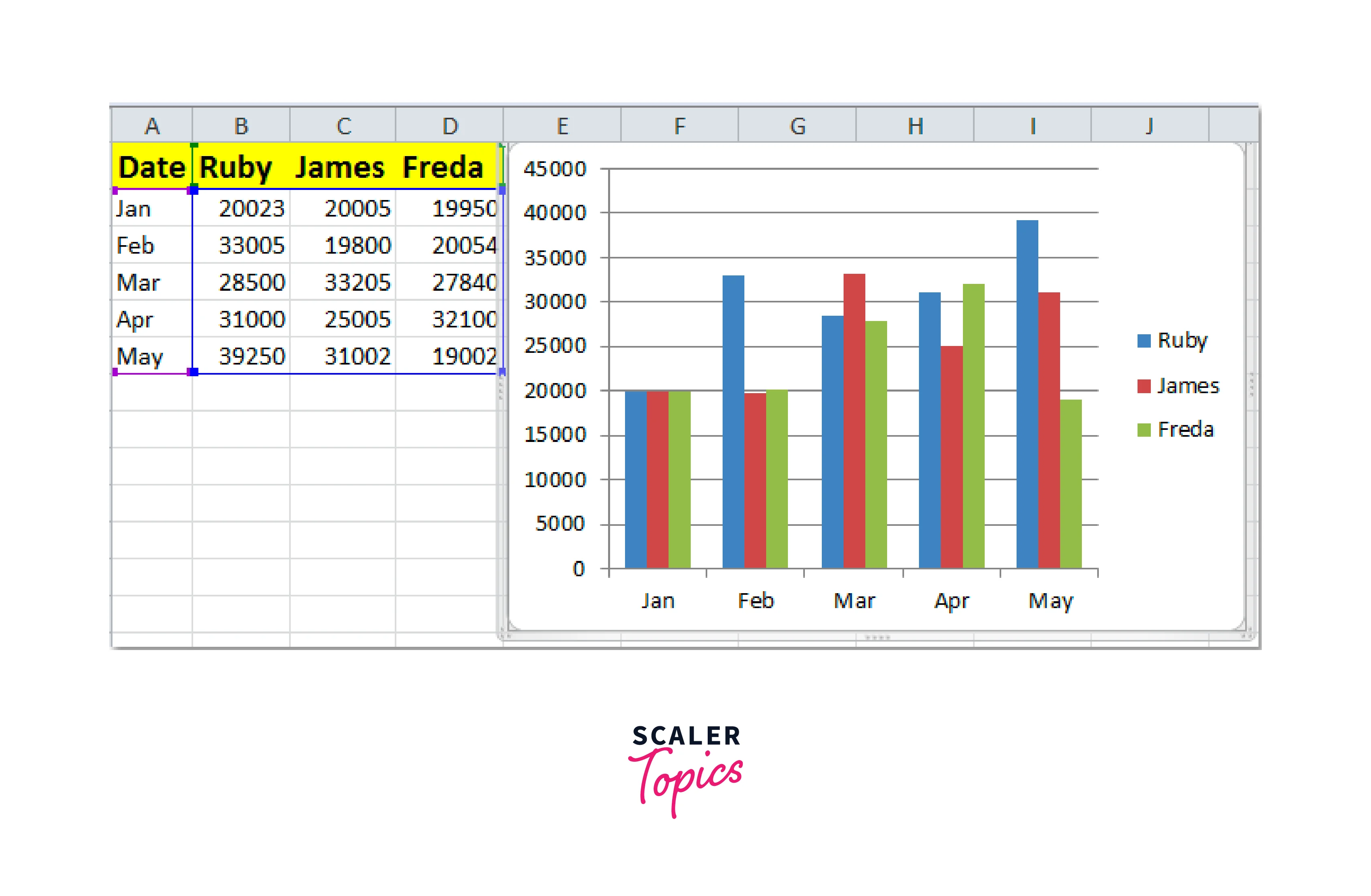
1. Column Chart
- Description:
A column chart displays data using vertical bars, where the height of each bar represents the value being plotted. The columns are typically grouped or clustered to compare values across different categories. - Use Cases:
Column charts are effective for comparing data across categories, analyzing trends over time, and showing variations or comparisons between different data series.
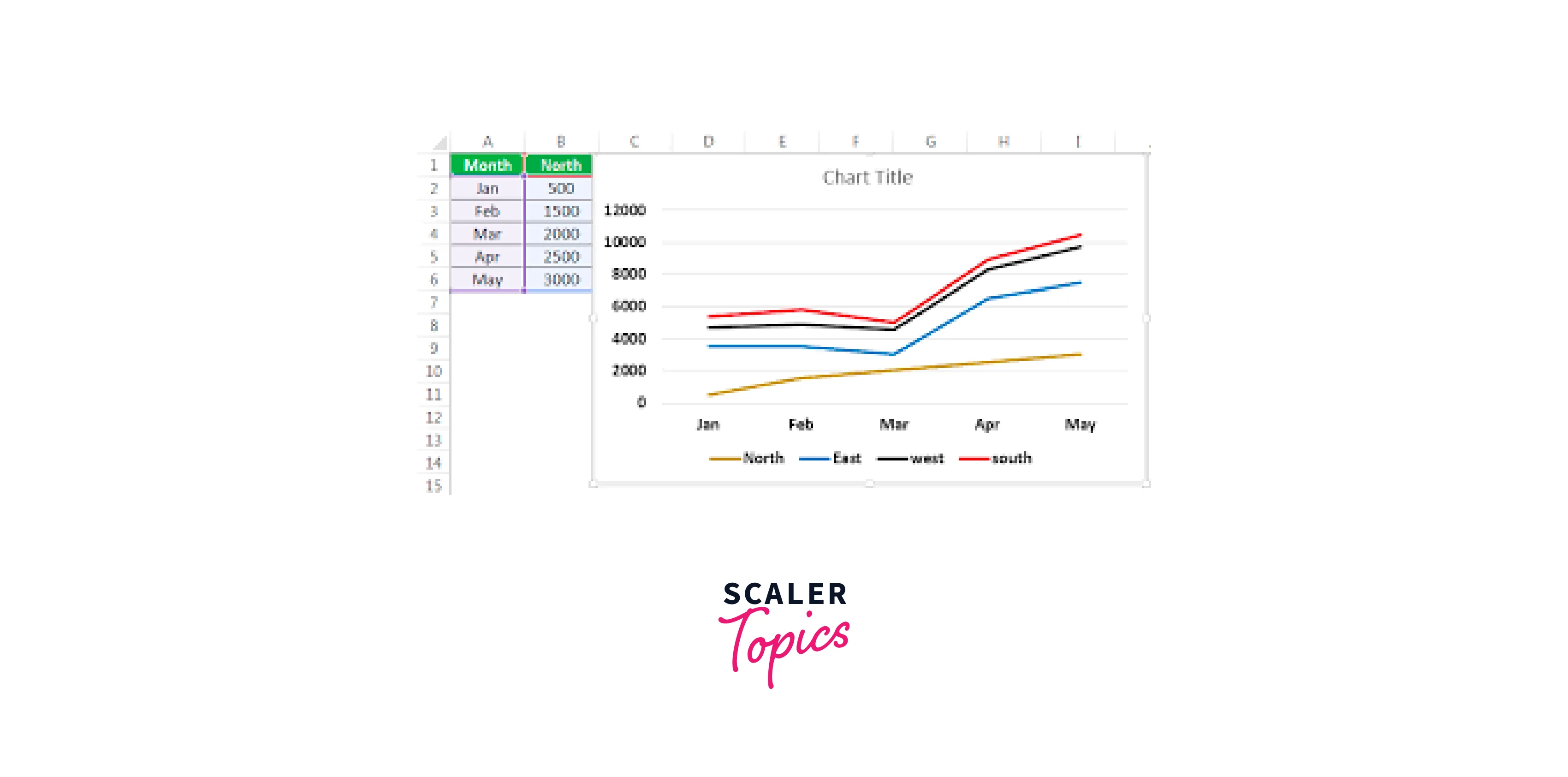
2. Line Chart
- Description:
A line chart connects data points with lines, creating a visual representation of trends and changes over time. Each data point is plotted on the chart using markers, such as circles or squares. - Use Cases:
Line charts are commonly used to track data over time, such as stock prices, sales figures, or population trends. They are suitable for showing continuous data and identifying patterns or fluctuations.
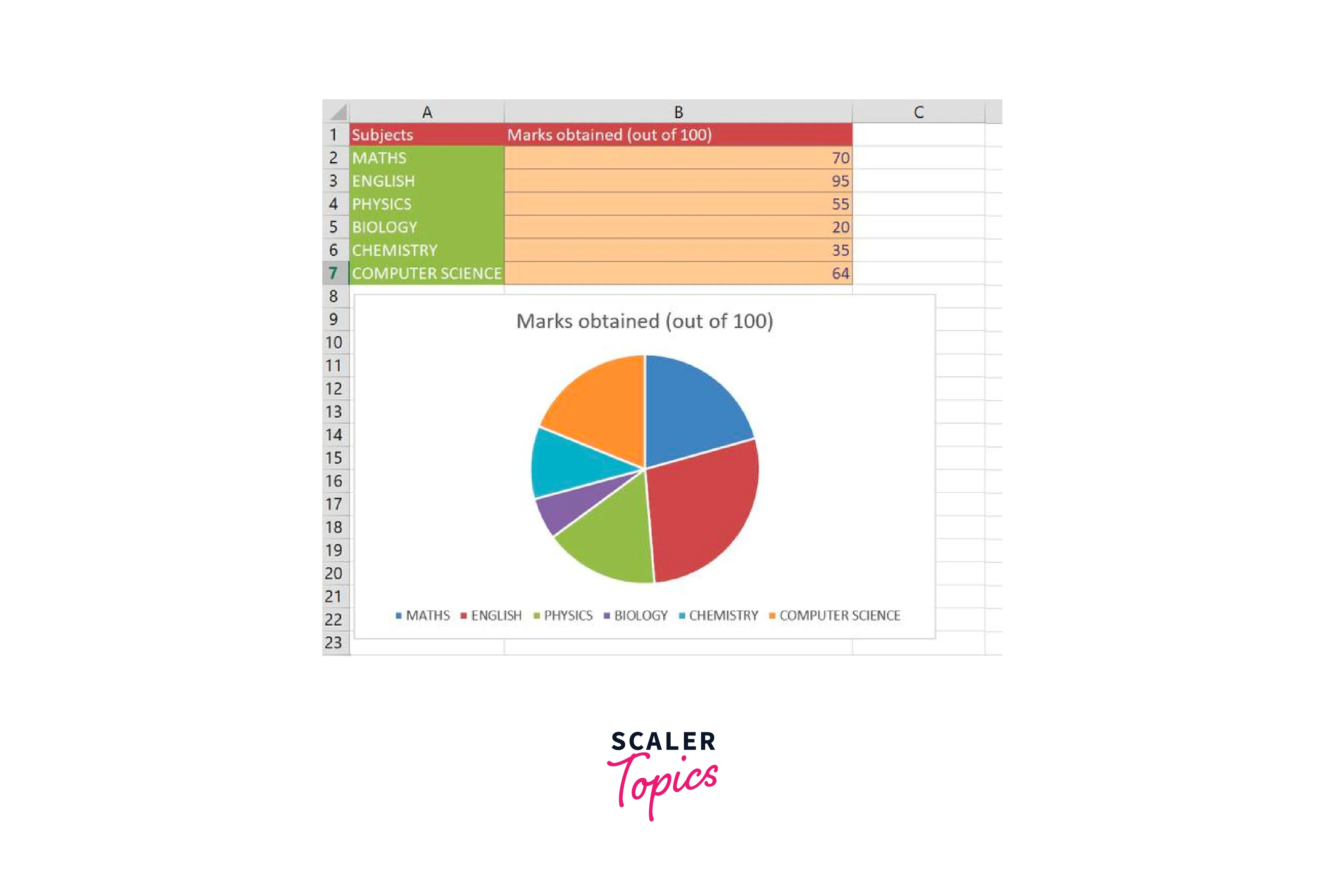
3. Pie Chart
- Description:
A pie chart represents data as slices of a circle, with each slice representing a different category or proportion. The size of each slice corresponds to the proportionate value it represents.
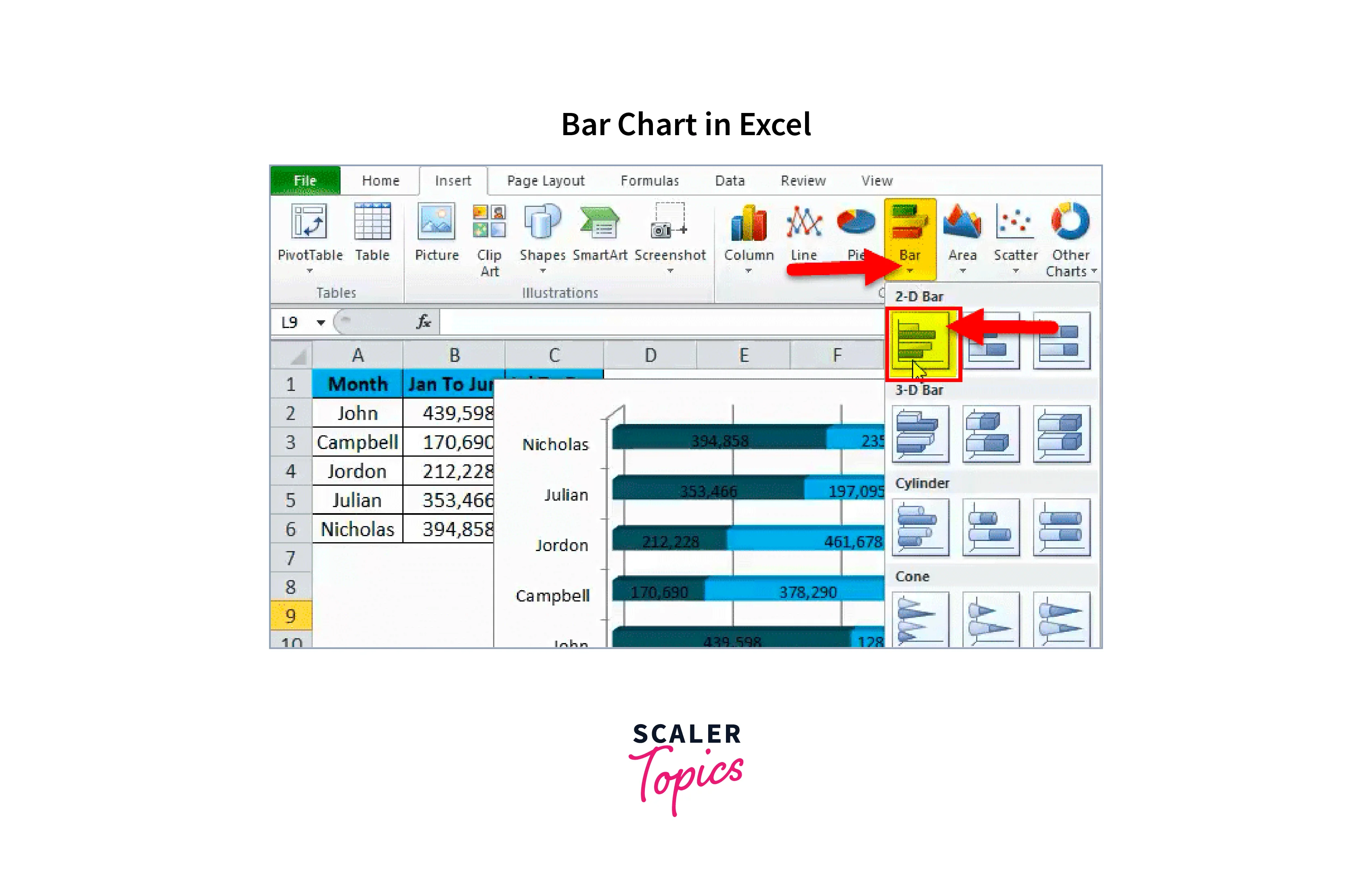
4. Bar Chart
- Description:
Similar to a column chart, a bar chart displays data using horizontal bars. The length of each bar represents the value being plotted. Bar charts are particularly effective when labels or category names are long.
5. Scatter Plot
- Description:
A scatter plot uses dots to represent individual data points. Each point represents the value of two variables, with one variable plotted on the x-axis and the other on the y-axis. - Use Cases:
Scatter plots are ideal for visualizing the relationship between two variables and identifying patterns, trends, or correlations. They are commonly used in scientific research, analyzing experimental data, or studying the relationship between variables.
6. Area Chart
- Description:
An area chart displays data as filled areas bounded by lines. It is similar to a line chart, but the space below the lines is filled with colors, emphasizing the cumulative total or proportion over time.
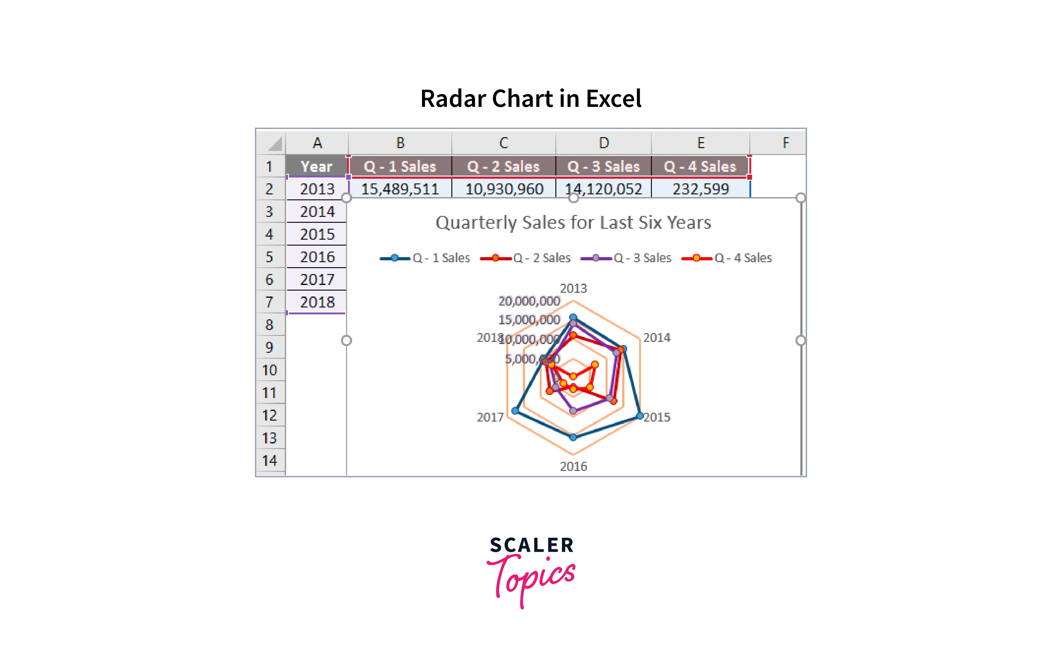
7. Radar Chart:
- Description:
A radar chart displays data on multiple axes radiating from the center. Each axis represents a different variable, and the data is plotted as points connected by lines. The shape formed by these lines provides insights into the data.
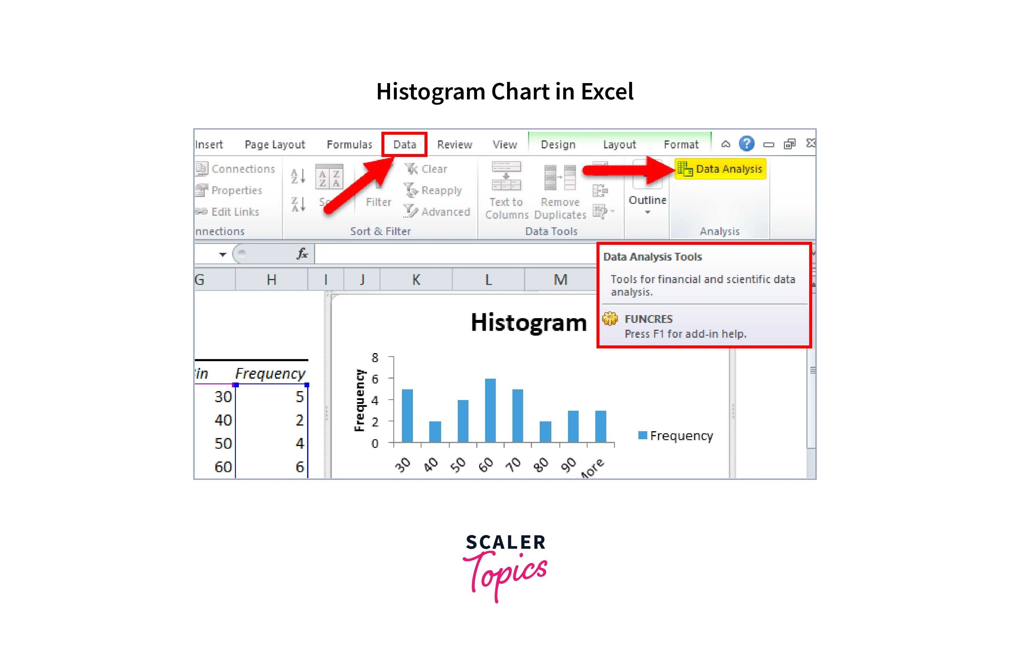
8. Histogram:
- Description:
A histogram represents the distribution of numerical data by dividing it into bins or intervals. The height of each bar represents the frequency or count of data points falling within that bin. - Use Cases:
Histograms are used to analyze data distribution, identify patterns or outliers, and understand the frequency or probability of certain events occurring. They are commonly used in statistical analysis, quality control, or data mining.
Waterfall Chart
- Description:
A waterfall chart illustrates the cumulative effect of positive and negative values on a starting value. It shows how each value contributes to the final total and visually depicts the increases and decreases in the data.
How to Insert a Chart?
Here is a detailed step-by-step guide on how to insert a chart in Excel:
- Open Excel:
Launch Microsoft Excel on your computer and open the workbook where you want to insert the chart. Ensure that you have the data ready for charting. - Select Data:
Select the range of data that you want to include in the chart. Make sure to include the column or row labels as well. You can click and drag over the data to select it. - Go to the "Insert" Tab:
In the Excel menu, navigate to the "Insert" tab located at the top of the screen. This tab contains various options for inserting objects, including charts. - Choose Chart Type:
In the "Charts" group, you will see different chart types available. Click on the chart type that best suits your data. Excel provides a gallery of recommended chart types, or you can click on the "Insert Chart" button to see more options. - Insert the Chart:
After selecting the chart type, click on it, and Excel will insert a blank chart into your worksheet. - Customize Chart:
With the chart selected, you can now customize its appearance and layout. Excel provides several design and formatting options to modify the chart elements, such as titles, labels, axes, colors, and data series formatting. Right-click on specific chart elements or use the Chart Tools tabs in the Excel menu to access these customization options. - Add Data Labels or Trendlines (Optional):
If desired, you can add data labels to display the values associated with each data point or trendlines to show the trend or regression line in the chart. Select the chart, go to the "Chart Elements" button (represented by a plus icon) that appears when you hover over the chart, and check the desired elements to add to your chart. - Move or Resize the Chart:
Click and drag the chart to reposition it within the worksheet. To resize the chart, click on any edge or corner of the chart and drag it to the desired size. - Save the Chart:
After inserting and customizing the chart, remember to save your Excel workbook to retain the changes made to the chart.
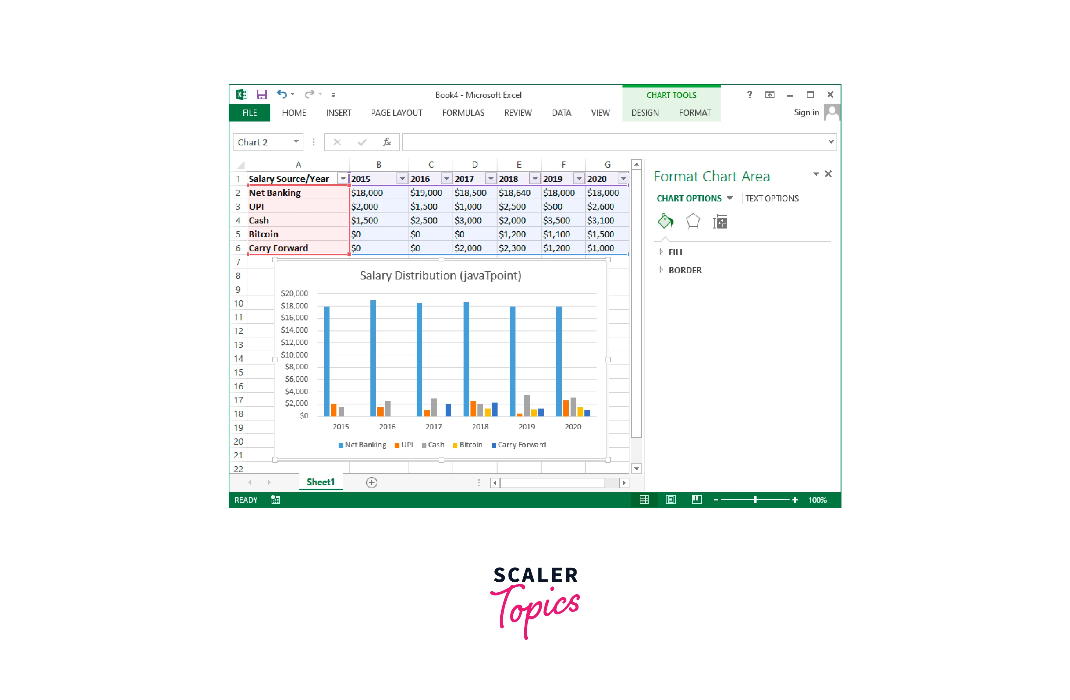
Chart and Layout Style
Here are detailed explanations of chart and layout styles in Excel:
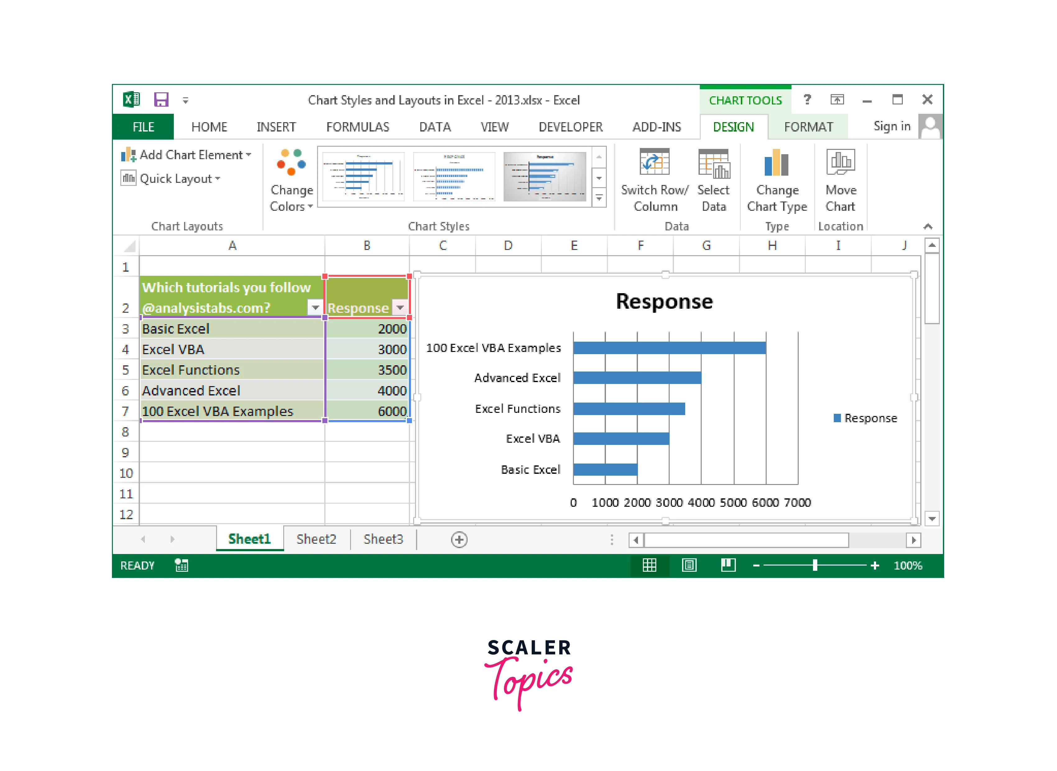
Chart Styles:
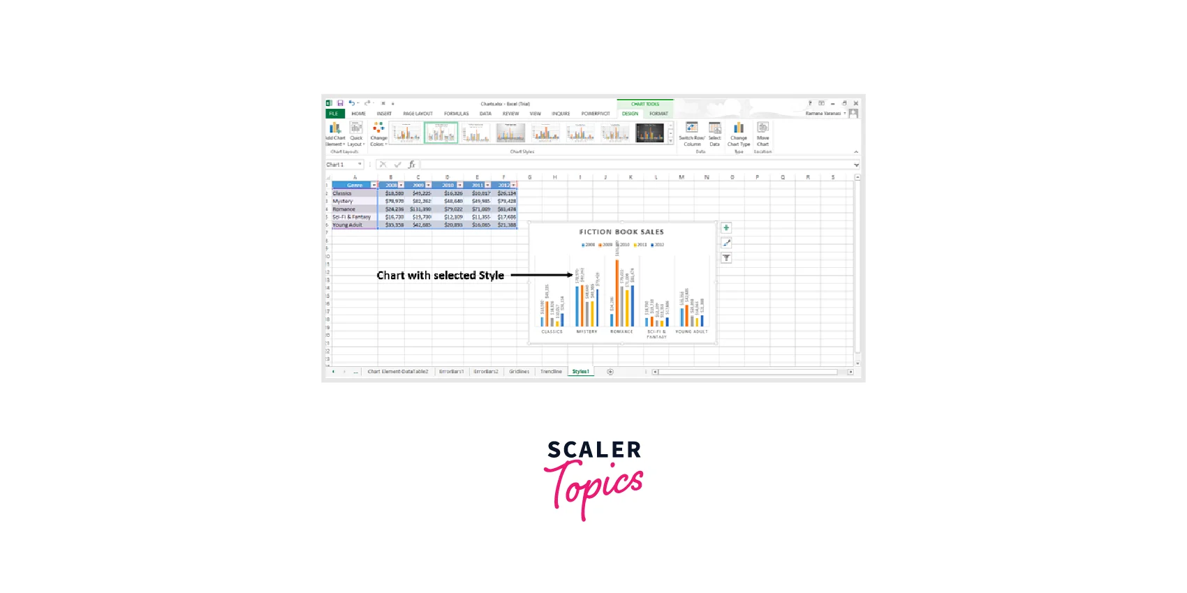
- Chart Styles Gallery:
Excel provides a range of pre-defined chart styles in the "Chart Styles" gallery. You can access this gallery by selecting the chart and then clicking the "Chart Styles" button in the Chart Tools Design tab. It offers different combinations of colors, fonts, and effects to quickly change the appearance of your chart. - Color Schemes:
Within the Chart Styles gallery, you can choose different color schemes to apply to your chart. These color schemes harmonize the colors used in the chart elements, such as data bars, backgrounds, axes, and data labels. Excel provides various built-in color schemes, or you can create custom color schemes to match your preferences or your organization's branding.
Layout Styles:
- Chart Titles:
Excel allows you to add and format titles for your chart. You can customize the font, size, color, and alignment of the chart title. - Axes Labels:
Axes labels are used to describe the scales and categories on the chart axes. You can add and format labels for the x-axis (horizontal) and y-axis (vertical) in a chart. - Data Labels:
Data labels provide information about individual data points within the chart. You can add and format data labels to display the values, percentages, or other relevant information associated with each data point. - Legends:
Legends help identify the different data series or categories represented in the chart. You can add a legend to your chart and customize its position, font, and layout.
Other Chart Options
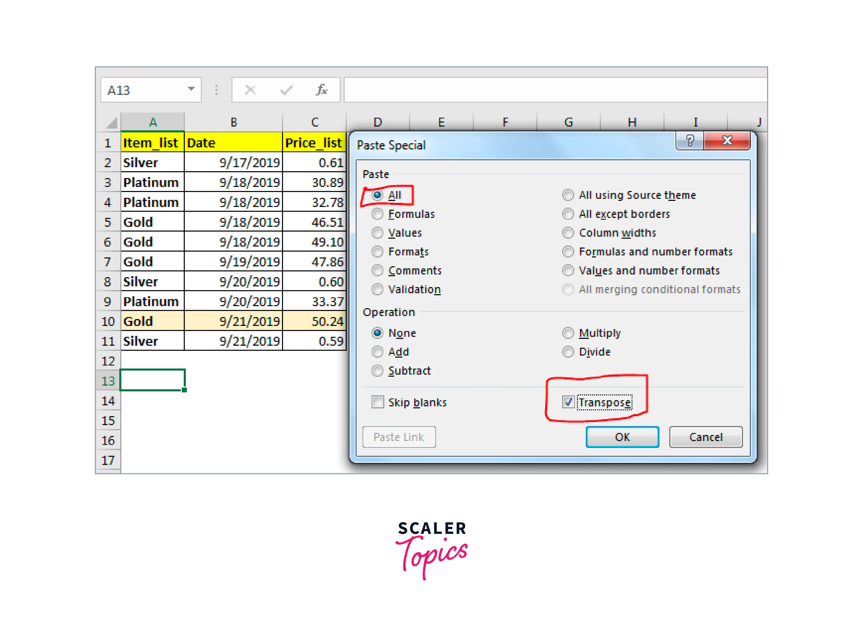
1. Switch Row and Column Data in Excel
To switch row and column data in Excel and other chart options, you can follow these steps:
- Select the Chart:
Click on the chart you want to modify to activate it. This will display the Chart Tools tabs in the Excel menu. - Go to the "Design" Tab:
In the Chart Tools Design tab, locate the "Data" group. You will find various options related to data manipulation and chart formatting. - Click on "Switch Row/Column":
In the Data group, you will see a button labeled "Switch Row/Column". Click on this button to switch the data orientation from rows to columns or vice versa. - Observe the Changes:
After clicking the "Switch Row/Column" button, Excel will immediately update the chart with the switched data orientation. The data series that was originally displayed as rows will now be displayed as columns and vice versa. - Adjust Chart Formatting (if necessary):
Depending on the specific chart type and data, you may need to adjust the chart formatting to ensure it accurately represents the switched data. For example, you may need to update axis labels, legends, data labels, or other chart elements to reflect the new data arrangement. - Save and Update Chart:
Once you are satisfied with the switched row/column data and the chart formatting, save your Excel workbook to retain the changes.
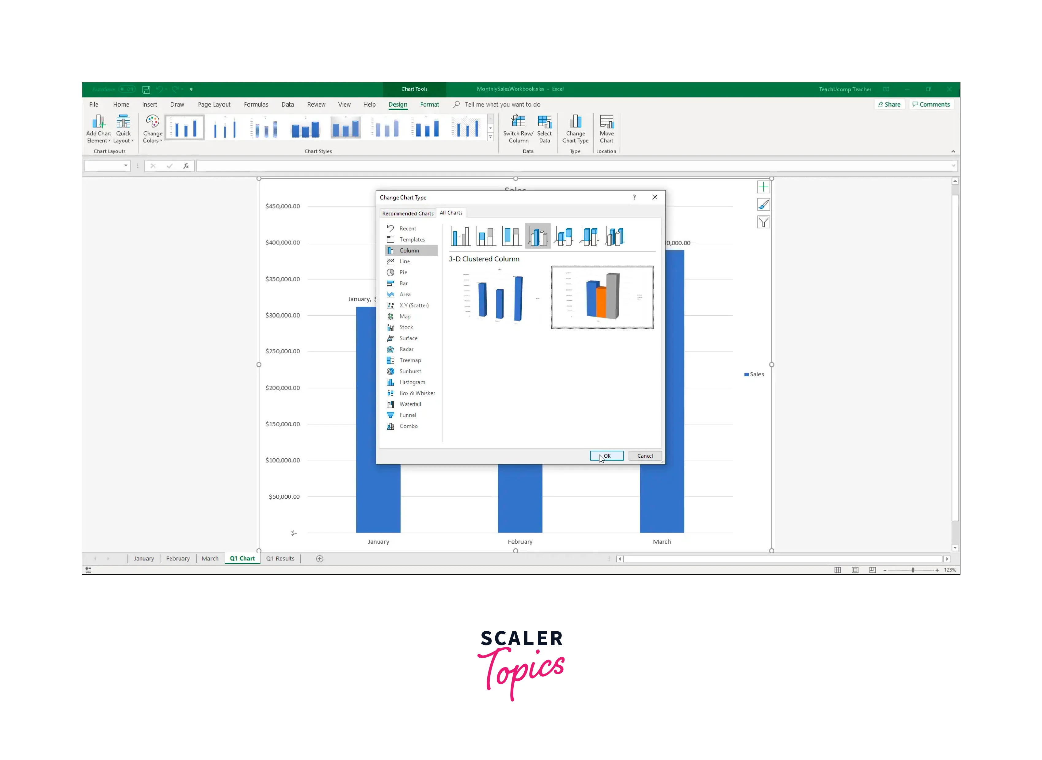
2. To Change the Chart Type
To change the chart type and explore other chart options in Excel, follow these steps:
- Select the Chart:
Click on the chart you want to modify. This will activate the "Chart Tools" tabs in the Excel menu. - Go to the "Design" Tab:
In the "Chart Tools" section, navigate to the "Design" tab located at the top of the screen. This tab provides various options for chart customization. - Click on "Change Chart Type":
In the "Type" group of the "Design" tab, click on the "Change Chart Type" button. A dialog box will appear, displaying a gallery of available chart types. - Explore Chart Types:
In the "Change Chart Type" dialog box, you will see a list of chart types on the left side and a preview on the right side. Scroll through the chart types to explore different options. Excel provides various chart categories such as Column, Line, Pie, Bar, Area, Scatter, and more. - Select a New Chart Type:
Click on the chart type you want to use. The selected chart type will be highlighted, and you will see a description of the chart type along with its preview on the right side of the dialog box. - Customize Chart Subtype and Options:
Depending on the selected chart type, you may have different subtypes or additional options available. Use the options provided in the dialog box to further customize the chart's appearance and behavior. For example, you can choose stacked or clustered column charts, 2D or 3D chart effects, or adjust axis settings. - Click "OK":
Once you have chosen the desired chart type and made any necessary adjustments, click the "OK" button in the "Change Chart Type" dialog box. - Review the Updated Chart:
Excel will update the chart with the newly selected chart type.
3. Keeping Charts Up to Date
Apart from the common chart styles and layout options, Excel offers additional features to keep your charts up to date and enhance their functionality. Here are some other chart options in Excel:
- Data Labels and Data Tables:
Excel allows you to add data labels and data tables to your charts, providing additional information and context. Data labels display the values or percentages directly on the data points, while data tables show the actual data values in a tabular format within the chart area. - Chart Filters:
Chart filters enable you to dynamically control the data displayed in your chart. By using chart filters, you can easily focus on specific categories, series, or periods without modifying the underlying data. Excel provides options to filter data based on values, dates, or even custom criteria. - Chart Titles and Axis Titles:
In addition to the chart title, you can add titles to the x-axis and y-axis. Axis titles provide more clarity and context to the chart's axes, making it easier for viewers to understand the data represented.
Conclusion
- Charts provide a visual representation of data, making it easier to understand patterns, trends, and relationships within the data set.
- Charts are an effective way to communicate complex information and findings to a wider audience. They convey information quickly and clearly, enabling stakeholders to grasp the key insights at a glance.
- Charts allow for easy comparison of data across categories, periods, or data series. This facilitates data analysis and helps identify trends, outliers, or significant variations.