How to Create a Report in Excel?
Overview
Generating reports in Excel is a common task for businesses and individuals alike. Excel is a powerful spreadsheet program that can be used to store and manipulate data, and it also has features that allow users to generate professional-looking reports quickly and easily. To generate a report in Excel, you first need to organize your data into a table. This table should have column headings and rows of data. Once your data is organized, you can use Excel's built-in features to generate charts, tables, and other visualizations that will help you understand your data better.Conditional formatting is another useful feature for generating reports in Excel. This feature allows you to highlight certain data based on specific conditions.
How to make reports in Excel?
Excel for reporting is a powerful tool for creating reports, and there are several steps you can follow to create a professional-looking report in Excel:
- Determine the purpose of the report: Before you start creating your report, it is important to determine the purpose and scope of the report. This will help you to identify the data you need to include and the format that will be most effective in presenting your findings.
- Gather your data: Once you have identified the purpose of your report, you will need to gather the data you need to include. This may involve importing data from other sources or manually entering data into Excel.
- Organize your data: Once you have gathered your data, you will need to organize it in a way that is easy to understand and visually appealing. This may involve grouping data into categories, creating tables, or using pivot tables to summarize data.
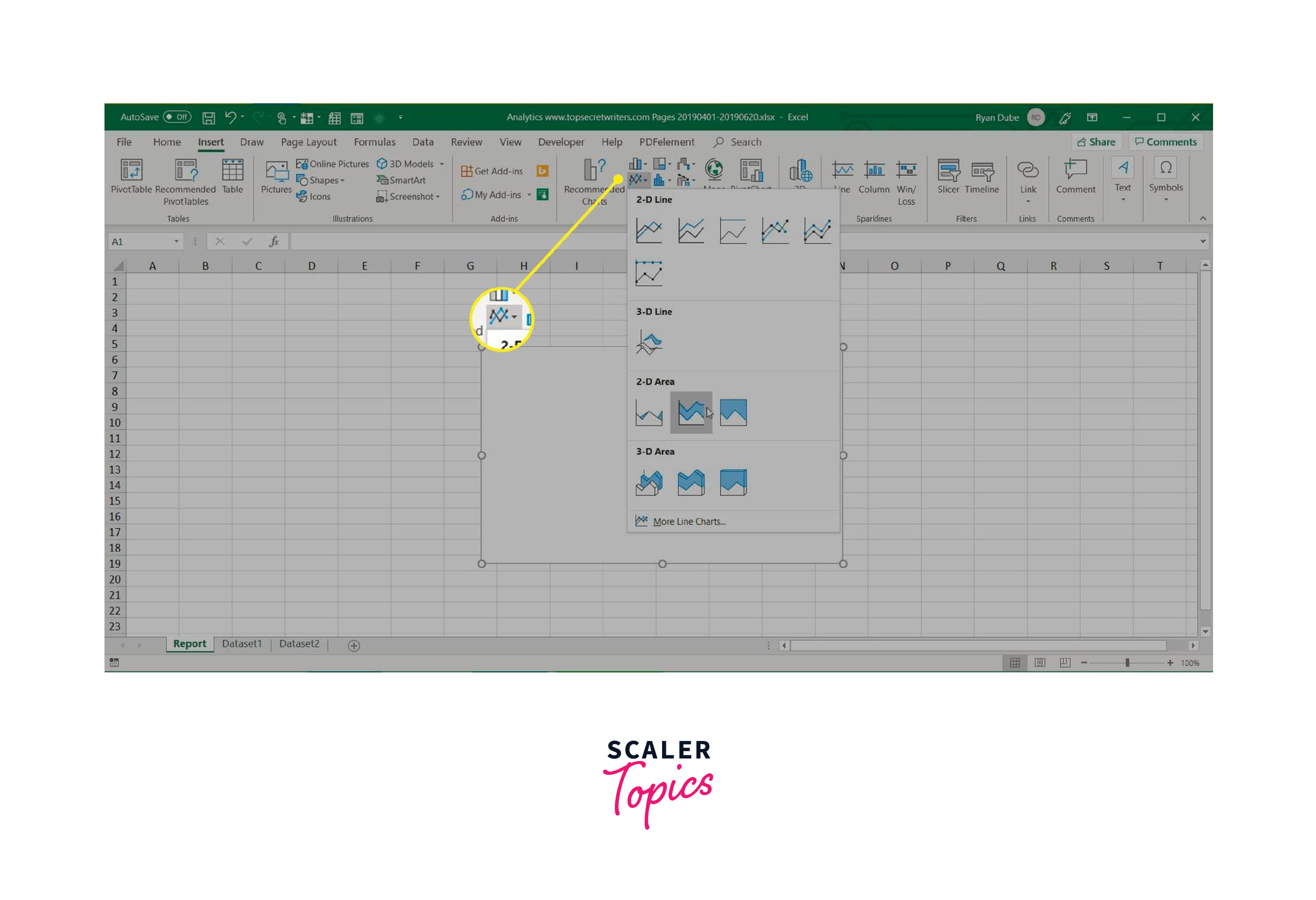
Let us see an image for better understanding:
Now let us see an use case as an example to create a report in excel:
Use Case: Sales Report for a Company
Let's say you work for a company that sells products and you are responsible for creating a sales report for the past quarter (January to March). The report should include data on the company's total revenue, number of units sold, and average selling price for each product category.
Here are the steps you could follow to create this report in Excel:
Step 1: Collect the Data Gather the necessary data from different sources, such as the company's sales database, financial reports, and any other relevant sources.
Step 2: Create a New Workbook Open a new Excel workbook and name it "Sales Report Q1 2023".
Step 3: Enter the Data Enter the collected data into the appropriate cells of the workbook.
Step 4: Create Tables Create tables for the different product categories, which will include the total revenue, number of units sold, and average selling price for each category.
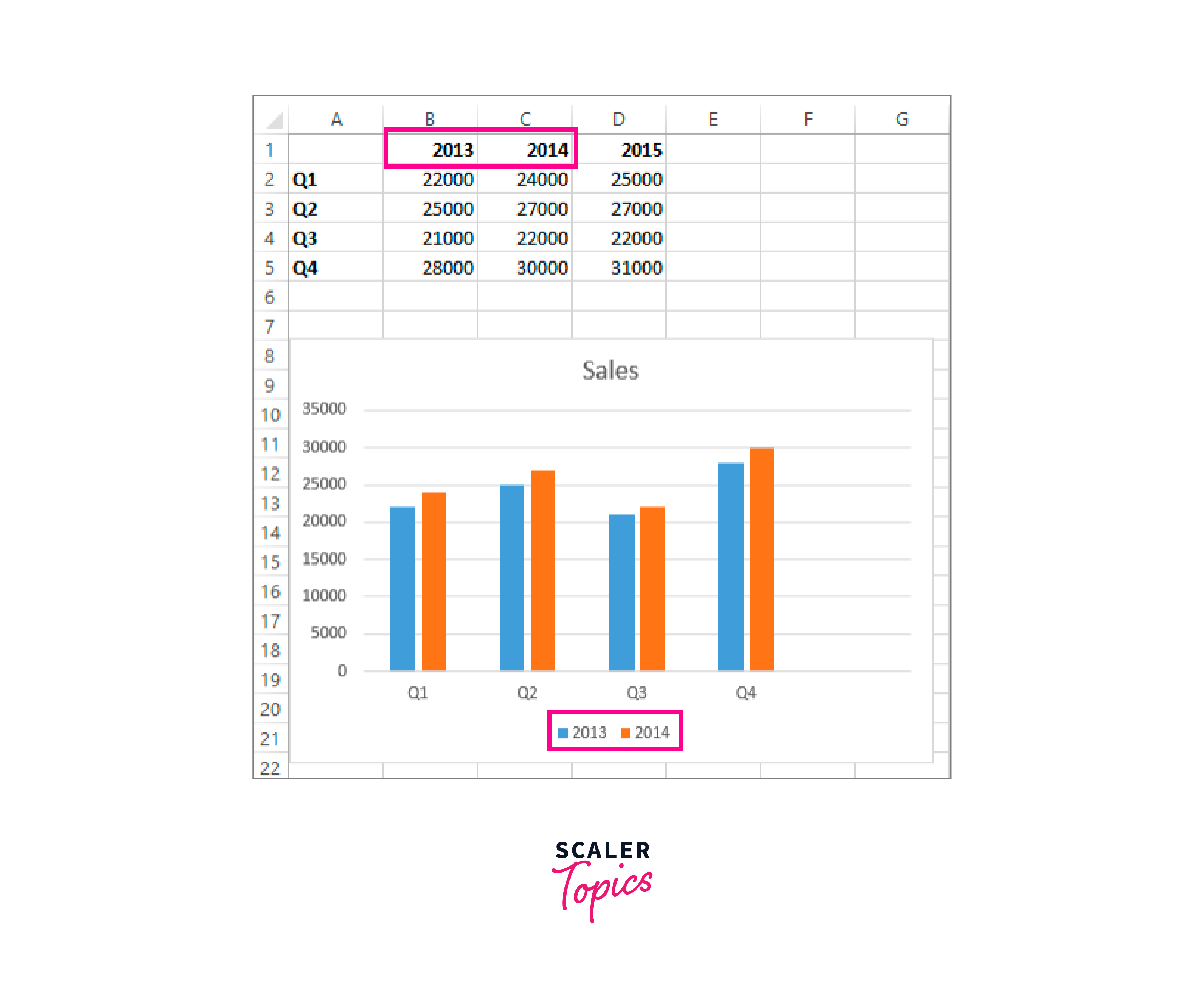
Step 5: Create Charts Create charts to visually represent the data. For example, a bar chart for the total revenue and number of units sold, and a line chart for the average selling price.
Step 6: Format the Workbook Format the workbook to make it visually appealing and easy to read. This may include changing font sizes, colors, and adding borders.
Step 7: Add a Summary Add a summary of the findings and recommendations based on the data.
Step 8: Save and Share Save the workbook and share it with the relevant stakeholders, such as the sales team and senior management.
Display data in charts
Charts are visual representations of data that can help users to quickly identify patterns and trends, and make informed decisions based on the information presented.
Excel for reporting provides a wide range of chart types, including bar charts, line charts, pie charts, and scatter charts, among others. Users can choose from different chart styles, colors, and formatting options to customize the appearance of their charts.
To create a chart in Excel for reporting, users simply need to select the data they want to include in the chart and choose the chart type they want to use. Excel will automatically generate a chart based on the selected data, which can be further customized by adjusting the chart's formatting, layout, and data labels.
Let us see an example to display data in charts:
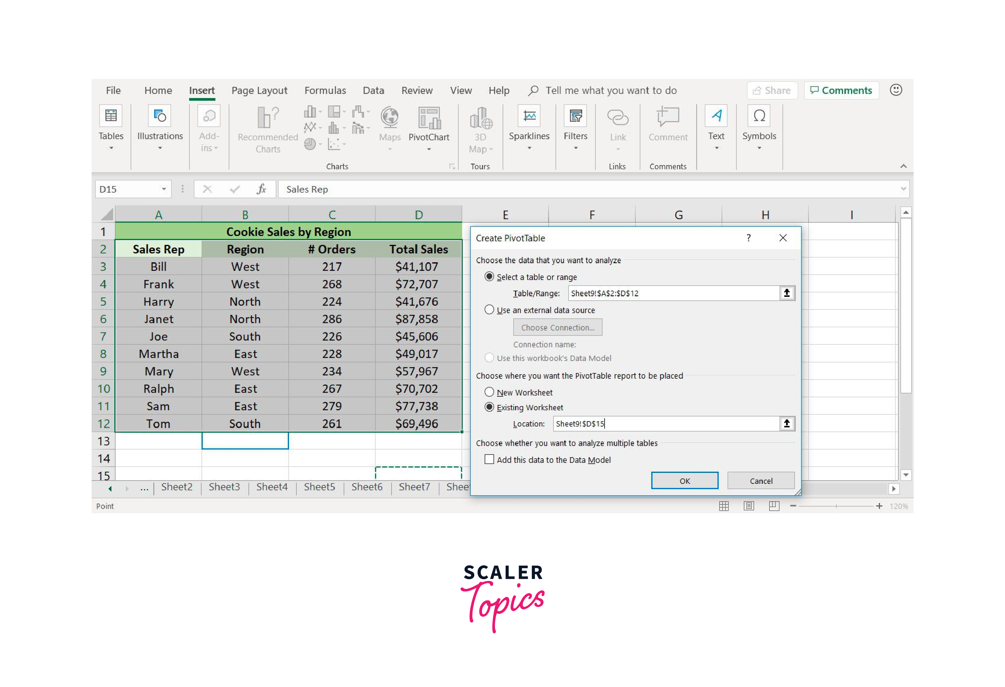
Create a Pivot Table to Organize Data
Pivot tables are a powerful tool in Excel for reporting that allows users to organize, summarize and analyze large amounts of data. A pivot table is a table that summarizes data from another table or range of cells, and presents the data in a more condensed format. Pivot tables are useful for analyzing data, generating reports, and identifying trends and patterns in data.
Here are the steps to create a pivot table in Excel:
- Select the data you want to use for your pivot table. This data should be organized in columns and rows with headings for each column.
- Click on the "Insert" tab in the Excel ribbon, and then click on "PivotTable" in the "Tables" group.
- In the "Create PivotTable" dialog box, select the range of data you want to use for your pivot table. You can choose to create a pivot table in a new worksheet or in an existing one.
- In the "PivotTable Fields" pane, drag and drop the fields you want to use for your pivot table into the "Rows" and "Columns" sections. You can also drag and drop fields into the "Values" section to calculate summaries of your data.
- Customize your pivot table by adjusting the column widths, formatting the table, and adding filters and slicers to refine the data displayed.
- Refresh your pivot table to update it with any changes to the original data.
Let us see an image to create pivot table:
Separate the data types of your reports
Excel for reporting, it is important to separate the different data types to improve readability and make the information easier to understand. By separating the data types, you can make it clear to your audience which data is qualitative, quantitative, or categorical.
Here are some tips for separating the data types of your reports:
- Use headings and subheadings: Use clear headings and subheadings to separate different sections of your report. This will make it easier for your audience to follow the flow of information and find the information they are looking for.
- Use different fonts or formatting: Use different fonts, colors, or formatting to visually separate different data types. For example, you might use bold font for headings, italics for qualitative data, and a different color for categorical data.
Page headers
Page headers in Excel for reporting are used to display information at the top of each printed page in a worksheet. This can include page numbers, titles, dates, or other information that you want to display consistently across all pages of your worksheet.
Here are the steps to create a page header in Excel:
- Click on the "Insert" tab in the Excel ribbon, and then click on "Header & Footer" in the "Text" group.
- In the "Header & Footer Tools" tab that appears, click on "Header" to open the header section of the worksheet.
- Type the text you want to display in the header, such as a page title or page number. You can also use the "Insert" tab to add additional elements, such as the date or time.
- Customize the font, size, and alignment of the text using the "Home" tab in the Excel ribbon.
- Click on the "Close Header and Footer" button to close the header section and return to the worksheet.
Your page header will now be displayed at the top of each printed page in your worksheet. You can also preview the header by clicking on the "Print Preview" button in the Excel ribbon.
Format and print reports
Once you have created your report in Excel, it is important to format and print it in a way that is clear, easy to read, and visually appealing. Here are some tips for formatting and printing reports in Excel:
- Use page layout view: Excel's Page Layout view allows you to see how your report will look when printed. This view also allows you to adjust margins, page orientation, and page breaks to fit your report on the page.
- Add page numbers and headers/footers: Adding page numbers and headers/footers to your report will make it easier to navigate and identify different sections of your report.
- Use formatting tools: Excel offers a range of formatting tools that can help you to create a professional-looking report. Use font styles, colors, and sizes consistently throughout your report to make it more visually appealing and easier to read.
- Use charts and tables: Charts and tables can help to summarize and present data in a clear and concise way. Make sure to format charts and tables consistently and ensure that they are easy to read.
Other Report Options
Excel provides several other report options that can help you to create professional-looking reports and presentations. Here are some of the other report options in Excel:
- Sparklines: Sparklines are small charts that can be used to present data trends in a condensed format. They are particularly useful for showing data trends over time and can be inserted directly into a cell in Excel.
- Conditional Formatting: Conditional formatting allows you to highlight specific data values based on certain criteria. This can be useful for drawing attention to important data points or outliers in your report.
- Data Bars: Data bars are visual representations of data that are inserted into cells in Excel. They can be used to quickly see which values are highest or lowest in a range of data.
- Pivot Charts: Pivot charts are charts that are based on pivot tables. They allow you to visualize data trends and patterns in a more dynamic and interactive way than standard charts.
- Waterfall Charts: Waterfall charts are useful for presenting changes in data over time. They show the cumulative effect of positive and negative values on a starting point and can be useful for analyzing financial data.
What are Excel Reports Used for?
Excel reports are commonly used to present and analyze data in a clear and organized manner. Here are some of the most common uses of Excel reports:
- Financial Reporting: Excel reports are often used to create financial reports, such as balance sheets, income statements, and cash flow statements. These reports can help businesses to analyze their financial performance and make better-informed decisions.
- Sales Reporting: Excel reports can be used to track sales data, such as sales revenue, sales volume, and sales trends. Sales reports can help businesses to identify opportunities for growth and make adjustments to their sales strategies.
- Budget Reporting: Excel reports are often used to create and track budgets, such as project budgets, departmental budgets, and overall company budgets. These reports can help businesses to monitor spending and make adjustments to stay within budget.
Tips to Maximize Your use of Excel's Report Features
Excel for reportinf has features that can help you to create professional-looking reports and presentations that effectively communicate your data. Here are some tips to maximize your use of Excel's report features:
- Plan your report: Before you start creating your report, take the time to plan out what data you need to include, how it should be organized, and how it should be presented. This will help you to create a report that is clear and easy to understand.
- Use templates: Excel offers a range of report templates that can help you to get started quickly. These templates can be customized to suit your needs and can save you time when creating your report.
FAQ
Q. How to create an expense report in Excel?
A. To create an expense report in Excel, you can use a pre-designed template or create your own. Enter your expenses, organize them by category, and use formulas to calculate totals. Finally, format the report and print it out for submission.
Q. How to create a scenario summary report in Excel?
A. To create a scenario summary report in Excel, go to the "Data" tab, select "What-If Analysis," and then select "Scenario Manager." From there, you can create, edit, and view different scenarios and generate a summary report that compares them.
Q. How to create automated reports in excel?
A. To create automated reports in Excel, you can use tools such as macros, pivot tables, and Power Query to automate data retrieval, formatting, and analysis. You can also schedule reports to run automatically using Excel's built-in task scheduler or third-party add-ins.
Conclusion
- Excel is a powerful tool for generating reports that can help you to analyze and present data in a clear and organized manner.
- Pivot tables, charts and graphs, conditional formatting, data validation, and formulas are all features of Excel that can help you to create effective reports.
- Planning your report, using templates, and separating the data types can help you to create a report that is clear, concise, and easy to understand.
- Formatting and printing your report, as well as exploring other report options such as adding images and using external data, can enhance the overall look and functionality of your report.