Exploratory Data Analysis in Excel
Overview
Exploratory Data Analysis (EDA) is a crucial step in the data analysis process, and Excel is a widely used tool for conducting EDA due to its flexibility and ease of use. Excel provides various features and functions that enable analysts to visually and statistically explore and summarize data. In EDA, analysts can use Excel to import and clean data, visualize data using charts and graphs, calculate basic summary statistics, identify patterns and trends, and detect outliers. Excel also allows for filtering and sorting data, creating pivot tables for multidimensional analysis, and using conditional formatting to highlight important information.
What are We Building?
Welcome to the world of data analysis! In today's fast-paced digital age, data is abundant and is generated at an unprecedented rate. Extracting valuable insights from data has become a crucial skill for businesses, researchers, and individuals alike. One powerful tool for analyzing data in Microsoft Excel, a widely used spreadsheet software that offers powerful data analysis capabilities.
Exploratory Data Analysis (EDA) is a critical first step in the data analysis process. It involves examining and understanding data to identify patterns, trends, and relationships that can provide meaningful insights. EDA helps in gaining a deeper understanding of the data and informing subsequent data analysis steps.
In this article, we will explore the fundamentals of Exploratory Data Analysis in Excel. We will discuss various techniques and tools available in Excel for visualizing and summarizing data, as well as techniques for cleaning and preparing data for analysis. Whether you are a beginner or an experienced data analyst, this article will provide you with valuable insights and practical guidance on how to perform effectively Exploratory Data Analysis using Excel. So, let's dive into the world of data exploration and uncover the hidden gems within your data!
Pre-requisites
i. What is EDA?
Exploratory Data Analysis (EDA) is a process of examining and analyzing data to understand its characteristics, patterns, and relationships. It involves visually exploring the data, summarizing its main features, and identifying potential trends, outliers, and anomalies. EDA is typically performed as an initial step in the data analysis process, before applying more advanced statistical techniques or building predictive models.
EDA aims to gain insights and generate hypotheses about the data, and it helps in formulating questions and hypotheses to be tested in subsequent analyses. By examining the data closely, EDA can reveal patterns, correlations, and trends that may not be apparent at first glance. It also helps in identifying data quality issues, missing values, and outliers that may impact the validity of subsequent analyses.
ii. Pivot Table
A pivot table is a powerful data analysis tool in Microsoft Excel that allows users to summarize, analyze, and manipulate large amounts of data in a tabular format. It enables users to transform raw data into meaningful insights by organizing and aggregating data based on various criteria such as columns, rows, values, and filters.
With a pivot table, users can quickly create dynamic and interactive summaries of data without needing to write complex formulas or perform manual calculations. Pivot tables are especially useful for analyzing data with multiple dimensions or variables, such as sales data, financial data, customer data, and more.
iii. Dashboards in Excel
Dashboards in Excel are powerful visual representations of data that provide a snapshot of key metrics and performance indicators. They are typically created using charts, graphs, and other visual elements to convey complex data in a concise and easy-to-understand format. Excel dashboards are widely used in businesses, organizations, and personal projects to track progress, monitor performance, and make data-driven decisions.
Excel dashboards allow users to gather, analyze, and present data from various sources in a visually appealing and interactive manner. They provide a bird's-eye view of data, allowing users to quickly grasp trends, patterns, and insights without having to sift through extensive spreadsheets or raw data.
Dashboards in Excel can be customized to suit specific needs and can include a wide range of visual elements such as bar charts, line charts, pie charts, gauges, heat maps, and more. They can also incorporate interactive features such as drop-down menus, slicers, and buttons to filter and manipulate data in real-time, providing dynamic and interactive data analysis experiences.
How Are We Going to Build This?
Building an Exploratory Data Analysis (EDA) project in Excel typically involves the following steps:
- Data Collection : Gather the relevant data that you want to analyze in Excel. This data can come from various sources, such as spreadsheets, databases, or external data files. Import the data into Excel and organize it in a structured format, such as a table, for easy analysis.
- Data Cleaning : Clean the data by identifying and handling any missing, inconsistent, or erroneous data. This may involve removing duplicates, filling in missing values, correcting data entry errors, and standardizing data formats.
- Data Exploration : Use Excel's built-in data analysis tools, such as filters, pivot tables, and charts, to explore the data visually and gain insights. Generate descriptive statistics, such as mean, median, mode, and standard deviation, to summarize the data and identify trends, patterns, and outliers.
- Data Visualization : Create visually appealing and informative charts and graphs in Excel to visually represent the data. Use various chart types, such as bar charts, line charts, scatter plots, and heatmaps, to display different types of data and relationships between variables.
- Hypothesis Testing : Use Excel's statistical functions and tools, such as t-tests, ANOVA, and regression analysis, to test hypotheses and make data-driven decisions. Analyze the data to identify significant relationships, correlations, and trends.
- Data Interpretation : Interpret the results of your analysis and draw meaningful conclusions from the data. Summarize your findings and insights clearly and concisely, using charts, tables, and written explanations.
- Reporting : Create a comprehensive report or presentation in Excel to communicate your findings and insights to stakeholders. Use Excel's formatting, styling, and visualization features to create professional-looking reports that effectively convey the results of your EDA.
- Documentation : Document your entire EDA process, including the data collection, cleaning, exploration, visualization, hypothesis testing, interpretation, and reporting steps. This documentation will help you reproduce your analysis in the future and enable others to understand and replicate your findings.
Final Output
Requirements
Some potential requirements for an EDA project in Excel may include:
- Microsoft Excel : A version of Microsoft Excel software, such as Microsoft Office, installed on the computer to perform data analysis, visualization, and reporting tasks.
- Data : Relevant and cleaned data that is organized in a structured format, such as a table, in Excel. This data can come from various sources, such as spreadsheets, databases, or external data files, and should be imported into Excel.
- Data Cleaning Tools : Excel's built-in data cleanings tools, such as filters, sorting, and data validation, may be utilized to clean and preprocess the data, including handling missing values, correcting data entry errors, and standardizing data formats.
- Data Analysis Tools : Excel provides various data analysis tools, such as pivot tables, charts, and statistical functions, that can be used to explore and analyze data. These tools can help generate descriptive statistics, perform calculations, and visualize data relationships.
- Visualization Tools : Excel's charting and graphing features can be used to create visualizations, such as bar charts, line charts, scatter plots, and heatmaps, to represent the data visually and identify patterns, trends, and outliers.
- Statistical Functions : Excel's built-in statistical functions, such as mean, median, mode, standard deviation, t-tests, ANOVA, regression analysis, and correlation, can be used to perform hypothesis testing, calculate statistical measures, and analyze data relationships.
- Documentation Tools : Excel's features for formatting, styling, and creating professional-looking reports or presentations can be utilized to document the EDA process, including the findings, insights, and conclusions from the analysis.
- Additional Tools : Depending on the specific requirements of the project, additional tools or resources may be needed, such as external data visualization tools, programming languages for advanced analysis, or specialized add-ins for Excel.
Exploratory Data Analysis in Excel
Exploratory Data Analysis (EDA) is a critical step in the data analysis process that involves exploring and understanding the data to uncover patterns, trends, and insights. Excel is a popular tool for performing EDA tasks due to its wide availability and built-in data analysis and visualization features. Here's a step-by-step incremental approach for conducting EDA in Excel:
Step 1: Importing Data
Start by importing the data into Excel. You can do this by opening a new Excel sheet and navigating to the "Data" tab, then selecting "Get Data" or "From Text/CSV" to import data from external files, databases, or other sources. Once the data is imported, organize it in a structured format, such as a table, for easy analysis.
Step 2: Data Cleaning and Preprocessing
Next, clean and preprocess the data to ensure it is ready for analysis. This may involve handling missing values, correcting data entry errors, standardizing data formats, and removing duplicates. Excel's built-in tools, such as filters, sorting, and data validation, can be used for these tasks.
Step 3: Descriptive Statistics
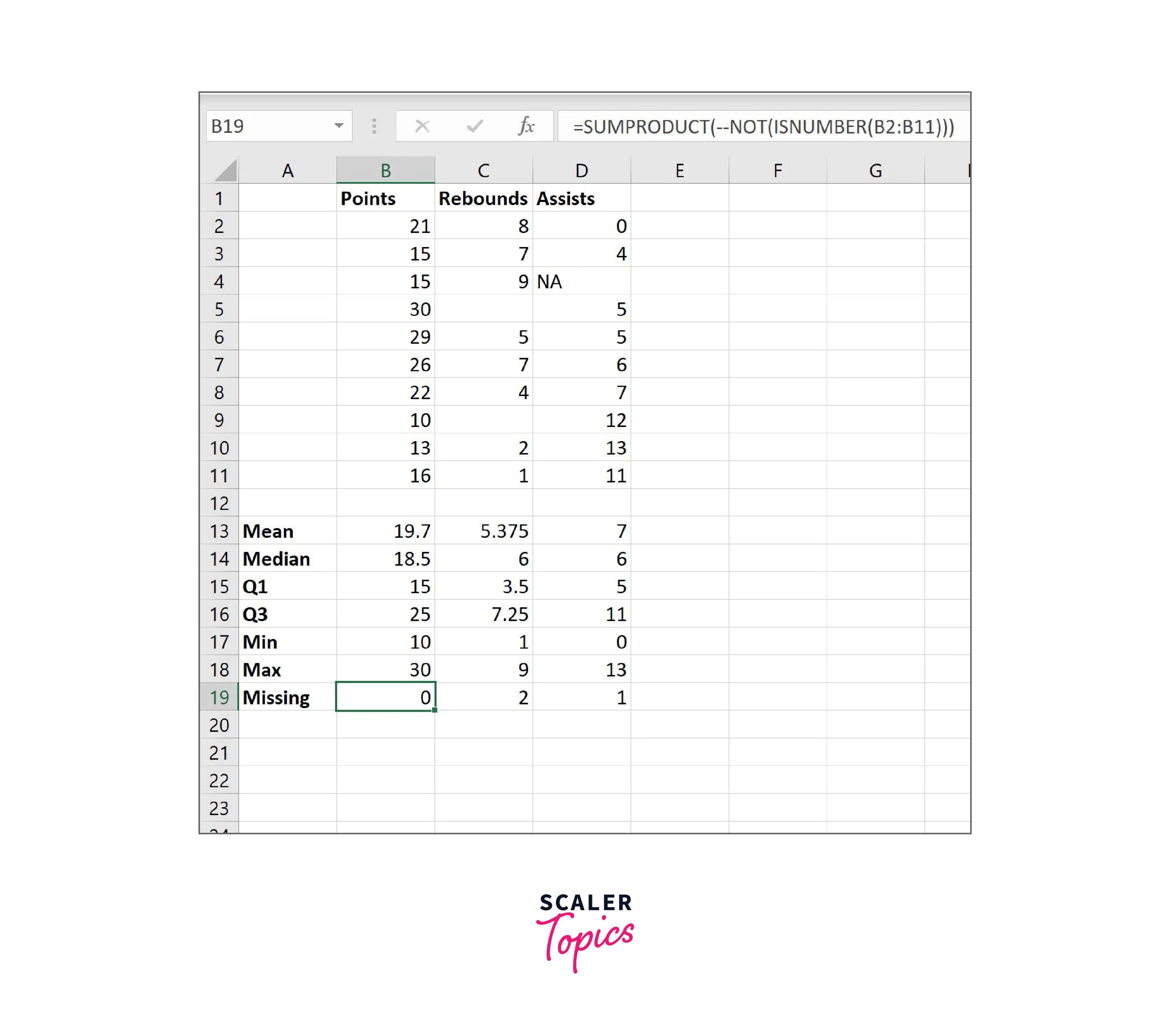
Use Excel's built-in statistical functions to generate descriptive statistics for the variables of interest. For example, you can use the "AVERAGE", "MEDIAN", "MODE", "STDEV.P", and "COUNT" functions to calculate measures of central tendency, variability, and frequency. These statistics provide a basic understanding of the data and can help identify potential outliers or unusual observations.
Step 4: Data Visualization
Create visualizations to explore the data visually and identify patterns or trends. Excel offers a wide range of chart types, such as bar charts, line charts, scatter plots, and heatmaps, which can be created using the "Insert" tab. Customize the visualizations with appropriate titles, labels, and colours to make them visually appealing and informative.
Step 5: Data Relationships
Analyze relationships between variables in the data. Excel's "PivotTable" and "PivotChart" features are powerful tools for aggregating and summarizing data, as well as exploring relationships between variables. You can use them to create pivot tables and pivot charts that provide insights into data relationships, such as grouping data by categories, calculating totals, and creating calculated fields.
Step 6: Hypothesis Testing
If applicable, perform hypothesis testing to make statistical inferences about the data. Excel's built-in statistical functions, such as t-tests, ANOVA, and regression analysis, can be used to test hypotheses and assess the significance of relationships between variables. Interpret the results carefully and draw conclusions based on statistical significance and practical relevance.
Step 7: Documentation and Reporting
Document the findings, insights, and conclusions from the EDA process. Use Excel's formatting and styling features to create professional-looking reports or presentations that effectively communicate the results. Include relevant visualizations, descriptive statistics, and interpretations to provide a comprehensive overview of the data analysis process and its outcomes.
Step 8: Iterative Analysis
EDA is often an iterative process, where you may need to revisit and refine your analysis based on new insights or feedback. Use Excel's features to update and modify visualizations, calculations, and interpretations as needed to further explore the data and refine your findings.
Data Collection and Preparation
Data Collection and Preparation are crucial steps in the Exploratory Data Analysis (EDA) process, as they involve gathering data from various sources, cleaning and preprocessing it, and transforming it into a format suitable for analysis in Excel. Here's how these steps can be performed with examples:
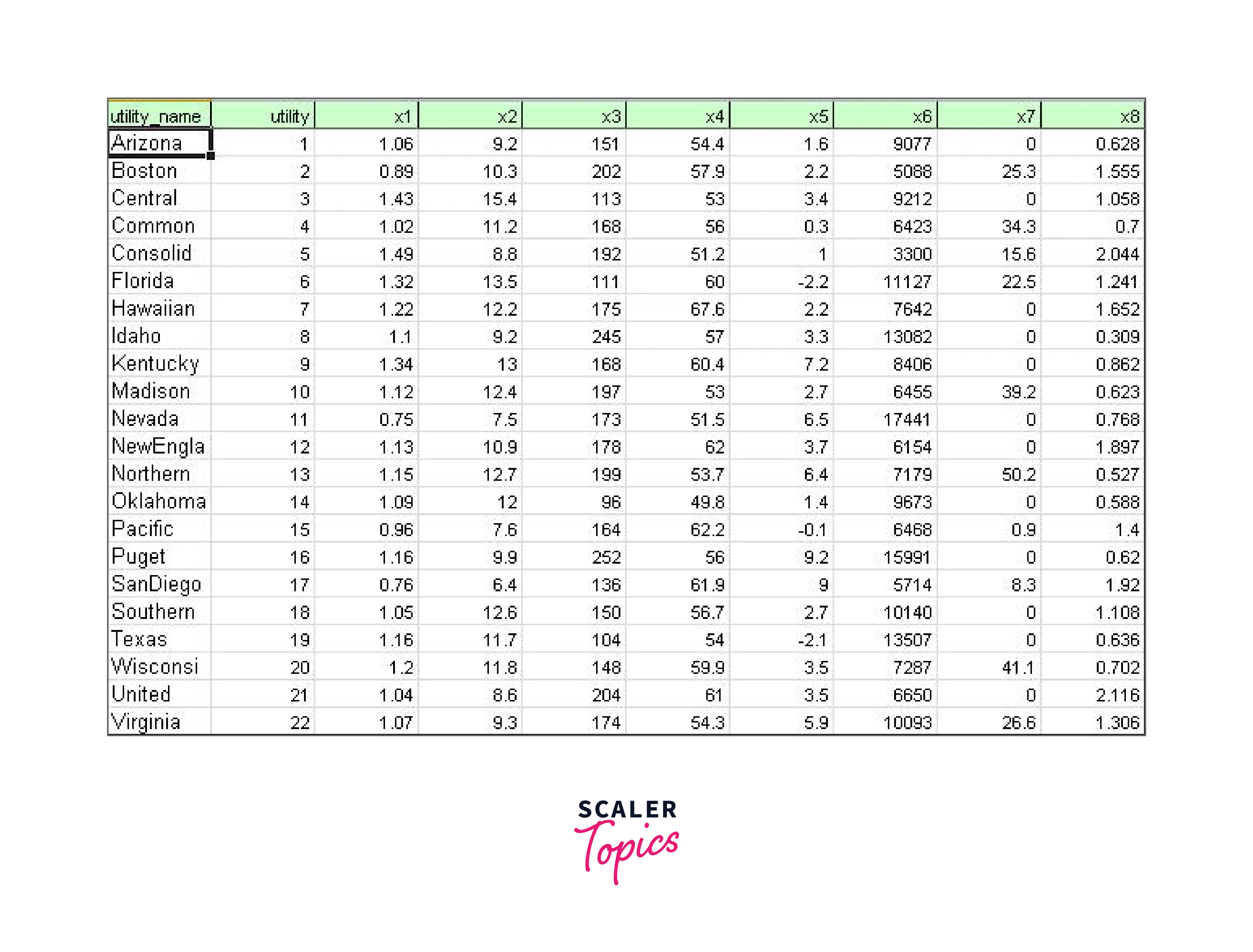
- Data Sources: The data used for EDA can come from various sources, such as databases, surveys, online repositories, or external files. For example, let's consider a dataset of sales transactions from an online store, which is stored in a CSV file.
- Data Extraction: To extract the data from the CSV file, you can use Excel's "Get Data" or "From Text/CSV" option under the "Data" tab. This will allow you to import the data into Excel and store it in a worksheet.
- Data Cleaning and Preprocessing: Once the data is imported, you may need to clean and preprocess it to ensure its quality and integrity. For example, you may need to handle missing values, correct data entry errors, and standardize data formats. Let's say the dataset has a column named "Price" that contains some missing values. You can use Excel's "Filter" or "Sort" options to identify and handle these missing values, such as by filling them with appropriate values or removing rows with missing data.
- Data Transformation: After cleaning the data, you may need to transform it into a format suitable for analysis. This may involve aggregating data, creating calculated fields, or converting data types. For example, you can use Excel's "PivotTable" feature to create a pivot table that summarizes the total sales by product category and month, or you can use Excel's "Text to Columns" feature to split a column containing combined data, such as "Name" into separate columns for "First Name" and "Last Name".
- Key Variables and Features: Identify and select the key variables and features from the data that are relevant to your analysis. These may include numerical or categorical variables that you want to explore or compare. For example, in our sales transaction dataset, the key variables may include "Product Category", "Price", "Quantity Sold", "Payment Method", "Time of Purchase", etc.
By performing data collection, extraction, cleaning, and transformation, you can prepare the data for further analysis in Excel. These steps ensure that the data is accurate, complete, and in a format suitable for EDA tasks, allowing you to gain insights and uncover patterns or trends in the data.
Ready to Dive Deeper? Explore the Practical Applications of These Concepts in Our Data Science Course and Turn Knowledge into Expertise.
Data Description
Data Description is an important step in Exploratory Data Analysis (EDA) in Excel, as it involves gaining a comprehensive understanding of the dataset's characteristics, exploring the distribution and variability of the data, and examining the relationships between different variables. Here's how you can perform data description using descriptive statistics and charts:
Overview of the Dataset:
Start by providing an overview of the dataset, including its size, structure, and general characteristics. For example, you can mention the total number of rows and columns in the dataset, the data types of each variable, and any unique identifiers or keys present. This helps in understanding the context and scope of the data analysis.
Distribution and Variability:
Analyze the distribution and variability of the data to understand its central tendency, spread, and shape. You can use Excel's descriptive statistics functions, such as "AVERAGE", "MEDIAN", "MODE", "STDEV", "VAR", etc., to calculate these measures. Additionally, you can create histograms, box plots, or density plots to visually represent the distribution of data. For example, you can create a histogram to visualize the distribution of the "Price" variable in our sales transaction dataset, which can provide insights into the price range, frequency of different price points, and any potential outliers.
Variables and Relationships:
Describe the different variables in the dataset and their relationships with each other. You can use Excel's "Data Analysis" tool or functions such as "CORREL" or "COVARIANCE" to measure the correlation or covariance between pairs of variables. Additionally, you can create scatter plots, heatmaps, or line charts to visually explore the relationships between variables. For example, you can create a scatter plot to visualize the relationship between the "Price" and "Quantity Sold" variables, which can help identify any trends, patterns, or outliers in the data.
Descriptive Statistics and Charts: Use descriptive statistics and charts to summarize and visualize the data. Excel provides a wide range of built-in functions and chart types, such as bar charts, line charts, pie charts, pivot tables, etc., that can be used for this purpose. For example, you can use a pivot table to calculate the total sales by product category and create a bar chart to visualize the sales performance of different categories. You can also use Excel's conditional formatting to highlight specific patterns or trends in the data.
Data Exploration
Data Exploration is a crucial step in Exploratory Data Analysis (EDA) in Excel, as it involves using various techniques to analyze and gain insights into the underlying structure and relationships within the data. Here's how you can perform data exploration using different exploratory techniques in Excel:
Scatter Plots:
Scatter plots are useful for visualizing the relationship between two continuous variables. You can create scatter plots in Excel by plotting the values of two variables on the x-axis and y-axis, respectively. Scatter plots can help identify any trends, patterns, or outliers in the data. For example, you can create a scatter plot to analyze the relationship between "Age" and "Income" variables in a customer dataset, which can reveal insights into the income distribution across different age groups and identify potential outliers.
Histograms:
Histograms are useful for visualizing the distribution of a single variable. You can create histograms in Excel by using the "Data Analysis" tool or by using the built-in charting functions. Histograms provide insights into the frequency and distribution of data values, helping to identify patterns and outliers. For example, you can create a histogram to analyze the distribution of the "Monthly Expenses" variable in a budgeting dataset, which can provide insights into the spending patterns and identify potential outliers or unusual spending behaviour.
Box Plots:
Box plots, also known as box-and-whisker plots, are useful for visualizing the distribution and variability of a variable. You can create box plots in Excel by using the "Data Analysis" tool or by using the built-in charting functions. Box plots provide insights into the median, quartiles, and potential outliers of the data, helping to identify the spread and skewness of the data. For example, you can create a box plot to analyze the distribution of "Temperature" variables in a weather dataset, which can reveal insights into the temperature range, variability, and potential outliers during different seasons.
Insights and Findings:
Data exploration using these techniques can lead to several insights and findings. For example, you may discover that there is a positive correlation between "Education Level" and "Income" in a job market dataset, indicating that higher education levels tend to be associated with higher incomes. You may also find that there are outliers in the "Product Price" variable in a sales dataset, indicating potential pricing anomalies or data errors. Additionally, you may uncover that the "Age" variable in a customer dataset follows a normal distribution, with the majority of customers falling within a certain age range.
Data Clustering
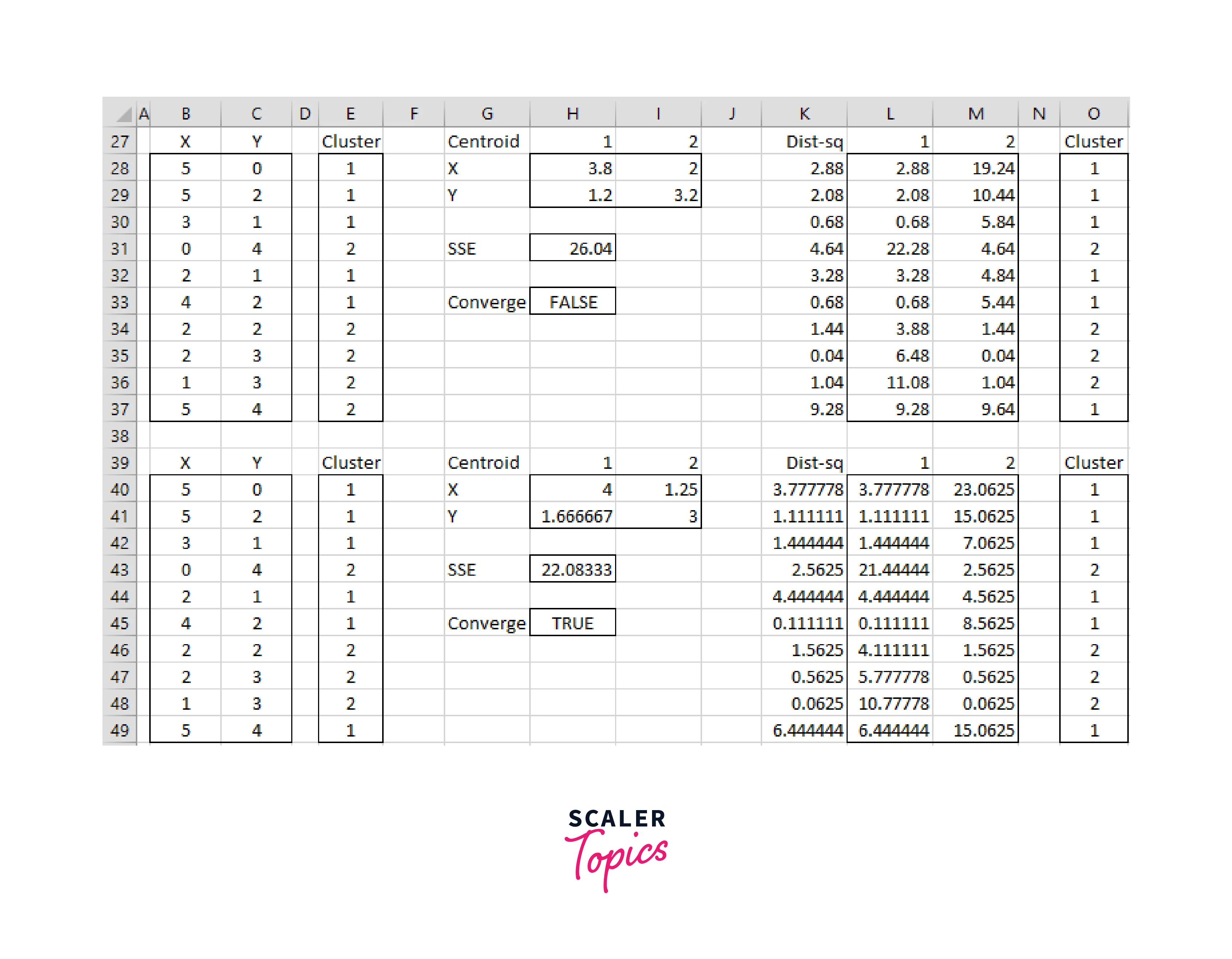
Data Clustering is a powerful technique in Exploratory Data Analysis (EDA) that involves grouping similar data points based on their similarities or dissimilarities. This technique helps identify different segments or clusters within the data set, which can provide insights into patterns and relationships that may not be immediately apparent. In Excel, you can use various techniques such as K-means clustering or hierarchical clustering to perform data clustering. Here's how you can apply data clustering in Excel:
-
K-means Clustering: K-means clustering is a popular algorithm for partitioning data points into k number of clusters. In Excel, you can use the "Data Analysis" tool or implement K-means clustering using Excel's built-in functions such as SUMPRODUCT, INDEX, and MATCH. K-means clustering requires you to specify the number of clusters (k) and an initial set of cluster centroids. The algorithm iteratively assigns data points to the nearest centroid and updates the centroids until convergence.
-
Hierarchical Clustering: Hierarchical clustering is a technique that builds a tree-like structure of clusters, also known as a dendrogram, by recursively merging or splitting clusters based on their similarities or dissimilarities. In Excel, you can use the "Data Analysis" tool or implement hierarchical clustering using Excel's built-in functions such as DMIN, DMAX, DIF, and DGET. Hierarchical clustering does not require specifying the number of clusters in advance, and you can visually interpret the dendrogram to identify different segments or clusters within the data.
-
Insights and Findings: Data clustering can reveal insights and findings that may not be immediately apparent from the raw data. For example, you may discover distinct segments or clusters of customers with similar purchasing behaviour, preferences, or demographics in a sales dataset. These segments can help inform targeted marketing strategies, product recommendations, or customer retention efforts. You may also uncover patterns or relationships between variables within each cluster, such as identifying features that are strongly associated with a particular segment. Data clustering can also help identify potential outliers or anomalies within the data, which may require further investigation.
Data Visualization
Data Visualization is a critical component of Exploratory Data Analysis (EDA) that involves the use of visual techniques to present analysis results in a clear and meaningful way. In Excel, you can create various types of charts, graphs, and visuals to enhance the presentation of your analysis. Here's how you can effectively use data visualization techniques in Excel for your EDA project:
Types of Visualization Techniques:
Excel offers a wide range of visualization techniques, including but not limited to, bar charts, line charts, scatter plots, pie charts, heat maps, and more. These techniques can be used to visually represent different types of data and relationships, such as trends, patterns, comparisons, distributions, and correlations. For example, bar charts can be used to compare data across different categories, scatter plots can show the relationship between two variables, and heat maps can display data values using colours.
Creating Charts, Graphs, and Other Visuals in Excel:
Excel provides a user-friendly interface for creating various charts, graphs, and visuals. You can access the "Charts" feature in Excel by selecting the data you want to visualize and then clicking on the "Insert" tab. From there, you can choose the desired chart type, customize its appearance, and add labels, titles, and other elements to enhance the visual presentation. Excel also allows you to create dynamic charts that update automatically as your data changes.
Examples of Visualization Techniques:
Here are some examples of how you can use different visualization techniques in Excel for your EDA project:
- Bar Chart: Use a bar chart to compare sales performance across different product categories, where the height of the bars represents the sales amount for each category.
- Scatter Plot: Use a scatter plot to visualize the relationship between the price and mileage of used cars, where each data point represents a car and its location on the plot reflects its price and mileage values.
- Heat Map: Use a heat map to represent the frequency of customer complaints by different product categories, where the intensity of colour represents the frequency of complaints.
- Line Chart: Use a line chart to show the trend of stock prices over time, where the x-axis represents the period and the y-axis represents the stock prices.
- Pie Chart: Use a pie chart to represent the proportion of different types of crimes in a crime dataset, where each slice of the pie represents the percentage of each crime type.
More Monthly Sales Report Templates
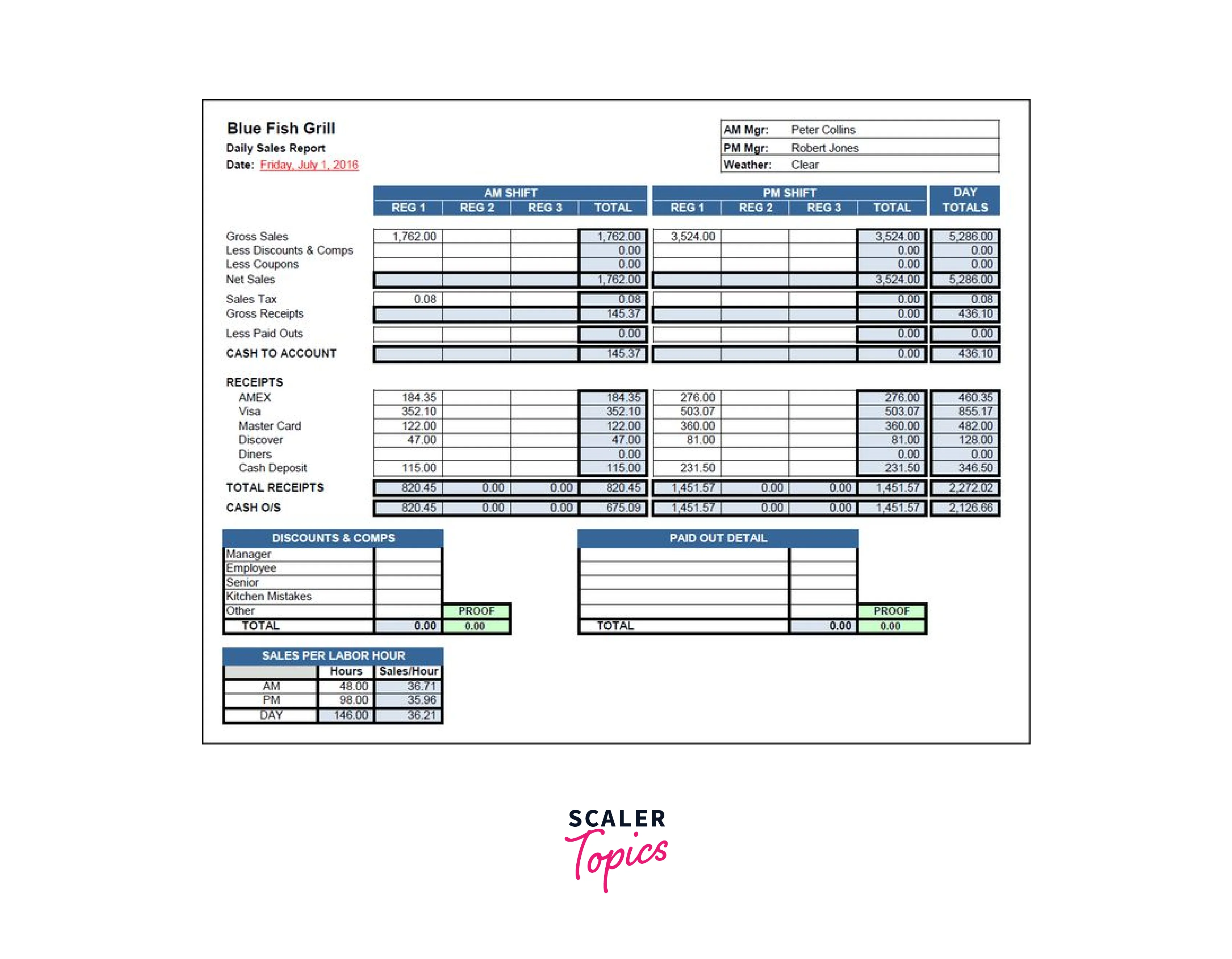
Restaurant Monthly Sales Report Template
End-of-Month Sales Report Template
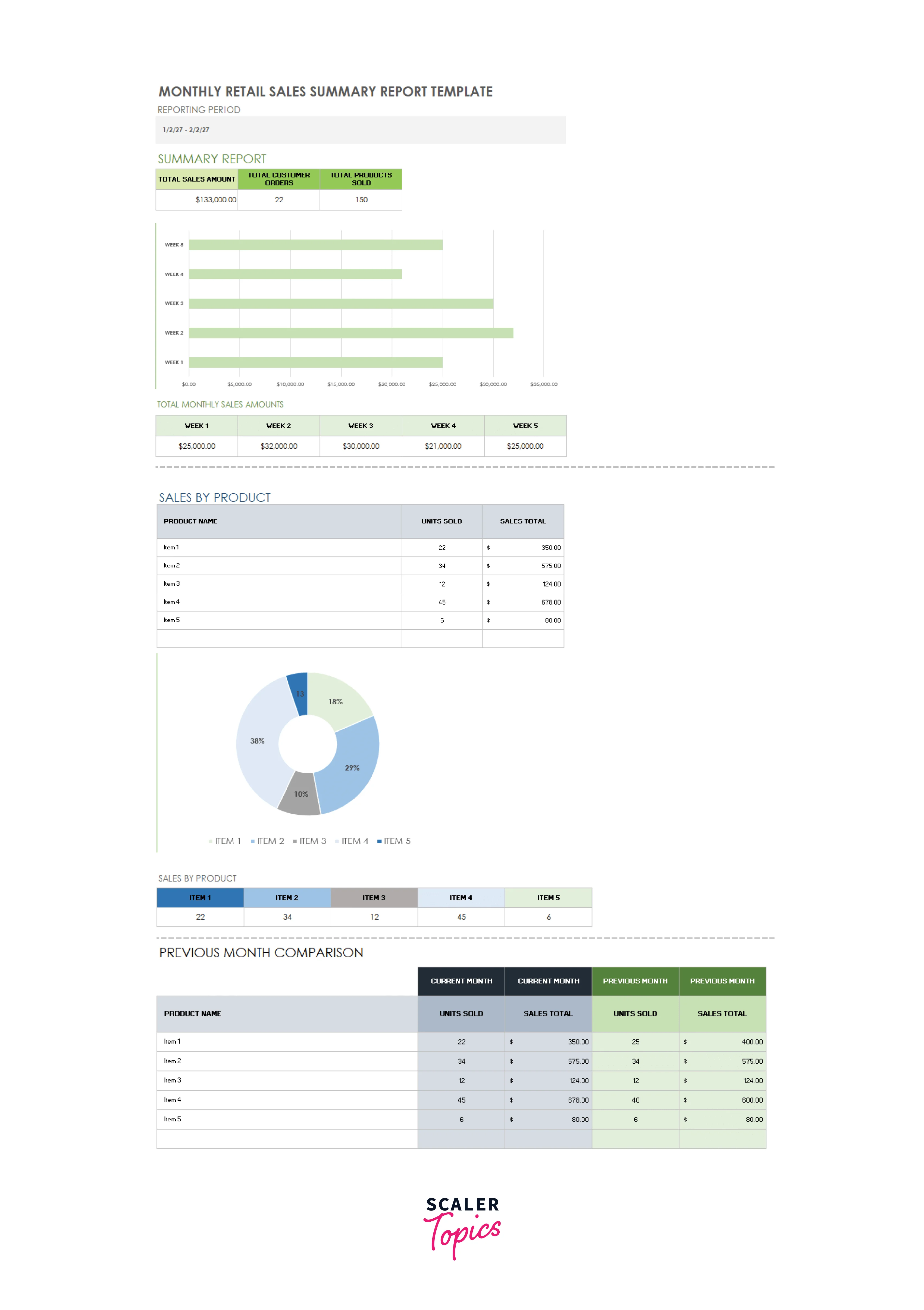
Monthly Retail Sales Summary Report Template
Monthly Sales Activity Report Template
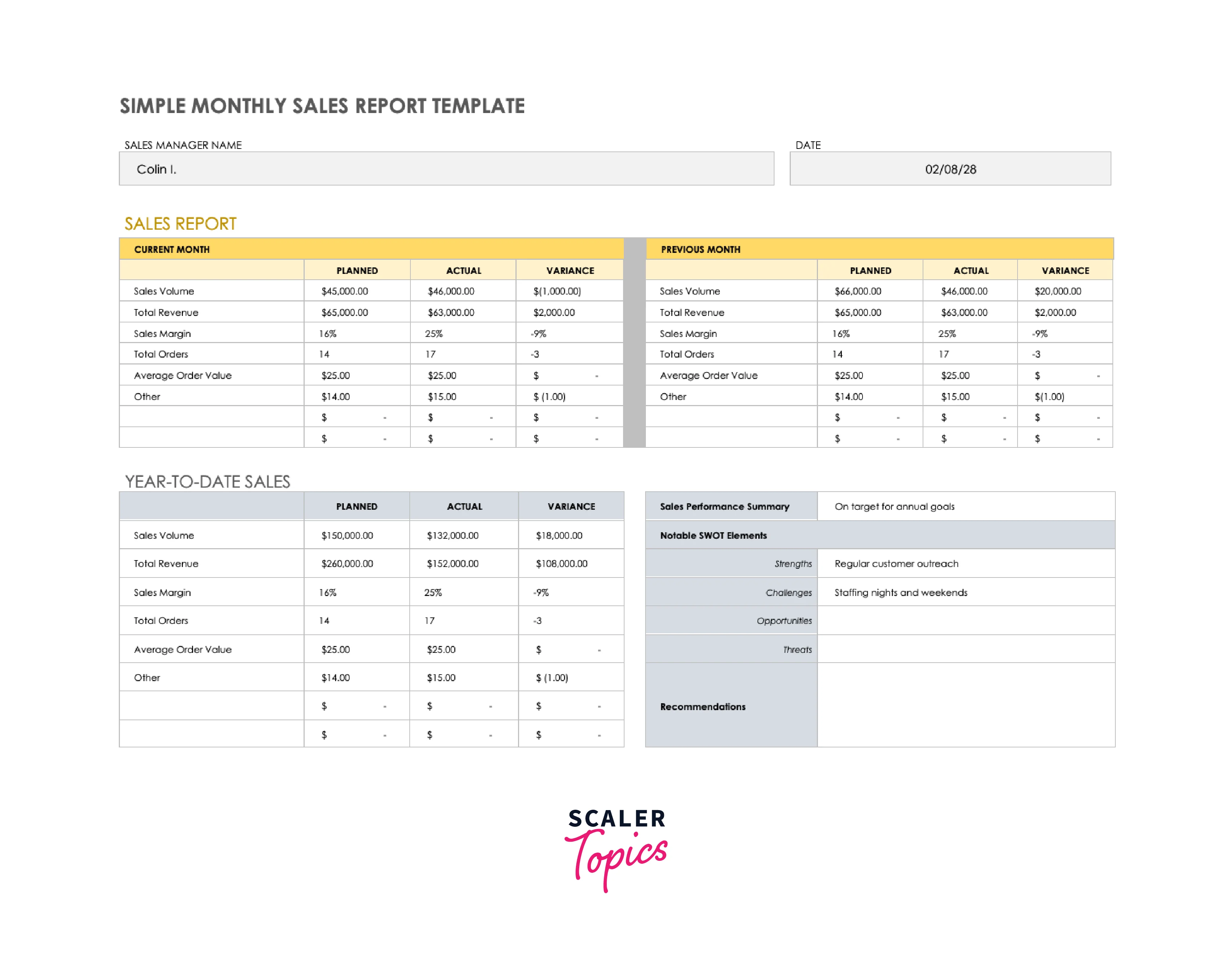
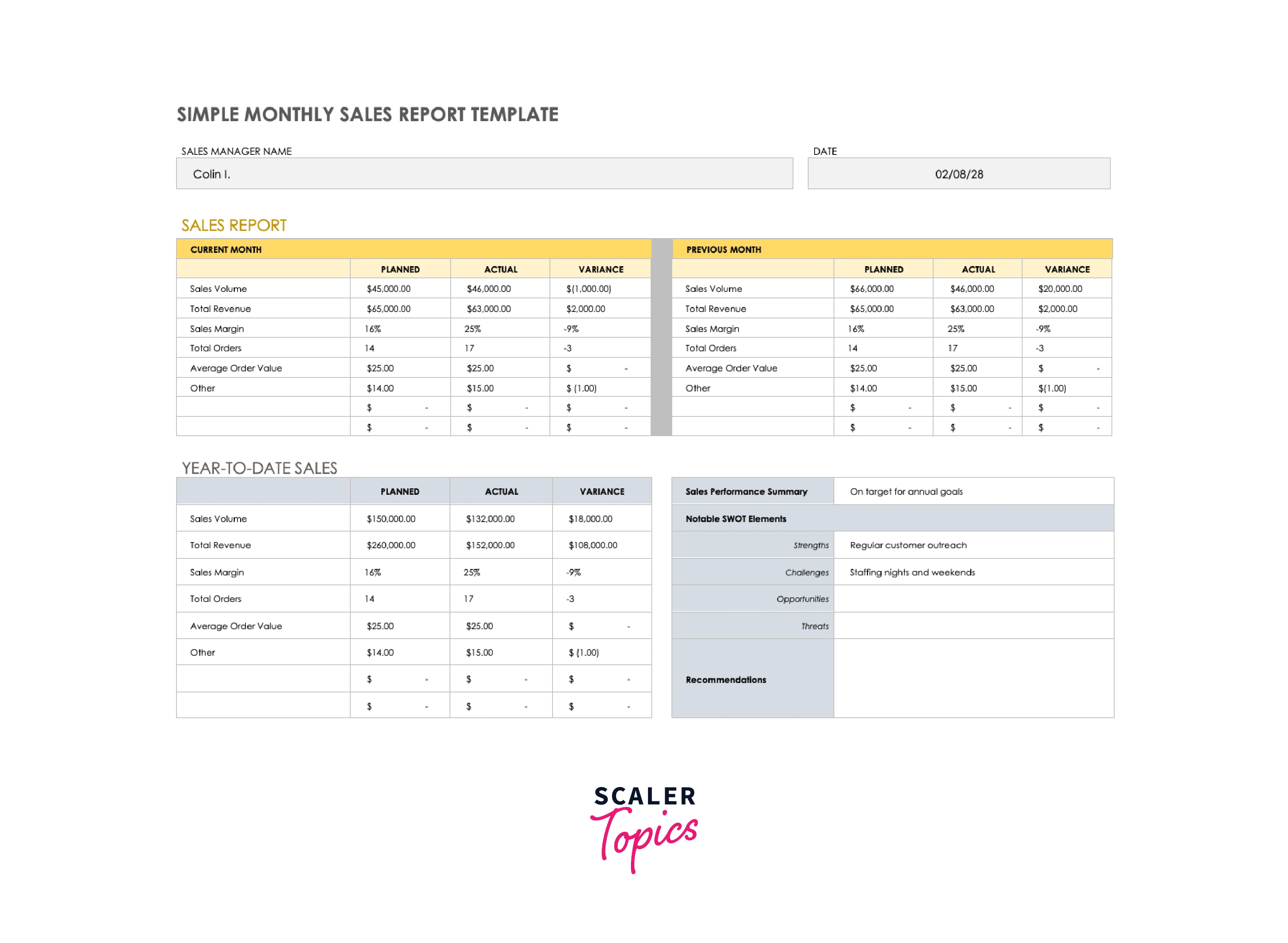
Simple Monthly Sales Report Template
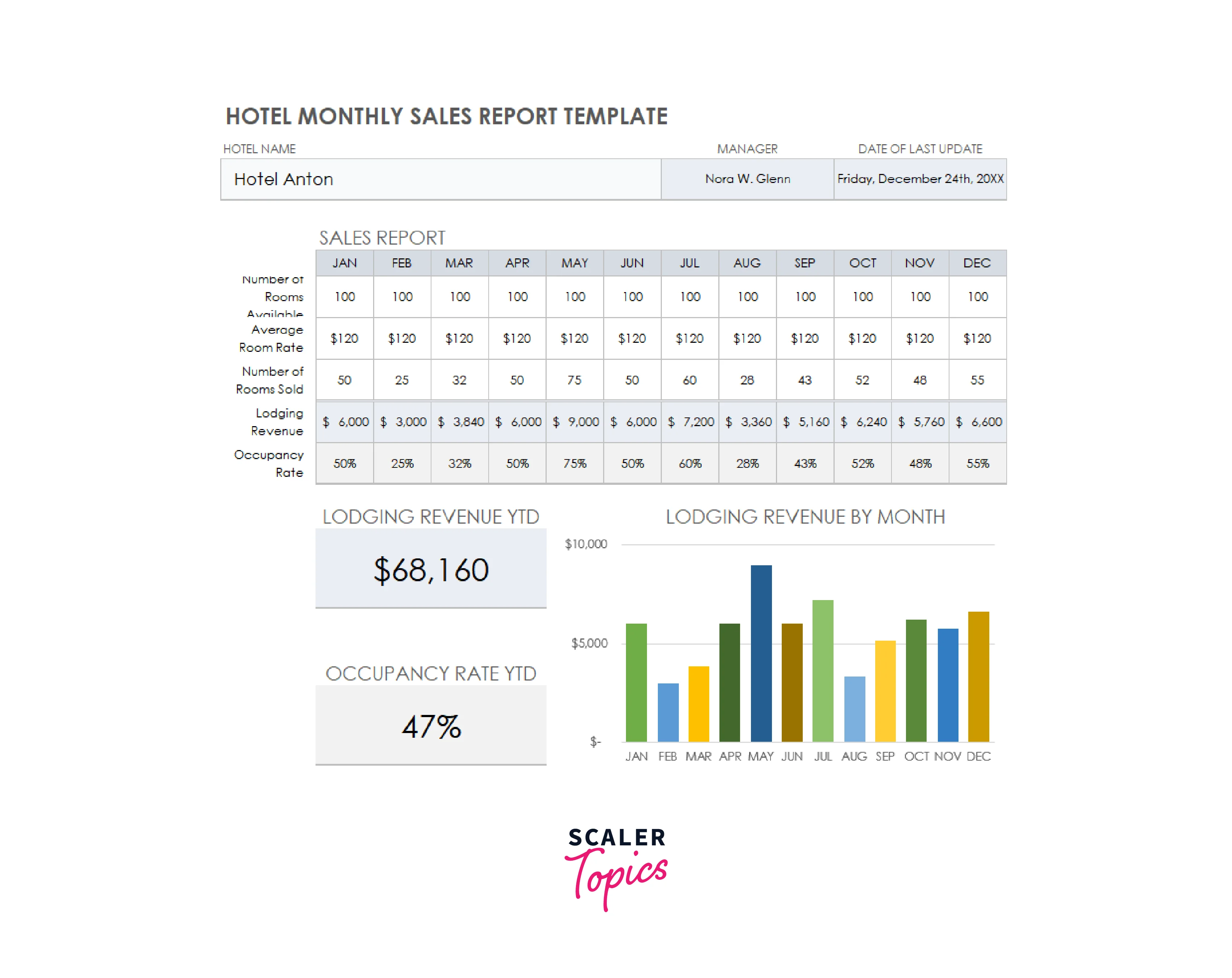
Hotel Monthly Sales Report Template
Conclusion
- Excel provides a powerful and user-friendly tool for conducting EDA, with a wide range of data analysis functions and visualization capabilities.
- EDA in Excel involves several stages, including data collection and preparation, data description, data exploration, data clustering, and data visualization.
- EDA in Excel helps in identifying patterns, trends, and relationships within the data, as well as uncovering potential outliers or anomalies.
- Excel offers a variety of visualization techniques, such as charts, graphs, and heat maps, to effectively present analysis results.
- EDA in Excel can be used across various industries and domains, including retail, hospitality, finance, healthcare, and more, to gain valuable insights from data and inform decision-making processes.
- EDA in Excel is an iterative process that involves continuously refining the analysis and interpreting the results to derive meaningful insights.
- EDA in Excel is a valuable tool for identifying opportunities, addressing challenges, and making data-driven decisions to optimize business outcomes.