Data Analysis on Formula One Race using Power BI
Overview
Welcome to the world of Formula One racing, where data isn't just numbers – it's the key to unlocking the secrets of victory. Formula One, often referred to as F1, stands as a multi-billion-dollar industry. Its calendar is marked by a sequence of events called the Grand Prix, a collection of races typically held globally on specially designed tracks and occasionally on public roads temporarily transformed into racetracks. In this article, we're going to delve into an F1 dataset and perform F1 data analysis using Power BI.
What are We Building?
In this project, our goal is to create a dashboard/report that helps us dive into an F1 dataset, enabling us to conduct comprehensive F1 data analysis using Power BI’s capabilities and tools. Let’s explore what the prerequisites are and how we are going to build this.
Pre-requisites
Here are a few prerequisites for undertaking the F1 Data Analysis using Power BI project. By meeting these prerequisites, you'll be well-prepared to dive into the project and extract meaningful insights from the F1 dataset using Power BI.
-
Power BI Desktop -
Make sure that you've got Power BI Desktop installed on your system. You can download and install it from the official Microsoft Power BI website.
-
Basic Data Analysis Concepts -
Take the time to familiarize yourself with ideas such as data cleaning, transformation, and visualization. These skills will be vital in extracting valuable insights from the dataset.
-
Basic Excel Skills -
A good knowledge of Excel is beneficial for data preparation and manipulation before importing it into Power BI.
-
Visualization Concepts -
Fundamental understanding of data visualization principles and various types of charts, such as bar charts, line graphs, and pie charts.
How are We Going to Build This?
To perform F1 data analysis using Power BI, we'll follow a structured path. First, we'll grasp the intricacies of our problem statement – diving into the nuances of F1 race data analysis. Next, we'll import our curated dataset into Power BI for exploration. With data in Power BI, we'll delve into data transformation, converting raw information into actionable insights. Assembling these insights, we'll craft an F1 Data Analysis Report, utilizing Power BI's visualization capabilities to showcase driver victories and constructor achievements. Finally, we'll scale our efforts by publishing the report and sharing our findings with the world. Through these steps, we'll perform F1 data analysis using Power BI and derive powerful insights.
Exploratory Data Analysis on Formula One Race Using Power BI
Utilizing the step-by-step guide outlined below, we'll undertake the F1 data analysis using Power BI on the dataset encompassing Formula One races -
Understanding Problem Statement
Before we dive into numbers and charts, let's understand the problem statement and get a clear picture of what we're aiming to explore. The problem statement is like our roadmap or objectives. It tells us the questions we're trying to answer with data. For instance, we might ask, Who are the most successful drivers in F1 history? or Which constructors have the most wins? By understanding this, we'll know exactly what to look for as we analyze the F1 race data. Think of it as setting the destination before starting a journey – it guides us through the data landscape.
Importing Data into Power BI
The next step in performing F1 data analysis using Power BI is to connect to your data source. For this project, we will utilize a formula one dataset which can be downloaded from here. This offers a comprehensive compilation of information about drivers, constructors, races, results, and many more. It spans from the 1950 season to 2018, providing a historical view. For our F1 data analysis using Power BI, I have imported five key tables - circuits, constructors, drivers, races, and results.
Once all 5 CSVs are imported into the Power BI, here is how it will look in the data modeling view. As evident in the data model, Power BI has automatically recognized the underlying connections among the tables, revealing numerous one-to-many relationships. For instance, the results table is linked with drivers, races, and constructors, showcasing the intricate connection between these elements.

Performing Data Transformation
We will click on the "Transform Data" option in the previous image to initiate several data transformation actions on the dataset. In this step, we'll remove any NULL or error records. Additionally, we'll check if the data types, like numbers or dates, are accurate. If needed, we'll make adjustments for consistency. This data transformation process ensures our insights are accurate and reliable for further analysis.
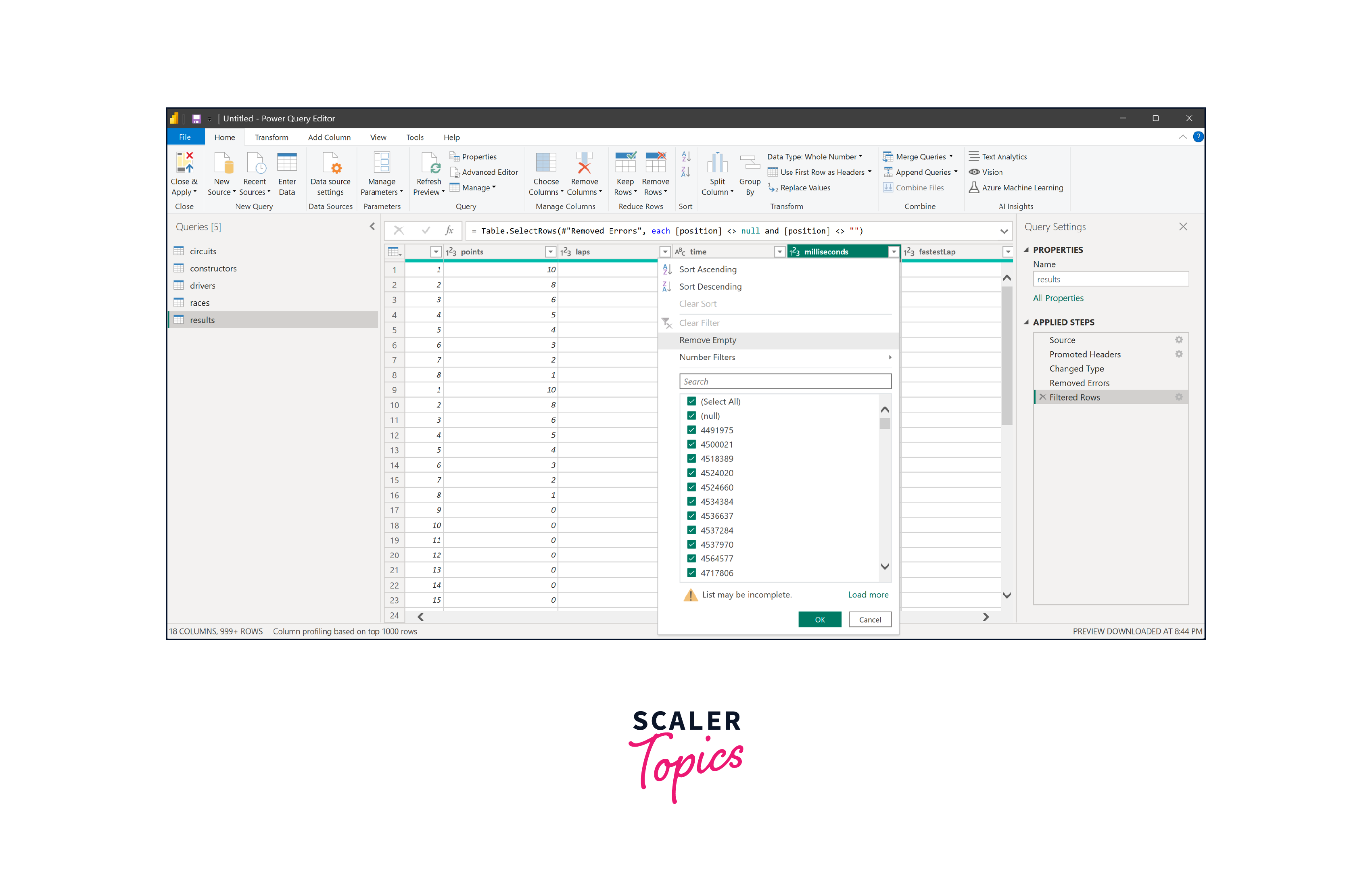
Once you have successfully carried out all the required data transformations, go ahead and click on the "Close & Apply" button. This will ensure that your applied transformations are saved, and the dataset is prepared for analysis.
Building the F1 Data Analysis Report
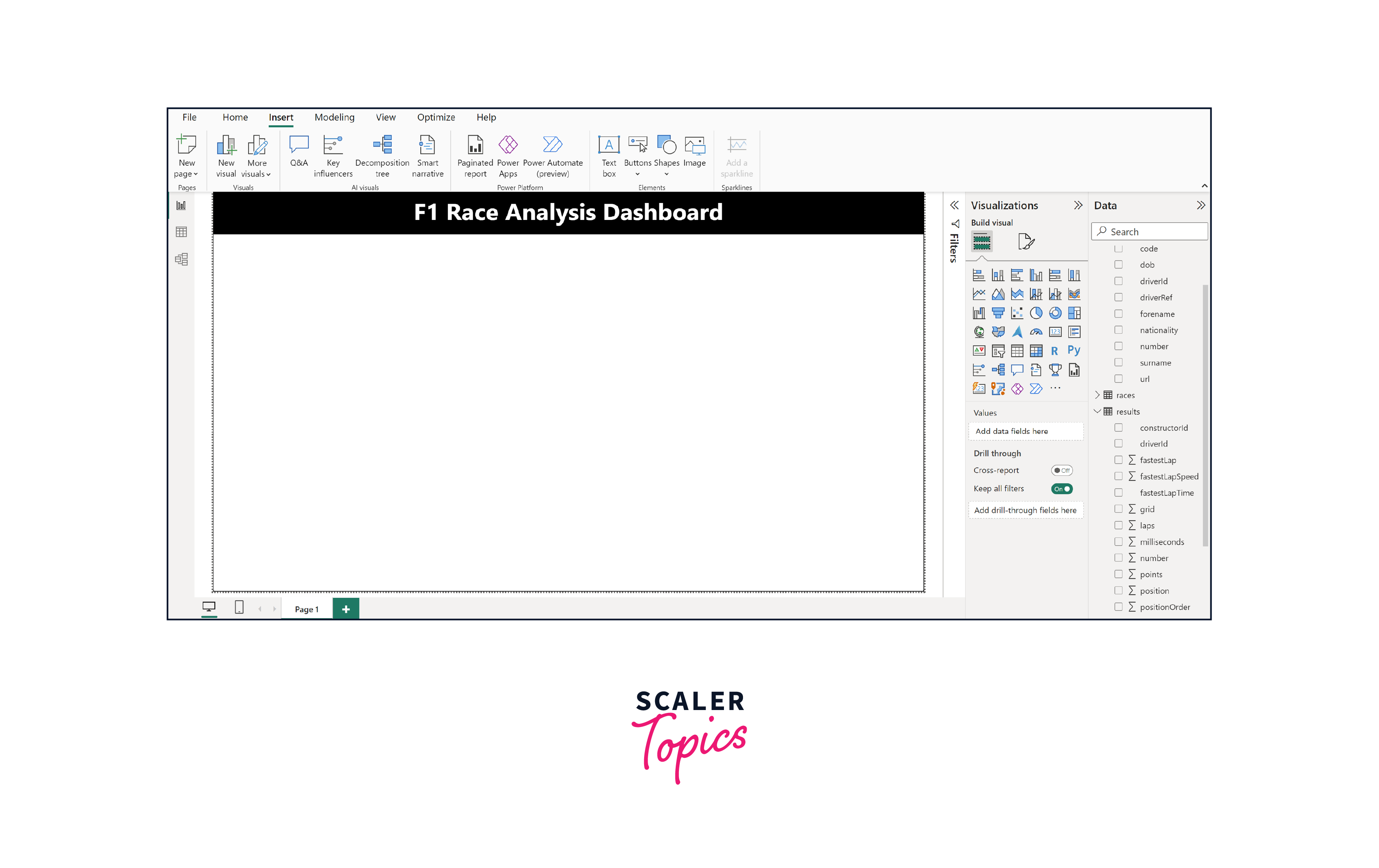
Go to the Home tab and choose Text Box. Put in the text you want – like we will use F1 Race Analysis Dashboard in this project, as shown in the figure below. You also have the flexibility to personalize the font, color, background, and alignment according to your preferences.
Afterward, we'll create a new column in the drivers table by joining the driver's first and last names. We'll name this column 'DriverName' and build it using DAX, as you can see in the illustration below.

Moving forward, head to the visualization pane and pick a horizontal bar chart. This will show how many wins each driver has. As evident from the figure below, Michael Schumacher and Lewis Hamilton lead the pack with the most victories.

Now, we're going to include a slicer for the race year so that we can interact with the dashboard and explore different years. As you can see in the figure below, when we adjust the slicer to show the years between 1951 and 1978, we find that Jackie Stewart and Jim Clark secured the highest number of victories.

Moving forward, we'll introduce a treemap that provides an overview of victories by constructors. This visual representation will showcase the distribution of wins among different constructor teams, allowing us to grasp their respective performance in a clear and engaging manner. As shown in the figure below, Ferrari and Mclaren are the most successful constructors in F1 history.
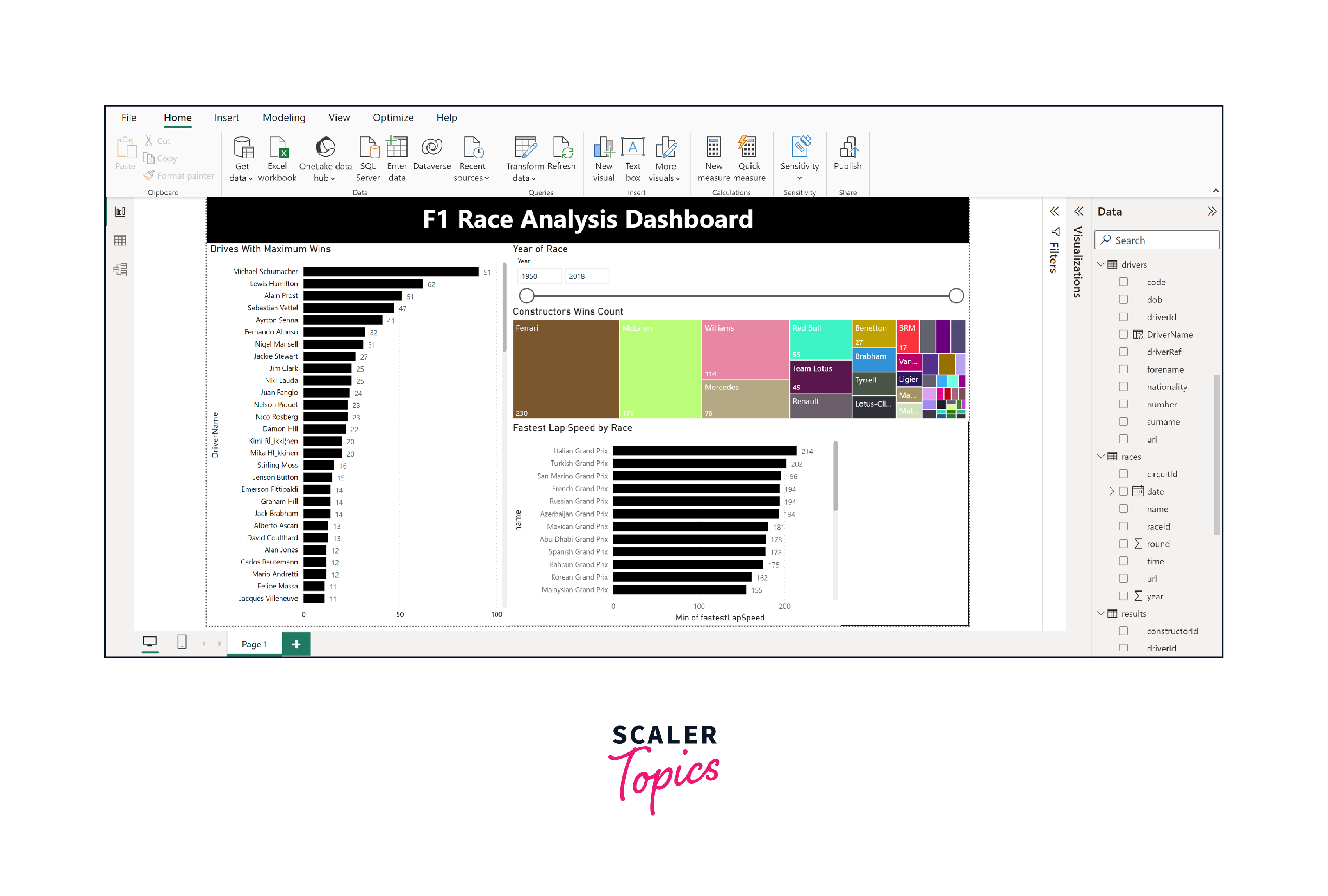
Following this, we'll incorporate a bar chart that illustrates the fastest lap times for each circuit. This visual aid will shed light on the variations in lap times across different tracks, aiding our understanding of circuit-specific performance. As you can see in the figure below, the Italian Grand Prix has the longest lap time, while the Monaco Grand Prix has the shortest lap time.
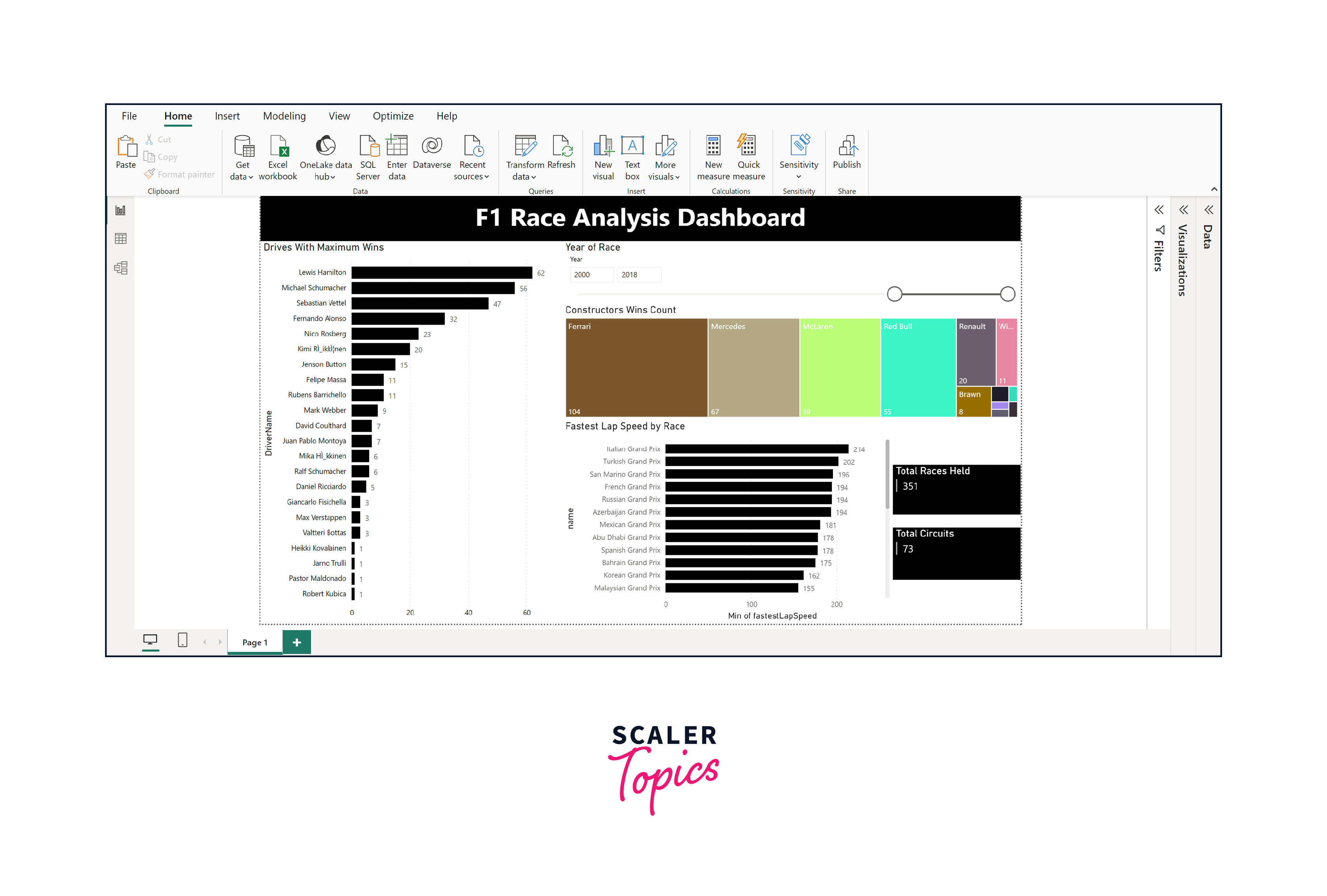
Lastly, we'll introduce two card visualizations that provide a quick glance at the total number of races and circuits in our analysis. These succinct visual elements offer an instant snapshot of these key figures, encapsulating the breadth of our dataset in a compact and informative manner.

Publishing the Report
Publishing the report is an essential step that involves sharing your insights with various stakeholders. You can leverage Power BI's publishing features to upload your report to the Power BI service to do this. Doing so makes your analysis accessible to a wider audience, enabling collaborators and decision-makers to access real-time insights. The Power BI service also facilitates interactive dashboards and scheduled data refreshes, ensuring your report remains up-to-date. This seamless sharing enhances collaboration, supports data-driven decision-making, and empowers your team to derive actionable insights from the analysis.
What’s Next
-
Dive Deeper into Other Tables -
Take your exploration further by delving into the other tables within the F1 dataset. You can analyze trends, patterns, and connections beyond the five tables we have explored here.
-
Discover Anomalies -
Extend your analysis by hunting for anomalies in the dataset. One intriguing avenue is investigating lap times for each circuit over the years. Look for unexpected spikes or dips that might reveal interesting insights, like technological improvements or challenging weather conditions affecting lap times.
Conclusion
- In this project, we utilized Power BI to explore Formula One's data from 1950 to 2018. We collected five tables together to perform F1 data analysis using Power BI.
- With data transformation, we cleaned and prepared our dataset, ensuring accuracy and reliability. Further, we transformed raw data into visualizations and explored driver victories and constructor achievements.
- We further enhanced our dashboard by incorporating interactive elements and card visualizations. These additions not only make the dashboard engaging but also offer a quick snapshot of key metrics, enriching the overall data exploration experience.