flex grow CSS Property
 FREE
FREE

Overview
You already know about the flexbox and how to use it to properly align the content and distribute the space within the parent element or the container. There is a property of the flexbox named, the flex-grow CSS property which is widely used to distribute the remaining space inside the container when the flexbox layout model is used for the alignment of the content.
In this section, we are going to learn about the flex-grow CSS property and you'll see how to use the flex-grow CSS property so that the child elements can fit easily inside the container.
What is Flex Grow CSS?
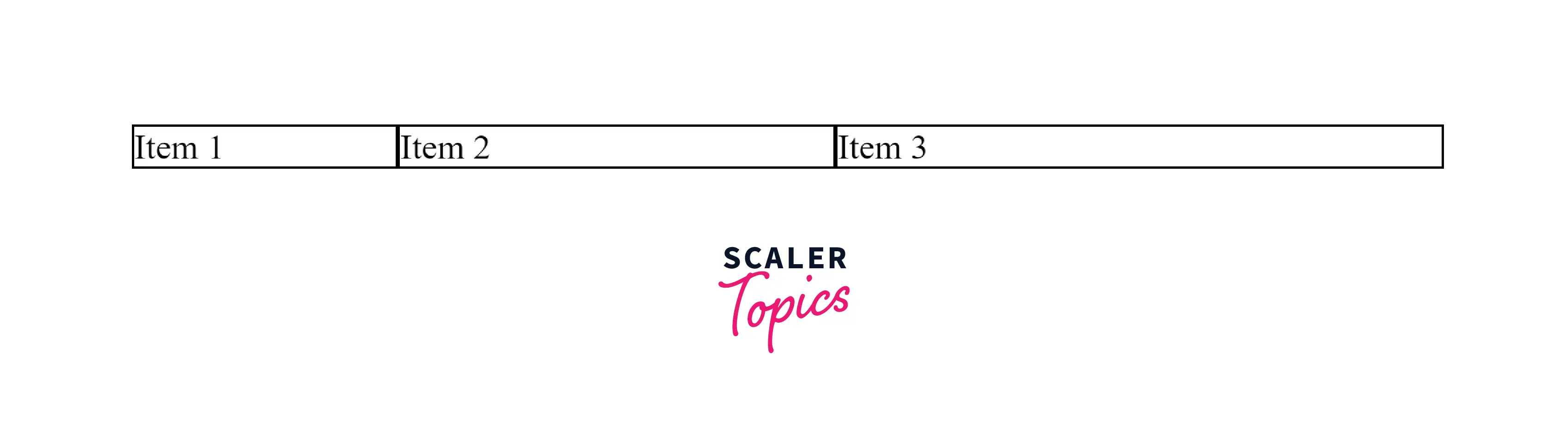
It may happen sometimes that some space inside the container filled with the elements remains vacant, as shown in the below image.

As shown in the above image, with the help of the flex-grow CSS property, you'll be able to grow the elements and fill the remaining free space. Isn't this cool? Let's see how this can be achieved, but first, we'll understand what is the flex-grow CSS property and what it specifies.
The flex-grow CSS property specifies how much amount of space a child element should take relative to the other elements if there is any remaining space inside the parent container or the flex container. That being said, this property defines how much an item or the child item will grow inside the flex container relative to the other child elements.
For example, if the value of the flex-grow CSS property is set to 1 for all the items inside the parent container, each item will take an equal amount of space in the container. But, if the value of any of the child elements of the flex-grow CSS property is set to 2, then that element will take up double or twice the space than the other child elements.
CSS Demo: flex-grow
Let's take a demo of the flex-grow CSS property and observe the sizes of the child elements according to the values of the flex-grow property.
Output:
In the above CSS demo of the flex-grow property, the child elements are provided with the individual flex-grow property so that if there is any remaining space available in the parent container, the child elements will grow according to their growth factor. Here, the item1 takes up (1/6) of the total space of the parent container as the value of the flex-grow CSS property is set to 1. Similarly, the other child elements grow and the total space taken after applying the flex-grow CSS property is (1/3) and (1/2) of the parent container sizes respectively.
You'll get to know how to calculate the sizes based on the value of the flex-grow property in the later sections along with the examples.
Syntax
Let's take a look at the syntax of the flex to grow CSS property and understand how you can use it to fit the flex items inside the flex container.
Syntax
As shown in the syntax above, the flex-grow CSS property takes the number as a value and if a number is not given to the flex-grow property then the inherit and initial values are provided to the flex-grow and the meaning of these values are explained in the next section.
Values
The syntax of the flex-grow CSS property is mentioned in the above section and the values which can be associated with the flex-grow CSS property are also mentioned. Now, let's understand what these values mean and how you can use them.
| Value | Description |
|---|---|
| number | This value specifies a positive number which can also be named as a growth factor or the flex-grow factor. The default value of the flex grow CSS property is 0 and it does not accept negative values. |
| initial | This value sets the flex-grow CSS property to its default value i.e. 0. |
| inherit | This value means the element will inherit this property from its parent element. |
Description
The flex grows CSS property, as mentioned above, specifies the amount of remaining space an element will take inside the flex container. This CSS property takes a value and this value determines the growth factor of the element i.e. how much an element will take up the remaining space is determined by the growth factor.
You might be wondering about the remaining space. Well, this remaining space is the size of the total flex container minus the size of the combined size of all the flex elements. Let's say the value of the flex-grow CSS property is the same for all the child elements. In this case, all the elements will take up the same space inside the container.
If the value of the flex-grow CSS property is different for each element of the flex container, then the elements will grow or take up the space relatively according to the growth factor i.e. value of the flex-grow CSS property.
The default value of the flex-grow CSS property is 0. When the value of this property is set to 0, the items will not grow even if there is any remaining space available inside the flex container.
Example
Now, let's take some examples in which the flex-grow CSS property is used.
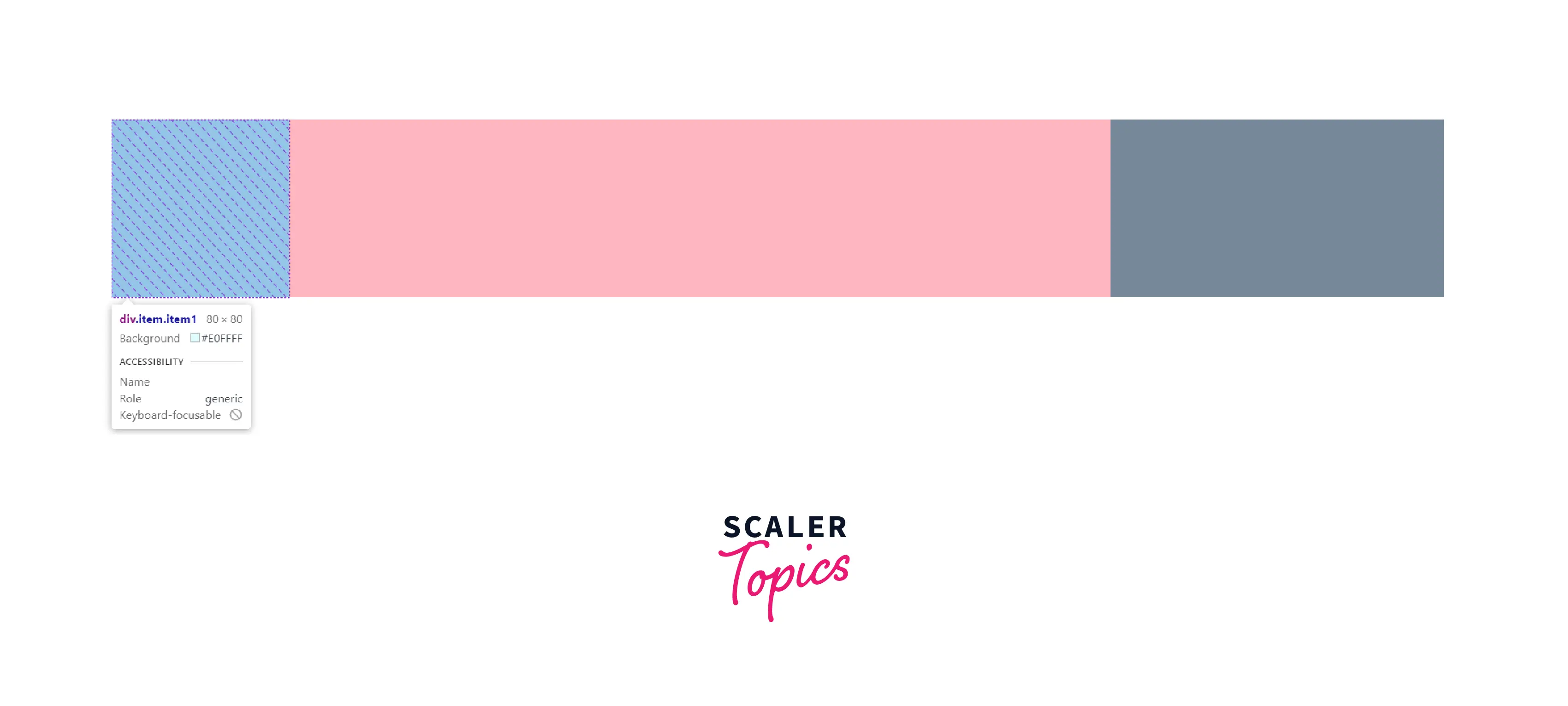
Example: flex-grow: 0;
Output
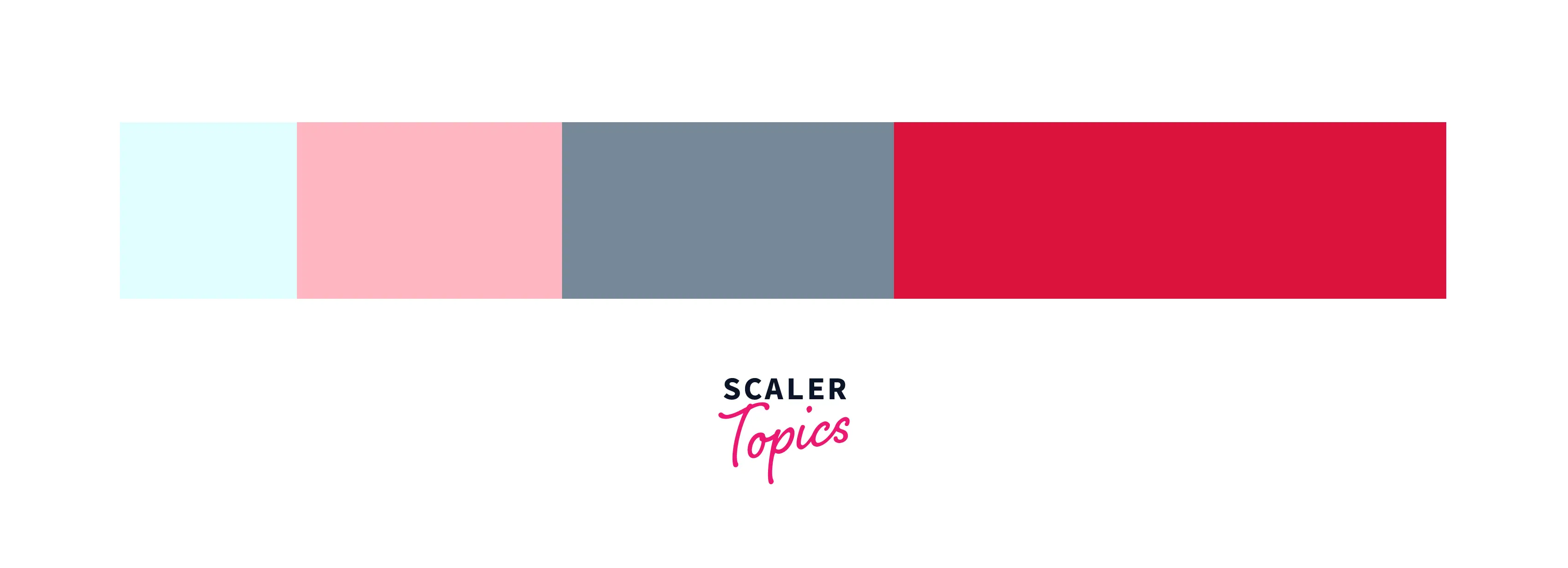
In the above example, the flex-grow CSS property of item1 is set to 0. That means the remaining space is not taken by any of the child elements and you can see the red-colored space which is still vacant inside the flex container.
Example: flex-grow: 1;
Output:
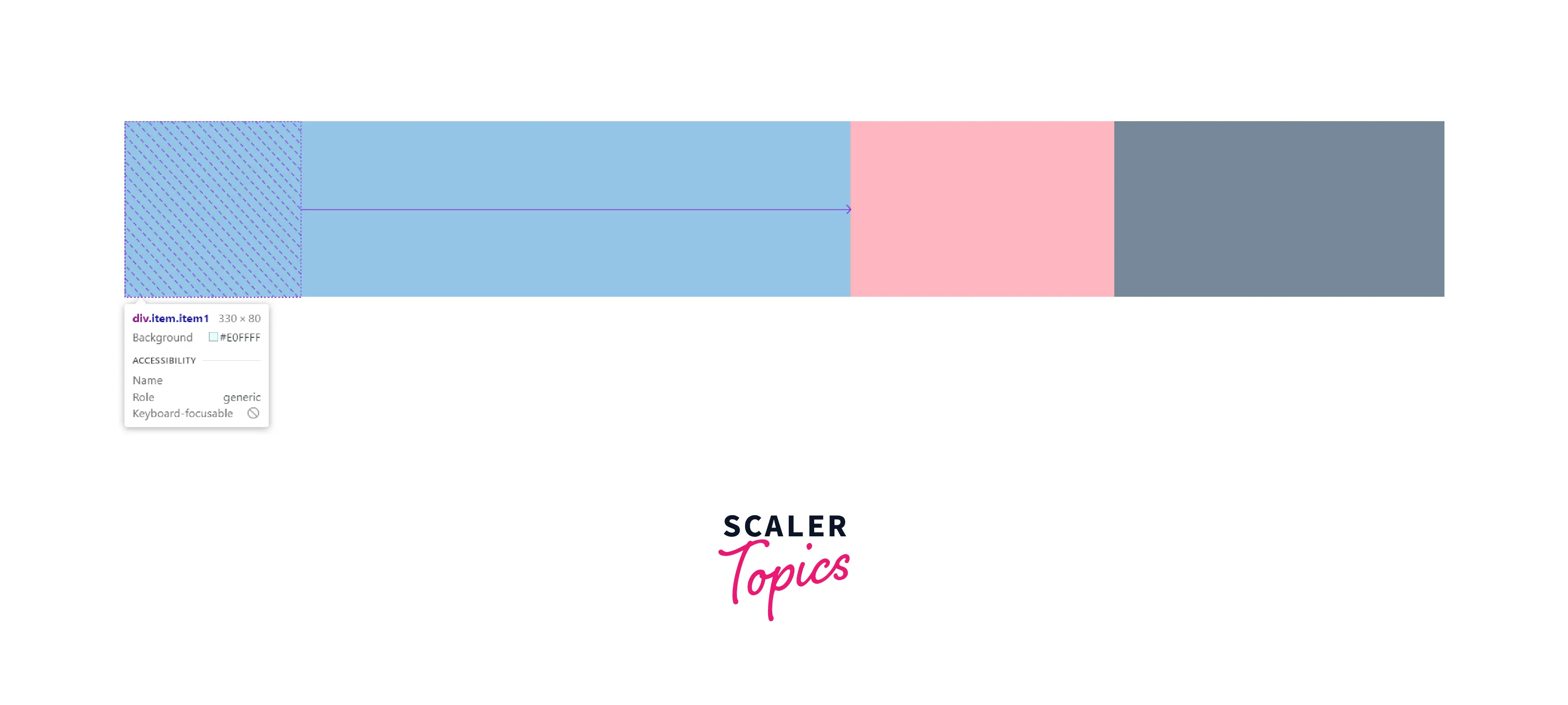
As you can see in the output above, the value of the flex-grow for the item1 element is set to 1 and for the rest of the elements, it is set to 0. So, all the remaining space of the flex container is occupied by item1. This can also be proved by looking at the width of each element.
Before applying flex-grow
Width of item1: 80px Width of item2: 120px Width of item3: 150px Total width of the flex container: 600px Remaining space in the flex container: 250px
After applying flex-grow
Width of item1: 330px (Remaining space in the flex container + Width of item1, because flex-grow is 1) Width of item2: 120px (because flex-grow is 0) Width of item3: 150px (because flex-grow is 0)
Example:
Output:
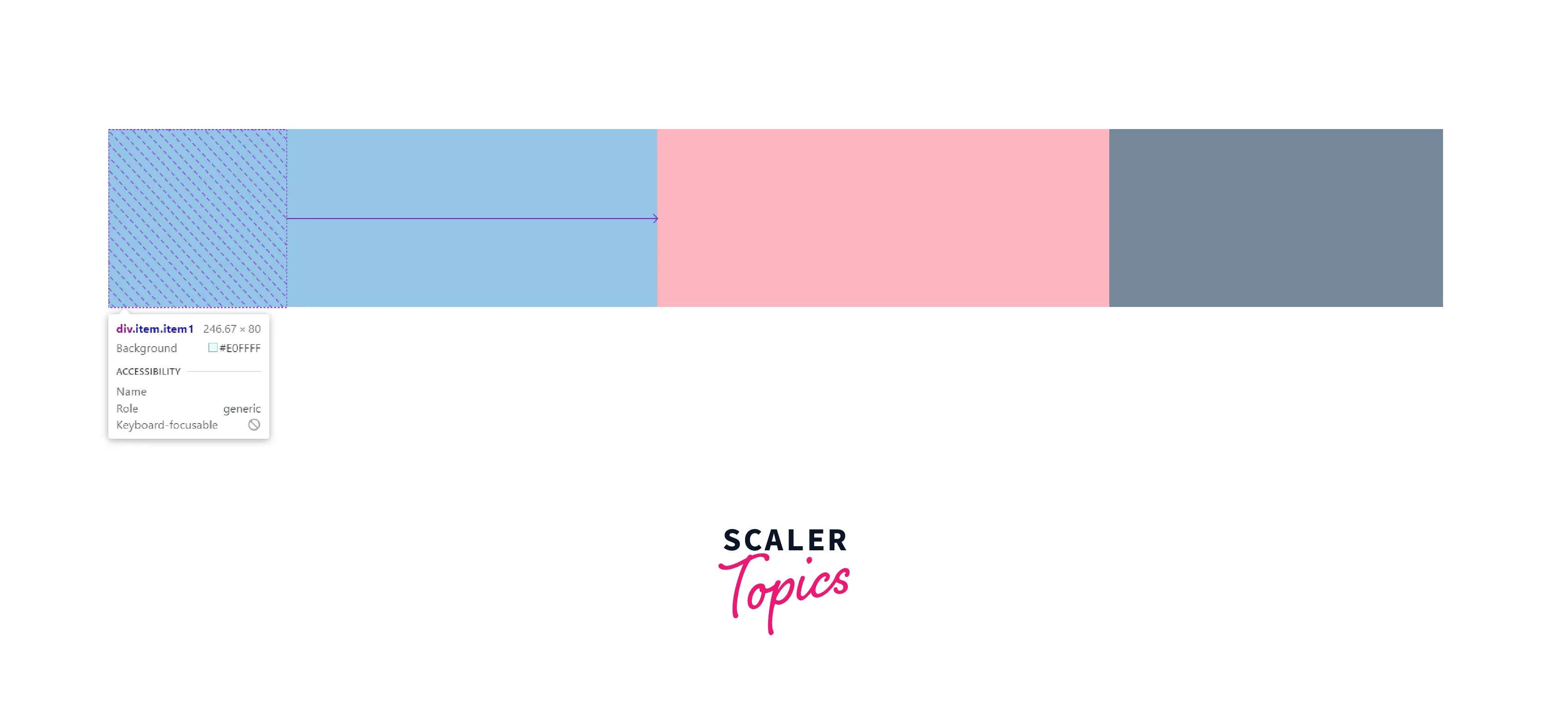
Before applying flex-grow
Width of item1: 80px Width of item2: 120px Width of item3: 150px Total width of the flex container: 600px Remaining space in the flex container: 250px
After applying flex-grow
Width of item1: 80 + 166.67 = 246.67 (Because flex-grow is 2, Original width + (2 * (250 / 3 ))) Width of item2: 120 + 83.34 = 203.34px (Because flex-grow is 1, Original width + (1 * (250 / 3 ))) Width of item3: 150px (because flex-grow is 0)
Example: flex-grow: initial;
Output:
Before applying flex-grow
Width of item1: 80px Width of item2: 120px Width of item3: 150px Total width of the flex container: 600px Remaining space in the flex container: 250px
After applying flex-grow
Width of item1: 80px (Because flex-grow is set to initial.) Width of item2: 370px (Because flex-grow is 1, all the remaining space is occupied by this item.) Width of item3: 150px (because flex-grow is 0)
Example: flex-grow: inherit;
Output:
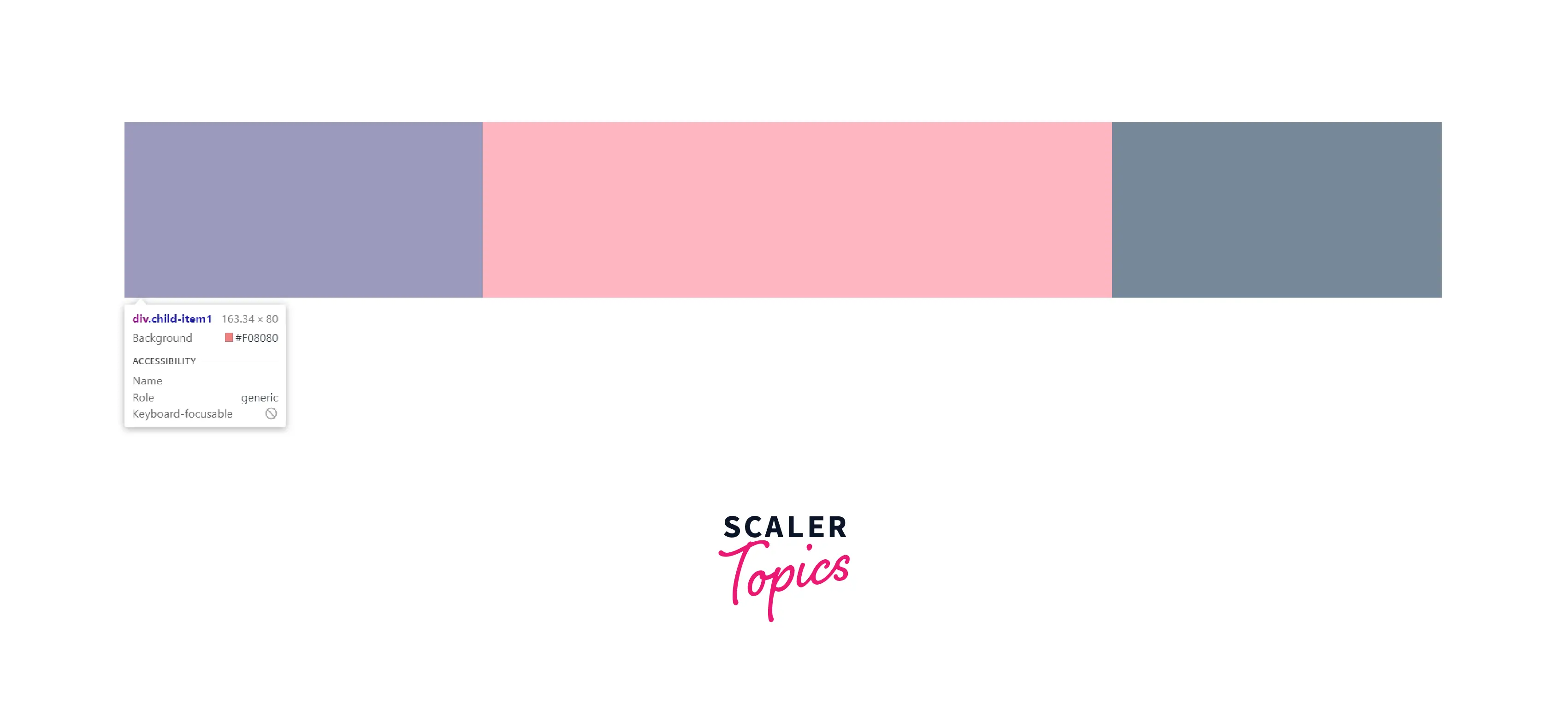
Before applying flex-grow
Width of item1: 80px Width of item2: 120px Width of item3: 150px Total width of the flex container: 600px Remaining space in the flex container: 250px
After applying flex-grow
Width of item1: 163.34px (Because the value of flex-grow: 1 is inherited from its parent container i.e. item1 and the child item has the same width as that of item1.) Width of item2: 286.66px (Because flex-grow is 2) Width of item3: 150px (because flex-grow is 0)
As shown in the above output, the div container having the class child-item1 is the child of the item1 container. And the value of the flex grows CSS property of the child element is set to inherit and this container inherits the flex-grow CSS property from the item1 element as it is the parent element.
Conclusion
- The flex-grow CSS property is used to set the growth factor of a flex item.
- The CSS property flex-grow specifies the amount of space a flex item should occupy from the remaining space of the flex container.
- The default value of the flex-grow CSS property is 0. It means the child element will not grow even if there is vacant space left inside the flex container.
- There can be three values of the flex grow CSS property name, a number (growth factor), inherit, and initial.
- The flex-grow CSS property does not accept any negative values as the growth factor.
- If the container's item is not a flex item then the flex-grow CSS property will not work and it'll not affect the sizes of the neighboring elements too.
- When the value of the flex grow CSS property is set to inherit, the child element will inherit this property from the parent container.
Related Properties
- flex-basis
- flex-shrink
- flex