Flutter - FloatingActionButton
In Flutter, the FloatingActionButton (FAB) is a key widget, adhering to Material Design Guidelines for critical actions. Its unique properties and usage rules make it vital in creating user-friendly applications.
What is FloatingActionButton in Flutter?
FloatingActionButton is a circular-shaped button commonly used in the Scaffold's field of the same name. When a user clicks on it, it performs certain functions giving them more priority over other widgets. It is advised to use no more than a single floating action button per page as doing so can ruin the user experience. It can be customized to a great extent to suit our demands. As we proceed further in this article, we are going see multiple properties and applications of the floating action button in Flutter.
FloatingActionButton Rules and Principles
As the FloatingActionButton comes with various properties, there is also a need to use it within some pre-defined constraints to ensure a good user experience for our application. There is a standard set of certain rules and principles which need to be taken care of while using the floating action button in Flutter. These rules and principles are discussed below :
a. Primary Action
This principle suggests that we should implement the FloatingActionButton in such a manner that it only performs the primary action in the application*. As we have discussed earlier, we refrain from using it multiple times on the same screen of our application. Therefore, as we have only one floating action button on a screen, it should be used to perform some important action, which can be termed as the primary action.
b. Constructive Action
This principle suggests that the FloatingActionButton should perform a constructive action that leads the user constructively into the application, and then the user can perform further actions. Taking the example of real-life mobile applications used in our day-to-day life, we see that the floating action button in Flutter is used to perform constructive actions such as writing a new tweet, creating a new alarm, uploading a new photo, navigating to a new location, etc.
c. Context is Key
This principle suggests that the FloatingActionButton should fit in the context of the application and its user interface correctly. The implementation should never go out of the domain of the mobile application. By this principle, we mean that it should not take the user to a course of action that is not relevant to the application. The user should be taken to only have access to those actions which are not out of the context of the application.
d. Don't use Multiple FABs (in most cases)
This principle suggests that we should never use multiple floating action buttons in Flutter unless it is extremely necessary to do so. Using multiple FABs can confuse the user and make his experience worse. As it is such a significant and dominant part of the user interface, putting multiple floating action buttons is a bad idea. It is advised to use only a single FAB and use it to perform some very important functions in our application.
e. Icon and Label
This principle suggests that the FAB should contain an icon and label, which makes it clear to the user the purpose of clicking on the FAB. For instance, if the user does not get a clear idea of what the floating action button is all about just by looking at the FAB, then it is considered bad as far as the user experience is concerned.
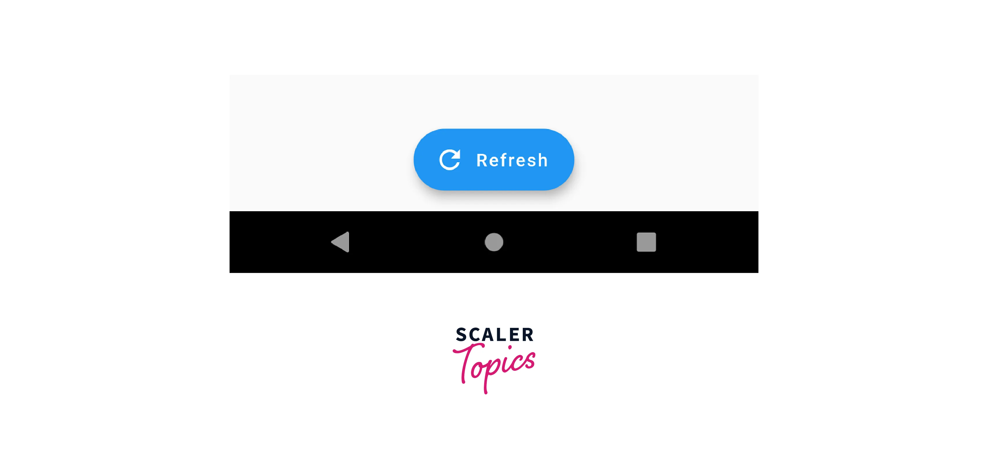
Now we will look at an example that illustrates this principle.
As shown below, the Icon and label clearly indicate to the user that clicking on them will refresh the present screen.
Constructor
The constructor of the floating action button in Flutter is as follows :
Syntax
Now, we will have a look at the syntax of the FloatingActionButton. We can tweak the following code to design our FAB for any custom use case :
The above code contains numerous properties provided by the floating action button using which we can modify its functionality and appearence. Now we are going to learn about these properties.
Properties
| Property | Description |
|---|---|
| autofocus | By this property, we specify whether the FAB should automatically be focused on or not when the widget is being displayed. This is particularly helpful for easing out the navigation. |
| backgroundColor | By this property, we set the background color of the FloatingActionButton. The background color is chosen in such a manner that it suits the overall design of the application and looks good to the end user. |
| child | By this property, we specify the child widget of the FAB. The child widget generally contains simple icons, text, or more complex items such as images or videos. |
| clipBehaviour | If the FloatingActionButton exceeds its bounds then we need to specify how the FAB will be clipped. This is done using the clipBehaviour property. |
| disabledElevation | This property is used to specify the elevation of the FloatingActionButton when it is disabled. |
| elevation | This property is used to specify the elevation of the FAB when it is in the normal state. By elevation, we mean the amount by which it stands out from the rest of the page. |
| focusColor | This property specifies the color of the FAB when it is in the focused state. |
| focusElevation | This property is used to specify the elevation of the FloatingActionButton when it is in the focussed state. |
| focusNode | By this property we specify the focus node of the FAB. |
| foregroundColor | By this property, we set the background color of the FloatingActionButton. |
| heroTag | By this property, we set the heroTag of the FloatingActionButton.heroTag is applied to the button's Hero widget. By default, there should be only one FloatingActionButton per screen. |
| highlight Elevation | This property is used to specify the elevation of the FAB when it is in the highlighted state. |
| hoverColor | Using this property, we set the color of the FloatingActionButton when we are hovering over it with the help of our mouse. It is a way of providing visual feedback to the user and making the button interactive. |
| hoverElevation | This property is used to specify the elevation of the FAB when we are hovering over it with the help of our mouse. |
| isExtended | By this property, we specify whether the floating action button should be extended. It is a boolean and it is used when we need to display some additional information on the FAB. |
| materialTapTargetSize | This property is used to set the tap target size of the FAB. This property is very useful for improving the user experience, particularly for touch devices. |
| mini | This property is used to set whether the FloatingActionButton should be mini. It is nothing but a boolean value that determines whether the FAB should be smaller than usual in size. |
| mouseCursor | This property is used to display the mouse cursor when we are hovering over the FloatingActionButton with the help of our mouse. This is used to provide some additional visual feedback to the end user. |
| onPressed | This property is used to specify the function which is called when we when clicking on the FloatingActionButton. |
| splashColor | Using this property, we set the color of the splash effect that is displayed on clicking the FAB. |
| shape | We use this property to specify the shape of the floating action buttons. By default, they are circular but we can customize them to be rectangular or any other shape. |
Example
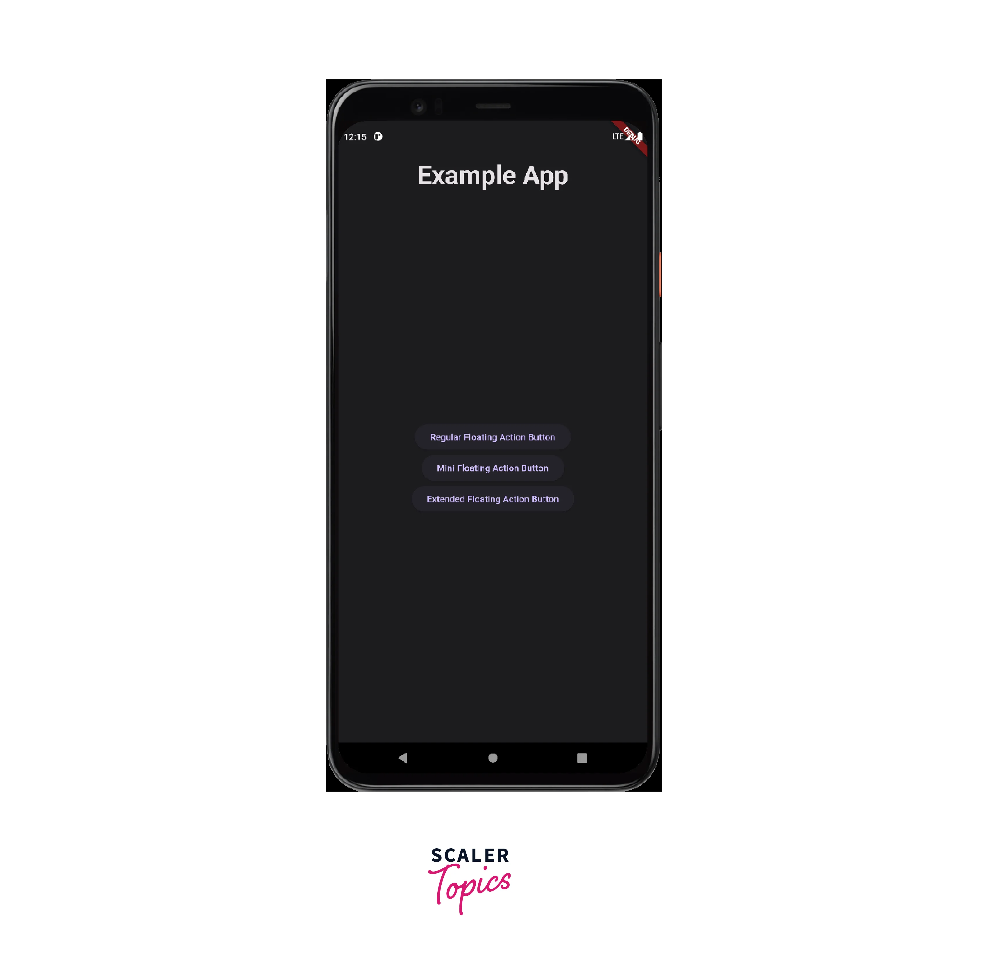
Now we will look at examples of how we can use the floating action button in Flutter.
Here is the standard main.dart file for all of them:
Here is the demo.dart file:
The floating action button is generally used in three ways: as a Regular floating action button, a Mini floating action button, and an Extended floating action button. Now we will look at those one by one :
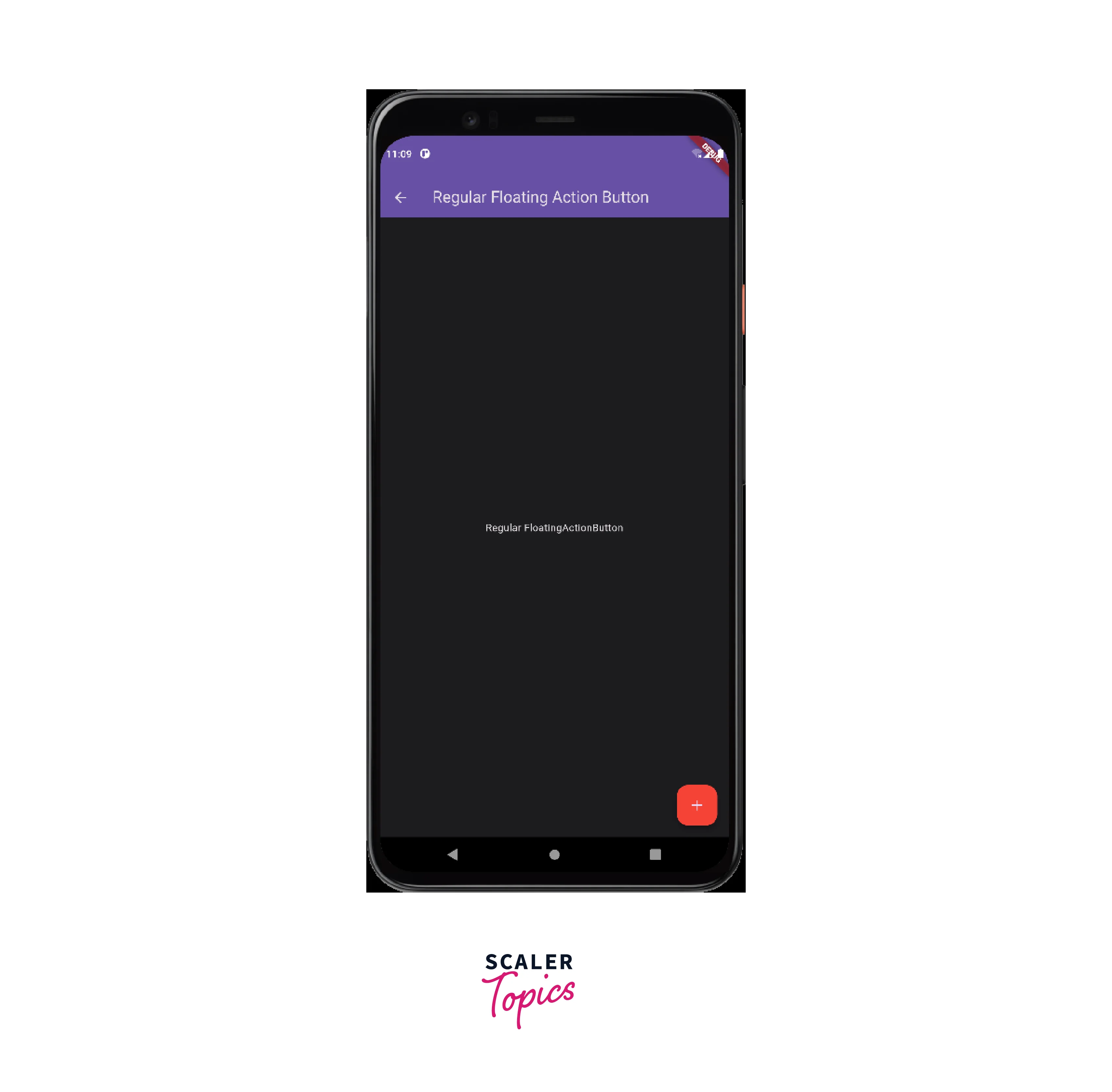
Regular FloatingActionButton
We are going to create a regular floating action button with a '+' icon, setting the background color as red.
Here is the output of the above code :
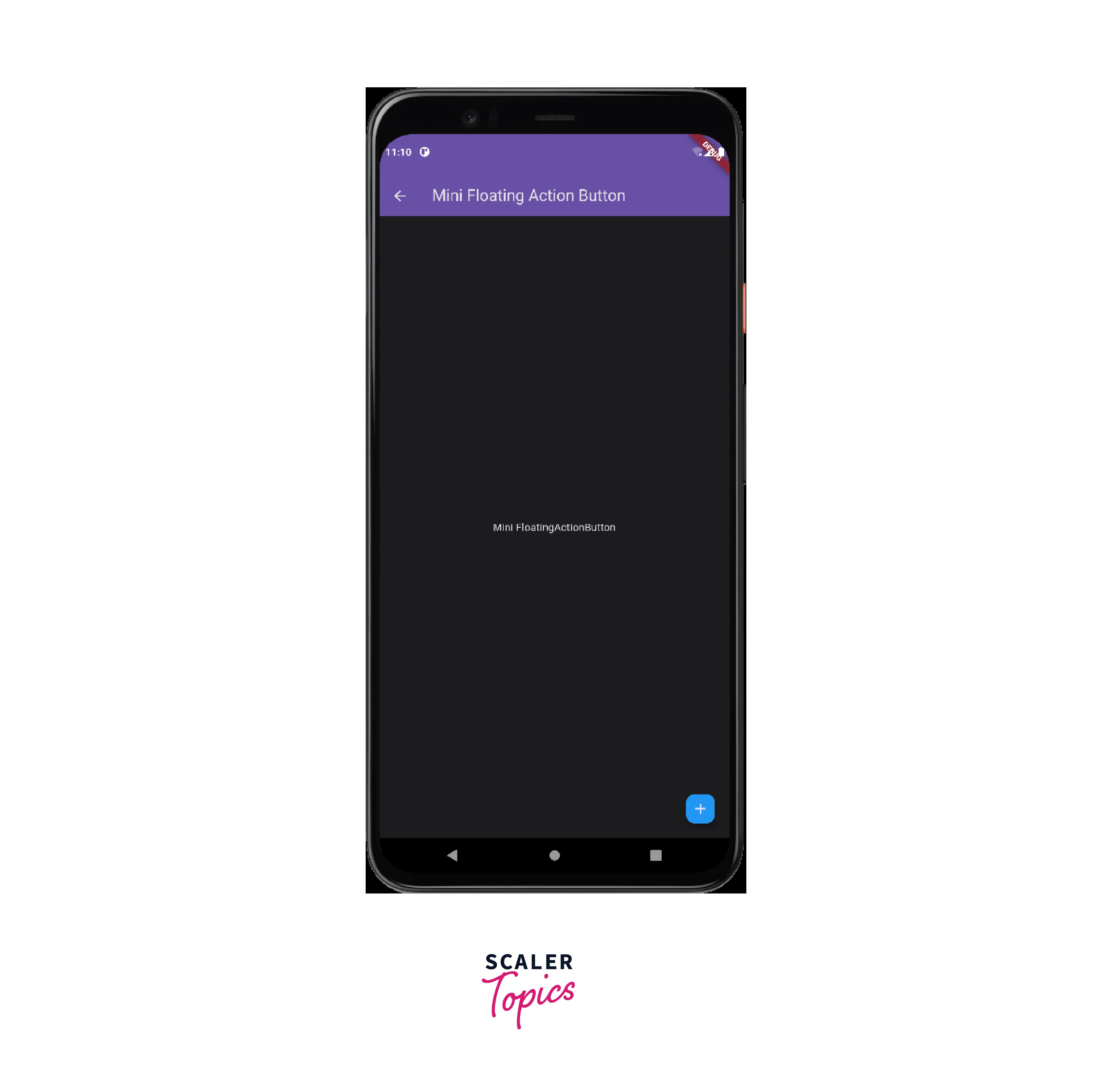
Mini FloatingActionButton
Now, we are going to create a Mini FloatingActionButton with blue background color. To achieve this, we simply need to set the "mini" property of the FloatingActionButton as true.
Here is the output of the above code :
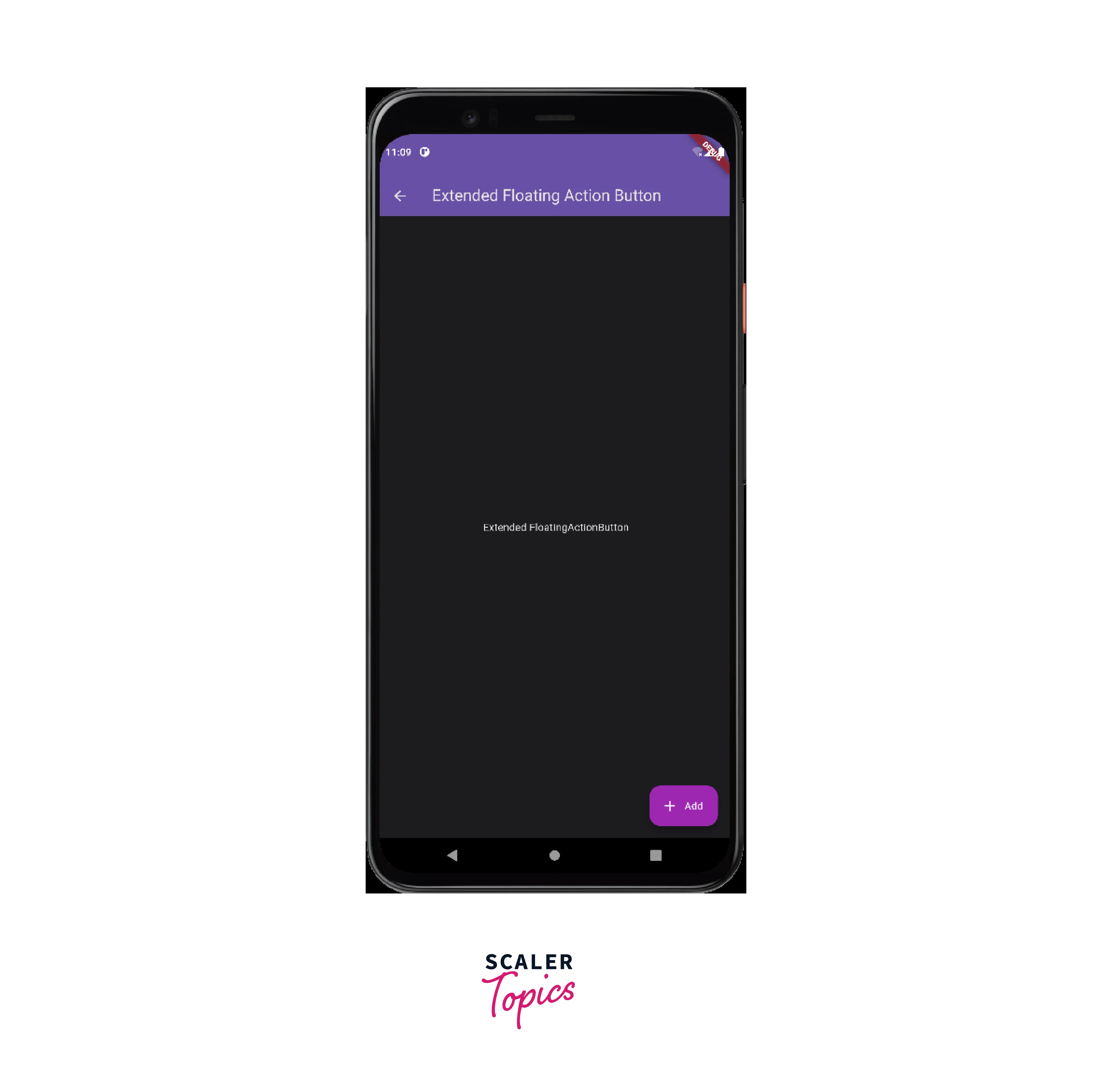
Extended FloatingActionButton
Now, we are going to create a mini FloatingActionButton with purple background color. To achieve this, we simply need to use the FloatingActionButton.extended as the FloatingActionButton.
Here is the output of the above code :
Conclusion
- The FloatingActionButton is a commonly used widget in Flutter that provides a circular-shaped button that looks as if it is floating on the screen.
- It performs some pre-defined task when the user clicks on it.
- We use it to implement some important functions in the user interface and we avoid using more than one FAB on a single screen as it worsens user experience.
- The floating action button also provides numerous properties such as autofocus, backgroundColor, childclipBehaviour, disabledElevation, elevationfocusColor, focusElevationfocusNode, hoverColor, hoverElevation, isExtended, materialTapTargetSize, mini, mouseCursor,onPressed, splashColor, shape, and many more which allow us add so many functionalities to our floating action button.
- We can further create three kinds of FloatingActionButtons Regular floating action buttons, Mini floating action buttons, and Extended floating action buttons. The most basic and generally used one is the Regular floating action button whereas the advanced one is the Extended floating