How to Create a Flutter AppBar?
Overview
Appbar is a crucial UI component in Flutter, giving a consistent look and feel across Android, iOS, and web apps. By using the Appbar widget, developers can easily create and customize appears by changing their appearance and behavior as necessary. Appbars are highly versatile and appear at the top with properties like the app's title, actions, and navigation icons. They are highly customizable for their background color, title position, shape, and other things. You can also add other widgets like PopupMenuButton and IconButton for more functionality. Overall, it is an essential widget for Flutter apps, making them a valuable addition to any developer's toolkit.
Introduction
The Flutter appbar is a highly customizable widget that can completely change the look and feel of an app as it appears at the top. It appears as a header or top-level widget on each screen or view of the app. To use flutter appbar, pass it inside the Scaffold widget in the appbar property and style it according to your needs, like transparent background, coloured background, title, title position, actions list, etc.
What is an AppBar in Flutter?
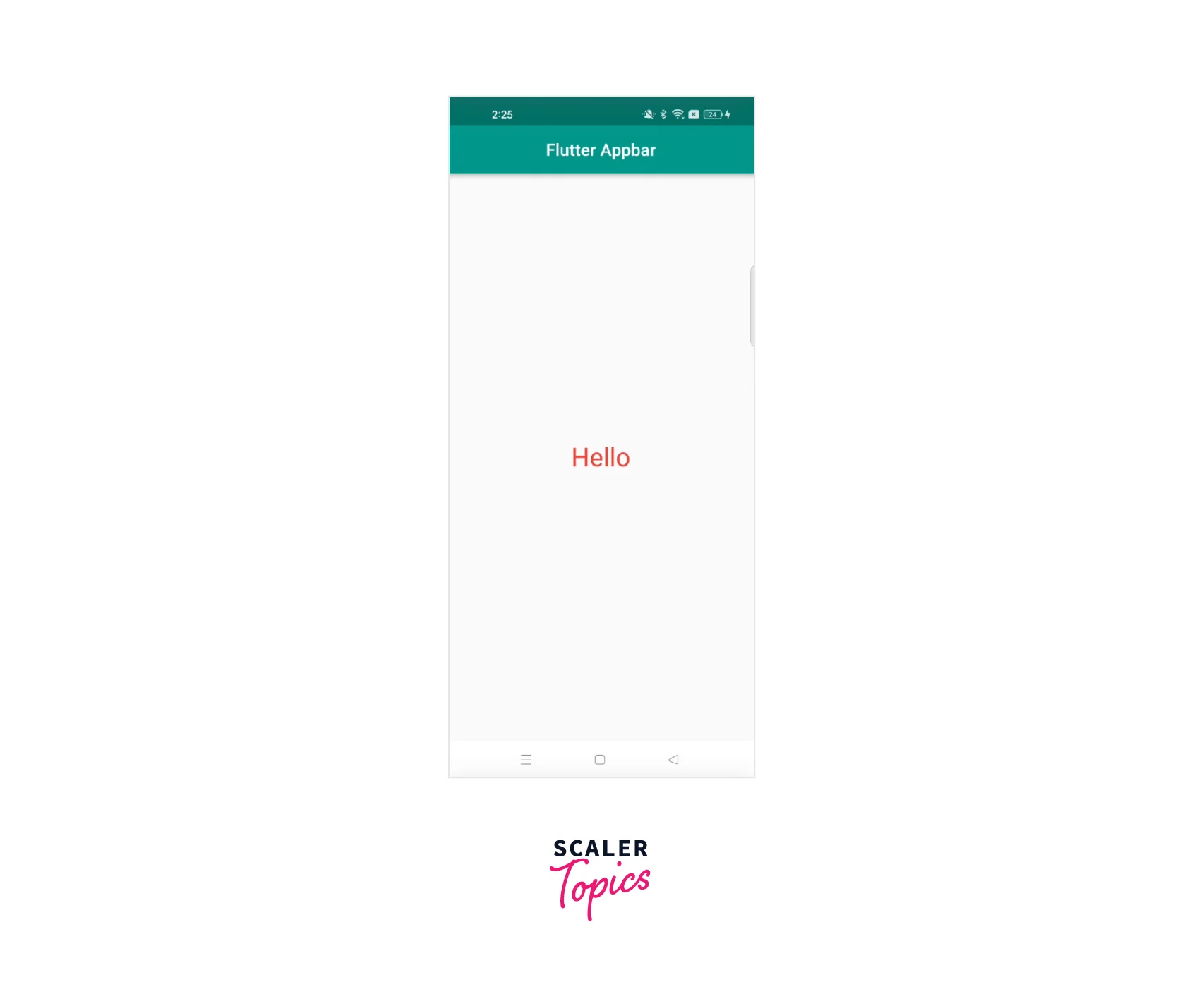
Flutter appbar is equal to a header as shown in web apps or a top-level widget, which we see in every app in the starting or top area where an app's title is defined. It also includes a back button; clicking on it shows us the previous screen and removes the current screen.
Below is the UI to give you an idea of the look of Flutter appbar.

Properties of Appbar Widget
Let's discuss the properties of Flutter appbar, in brief, to use them according to our needs.
| Property Name | Description |
|---|---|
| title | It returns a widget that contains a title or description of the current contents of the app. We can customize this widget |
| Key | This is optional to pass a key. It is used to identify a widget. |
| centerTitle | It returns a bool value, if true, it shows the widget in the centre |
| elevation | The z-coordinate at which to place this app bar relative to its parent and shows the shadow below the app bar. Should be greater than 0. |
| shape | Just pass any shape like Rectangle to this and youc can change the borderRadius, color, and width anytime. |
| titleSpacing | This is the spacing around the title content on the horizontal axis. This spacing is applied even if there is no leading content or actions in appbar |
| backgroundColor | This shows the appbar filled color like blue,grey etc. You can also set it to Colors.transparent with elevation 0 to show a transparent appbar. |
| toolbarHeight | It defines the height of the toolbar i.e. you can set the custom height of your flutter appbar to 70,80,100. |
| actions | This represents a list of widgets in a row after the title property like PopupMenuButton, search button, notification, etc. |
| leading | This widget is displayed before the toolbar's title and generally, it is an Icon or IconButton. |
| automaticallyImplyLeading | This return a bool value and it controls the leading widget. If true, we will see the leading widget else not. |
| bottom | This widget is at the bottom of the app bar typically a TabBar. Only widgets that implement PreferredSizeWidget can be used at the bottom of an app bar. |
| bottomOpacity | It shows, how opaque should be the bottom of the flutter appbar. If 1, is fully opaque and 0 is fully transparent |
| flexibleSpace | This widget is stacked behind the toolbar and the tab bar. Its height will be the same as the app bar's overall height. |
| foregroundColor | This shows the default color for Text and Icons within the Flutter app bar. |
| leadingWidth | This property shows the width of the leading widget and it has a default size of 56.0 |
| toolbarOpacity | This tells about how opaque is a toolbar in Flutter appbar |
| titleTextStyle | This is used to style the flutter appbar's title like font, font family, size, and color. |
| iconTheme | This is used to set the color, opacity, and size of the icons used in flutter appbar |
| actionsIconTheme | This is used to set the color, opacity, and size of the icons used in the actions property of flutter appbar. |
| primary | This property returns a bool value. If returned false, then the appbar will be displayed on the top of the system status bar. It is better to pass true always. |
AppBar Layout
The main components of the flutter appbar that are commonly used in designs are defined below.
-
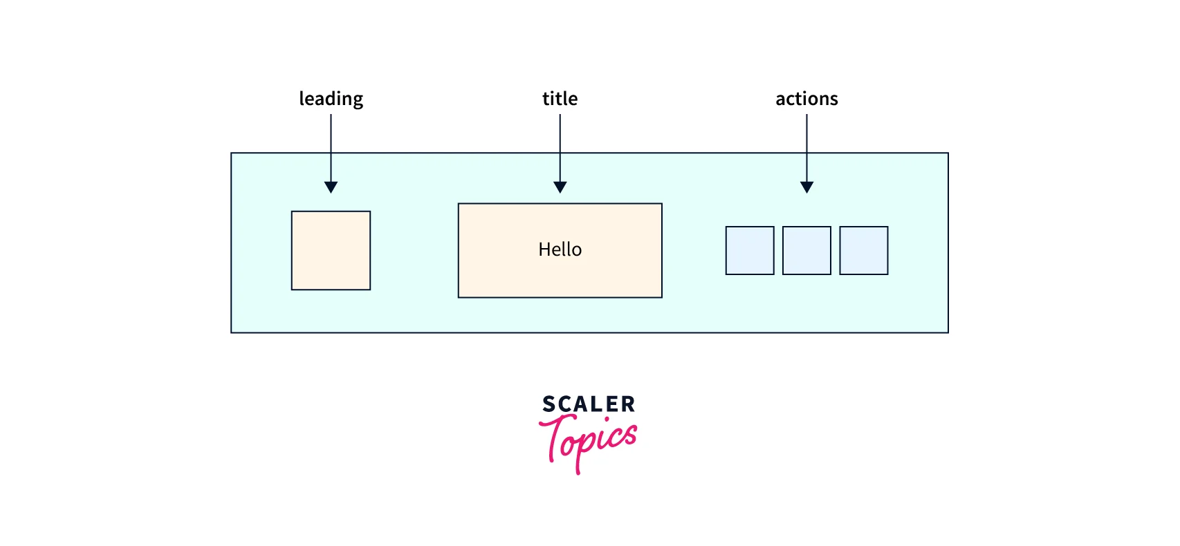
leading - This property of the Flutter appbar is displayed before the title of the app. This is a leading component of the Flutter appbar which typically returns a widget, Icon, or IconButton. If the automaticallyImplyLeading property is set to true, we get to see an arrow icon as a leading widget. By clicking on this arrow, we get back to the previous screen of the stack, and this current screen is removed.
-
title - This flutter appbar property returns a widget, and we can style it according to our requirements. Generally, we pass a Text widget and use it. By default, this is seen on the left unless we set the centerTitle property to true to make it visible in the center. The title property represents the name of the screen, view, or app at the top.
-
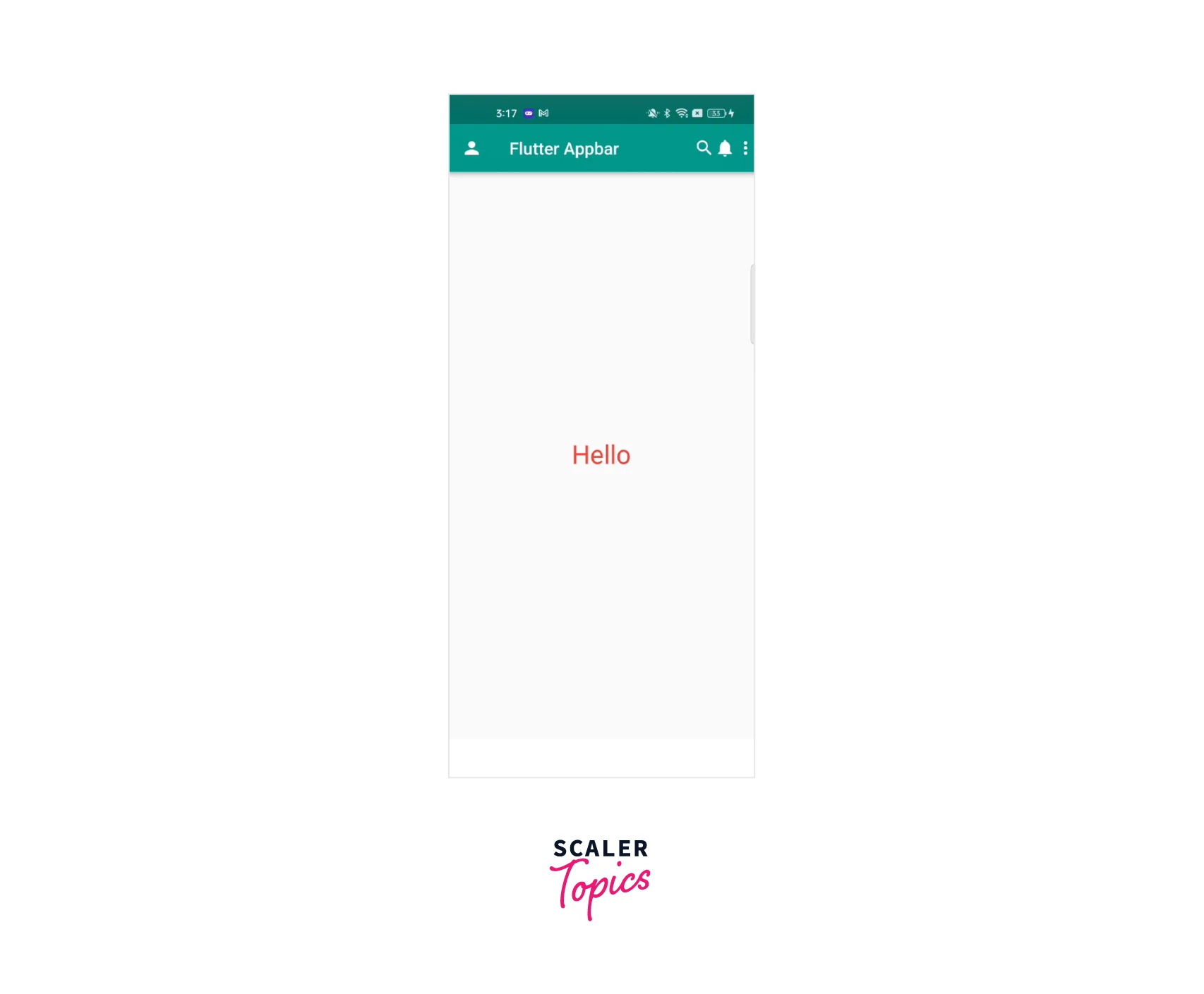
actions -This property returns a list of widgets generally at the end of the Flutter appbar. You can pass any widget here, like Icons, Text, Images, PopupMenuButton, etc. Most of the applications show a search button, a notification icon, or PopupMenuButton, or all three as a list of widgets.
This image shows the title, leading, and actions in flutter appbar.


Example App
In the below example, we will see, how we can customize our Flutter appbar and use its properties to make and style our UI. These are two classes, one is main.dart and the other is appbar.dart showing flutter appbar code with all properties.
- main.dart
- appbar.dart
From main.dart file, we are going to call the FlutterAppbar() class, where all code is related to the Flutter appbar.
We have extended FlutterAppbarState with SingleTickerProviderStateMixin because we are showing tabs in this that need a TabController for TabBar and need to pass this in vsync in TabController.
We are using TabBar here to show the clear use of the bottom property of the Flutter appbar that is just at the bottom of the appbar.

Best Practices
There are some tips and practices you can follow for better code and UI.
-
Flutter appbar should be simple and avoid using multiple buttons, text, and images.
-
The colour combination should be proper and simple UI of the flutter appbar, to make it more user-friendly.
-
Keep in mind how much space the app bar takes up on the screen. Try to avoid using too much space, as this can interfere with the user's ability to interact with the app and cause glitches in the app.
-
One thing you can do is create a common Flutter appbar and import it everywhere. This will make our code look more clean and readable, reduce redundancy, and make it easy to use for everyone. Try to follow this practice wherever you need the same widget more than 2-3 times in your project. Let us try to understand this through the code, where we will make one common class, and you will have to import this common class whenever you want to use the Flutter appbar.
Steps to follow
- Make a class with any name and pass the properties according to your requirement and use case. You can always pass more properties and customize them.
- Just pass this class wherever you need a flutter appbar and pass the data according to your need like title, appbar height, etc.
Conclusion
- We have to use the flutter appbar when we want to show something at the top, like a title, actions, and a back arrow.
- To make a transparent flutter appbar, make backgroundColor as Colors.transparent and pass 0 to elevation.
- To make the app of the title in the center, you have to pass true to centreTitle and it will be in the center.
- You can also pass 0 or negative values to titleSpacing if there is more gap between the title and leading widget and you want the gap to be minimum.
- You can increase or decrease the height of your flutter appbar based on your requirements. You have to pass any value like 80, 100 to the toolbarHeight property.
- If you want to show the same color to leading, title and actions then pass that color to the foregroundColor property instead of defining the color individually for all.
- If you have to use the Flutter appbar on many screens, try to make a common class, define required properties and import that class everywhere in the needed screens.
- We have discussed the properties of the flutter appbar in the above example, which are commonly used, with an explanation and code.
