How to make Color Picker in Flutter?
Overview
The Flutter color picker is a widget that allows users to select colors in Flutter applications. Users can select colors from a palette or type in custom color values using the interactive interface that is provided. The color picker provides a variety of functions, including sliders, opacity controls, and color swatches, to enable accurate color selection. It can be quickly customized to fit the application's design and readily integrated into Flutter projects. Developers may improve user experiences by enabling users to quickly and easily adjust colors within their apps with the Flutter color picker.
Introduction
Developers may incorporate sophisticated color-choosing capabilities into their Flutter applications using the flexible and strong Flutter color picker widget. The color picker's user-friendly and dynamic interface makes it simple for users to select and alter colors to suit their preferences and requirements. The color picker provides several features to make the process easier, including the ability to choose colors from a predetermined palette and specify exact color values. These consist of sliders, opacity controls, color swatches, and other tools. Developers may improve the user experience by allowing users to easily customize and fine-tune colors by incorporating the color picker into their Flutter apps. With its flexibility and customization options, the Flutter color picker provides a seamless and efficient way to incorporate robust color selection capabilities into any Flutter application, enhancing visual aesthetics and enabling users to create captivating and personalized experiences.
flutter_colorpicker Package
For adding color pickers to Flutter applications, the flutter_colorpicker package offers an easy-to-use and scalable solution. The flutter_colorpicker package makes it simple for developers to add color picker capabilities to their user interfaces. This package includes several features, including a color picker widget that enables users to engage with color selection, personalize the color picker's design, and manage color change events. The flutter_colorpicker package makes it easy to include color-choosing functionality in your app, allowing users to make precise and accurate color selections. Developers may add logical and aesthetically pleasing color selection interfaces to their Flutter applications with the flutter_colorpicker package, enabling users to work with colors easily.
To Add the flutter_colorpicker dependency to your pubspec.yaml file:
import the necessary packages in your Dart file:
- The package's extensive feature set enables users to select colors using a variety of tools, including color wheels, color palettes, and RGB sliders.
- Additionally, the flutter_colorpicker package supports many color representations, allowing for easy conversion between them.
- It also offers customization choices so that the color picker may be made to look exactly like the rest of the application's design.
- The flutter_colorpicker package streamlines the development process by offering a ready-to-use solution for handling color choices, regardless of whether you're creating a drawing app, a photo editing tool, or a feature that allows you to customize a theme.
- By integrating the flutter_colorpicker package into your Flutter project, you can empower your users to express their creativity and personalize their experiences through color customization, adding a visually appealing and engaging aspect to your application.
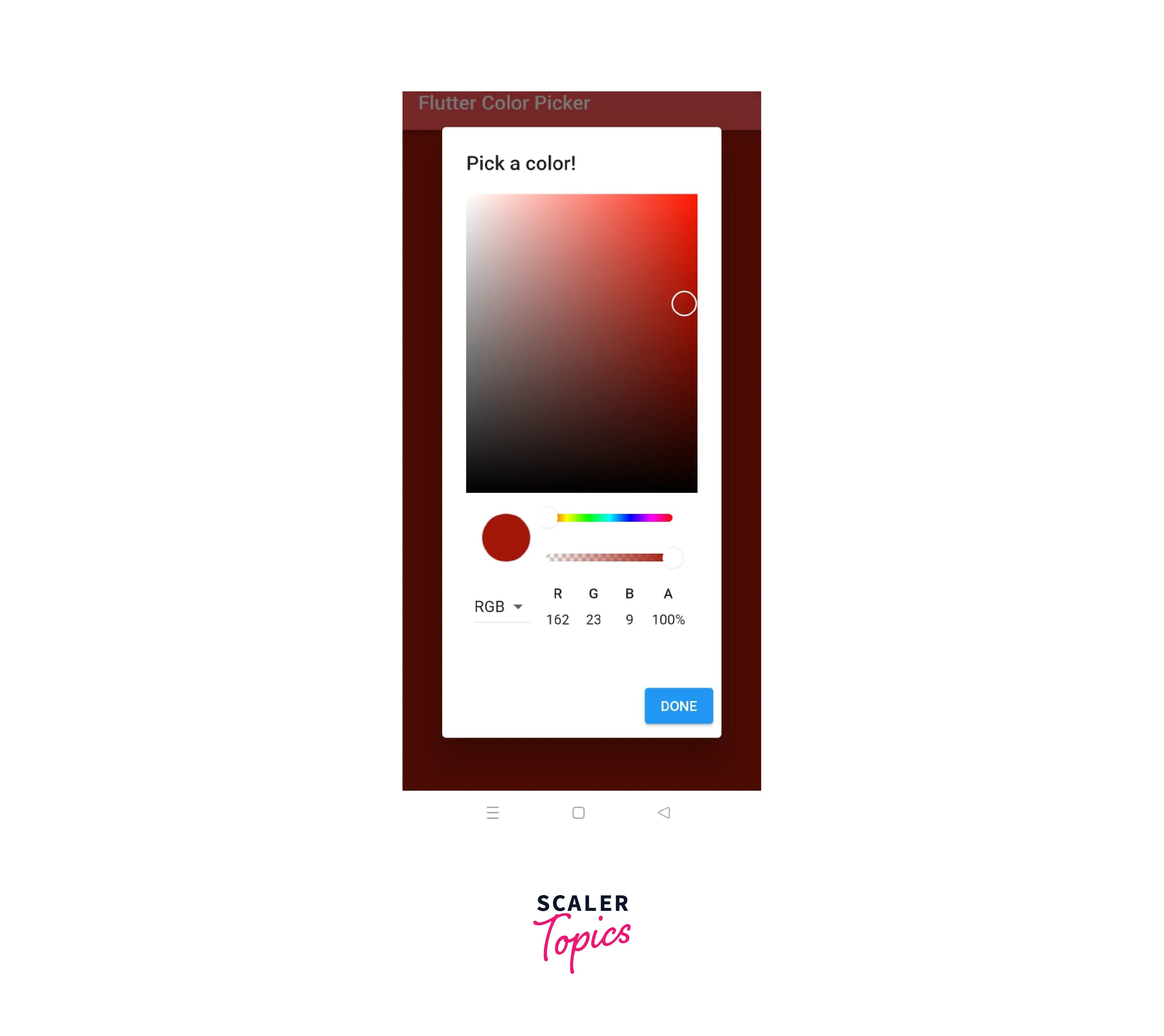
Color Selection and Display
The color-choosing and display processes are perfectly combined in the ColorPicker package for Flutter. Users can choose colors interactively and see the chosen color displayed in real-time thanks to a full collection of tools and components included in the package.
Some types of color selections and display methods are :
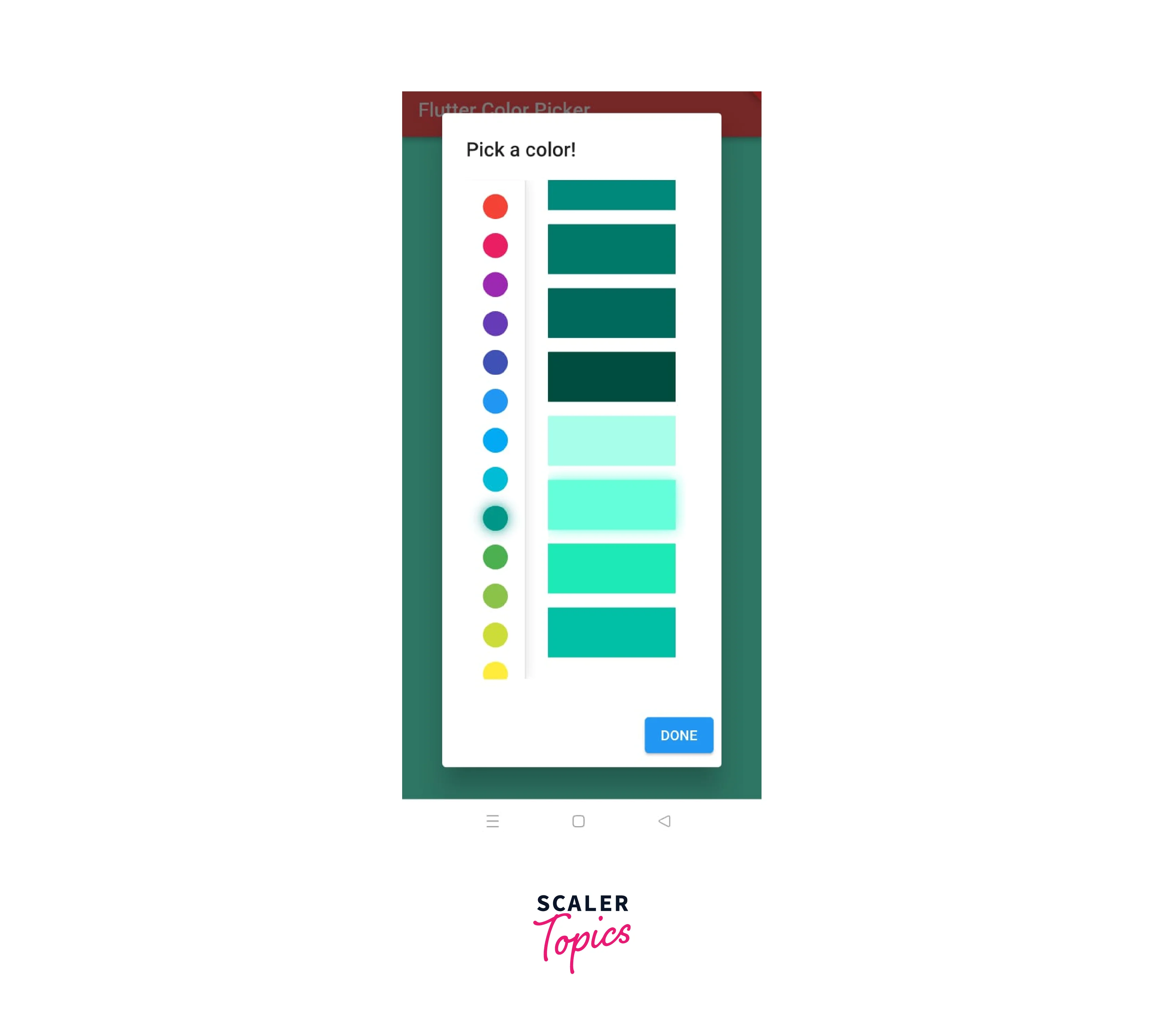
Drag and Drop color picker :

Material color picker :
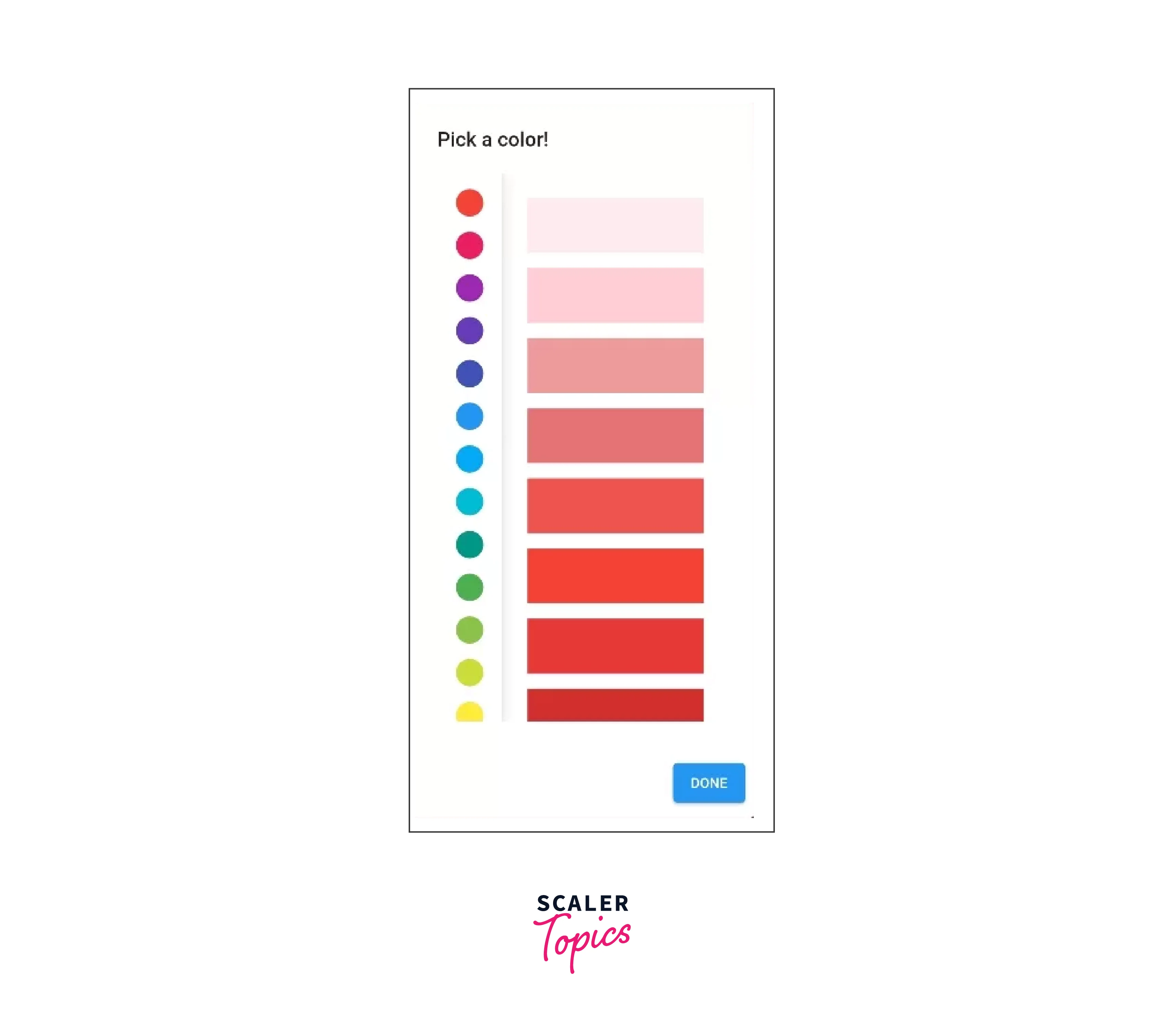
Block color picker :
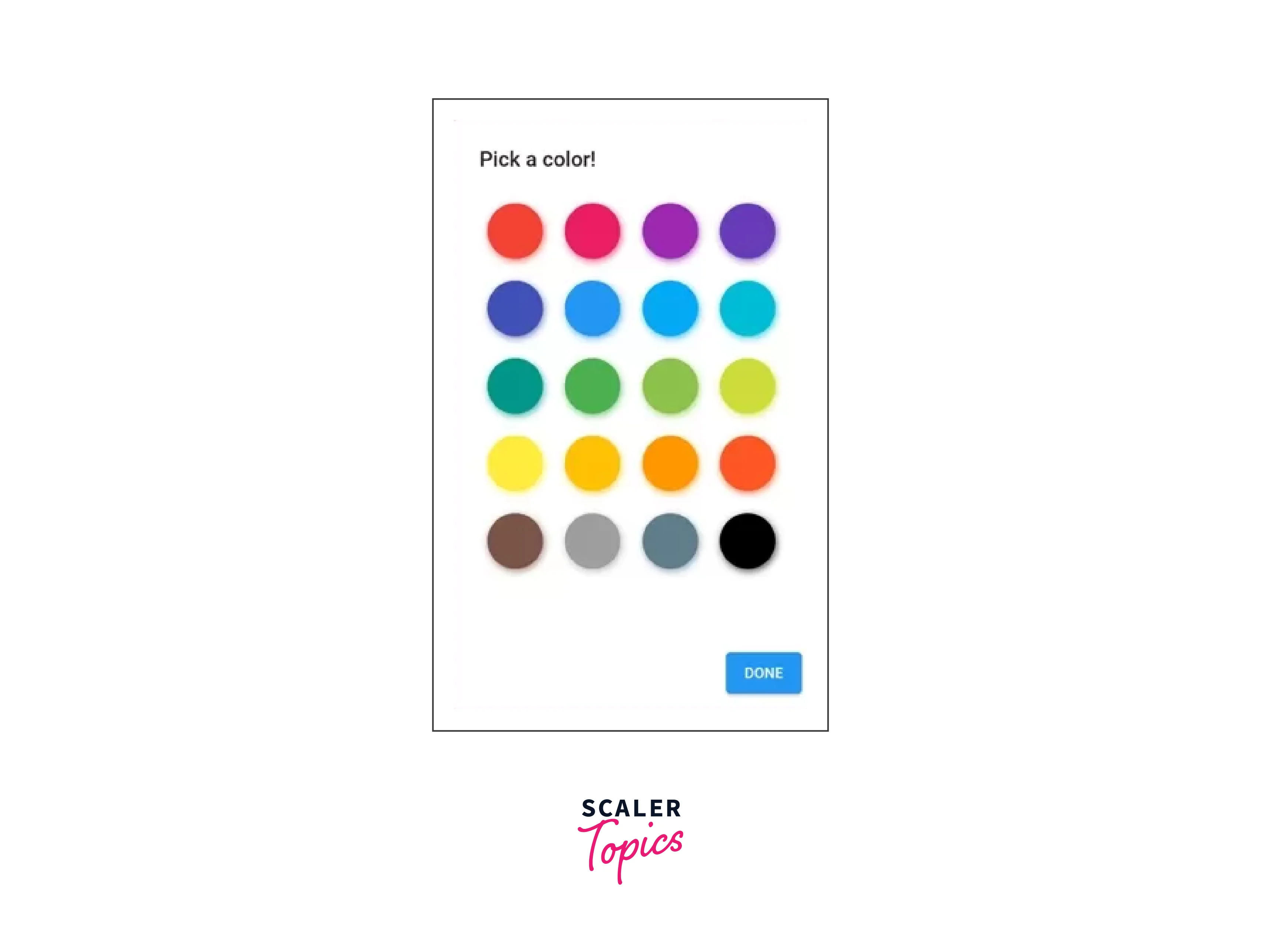
Multiple color picker :

Customizing the Color Picker
In Flutter, you can customize the appearance and behavior of the ColorPicker widget provided by the flutter_colorpicker package to match your specific requirements. Here are some ways you can customize the ColorPicker:
| Behavior | Description |
|---|---|
| Picker Layout | By changing its attributes, the ColorPicker widget's layout can be modified. For instance, the pickerAreaHeightPercent property allows you to modify the height of the color picker area. By setting the pickerIndicatorShape property to a custom shape, you may also alter the color indicator's dimensions and appearance. |
| Color Palette | You can create a unique color palette for people to select from using the ColorPicker widget. A list of predetermined colors can be set using the paletteColors property. By supplying the column-count attribute, you can also alter the color palette's column count. |
| Label and Indicator | Labels and color indications can be displayed using the ColorPicker widget. Using the showLabel property, you may turn the color value label on or off. Using the pickerColorBuilder parameter, you can construct a custom widget to alter the color indicator's appearance. |
| Color Picker Dialog | A dialogue commonly makes use of the ColorPicker widget. By making a custom AlertDialog widget the parent of the ColorPicker, you can alter how the dialogue looks. By doing so, you can modify the dialog's title, content, actions, and other attributes. |
| Color Formats | The RGB color format is what the ColorPicker widget use by default. By setting the pickersEnabled property, you can, however, alter the color format to another format, such as HSV, HSL, or HEX. Users can choose colors in the format of their choice thanks to this. |
| Theme and Styling | One can further customize the appearance of the ColorPicker widget by leveraging Flutter's theming capabilities. Use the Theme widget to set custom styles, such as colors, fonts, and borders, to match your app's overall design. |
Interacting with the Color Picker
Interacting with the ColorPicker widget in Flutter allows users to select colors and perform actions based on the selected color. Here are some ways you can interact with the ColorPicker:
-
Handling Color Changes : When a user chooses a new color, the ColorPicker widget's onColorChanged callback is activated. To take action anytime the color changes, you can create a function and assign it to the onColorChanged property. For instance:
-
Updating the UI : The user interface can be instantly updated using the chosen color. For instance, you may alter the background color of a widget dynamically, paint a canvas with the chosen hue, or change the color of the text or icons. To accomplish this, you may utilize the setState method and the selectedColor variable together to have the UI reconstruct itself each time the color changes.
-
Performing Actions : The chosen color can be linked to several activities, such as preserving the choice, applying it to an object, or starting an event. When the user chooses a color, for instance, you can show a confirmation dialogue and ask them to double-check their choice before implementing it.
-
Integrating with Other Widgets : The user experience can be improved by combining the chosen color with other Flutter widgets. For example, you may use the selected color to alter the behavior of another widget by passing it as an argument or by using it to change the color of a Button.
-
Accessing Color Information : The chosen color is made available as an instance of the Colour class by the ColorPicker widget. To do computations, make gradients, or generate color codes, you can access various color attributes, such as red, green, blue, or opacity.
Advanced Techniques and Enhancements
-
There are several advanced approaches and additions available in Flutter to improve the functionality and user experience of a color picker.
-
These include offering advanced color manipulation options such as blending or variations, taking accessibility considerations for users with visual impairments, integrating with external color libraries, allowing users to create custom color palettes, maintaining a color history for simple color switching, adding alpha/opacity control, enabling color conversion between different formats, and more.
-
By utilizing these cutting-edge methods, programmers can produce a color picker that is more robust and flexible, enabling users to choose and work with colors in a way that best suits their needs and preferences while also offering extra features and capabilities for sophisticated color manipulation and customization.
-
Features like color preview, real-time color updates, and live color swatches can also be included in an advanced method or upgraded in a color picker for Flutter.
-
Users can view the selected color in their application or design using the color preview feature. Any changes made to the color picker are quickly reflected in the UI thanks to real-time color updates, which gives users fast visual feedback.
-
Users of live color swatches can quickly explore color variants and harmonies by viewing a collection of colors that are dynamically generated based on the color they have chosen.
-
These cutting-edge features not only improve the color picker's usability and interactivity but also give users the tools they need to choose colors for their projects more thoughtfully and originally.
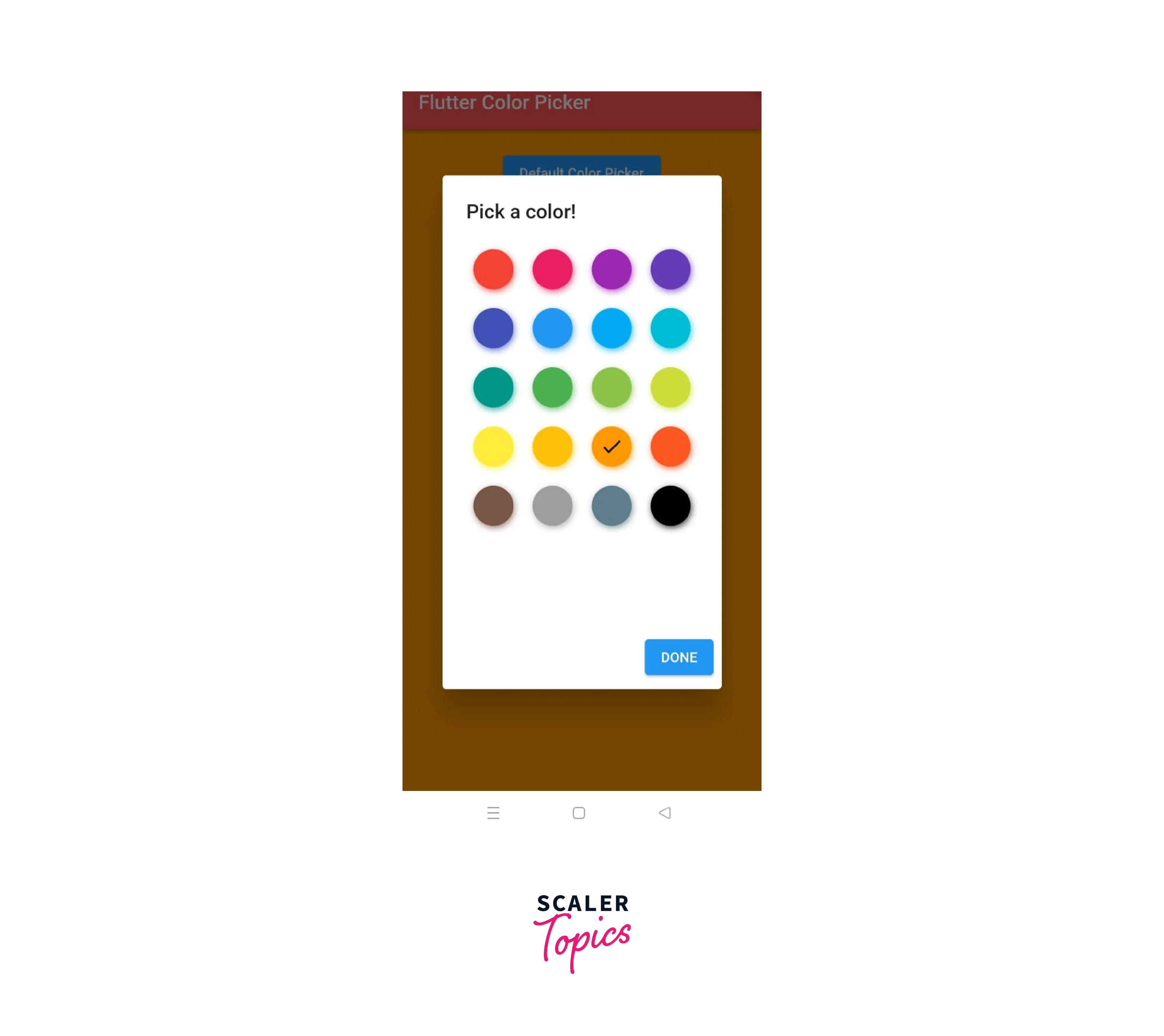
Example
The output should look like this :


Conclusion
- Color Picker can be implemented as a Drop color Picker, Material Color Picker, Block Color Picker or Multiple Color Picker.
- One can interact with the various colors option provided in the pallet and change them accordingly.
- The onColorChanged callback of the ColorPicker widget is invoked when a user selects a new colour. You may build a function and add it to the onColorChanged property to perform an action whenever the colour changes.
- Using the colour picker in flutter, the user interface will be quickly updated with the selected colour.