Dropdown in Flutter
Discover the essentials of Flutter's DropdownButton, a key widget for enhancing user experience in app development. This versatile tool simplifies user choices, streamlining workflows by offering a straightforward selection method from a list of options. Learn to master its various properties, including DropdownButtonFormField for added validation, and see how it excels in scenarios like country selection in forms, providing a superior user interface to other widgets like radio buttons.
What is a Dropdown?
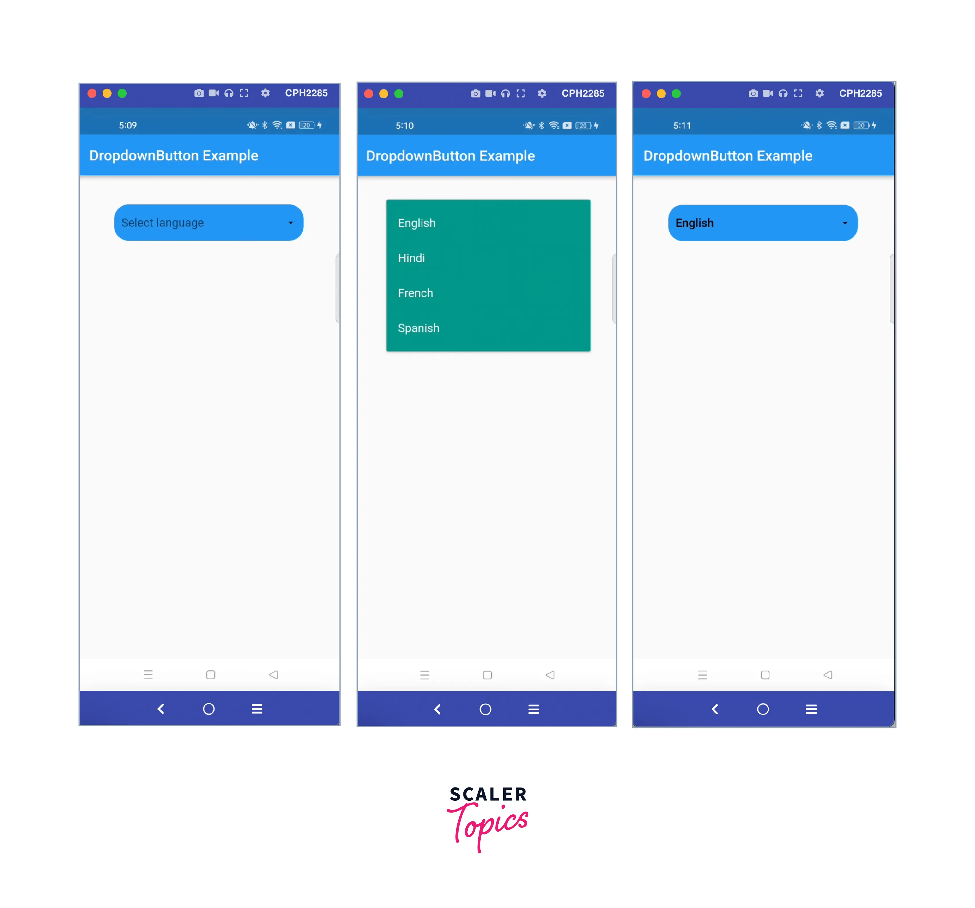
Dropdown a graphical user interface with a triangle icon, and on clicking it, the user can see the list of options and can select the required value, and the selected value will appear.
How to Create a Dropdown in Flutter?
To create a flutter dropdown, you have to return a DropdownButton widget and use the properties according to your needs.
- Create a list of items to be displayed in the dropdown list.
- Define a variable that will store the selected item.
- Then pass these data to the DropdownButton.
Dropdown with Validation
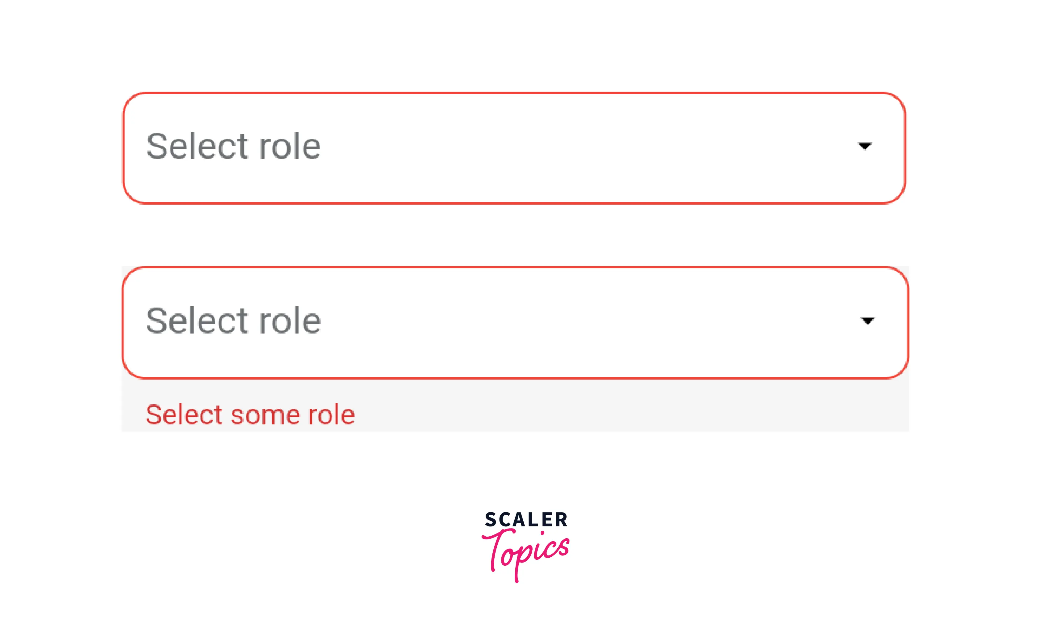
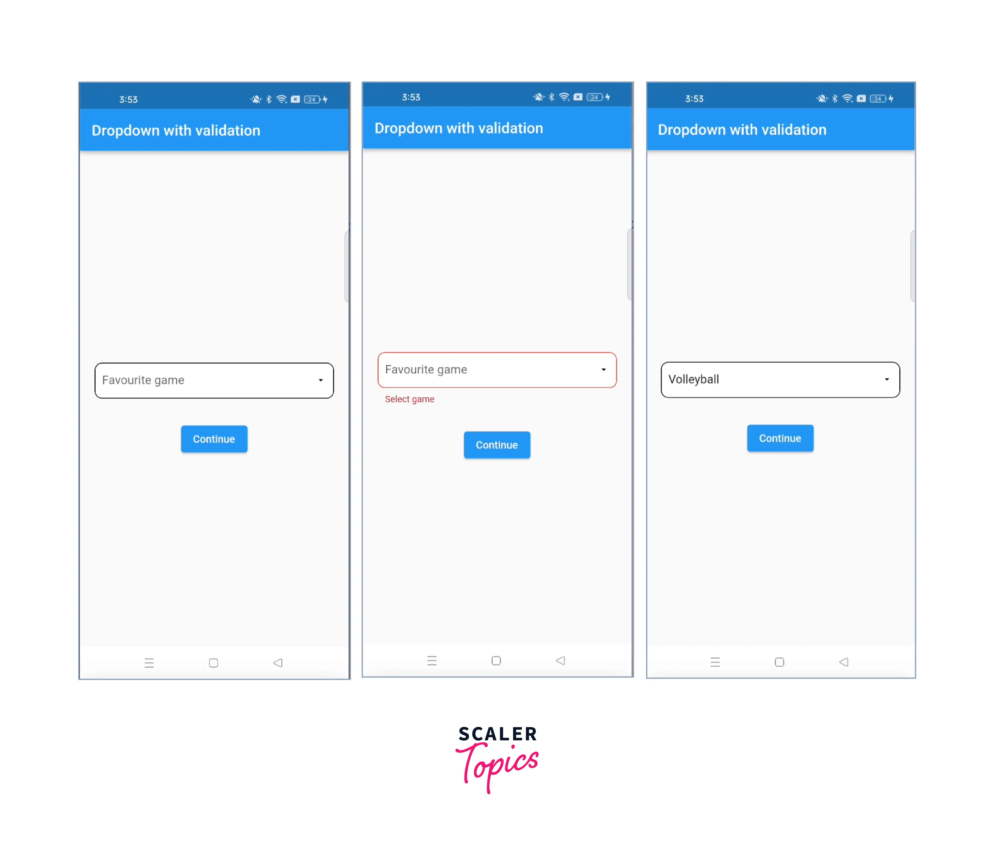
It means we have to validate our flutter dropdown, i.e., make it compulsory to select an item from the list; otherwise, it will show an error. In this case, either we can show only a red outer border or we can display some text as shown below, or both.

So, for this we have to keep two things in mind -
- Wrap the flutter dropdown widget with the "Form" widget and we have to pass a global key in the Form widget.
- For this we have to use "DropdownButtonFormField" instead of "DropdownButton"
Steps to follow
- First, we have to create a key of type GlobalKey inside the class
- Then wrap the "DropdownButtonFormField" with Form widget and pass the global key defined above in the key property of the Form widget.
- Inside DropdownButtonFormField, it is mandatory to pass the validator property to show the error text by checking null and empty conditions. Also to show the red color border, you have to pass decoration property and define the error border inside it where you can chaitsit's color, width, and borderRadius.
- Then inside the Button widget, you have to validate using GlobalKey variable by pressing the button. We have to validate the current state of the key and return the validator defined in the flutter dropdown button if not valid.
So, this is all we need to validate a flutter dropdown. This is mostly used in form filling where you can't leave a field empty i.e. unselected or unfilled.
Properties of DropDownButton
Let's discuss the properties of the flutter dropdown in brief.
| Property Name | Description |
|---|---|
| elevation | It is the z-coordinate at which to place the dropdown menu list when opened. It can be 1,2,5,8,24. |
| underline | It makes an underline in the dropdown-button |
| isExpanded | It expands the button width horizontally and gives full available space. |
| hint | A placeholder widget that is displayed by the dropdown button initially like select |
| iconSize | To change the size of the icon like 20, or 30. |
| iconEnabledColor | To show icon color if onChanged is defined and not null. |
| icon | It takes the widget, you can pass any image as an icon or can use predefined icons |
| value | The value of the currently selected DropdownMenuItem from the given or defined list |
| style | It is used to style the text of the dropdown button and dropdownmenu item which appears on the click |
| items | This shows the list on click from which the user can select one value. |
| onChanged | This function is called the hen user clicks an item and we get to see the selected item |
| alignment | This is to show the position of the dropdown button text to center, centerStart, bottom, end, etc. |
| iconDisabledColor | This color is shown when the button is disabled i.e onChanged is null |
| dropdownColor | It shows the background color of the dropdown |
| isDense | It returns a bool value and reduces the height if it is true. By default it is false. |
| disabledHint | This widget is displayed when the button is disabled i.e items or onChanged is null |
| selectedItemBuilder | A builder to customize the dropdown buttons corresponding to the DropdownMenuItems in items. When a DropdownMenuItem is selected, the widget that will be displayed from the list corresponds to the DropdownMenuItem of the same index in items |
Best Practices for Using Dropdown in Flutter
- As we all know, Fluttertter dropdown is a very common widget that is widely used across the project in so many places for different screens.
- It will not be a good practice to write the same dropdown code of 100–200 or more lines everywhere in the project.
- To avoid this, we will create a common class for the flutter dropdown. We will write all the code for the dropdown in one place, and we will simply import this class wherever we want to use the flutter dropdown.
- This will make our code look more clean and readable, reduce redundancy, and make it easy to use for everyone.
Let us try to understand this through the code, where we will make one common class, and you will have to import this common class whenever you want to use the Flutter dropdown.
1. Make a class with any name like common_dropdown_button.dart.
Define all the properties that are changeable in the class constructor and pass the variable to the properties as shown in the code snippet.
2. To use this, import the class to other required places and pass your data accordingly.
Example App
These are three files-
- main.dart
- dropdown_exapmle.dart //for normal dropdownbutton
- dropdown_with_validation.dart // for showing validation


Conclusion
- We have to use the dropdown when we have to choose one value from the list.
- We can style it according to our needs by changing the properties.
- "DropdownButtonFormField" is used when it is compulsory to select something from the flutter dropdown list.
- Remember to wrap your "DropdownButtonFormField" widget with the "Form" widget to show the validation.
- Normally, for selecting a value you can use "DropdownButton" widget.
- Make a common class for flutter dropdown button if it is used for more than 2-3 times in the project.
- We have discussed the properties of the Flutter dropdown in the example, which are commonly used, with an explanation.
