Flutter Switch
Overview
Flutter Switch is a highly versatile and customizable UI component in the Flutter framework that allows developers to incorporate toggle functionality into their mobile applications with ease. With its sleek and intuitive design, Flutter Switch provides a seamless and engaging user experience, enabling users to toggle between two states effortlessly. Whether it's implementing a dark mode switch, a settings toggle, or any other binary functionality, Flutter Switch offers a wide range of options for customization, including color schemes, animations, and size adjustments. Its straightforward integration and extensive flexibility make Flutter Switch a popular choice for developers seeking to enhance their Flutter applications with intuitive and visually appealing toggles.
Introduction
Flutter Switch is a user interface component in the Flutter framework that enables developers to add toggle functionality to their mobile applications. It provides a visually appealing and intuitive switch interface, allowing users to switch between two states effortlessly. Flutter Switch offers extensive customization options, such as color schemes, animations, and size adjustments, making it a popular choice for implementing toggles in Flutter applications.
What is a Switch widget?
Widgets as you already know are the baisc building block of any flutter application. There are numerous ways in which widgets in flutter can be divided into and described. Here, you shall learn aboyt a new classification of widget called the switch widget.
In Flutter, a switch widget is a UI component that represents a binary toggle, allowing users to switch between two states. It displays a sliding button that can be dragged or tapped to change its position and toggle between "on" and "off" states. The switch widget is commonly used to implement features like dark mode switches, settings toggles, or any other binary functionality in mobile applications. It provides visual feedback and can be customized with different colors, sizes, and animations to match the app's design.
The switch widget is a versatile and user-friendly component in Flutter that enhances the interactivity and functionality of applications. The use of switch widget in flutter enhances the UI of the application making the experience more seamless and efficient.
Implementing a Basic Switch
So far in this article, you have learned about the flutter switch and why is it important to implement it in our flutter application. In this section, we shall learn how to implement flutter switch so that we can make the application more user-friendly and interactive. To implement a basic switch in Flutter, you can follow these steps:
-
Create a new Flutter project or open an existing one in your preferred development environment.
-
Open the main.dart file and remove the existing code in the build() method of the MyApp widget.
-
Replace the code with the following:
- Save the changes and run the application.
This implementation creates a basic Flutter application with a switch widget. The switch's value is controlled by the _switchValue variable, which is initially set to false. When the user interacts with the switch, the onChanged callback is triggered, and the _switchValue is updated accordingly.
The switch widget is placed at the center of the screen using the Center widget. The Scaffold provides a basic app structure, and the AppBar widget displays the title "Basic Switch" at the top of the screen.
When you run the application, you should see a switch that can be toggled between "on" and "off" states. This implementation of flutter switch shall help you to visulaize the significance of integration of flutter switch into your application.
Properties of Switch Widget
As you have learned about the switch widget in flutter and its implementation, you shall now learn about the the properties of flutter switch. It is essential to know the properties of the flutter switch so that you can easily implement in into your application and leverage its various properties to get the best possible result.
The Switch widget in Flutter has several properties that can be used to customize its appearance and behavior. Here are some commonly used properties:
-
value: The current state of the switch, represented by a boolean value (true or false). This property is required.
-
onChanged: A callback function that is called when the user toggles the switch. It takes a boolean parameter representing the new value of the switch.
-
activeColor: The color of the switch when it is in the "on" state. It can be set using the Color class or predefined colors from the Colors class.
-
inactiveColor: The color of the switch when it is in the "off" state. Like activeColor, it can be set using the Color class or predefined colors.
-
activeTrackColor: The color of the track (background) when the switch is in the "on" state.
-
inactiveTrackColor: The color of the track when the switch is in the "off" state.
-
activeThumbImage: An optional image that can be used as the thumb (the sliding button) when the switch is in the "on" state. It can be set using the AssetImage class or any other image provider.
-
inactiveThumbImage: An optional image used as the thumb when the switch is in the "off" state.
-
dragStartBehavior: Determines the behavior of the switch when the user starts dragging it. It can be set to DragStartBehavior.start or DragStartBehavior.down.
These are just a few of the available properties for the Switch widget. You can explore the Flutter documentation for additional properties and methods to further customize the switch based on your application's requirements.
Creating a ustom animated Switch Button
Animations make the application look better and are undoubtedly more fun to work with. To create a custom animated switch button in Flutter, you can follow these steps:
-
Create a new Flutter project or open an existing one in your preferred development environment.
-
Open the main.dart file and remove the existing code in the build() method of the MyApp widget.
-
Replace the code with the following:
Output:

- Save the changes and run the application.
This implementation creates a custom animated switch button. The switch's value is controlled by the _switchValue variable, which is initially set to false. When the user taps on the switch button, the _switchValue is toggled, and the animation controller plays the forward or reverse animation based on the new switch value.
The switch button is created using a GestureDetector widget wrapped around a Container. The onTap callback is triggered when the user taps the switch button. The container's color is animated using the _animation value, which is based on the animation controller's value.
Inside the container, a Stack widget is used to position the sliding button. The Positioned widget is animated horizontally based on the _animation value. When the _switchValue is true, the sliding button is positioned on the right side of the container. Otherwise, it is positioned on the left side.
When you run the application, you should see a custom animated switch button that smoothly slides between the on and off states.
Difference Between a Switch and a Toggle
In Flutter, both a switch and a toggle refer to UI components that allow users to toggle between two states. However, there are slight differences in their appearance and usage:
-
Switch: A switch in Flutter is represented by the Switch widget. It typically consists of a sliding button that can be dragged or tapped to change its position and toggle between "on" and "off" states. The switch widget is commonly used for binary options such as enabling/disabling a feature or activating/deactivating a setting.
-
Toggle: The term "toggle" is more generic and can refer to any UI component or mechanism that allows users to switch between two states. In Flutter, a toggle can be implemented using various UI elements such as buttons, checkboxes, or even custom-designed components. Unlike the switch, a toggle doesn't have a predefined visual representation and can be customized based on the specific design requirements of the application.
In summary, a switch is a specific type of toggle that has a standardized appearance with a sliding button, while a toggle is a broader term encompassing any mechanism that facilitates toggling between two states in Flutter.
Working with Switch Lists and Switch Tiles
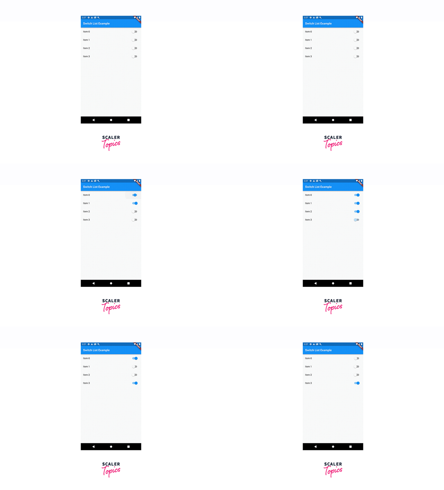
Working with Switch Lists and Switch Tiles in Flutter involves creating a list of items with toggle functionality using the ListView.builder widget and the SwitchListTile widget. Here's an example:
Output:

In this example, we create a list of items using the ListView.builder widget. The number of items is determined by the length of the _switchValues list, which is initially populated with false values.
Inside the ListView.builder, we use the SwitchListTile widget for each item. The SwitchListTile displays a title, a switch, and an optional subtitle. The value property of the SwitchListTile is bound to the corresponding value in the _switchValues list, and the onChanged callback is triggered when the switch is toggled.
When the onChanged callback is called, we update the _switchValues list with the new value using setState. This triggers a rebuild of the UI, reflecting the updated switch state.
Running this application will display a list of items with switches next to each one. Toggling a switch will update its corresponding value in the _switchValues list, and the UI will be updated accordingly.
How to Customize the Switch Button in Flutter?
To customize the appearance of the Switch button in Flutter, you can utilize various properties and widgets to achieve the desired customization. Here are some common customization options:
-
activeColor: The activeColor property allows you to set the color of the switch when it is in the "on" state. You can specify a color using the Color class or use predefined colors from the Colors class.
-
inactiveColor: The inactiveColor property sets the color of the switch when it is in the "off" state.
-
activeTrackColor: The activeTrackColor property defines the color of the track (the background behind the switch) when the switch is in the "on" state.
-
inactiveTrackColor: The inactiveTrackColor property sets the color of the track when the switch is in the "off" state.
-
thumbColor: The thumbColor property allows you to specify a custom color for the thumb (the sliding button) of the switch.
-
thumbImage: The thumbImage property lets you use a custom image as the thumb of the switch. You can specify an image using the AssetImage class or any other image provider.
You can adjust these properties according to your specific design requirements to create a customized Switch button.
Example App
Output:

In this example, we have an ExampleApp widget as the root of the application. It has a _switchValue variable to track the state of the switch. The FlutterSwitch widget is created separately to encapsulate the custom switch implementation.
The FlutterSwitch widget receives the initial value and an onToggle callback via its constructor. Inside its state, it maintains a _value variable that represents the current state of the switch. The switch is visually represented using a Container with a sliding effect achieved through AnimatedPositioned.
When the user taps on the switch, the toggleSwitch function is called, which updates the _value variable and invokes the onToggle callback passed from the parent widget.
The main app, ExampleApp, displays the FlutterSwitch widget and also shows a text message indicating whether the switch is ON or OFF.
Running this app will give you a switch that can be toggled, and the text message below will reflect the switch's state.
Conclusion
-
Flutter Switch is a versatile and customizable UI component in the Flutter framework that allows developers to incorporate toggle functionality into their mobile applications with ease.
-
With its sleek and intuitive design, Flutter Switch provides a seamless and engaging user experience, enabling users to toggle between two states effortlessly.
-
The extensive customization options offered by Flutter Switch, such as color schemes, animations, and size adjustments, make it a popular choice for implementing toggles in Flutter applications.
-
Flutter Switch can be used for various purposes, including implementing dark mode switches, settings toggles, or any other binary functionality required in mobile applications.
-
The straightforward integration and flexibility of Flutter Switch make it a powerful tool for developers seeking to enhance their Flutter applications with intuitive and visually appealing toggles.
