Flutter Themes
Overview
Flutter themes provide developers with a powerful mechanism to visually enhance and customize applications. By utilizing the Theme class as the cornerstone, Flutter enables the creation of visually captivating user interfaces through properties. The Theme widget ensures consistency in design throughout the entire application or specific widget subtrees.
Customization options allow for precise branding alignment, while theme inheritance facilitates the creation of new themes based on existing ones. The seamless implementation of dark mode ensures a visually pleasing experience across different environments.
Introduction
Achieving an aesthetically pleasing and consistent user interface is crucial for creating engaging user experiences. This is where Flutter themes come into play as a powerful tool for designing and customizing the visual aspects of applications. Flutter themes provide developers with the ability to define a cohesive and branded look and feel, ensuring visual consistency throughout the app.
By leveraging the Theme class and the Theme widget, developers can easily configure properties such as colors, fonts, and text styles to create visually appealing user interfaces. Whether it's creating a stunning app-wide theme, customizing themes for specific widget subtrees, or implementing dark mode support, Flutter themes empower developers to craft striking and user-friendly applications.
Constructor Of Theme Widget
At the core of Flutter themes lies the Theme widget's constructor, which serves as a crucial entry point for defining and configuring themes. The constructor accepts a ThemeData object that encapsulates various properties and settings related to the visual appearance of the application.
The constructor of the Theme widget is typically utilized at the root of the widget tree, wrapping the entire application or specific widget subtrees to apply the defined theme consistently throughout.
By providing a ThemeData instance to the constructor, developers can specify the desired visual characteristics of their application, such as colors, typography, and widget styles.
Properties of Theme Widget
The Theme Widget as you can see above has mainly two properties:
- data: This property accepts a ThemeData object and defines the overall theme for the widget subtree it wraps.
- child: The child property refers to the widget or widget subtree that is wrapped by the Theme widget. It ensures that the specified theme is applied to the entire subtree, affecting all its child widgets.
The ThemeData class itself offers a range of properties and options to customize the theme. Some notable properties include:
- primaryColor: Specifies the primary color used for elements such as the app bar, buttons, and highlighting.
- accentColor: Determines the accent color, typically used for secondary elements or to provide visual emphasis.
- fontFamily: Specifies the default font family for text within the application.
- textTheme: Allows customization of various text styles, including the headline, body, caption, and more.
- buttonTheme: Defines the default styling for buttons within the application.
These properties, along with many others available within the ThemeData class, allow developers to fine-tune the visual presentation of their application to align with specific design requirements.
Creating a New Theme
Creating a theme in Flutter involves instantiating a Theme widget and specifying the desired properties within a ThemeData object. The process typically follows these steps:
- Define a ThemeData object: Create a new instance of the ThemeData class and set the desired properties. For example, you can define the primaryColor, accentColor, fontFamily, and textTheme properties to establish the core visual aspects of the theme.
- Instantiate the Theme widget: Wrap the widget subtree where you want to apply the theme with the Theme widget. Assign the previously created ThemeData object to the data property of the Theme widget.
- Apply the theme: Ensure that the Theme widget is placed at an appropriate location within the widget tree, typically at the root level of the application or specific widget subtrees. This ensures that the defined theme is applied consistently throughout the wrapped subtree.
It's important to note that while the ThemeData constructor is commonly used to define the initial theme, the theme can be modified dynamically during runtime using techniques like theming with inherited widgets or applying a different theme to specific widget subtrees.
Using a Theme
In Flutter, applying a theme can be done either at an app-wide level or by setting a theme for a specific widget subtree. This flexibility allows developers to tailor the theme application to their specific needs.
Applying a theme app-wide involves wrapping the entire application with a Theme widget at the root level. By doing so, the defined theme properties will be propagated to all the child widgets within the app. This approach ensures a consistent user interface theme across the entire application.
To apply an app-wide theme:
- Define a ThemeData object
- Wrap the root widget with Theme: In the main() function or MaterialApp widget, wrap the root widget of the application with a Theme widget. Assign the previously created ThemeData object to the data property of the Theme widget.
Customizing a Theme
Here's how you can customize a theme in Flutter:
-
Modifying Theme Properties: To customize a theme, developers can directly modify the properties of the ThemeData object. This includes properties such as colors, typography, button styles, and more. For example, to change the primary color of a theme, simply update the primaryColor property with the desired color value.
-
ThemeData.copyWith(): In addition to directly modifying properties, Flutter provides the ThemeData.copyWith() method, which creates a new ThemeData instance with the desired modifications. This approach is particularly useful when developers want to make small adjustments to an existing theme without altering the original theme object. This technique ensures that the original theme remains intact while allowing for fine-grained customization. For example, to create a modified version of a theme with a different accent color, developers can use the copyWith() method as follows:
-
Scoped Theme Customization: Flutter also enables developers to customize a theme for specific parts of the UI by using a scoped approach. This involves creating a new ThemeData object and applying it only to the desired widget subtree using the Theme widget. By wrapping a specific widget subtree with a Theme widget that contains the customized ThemeData, developers can achieve localized customizations without affecting the rest of the application.
Inherited Themes
In Flutter, the concept of inherited themes allows developers to create new themes based on existing ones, forming a hierarchy of themes that inherit properties and styles from their parent themes.
The new theme acts as a specialized version of the original theme, with modified or extended properties to fulfill specific design requirements. This approach promotes code reuse, reduces redundancy, and ensures consistency by leveraging the existing theme's core design principles.
Dark Mode Implementation
Flutter allows you to implement a dark theme for use in the case of dark mode. You can do so by:
- Defining Dark Theme: To implement dark mode, define a separate ThemeData instance specifically for dark mode. Set properties such as background color, text color, and other visual elements to match the dark theme aesthetics.
- Conditional Theme Application: Flutter allows for conditional theme application based on the system's current brightness setting which can be done by utilizing the MediaQuery widget and the brightness property, developers can determine whether to apply the dark theme or the default (light) theme.
ExampleApp
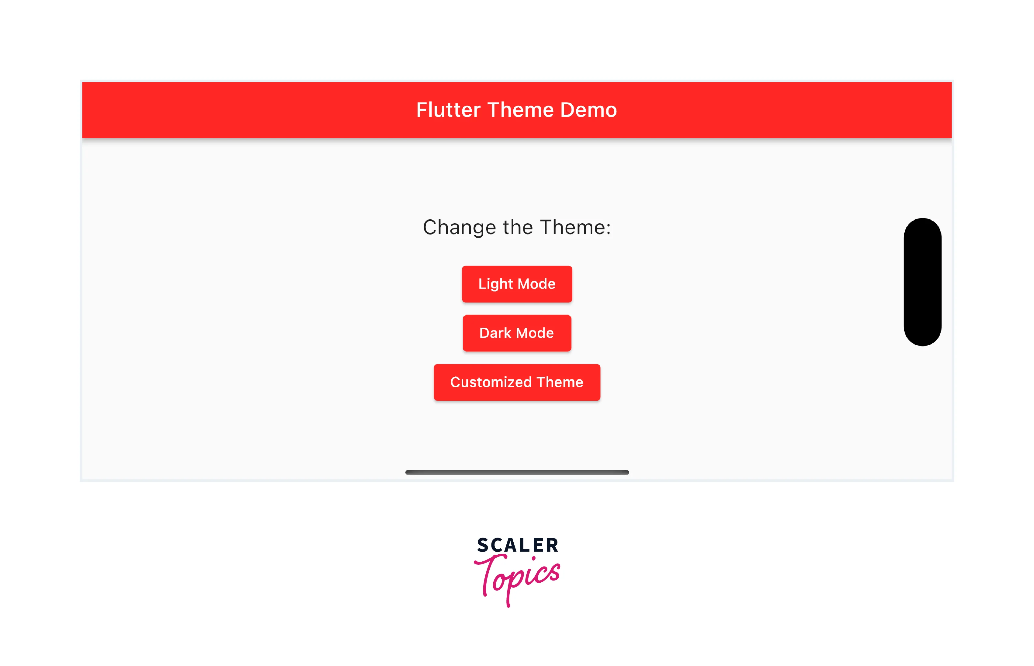
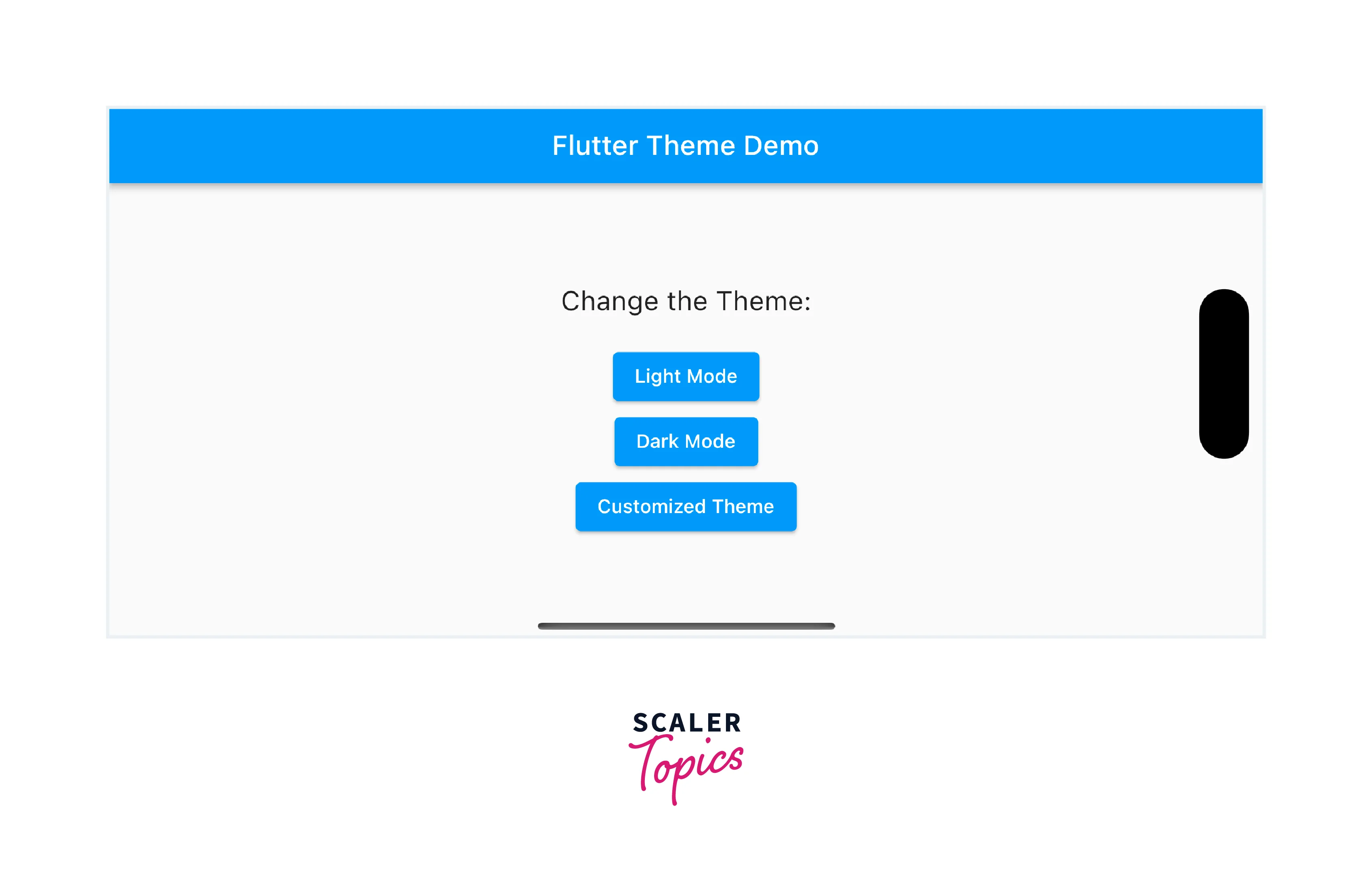
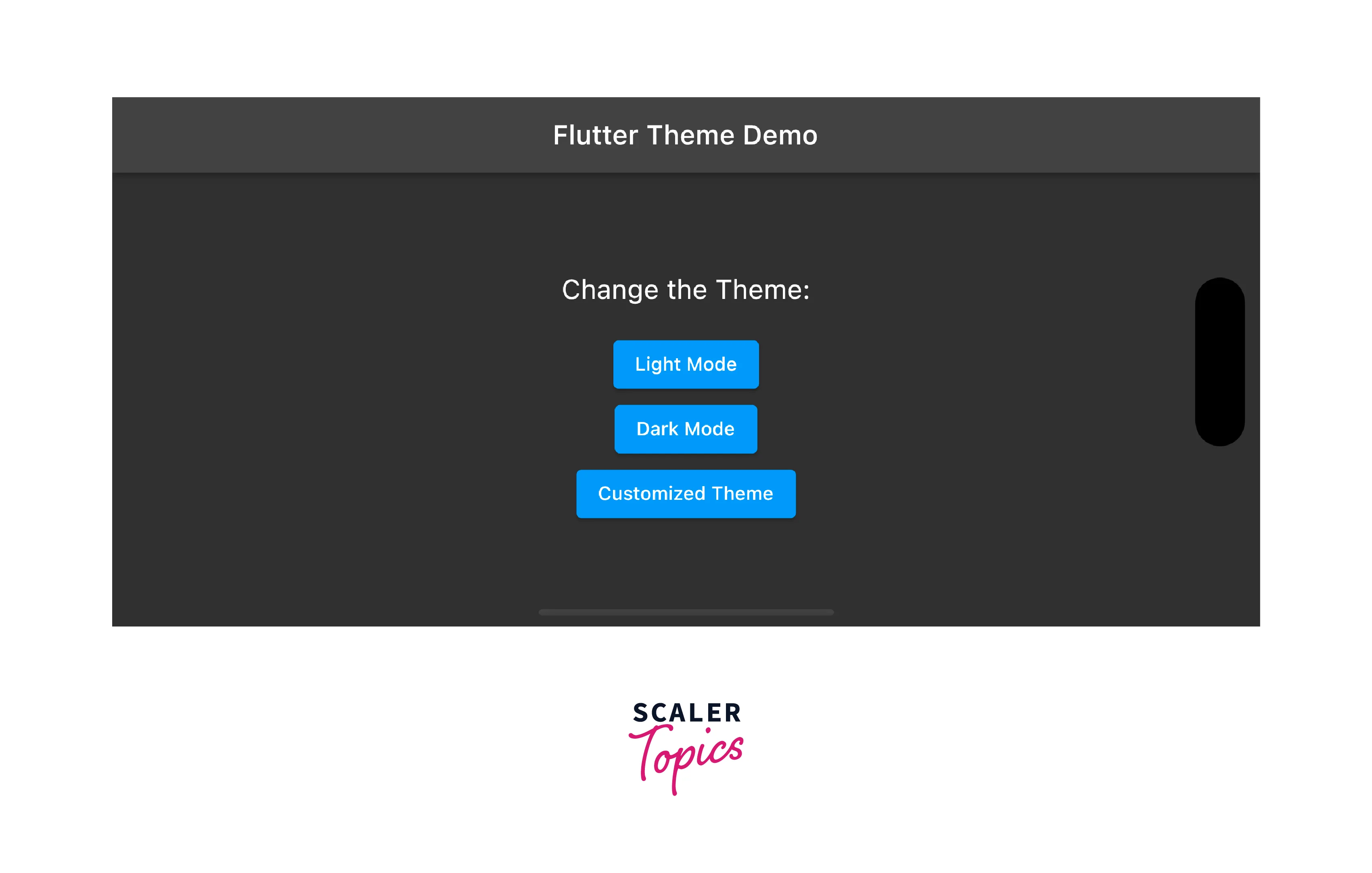
Let us build a sample app in Flutter which will have three buttons to change the theme of the app.
In this app, we are gonna build a basic Flutter app and use the theme property in MaterialApp to set the theme of the app
In our project directory, We have a folder named 'lib'.
Inside the lib folder, there is a file named 'main.dart'.
This is the file through which any Flutter application is called and executed. This is where we are gonna write the code today.
Let us see all the properties we have talked about in action:
(Below is the main.dart file code)
The code is pretty self-explanatory as you glance through it and refer to the above-mentioned points.
We are using a Column widget in the center to put the text and three buttons aligned and each button on press changes the theme of the app.
The result of the above code would look something like this:
Conclusion
- Flutter themes provide a way to define and customize the visual appearance of your application, ensuring a consistent and appealing user interface.
- The constructor of the Theme class is used to create a ThemeData instance, which serves as the foundation for defining theme properties.
- Properties of the Theme widget include attributes like colors, typography, button styles, and more, which can be customized to achieve a desired look and feel.
- Creating a theme involves defining a ThemeData instance and modifying its properties directly or using the copyWith() method to create a new instance with specific modifications.
- Themes can be applied globally to the entire app or selectively to specific widget subtrees using the Theme widget.
- Inheriting themes allows developers to create new themes based on existing ones, inheriting and modifying properties while maintaining consistency.
- Dark mode implementation in Flutter involves defining a separate ThemeData instance for dark mode and/or conditionally applying it based on the device's brightness setting.