Ecommerce App in Flutter
Overview
In this article, we'll cover all the essential components that make up a successful E-Commerce app. From crafting an attractive and intuitive UI design, implementing secure user authentication, showcasing your products effectively in listings, to allowing smooth cart and checkout processes – we've got it all covered. But that's not all! We'll also dive into the world of payment integration, ensuring that your app can seamlessly handle transactions for a truly end-to-end shopping experience.
Flutter Shoe Shopping App
In a world where convenience and personalization reign supreme, the Flutter Shoe Shopping App emerges as your one-stop destination for an exquisite and effortless shoe shopping experience. This innovative app, powered by Flutter technology, brings the latest fashion trends, comfort, and technology to the palm of your hand. Discover a diverse collection of shoes from renowned brands and designers, complemented by a smart recommendation system that caters to your unique style preferences. Say farewell to crowded malls and hello to a future where your perfect pair of shoes is just a tap away – welcome to the world of Flutter Shoe Shopping.
Whether you're a seasoned fashion enthusiast or simply in search of your ideal footwear, this app is set to redefine the way you choose, try on, and own the perfect pair. Step into the future of shoe shopping, where technology meets style, and every step is a stylish adventure.
:::
Designing UI
Crafting the Perfect User Interface (UI) for Your Flutter E-Commerce App:
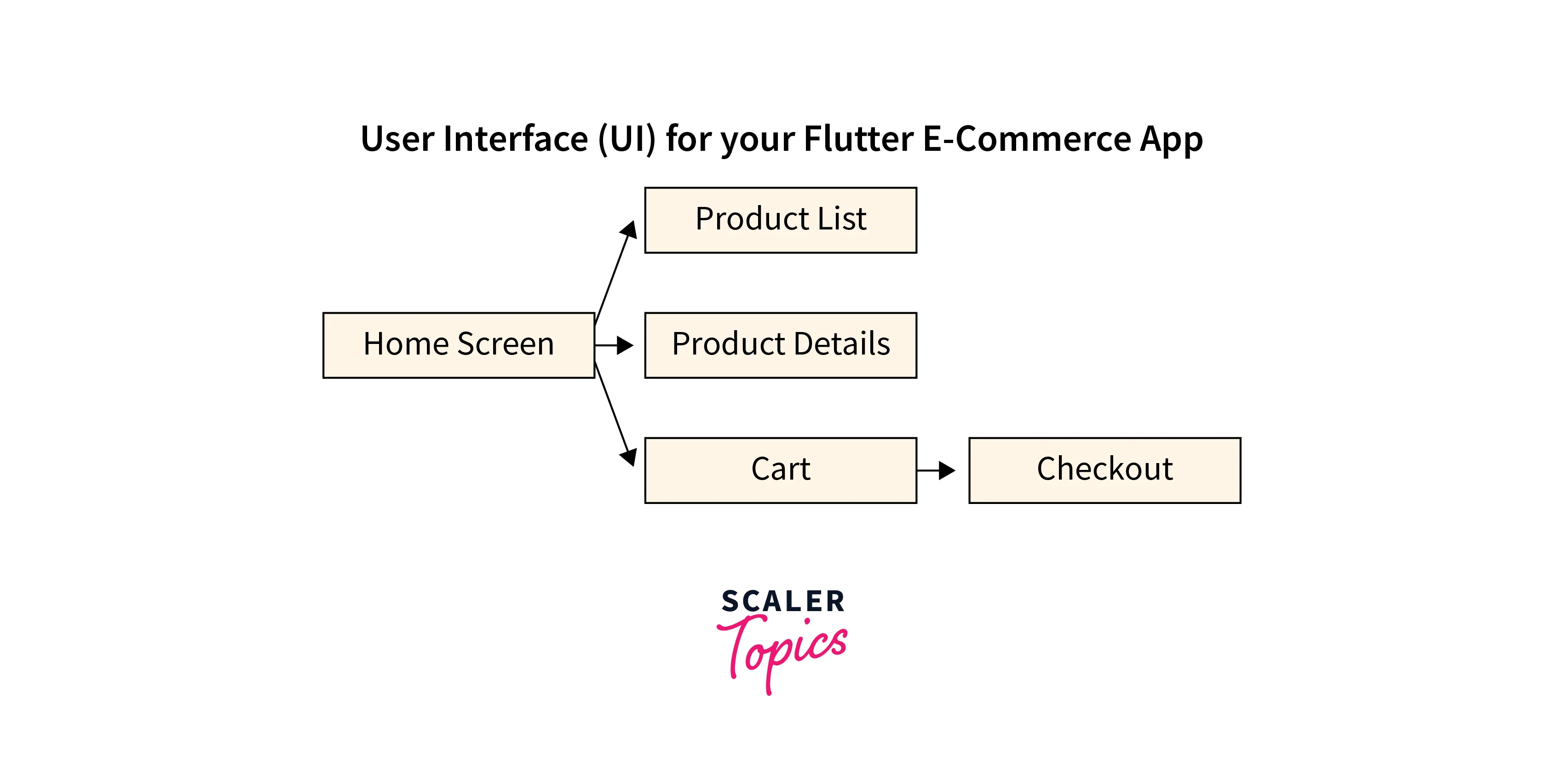
In the world of app development, the User Interface (UI) serves as the face of your application – it's what users interact with and experience firsthand. In our Flutter E-Commerce App, we've taken special care to design a UI that's not only visually appealing but also incredibly user-friendly.
Home Screen
The heart of your app lies in the home screen. Here, users will find an intuitive layout that presents featured products, categories, and promotions in a visually pleasing manner. With easily accessible navigation elements, users can effortlessly explore the app and discover what it has to offer.
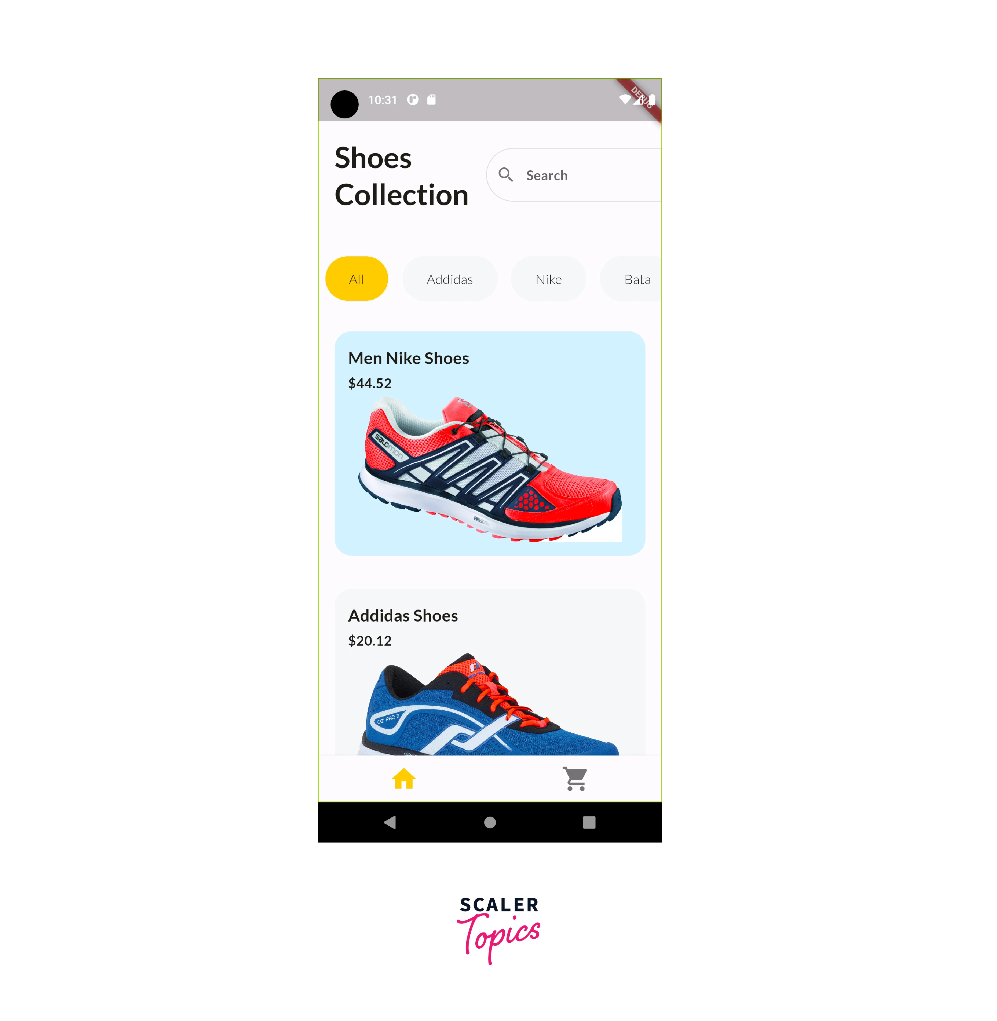
Product List
Presenting products effectively is key to boosting sales. Our product listing design offers clear images, concise titles, and pricing information. Users can browse through products with ease, applying filters and sorting options to find exactly what they're looking for.
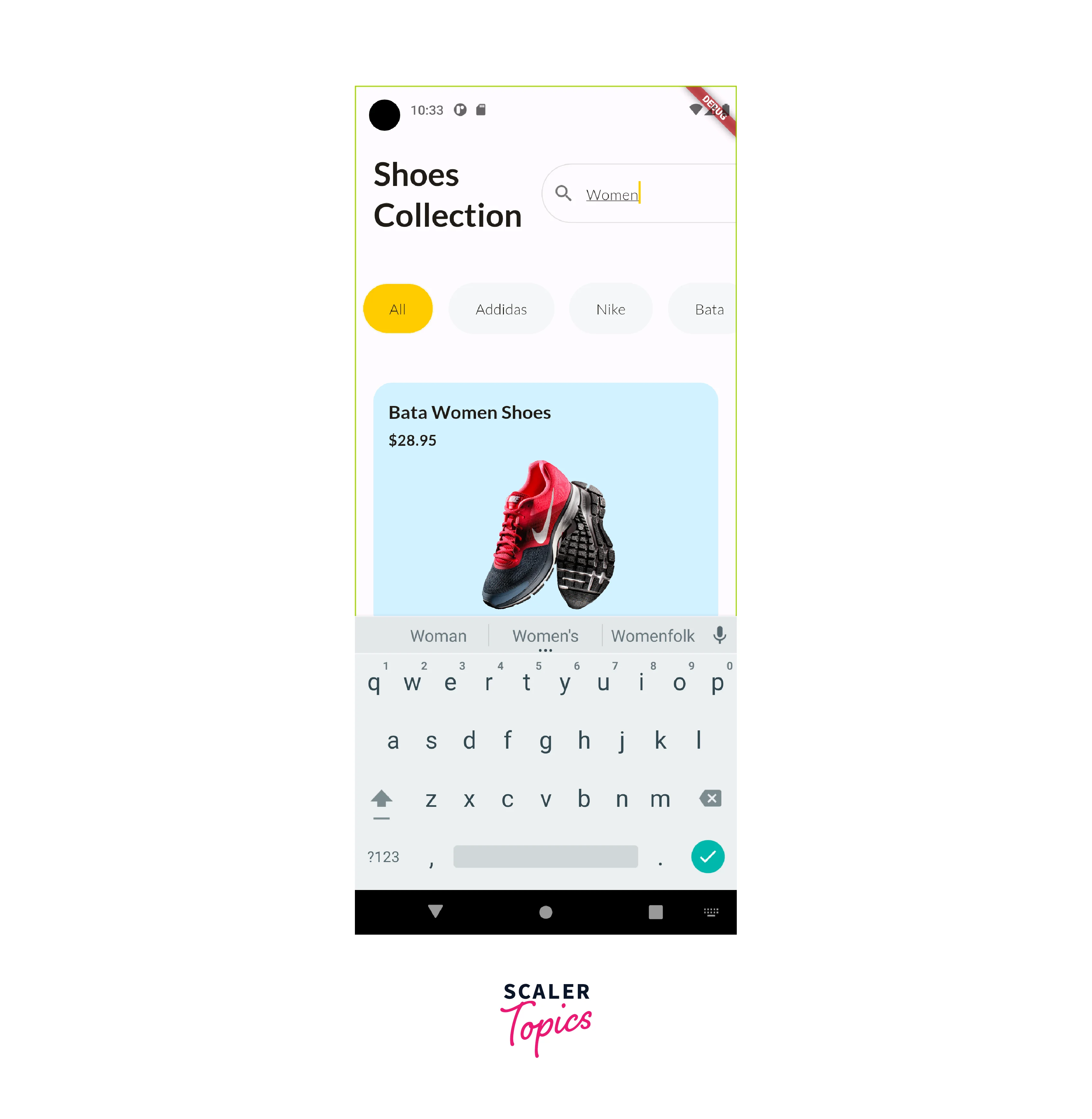
Product Details
When users tap on a product, they're treated to a detailed product description page. This page showcases high-quality images, comprehensive information, and customer reviews. By providing all the relevant details, we enhance the user's confidence in making a purchase decision.
Cart Screen
The Cart screen is where users can review the items they've added to their shopping cart before proceeding to payment. It displays a list of products with their details such as title, quantity, price, and a subtotal for each product.

Continuous Development and Future Scope
Continuous development and future improvements for your Flutter E-Commerce project can encompass a wide range of features and enhancements. Here are some potential areas for ongoing development and improvement:
Enhanced User Experience
Continuously work on refining the user interface and experience. Incorporate user feedback to improve navigation, accessibility, and overall app usability. Regularly update the app's design to match current trends.
Multi-Language Support
Add support for multiple languages to cater to a broader audience. Implement localization to display content in the user's preferred language and region.
Push Notifications
Integrate push notifications to keep users informed about promotions, new arrivals, order updates, and more. Personalize notifications to engage users and drive them back to the app.
Continuous Testing and Bug Fixing
Regularly perform testing to identify and fix bugs and glitches. Implement automated testing to ensure that new features and updates don't introduce regressions.
Responsive Design
Optimize the app for various screen sizes and orientations to ensure a consistent experience on different devices, including smartphones, tablets, and desktops.
Integration with Third-Party Services
Explore integrating additional third-party services such as customer support chatbots, loyalty programs, or advanced payment gateways to offer more value to users.
Implementing Features
Home Screen
The home screen is the main screen of your app, and it should be where users can easily find the products they are looking for. You can display a variety of features on the home screen, such as featured products, new products, and personalized recommendations.
Product Listings
Display a well-organized list of products on the home screen. Each product card should showcase the product image, title, price, and a brief description. Users can scroll through the list and click on individual products to learn more.
Product Details
The Product Description feature adds a new screen to your app where users can view detailed information about a specific product. When users tap on a product, they're taken to this screen, which shows the product's images, title, description, price, and other details. It's a way for users to learn more about the product before making a decision.
Shopping Cart
Allow users to add products to their shopping cart. Display a cart icon with a badge indicating the number of items in the cart. Users can review their cart, adjust quantities, remove items, and proceed to checkout.
Code for the E-commerce app
Custom AppBar
A custom AppBar can greatly enhance the visual appeal and branding of your Flutter E-Commerce app. An AppBar is a fundamental UI element that provides navigation, branding, and additional functionality. Creating a custom AppBar allows you to tailor its appearance and behavior to match the design and theme of your app. Here's how you could implement a custom AppBar for your project:
- Branding
- Navigation
- Search Bar
- Cart and Wishlist Icons
- Favourite Icons
- User Profile Icon
- Action Buttons
- Custom Styling
- Scroll Behavior
- Animations
- Responsive Design
Code:
To use this custom AppBar in your project, you can include it in your HomeScreen widget like this:
Output:

Complete HomeScreen
The home screen is a crucial part of a Flutter e-commerce app as it serves as the initial interface that users see when they open the app. Its primary function is to provide a curated list of products or categories to entice users to explore and make purchases. Here's a simple text explanation of the components and purpose of a typical home screen in a Flutter e-commerce app:
-
App Bar: The top of the home screen typically contains an app bar, which displays the name or logo of your e-commerce app. It's a consistent element across your app's screens, providing users with a way to navigate back to the home screen from anywhere in the app.
-
Product Listings: The central part of the home screen is dedicated to displaying a list of products. These product listings are presented in a visually appealing way to grab the user's attention. Each product listing usually includes:
-
Product Image: An image of the product, which helps users visualize the item.
-
Action Button: Often, there's a button or icon (e.g., a shopping cart or arrow) that allows users to interact with the product. For example, they can tap to view more details, add it to their cart, or go to the product's detail page.
-
Product Categories: Some home screens include a section for product categories or featured collections. This helps users quickly find products they are interested in by browsing specific categories like "Shoes," "Clothing," or "Electronics."
-
Search Bar: Many e-commerce apps include a search bar at the top of the home screen, allowing users to search for products by keywords. This enhances the user experience by providing a quick way to find specific items.
-
Product Price: The price of the product, displayed prominently.
-
Navigation Menu: At the bottom or top of the screen, you may include a navigation menu or tab bar that allows users to access other sections of the app, such as their shopping cart, user profile, or saved items.
-
Product Title: A brief title or name of the product to identify it.
-
Personalization: Some e-commerce apps use algorithms to personalize the home screen content based on a user's past interactions, browsing history, and preferences. This can enhance user engagement and increase the likelihood of making a purchase.
Code:
Output:
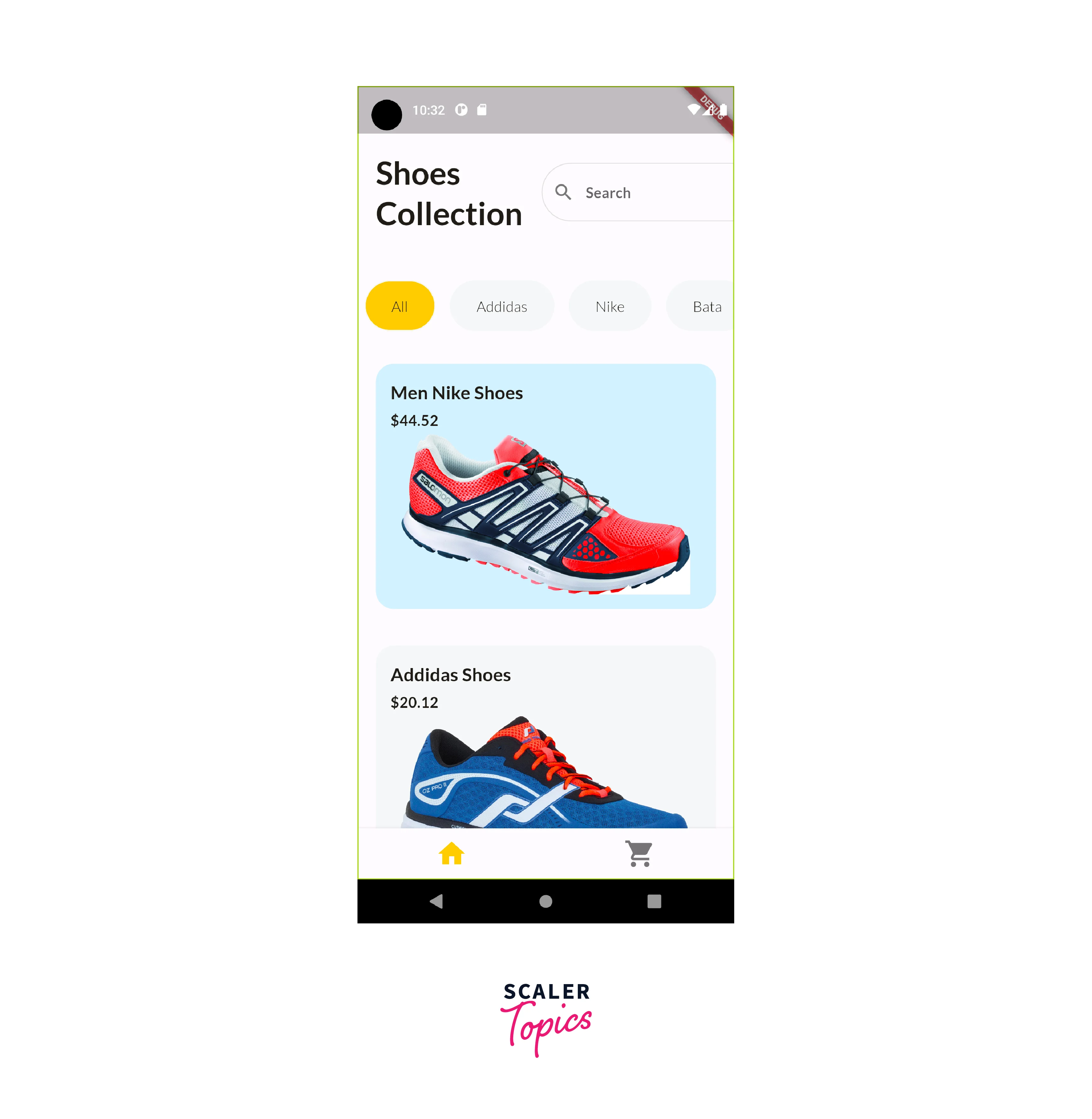
the home screen of a Flutter e-commerce app is the gateway to the app's shopping experience. It showcases products, categories, promotions, and navigation options, all designed to engage users and encourage them to explore and shop within the app. The goal is to create an attractive and user-friendly interface that facilitates easy product discovery and a seamless shopping journey.
Product Details
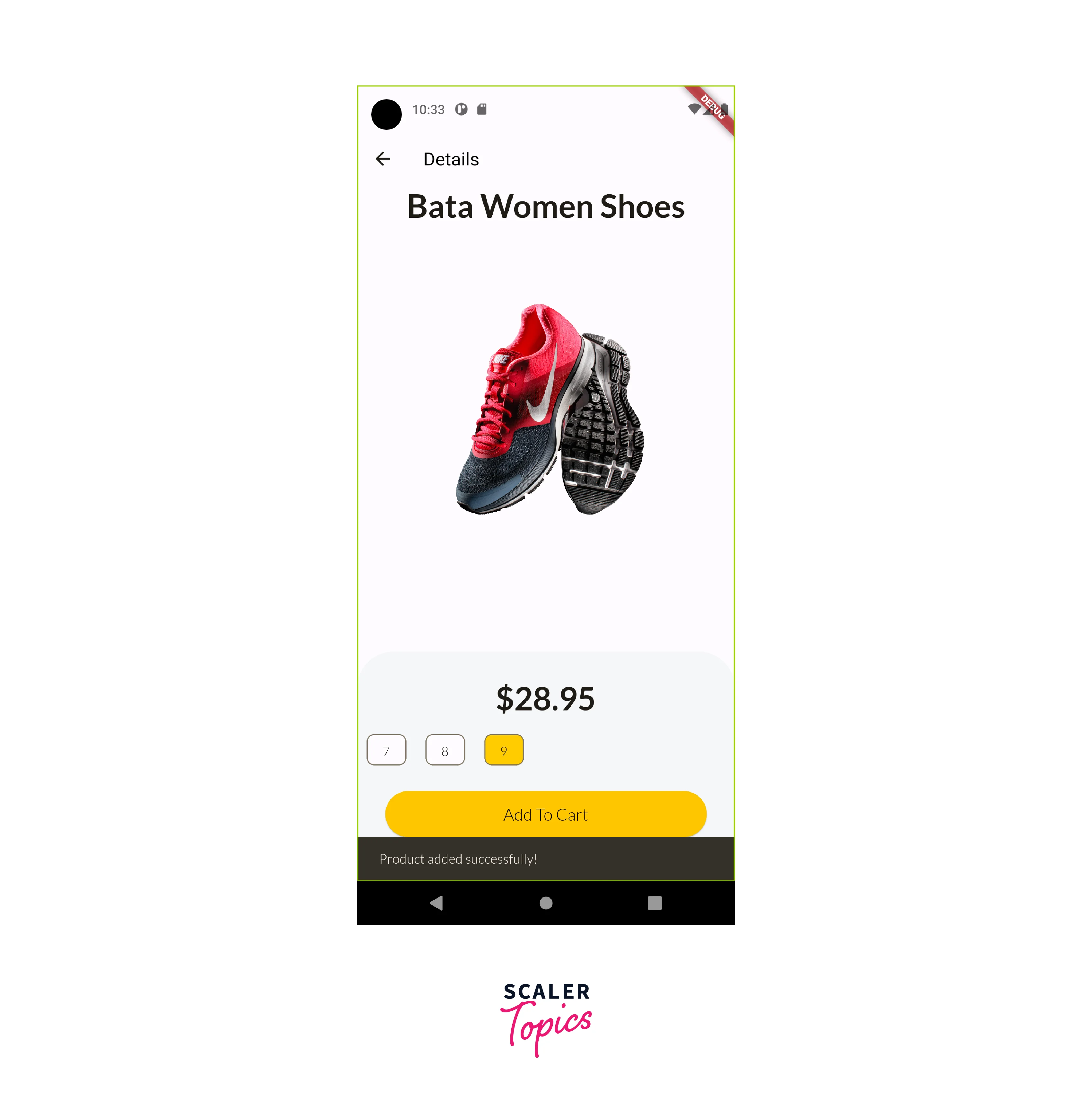
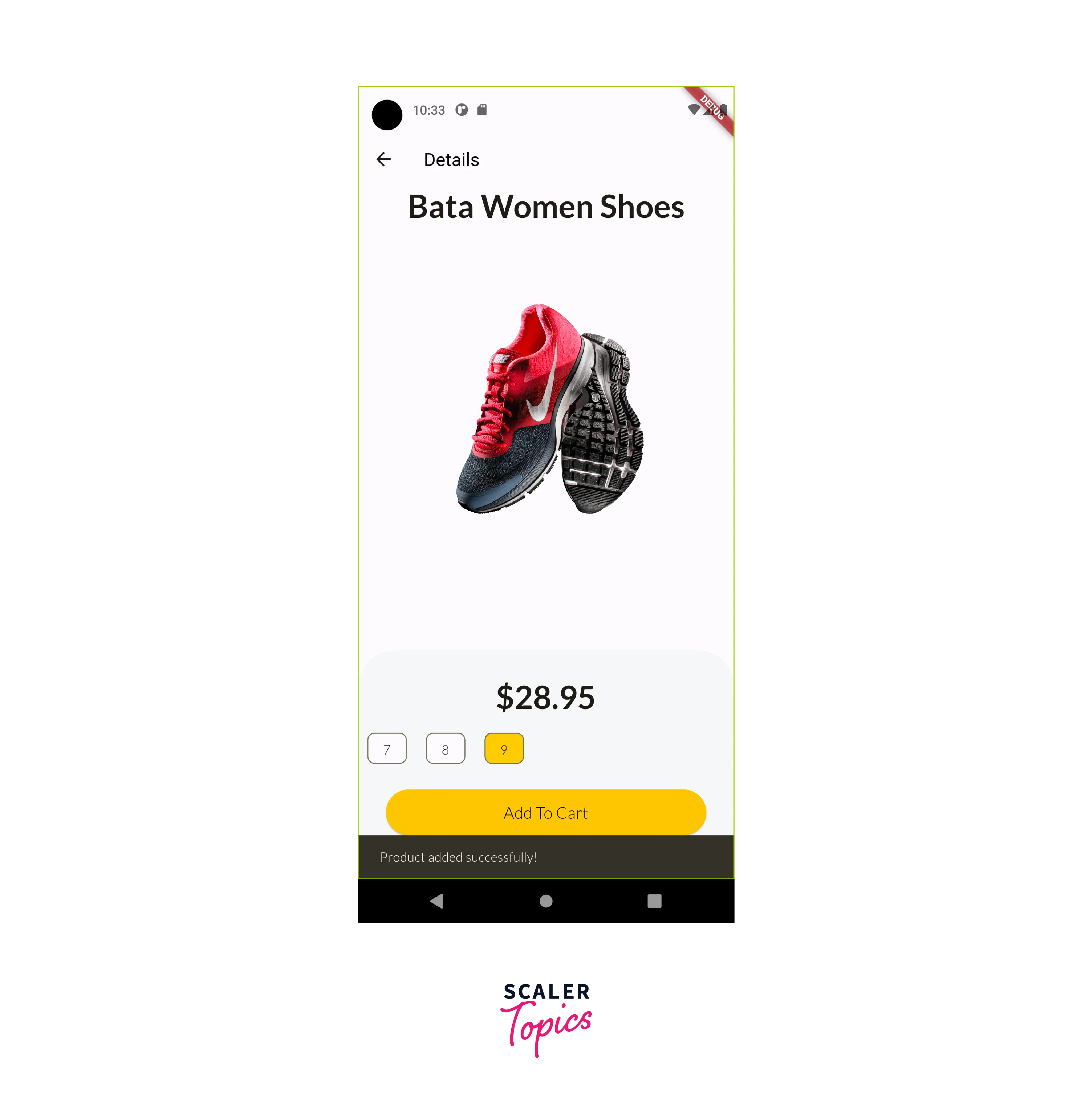
The product details screen in a Flutter e-commerce app provides users with comprehensive information about a specific product. It includes details, customization options (like size selection), and an easy way to add the product to the shopping cart. The goal is to provide a rich and informative experience that helps users make confident purchase decisions.
-
Product Image: The product details screen prominently displays a larger image of the selected product. This image provides a clear view of the product's appearance, helping users make informed decisions.
-
Product Title: Just like on the home screen, the product's title or name is displayed prominently at the top of the product details screen. It reinforces the product's identity and helps users confirm they've selected the correct item.
-
Product Price: The price of the product is typically shown near the product title. It reminds users of the cost and allows them to quickly assess whether it fits within their budget.
-
Product Description: Below the product title and price, there is usually a section for a detailed product description. This description provides users with essential information about the product, such as its features, materials, specifications, and any unique selling points. It helps users understand what they are buying and why it's worth considering.
-
Product Variations (e.g., Shoe Size): For products with variations like different sizes (e.g., shoes), a selector or dropdown menu is often included. Users can choose the size they want before adding the product to their cart. This customization is crucial for a seamless shopping experience.
-
Add to Cart Button: A prominent "Add to Cart" button allows users to easily add the product to their shopping cart. This action is often accompanied by an animation or confirmation message to provide feedback that the product has been successfully added.
Code:
Output:
Cart Screen
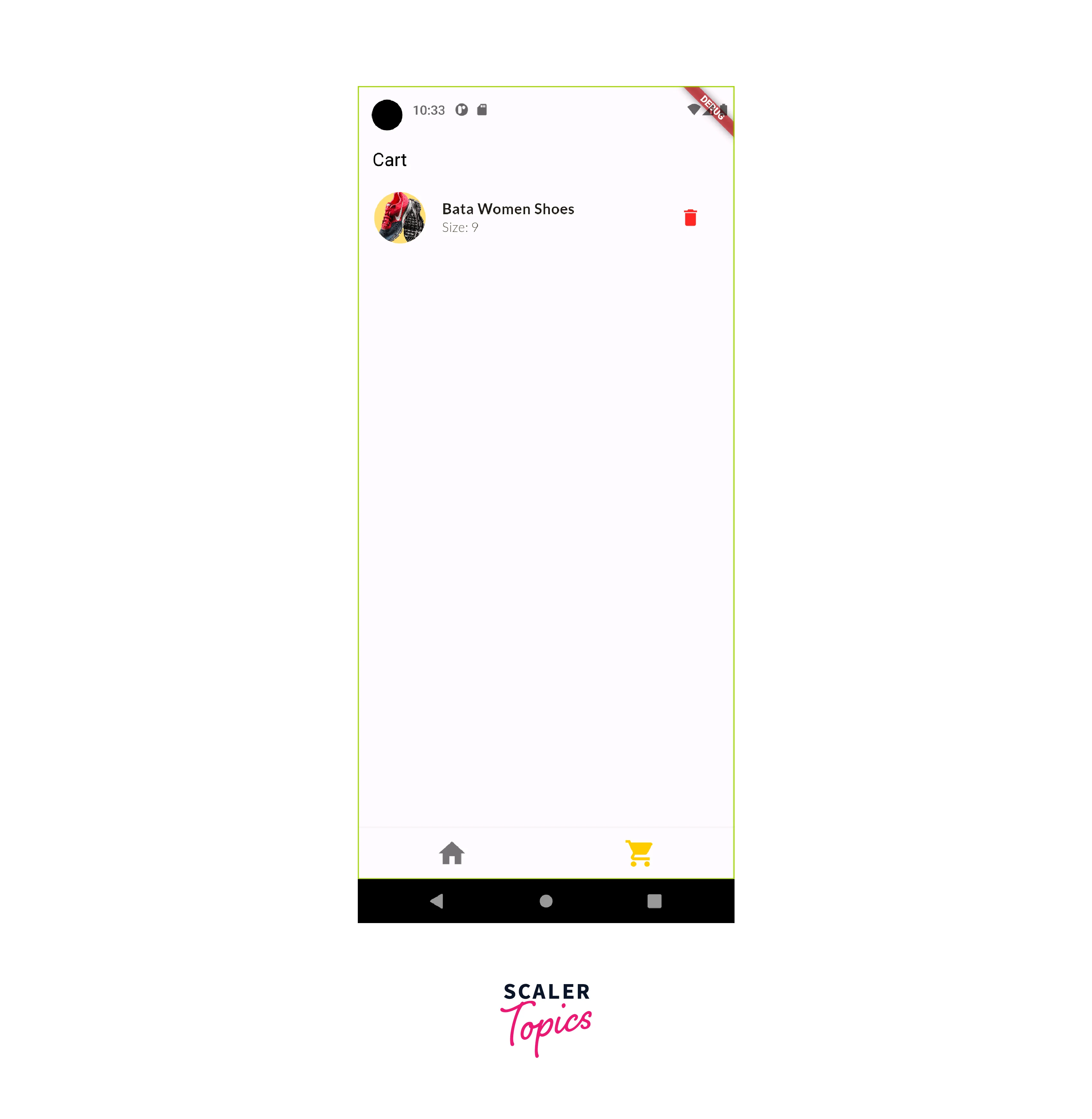
The shopping cart screen in a Flutter e-commerce app is a critical step in the buying process. It displays a detailed list of items in the cart, provides options for adjusting quantities, allows for item removal, and calculates the order's total cost. The screen also facilitates a smooth transition to the checkout process while giving users the flexibility to continue shopping or apply discounts. It plays a significant role in the overall user experience and conversion rate of an e-commerce app.
-
Cart Items List: The central part of the cart screen displays a list of items that the user has added to their shopping cart. Each item is usually presented as a card or list tile and includes the following information:
-
Product Image: A small thumbnail or image of the product.
-
Product Price: The price of the product.
-
Product Quantity: The quantity of the product in the cart. Users can often increase or decrease the quantity for each item.
-
Total Price: The total cost of the product (price multiplied by quantity).
-
Delete Option: Each item typically has a "Delete" or "Remove" button or icon that allows users to remove the item from the cart.
-
Product Title: The name of the product.
-
Subtotal: Below the list of cart items, the subtotal is displayed. This is the total cost of all items in the cart before taxes and shipping fees. It provides users with a summary of their cart's total value.
-
Promotional Codes or Coupons: Some cart screens include a field where users can enter promotional codes or coupons to apply discounts to their order.
-
Proceed to Checkout Button: A prominent "Proceed to Checkout" button is usually placed at the bottom of the screen. When clicked, it takes the user to the checkout process, where they can provide shipping and payment information.
-
Continue Shopping Option: To allow users to continue shopping, a "Continue Shopping" button or a link is often provided. This takes users back to the product listings or the home screen.
-
Empty Cart Message: If the cart is empty, a message is displayed to inform users that their cart is empty and encourage them to start shopping.
-
Cart Icon: A cart icon or badge, often located in the app's navigation bar, provides a visual indication of the number of items currently in the cart. It allows users to quickly access their cart from any screen in the app.
-
Quantity Adjustment: Users can typically adjust the quantity of each item in the cart. They can increase or decrease the quantity as needed. The total price updates dynamically based on these changes.
-
Total Cost: The cart screen displays the total cost of all items in the cart, including taxes and shipping fees if applicable. It provides users with a clear understanding of their order's final cost.
Code:
Output:
Here is the complete github repo for the Flutter E-Commerce App
https://github.com/SahilChahal221/flutter_shoes_shopping_app
Conclusion
Our Flutter E-Commerce app offers a complete package of features that ensures a seamless and satisfying mobile shopping experience. Here's a detailed conclusion highlighting the key points:
-
Explore UI Design: Our app boasts an intuitive and visually appealing user interface, making navigation and product discovery a breeze.
-
Homepage: The homepage of our simple Flutter shoe shopping app offers a seamless and engaging shopping experience for shoe enthusiasts. With an elegant design, user-friendly navigation, and a comprehensive collection of shoes, we strive to meet the diverse tastes and preferences of our customers.
-
Product Listings: Our extensive product listings cover a wide range of categories, ensuring you can find products that suit your preferences and needs.
-
Cart and Checkout: We've streamlined the cart and checkout process, enabling you to effortlessly review your selected items and complete your purchase with minimal effort.
-
Enhanced Features: In addition to the core features mentioned, our app offers other essential functionalities that contribute to an enriched shopping journey.
The result is an enjoyable and reliable mobile shopping experience that caters to your preferences and ensures your satisfaction. Get ready to explore, shop, and enjoy a new level of convenience in the world of online retail.
