Responsive UI in Flutter
Overview
As we all know, the Flutter SDK allows us to build for multiple platforms. The apps built-in Flutter are used across devices of multiple screen sizes. Thus, it becomes very crucial to ensure that we can provide an adaptive and responsive UI to the end user. The Flutter framework allows us to build such responsive user interfaces with ease. In the course of this article, we will be discussing the various ways to build such responsive User Interfaces in Flutter.
Introduction
The UI which can adapt itself to various screen sizes and devices is termed a Responsive UI. Modern-day applications are used on a wide range of devices from large-screen to small-screen devices. We need to build apps by utilizing UI techniques and ensure a consistent user-friendly experience regardless of the device on which the app is being used.
Building responsive UI in Flutter is essential for Cross-Platform Development and to enhance User Experience. As the diversity of screen sizes and device types is increasing at a rapid pace, implementing responsive UI helps our applications to adapt to those changes.
Understanding Flutter Layouts
We use layouts to structure and organize widgets on the screen. Apart from providing a vast variety of widgets, Flutter also allows us to control how widgets are positioned inside a parent widget. We will get a better understanding of the Flutter Layouts by discussing the functionalities of some essential layout widgets:
1. Container Widget:
- Container is one of the most versatile layout widgets.
- It allows us to control the size, position, and appearance of its child widgets
- It allows us to set margins, padding, border, background color, etc.
- The Container widget is very often used as a parent widget to wrap other widgets.
2. Row Widget and the Column Widget:
- The Row Widget allows us to arrange widgets horizontally
- The Column Widget on the other hand allows us to arrange the widgets vertically.
- The mainAxisAlignment property helps the developers to set the alignment of the main Axis and similarly, the crossAxisAlignment helps to set the alignment of the cross Axis.
3. Stack Widget:
- The Stack Widget helps us to overlay multiple widgets on top of each other
- Stack is a data structure of the form Last-In-First-Out or LIFO.
- The order in which the widgets are added to the Stack is crucial.
- It is popularly used for creating overlapping UI elements
4. Expanded Widget:
- This widget is used to let the child widgets distribute the remaining space inside the parent widget.
- The proportion is decided by the Flex factor
- We can wrap any widget with Expanded to use its properties.
5. SingleChildScrollView Widget:
- This Widget is used when the content of another widget exceeds the screen height or width.
- The user can scroll and see the complete content by scrolling.
- The scroll direction can be either vertical or horizontal.
6. MediaQuery Widget:
- The MediaQuery Widget provides information about the device's screen size, height, width, orientation, etc.
- We can dynamically adjust UI components based on that information
7. LayoutBuilder Widget:
- This widget allows building UIs based on the parent's widget size dynamically
- We use the LayoutBuilder Widget for different screen sizes to ensure optimal content representation
We can build responsive UI in Flutter very easily by combining and nesting the above-discussed widgets. We can also create custom layouts by creating custom layout widgets or by manually manipulating the constraints.
Creating a Responsive UI with Flutter
It is very convenient to build Responsive UI with Flutter. We can create a Responsive UI by simply following the below-mentioned steps:
1. Understand Device Constraints
Understanding the device constraints is the first necessity to build responsive user interfaces in Flutter. It is very important to understand the factors such as screen size, aspect ratio, orientation, etc. The MediaQuery widget helps us to obtain such information.
2. Use Flexible and Expanded Widgets
We use Flexible and Expanded widgets to create responsive user interfaces. The Flexible widget makes the child widget flexibly grow or shrink based on the space available for it. The Expanded widget on the other hand ensures a child widget to get distributed within all the space within its parent by using a flex parameter.
3. Use MediaQuery Widget
Apart from providing the device constraints, the MediaQuery widget can also be used with the LayoutBuilder. We can wrap our layout in the LayoutBuilder and access the data given by MediaQuery.
4. Use Third-Party Responsive Design Packages
We have some third-party packages specifically designed to facilitate building responsive user interfaces. For instance, we have packages such as flutter_screenutil, flutter_responsive_screen, and responsive_builder which simplify the task of creating adaptive user interfaces. The above-mentioned packages provide features such as responsive scaling, screen size detection, breakpoint handling, etc.
5. Adaptive Layouts and Breakpoints:
We implement adaptive layouts that rearrange or resize the components to provide an optimal user interface. The LayoutBuilder and OrientationBuilder are used for this purpose. We also have to identify the breakpoints in our UI. The breakpoints are the places in our UI that need to adjust based on the different screen sizes.
6. Handling Text and Images
We handle the text and images by making use of widgets like Flexible, Wrap, and AspectRatio. This help to adapt the size and positioning of text and images to fit various screen sizes. We can also use the FittedBox widget to ensure they remain within the defined space.
By following the above-mentioned practices, we can very conveniently create responsive UI in Flutter.
Responsive UI Best Practices
After having discussed how can we create a responsive UI with Flutter, Now we will be discussing some of the best practices we need to keep in mind while creating such user interfaces.
1. Optimizing Typography and Spacing
Text and spacing play a very important role in building an aesthetically appealing user interface. We use the techniques of typography and spacing to scale our application's user interface such that it is appropriate to all screen sizes. Relative units like em or rem for font sizes and percentages for spacing are used to allow the user interface to adjust based on that particular device's dimensions.
2. Using Responsive Images
In most of the user interfaces, images constitute a significant portion of the user interface. We use techniques like responsive images to ensure that the images are optimized for every device. These techniques help us to minimize bandwidth usage and enhance load times as well.
3. Testing across Devices
The devices on which the apps would be used come in numerous variety of sizes. Now, to ensure that our application is responsive, we should test it across as many devices as we can. The responsive UI in Flutter can only be ensured this way.
4. Following Progressive Enhancement
Progressive enhancement is a practice of enhancing our mobile applications in such a manner that the app is first built such that it works well on all devices and then further enhancements and optimizations are made for the app to work on higher-end devices. We generally start from a baseline and update it with further enhancements.
5. Following Platform Guidelines
When we are building our applications for a particular platform such as iOS or Android then we should follow their respective guidelines. Doing so ensures that the app feels native to that particular platform. We should also try to use more widgets and design patterns suitable for that particular platform so that the overall look, feel, and experience of using the app remains familiar to the user which is one of the primary conditions for creating responsive UI in flutter.
Example App
Github Repository Link: scaler_responsive_ui
main.dart file:
Github Link: main.dart
demo.dart file:
Github Link: demo.dart
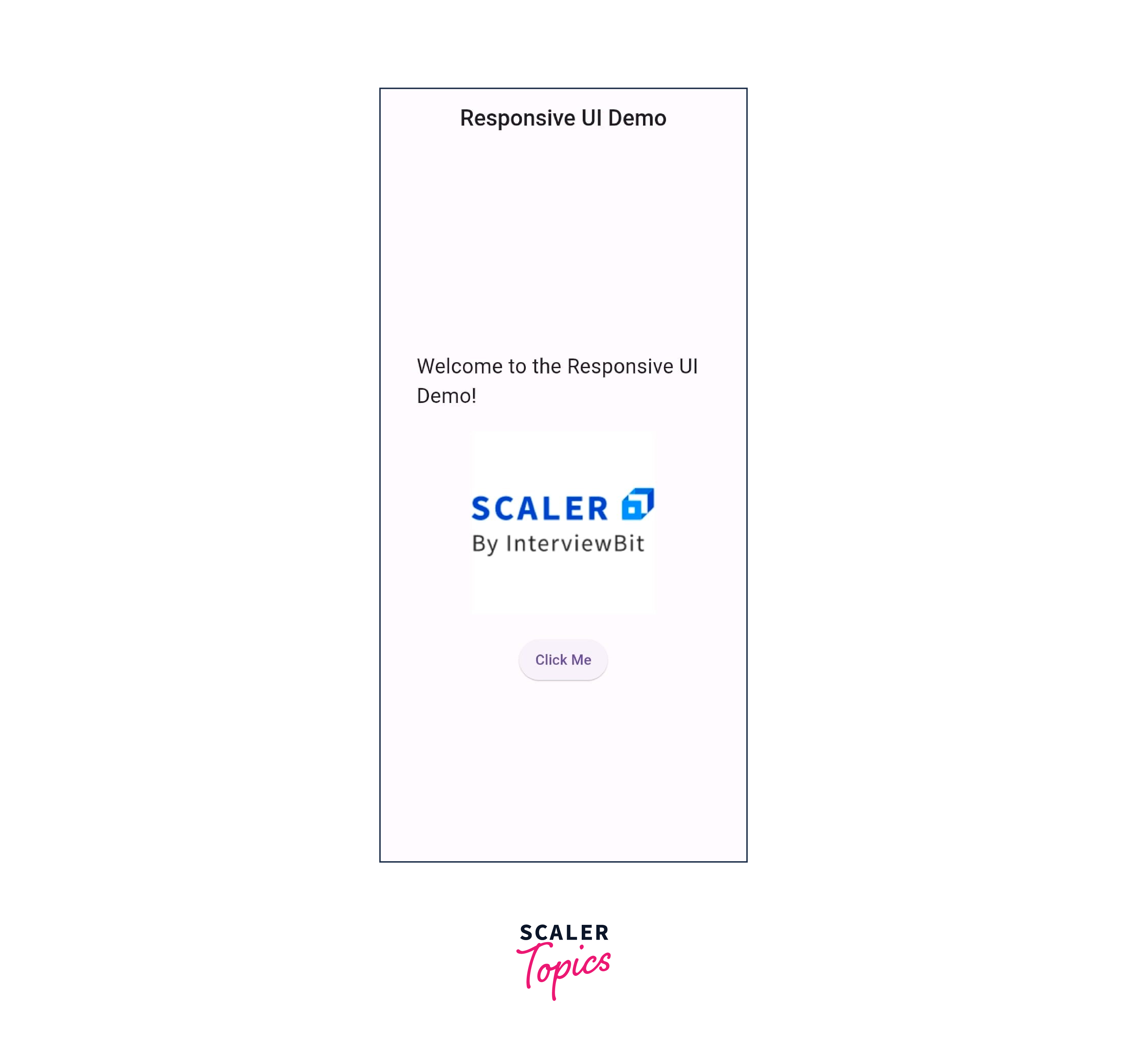
The ResponsiveHomePage class represents the home page of the application and extends StatelessWidget. It Contains a build() method that overrides the build() method from StatelessWidget. The ResponsiveHomePage Retrieves the screenSize using MediaQuery.of(context).size to get the actual screen width and height.
The Scaffold widget provides the basic structure for the page. It contains an AppBar with a centered title, "Responsive UI Demo".
The LayoutBuilder widget helps in accessing the constraints of the parent widget. It Wraps the ScreenTypeLayout.builder widget.
The ScreenTypeLayout.builder widget builds different layouts based on the screen type (mobile, tablet, desktop). It takes in three builder functions:
- mobile:
Builds the mobile layout by calling the buildMobileLayout method. - desktop:
Builds the desktop layout by calling the buildDesktopLayout method. - tablet:
Builds the tablet layout by calling the buildTabletLayout method.
The buildMobileLayout method builds the mobile layout using the given constraints and screenSize. Likely contains UI components specific to the mobile layout.
The buildTabletLayout method builds the tablet layout using the given constraints and screenSize. It likely contains UI components specific to the tablet layout.
The buildDesktopLayout method builds the desktop layout using the given constraints and screenSize. Likely contains UI components specific to the desktop layout.
mobile.dart file:
Github Link: mobile.dart

TheWidget buildMobileLayout(BoxConstraints constraints, Size screenSize) method takes in two parameters: constraints, which represent the constraints of the parent widget, and screenSize, which represents the actual screen size.
Center widget centers its child widget within the available space.
The Container widget acts as a container for the layout components. It has a width of screenSize.width _ 0.8 and a height of screenSize.height _ 0.6, taking up 80% of the screen width and 60% of the screen height.
Column widget arranges its children widgets in a vertical column.
The Image.asset widget loads and displays an image from the assets folder using the path 'assets/logo.png'. The image's width is set to screenSize.width * 0.5, taking up 50% of the screen width.
desktop.dart file:
Github Link: desktop.dart

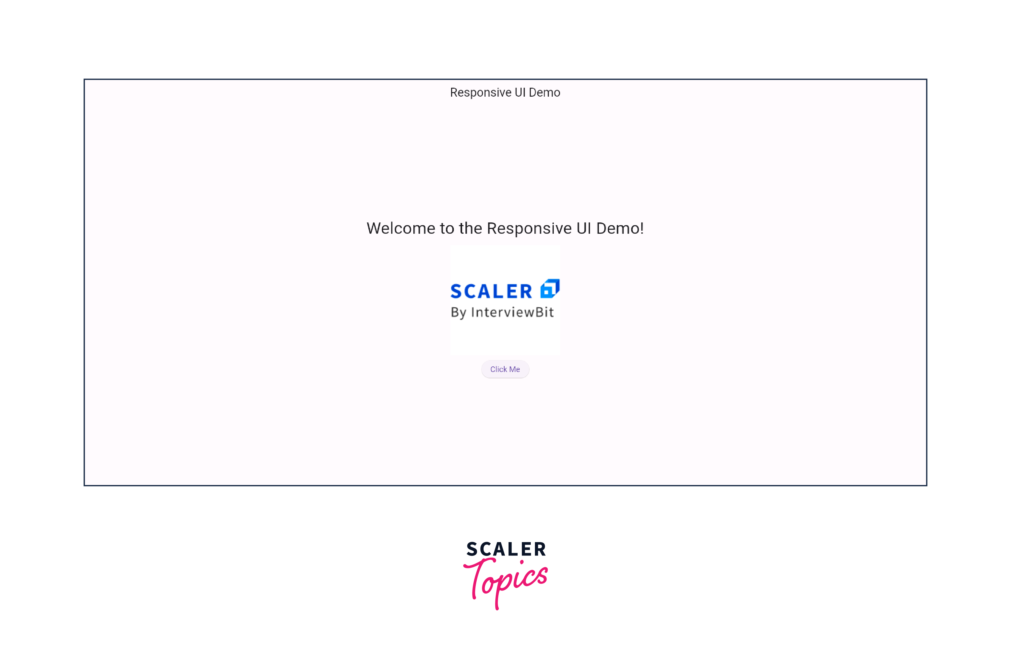
TheWidget buildDesktopLayout(BoxConstraints constraints, Size screenSize) method takes in two parameters: constraints, which represent the constraints of the parent widget, and screenSize, which represents the actual screen size.
The Center widget centers its child widget within the available space.
The Container widget acts as a container for the layout components. It has a fixed width of 550 and a fixed height of 350.
The Image.asset widget loads and displays an image from the assets folder using the path 'assets/logo.png'. The image's width is set to 200, which is a fixed value.
tablet.dart file:
Github Link: main.dart

The Widget buildTabletLayout(BoxConstraints constraints, Size screenSize) method takes in two parameters: constraints, which represent the constraints of the parent widget, and screenSize, which represents the actual screen size.
The Container widget acts as a container for the layout components. It has a width of screenSize.width - 0.5 and a height of screenSize.height - 0.6, taking up 50% of the screen width and 60% of the screen height.
The Column widget arranges its children widgets in a vertical column.
The Image.asset widget loads and displays an image from the assets folder using the path 'assets/logo.png'. The image's width is set to screenSize.width - * 0.4, taking up 40% of the screen width.
Conclusion
- We need to build apps in such a manner that it offers a good user experience across all devices.
- MediaQuery gives us the constraints of the target devices.
- We use Flexible, Expanded, and LayoutBuilder to build responsive designs
- We need to optimize typography and spacing for better visibility.
- We need to thoroughly test the UI across devices of multiple sizes
- Following the respective platform guidelines is a good practice
- We need to continuously update and improve our UI based on user feedback.
