Styling Widgets in Flutter
Overview
We all know, widgets are the building blocks of the user interface in Flutter and they give structure and appearance to our UI elements. What we see on the screens or applications are all widgets that can be customized to give a user-friendly experience with a great look and feel. User Interface is what we see in front, styling, and designing are important for this as this will engage more users and customers in your application. So, in this article, we will learn about styling and customizing our widgets to attract more people to your application.
Introduction
Styling the widgets means how you can customize the appearance of user interface elements within your Flutter app. This involves setting properties, applying themes, using design systems, and leveraging packages to achieve the desired visual presentation. Flutter provides a flexible and powerful set of tools and techniques to customize the appearance of widgets** according to our app's design, personal preference or requirement.Every widget of Flutter has default properties with color, design, font, theme, padding, margin and we can customize these properties accordingly. We can also go for third-party packages to make the desired UI and can make changes in those files according to our needs.
Getting Started with Styling Widgets in Flutter
Basic styling concepts in Flutter include padding, margins, color, and alignment. These concepts help us in positioning our widgets and giving a good visual representation of the user interface. We will discuss all these in detail below-
-
Padding Padding is giving the space between the content of a widget and its edges. This adds extra space around the widget's content, giving visual separation between the widget and its surroundings. We can apply it uniformly or give it individually to all the sides(bottom, left, and right)in the widget. We can give padding to containers, cards, buttons e, etc. We use padding property for giving padding to any widget using EdgeInsets class. We can define padding in different ways as shown below.
-
Margin
This is similar to padding but this defines the space between widgets rather than the content and its edges. We can give space between widgets using margin and can also position a single widget by giving margin from any side(bottom, left, and right). We can use margins in widgets like containers,cardsd, etc. We use the margin property for giving margin to any widget using EdgeInsets class. We can define margin in different ways as shown below.
-
Alignment
Alignment means positioning a widget within its parent's available space like horizontally and vertically. This property is very useful for developers to handle the position of widgets inside its parent's widget
We can control widget alignment using the alignment property. The Alignment class provides predefined values such as "topLeft", "topCenter", "topRight", "centerLeft", "center", "centerRight", "bottomLeft", "bottomCenter", and "bottomRight". See the usage below.
These properties are very useful and are used widely to give a better visual representation to the users.
Let us try out all these in a container. We will apply margin, padding, alignment and color properties in the container.
So, the gap between the text and edges of container is "padding" and gap between these two containers is "margin".
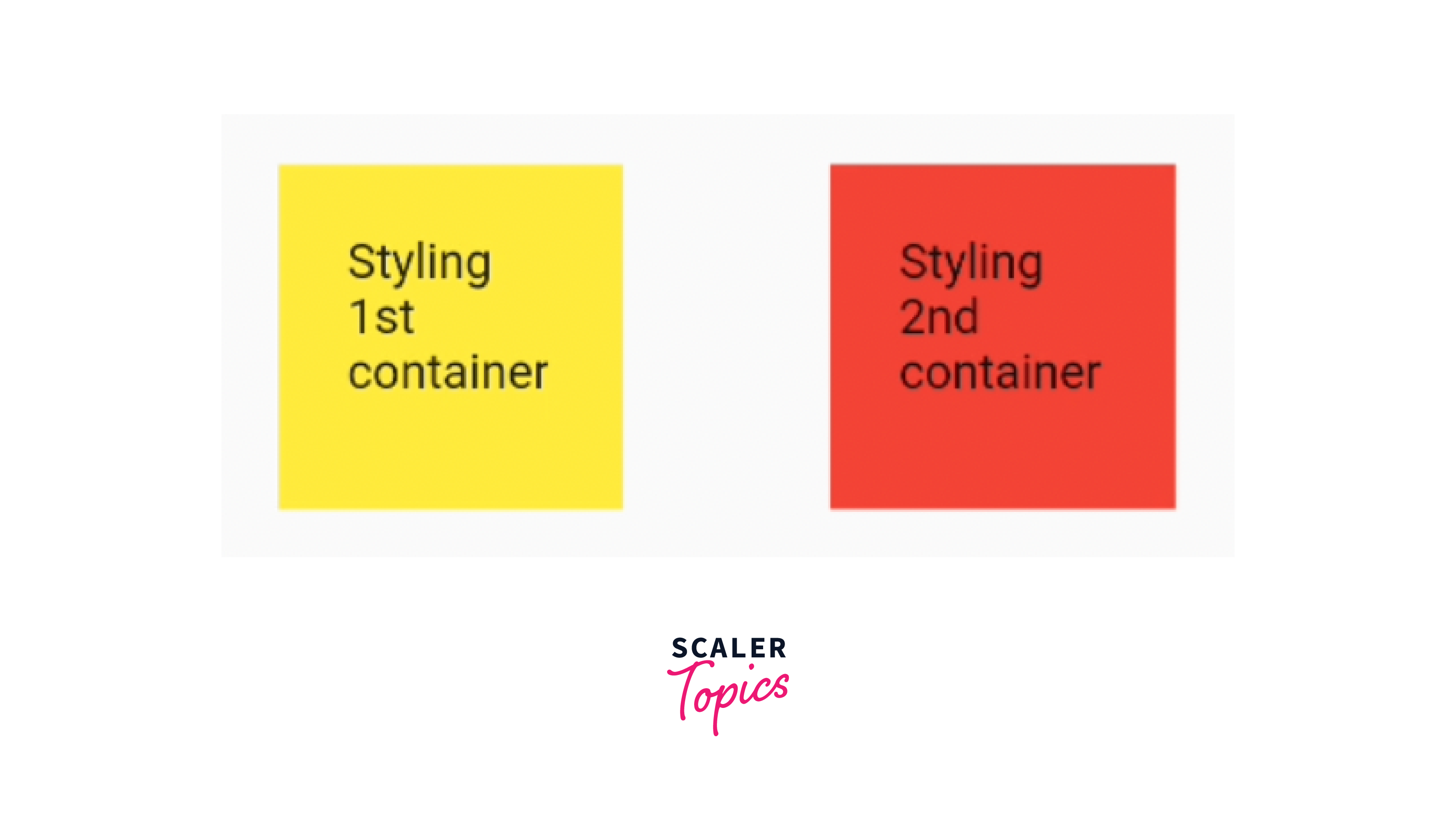
Styling Widgets by Customising
We can make our application beautiful, engaging and attractive by using catchy fonts,text styles, good colors, images and borders. We will understand these properties and will use them in styling our widgets.
-
Fonts
We can define custom font files(e.g. .ttf or .otf) and place them inside the fonts folder in the assets directory. If you want to text with default fonts, you can set their color, font family, font size,e, and font style. We define all these to the style property of the Text widget as shown in the code.
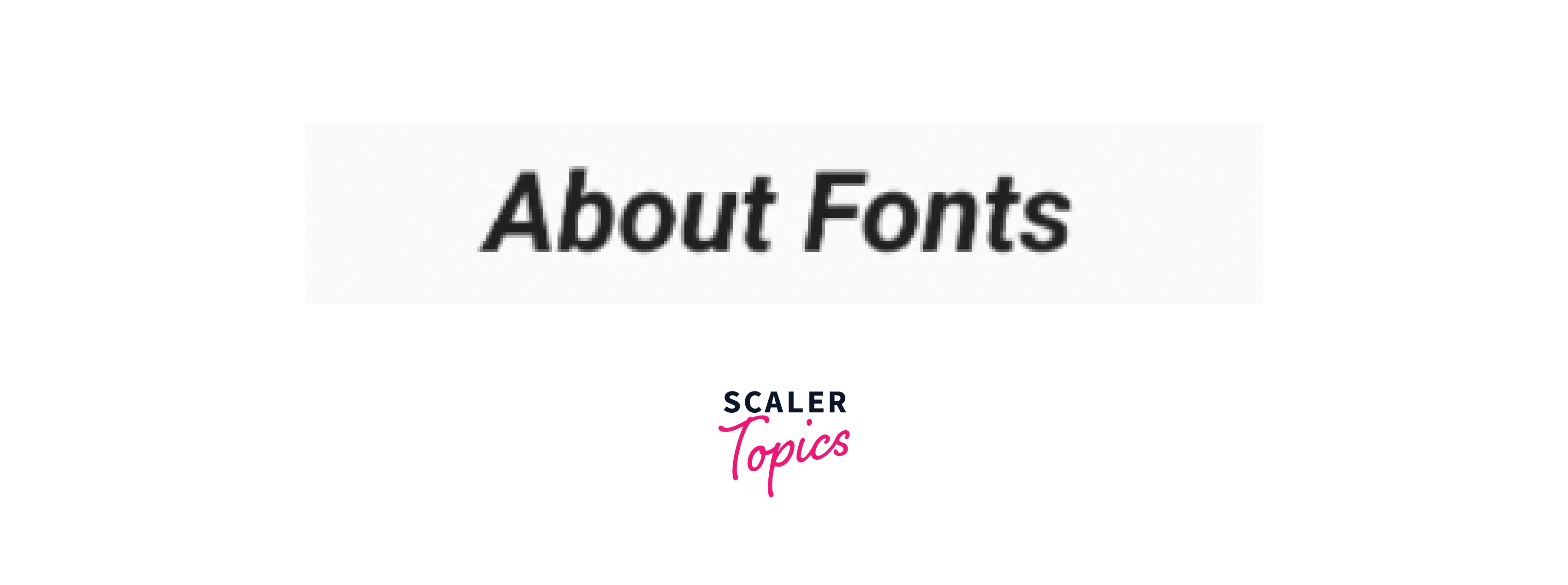
-
Colors
Colors are very important for every widget we use in the application like containers, text, cards, buttons, dividers, lists, etc. We set colors to the color property of that widget. We can specify colors in different ways like Colors.blue,Color(0xFF00FF00), Color.fromRGBO(255, 0, 0, 0.5)**. I have used all the ways of using colors in the code shown below for different widgets.
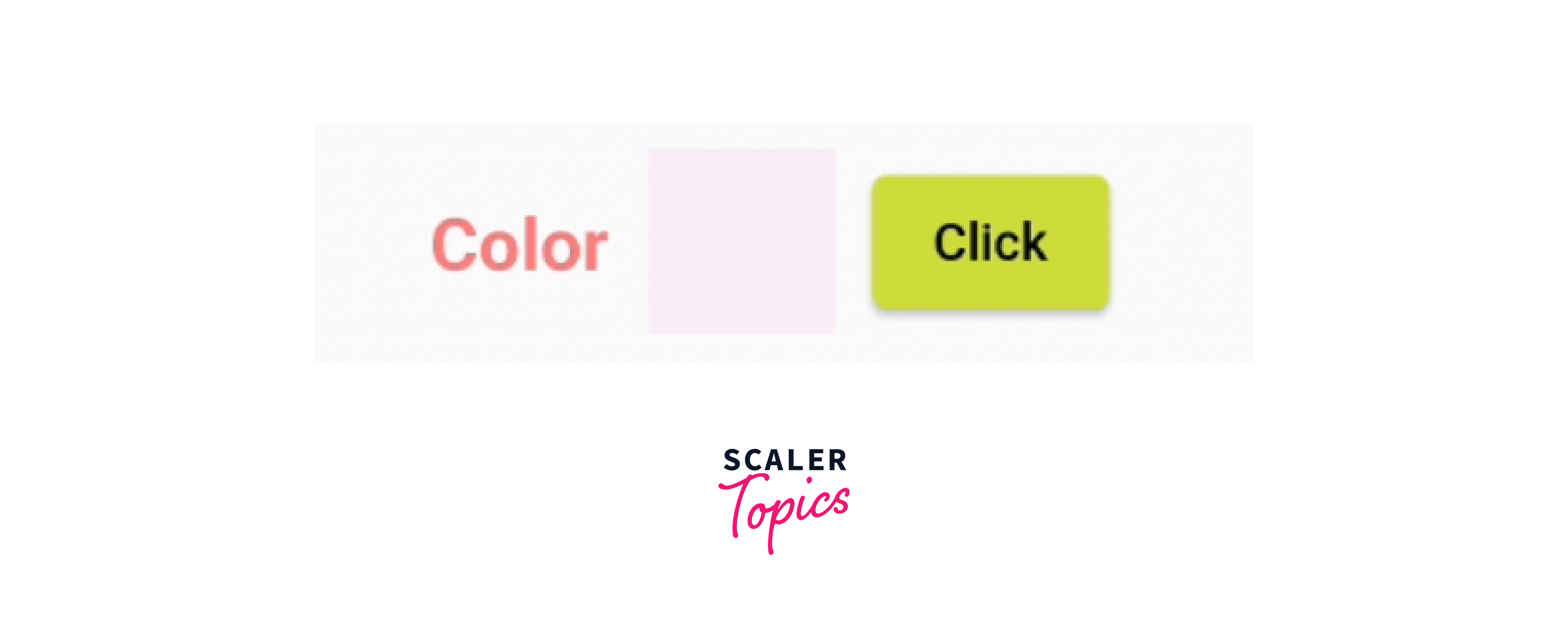
-
TextStyles
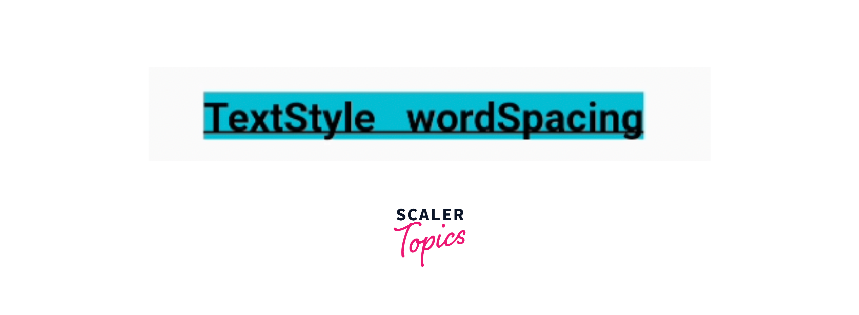
We can design our written text with the TextStyle class to the style property of Text widget. There are so many properties available to style our text like color, font family, background color, text flow, and many more.
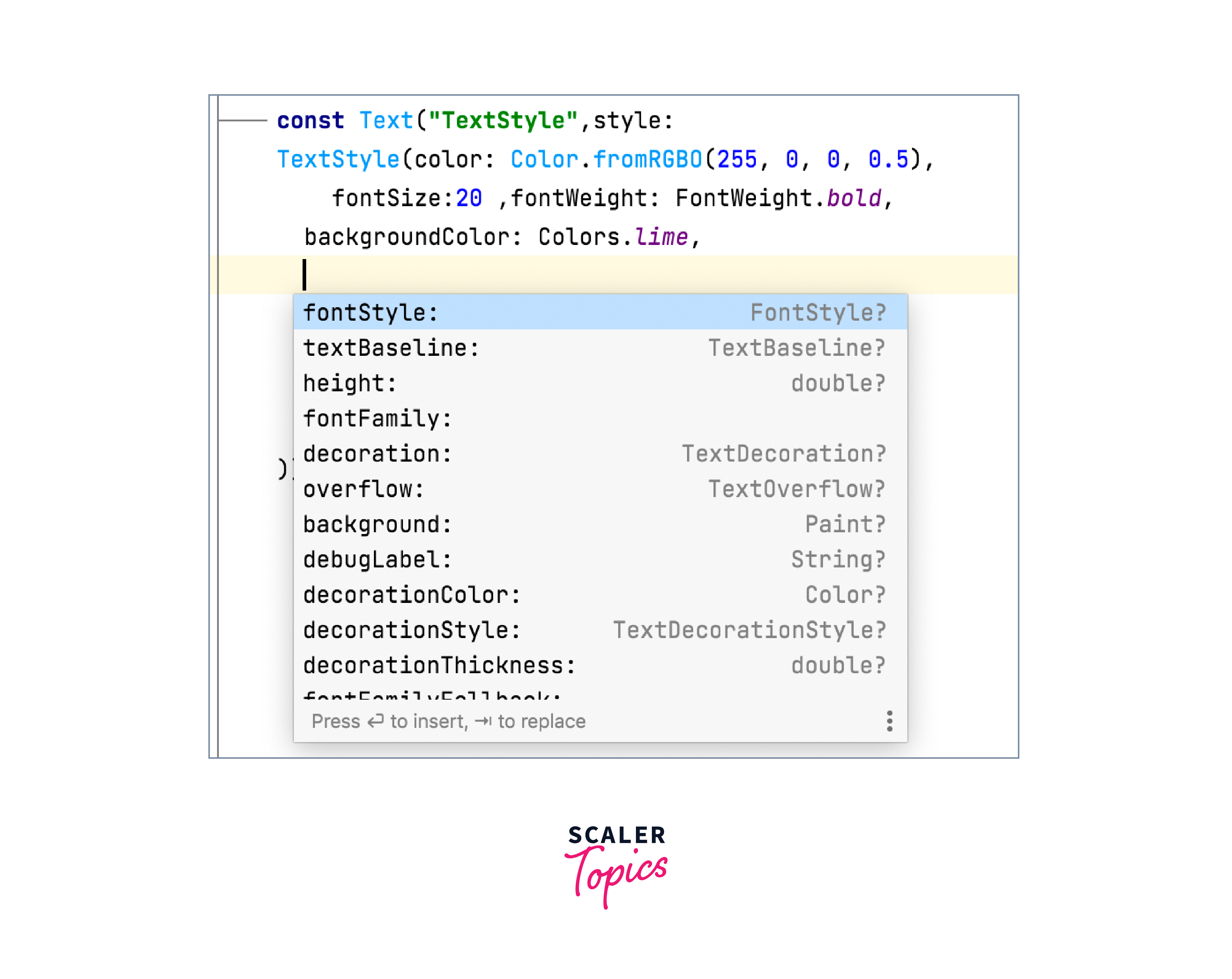
-
Container
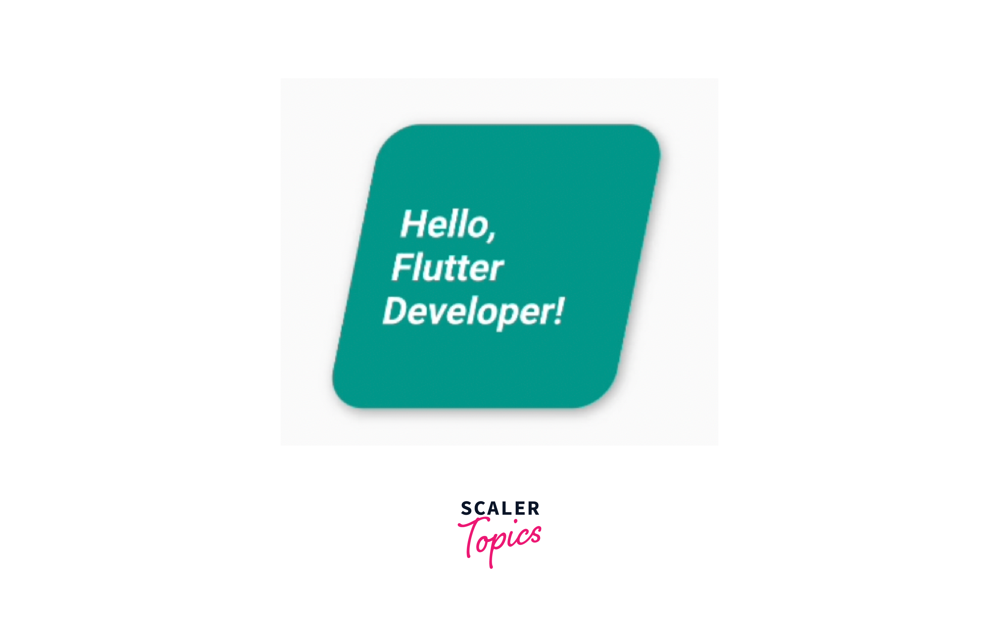
Container is a very basic widget of Flutter which is widely used across the app. This has properties like height, width, background color, margin, padding, background image, alignment transform and decoration(like border, borderRadius, width). There is a child property where we can pass any widget and this will acquire the properties of the container.
I have used the transform property to make the container tilt and see the result.
-
Gradient
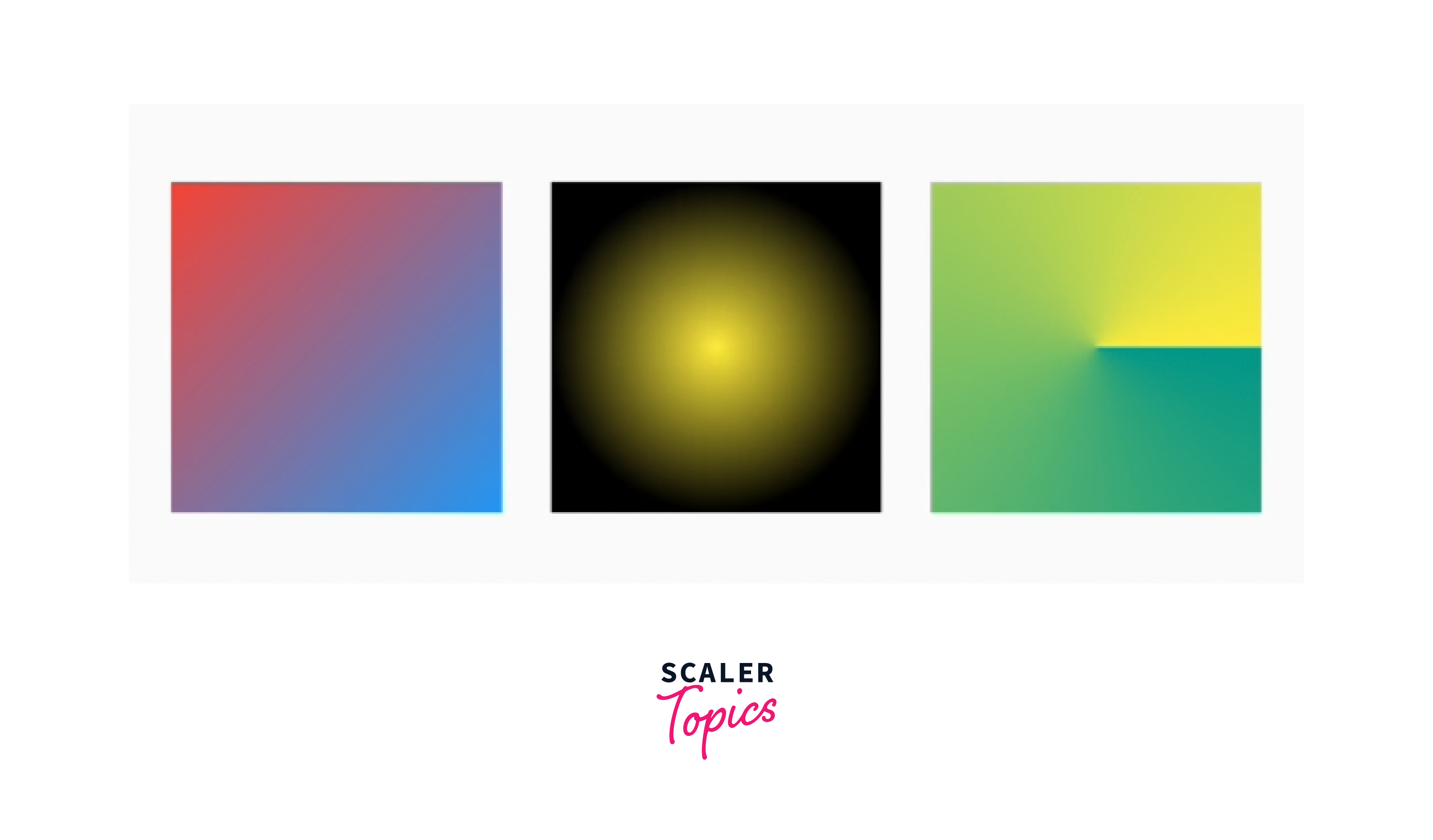
The gradient property is used to apply a gradient color effect to certain widgets, allowing for smooth transitions between multiple colors. Most commonly used with Container and other widgets for background decoration. There are 3 types of gradients available like-
- Linear Gradient- This gradient creates a linear transition between two or more colors in a straight line.
- Radial Gradient - A radial gradient creates a circular transition between colors, starting from a center point and radiating outwards
- Sweep Gradient - A sweep gradient creates a circular transition between colors, sweeping around a center point. It requires a center point, start and end angles, and a list of color stops.
-
Icons and Images
Flutter provides a wide range of icons through the Icons class. Use the icon property in IconButton and get the desired icon available in Flutter like Icons.mic or simply use the Icons class. We can change the size, color and other properties of icons.
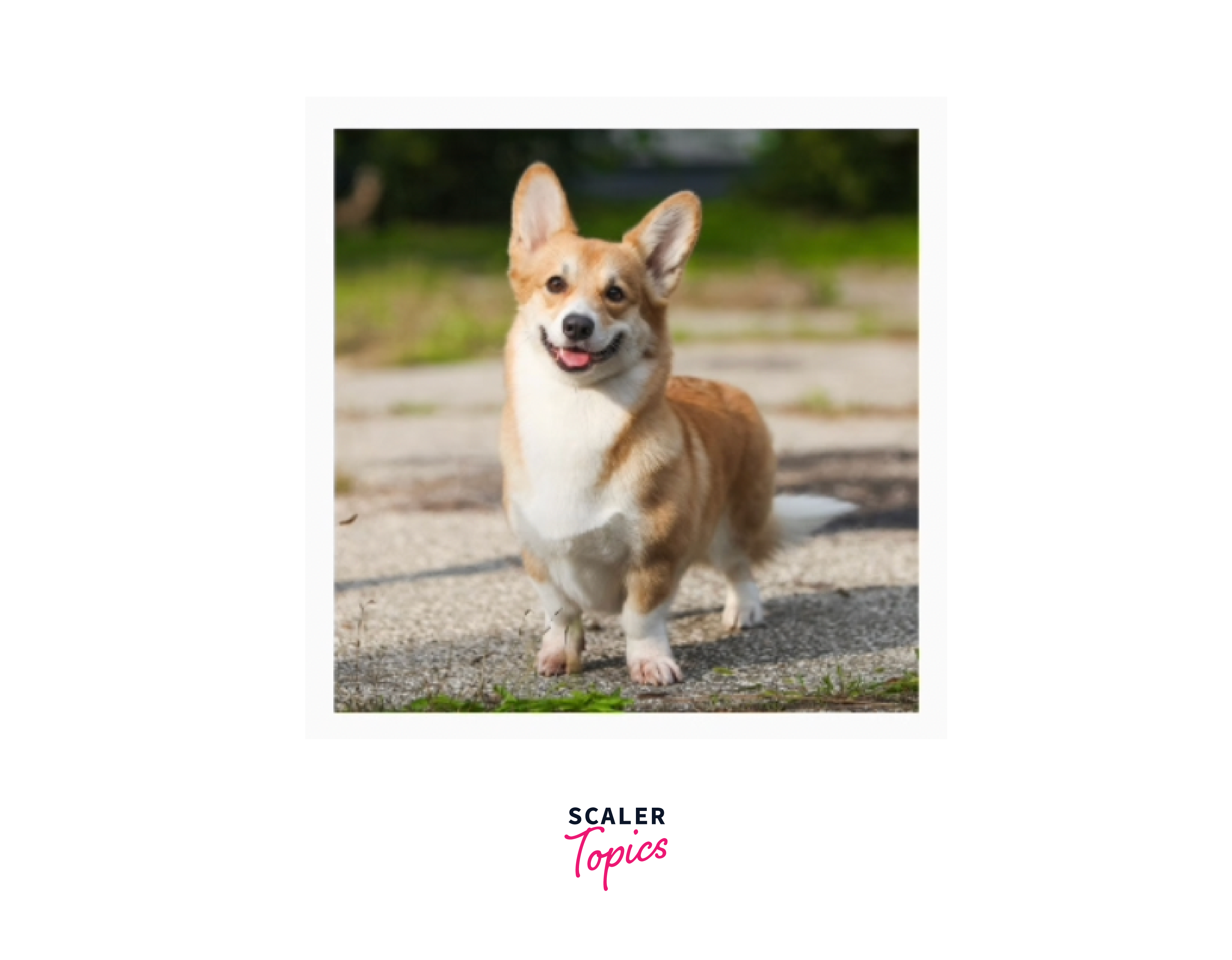
We can display images in the application from the network, store fixed images, or from devices. We can customize the image according to our needs like height, width, color, opacity, scale, fit, etc. We can use images like Image.network, Image.file,Image.asset and change other properties. This fit property is very important if we want to display full image, full height, full width, or normal as it is.
-
Themes
Theme widget and the ThemeData class are used to apply consistent visual styles and configurations to a widget subtree. We can define colors, fonts, and text styles in the "Theme" widget that can be accessed and applied throughout your app.
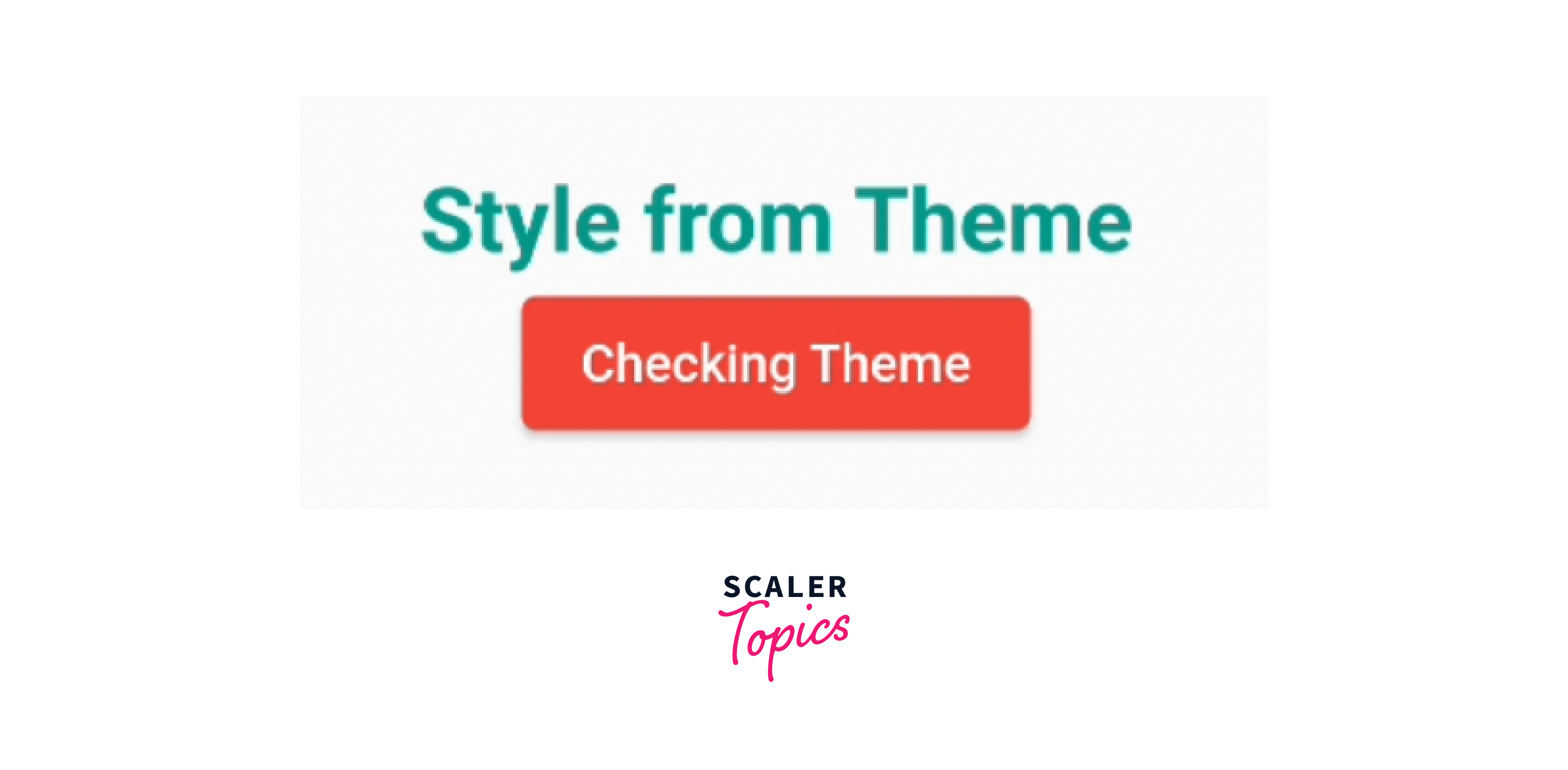
We can define colors for text or background or shape in the root of the app in the ThemeData widget like textTheme and elevatedButtonTheme and use "Theme.of(context).textTheme.headline1,)" for text and the elevated button will take it automatically. If you want to change it, you can redefine the colors, and shape in the button itself. You can see, I have not defined color in the button widget and this is taken from the Theme class.
-
DecoratedBox
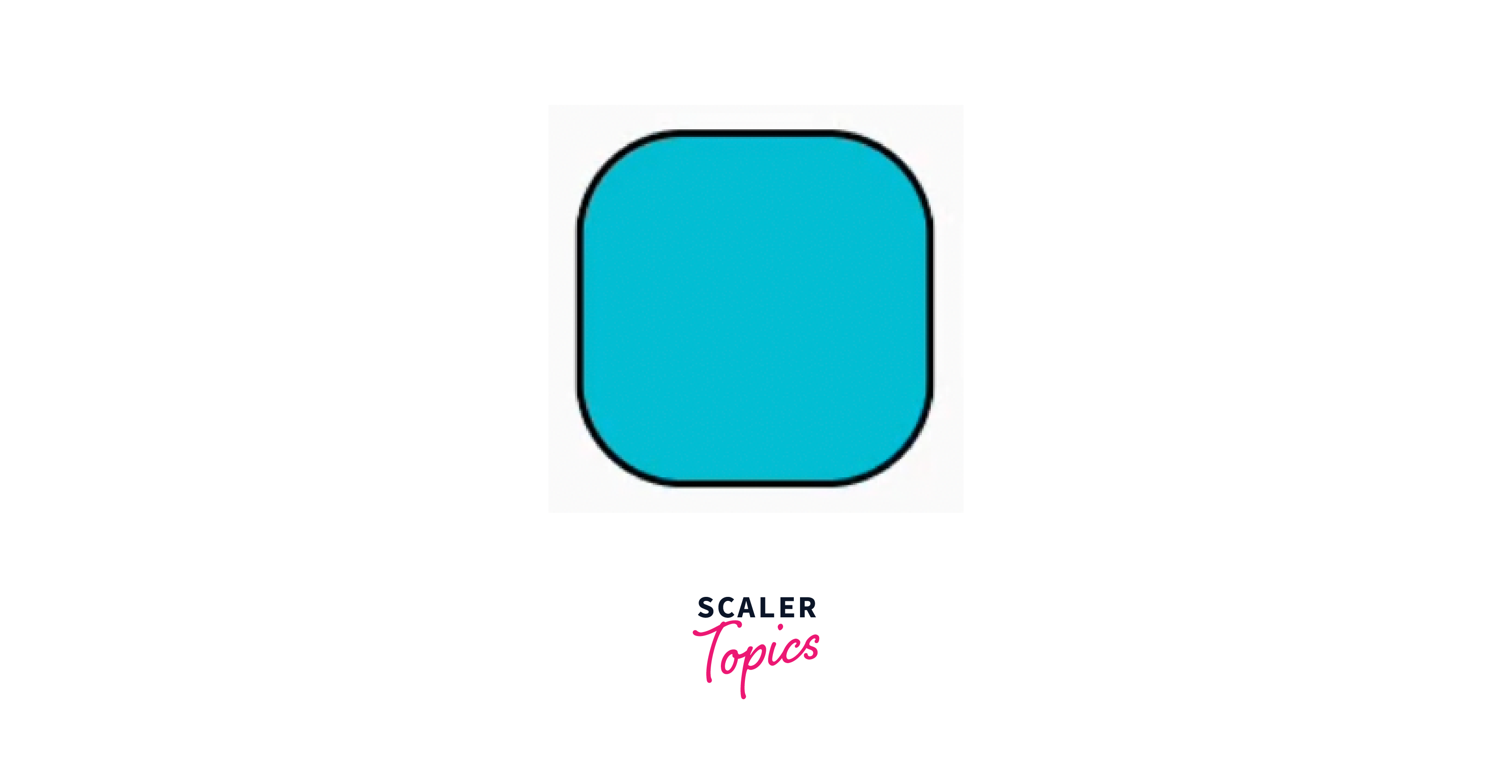
The DecoratedBox widget is used to apply visual decorations to its child widget. It allows us to customize the background, border, and other visual effects of a widget using the BoxDecoration class.
Creating Themes
-
To create themes for Flutter apps, we can define the colors, fonts, text styles, button styles, etc. in the ThemeData class.
-
Then wrap the app with MaterialApp or CupertinoApp and pass the app theme to the theme property like below.
-
Then you can access the themes in text and button widgets. You can access the theme property for text within your widgets using the Theme.of(context) method.
We will see some best practices that can be used within your application to write neat and clean code.
- Define the theme in a centralized location like app_themes.dart. This makes it easier to manage and update the theme throughout your app.
- Instead of hardcoding specific colors or text styles directly in your widgets, utilize the theme properties. This allows for easier theming and makes it simpler to update the appearance of your app.
- If your app targets multiple platforms (e.g., Android and iOS), consider creating separate themes or adapting your theme to match each platform's design guidelines.
- Test your app's UI with different themes to ensure that the desired styles are consistently applied.
- Customize only the necessary aspects of your app's visual appearance and avoid overwriting the entire theme unless necessary.
Advanced Styling Techniques
- Animations
Flutter is well known for its powerful animation capabilities to make the UI more interactive and appealing. We can animate various properties of widgets, such as size, position, opacity, and colors. Flutter offers different animation classes, such as Tween, Animation, AnimationController, and AnimatedBuilder, to facilitate smooth animations.
We will see a basic code for animating the opacity of a widget.
- Shadow
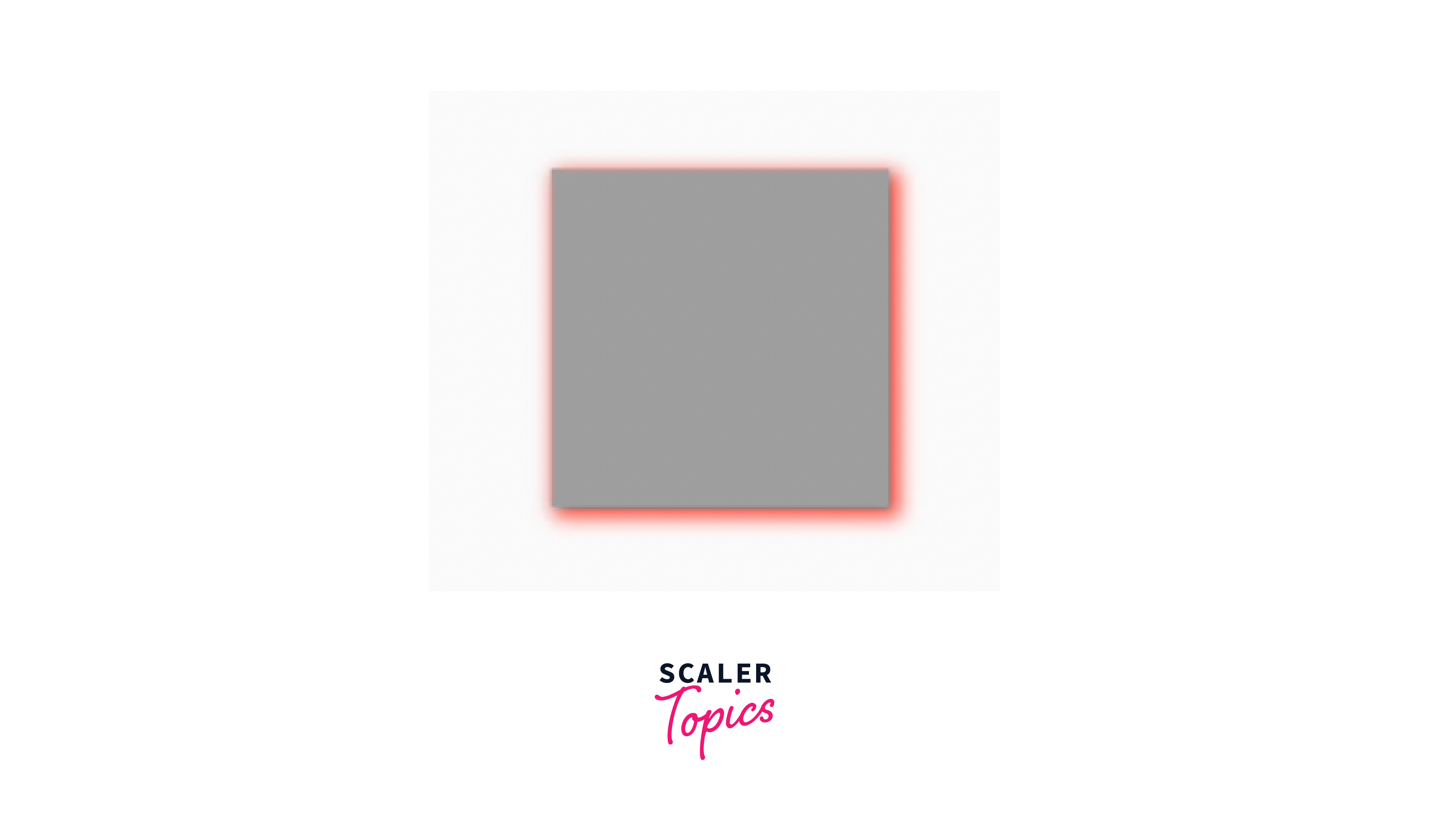
Shadows add depth and visual interest to widgets by simulating light and shadow effects and giving good style to the widget. Flutter allows you to create shadows using the BoxShadow class. You can specify properties such as color, offset, blur radius, and spread radius.
The shadow has an offset of (2.0, 2.0) (x and y), a blur radius of 4.0, and a spread radius of 1.0.
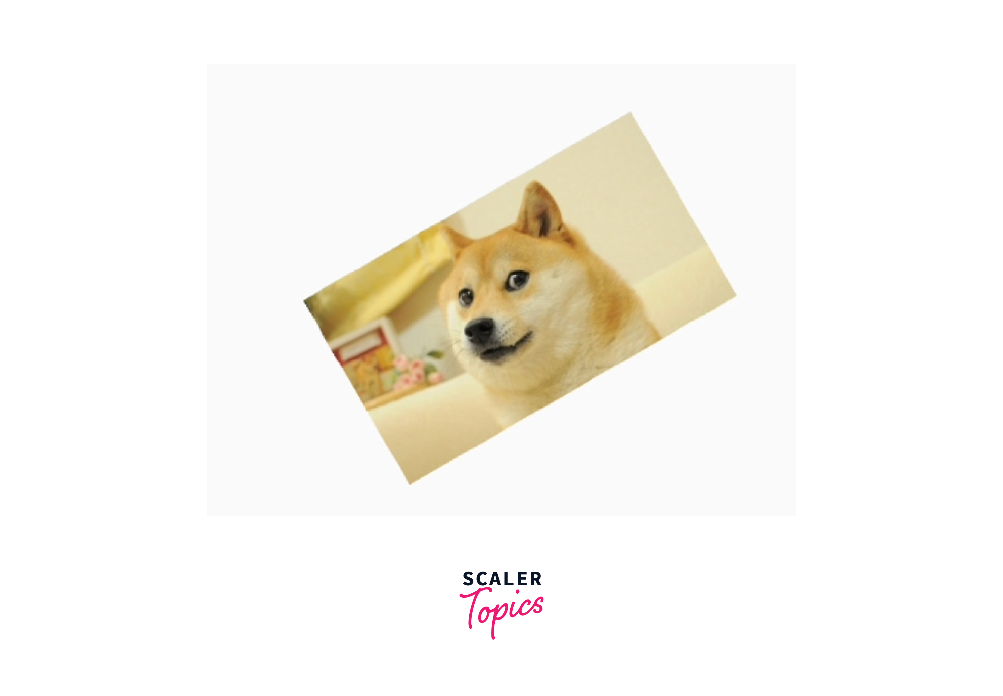
- Transform
The Transform widget allows you to apply transformations to its child widget. With this widget you can rotate, scale, translate, or skew the child widget. This is useful for creating animations or transforming widgets in response to user interactions.
- BackdropFilter
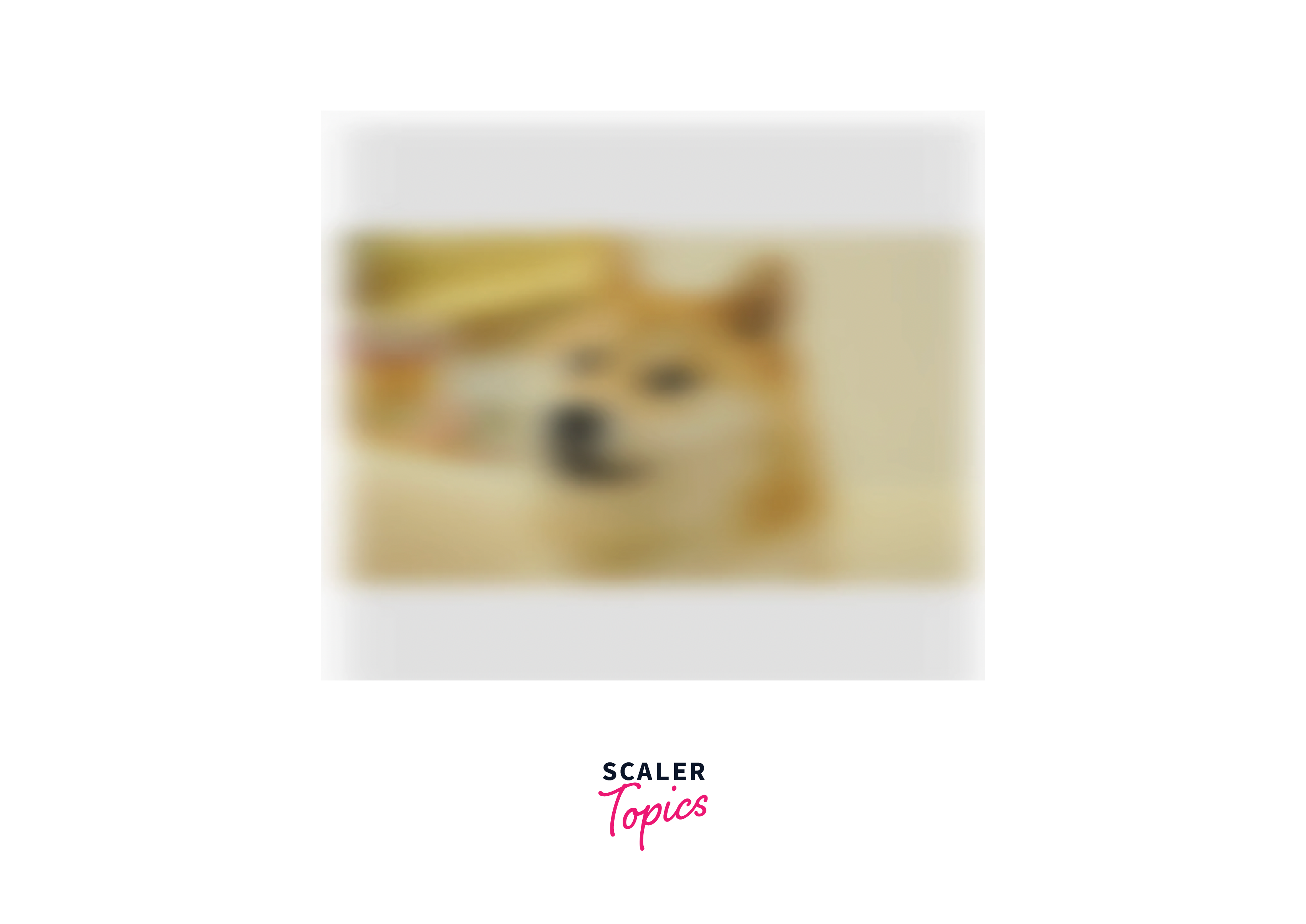
This widget allows us to blur, darken, or add other filter effects to the content. This is useful for creating translucent overlays or adding visual depth. This is also a very useful widget and a technique to change the appearance of the same widget from different angles.
Conclusion
- We have learnt about styling widgets with properties like color, theme, padding, margin, fonts, styles etc.
- We can define the colors, styles and other properties in ThemeData class and the widgets can use it.
- Do not apply excessive styling or animations to your widgets and test on different devices and platforms.
- Try to use SizedBox() widget instead of Container(), if you need to have only height and width. Use Container(), if you want to decorate the widget.
- Do not hardcode your text, colors, fonts and styles as if there comes a change, you will have to change it manually in every class. Instead, make a separate class like constants. dart.
- You can animate, transform, and blur your widgets as discussed above to make your app more attractive.
