Which CSS Property Controls the Text Size?
 FREE
FREE
The font-size property in CSS controls the text size of fonts that appears on the web pages. The font size property increases or decreases the height and size of the text. The text that appears on a website is one of the most important factors that affect user experience. Therefore the text on a webpage must be styled in a manner that a user should found it relevant to the content and enjoy the time spent on that webpage.
There are mainly two units in which font size in CSS is written which are:
- Absolute Size Values
- Relative Values
Refer to the section 'Absolute Size Values' and 'Relative Values' for a detailed explanation.
Syntax
Let's see the syntax used for font size in CSS:
Example
Example 1 (Using Absolute Value):
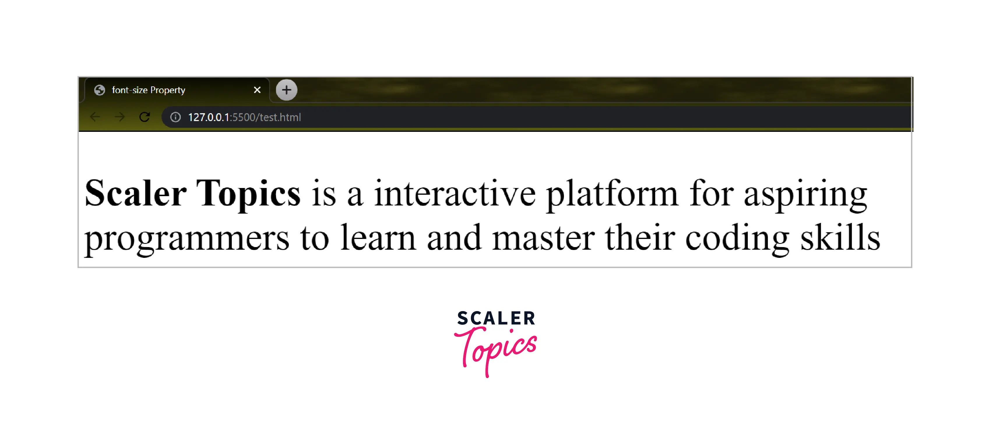
Let us take a simple example to understand how font size in CSS affects the text on a webpage. We will display a simple text with a font size of 50 pixel(absolute value).
Code:
Output:
Explanation:
In the above program, we have used Internal CSS to use the font size property for paragraphs inside the body tag. We have used px(pixel value) to change the size of text inside paragraph(p) tag. Here, we have also used the strong tag to display the selected words in bold text.
Example 2 (Using Relative Value):
Let us take another example in which we will use a different value for the font size in CSS. We will display a simple text with a font size larger(relative value).
Code:
Output:

Explanation:
It is the same program used in 'Example 1' in which we have used Internal CSS to use font-size property for paragraphs inside the body tag. We have used larger (relative value) to change the size of the text inside the paragraph(p) tag. Here, we have also used the strong tag to display the selected words in bold.
Absolute Size Values
As the name tells us, Absolute values are fixed values that are used in font-size properties which cannot be changed no matter what screen size is used. The unit of absolute value is pixel(px).
- They do not support the responsiveness of the text.
- It is not possible to change the size of the font in any browser.
- It may be useful if we know the physical size of the output text.
a.) Absolute keyword Values
Absolute keyword values contain some keywords which are used in the font-size property to set an absolute value. These keywords are as follows:
- large
- xx-large
- x-large
- medium
- small
- xx-small
- x-small
b.) Absolute Length Values
Absolute length values contain length units that are used with font size property to change the text representation. These units are as follows:
- in(inches)
- mm(millimeter)
- cm(centimetre)
- px(pixel)
- pt(points)
- pc(picas)
Note: If we do not specify a value for the font-size property then medium will be assigned as the default value.
c.) A Coding Sample for Setting Text Sizes using Absolute Values
Here, we have used absolute values in different paragraphs:
Code:
Output:

In the above code, we implemented both Absolute Keyword Values and Absolute Length Values for a better understanding of font size in CSS using absolute values inside a single Webpage.
Relative Values
The relative size values are not fixed as we have seen in absolute size values(check the above example). Relative value depends on its family or parent element which means it calculates the size based on the browser's default font size value.
- Relative values are the preferable choice for web developers over absolute values.
- Font quickly adjusts according to various screens of different sizes which means it supports the responsiveness of the text.
a.) Relative Keyword Values
Some specific keywords are used with font-size properties to change the text size. These keywords are as follows:
- larger
- smaller
b.) Relative Length Values
Some specific length units are used with font-size properties to change the text representation. These length units are as follows:
- rem
- em
- %(percentage)
c.) A Coding Sample for Setting Text Sizes using Relative Values
Code:
Output:

In the above code, we implemented both Relative Keyword Values and Relative Length Values for a better understanding of font size in CSS using relative values inside a single Webpage. This shows how relative values change according to the browser's default font size and the font size of the parent element.
Responsive Values
We use some specific units which help web developers so that the text size responds according to the screen size used. These units are called viewport units.
The viewport is the area of the browser where the content of the webpage is seen. The viewport unit changes the text size according to the current device width. Like whatever screen may be used it adjusts the text and shows responsiveness in the fonts. Here, we will use the viewport meta tag which adjusts the viewport of the browser according to the device.
There are a total of four viewport units used to adjust the text size of a webpage:
- vw (Viewport Width)
- vh (Viewport Height)
- vmin (Viewport Minimum)
- vmax (Viewport Maximum)
a.)A Coding Sample for Setting Text Sizes using Responsive Values
Code:
Outputs:
- Output(seen on Laptop screen):

- Output(seen on Mobile screen):

- Output(seen on Tablet Screen):

In the above code, we represented how viewport units are used with font size in CSS. The output also shows how fonts are adjusted concerning different screen sizes.
Browser Support
Below is a table that represents Browsers and their version from which they fully support font size in CSS:
| Browsers | Google Chrome | Safari-Apple | Mozilla Firefox | Microsoft Edge/ Internet Explorer | Opera |
|---|---|---|---|---|---|
| Version | 1.0 | 1.0 | 1.0 | 5.5 | 7.0 |
Learn More
To learn more about font properties along with font size in CSS, visit CSS font properties.
Conclusion
-
font-size property controls the text size in CSS.
-
Two units in which font-size property is written with:
- Absolute Size Values
- Relative Values
-
Viewport Units are used to provide responsiveness in font size.