Data Visualization in R with ggplot2
Overview
Data visualization is a powerful tool that helps us comprehend complex data patterns, relationships, and distributions effectively. R, a popular programming language among data analysts and statisticians, offers numerous packages for data visualization. One of the most widely used packages for creating visually appealing and interactive graphs is ggplot2. Developed by Hadley Wickham, ggplot2 is a part of the tidyverse ecosystem and follows the grammar of graphics concept, making it highly flexible and intuitive to use. This article will take you through the fundamentals of ggplot2, how to install it, a simple example, and explore various types of visualizations that can be created using ggplot2.
What is ggplot2?
ggplot2 is an R package that provides a high-level and declarative framework for creating elegant and informative visualizations. It is built on the principles of the grammar of graphics, which revolves around the idea of mapping data to visual properties and layers. This makes ggplot2 highly customizable and allows users to build complex visualizations in a structured and coherent manner. The package is widely praised for its ability to handle both simple and complex datasets while offering a consistent syntax.
ggplot2 Installation
To install and use ggplot2, follow these steps:
- Install R: If you haven't already, download and install R from the official website: https://www.r-project.org/
- Install RStudio (optional but recommended): RStudio is a popular integrated development environment (IDE) for R that makes working with R much more convenient. You can download and install RStudio from: https://www.rstudio.com/products/rstudio/download/
- Install the ggplot2 package:
- Launch R or RStudio.
- In the R console, type the following command and press enter: install.packages("ggplot2")
- R will download and install the ggplot2 package along with any necessary dependencies.
- Load the ggplot2 package: Once the package is installed, you need to load it into your R session before using its functions. To do this, type the following command and press enter: library(ggplot2)
- Create a Basic Plot: Now that the ggplot2 package is loaded, you can start creating visualizations.
ggplot2 Example in R:
Let's start with a simple example to demonstrate the basic usage of ggplot2. We will create a scatter plot using sample data. Assume we have a dataset containing two variables, "X" and "Y," representing some measurements.
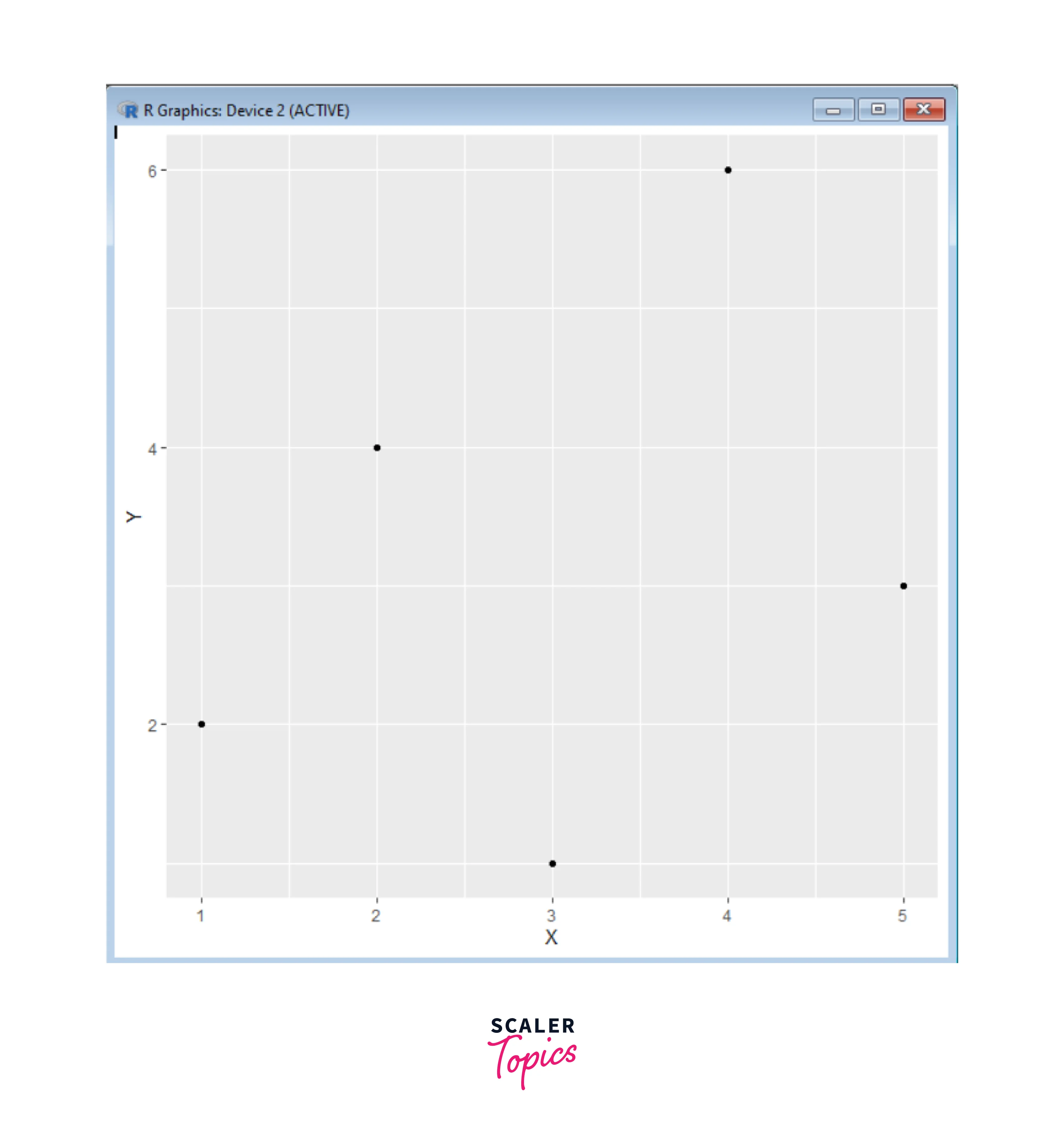
In this example, we used ggplot() to initiate the plot and provided the dataset and aesthetics mapping using aes() (aes stands for aesthetics). We used geom_point() to add points to the plot, representing the X and Y variables.
Data Visualization with ggplot2:
Now that we understand the basic ggplot2 structure, let's explore some commonly used types of visualizations:
1. Scatter Plot
A scatter plot is primarily used to explore the relationship between two continuous variables and to identify patterns, trends, or correlations within the data. Each point on the plot represents an observation from the dataset, where one variable is mapped to the X-axis, and the other is mapped to the Y-axis.
Creating a scatter plot involves selecting the two variables you want to compare, arranging the data points based on their values, and then customizing the appearance of the plot to make it more informative and visually appealing.
Scatter plots are great for various purposes, such as identifying outliers, detecting patterns, checking assumptions in statistical analyses, and gaining insights into the relationships between variables in your data.
Scatter plots are useful for various purposes, such as:
- Identifying trends or patterns in data.
- Visualizing the strength and direction of relationships between variables.
- Detecting outliers or unusual data points.
- Assessing the fit of a regression model.
- Exploring data distribution and clusters.
Overall, scatter plots are a powerful tool for visualizing and understanding relationships between continuous variables and are widely used in data analysis and exploratory data visualization.
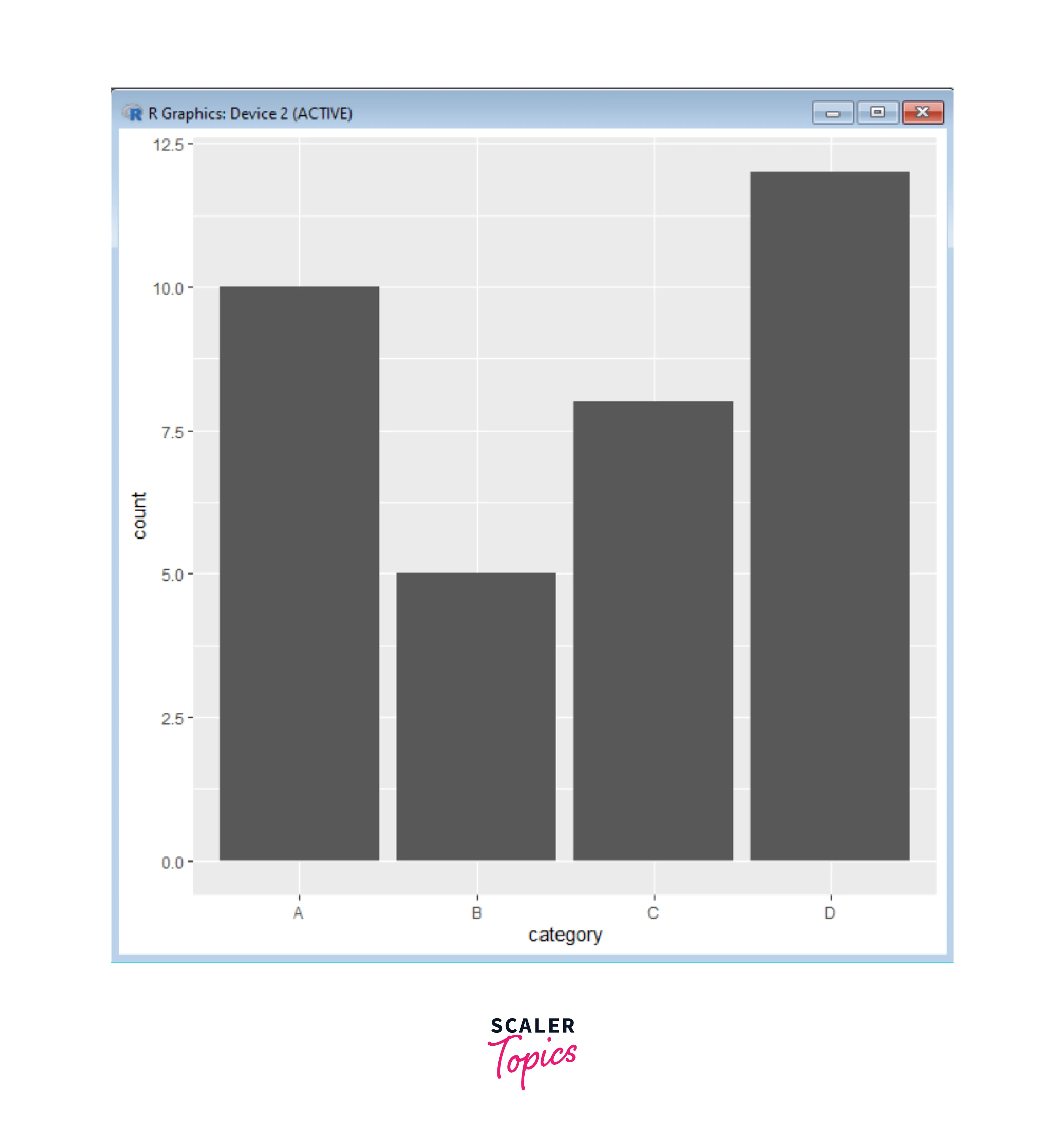
2. Bar Plot
A bar plot is suitable for visualizing the distribution of categorical data. It uses rectangular bars of lengths proportional to the values they represent. It represents the frequency, count, or proportion of different categories by using rectangular bars of varying lengths. Bar plots are effective for comparing the values of different categories or groups and are widely used for data analysis and communication of results.
Creating a bar plot involves selecting the categorical variable to be plotted, calculating the appropriate values for each category (such as counts or proportions), and then customizing the plot's appearance to effectively convey the information.
Bar plots are commonly used for tasks such as:
- Comparing the distribution of a categorical variable.
- Displaying frequency counts of different outcomes.
- Visualizing survey responses or categorical data.
- Showing the composition of a whole (e.g., a pie chart as a type of bar plot).
- Comparing performance or measurements across different groups.
Overall, bar plots are a straightforward and effective way to visualize categorical data and make meaningful comparisons between different categories or groups.
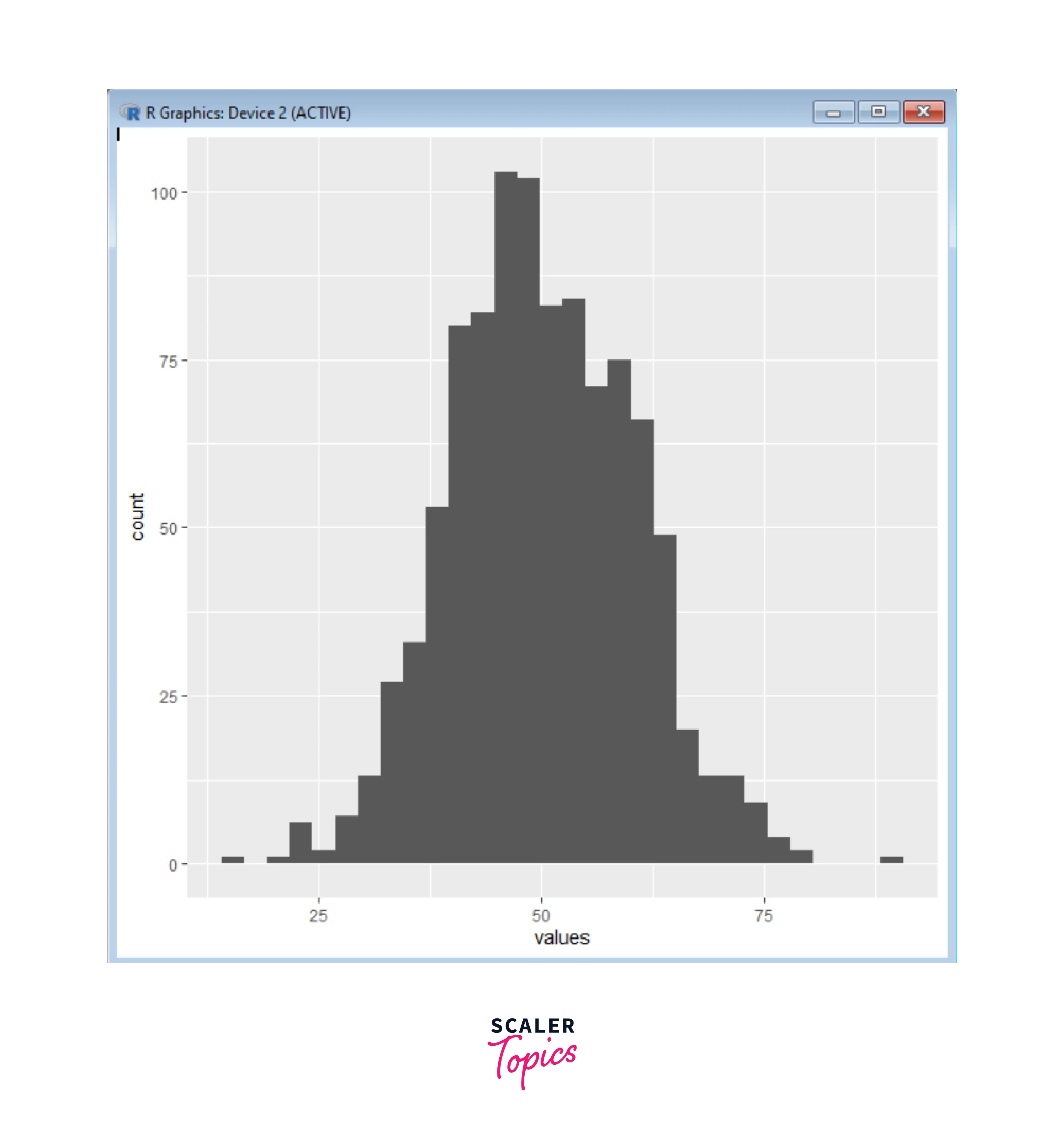
3. Histogram
A histogram is used to display the distribution of a single continuous variable. It divides the data into bins and represents the frequency of observations in each bin with bars. Histograms provide insights into the underlying data distribution, including its shape, central tendency, spread, and potential outliers.
Creating a histogram involves selecting the numerical variable to be analyzed, determining the appropriate bin size, calculating the frequency or count of data points within each bin, and then visually representing this information using bars.
Histograms are commonly used for tasks such as -
- Exploring the distribution of continuous data.
- Identifying data skewness or symmetry.
- Detecting potential outliers.
- Comparing different data distributions.
Histograms provide a concise and visual summary of the distribution of a numerical variable, helping analysts and researchers gain insights into the nature of their data.
4. Box Plot
A box plot, also known as a box-and-whisker plot, shows the distribution of data along a single axis. It summarizes the key statistical characteristics of a dataset, such as the median, quartiles, and potential outliers, in a compact and visual format. Box plots are particularly useful for comparing the distribution of data across different groups or categories.
A box plot summarizes data distribution along a single axis. The box represents the interquartile range (IQR), including the median. Whiskers extend to variability within a specified range, while outliers are plotted separately. It's a compact way to compare data across groups or categories, highlighting central tendency, spread, and potential outliers.
Creating a box plot involves selecting the numerical variable to be analyzed, organizing the data into groups or categories, and then plotting the box plot for each group. Box plots are particularly useful when comparing multiple groups to understand the differences in their distributions, central tendencies, and spread.
Box plots are commonly used for tasks such as:
- Visualizing the spread and variability of data.
- Identifying potential outliers.
- Comparing distributions of different groups or categories.
- Summarizing the central tendency of data within a group.
Box plots provide a clear and concise summary of the distribution of numerical data and are especially effective for revealing differences and patterns in datasets with multiple groups.

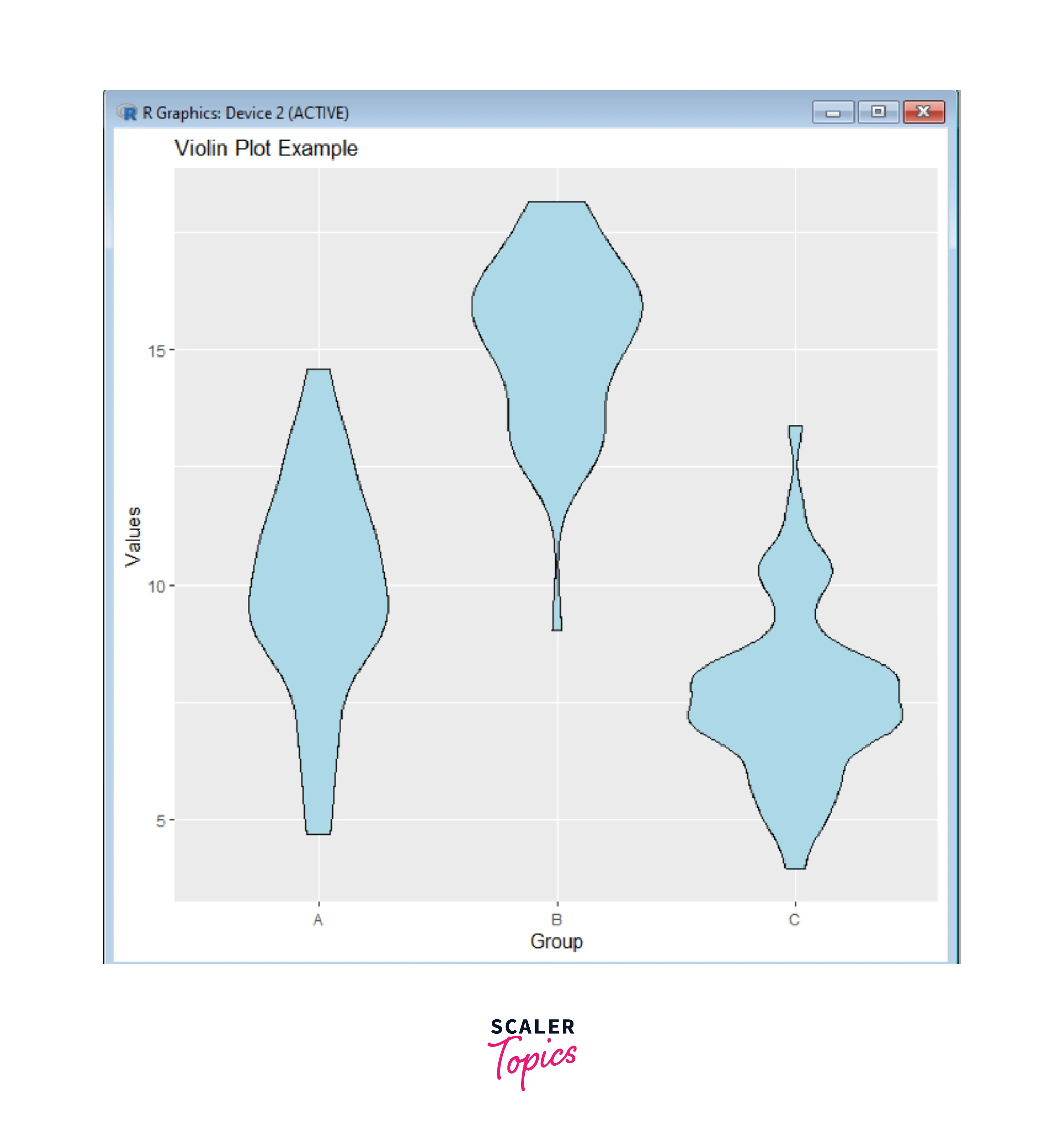
5. Violin Plot
A violin plot combines a box plot with a kernel density plot to visualize the distribution of data. It provides insights into both the summary statistics and the underlying data density. It is particularly useful for comparing the distribution of a continuous variable across different categories or groups.
Creating a violin plot involves selecting the continuous variable and the categories for comparison, estimating the density of data points at different values, and then plotting the violin shapes for each category.
Violin plots are commonly used for tasks such as:
- Comparing distributions across different categories or groups.
- Displaying summary statistics like medians and quartiles.
- Identifying modes and skewness in data distribution.
- Visualizing the spread and variability of data.
Violin plots provide a richer and more detailed view of data distribution compared to traditional box plots. They can reveal features of the data distribution that might be missed by simple summary statistics, making them a valuable tool for exploratory data analysis and data visualization.
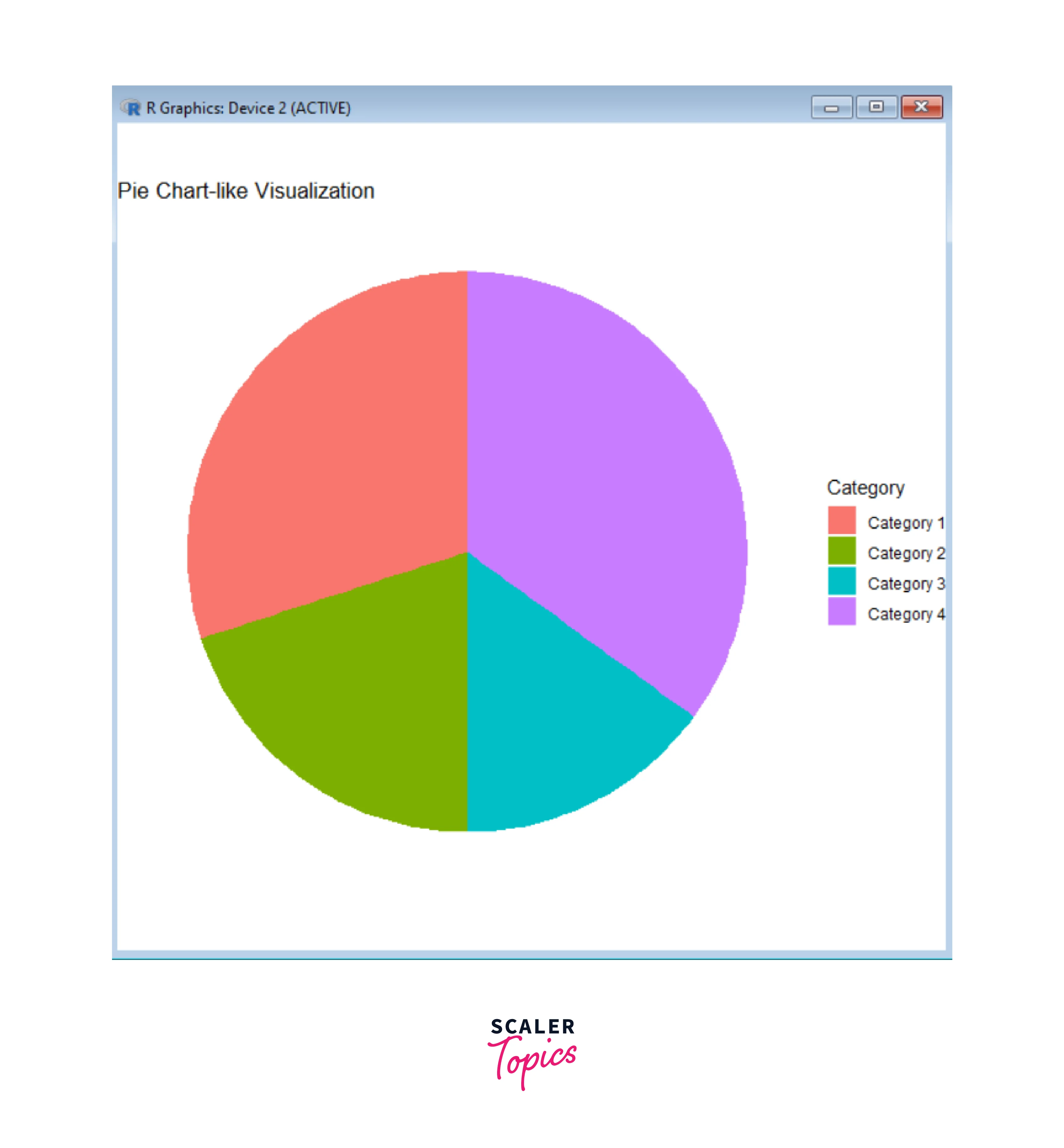
6. Pie Chart
A pie chart is employed to display the relative proportions of various categories within a dataset. Each category is depicted as a slice of the pie, with its size corresponding to the proportion it holds in relation to the entire dataset. Pie charts are commonly used to display the composition of a whole or to compare the sizes of different parts in relation to the entire dataset. They can sometimes be misleading when slices are close in size, as it's harder to make accurate comparisons with the human eye.
Creating a pie chart involves determining the proportions or percentages of each category, calculating the corresponding angles, and then plotting the sectors on the circle. Pie charts are most appropriate when you have a small number of categories and want to emphasize the relative sizes of each category in relation to the whole.
Pie charts are commonly used for tasks such as:
- Showing the composition of a whole (e.g., sales distribution by product, budget allocation by category).
- Comparing the proportions of different groups within a dataset.
- Highlighting the most significant category within a set.
However, it's important to note that pie charts have some limitations and potential drawbacks, such as difficulty accurately comparing angles and sizes, especially with many categories. Other chart types, such as bar charts or stacked bar charts, may be more suitable in situations where precise comparisons are needed. Despite this, pie charts can still be a useful tool for providing a quick overview of data composition when used appropriately.
7. Pairplot with ggpairs
The ggpairs function allows us to create a matrix of scatter plots for multiple variables in a dataset. A pairplot consists of a grid of scatter plots, where each scatter plot shows the relationship between two variables, one plotted on the X-axis and the other plotted on the Y-axis. Pair plots are particularly useful for exploring and visualizing interactions and correlations between variables.
Creating a pair plot involves selecting a subset of variables from your dataset and then plotting scatter plots for each pairwise combination of these variables. Pair plots are especially useful when dealing with moderate-sized datasets to get a quick overview of interactions between variables.
Pair plots are commonly used for tasks such as:
- Identifying patterns and relationships between variables.
- Exploring correlations and dependencies in data.
- Spotting potential outliers and clusters.
- Informally assessing assumptions in statistical analyses.
It's important to note that pair plots become less practical as the number of variables increases, as the number of scatter plots grows quadratically with the number of variables. In such cases, other techniques like correlation matrices or dimensionality reduction methods may be more suitable for analyzing relationships in high-dimensional datasets.
Here's an example code to create a pair plot using the ggpairs() function:

In this example, a sample dataframe with five variables (x1 to x5) is used. Replace this sample data with your own dataset. The ggpairs() function will automatically create a scatterplot matrix with pairwise scatterplots, density plots, and correlation coefficients.
You can customize the appearance of the pair plot using various arguments in the ggpairs() function. For example:
Customization in ggplot2 in R
Customization in ggplot2 is a key feature that allows you to create highly tailored and visually appealing data visualizations in R. The ggplot2 package provides a flexible and layered approach to building plots, which makes it easy to customize nearly every aspect of your visualizations. Here's a detailed guide on how to customize your plots using ggplot2:
-
Aesthetic Mapping and Layers:
- The foundation of ggplot2 customization is the concept of aesthetic mapping. Aesthetics are visual properties that can be mapped to variables in your dataset. Common aesthetics include X and Y position, color, shape, size, and alpha (transparency).
- You start by creating a plot object using ggplot(), specifying the data and aesthetics. You then add different layers using functions like geom_point(), geom_line(), and so on.
- Aesthetic mapping and layers provide a structured and modular way to construct sophisticated and informative visualizations in ggplot2.
-
Themes:
- Themes control the overall appearance of your plot, including grid lines, background color, text size, and more.
- You can apply themes using the theme() function. For example, theme_minimal(), theme_light(), and theme_dark() are some built-in themes.
- You can further customize themes by modifying specific elements, like theme(axis.title.x = element_text(size = 12)).
-
Labels and Titles:
- Customizing labels and titles in ggplot2 allows you to enhance the readability and aesthetics of your data visualizations.
- With the ability to modify axis labels, legends, titles, and annotations, you can create more informative and visually appealing plots.
- You can customize axis labels, titles, and other text elements using labs() and ggtitle() functions.
- For example, labs(x = "X-axis Label", y = "Y-axis Label") and ggtitle("My Custom Title").
-
Scales:
- Scales control how data values are translated into visual properties. You can customize scales using functions like scale_x_continuous(), scale_fill_manual(), and so on.
- For example, scale_x_continuous(limits = c(0, 10)) sets the X-axis limits.
- Customizing scales in ggplot2 allows you to control how data values are represented and displayed on your plots.
- Scales determine how variables are mapped to aesthetics such as position, color, size, and shape. By customizing scales, you can fine-tune the appearance and interpretation of your visualizations.
-
Legends:
- Customizing legends in ggplot2 allows you to control how the mapping between data values and visual aesthetics is displayed on your plots.
- Legends provide crucial information to interpret the plot, such as the meaning of colors, shapes, and sizes. By customizing legends, you can improve the clarity and aesthetics of your visualizations.
- Legends show the mapping between data values and visual properties. You can customize legends using functions like labs(), guide_legend(), and scale_*_manual().
- For example, labs(fill = "Categories") or scale_fill_manual(values = c("red", "blue")).
-
Colors and Palettes:
- Colors and palettes are essential components in data visualization, and ggplot2 provides a variety of options for customizing colors and color schemes to create visually appealing and informative plots in R.
- You can customize colors using functions like scale_color_manual(), scale_fill_gradient(), and more.
- Palettes are sets of colors that you can apply to your plot. ggplot2 includes some built-in color palettes, and you can also use packages like RColorBrewer or viridis for more options.
-
Annotations and Text:
- You can add custom text, labels, and annotations to your plot using functions like annotate(), geom_text(), and geom_label().
- These functions allow you to place text or labels at specific coordinates on your plot.
- Customizing annotations and text in ggplot2 allows you to add additional information, context, or explanatory text to your data visualizations.
- Annotations can include text labels, arrows, shapes, and lines that highlight specific data points or patterns. Customizing annotations and text in ggplot2 helps you create more informative and visually engaging plots.
-
Faceting:
- Faceting is a powerful customization feature in ggplot2 that allows you to create multiple plots based on the levels of a categorical variable, effectively dividing your data into subsets and visualizing them separately.
- Faceting helps you explore and compare the relationships between variables within different groups or categories. In ggplot2, you can use functions like facet_grid() and facet_wrap() to implement faceting in your plots.
- Faceting customization in ggplot2 allows you to efficiently explore complex relationships within your data across different groups or categories. By customizing the appearance and arrangement of facets, you can effectively communicate insights and comparisons in your visualizations.
-
Saving and Exporting Plots:
- Saving and exporting plots in ggplot2 allows you to preserve your visualizations for sharing, publication, or further analysis.
- ggplot2 provides various methods for saving your plots in different formats, ensuring your work can be easily disseminated and integrated into documents or presentations.
- You can save your customized plot as an image file (e.g., PNG, PDF) using the ggsave() function. Specify the filename and dimensions to save your plot in different formats.
-
Custom Themes and Extensions:
- Custom themes in ggplot2 allow you to control and modify the overall appearance and styling of your plots. Themes provide a consistent and polished look to your visualizations, making them more professional and visually appealing. While ggplot2 comes with a set of built-in themes, you can also create your own custom themes to match your specific preferences or the branding of your project. You can create your own custom themes using the theme() function and share them with others.
- Extensions like ggplot2's ggthemes or third-party packages like ggpubr provide additional themes, color palettes, and features for even more customization options.
Remember that ggplot2 follows a layered approach, so we can add multiple layers and customization options to build complex and informative visualizations. The possibilities for customization are virtually endless, making ggplot2 a powerful tool for creating publication-quality graphics that effectively convey your data's insights.
Benefits of Using ggplot2
ggplot2 offers several advantages that make it a preferred choice for data visualization:
- Declarative Syntax: The syntax of ggplot2 is declarative, meaning users describe what the plot should look like rather than specifying each step in detail. This approach makes the code more intuitive and readable. In traditional imperative programming, you might instruct the computer on how to create each element of the plot. In contrast, ggplot2 allows you to specify the data, aesthetics (mapping data variables to plot features like position, color, etc.), and geometric objects (geoms) in a concise and intuitive manner. This approach results in more readable and easily understandable code, which enhances collaboration and reduces the cognitive load of creating complex visualizations.
- Consistency: ggplot2 follows a consistent approach to create different types of visualizations, making it easier for users to switch between plot types. Regardless of the plot type—be it scatter plots, bar plots, line plots, or more—users can rely on a common set of principles and functions. Once you learn the basics of ggplot2, transitioning between different plot types becomes much smoother, as you apply the same grammar of graphics principles to each plot. This consistency simplifies the learning curve and encourages users to explore and experiment with various plot types without relearning the entire process for each one.
- Faceting: Faceting in ggplot2 allows the creation of small multiples, i.e., multiple plots based on different categories, enabling easy comparison and exploration of patterns. Facets allow for easy comparison of patterns and relationships across different categories, making it an essential tool for exploring and interpreting complex datasets. By facetting, you can quickly identify trends and variations in data subsets, enhancing the overall insights derived from the visualization.
- Extensibility: ggplot2 is highly extensible. Users can create their own custom themes, scales, and geometric objects to meet specific visualization needs. This extensibility allows for complete creative control over the appearance and behavior of your plots. It also encourages a thriving ecosystem of user-contributed packages that enhance and expand the capabilities of ggplot2, providing solutions for unique visualization challenges.
- Support for Large Datasets: ggplot2 handles large datasets efficiently, making it suitable for big data visualizations. Behind the scenes, ggplot2 employs smart data aggregation and rendering techniques to ensure that plots remain responsive and visually informative even when dealing with significant amounts of data points. This capability allows users to explore and communicate insights from massive datasets without sacrificing performance or compromising the quality of the visualization.
Conclusion
- ggplot2 is a powerful data visualization package in R, based on the grammar of graphics principles.
- It offers an intuitive and consistent syntax for creating a wide range of visualizations.
- We explored a basic example of a scatter plot using ggplot2.
- Data visualization with ggplot2 extends to various plot types, such as scatter plots, bar plots, histograms, box plots, violin plots, pie charts, and pairplots with ggpairs.
- ggplot2 allows extensive customization of visualizations, including axis labels, titles, colors, themes, and more.
- Faceting in ggplot2 enables the creation of multiple plots based on categorical variables for easy comparison.
- By mastering ggplot2, data analysts and researchers can efficiently convey insights and make informed decisions through visually compelling representations.
- Time series data can be effectively visualized using ggplot2, allowing you to create dynamic and informative plots that highlight temporal patterns and fluctuations.
- When combined with interactive libraries like plotly, ggplot2 plots can be made interactive, allowing viewers to explore data by hovering over points, zooming, and filtering.
- ggplot2 works seamlessly with data manipulation packages like dplyr and tidyr, making it easy to preprocess and reshape your data before creating visualizations.