CSS grid template columns Property
 FREE
FREEOverview
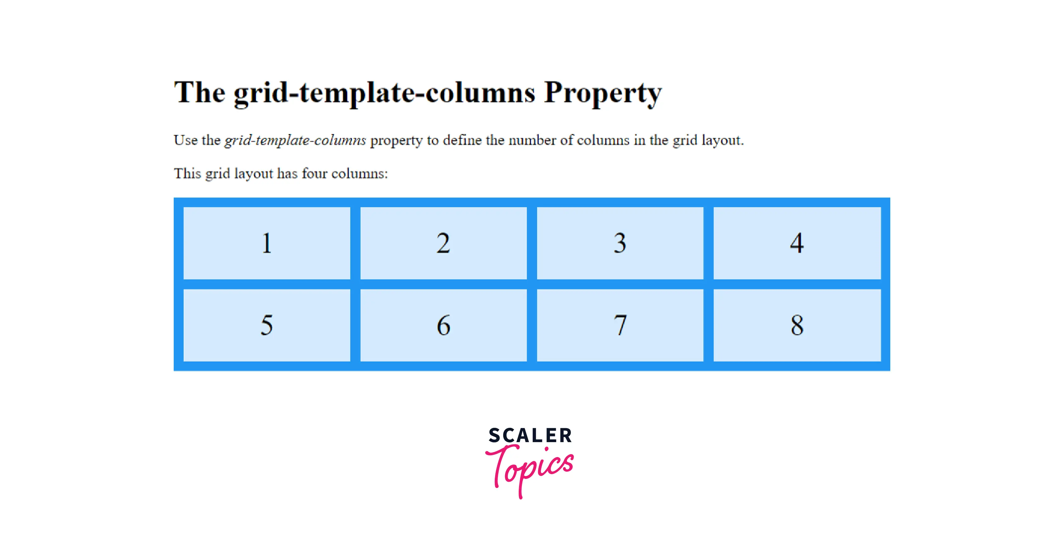
The grid-template-columns is a CSS property that decides the number of columns and the column size in a grid. It also tracks the sizing functions and names of the lines in the grid columns. This CSS property accepts multiple values, and the number of columns in a grid sets according to the number of values assigned to the property.
Syntax
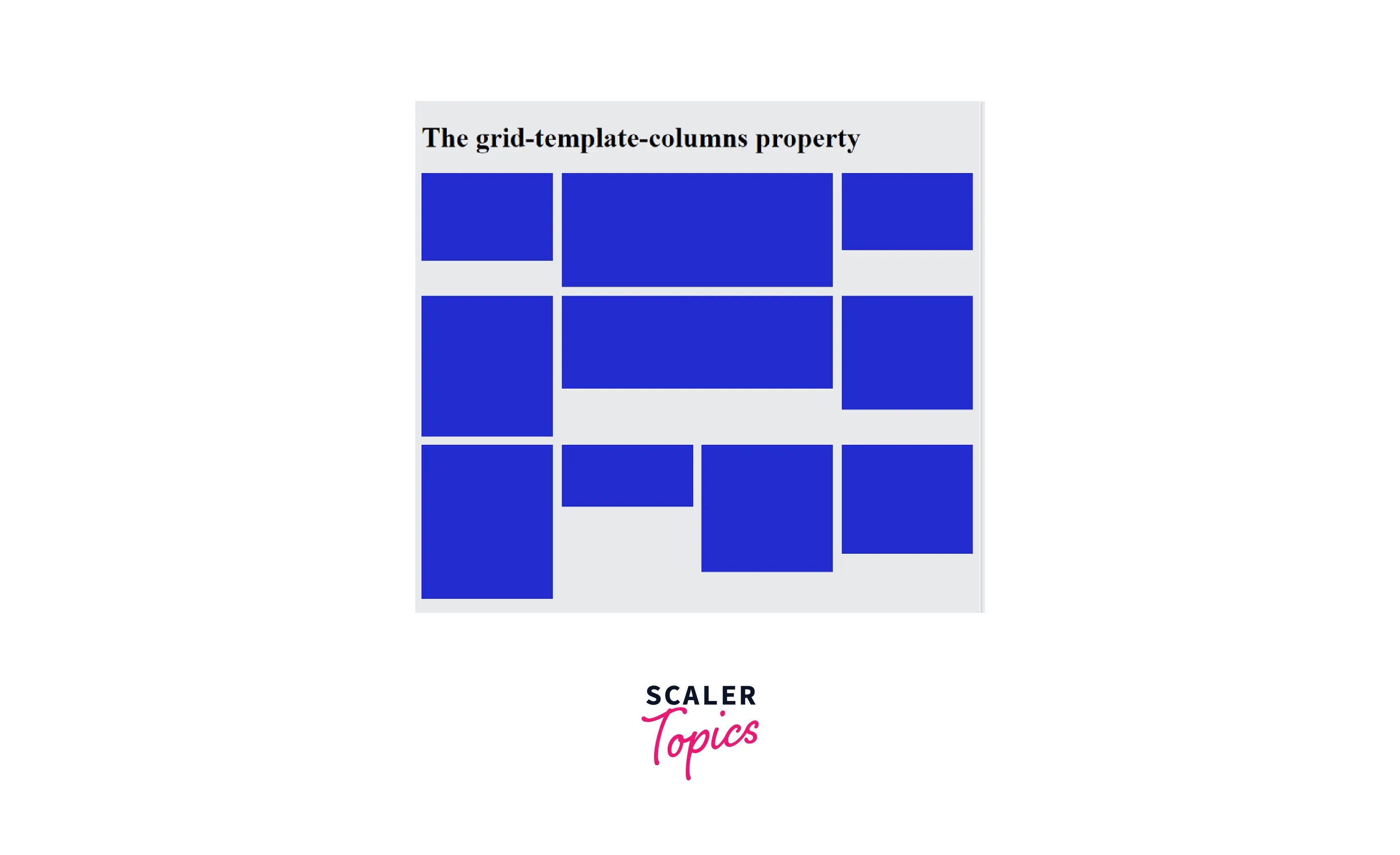
Grid Template Columns in CSS
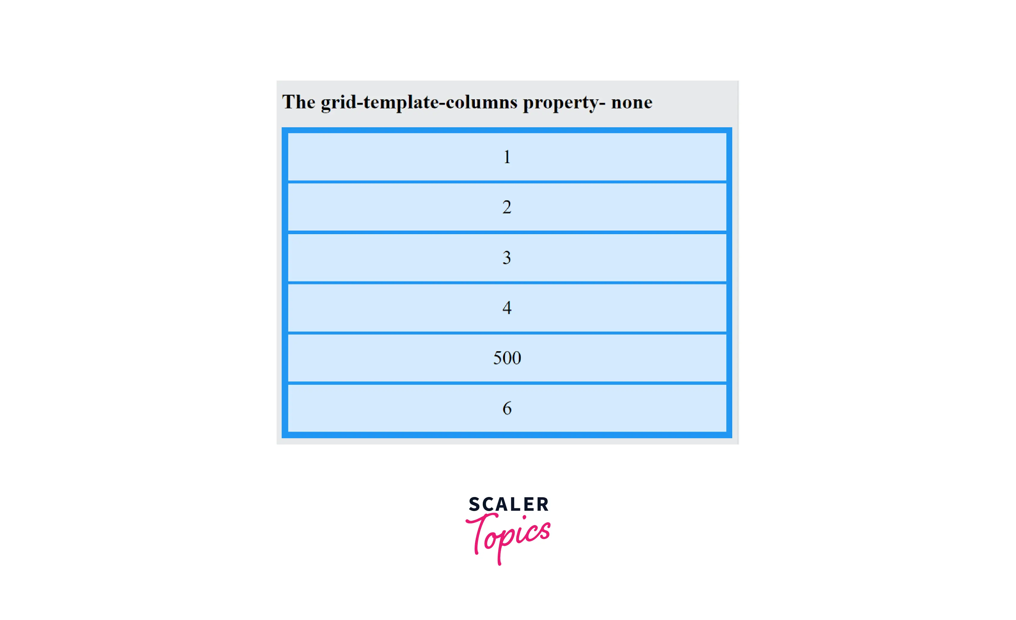
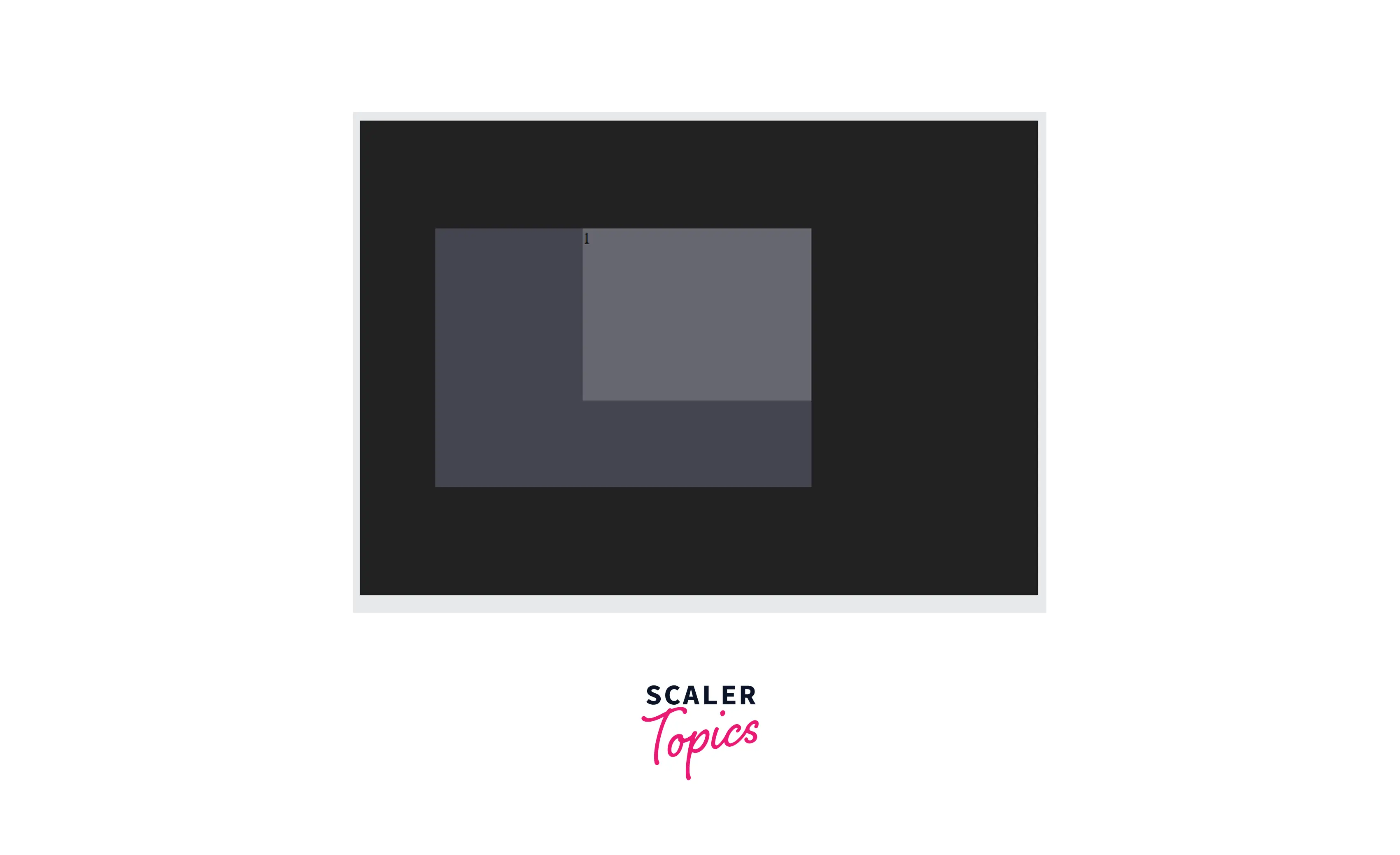
none
The value none of the grid-template-columns property sets it to the default value with no explicit grid columns. With this value, the grid contains no columns until its necessary. The grid-auto-columns property decides the size of the columns generated implicitly.
Syntax:
Example
Output
[linename]
We know that each grid line has an implicit name expressed numerically. But we can make the code of a complicated grid more understandable and simple by giving them custom names of our choice. Each grid item can then get referred to using its line names.
The [linename] is in the form of <custom-ident>. <custom-ident> is a CSS datatype consisting of a user-defined string of multiple case-sensitive characters. A line name cannot be span or auto as they are reserved words. We can have more than one name of a line that can be written together in square brackets with space between them. For example [line-name-a line-name-b].
Syntax
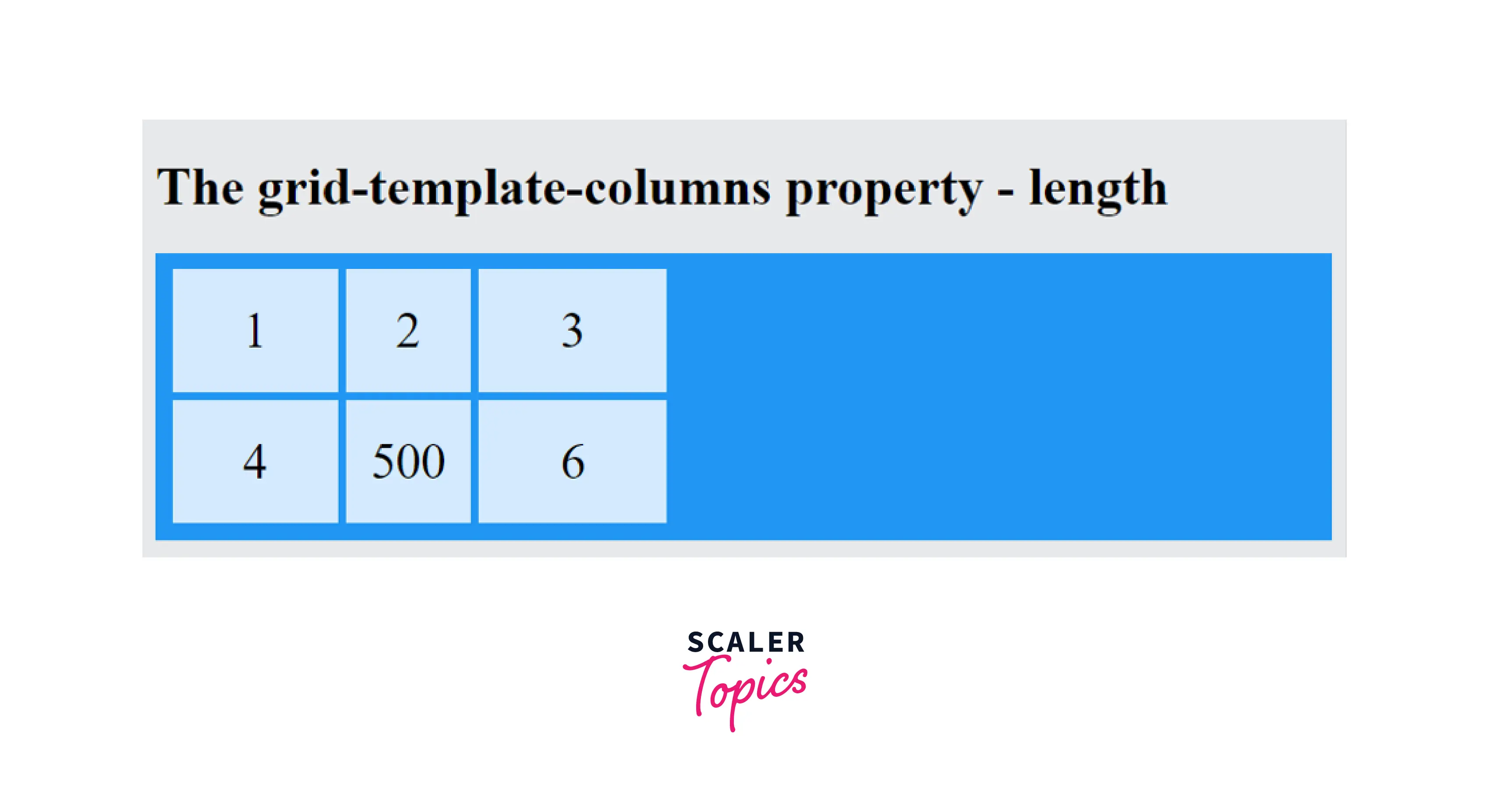
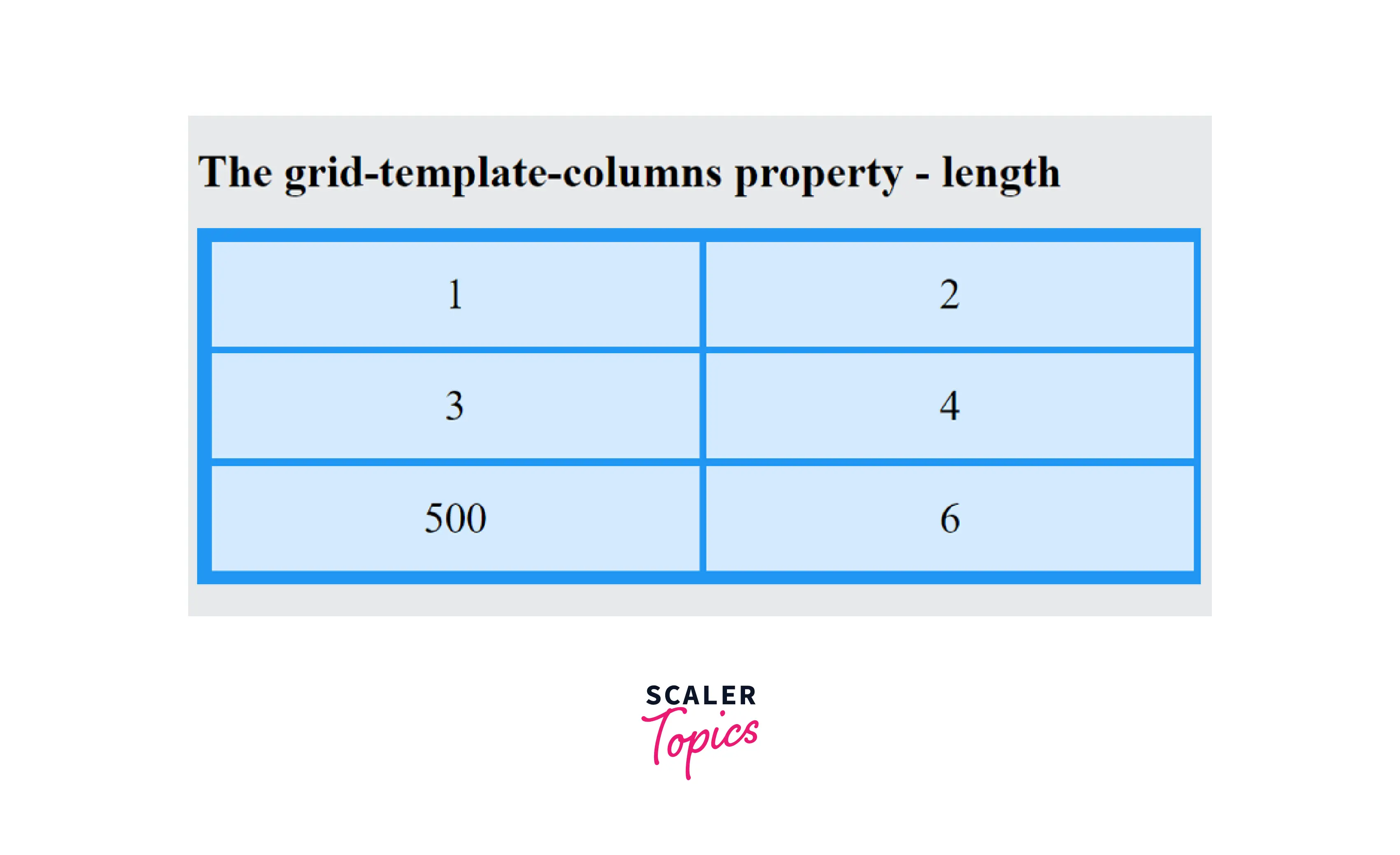
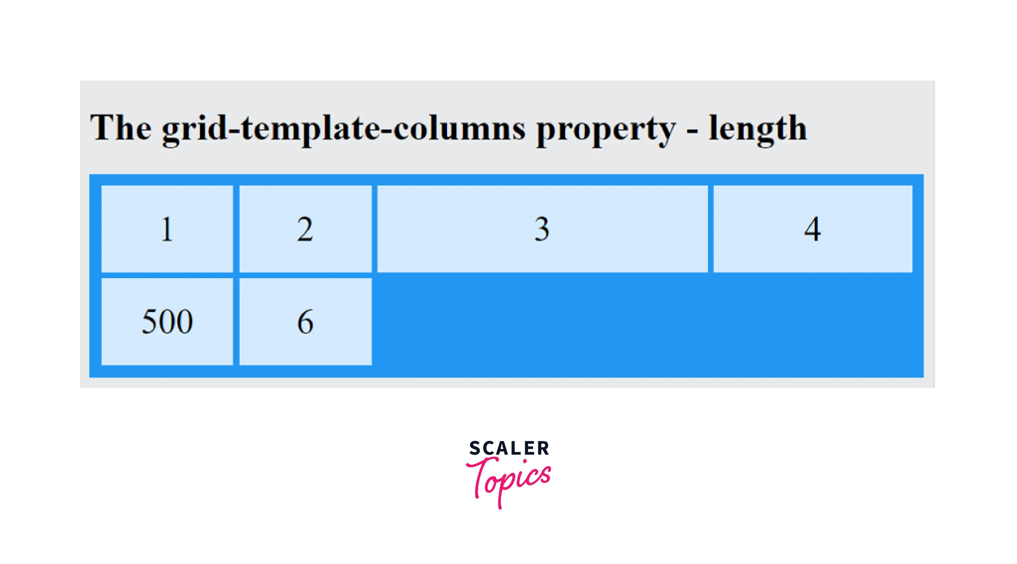
<length>
It is a positive value to set the length of the column in the grid template columns css property. The length value to specify the column size can be in various units like px, em, rem, etc.
Syntax:
Example
Output
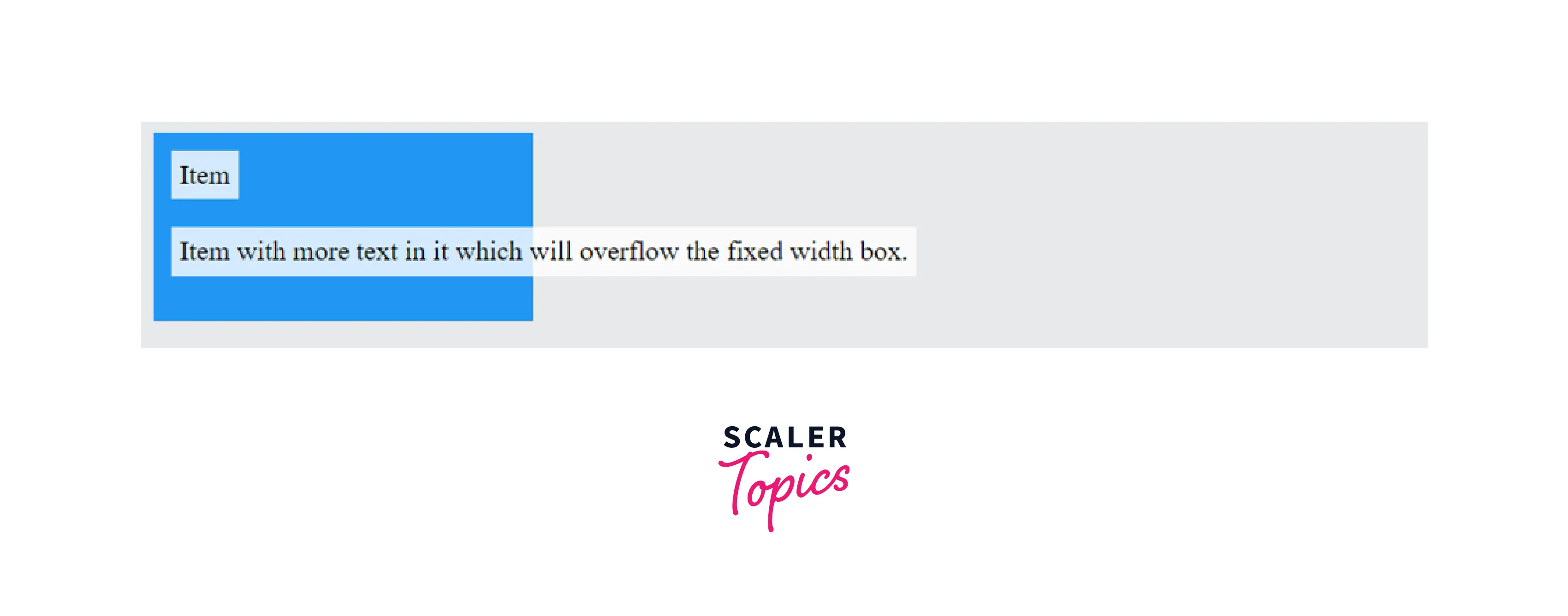
<percentage>
It is a positive percentage value that takes the inner inline size of the grid container as a reference. The percentage is declared as auto when the grid container's size depends on the size of its tracks. The track intrinsic size contributions adjust to the grid container's size increasing the final size of the track. It increases by the minimum amount that honors the percentage.
The percentage value has the disadvantage of overflow. When gaps are added between the tracks, their size gets added to the size of the tracks resulting in overflow. It can be prevented using the auto keyword or fr unit to size the tracks.
Example
Output
<flex>
<flex> is a positive value expressed in fr units that specifies the flex factor of the track. The remaining space of each <flex> sized track gets distributed in proportion to its flex factor. minmax(auto, <flex>) represents an automatic minimum if the code is used in a minmax() notation.
Example
Output
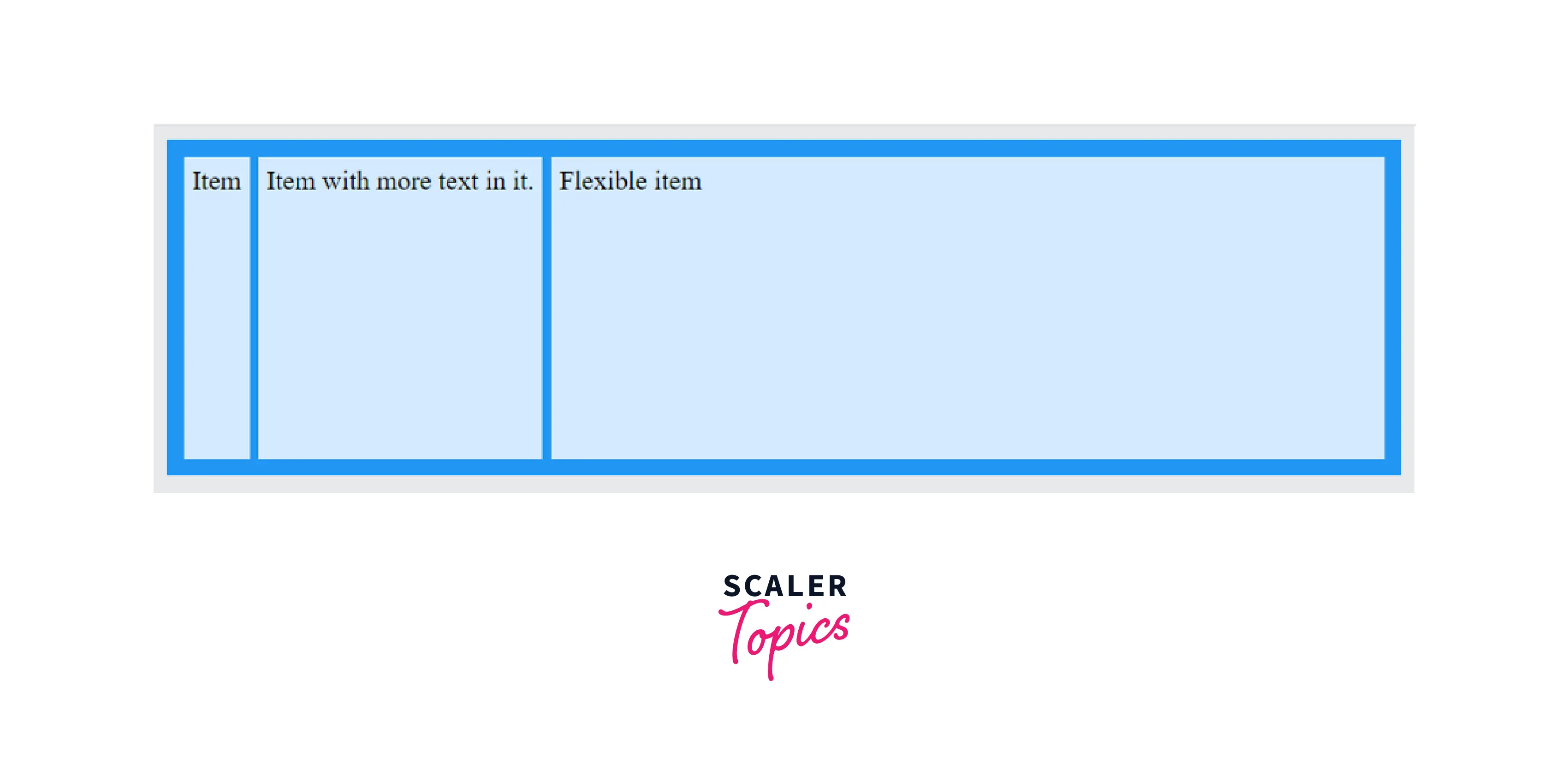
max-content
The keyword max-content represents the largest of the grid item having the maximal content contribution on the grid track. Let's understand it with an example. For example, the grid track consists of two elements. Each grid track element contains a sentence.
"Repetition is the mother of all learning" is the sentence in the first element, and "While I breathe, I hope" is in the second statement. The size of the largest sentence of all the grid elements defines the maximal content contribution. Thus, in the above grid track, the element "Repetition is the mother of all learning" has the maximal content contribution.
Example
Output
Example 2
Output
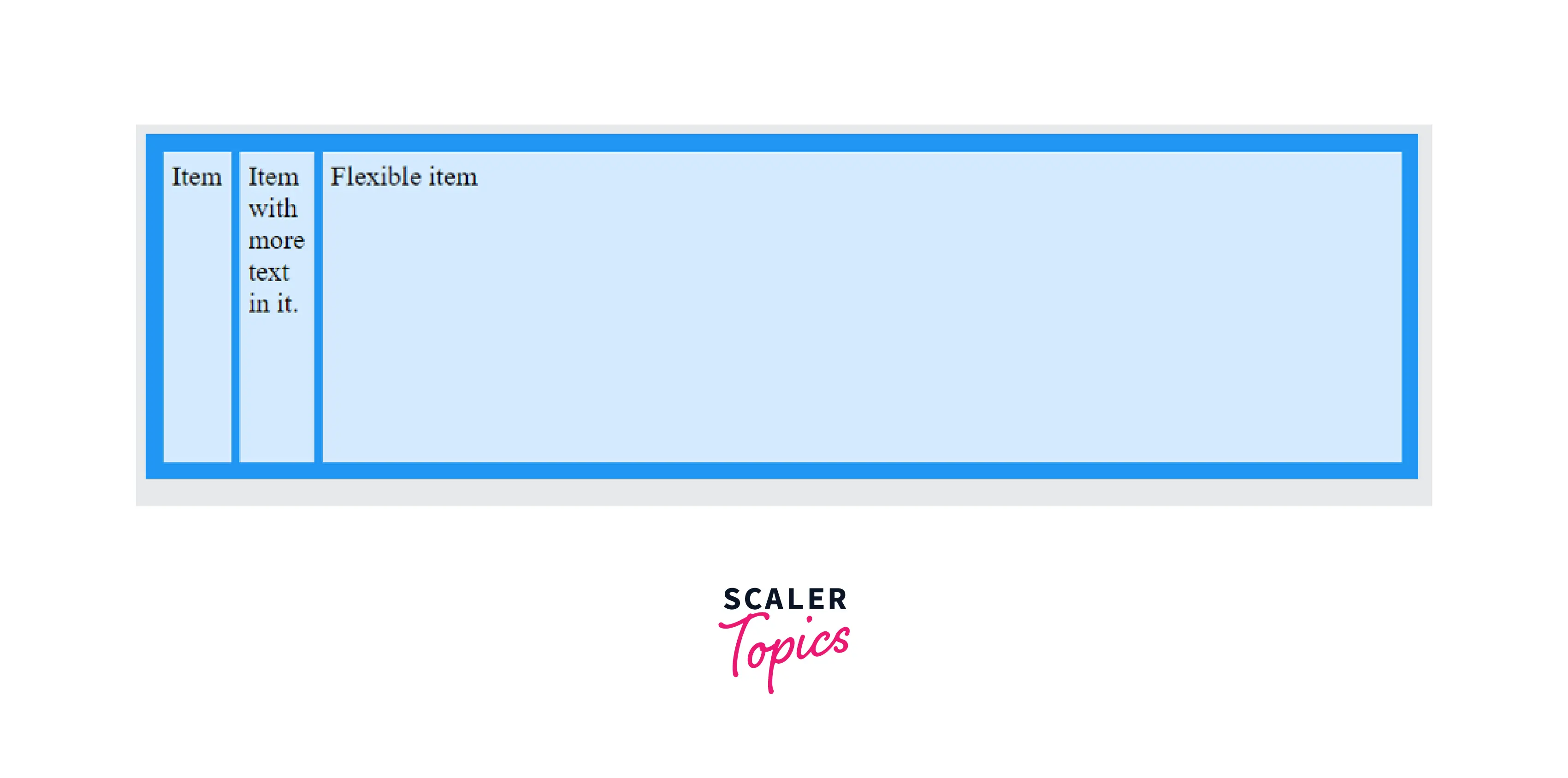
min-content
The keyword min-content represents the largest of the grid item having the minimal content contribution on the grid track. Let's understand it with an example. For example, the grid track consists of two elements. Each grid track element contains a sentence.
"Repetition is the mother of all learning" is the sentence in the first element, and "While I breathe, I hope" is in the second statement. The size of the largest word of all the sentences in the grid elements defines the minimal content contribution. Thus, in the above grid track, the element "Repetition" has a minimal content contribution.
Example
Output
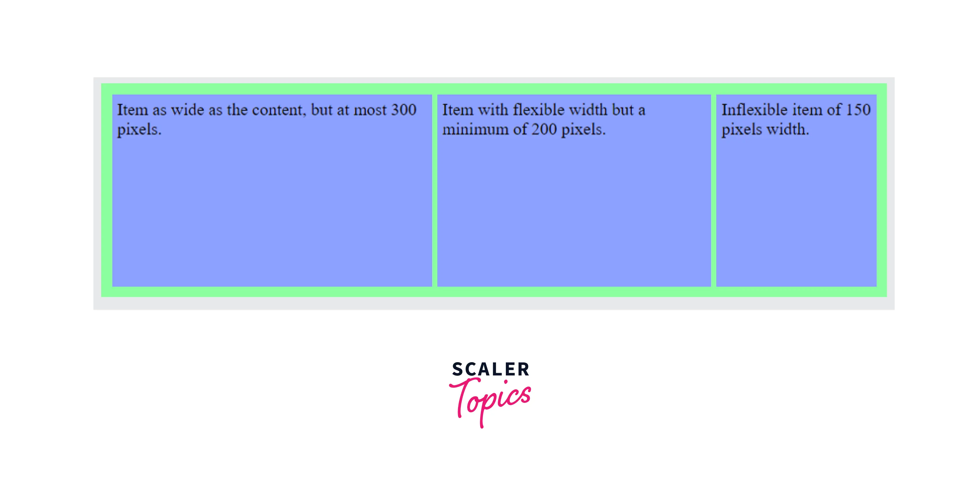
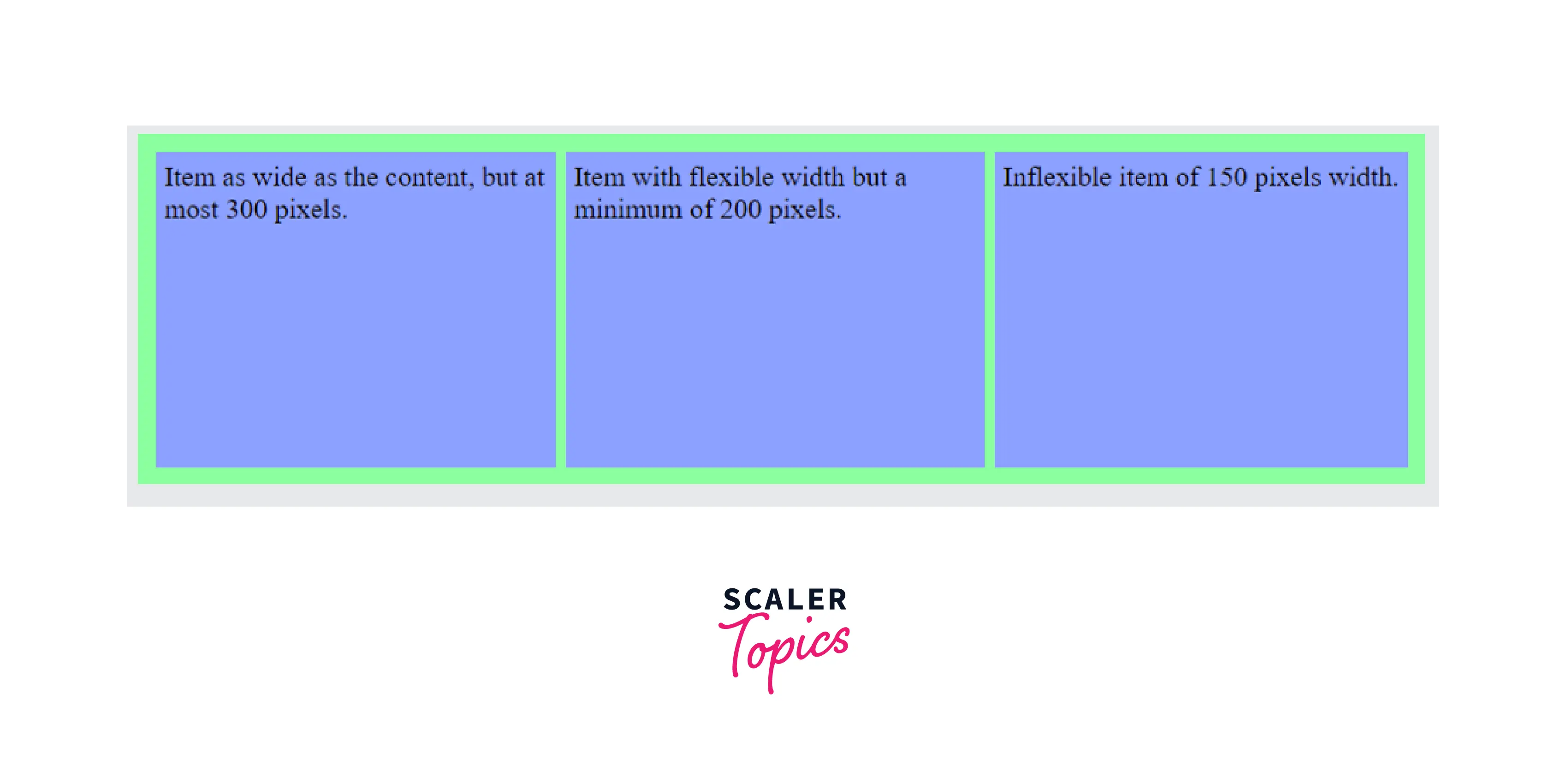
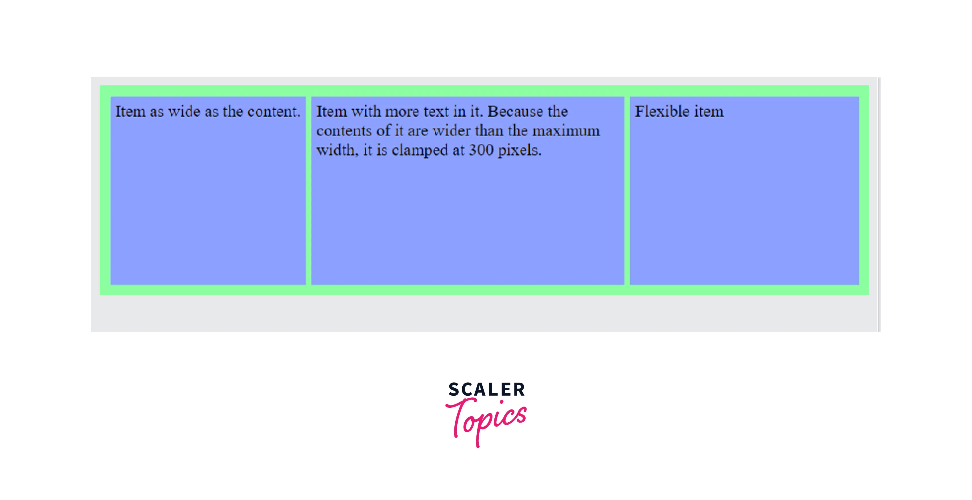
minmax(min, max)
minmax(min, max) is a functional notation accepting the minimum length value and the maximum length value as its arguments. It defines the size of the grid-template-columns to range between the min and the max value including them.
Thus it shows that the grid-template-columns cannot be narrow than the min value and cannot be wider than the max value. If the maximum value is a <flex> value, it sets the flex factor of the track. The minimum value doesn't accept a <flex> value.
Example
Output
auto
The auto value automatically sets the size of columns depending on the content inside the column and the element size. If used inside a minmax notation, it mostly works in the same way as minmax(min-content, max-content). When used for a maximum, it represents the largest max-content size of the items present in the grid track.
When used for a minimum, it represents the largest minimum size of the items present in the grid track. It is specified in terms of min-height or min-width of the items which is often equal to the min-content size of the items. The auto track sizes automatically take the remaining space inside the grid container.
Syntax:
Example
Output
fit-content ([\<length>|\<percentage>])
We can represent the fit-content value with an equivalent max function, having minimum and min(limit, max-content) as its argument. We can write it as max(minimum, min(limit, max-content)). The minimum is the auto minimum which is often equal to the min-content minimum. The argument limit is the track sizing function. We can calculate it as a smaller value of the minmax(auto, max-content) and minmax(auto, limit).
Example
Output
repeat ([\<positive-integer>|auto-fill|auto-fit],\<track-list>)
The repeat function of the grid-template-columns in CSS specifies a fragment of the grid track that repeats itself. We can use it to define several grid-template-columns that appear the same and appear in a recurring pattern, in a compact manner.
Example
Output

masonry
The masonry value of grid template columns CSS lays out the columns following the masonry algorithm. It is a layout where the grid items are together depending on the available vertical space in a particular column. Here the axis of the columns uses a strict grid layout. Whereas the items on the masonry axis (row) rise to fill the gaps rather than sticking to a strict grid leaving gaps after items of smaller size.
Example
Output
subgrid
The subgrid value of grid-template-columns in CSS helps us to create a grid within a grid. The inner child grid lines follow the track of the parent grid lines in the axis. It avoids the redeclaration of the code again while providing consistent track lines.
Example
Output
Examples
Output
Browser Support
Below is a list of the first browser version that completely supports the following grid-template-columns properties.
| Property | Chrome | Microsoft Edge | Mozilla Firefox | Safari | Opera | Internet Explorer |
|---|---|---|---|---|---|---|
| grid-template-columns | 57 | 16 | 52 | 10.1 | 44 | 10 |
Conclusion
- The grid-template-columns are a CSS property that decides the number of columns and the column size in a grid.
- The value of a CSS grid-template-columns can be represented in various ways using keywords, global values, length, and percentages.
- We can explicitly change the name of each grid line using the [linename] property. A grid line can have more than one line name written together with spaces.
- We can also decide the layout of the grid-template-columns using the masonry and subgrid layout values.
- We have other grid-template-column values like min-content, max-content, and minmax(min, max) that define the length of the grid-template-columns in CSS depending on the size of the longest word in the sentence or the longest sentence in the grid track.
Related Properties
You can also refer to similar articles on related topics like:
- CSS grid layout
- CSS grid-template-rows
- CSS grid template
- CSS Flexbox To learn more about CSS properties, visit Scaler Topics.