What are Gutters in Bootstrap?
Overview
Bootstrap being an open-source front-end framework has made the work of web developers quite easy by creating responsive designs and predefined components. Gutter in Bootstrap is one such key component that helps Bootstrap be flexible and adaptable in making responsive websites. In this article, we'll examine the gutter's importance in Bootstrap, how it contributes to visually pleasing layouts, and how it improves the user experience as a whole.
What are Gutters?
In the context of the layout of a page, a gutter is the space between the columns. It acts as a visual buffer that makes it easier to differentiate between different columns and keeps the text from looking packed. The readability and overall aesthetics of a webpage are both impacted by the gutter, making it a crucial component of design.
The gutter in Bootstrap is made with CSS margins. The gutters between the columns are created by default by applying a margin to the columns in Bootstrap's grid system. Regardless of the size of the screen, this constant spacing improves the readability and structure of the text within the columns.
There are various bootstrap elements like cards, buttons, and navigation bars on which we can apply the gutter bootstrap to give them an appropriate spacing. Gutters in bootstrap can be used to provide consistent spacing around buttons. By adjusting the margin or padding of buttons, you can control how much space surrounds them, making buttons more visually appealing and easier to interact with.
To maintain consistent spacing around buttons, you can use margin or padding:
Here, the mr-3 class adds a right margin of 0.5rem (8px) to the first button, creating space between the two buttons.
Bootstrap cards often include margins and padding to create spacing around their content. Gutters, controlled by CSS properties like margin and padding, can be used to adjust the spacing between cards, both horizontally and vertically. By customizing these properties, you can control how closely cards are positioned, creating aesthetically pleasing layouts. To control spacing between Bootstrap cards, you can use the margin or padding classes:
The mb-4 class adds a margin-bottom of 1rem (16px) between the two card elements, maintaining consistent spacing between the cards.
You can also use gutters to control the space between navigation items, logos, or brand elements within the navbar. This helps in achieving a balanced and well-organized navigation bar. Bootstrap's responsive navigation features, like the collapsing navbar for mobile devices, automatically adjust gutter spacing to provide an optimal user experience on various screen sizes. You can fine-tune these gutters to ensure that the navigation elements remain accessible and well-spaced.
To control spacing between navigation items within a Bootstrap navbar, use margin or padding classes:
In this example, you can also add margin or padding classes to the <li> or <a> elements to control the spacing between navigation items.
How do they work?
The gutter in Bootstrap works in the following manner:
- Gutters are the gaps between the column content which are created using the horizontal padding. This horizontal padding is set using the properties padding-left and padding-right on each column.
- Gutters in bootstrap are usually created by adding padding and/or margin to the columns and sometimes to the container elements. Padding is added to the inner side of the column, which affects the space between the column's content and its borders, while margin is added to the outer side of the column, affecting the space between columns.
- The gutter between the columns can also be set using a negative margin using the same properties.
- In responsive web design, gutters may change in size or behavior based on the screen size or viewport. For example, on smaller screens, gutters may become narrower or disappear altogether to optimize space and maintain readability.
- Gutters in bootstrap can be customized to meet the specific design needs of a website or application. Designers and developers can adjust gutter widths, choose different colors or styles for gutters, and even control gutter behavior based on screen sizes.
- Gutters in bootstrap start at 1.5rem wide which is about 24px to match our grid system in bootstrap.
- In Bootstrap, gutters are managed using predefined classes like .gutter, which set the spacing between columns within the grid system. For example, you can use classes like .gx-3 to add horizontal gutters with a specific width.
Horizontal gutters
Horizontal gutters refer to the space between elements placed side by side, such as navigation menus, content sections, or images. They are used for horizontal padding between columns, implementing responsive spacing between the elements, and aligning the content with the grid system.
In order to prevent undesirable overflow, the horizontal gutter widths are regulated by the gx- classes changing the container or the container-fluid parents.
The horizontal gutter uses a utility called gx-* which controls the horizontal spacing of elements to align them with the layout. The * in the utility can be 1, 2, 3, and so on. They are used to create separation, structure content, and improve the overall visual appearance of a web layout.
Syntax
The syntax for the horizontal gutter utility class of Bootstrap is as follows:
In the above syntax, we have used the spacing as 3, therefore the horizontal spacing between the elements will be 3.
Example
Let us understand the horizontal gutter in Bootstrap with the help of a code example.
Output:
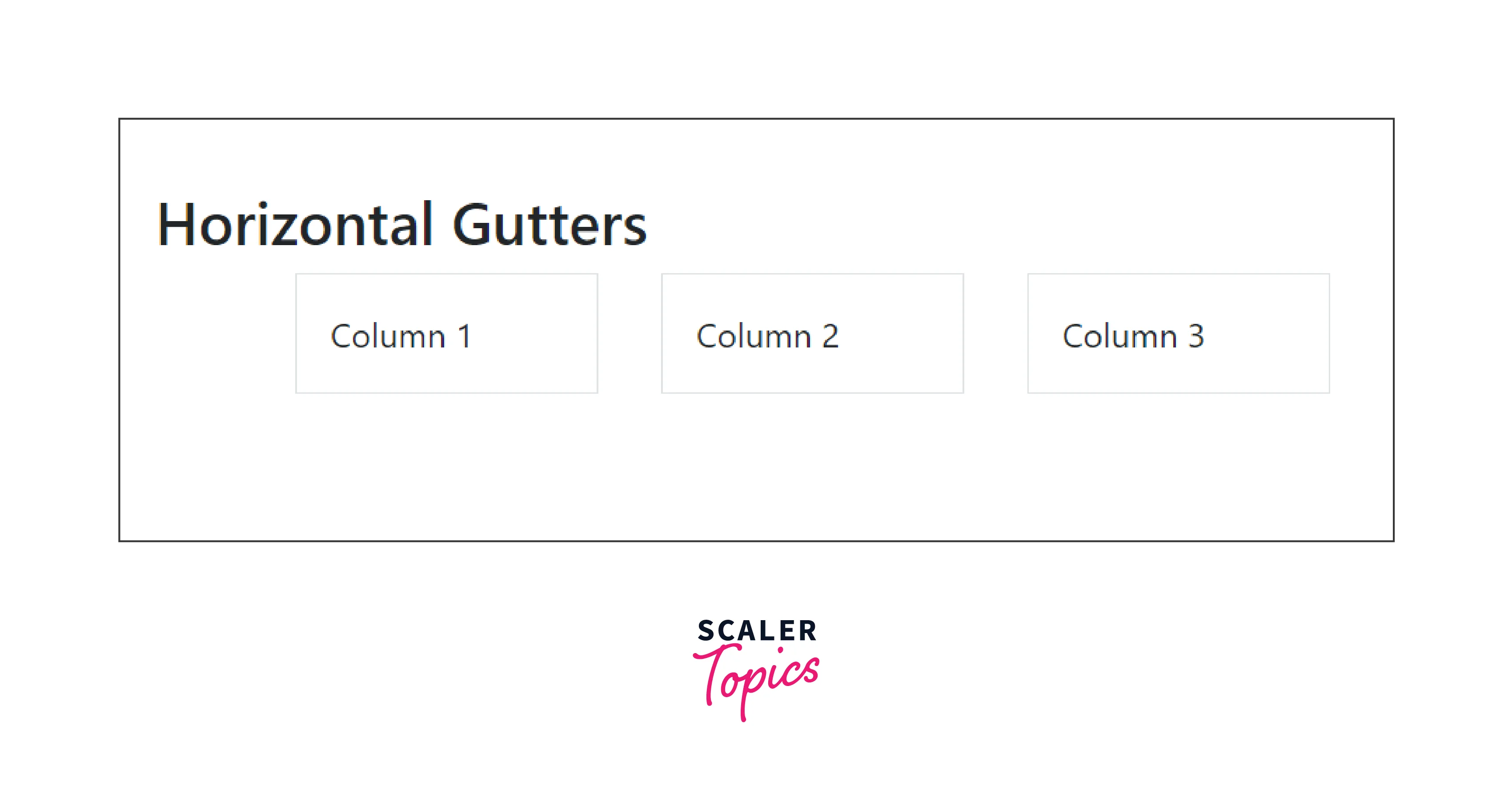
In the above code example, we have created the row class which is controlled by the gx-5 horizontal class which in turn adjusts the container. Moreover, we have created three column classes giving it a padding of 2. Therefore, these three columns will be having a horizontal padding of 5 around them.
Vertical gutters
In web design, the space between neighboring content blocks or sections that are placed vertically is referred to as a vertical gutter. It is used for adding vertical padding between the columns.
The vertical gutter widths can be controlled using the gy-* classes where * can be 1, 2, and so on based on the spacing you want in your layout. Additionally, some overflow may also occur below the row at the page's bottom due to the vertical gutters. They serve to create separation, structure content, and enhance the overall visual presentation of a web layout.
Syntax
The syntax for the vertical gutter utility class of Bootstrap is as follows:
In the above syntax, we have used the spacing as 3, therefore the vertical spacing between the elements will be 3.
Example
Let us now understand the vertical gutters with the help of a code example.
Output:
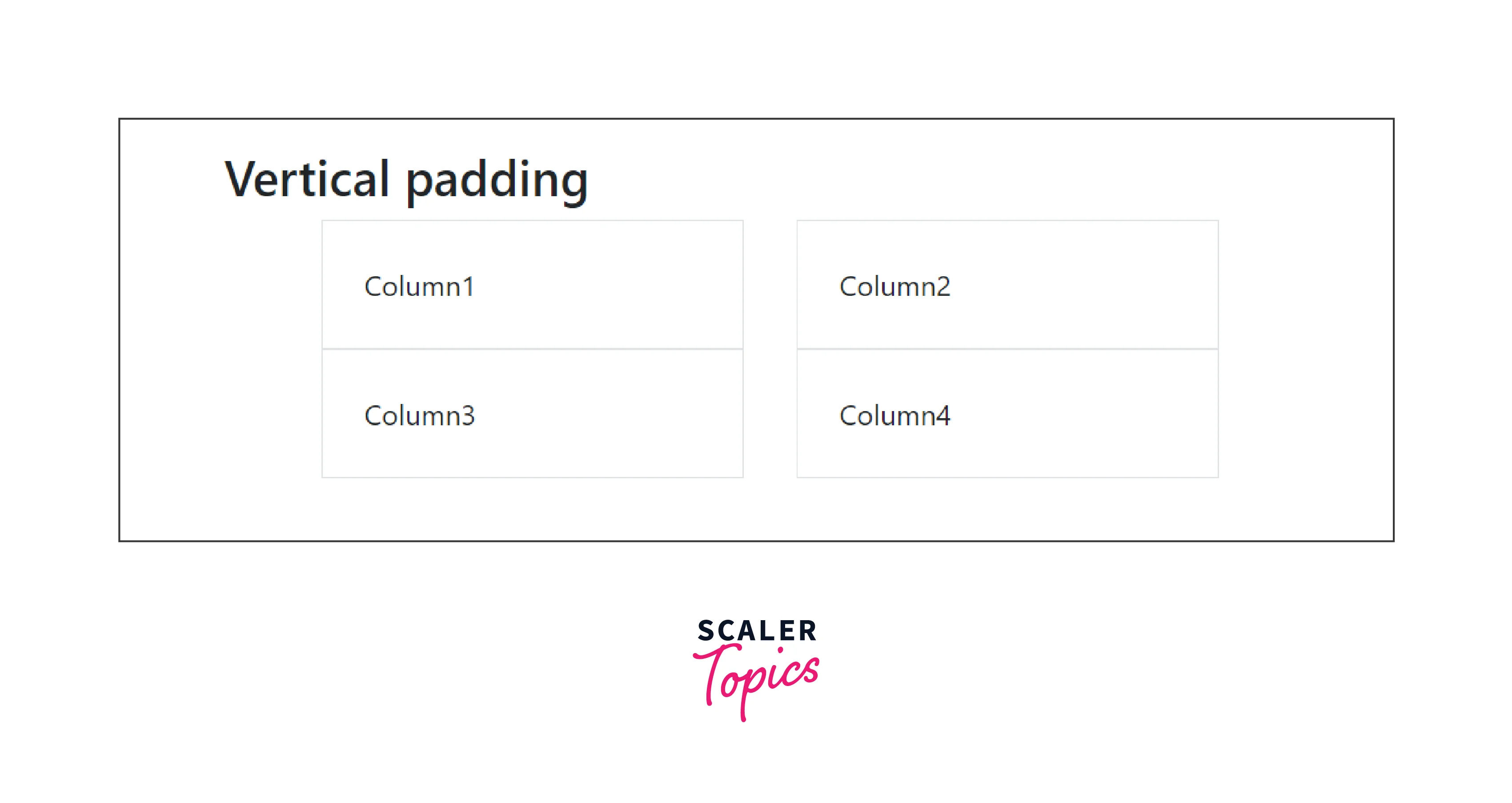
In the above code example, we have used the row class which is controlled by the gy-5 vertical padding class. Further, we have created 4 columns each with a padding of 4. Therefore, these 4 columns will be having a vertical padding of 5 around them.
Horizontal & vertical gutters
Horizontal and vertical gutters are terms that are used to denote the gaps between elements along either the horizontal or vertical axis. These gutters create responsive space and align the elements to fit in the best with the layout.
It uses the bootstrap utility g-* where * can be 1, 2, 3, and so on which controls both the horizontal and vertical spacing of the elements.
Syntax
The syntax for horizontal and vertical utility classes of Bootstrap is as follows:
In the above syntax, we have used the spacing as 3, therefore the horizontal and vertical spacing between the elements will be 3.
Example
Let us understand the horizontal and vertical gutters with the help of a code example.
Output:
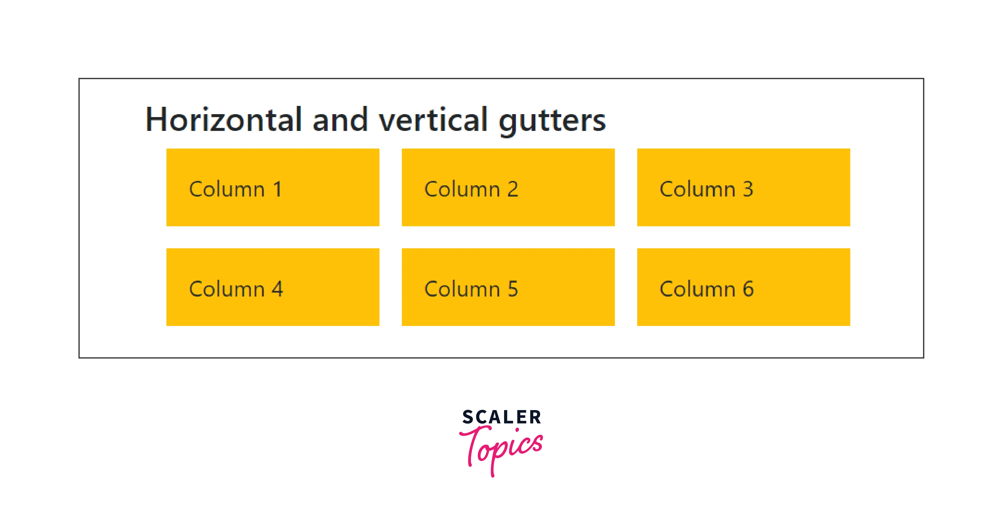
As you can see in the above code example, the horizontal and vertical gutter utility is set to 3, therefore it aligns the 6 boxes based on that. Moreover, we have also given a padding of 3 to all the boxes for a better layout.
Row columns gutters
Row and column gutters are the gutters that are used to add responsive spaces between elements in bootstrap. The space or gaps between rows and columns in a grid-based layout scheme are referred to as row and column gutters in web design and layout.
It uses the class row-cols-* in which * represents 1, 2, 3, 4, and so on which is the number of columns that best render the website layout.
Syntax
The syntax for the row and column gutter utility class of Bootstrap is as follows:
In the above syntax, we have used the spacing as 3, therefore the spacing between the row and column would be 3.
Example
Let us understand row and column gutters with the help of a code example.
Output:
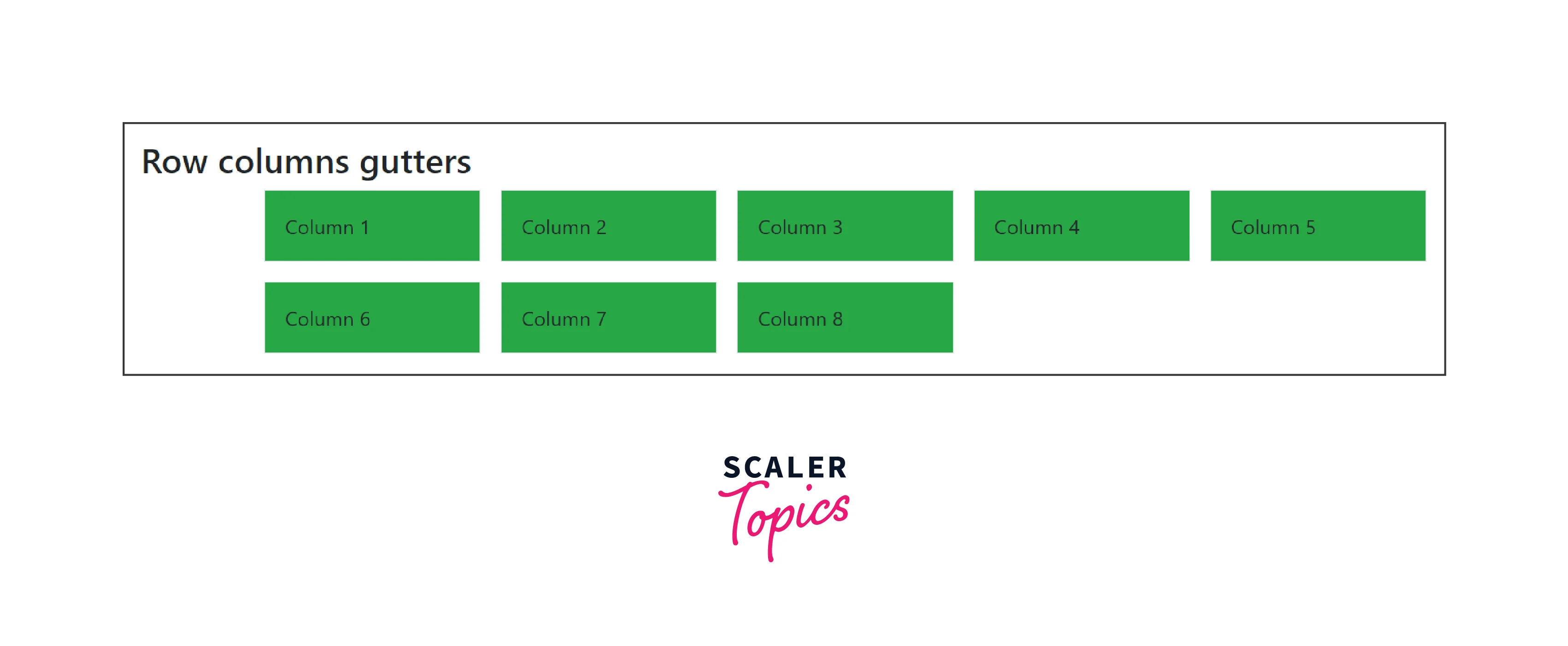
In the above code example, we have implemented the row-cols-* bootstrap utility class to control the padding of the rows and columns. We have implemented 8 columns with a padding of 3 and a background color of green using the bootstrap utility bg-success.
Change the gutters
The $space variable in Bootstrap allows you to adjust the gutters (spacing) between columns and rows in the grid layout. The default spacing values specified in the Bootstrap spacing scale are represented by the $space variable. The $space variable uses Bootstrap to make the $gutters SASS map.
The $space variable is often used to define a consistent spacing system in Bootstrap. It has a list of values denoting various spacing increments and is used to keep gutters and spacing uniform across the design.
Here is a list of the default values of the $gutters map.
The $space variable impacts the gutter widths in the following way:
- If you need to adjust gutter widths or spacing throughout your design, you can simply modify the values in the $space variable rather than searching and updating each instance manually.
- The $space variable have values that change depending on screen size when creating responsive layouts. This guarantees that gutter widths adjust to various viewport sizes effectively.
- By using a consistent spacing scale defined by the $space variable, you ensure that gutters and spacing between elements remain consistent across various parts of the design.
- Although predefined $space scales are frequently provided by frameworks, you can easily change them to suit your design tastes.
Cross-Browser Compatibility
Gutters in bootstrap are compatible with different web browsers making them even more useful and important to use them in our designs. Here are a list of some web browsers with which gutters are compatible with.
- Google Chrome
- Mozilla Firefox
- Apple Safari
- Microsoft Edge and many others.
Conclusion
- Gutters are used to add responsive spacing between the elements of a website.
- Horizontal gutters are controlled using the gx-* utilities.
- Vertical gutters are controlled using the gy-* utilities.
- Horizontal and Vertical gutters are controlled by g-* utilities whereas the row and column gutters are controlled by row-cols-* utility class of bootstrap.
- These gutters allow the elements to align themselves in a way that the layout gets even better.