Histograms in R Programming
Overview
Histograms in R programming play a crucial role in data analysis and statistics as they provide essential graphical representations to explore dataset distributions. Thanks to the built-in functions in R, plotting histograms becomes a straightforward task, enabling users to effectively visualize data patterns, identify central tendencies, and detect outliers.
What is a Histogram in R?
Histograms in R are graphical representations used to visualize the distribution of a dataset. They effectively display the frequency or count of values falling into predefined intervals or bins along the x-axis. The height of each bar corresponds to the number of occurrences within that specific bin, revealing significant insights into the underlying structure of the data.
To plot histograms in R, we can utilize the built-in hist() function, which provides a straightforward approach to visualize the distribution of data points. By specifying the number of bins or breakpoints, we can control the granularity of the histogram. Moreover, we can add titles and labels to enhance the interpretation of the graph.
A. Syntax
The basic syntax for creating a histogram in R is as follows:
B. Parameters
- data_vector:
This is the input vector containing the data points that you want to visualize as a histogram. - breaks:
It specifies the number of bins or breakpoints for the histogram, determining the granularity of the representation. - main:
This parameter sets the title for the histogram, which helps provide context for the plot. - xlab:
It labels the x-axis to provide information about the data being represented along the horizontal axis. - ylab:
It labels the y-axis to indicate the frequency or count of values along the vertical axis. - col:
This allows you to customize the color of the bars in the histogram, making it visually appealing and easier to interpret.
Note:
It's important to note that parameters like col, main, xlab, and ylab in the hist() function are optional, meaning they are not required for creating a histogram. If not explicitly specified, the default values will be applied. However, using these optional parameters can provide valuable customization options for the histogram, allowing you to enhance its appearance and improve data interpretation.
C. Example
Here's a practical example of creating a histogram in R:
Suppose we have a dataset called data_points containing numerical values, and we want to visualize its distribution using a histogram.
Code:
Output:

Create a Histogram in R
Let us use the built-in dataset mtcars which has "fuel consumption and 10 aspects of automobile design and performance for 32 automobiles (1973–74 models)" - R documentation.
Code:
Output:
We will use the hp parameter which has 32 observations in horsepower.
A. Creating a Simple Histogram
Code:
Output:

Above, we can observe that there are 6 cells with evenly spaced breaks. The height of a cell in this example is equal to the number of observations lying in that cell.
Additional parameters can be provided to modify the appearance of our plot. You can find out more about them in the assistance section ?hist.
Some of the most commonly used ones are main for the title, xlab and ylab for axis labels, xlim and ylim for axes range, col for color, and so on. In the next section, we will go through each of them individually.
Furthermore, with the argument freq=FALSE, we may obtain the probability distribution rather than the frequency.
B. Creating a Histogram with Added Arguments
Code:
Output:

It should be noted that the y-axis is labeled density rather than frequency. In this situation, the entire area of the histogram is equal to 1.
C. Add Title and Label
Code:
Output:
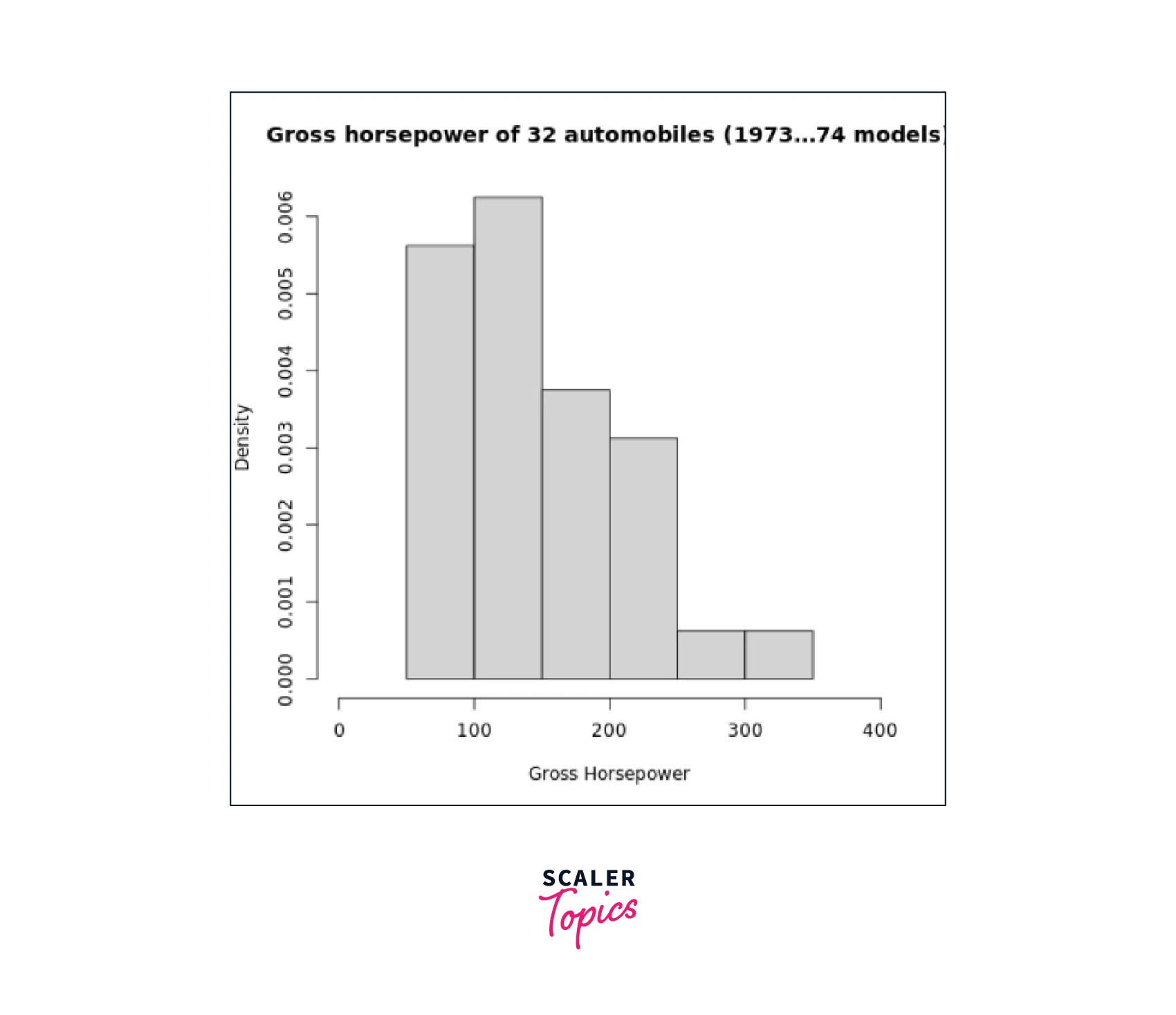
We can observe that the title changed from "Histogram of horsepower" to "Gross horsepower of 32 automobiles (1973–74 models)"
D. Change Bar Color
Making the histogram visually appealing by changing the color of the bars:
Code:
Output:

Range of X and Y Values
We may set the axis range using the additional parameters xlim and ylim. Consider the following R code:
Code:
Output:

Find Return Value of hist()
When creating histograms in R, the hist() function returns a list containing six components, each providing valuable information about the histogram object.
Histogram Object Components:
- breaks:
This component contains the breakpoints or intervals in which the histogram is divided, aiding in understanding the distribution's granularity. - counts:
It represents the number of observations falling within each cell or bin, offering insights into the frequency of data points in each interval. - density:
The density of cells, providing the proportion of data points within each bin, which can be useful in probability density calculations. - mids:
The midpoints of cells, offering essential reference points for each interval. - xname:
This indicates the name of the x-axis variable, facilitating data identification. - equidist:
A logical value that signifies whether the breaks are equally spaced or not, which is crucial for interpreting the histogram's structure.
Take a look at the following code:
Code:
Output:
By leveraging the return values of hist() in R histograms, we can perform further analysis and processing of data. One practical application is using the return values to annotate the histogram. The example below demonstrates how we can use the text() function to place the counts on top of each cell for better visualization:
A. Use Histogram Return Values for Labels Using text()
Code:
Output:

Histogram with Different Breaks
When working with histograms in R, the breaks argument allows us to specify the number of cells or bins we desire for the histogram. However, it is essential to note that this number is merely a suggestion.
Let's observe two histograms on the same dataset, each with a different number of cells, to see how R dynamically adjusts the visual representation:
Code:
Output:


Histogram Using Non-uniform Width
Alternatively, we can define breakpoints between the cells using a vector. This enables us to create histograms with unequal intervals, where the area of each cell is proportional to the number of observations falling within it.
Code:
Output:

By utilizing the breaks argument in histograms in R, you can control the granularity of the histogram and tailor it to suit your analysis needs. Whether you opt for a specific number of cells or utilize breakpoints for unequal intervals,
We just saw that by utilizing the histograms in R, we can effectively visualize data distributions, discover insights, and identify patterns in datasets. Customizing the histograms using arguments like bin numbers, titles, labels, and bar colors offers a comprehensive understanding of the data. Such insights are invaluable in making data-driven decisions and gaining a deeper understanding of datasets in various applications.
Conclusion
This article taught us:
- Histograms in R programming are invaluable tools for understanding data distributions and patterns.
- By using the built-in hist() function, users can easily plot histograms, customize their appearance, and gain insights into data patterns.
- Armed with this knowledge, we can now effectively analyze and visualize data using histograms in R, aiding us in making informed decisions in data analysis and statistics.