CSS :hover Selector
 FREE
FREE

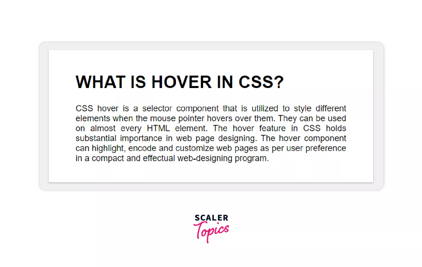
What is the :hover Selector in CSS?
The hover selector is a pseudo-class (A CSS pseudo-class is a keyword that is applied to a selector to specify a specific state for the selected element (s)) that allows you to target an element over which the cursor or mouse pointer is hovering.
CSS pseudo-classes are used to apply styles to selectors, but only when particular circumstances are met. In CSS, a pseudo-class is represented by inserting a colon (:) after a selector, followed by a pseudo-class such as hover, focus, or active,.
The concept behind pseudo-classes is that you may stylize components differ depending on whether users are hovering over them (: hover), tabbing to them with the keyboard (: focus), or choosing a link (: active).
What are the uses of the Hover Selector (:hover) in CSS?
-
The :hover CSS selector is used to select elements and hover over them with a mouse pointer.
-
:hover CSS can be used on all elements to apply various effects like the color of background and font, change opacity, image rollover effects, add decorations and other effects to text, etc.
-
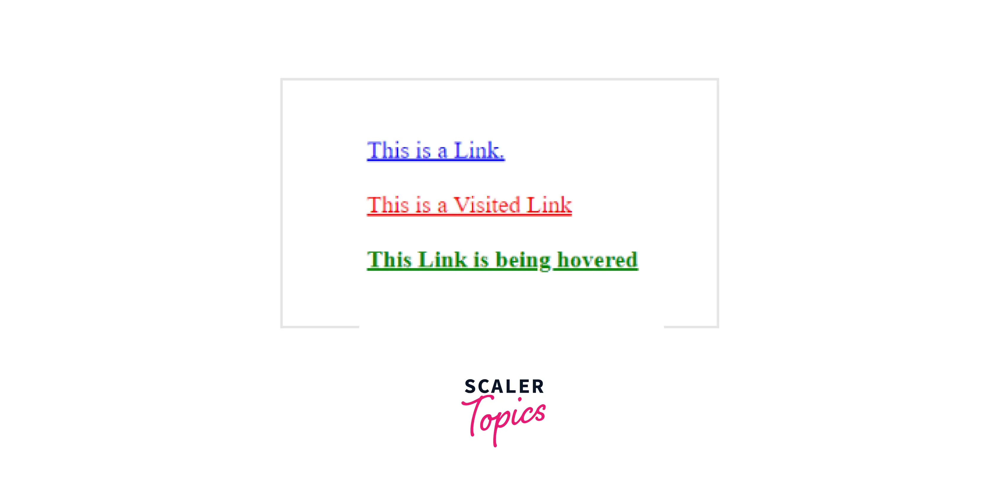
However, a special application can be done in the case of links. The selector helps to style links to unvisited pages, the
selector styles links to visited pages, and the active link is styled using the selector. If and selectors are used in the piece of code, they must be followed with a hover CSS selector for the effects to show up.
Example
Output
Syntax for using CSS: Hover
The declaration of pseudo-classes must be made in a specified order.
For remembering the correct order, the mnemonic LoVe HAte is always useful:
- a:link
- a:visited
- a:hover
- a:active
That is to say:
- Before a link is visited, it is unvisited.
- Before hovering over a link, it is visited.
- Before a link is activated, it hovers over.
We can use the link selection to design the link to unvisited pages.
The :visited selection may be used to style links for visited pages while
The: hover selector activates the element when a user hovers their cursor.
The :active selector can be used to design active links.
Output of the above code:

Hover Vs Active Vs Focus Selectors
:hover,
:hover
:hover pseudo-class is used to apply the effect when the mouse pointer hovers over the selected element without clicking on it.

Example
Example
Example
Applying
To view the effect of all the pseudo-classes an order needs to be followed. Generally, an element is first hovered over, then focussed on, and finally activated. Hence, the order is:
Pseudo-classes and their Response to Different Input Devices:
The input devices respond differently to the pseudo-classes.The following table shows how a mouse, keyboard and touchscreen respond to :hover,
| :hover | |||
|---|---|---|---|
| Mouse | Yes | Yes | Yes |
| Keyboard | No | Yes | Yes |
| Touchscreen | Yes (on click) | Yes (on click) (except Safari iOS) | Yes (on click) (except Safari iOS) |
How To Use hover selector in CSS?
Hover.css can be used in multiple ways:
- Copy and paste the effect one wishes to use in the project’s stylesheet.
- Reference the stylesheet and then assign the class name to the element that needs to be hovered.
Copy and Paste an Effect
Copy and Paste is a go-to solution if the developer wants to use one or a few hover effects in his piece of code. In such a scenario, the user can simply view the website without having to download the entire hover.css file.
Steps:
- Download Hover.css (https://github.com/IanLunn/Hover/archive/master.zip "{rel=noopener nofollow}" ) or install npm install hover.css --save.
- In css/hover.css, find the effect you wish to apply. (The names of effects are commented above the respective piece of code for the developer’s ease).
- Copy and paste the code into your stylesheet.
- Head over to your HTML file, and add the class name (here .hvr-shrink) to the element to which you want to apply the effect (shrink on hovering).
Reference Hover.css
If multiple hover effects are used, then referencing the entire Hover.css stylesheet seems to be a feasible option.
Steps:
- Download hover-min.css.
- Add the file in a CSS directory of your project.
- You can use the css/hover-min.css file in different ways.
- Link the hover-min.css file using the <link> tag in the <head> section of the HTML file.
- You can alternatively, import the file into your CSS file. @import url("hover-min.css");
- Finally, head over to your HTML file, and add the class name (here .hvr-shrink) to the element to which you want to apply the effect to (shrink on hovering). <p class="hvr-shrink">Shrink this paragraph</p>
A Note on the Display Property
Hover.css specifies the following values for all elements to make them transformable.
In order to override this behavior, the code is erased from Hover.css, or the value of the display property of the element is changed. The overridden declarations should be after the Hover.css so that the effects are visible.
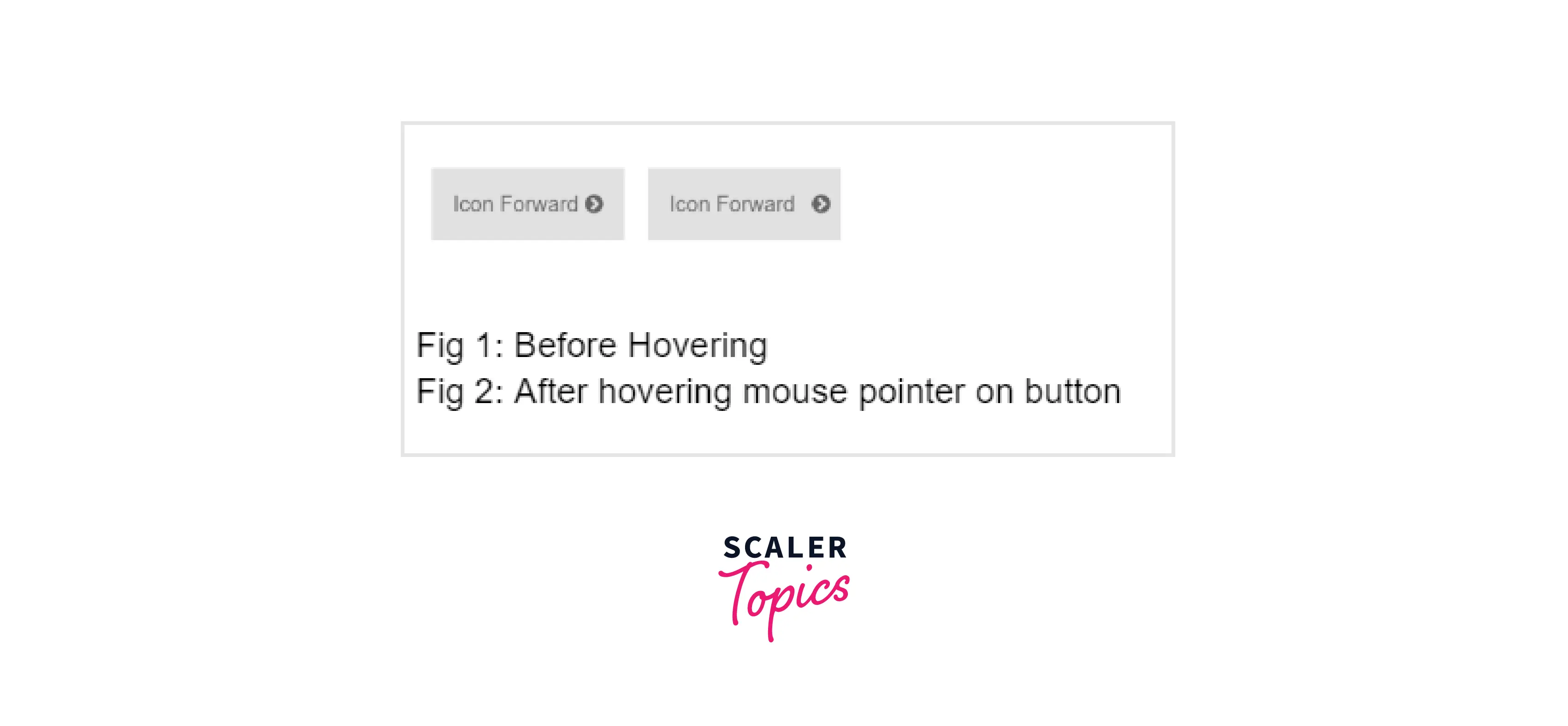
Using Icon Effects
Icons can be added from FontAwesome, other icon libraries(loaded using <link> tag in <head> section) or some image can be used.
Position of the icon depends on the developer. It could be placed before an element (image, text), after them or in a custom position as per requirement.
To add a Hover.css icon, the HTML code for the icon is placed inside the element that has a hover effect applied to it. For Example:
In the above example, the icon will move forward when hovered on.
Few Examples of Using CSS Link Hover Effects
Creating an animated box with the help of the CSS hover effect
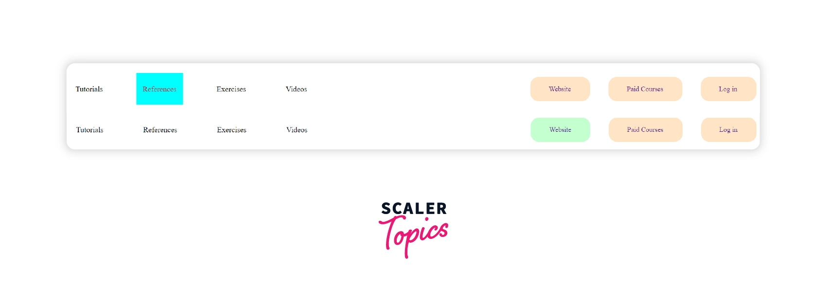
In this example, we have created an animated box with the help of the CSS hover effect.
Output of above code:
Output of the above code on hover:
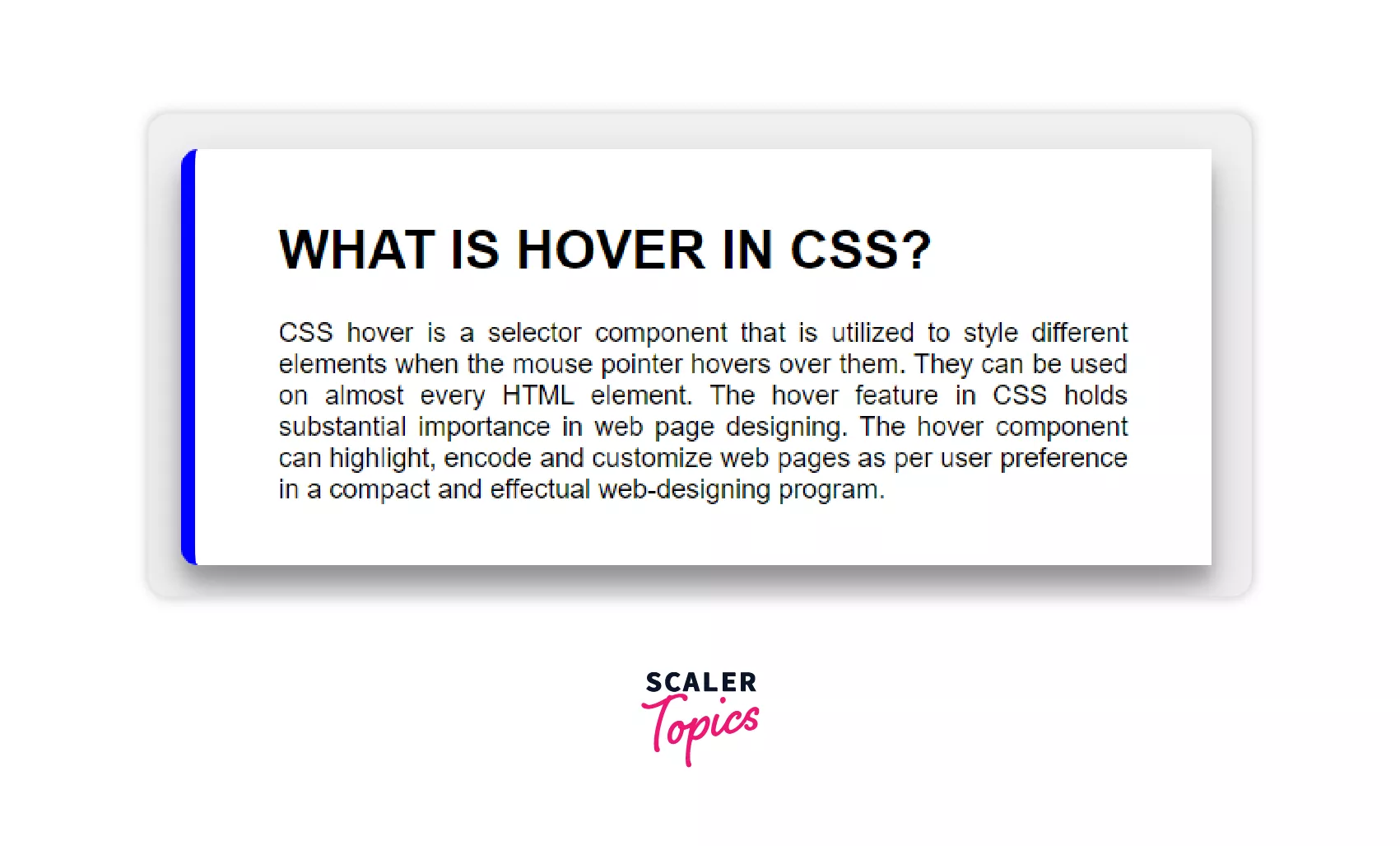
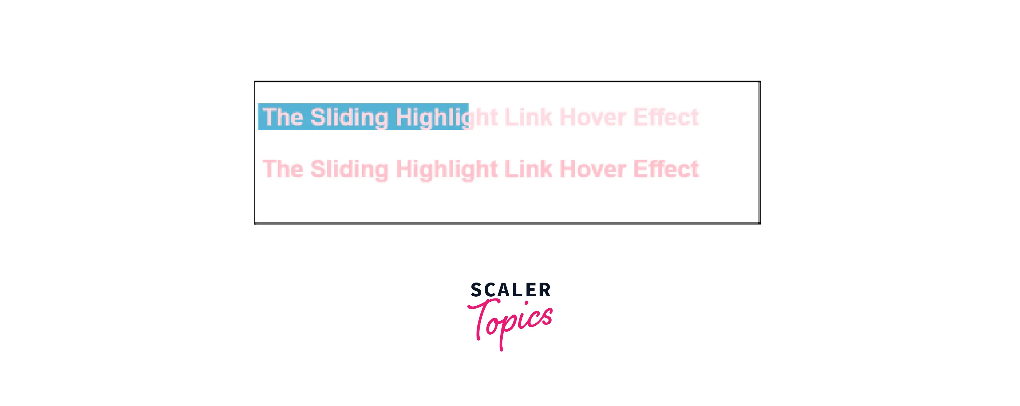
The Sliding Highlight Link Hover Effect
:hover selector can be used to apply box-shadow to the inline link, and change the color of the inline text. The box-shadow is used instead of the background property to allow the transition.
Example
Output
The Text Swappin’ Link Hover Effect
The text is swapped with some other text on being hovered. The new text slides in place of the existing text.
The ::after and ::before pseudo-elements are used where the former gets data from the ‘data-replace’ attribute of <a> tag.
Example
HTML:
CSS:
Output

The Growing Background Link Hover Effect
The targeted element has a thick underline that is slightly visible behind the actual text. Once the mouse hovers over this element the underline grows and appears as a background behind the entire element.
Example
Output

The Right-to-Left Color Swap Link Hover Effect
The targeted element on being hovered has an underline that slides from the left, and a new color for the text slides in from the right.
Example
Output

The Rainbow Underline Link Hover Effect
Rainbow color can not be applied directly. What we could do instead is add a few lines of code and chain the linear gradients together to get our desired rainbow effect. Use the class ‘rainbow’ in your HTML element to see the results.
Example
Output
The Passing Underline Link Hover Effect
In this effect, the underline slides in from the left of the element that is hovered. On removing the mouse pointer the line slides out from the right.
Example
Output

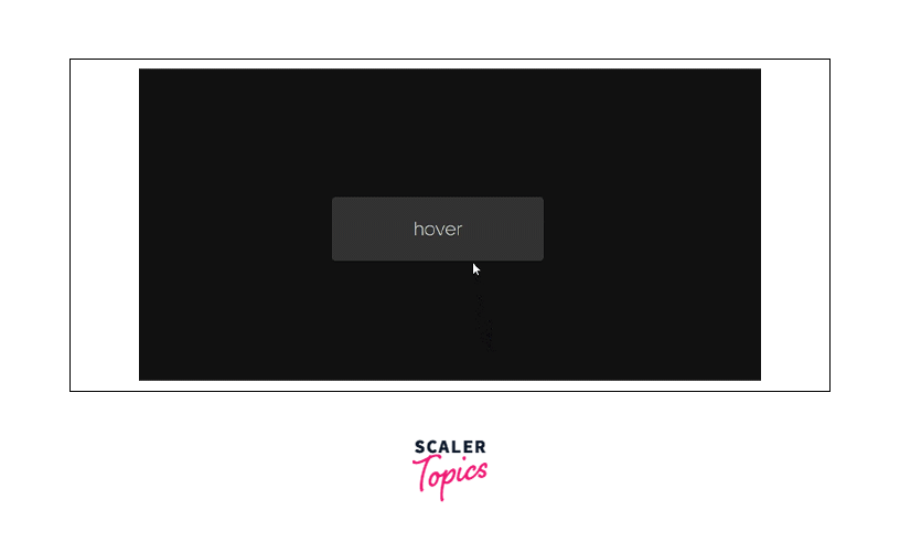
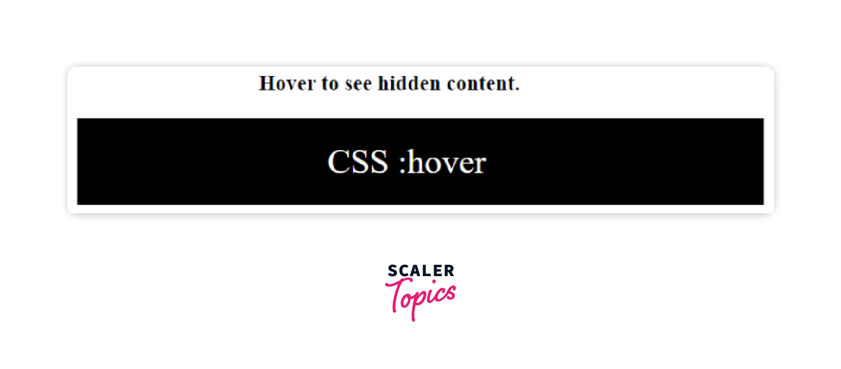
Displaying a hidden block when the cursor hovers over text
This example displays a hidden block when the cursor has hovered over text.
Output of above code:
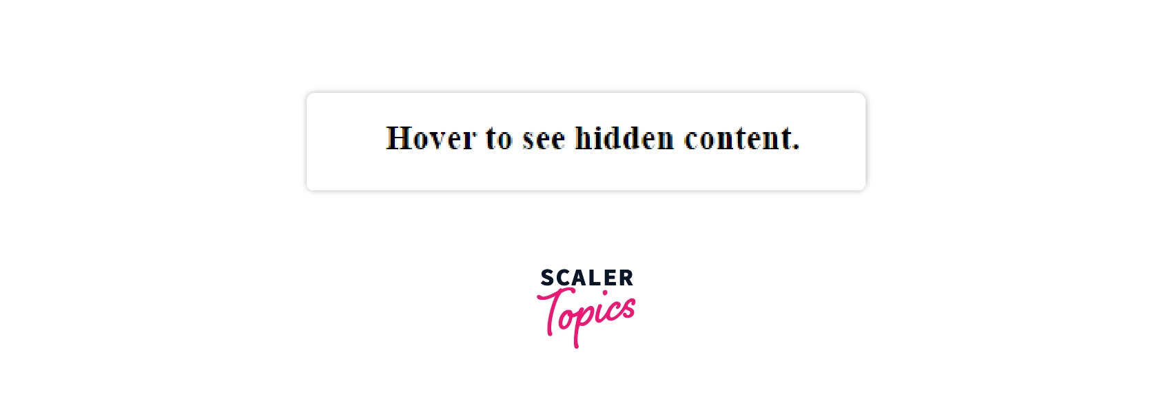
Output of above code on hover:
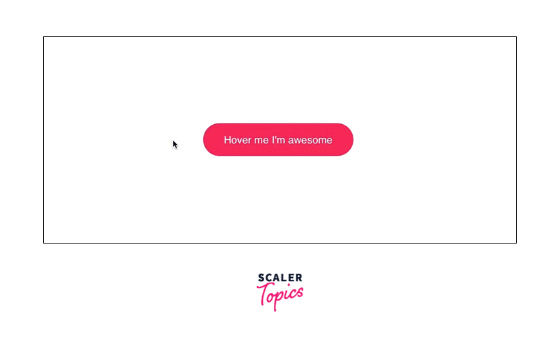
Changing the button color when user hovers on it
This example shows how to change the button color when you hover over an element.
Output of above code:
Output of above code on hover:
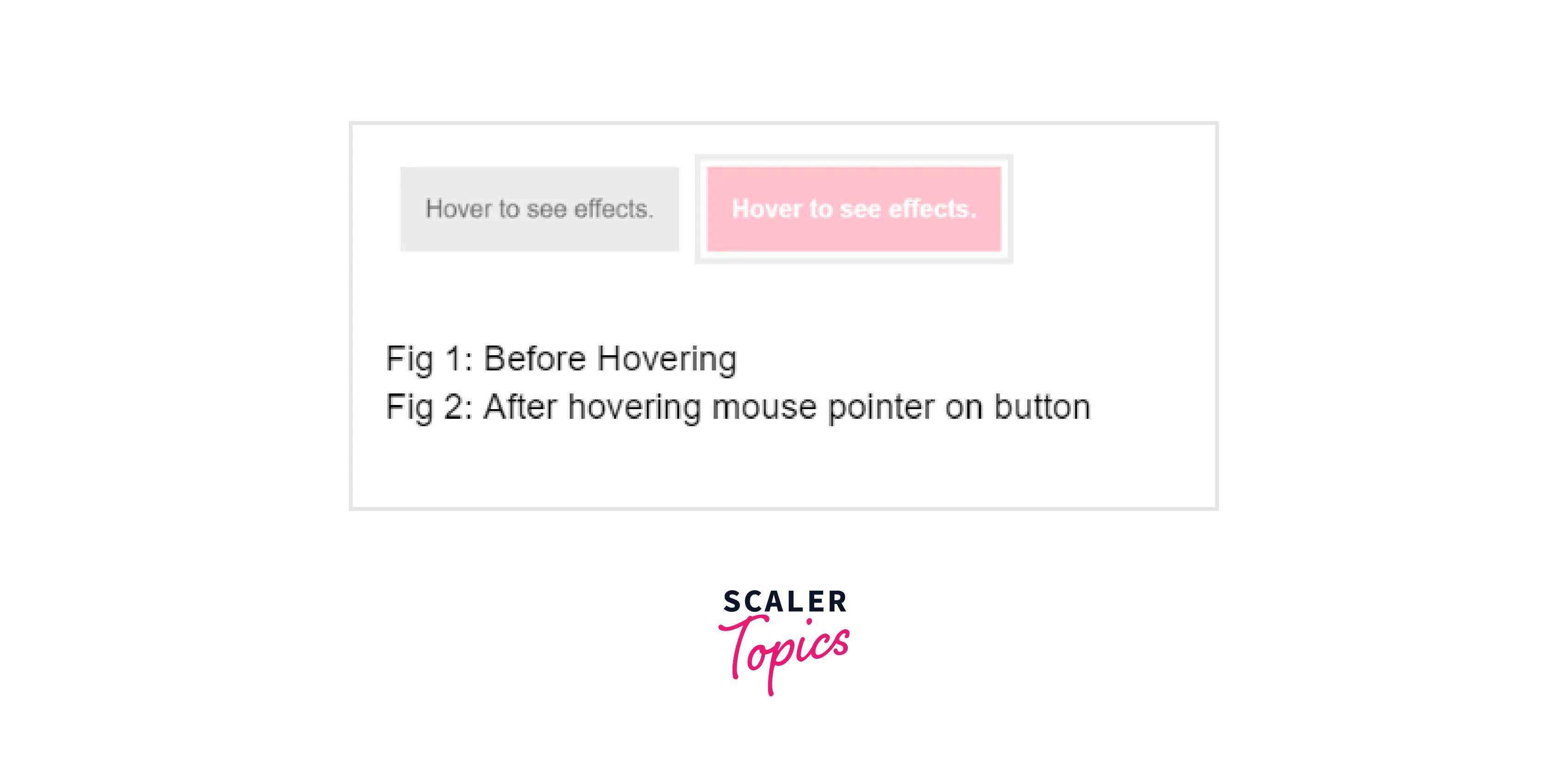
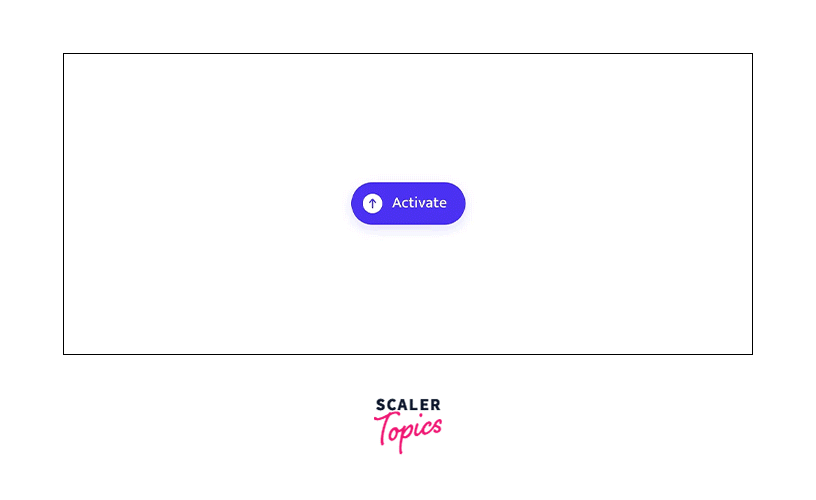
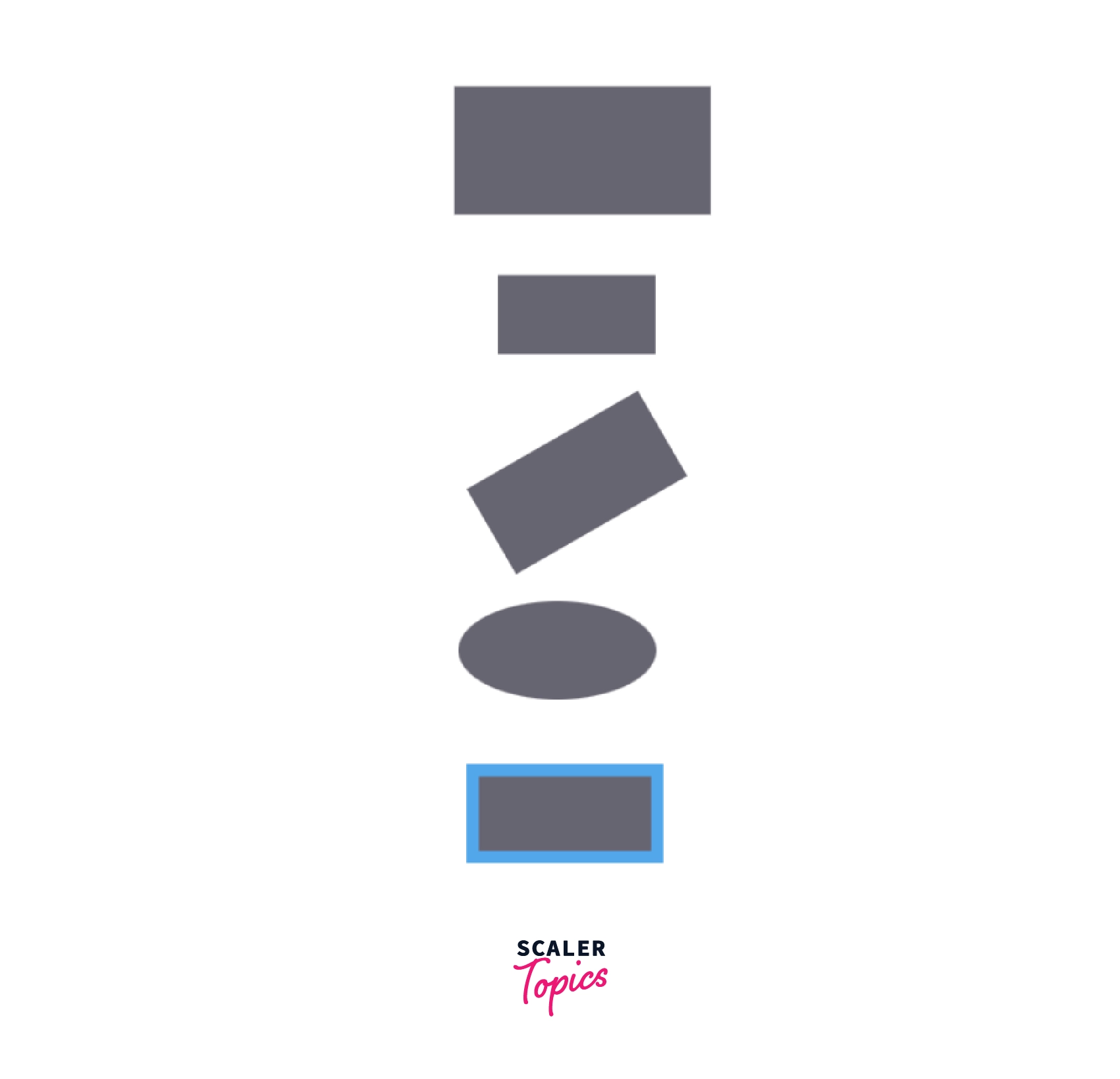
Box changing its property when a user hovers over it
This example shows how the box changes its property when a user hovers over it.
Output of the above code:
Output of the above code on hover:
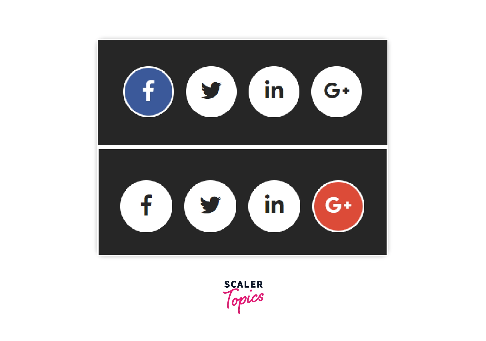
Creating animation with hover effect
In this example, you'll witness a cool animation when the cursor moves over a social media button. This is a good way to get people to share your website with others.
Output of above code:
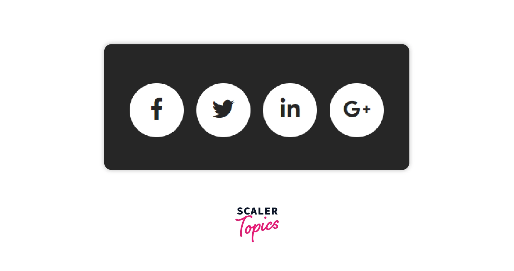
Output of above code on hover:
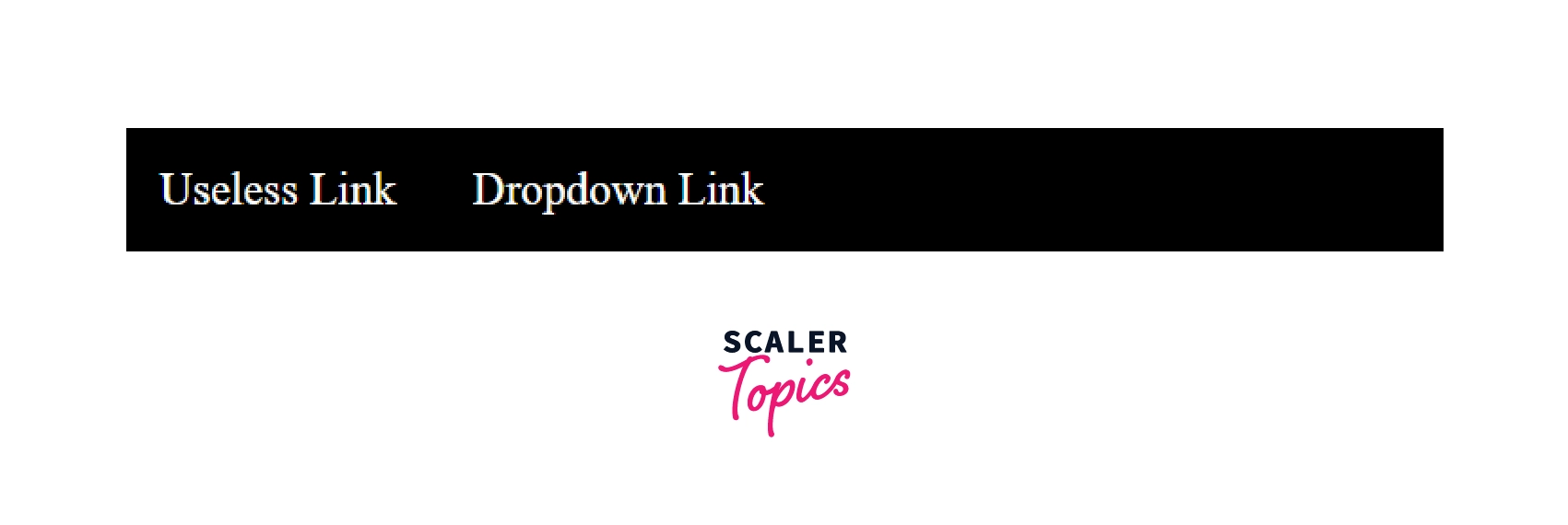
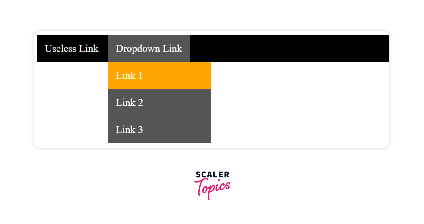
Creating a drop down menu with hover effect
This example shows a “dropdown menu” on mouse hover.
Output of above code:
Output of above code on hover:
Browser Compatibility
Most browsers support CSS:hover selector. The following list shows the first versions of the respective browsers that support :hover selector.
| Browser | Version |
|---|---|
| Chrome | 4.0 |
| Firefox | 2.0 |
| Edge | 7.0 |
| Safari | 3.1 |
| Opera | 9.6 |
Conclusion
- : hover selector is used for applying effects to elements of a website to beautify it.
- The desired effects are applied when the user hovers over the target element with a mouse pointer or cursor.