How to Change Image Size in HTML?

How to Change Image Size in HTML?
Changing image size in HTML can sometimes be more difficult than you think. But here's a quick help if this is a concern.
There are three ways to change image size in HTML:
- Using HTML tag
- Using an inline style attribute
- Using internal CSS
Method 1: Using HTML Tag
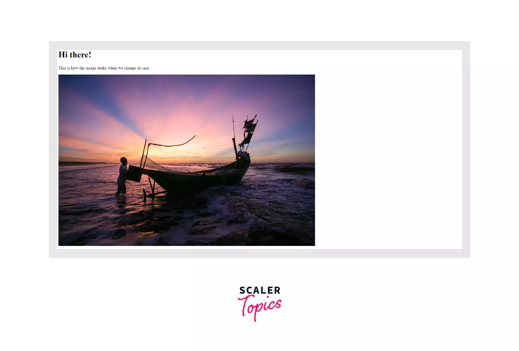
Before we begin, have a look at the original dimensions of this picture, as it's the one that will be used in our entire discussion. The original size of the image is 960 x 640.
 Now, let's discuss how to change image size in HTML by using HTML tags
We can use width, and height attributes in HTML along with the image tag to change the image size. It's the most basic approach.
Output

Note: Please be aware of the image's aspect ratio. If the height and width of the image are not chosen properly, it will diminish the quality of the image.
Method 2: Using an Inline Style Attribute
The next alternative would be to use the inline style attribute instead of the height and width attributes. We'll also have the same output in this case, but the code for setting height and width will be put inside the style tag in this manner.
This is the only difference between an HTML tag and an inline style attribute.
Output

Method 3: Using Internal CSS
The internal CSS will have the same code as the inline style attribute method. But this time, we are going to put the code separately in the style tag. This will help us separate the entire code for HTML and CSS.
We'll assign an id to our image tag and use the same id to modify the image with CSS.
Output

Note: In all the previous methods, we tried to set both height and width as per our wish. However, this may come at a price of the picture losing its aspect ratio and, ultimately, the quality. A better idea is only to modify either height or width of the image and set the other unmodified attribute to auto so that the height is adjusted to preserve the aspect ratio.
We can also set the width to be 100% so that it acquires the entire width of its parent element.
Output:
 But as you can see in the above image, width: 100% can also stretch the image to fit the entire viewport. If this happens, you can use max-width: 100% so that the image's width can either be less or equal to 100% of its original width, but it would never exceed it.
Output:

Downsides of Client-Side Image Resizing
There are several reasons why client-side image resizing needs to be avoided. A better alternative is CDN, which would deliver the web content quickly and with less bandwidth. But let's look at some consequences of the resizing of the client-side image.
Reduced Image Quality
When resizing comes into the picture, you cannot be certain about how a browser chooses to scale up or down an image. But, at the root level, a scaling algorithm always does its job. When you resize an image, chances are that the image quality might not be as you expected.
Hardware, as well as the OS, are the two instrumental factors in this case. And either the speed or quality will have to be compromised when another one is given more priority.
Increased Time for Image Rendering
Resizing any full-sized image happens when an image is initially loaded, following which the rendering takes place. So, if an image with a large size has to be scaled down, then it needs to wait till the image is loaded in the first place.
Increased Bandwidth Consumption + Costs
Increased bandwidth cost, as well as consumption, is what concerns everyone. And there will be bandwidth wastage when a full-sized image is loaded on the client side. Using a WebP or AVIF format for the images can save you in this regard.
Increased Required for Memory and Processing Power
Resizing an image isn't the same arduous task for every device. It can be more excruciating for devices with less memory to do the same thing. This ultimately leads to a bad user experience.
Learn more
If you need more knowledge of HTML tags, you can move on to this Article to know more. Or you can also learn more about the image tag in HTML by visiting this Article.
Conclusion
- To change image size using HTML tags, you can set width and height attributes in the <img> tag.
- We can also put the same width and height inside the inline <style> tag.
- Moreover, internal CSS can also be an option where you can put the CSS code to modify an image size which will be put inside the <style>...</style> tags that exist inside the <head>...</head> tags.
- Client-side image resizing can lead to:
- Reduced image quality
- Increased time for image rendering
- Increased bandwidth consumption + costs
- Increased required for memory and processing power
