How to Create an HTML Tooltip?
 FREE
FREE
Overview
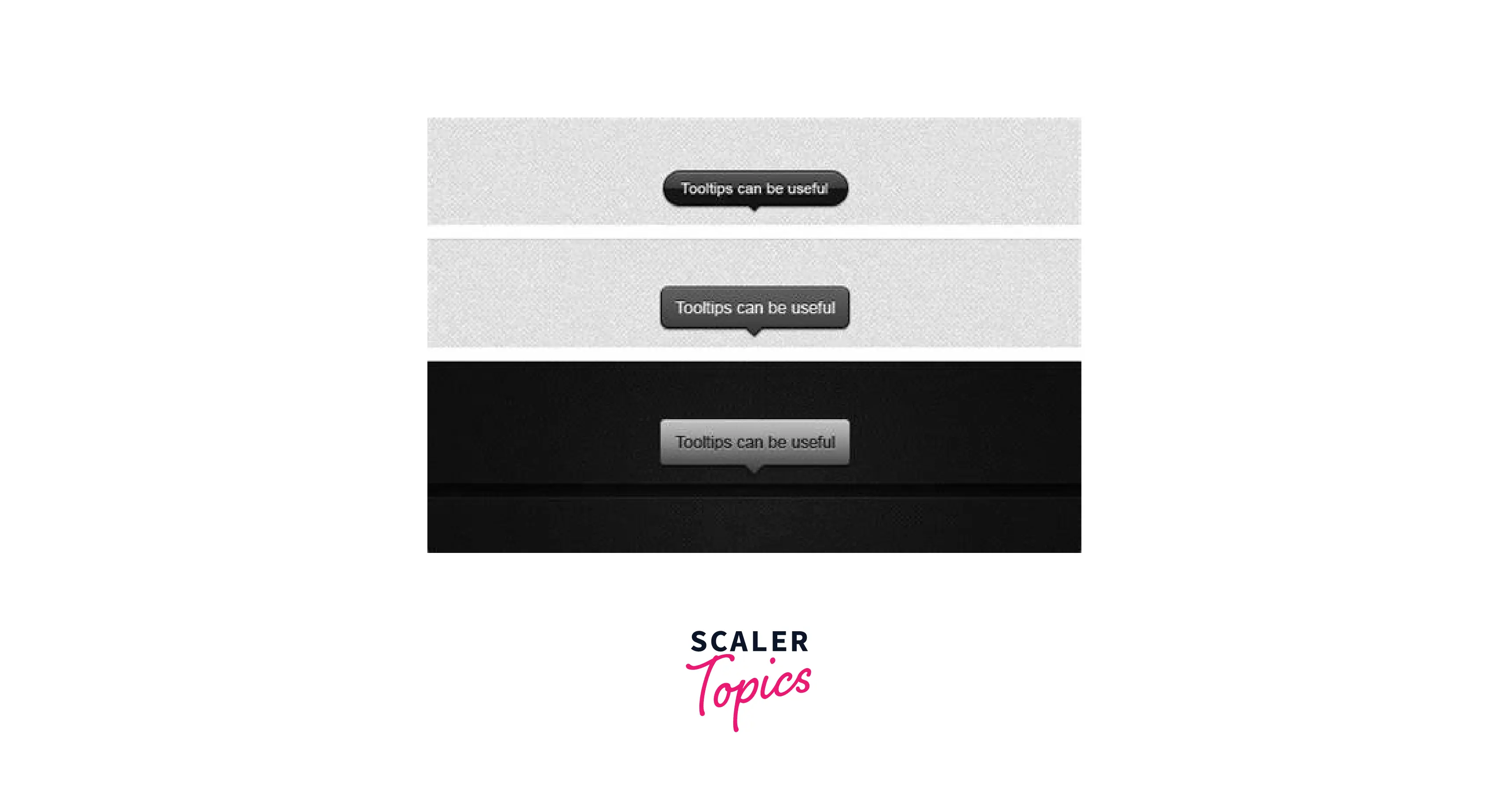
A Tooltip provides interactive textual hints to give users an idea about the element to which the mouse points. It contains text that provides additional descriptions or instructions that users might want to know.
Pre-requisites
What are we creating?
This article is a step-by-step guide on how to create a simple tooltip and then customize it as per requirement.

How to Create an HTML Tooltip?
To create a simple HTML tooltip follow the steps mentioned below.
- Step 1 - To make a simple tooltip, create an HTML div with class 'hover-text' to trigger the tooltip when hovered over.
- Step 2 - Next, create a span element with the class 'tooltip-text' for the tooltip. Place this element inside the parent div with class 'hover-text'.
- Step 3 - Finally, include CSS to add behavior to the tooltip.
- The visibility is set to hidden to hide the tooltip-text class.
- The z-index is set to 1 to place it above any other page content.
- The hover pseudo-class of class hover-text displays the tooltip text when the mouse hovers over it.
Code
HTML
CSS
Output

How to Make a Tooltip With an Arrow
Now that you have created the basic tooltip structure, add arrows to it using the following piece of code. An arrow points the tooltip towards its parent element.
To add an arrow to your tooltip use :: after. This creates a pseudo-element which is an empty element.
Position the tooltips as per requirement using the top and left attributes, and rotate them using the rotate attribute.
Code
Output
How to Add Effects to Tooltips
To add effects to enhance your tooltips you can add options like a fade, bounce, or grow effect, delay in appearance, color change, etc.
This example illustrates how you can change border-radius and fade a tooltip using transition. To fade a tooltip initially set the CSS opacity property to 0 to make the element invisible. Set it to 1 when the item is being hovered. To see a transition in the border radius add value. Add duration to both the properties to see a smooth effect.
Code
Output
How to Make a Tooltip With an Image
To add tooltips to images, the tooltip text should be placed inside the title attribute of the <img> tag.
Code
Output

HTML Tooltip Examples
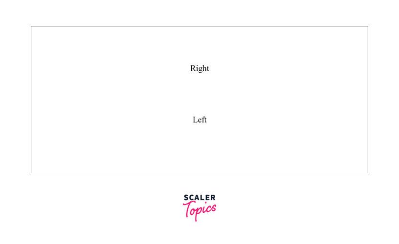
Example 1: Position of a tooltip with Right and Left value
The following example shows how to position a tooltip by setting values for the Right and Left properties. Code
HTML
CSS
Output
Example 2: Use tooltip on some links
To add tooltips to links, the tooltip text should be placed inside the title attribute of the anchor tag.
Code
Output
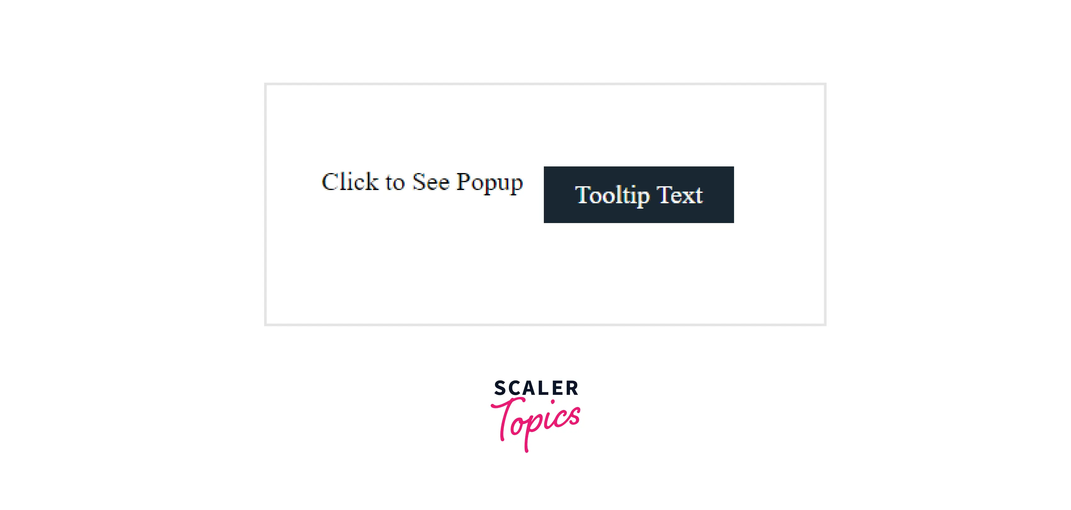
Example 3: Display a popup on hover or click on specific elements
The above examples display a tooltip when a specified element is being hovered. In this example, you'll learn how to show a tooltip only when the element is clicked.
Code
HTML
CSS
JavaScript
Output
How to create a tooltip without coding knowledge
To build a native tooltip use the Userpilot app. The app allows you to create and customize tooltips on your desired webpage without having to write a single line of code. Modify the color, text, or placement of the tooltip as per requirement and ‘Publish’ it to see the changes take effect.
Styling with CSS
To enhance user experience you can style and add functionality to your tooltip using CSS and JS.
Example 1
Code
HTML
CSS
Output
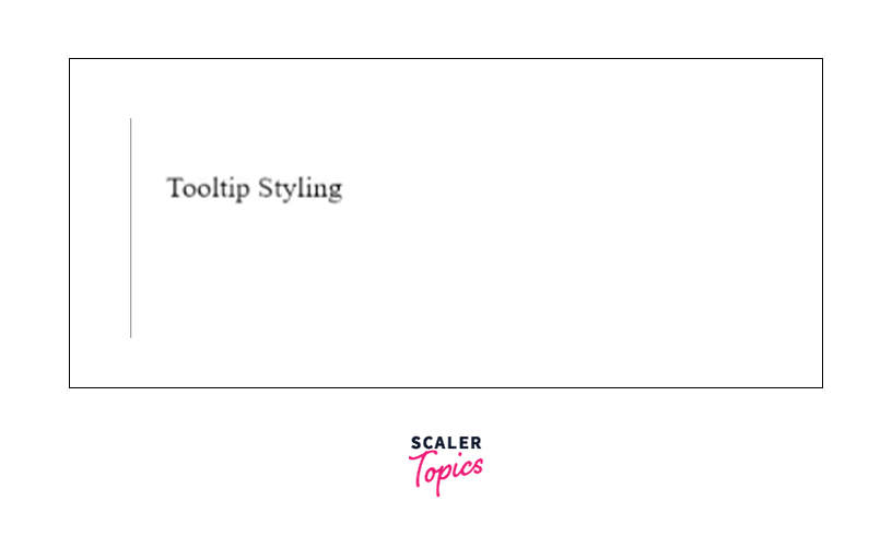
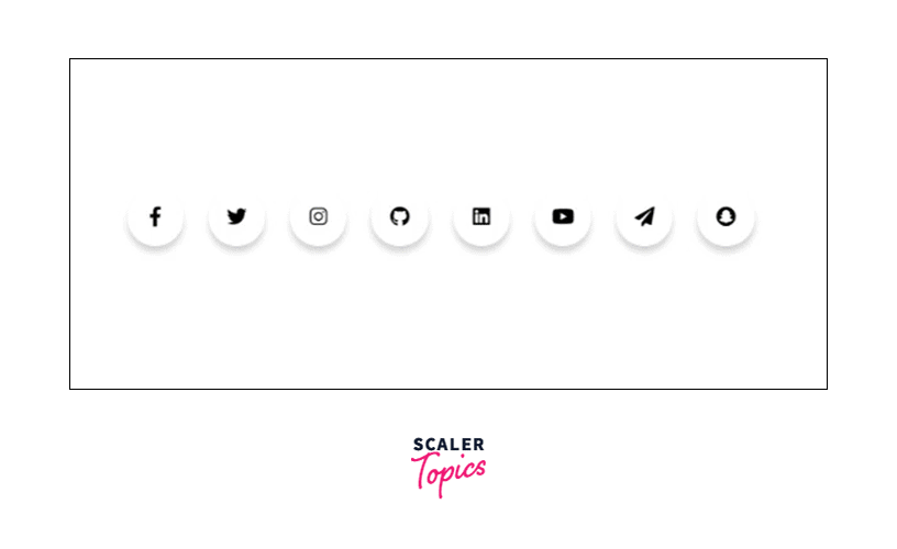
Example 2
You can use CSS to implement modern design for styling. In this example the tooltips of the social icons show the names of the social handles. Code
HTML
CSS
Output
Conclusion
- HTML Tooltip is a feature that shows related information about a selected element.
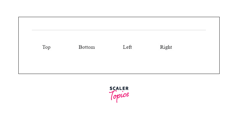
- A tooltip can be present at the top, bottom, left, or right.
- Tooltips can be added to images and links using the title attribute.