Building a Landing Page Using HTML and CSS

Overview
Our landing page is crucial. By designing an impressive landing page, we can create compelling content, draw viewers, and turn them into potential clients. Therefore, it's essential to comprehend what makes a landing page remarkable and what to avoid while building the website.
In this article, we'll learn how to use HTML and CSS to build a landing page.
Introduction
Any web page on which a customer can land is a landing page, but in the context of marketing, it's typically a standalone page. In contrast to web pages, we design our landing pages with a single emphasis or goal, known as a "call to action." In essence, it's the next phase before a visitor converts to a client. It enables us to exchange contact information for trade, unique offers, pieces of information, or transactions. Landing pages are the ideal option for increasing the conversion rates of our marketing campaigns.
Pre-requisites
Make sure you understand the following fundamental ideas of HTML & CSS before continuing :
- Flex-box
- pseudo elements
- CSS Combinators
- CSS Animations
- CSS media queries
- Hamburger menu CSS
How are We Going to Build the Landing Page?
In this article, we'll create a landing page for a restaurant.
Approach
We will walk through the following steps to create a captivating landing page with HTML and CSS.
- Create the basic structure using HTML.
- Build a responsive Hamburger navigation menu.
- Create a hero section.
- Beautify using CSS.
The Best Practices When Creating a Landing Page
- Clarify, on't omplicate: Our call to action (CTA) and unique selling proposition (USP) should be prominently displayed. We need not go too specific. We need to make it clear to visitors what we are offering and what they must contribute in exchange.
- Make it neat: For maximum impact, we must keep our landing page basic and clean, with less text and carefully chosen images.
- The test is vital: Testing is crucial to ensure that our landing page produces leads. We must create, put it into action, and then capture the results. We can change it if it's not working.
Final Output
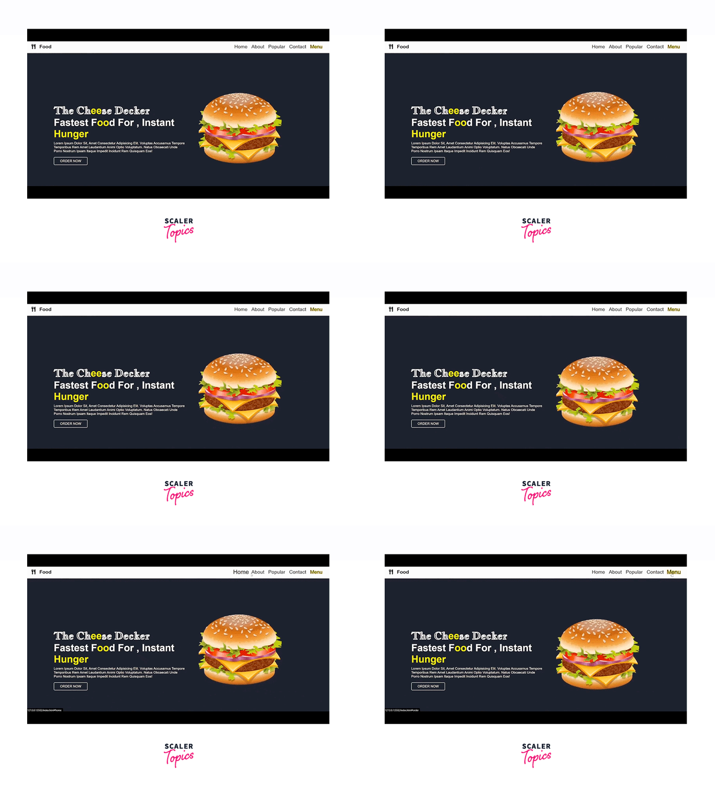
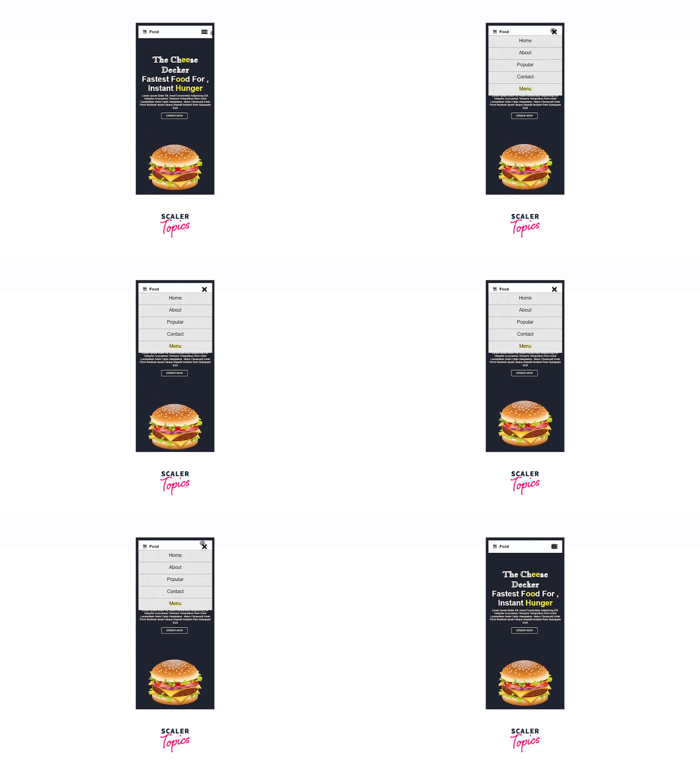
After creating the landing page, we would arrive at something like this:
DESKTOP VIEW :

MOBILE VIEW :

Building the Landing Page Using HTML and CSS
1. Creating the Basic Structure Using HTML
The two primary sections of the landing page are the header and the hero sections. The header area contains the navigation menu, while the hero section has some text and images. We will learn more about the hero section later.
2. Adding the Basic CSS
The below code includes the necessary CSS. We have imported a Google font and created a dark background.
3. Creating a Responsive Hamburger Menu
In the header's section we will create a responsive hamburger navigation menu . A hamburger menu turns the navigation bar on and off by hiding it behind the button or displaying it.Usually, it is for smaller displays and mobile devices. However, PC websites may also employ CSS hamburger menus.
- Adding the HTML
- We have the main navigation menu and a container for creating the hamburger icon.
- The navigation menu consists of a few links.
- Since we are using pure CSS, we will control the state of the icon, i.e., whether to show and hide the navbar using the HTML checkbox.
- We will specify an id for the checkbox and associate it with the label using the for attribute. Clicking the
- Styling the Responsive Hamburger Menu with CSS
- We will style the main menu nav and the hamburger menu-button-container.
- To draw the three lines for the hamburger icon, we’ll use the ::before and ::after pseudo-elements. The CSS for this is:
- Adding Functionality to The Hamburger Menu with CSS
- We will move the top and bottom bars or lines of the icon to the position of the middle line.
- We will hide the middle line.
- Lastly, we will rotate the top and bottom lines 45 degrees in opposite directions to create a cut/cross icon.
Responsive Navbar Using CSS Media Queries
- We will add the CSS media queries to make our hamburger navbar responsive.
- We must select a screen width that will toggle a full-width menu and the responsive CSS hamburger menu.
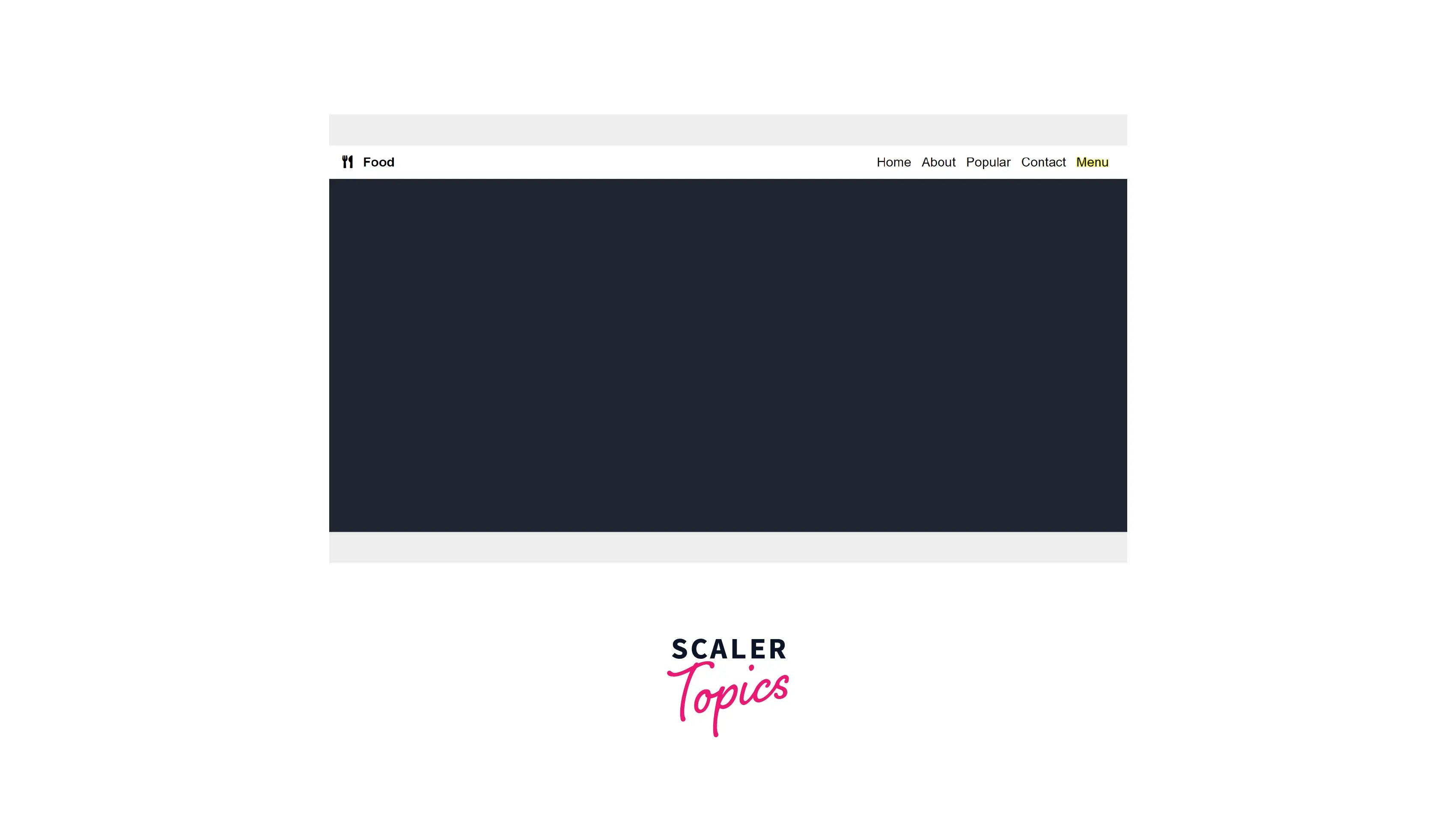
NAVBAR OUTPUT
-
DESKTOP VIEW :

-
MOBILE VIEW :

4. Creating the Hero Section
- What is a hero section ?
A backdrop image, video, illustration, or animation, along with text and occasionally a call to action, make up a hero section. A hero section is an area that appears on the screen beneath our logo and menu as the first thing visitors see when they arrive at our website.
This portion of the page should ideally cover the following information :
-
What services do we provide?
-
Why should others believe us?
-
What are the advantages of collaborating with us?
-
What should they do after that?
-
How to design a hero section ?
-
The Hero Image: Use a captivating graphic, also known as a "hero image." These are undoubtedly the most significant elements of the hero section since, in contrast to lines of text, consumers are typically more drawn to vibrant designs, captivating images, and movies that provide engaging information.
-
The powerful tagline: The headline of our hero section is crucial in determining whether a site visitor is interested or bored enough to click the "Back" button.
-
Subheadings: We should include concise descriptions of our services or products.
-
CTA: A bold, distinct, and engaging call to action is necessary.
-
-
Structure of the hero section - Adding HTML
- In this example, our hero picture is a depiction of a burger. To make the image more memorable in the user's mind, we will animate it using CSS transitions. By staring at the colors and textures of the dish, one can quickly get hungry in no time.
- We'll incorporate a catchy tagline and a brief explanation of the product.
- The CTA, in this case, is the order now button. The "order now" button directs the user to order food from the restaurant.
-
Adding CSS :
- We'll make use of the flexbox to design our hero section.
- We will display the tagline and description on the left, with the hero image on the right.
- To highlight the essential elements of our design, we'll use the color yellow.
- We will animate the image using keyframes and transforms.
-
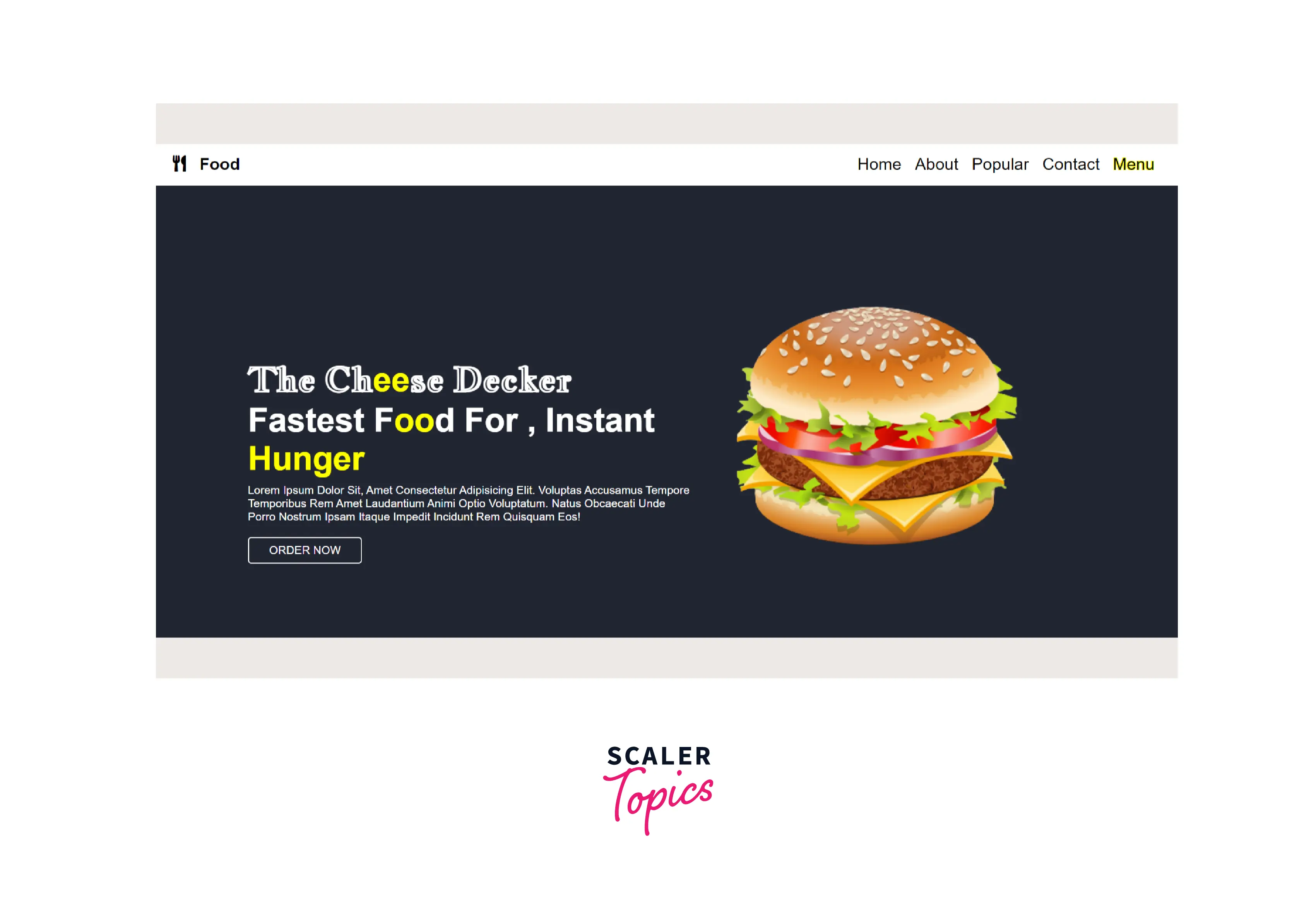
Output:
-
DESKTOP VIEW :

-
MOBILE VIEW :

-
The landing page is now ready.
Final Code
HTML
CSS
Conclusion
- A landing page is a standalone page with a call to action goal.
- By designing a landing page, we can create compelling content, draw viewers, and turn them into potential clients.
- We should create a clean, organised landing page with fewer content and eye-catching graphics.
- The two primary sections of our landing page are the navigation menu and the hero section.
- A backdrop image, video, illustration, or animation, along with text and occasionally a call to action, make up a hero section.
- A call to action (CTA) instructs the user to take some action on a website.
