Layout Builder in Flutter
Overview
The layout builder in Flutter is a powerful tool that enables developers to create responsive and adaptive user interfaces. It allows the dynamic adjustment of UI elements based on available screen space, providing a consistent experience across different devices and orientations. By using constraints and builder functions, developers can define flexible layouts that respond to changes in screen size. The layout builder in Flutter optimizes the UI by efficiently utilizing the available space and handling constraints such as aspect ratio, minimum and maximum width, and height. This abstract explores the capabilities of the layout builder in Flutter and its significance in building versatile and visually appealing applications.
Introduction
In the ever-evolving world of mobile application development, creating user interfaces that seamlessly adapt to various screen sizes and orientations is crucial. Flutter, a popular cross-platform framework, offers a powerful tool known as the layout builder to address this challenge. The layout builder in Flutter empowers developers to build responsive and adaptive UIs by dynamically adjusting the layout based on the available screen space. By leveraging the layout builder widget, developers can define flexible layouts that respond intelligently to changes in screen size, ensuring a consistent user experience across different devices. The widget takes advantage of constraints and builder functions to optimize the UI, efficiently utilizing the available space while adhering to specified constraints such as aspect ratios, minimum and maximum widths, and heights.
Understanding Layout Constraints
In Flutter, layout constraints play a vital role in defining the position and size of UI elements within the user interface. Constraints provide guidelines to the Flutter framework, allowing it to determine how widgets should be arranged on the screen. By understanding and utilizing layout constraints effectively, developers can create visually appealing and responsive user interfaces.
The two primary types of constraints in Flutter are box constraints and axis constraints.
- Box constraints define the minimum and maximum allowable sizes for a widget, enabling it to adjust its dimensions based on available space.
- Axis constraints control the positioning and alignment of widgets along a specific axis, such as horizontal or vertical.
Widgets in Flutter have their inherent constraints, but these can be further modified or overridden using parent widgets like Container, SizedBox, or Expanded. These widgets allow developers to set specific constraints, such as setting a fixed width or height, enforcing aspect ratios, or specifying minimum and maximum dimensions.
By utilizing layout constraints effectively, developers can create UIs that adapt gracefully to different screen sizes, orientations, and device types. Flutter's flexible and powerful constraint system empowers developers to build responsive and visually appealing applications that provide a consistent user experience across a wide range of devices and form factors.
Basics of LayoutBuilder in Flutter
The LayoutBuilder widget in Flutter provides a way to build responsive layouts by dynamically adapting to the available space. It allows developers to create custom layouts based on the constraints provided by its parent widget. Here are some key points about LayoutBuilder:
-
Purpose:
The main purpose of LayoutBuilder is to provide a way to build layouts that can adapt to different screen sizes and orientations.
-
Parent-Child Relationship:
LayoutBuilder is a widget that takes a single child widget as its argument. The child widget's layout is controlled by the parent LayoutBuilder widget.
-
Constraints:
LayoutBuilder receives constraints from its parent widget, which defines the available space for layout. These constraints include minimum and maximum width and height values.
-
Builder Function:
LayoutBuilder requires a builder function that returns the desired layout based on the constraints provided. The builder function takes two arguments: the BuildContext and BoxConstraints.
-
BoxConstraints:
The BoxConstraints object represents the constraints given to the child widget. It contains properties like minWidth, maxWidth, minHeight, and maxHeight, which define the allowable range for the child's size.
-
Responsiveness:
By utilizing the constraints received in the builder function, you can dynamically calculate and adjust the size and position of child widgets based on available space. This allows you to create responsive layouts that adapt to different screen sizes.
-
Widget Composition:
LayoutBuilder can be used with other layout widgets like Row, Column, or Stack to create complex layouts. The builder function can return any widget tree based on the provided constraints.
-
Aspect Ratio:
You can use the constraints to maintain a specific aspect ratio for child widgets. For example, you can ensure that an image maintains a fixed width-to-height ratio regardless of the available space.
-
Constraints-based Logic:
In the builder function, you can conditionally render different widgets or adjust their properties based on the constraints. This allows you to create flexible layouts that respond to the available space in different ways.
-
Performance Considerations:
The builder function in LayoutBuilder is called every time the constraints change, which can impact performance if the function is computationally expensive. It's important to optimize the builder function and avoid unnecessary calculations.
How to Use LayoutBuilder in Flutter?
- Wrap your desired widget tree with a LayoutBuilder widget.
- In the LayoutBuilder's builder function, provide a callback that takes in the BuildContext and BoxConstraints parameters.
- Within the callback, you can access the available constraints, such as the minimum and maximum width and height.
- Use these constraints to determine the layout and sizing of child widgets within the builder function.
- Return the desired widget tree or layout based on the provided constraints.
- Flutter will automatically rebuild the LayoutBuilder whenever the constraints change, ensuring that the layout adapts to different screen sizes.
By utilizing the LayoutBuilder widget, developers can create responsive and adaptive UIs that dynamically adjust based on available space. It is particularly useful when dealing with scenarios where the layout needs to be customized based on the constraints provided by the parent widget or the device's screen size.
Responsive Layouts with Layout Builder in Flutter
The LayoutBuilder widget is used to build a widget tree based on the constraints provided by its parent. It gives you access to the available space and dimensions, allowing you to customize the layout based on different screen sizes or orientations.
Here's a step-by-step explanation of using LayoutBuilder in Flutter:
-
Import the necessary packages:
-
Create a LayoutBuilder widget and define its builder property:
-
Within the builder function, you can access the constraints parameter, which provides information about the available space and dimensions. The constraints object has properties like maxWidth, maxHeight, minWidth, and minHeight that you can use to create a responsive layout.
-
Based on the constraints, you can build your layout using different widgets and adjust their properties as needed. For example, you can set the width and height of a widget based on the available space:
In this example, the width of the Container will be 80% of the maximum width available, and the height will be 50% of the maximum height available.
-
You can also conditionally modify the layout based on the constraints. For instance, you might want to display different widgets or change their properties for specific screen sizes:
In this case, the Text widget will display different text based on the available width.
-
Use the LayoutBuilder widget as a parent to other widgets to create complex responsive layouts. You can nest multiple LayoutBuilder widgets to adapt different parts of your UI separately. That's it! By utilizing the LayoutBuilder widget, you can dynamically adjust your UI based on the available space and create responsive layouts in Flutter.
Advanced Techniques with Layout Builder in Flutter
Here are some advanced techniques you can use with LayoutBuilder in Flutter to create even more customized and responsive layouts:
-
Responsive Breakpoints:
You can define custom breakpoints in your layout based on the available width or height. By using conditional statements, you can modify the layout based on these breakpoints. For example:
In this example, different layouts will be rendered based on the available width of the screen.
-
Aspect Ratio:
You can maintain a specific aspect ratio for a widget by utilizing the AspectRatio widget within LayoutBuilder. This is useful when you want to maintain a consistent aspect ratio regardless of the screen size. For example:
In this case, the Container will maintain a 16:9 aspect ratio, adapting to different screen sizes.
-
Custom Layouts:
With LayoutBuilder, you can create complex and custom layouts by using multiple widgets and conditional statements. You can conditionally display or adjust the properties of widgets based on the available constraints. This allows you to build adaptive layouts that are tailored to specific screen sizes or orientations.
-
Responsive Typography:
You can adjust the font size or typography styles based on the available constraints. For example, you might want to increase the font size for smaller screens to ensure readability:
In this example, the font size of the Text widget will be increased for smaller screens.
These advanced techniques allow you to create highly customizable and responsive layouts in Flutter using LayoutBuilder. By leveraging the available constraints and adapting your UI based on them, you can create versatile user interfaces that work well across different devices and screen sizes.
LayoutBuilder vs. MediaQuery
| LayoutBuilder | MediaQuery | |
|---|---|---|
| Purpose | It is used to build a widget tree based on the available layout constraints provided by its parent widget. | It is used to retrieve the information about the current media (screen) query and use that information to build a responsive UI. |
| Widget Hierarchy | It is a single widget that takes a builder function as a parameter to create a widget tree based on the available constraints. | It is a wrapper widget that can be placed anywhere in the widget tree to retrieve media query information. |
| Usage | It is used when you want to create a widget tree based on the available constraints, such as the parent's size, aspect ratio, etc. | It is used when you want to retrieve information about the current media query, such as the screen size, orientation, pixel density, etc., and adjust your UI accordingly. |
| Constraints | It provides the constraints of the parent widget to its builder function, which can be used to create responsive layouts. | It provides information about the current media query, such as the size and orientation of the screen, which can be used to create responsive layouts. |
| Granularity | It provides fine-grained control over the layout by exposing the exact constraints provided by the parent widget. | It provides higher-level information about the media query, such as screen size categories (small, medium, large) and orientation, without exposing the exact constraints. |
| Position in the Widget Tree | It is typically used as a child of a widget that provides constraints, such as Container, SizedBox, etc. | It can be placed anywhere in the widget tree to access the media query information from any point within the UI. |
| Flexibility | It allows you to build custom responsive layouts by directly manipulating the available constraints. | It provides information about the media query, but it doesn't allow direct manipulation of constraints. Instead, you can use the retrieved information to make decisions in your widget tree. |
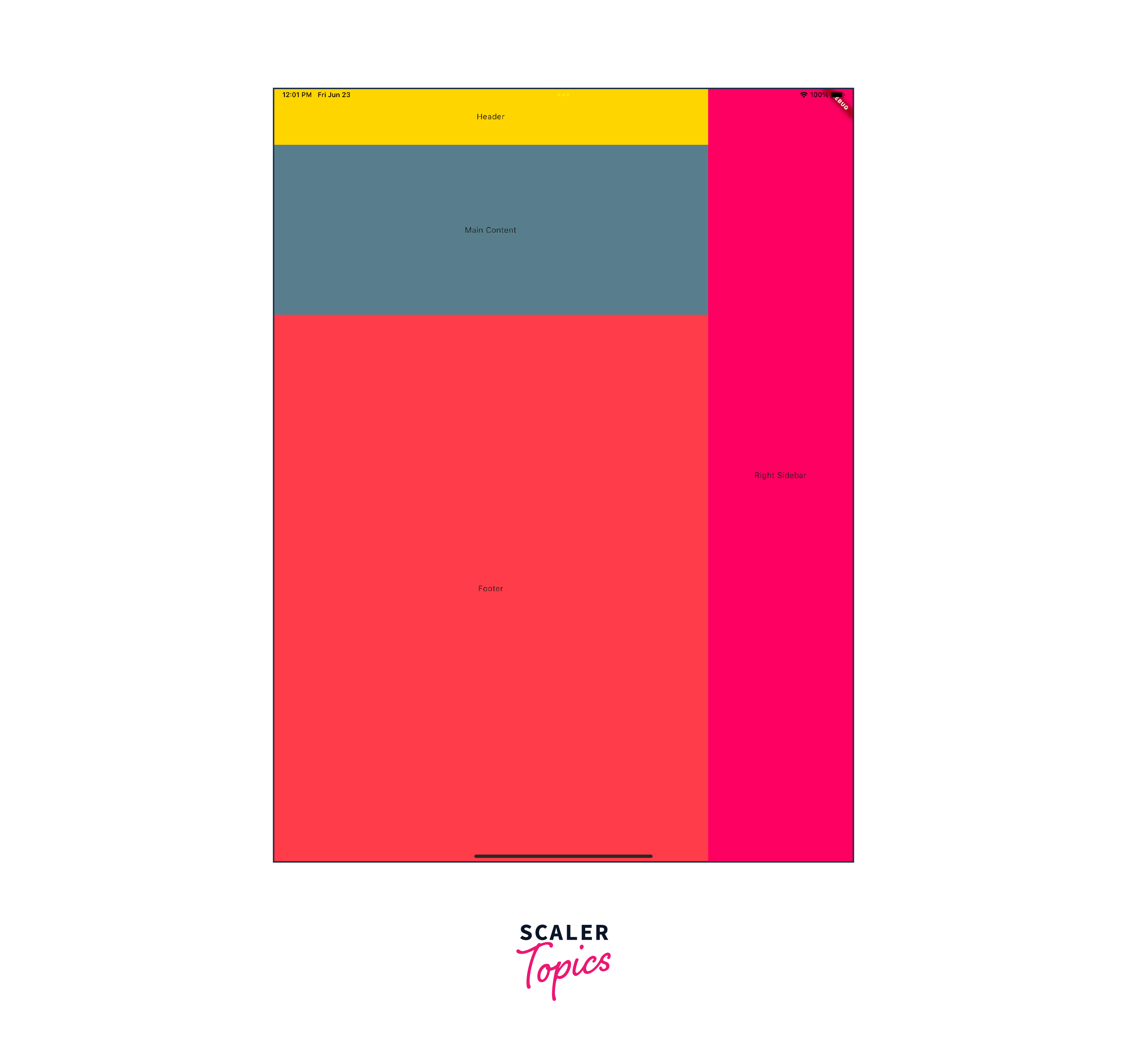
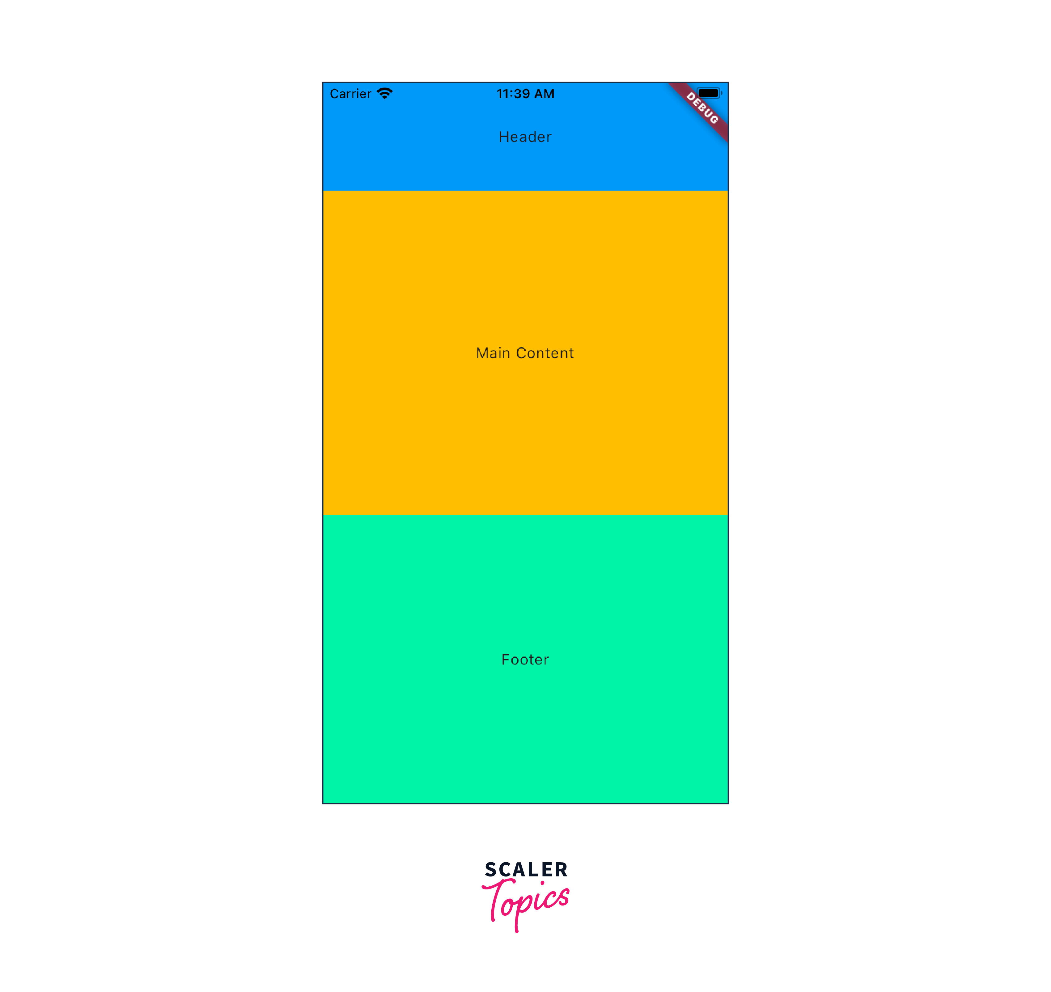
Example App
Conclusion
- Flutter's Layout Builder is a powerful tool that enables developers to create responsive and adaptive user interfaces in their Flutter applications.
- With Layout Builder in Flutter, developers can define dynamic layouts that adapt to different screen sizes, orientations, and device types, providing a consistent user experience across multiple platforms.
- The key feature of Layout Builder is its ability to provide constraints to child widgets based on the available space. This allows developers to build flexible layouts that adjust their appearance and behavior based on the screen's dimensions.
- By utilizing the Layout Builder widget, developers can access the parent widget's constraints, such as width and height, and use them to control the size and positioning of child widgets.
- This flexibility enables the creation of responsive designs that can automatically reflow, resize, or rearrange elements to fit different screen sizes, allowing apps to look great on various devices, including smartphones, tablets, and desktops.
- Layout Builder in Flutter also offers the flexibility to define custom logic and behavior based on the constraints. Developers can conditionally modify the layout based on factors such as aspect ratio, available space, or device orientation.
- The Layout Builder widget is straightforward to use, as it follows the Flutter's widget composition model. Developers can nest multiple Layout Builder widgets to achieve complex and granular control over the layout of their application.