CSS letter-spacing Property
 FREE
FREE

Overview
The CSS letter-spacing property is a valuable tool for controlling the spacing between characters within text elements on a website. By using this property, web developers can adjust the space between individual letters or characters to achieve specific design goals or improve readability. It's versatile and can be applied to various. Common units like pixels, ems, and percentages can be used for fine-tuning. Web designers often use letter-spacing to create aesthetic effects or address kerning issues in typography.
Syntax
Here is the syntax for using the CSS letter-spacing property:
Note:
The value of the letter-spacing property can also be set to inherit and initial, which are important for understanding inheritance and resetting
Property Values
The letter-spacing property in CSS accepts various values to control the spacing between characters in text. These values can be positive or negative, and they can be expressed using different units. Here are the common property values for letter-spacing:
1. Length Values:
You can specify the spacing in pixels (px), em units (em), or other length units such as centimeters (cm) or millimeters (mm). For example:
- letter-spacing: 2px; adds 2 pixels of space between characters.
- letter-spacing: 0.5em; adds half of the current font size as space between characters.
2. Percentage Values:
You can use a percentage value to specify the spacing relative to the current font size. For example:
- letter-spacing: 10%; adds 10% of the current font size as space between characters.
3. Negative Values:
Negative values are used to reduce the space between characters, making them appear closer together. For example:
- letter-spacing: -1px; reduces the space between characters by 1 pixel.
4. Normal:
The normal value, which is the default, means no additional spacing between characters. It maintains the default spacing defined by the font. For example:
- letter-spacing: normal; keeps the default spacing.
5. Inherit:
The inherit value allows an element to inherit the letter-spacing value from its parent element.
6. Initial:
The initial value sets the letter-spacing property to its default initial value, typically normal.
7. Combining Text Transformation with letter-spacing:
By combining letter-spacing with text-transform, you can achieve unique and stylized text effects. For instance, increasing letter spacing along with setting text to uppercase can create a bold and spaced-out appearance.
Formal Definition and Usage
Formal Definition:
The CSS letter-spacing property defines the amount of space to be inserted or removed between characters in a block of text. It allows fine control over the spacing between individual characters, enabling adjustments to typography and text appearance.
Usage:
The letter-spacing property is applied to HTML elements containing text content, such as paragraphs (<p>), headings (<h1>, <h2>, etc.), or inline elements (<span>, <a>) within a CSS stylesheet.
Examples
Here are some HTML and CSS examples that demonstrate how to use the letter-spacing property to control the spacing between characters in different text elements:
Example - 1: Adjusting Letter Spacing in Paragraphs
HTML:
CSS (styles.css):
Output:
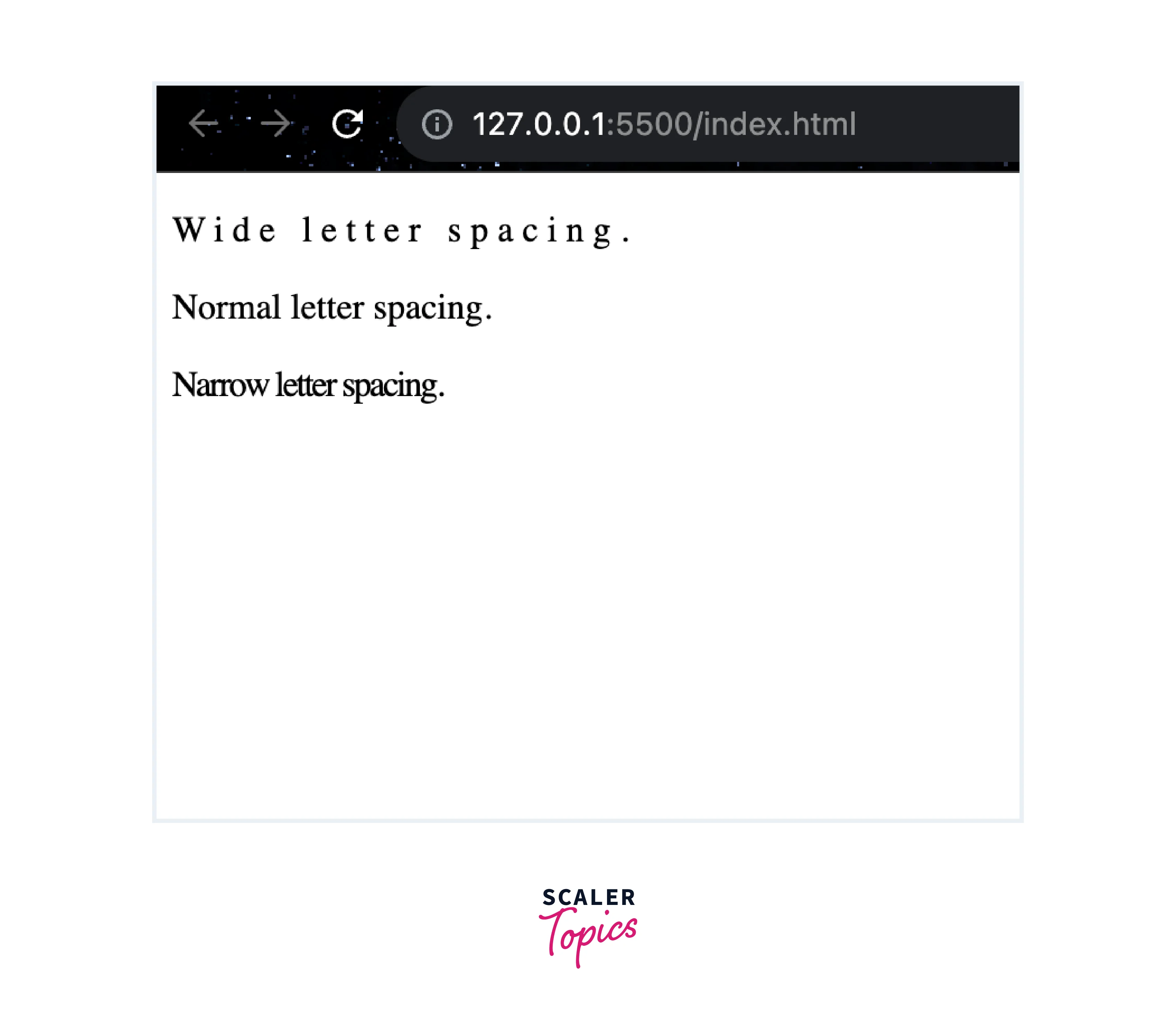
Explanation:
- The HTML document is standard with a DOCTYPE declaration, an HTML structure, and a reference to an external CSS stylesheet (styles.css) in the <head> section.
- We have three <p> (paragraph) elements in the <body>, each with a different class attribute applied: wide-spacing, normal-spacing, and narrow-spacing.
- In the CSS file (styles.css), we define three CSS rules, each targeting the paragraphs with specific classes.
- The .wide-spacing rule sets a letter-spacing of 4 pixels for paragraphs with the class wide-spacing, increasing the space between characters.
- The .normal-spacing rule sets the letter-spacing property to its default value, which is normal. This rule doesn't change the letter spacing and is applied to paragraphs with the class's normal spacing.
- The .narrow-spacing rule sets a negative letter-spacing of -1 pixel for paragraphs with the class narrow-spacing, making the characters appear closer together.
Example - 2: Letter Spacing in Headings
HTML:
CSS (styles.css):
Output:
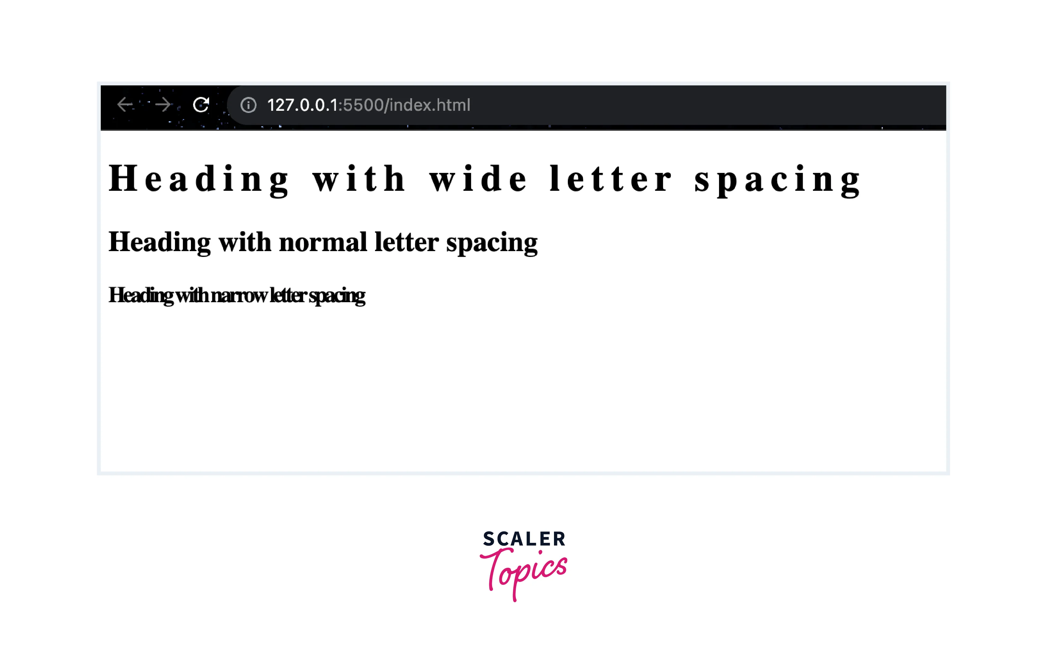
Explanation:
- This HTML code structure is similar to the first example, but instead of paragraphs, we have three heading elements (<h1>, <h2>, <h3>) with different classes applied.
- In the CSS file (styles.css), we define CSS rules for each of the heading elements with specific classes.
- The .wide-spacing rule sets a letter-spacing of 6 pixels for all heading elements with the classes wide-spacing, increasing the space between characters.
- The .normal-spacing rule sets the letter-spacing property to its default value (normal) for heading elements with the classes normal-spacing.
- The .narrow-spacing rule sets a negative letter-spacing of -2 pixels for heading elements with the classes narrow-spacing, making the characters in these headings appear closer together.
Accessibility Concerns
Here are some accessibility concerns to keep in mind:
- Readability:
Increasing the letter spacing too much can negatively impact readability, especially for users with visual impairments or cognitive disabilities. It may make text harder to follow or discern. - Responsive Design:
Consider how letter spacing adjustments affect text on different devices and screen sizes. What works on a desktop screen might not work as well on mobile devices. Adjusting letter spacing using the CSS letter-spacing property can be an effective way to optimize text readability and aesthetics across different screen sizes and devices. To handle letter spacing in responsive design, you can use media queries to define specific letter-spacing values or adjust them based on various viewport conditions. Here's a deeper dive into how this can be accomplished:- Using Media Queries for Different Viewports:
In responsive design, you often use media queries to apply CSS rules based on the user's viewport size. You can include specific letter-spacing values within these media queries to adapt typography for different screens. - Fluid Typography:
Another responsive design technique is using fluid typography, which involves adjusting font sizes and letter spacing based on viewport dimensions. - Breakpoints for Specific Devices:
You can also use breakpoints that target specific devices or device categories to fine-tune letter spacing.
- Using Media Queries for Different Viewports:
Browser Compatibility
The CSS letter-spacing property is widely supported across modern web browsers, making it a reliable choice for controlling the spacing between characters in your web design. In the case of letter-spacing, vendor prefixes were used more frequently for other properties, like border-radius or box-shadow, than for text-related properties. However, if you encounter situations where vendor prefixes are necessary due to specific browser requirements, you would include them in your CSS like this:
Supported by All Major Browsers:
| Supporting Browsers |
|---|
| Chrome |
| Firefox |
| Safari |
| Edge |
| Opera |
| Internet Explorer 9 |
Conclusion
- letter-spacing allows fine-tuning of character spacing, enhancing typography and visual aesthetics on web pages.
- It can be applied to various HTML elements, such as paragraphs, headings, and inline elements, using CSS selectors.
- You can set positive or negative values to adjust spacing, use different units (e.g., pixels, ems, percentages), or opt for normal spacing. The property also supports inherit and initial values.
- Consider the impact on readability, legibility, and accessibility when modifying letter spacing. Strive for a balance between aesthetics and usability.
- letter-spacing is well-supported across modern web browsers, making it a reliable choice for styling text.
- Always test your designs across different browsers and screen sizes to ensure consistent and accessible results.