Lines Types in R
Overview
In R, lines are crucial for data visualization, enabling the representation of data relationships and trends. R offers various functions and packages to work with lines in graphical plots. The plot() and lines() functions are commonly used for creating scatterplots with lines connecting data points, aiding trend analysis. The abline() function adds straight lines to plots, while curve() is employed for displaying mathematical curves. Packages like ggplot2 and lattice extend these capabilities, allowing users to create complex, customized plots with lines. Lines in R are essential tools for conveying data insights and patterns, making them invaluable for data exploration and presentation. In this article, we will learn how we can use different types of lines in R.
Introduction
In R, line types are essential for customizing the appearance of lines in various types of plots and graphics. Line types determine how lines are displayed, and they are often used to differentiate between data series or to emphasize specific patterns in your visualizations. Different types of lines are available in R to provide flexibility and versatility when creating data visualizations and plots. These various line types allow you to customize the appearance of lines in your graphics, making it easier to convey information effectively. Here are some reasons why different line types are available in R:
- Data Differentiation: In many plots, you need to represent multiple data series or categories. Different line types allow you to visually distinguish between these data sets, making it easier for viewers to identify and compare them.
- Emphasizing Patterns: Certain line types can be used to highlight specific patterns or trends in your data. For example, dashed or dot-dashed lines can draw attention to particular data points or changes in the dataset.
- Aesthetic Variation: Line types add aesthetic variation to your plots, enhancing the overall visual appeal. This variety can make your graphics more engaging and informative.
- Customization: R's flexibility allows you to customize line types to suit your specific needs. You can create your custom line patterns, assign them to specific data series, and use them in your plots to convey precisely the information you want.
- Plot Interpretation: Different line types can be used to represent different types of data or relationships within a plot. For instance, a solid line may represent a continuous function, while a dotted line may signify a theoretical or projected trend.
- Plot Clarity: Line types contribute to the clarity and readability of your plots. By selecting appropriate line types, you can reduce clutter and make your visualizations more understandable.
There are several common line types available in R, and they can be applied in various plotting functions and packages.
Line Types in R
In ggplot2, a popular data visualization package in R, there are several types of lines that you can use to customize the appearance of lines in your plots. These line types are specified using the linetype aesthetic and are essential for distinguishing between multiple lines in line charts or controlling the style of lines in various types of plots. Here's an introduction to the types of lines available in ggplot2:
-
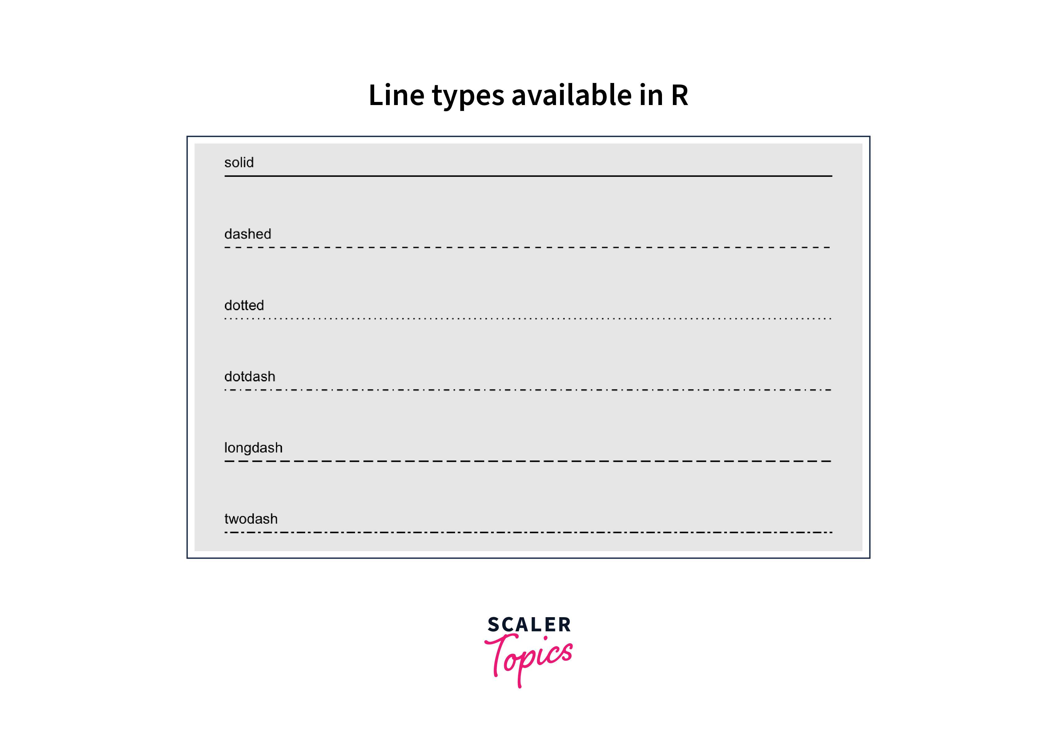
Solid Line (Default): This is the default line type in ggplot2. It represents a continuous, unbroken line. It can be used in various graphs: line charts to display trends, XY scatter plots to connect data points, mathematical function plots for continuity, box plots for whiskers, error bars for mean values, structural lines for borders, hierarchical clustering dendrograms, network diagrams for connections, and area plots for composition within graphs.
-
Dashed Line: Dashed lines consist of a series of short dashes.They are often used to differentiate one line from another or to highlight specific data series. These lines can be utilized in graphs for specific purposes, such as representing forecasts or projections in line charts, distinguishing different data series in line charts, illustrating uncertainty in error bars, and highlighting specific data points or regions. They provide visual variety and help convey distinct information in a graph.
-
Dotted Line: Dotted lines consist of a series of small dots. They can be used to create a visually distinct line pattern. Dotted lines are employed in graphs to indicate discontinuity or intermittent data patterns. They're suitable for displaying discrete data points in scatter plots, highlighting individual data values or outliers, and differentiating lines in multi-line charts. Dotted lines offer a clear way to emphasize specific data characteristics in visualizations.
-
Dot-Dashed Line: Dot-dashed lines combine dots and dashes in a repeating pattern. They offer a unique appearance that can be useful for emphasizing certain data trends. Dot-dashed lines are versatile in graphs. They can be used for boundary or threshold lines, separating distinct data regions. In error bar plots, they represent both mean and uncertainty, conveying central tendency and variability. This line type helps emphasize critical points or divisions in visual data representations.
-
Long Dashed Line: Long dashed lines consist of longer dashes compared to the regular dashed line. They can be used to make lines more prominent in the plot. Long dashed lines are beneficial in graphs for highlighting specific data trends or divisions. They're suitable for marking boundaries, showing predicted values in line charts, and creating visual separation between data series. The extended dash length enhances the visual distinction and draws attention to important data elements in the graph.
-
Two Dashed Line: Two dashed lines represent two parallel dashed lines. This line type is less common but can be used for specific visual effects. Two dashed lines in graphs are often used to indicate a range or interval. They can represent confidence intervals in error bar plots, show upper and lower bounds in uncertainty ranges, or highlight specific data bands. This line type effectively conveys a range of values or uncertainty in visualizations.
These line types are applied to ggplot2 layers using the linetype aesthetic within the aes() function. You can select a line type that suits your data and visualization goals to create visually appealing and informative plots. Additionally, you have the flexibility to define custom line types by mapping your line patterns to names and using the scale_linetype_manual() function, allowing you to tailor line appearances precisely to your needs.
We can see the types of lines available in R with the help of the following snippets.
Output:
Change R Base Plot Line Types
R's base plotting system, you can change the line types using the lty parameter within plotting functions like plot(), lines(), and abline(). The lty parameter allows you to specify the line type you want to use in your plot. Here's how you can change line types in base R plots:
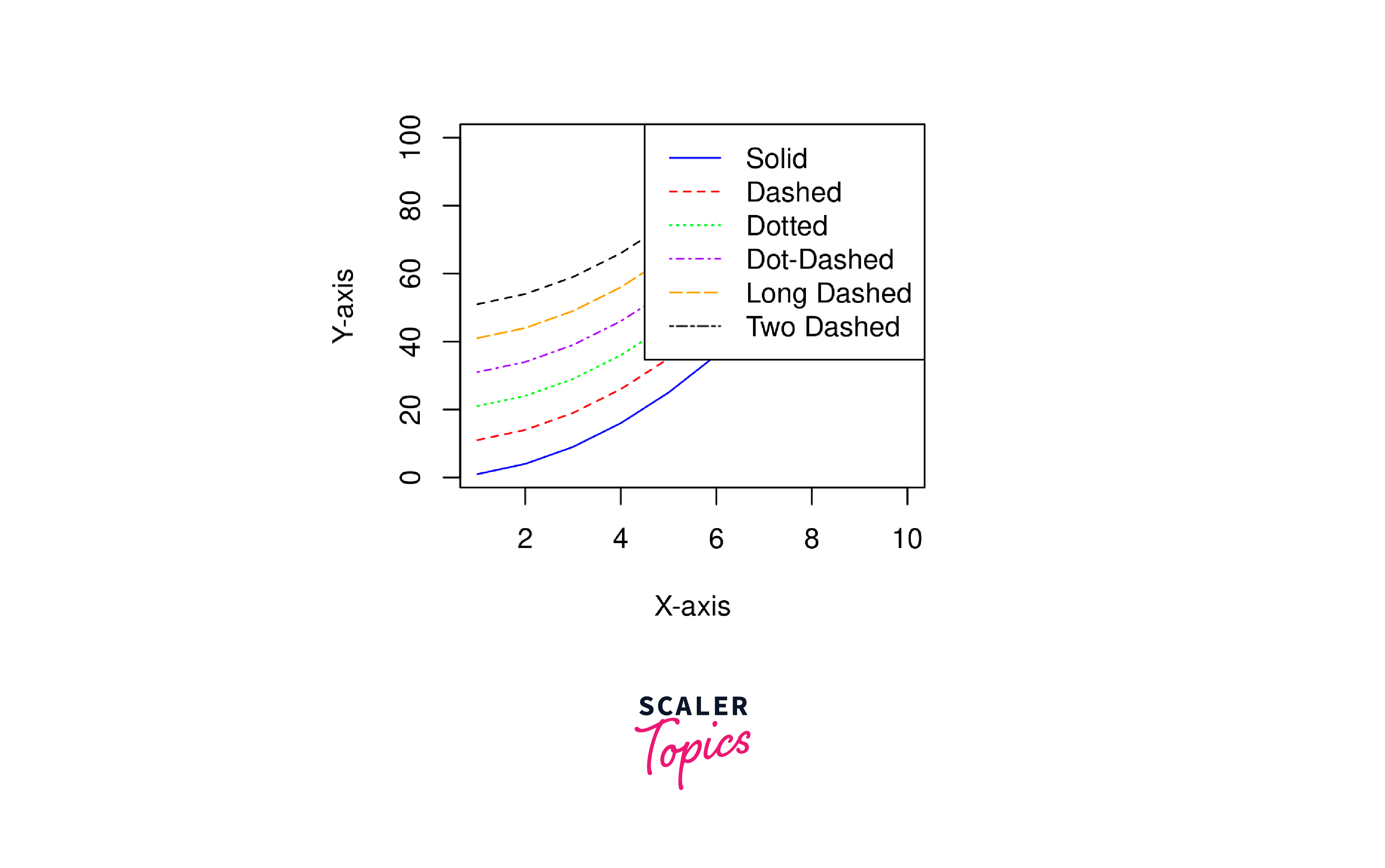
Changing Line Type in a Basic Plot::
This R code creates a simple plot with different line types and adds a legend to label each line type. Here's an explanation of each part of the code:
Data Creation:
- : Creates a vector x containing values from 1 to 10.
- : Creates another vector y with values equal to the square of x.
Plotting:
- plot(x, y, type = "l", lty = 1, col = "blue", xlab = "X-axis", ylab = "Y-axis"): This line of code creates the initial plot. It uses plot() to plot the x and y vectors with a solid blue line (lty = 1) and labels the x and y-axes with "X-axis" and "Y-axis," respectively.
Adding Additional Lines:
- lines(x, y + 10, lty = 2, col = "red"): Adds a dashed red line to the existing plot.
- lines(x, y + 20, lty = 3, col = "green"): Adds a dotted green line.
- lines(x, y + 30, lty = 4, col = "purple"): Adds a dot-dashed purple line.
- lines(x, y + 40, lty = 5, col = "orange"): Adds a long dashed orange line.
- lines(x, y + 50, lty = c(2, 5), col = "black"): Adds two dashed lines (custom) with different line types - one dashed (lty = 2) and one long dashed (lty = 5) - in black colour.
Adding a Legend:
legend is a function in R used to add a legend to a plot.
- topright specifies the location where the legend should be placed within the plot. In this case, it's the top-right corner of the plot.
- legend = c("Solid", "Dashed", "Dotted", "Dot-Dashed", "Long Dashed", "Two Dashed"): This part of the code specifies the labels that will be displayed in the legend. Each label corresponds to a different line type.
- lty = 1:6: lty stands for "line type." This argument specifies the line types to be used for each label in the legend. 1:6 is a vector of numbers from 1 to 6, indicating that there will be six different line types used in the legend. These line types correspond to the labels specified earlier.
- col = c("blue", "red", "green", "purple", "orange", "black"): col stands for "colour." This argument specifies the colours to be used for each label in the legend. The vector c("blue", "red", "green", "purple", "orange", "black") contains six colour names, one for each line type in the legend. Each colour corresponds to a specific label and line type.
Changing Line Type for abline():: You can also use the abline() function to add straight lines to your plot. To change the line type, use the lty parameter:
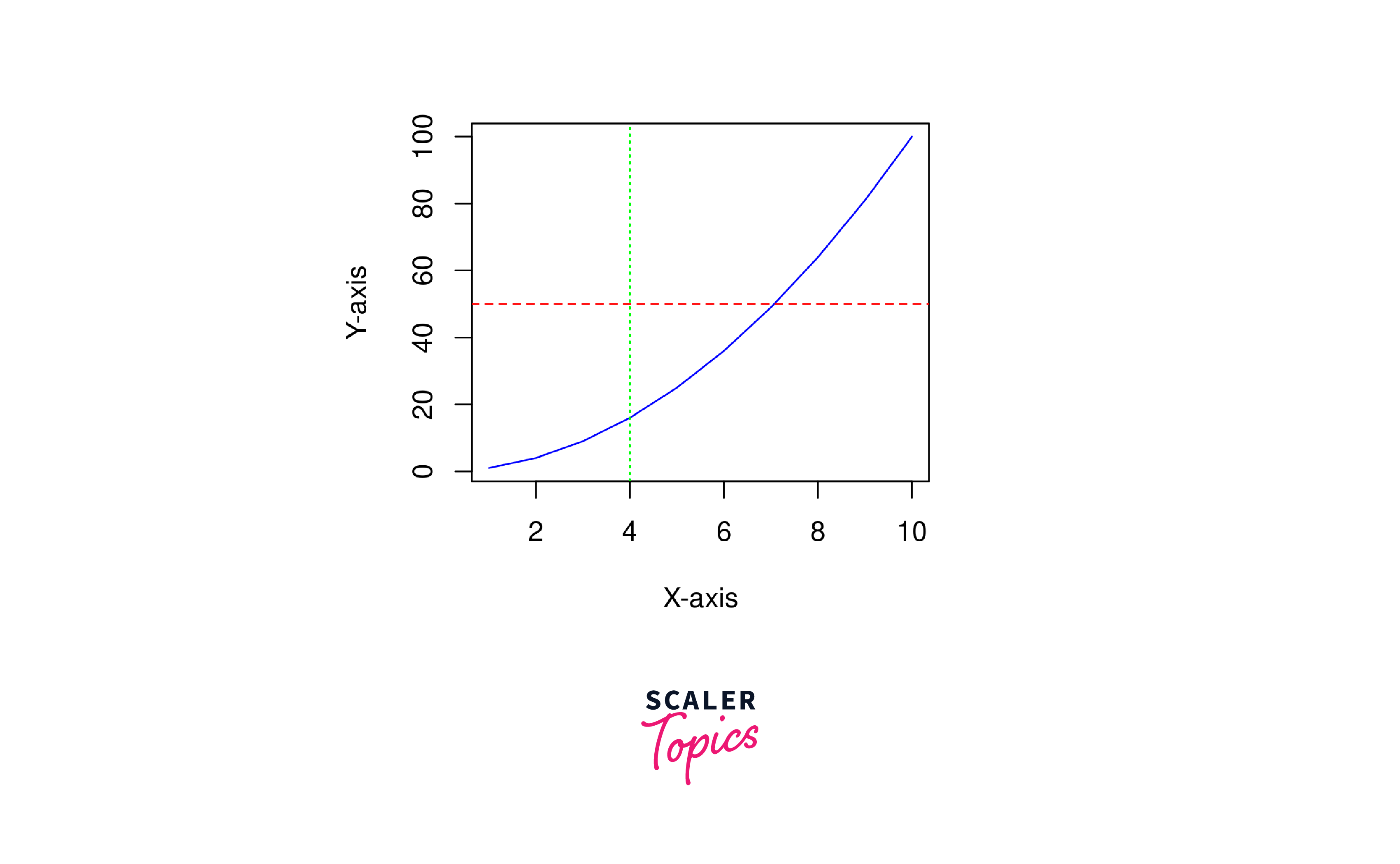
The above R code creates a simple plot and adds horizontal and vertical lines to it using the base R plotting functions plot() and abline():
plot(x, y, type = "l", col = "blue", xlab = "X-axis", ylab = "Y-axis"): This line of code creates a basic line plot. The arguments are explained below.
- abline() is a base R function used for adding straight lines to a plot. It can be used to add horizontal, vertical, or diagonal lines.
- x and y are the data points to be plotted.
- type = "l" specifies that you want to create a line plot (as opposed to other plot types like points or bars).
- col = "blue" sets the colour of the line to blue.
- xlab = "X-axis" and ylab = "Y-axis" label the X and Y axes, respectively.
abline(h = 50, lty = 2, col = "red"): This line of code adds a horizontal line to the plot. The arguments are explained below.
- abline() is a base R function used for adding straight lines to a plot. It can be used to add horizontal, vertical, or diagonal lines.
- h = 50 specifies the y-coordinate where the horizontal line will be drawn (at y = 50 in this case).
- lty = 2 sets the line type to a dashed line (line type 2).
- col = "red" specifies that the line should be red.
abline(v = 4, lty = 3, col = "green"): This line of code adds a vertical line to the plot. The arguments are explained below.
- abline() is a base R function used for adding straight lines to a plot. It can be used to add horizontal, vertical, or diagonal lines.
- v = 4 specifies the x-coordinate where the vertical line will be drawn (at x = 4 in this case).
- lty = 3 sets the line type to a dotted line (line type 2)
- col = "green" specifies that the line should be green in colour.
Change ggplot Line Types
In ggplot2, you can change line types using the linetype aesthetic. Here's a basic example of how to create a ggplot2 plot with different line types:
The above code snippets are explained below:
-
library(ggplot2): This line imports the ggplot2 library, which is essential for creating data visualizations using the ggplot2 package.
-
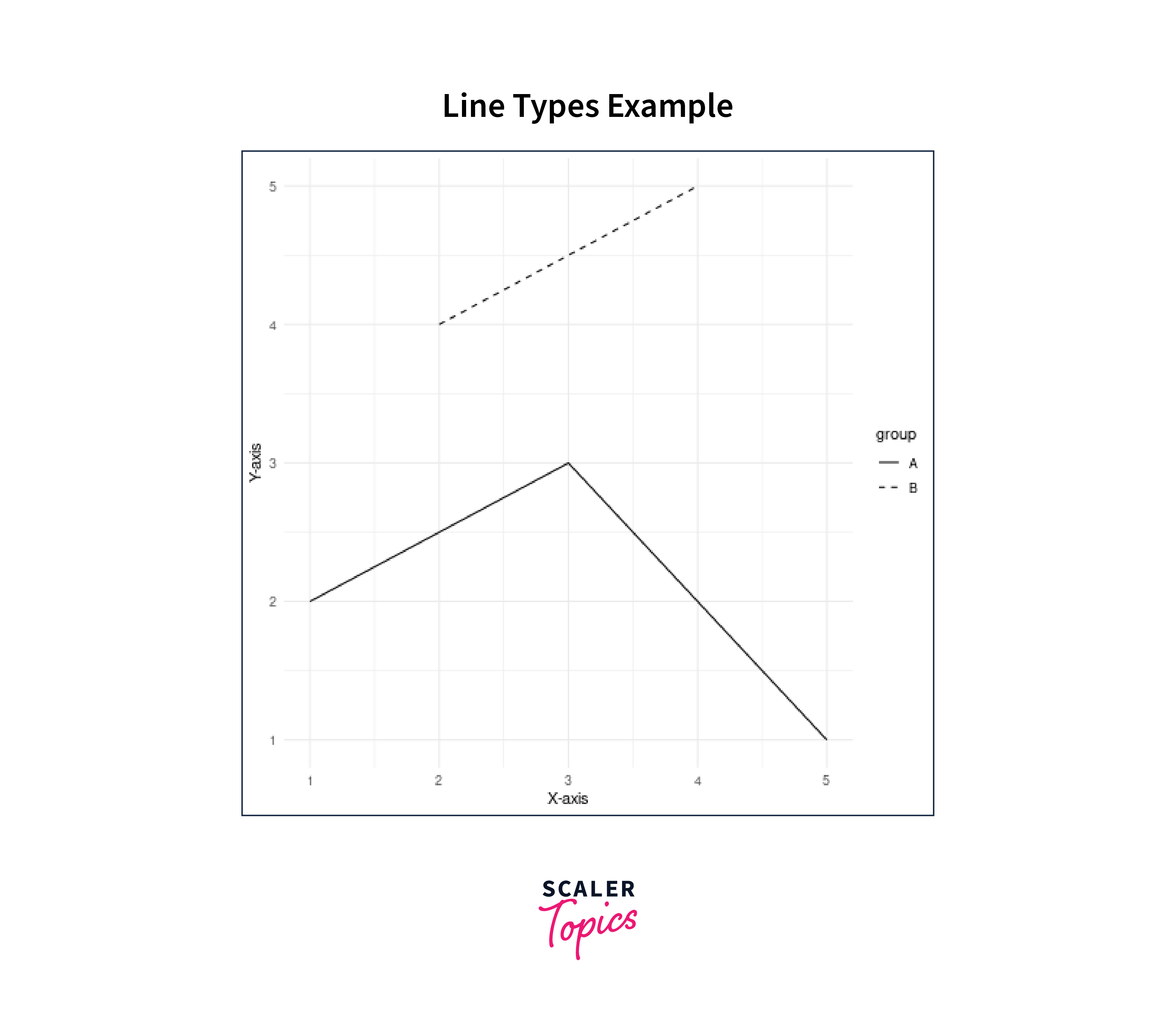
data <- data.frame(x = 1:5,y = c(2, 4, 3, 5, 1), group = c("A", "B", "A", "B", "A") ): Here, we have created a sample data frame called data. It has three columns: x, y, and group. The x column represents the x-axis values, the y column represents the y-axis values, and the group column categorizes the data points into two groups, A and B.
-
ggplot(data, aes(x = x, y = y, linetype = group)): This line initializes a ggplot2 plot using the data data frame and specifies the aesthetics of the plot. It tells ggplot2 to use the x values for the x-axis, and the y values for the y-axis, and to differentiate lines by the group variable.
-
geom_line(): This function adds a line layer to the plot, connecting the data points based on the specified aesthetics.
-
labs(title = "Line Types Example", x = "X-axis", y = "Y-axis"): This sets the plot's title, x-axis label, and y-axis label.
-
theme_minimal(): This function applies a minimal theme to the plot, which adjusts the overall appearance and style of the plot to a minimalistic design.
The result is a ggplot2 plot with two lines (one solid and one dashed) representing the "A" and "B" groups, respectively. This code serves as an example of how to create a basic line plot with customized line types in ggplot2 as shown below.
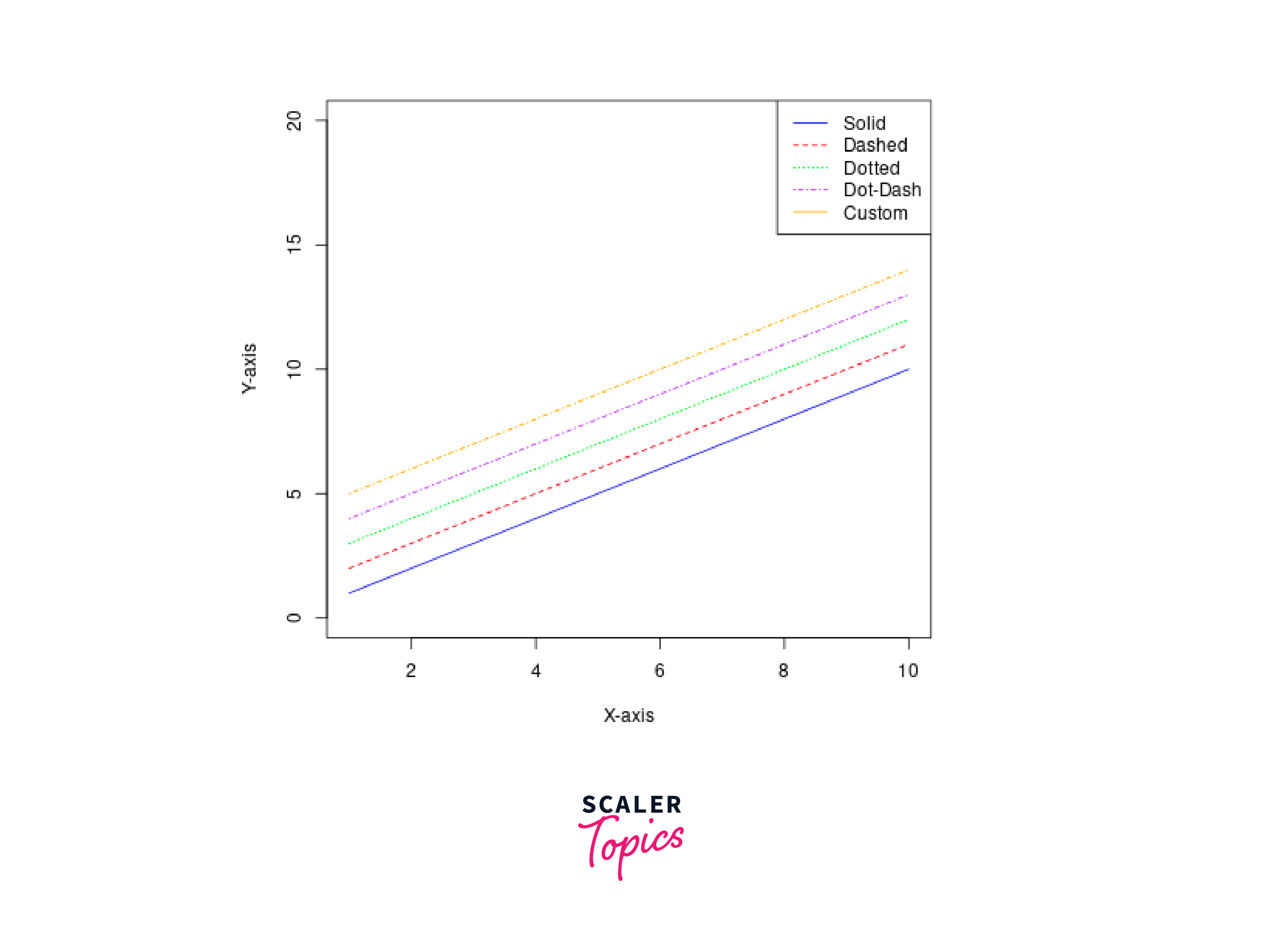
Applying lty() in Plotting Functions
In R, you can apply different line types to plotting functions using the lty argument. The lty argument allows you to specify the line type for the lines in your plot. Here's a simple example of how to use lty in a plotting function:
The above code is explained below:
-
We create some example data: x, y1, y2, and y3.
-
We use the plot() function to create the initial plot. The type = "l" argument specifies that we want to create a line plot. col sets the line colour, and lty sets the line type. In this example, lty = 1 specifies a solid line.
-
We add two additional lines to the plot using the lines() function. Each lines() call specifies a different line colour and line type using the col and lty arguments.
-
Finally, we add a legend to the plot using the legend() function to label the lines and indicate their colours and line types.
You can change the values of lty to use different line types. For example, you can use lty = 2 for dashed lines, lty = 3 for dotted lines, and so on. The lty argument provides flexibility in customizing the line types for your plots in R. The plotted graph is shown below.
Customizing Line Types in plot()
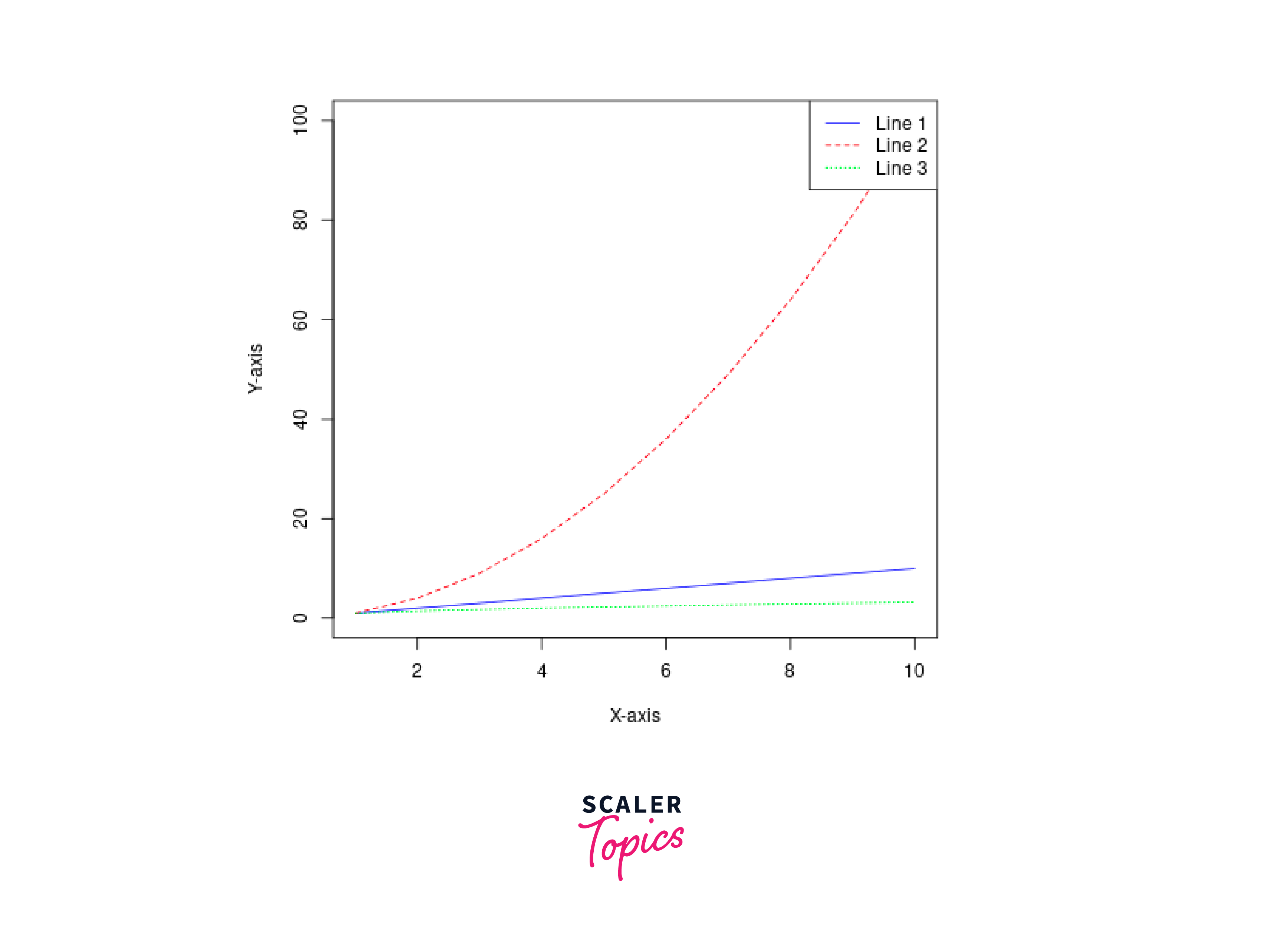
In R, we can customize line types in the plot() function by specifying the lty (line type) argument. The lty argument allows you to choose from a variety of line types for your plot. Here's an example of how to customize line types in the plot() function:
The above code is explained below:
-
library(ggplot2): This line loads the ggplot2 library, which is a popular data visualization package in R.
-
Three vectors KaTeX parse error: Expected 'EOF', got '&' at position 13: (x, y1, y2, &̲ y3) are defined as data. x is a sequence from 1 to 10, and y1, y2, and y3 are derived from x with different mathematical functions.
-
plot(x, y1, type = "l", col = "blue", lty = 1, ylim = c(0, 100), xlab = "X-axis", ylab = "Y-axis"): This line creates a basic line plot using the plot() function. Here's what each parameter does:
- x and y1 specify the data to be plotted.
- `type = "l"`` indicates that the plot should display lines.
- col = "blue" sets the line colour to blue.
- lty = 1 specifies a solid line type.
- ylim = c(0, 100) sets the y-axis limits from 0 to 100.
- xlab and ylab define labels for the x-axis and y-axis.
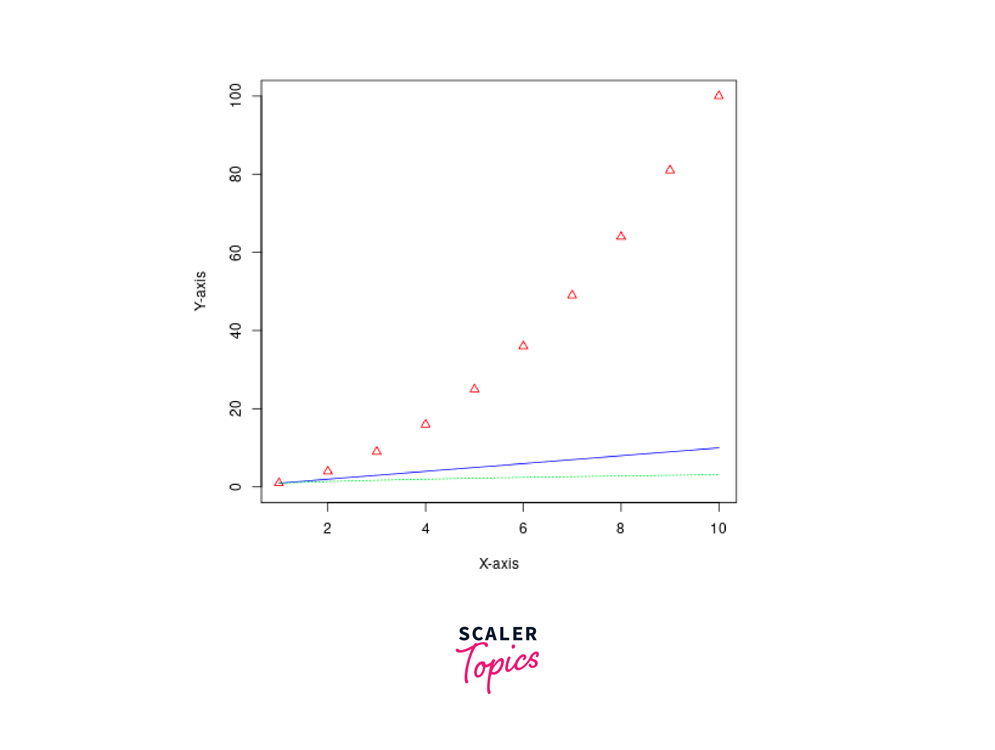
-
points(x, y2, col = "red", pch = 2, lty = 2): This line adds points to the existing plot. Parameters:
- x and y2 specify the data points to be added.
- col = "red" sets the point colour to red.
- pch = 2 specifies that the points should be displayed as triangles.
- lty = 2 sets the line type for these points to dashed.
-
lines(x, y3, col = "green", lty = "dotted"): This line adds another line to the existing plot. Parameters:
- x and y3 specify the data for the new line.
- `col = "green"`` sets the line color to green.
- lty = "dotted" specifies that this line should be dotted.
You can customize line types in the plot() function by setting the lty argument to different values like 1 (solid), 2 (dashed), 3 (dotted), and more. Additionally, you can use text labels like "dotted" or "dotdash" to specify custom line types. Feel free to experiment with different lty values and line types to achieve the desired appearance for your plot. The plotted graph is shown below.
Line Type Selection in lines()
The above code is explained below:
-
We create an empty plot using plot() with the type = "n" argument to create a plot with no data points or lines, just axes.
-
We then use the lines() function to add lines to the plot with different line types:
- lty = 1: Solid line (default)
- lty = 2: Dashed line
- lty = 3: Dotted line
- lty = 4: Dot-dash line
- lty = "dotdash": Custom line type ("dotdash")
-
We specify line colours using the col argument, and the lty argument sets the line type.
-
Finally, we add a legend to the plot using the legend() function, specifying the line types and their corresponding colours. This legend helps identify the different line types used in the plot.
You can adjust the lty argument to choose the line type that best suits your data visualization needs. Experiment with different line types and combinations to achieve the desired appearance in your R plots. The plotted graph is shown below.
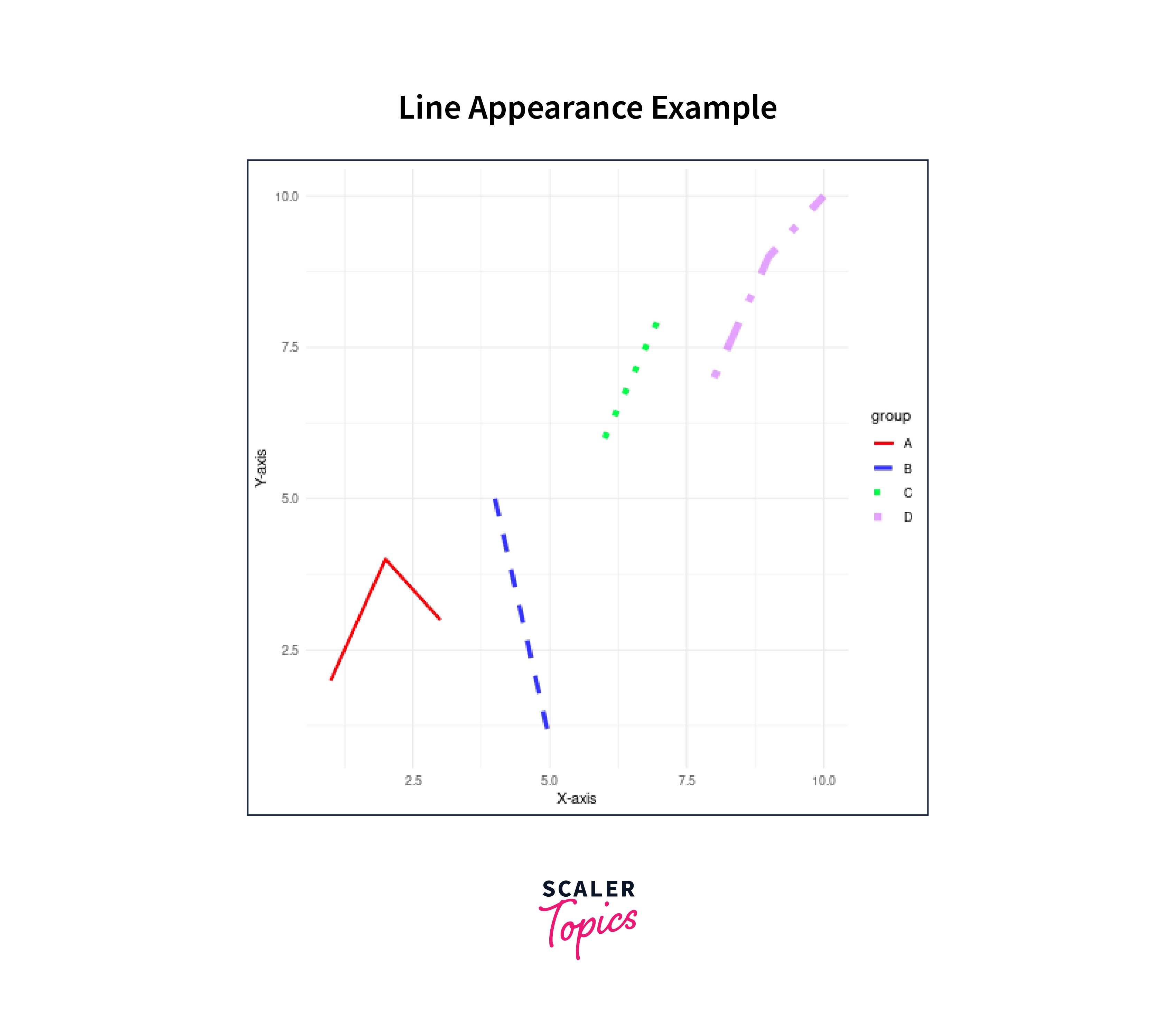
Modifying Line Appearance in ggplot2
In ggplot2, you can modify the appearance of lines in your plots by customizing various line aesthetics. Here's how you can modify line appearance in ggplot2:
The above code is explained below:
-
We load the ggplot2 library.
-
We have created a sample dataframe with three columns: x, y, and group. The group column is used to customize the line appearance based on different groups.
-
We have created a ggplot2 plot, mapping the x and y aesthetics to the x and y axes, respectively, and using the colour, linetype, size, and alpha aesthetics to customize line appearance based on the group variable.
-
We have use various scale_*_manual() functions to customize line appearance:
- scale_color_manual() sets the line colours.
- scale_linetype_manual() sets the line types.
- scale_size_manual() sets the line sizes.
- scale_alpha_manual() sets the line transparency levels.
-
We have added labels and customized the plot's appearance using the labs() and theme_minimal() functions.
This code will create a ggplot2 plot with customized line colours, types, sizes, and transparencies based on the group variable, allowing you to visually distinguish different groups in the plot. The plotted graph is shown below.
Conclusion
- Lines are essential for data visualization in R, allowing users to represent data relationships and trends effectively. Different line types are crucial for customizing the appearance of lines in plots, helping to differentiate data series, emphasize patterns, and enhance aesthetics.
- R provides various functions and packages to work with lines, including plot(), lines(), abline(), ggplot2, and lattice.
- In ggplot2, line types can be customized using the linetype aesthetic, enabling users to create visually appealing and informative plots.
- In R's base plotting system, line types can be changed using the lty parameter in functions like plot(), lines() and abline().
- Custom line types can be defined by specifying custom patterns or using text labels like "dotted" or "dotdash" in the lty argument. Properly chosen line types contribute to plot clarity and help convey data insights effectively, making them an essential tool in data exploration and presentation in R.