Linear Regression in Excel
Overview
Linear regression in Excel is a statistical technique used to model the relationship between a dependent variable and one or more independent variables. It involves fitting a straight line to the data points that best represent the linear relationship.
Excel provides the built-in function LINEST to perform linear regression analysis. By inputting the dependent and independent variables, it calculates the slope, intercept, and other statistical measures. Excel also offers tools like scatter plots and trendlines to visualize and interpret linear regression results. With Excel's capabilities, users can easily analyze and predict outcomes based on linear relationships in their data.
How to Perform linear regression in Excel?
Excel provides a powerful tool for performing linear regression analysis, which is a statistical technique used to model and understand the relationship between variables. Linear regression in Excel allows users to analyze and predict outcomes based on linear relationships within their data.
To perform linear regression in Excel, users can utilize the built-in function called LINEST. This function calculates the slope, intercept, and other statistical measures that best fit a straight line to the data points. By inputting the dependent variable and one or more independent variables, Excel generates the regression equation that represents the linear relationship.
Excel also offers various visualization tools to aid in the interpretation of linear regression results. Scatter plots are particularly useful for visually inspecting the relationship between variables. Users can plot the data points and add a trendline, which is a line that best represents the overall trend in the data.
Additionally, Excel provides statistical information such as the coefficient of determination (R-squared), which indicates the proportion of variability in the dependent variable that can be explained by the independent variable(s). This metric helps assess the strength and significance of the linear relationship.
Linear regression in Excel has numerous applications across various fields, including finance, economics, social sciences, and engineering. It enables users to analyze historical data, make predictions, and understand the impact of independent variables on the dependent variable.
By leveraging Excel's capabilities for linear regression, users can gain valuable insights, make informed decisions, and effectively model and analyze linear relationships within their data.
Linear Regression Equation
In Excel, the linear regression equation represents the relationship between a dependent variable and one or more independent variables. The equation is derived using the least squares method to minimize the sum of the squared differences between the observed data points and the predicted values on the regression line.
To obtain the linear regression equation in Excel, you can use the built-in function LINEST. This function returns an array of statistical information, including the slope, intercept, and other coefficients.
Here's a step-by-step guide to obtaining the linear regression equation in Excel:
- Organize your data: Ensure that your data is organized with the dependent variable in one column and the independent variable(s) in separate columns.
- Select an empty cell: Choose a cell where you want to display the regression equation.
- Enter the LINEST function: In the selected cell, type =LINEST(dependent_range, independent_range, constant, stats) without quotation marks. Replace "dependent_range" with the range containing your dependent variable data, independent_range with the range containing your independent variable data, and "constant" with TRUE or FALSE to include or exclude the intercept term, respectively. The "stats" argument is optional and determines which statistical information to include in the result.
- Press Ctrl + Shift + Enter: After entering the LINEST function, instead of pressing Enter alone, press Ctrl + Shift + Enter to enter the function as an array formula. Excel will display the regression coefficients as an array.
- Interpret the results: The first coefficient in the array represents the intercept, and subsequent coefficients correspond to the slopes for each independent variable. The linear regression equation can be written in the form:
- Replace "Y" with the dependent variable, "Intercept" with the intercept coefficient, Coefficient1 with the coefficient for the first independent variable, X1 with the value of the first independent variable, and so on.
By using the LINEST function in Excel, you can obtain the coefficients required to construct the linear regression equation. This equation allows you to predict the dependent variable based on the values of the independent variable(s) and provides insights into the relationship between the variables.
Linear regression has numerous applications across various domains. In finance, it can be used to model the relationship between stock prices and economic factors. In marketing, it can help analyze the impact of advertising expenditure on sales. In healthcare, it can be utilized to predict patient outcomes based on clinical variables. The versatility of linear regression makes it a valuable tool in exploratory data analysis, hypothesis testing, and predictive modelling.
Linear regression equation provides a concise representation of the relationship between a dependent variable and one or more independent variables. It serves as the foundation for estimating the coefficients that best fit the observed data and allows for making predictions and inferences. While the equation assumes a linear relationship, extensions and enhancements enable the modelling of more complex relationships. Linear regression is a powerful and widely used statistical technique with applications in various fields, offering valuable insights into data analysis and prediction.
Methods for Using Linear Regression in Excel
Scatter Chart with a Trendline
When using linear regression in Excel, one common method is to create a scatter chart with a trendline. This approach allows you to visualize the relationship between the variables and assess the goodness of fit of the regression line.
Here's a detailed guide on using a scatter chart with a trendline in Excel for linear regression:
- Organize your data: Ensure that your data is organized with the dependent variable in one column and the independent variable(s) in separate columns.
- Select the data: Highlight the data range, including both the dependent and independent variables.
- Create a scatter chart: Go to the "Insert" tab in Excel and select "Scatter" under the "Charts" group. Choose the scatter chart type that best suits your data. Excel will generate a scatter plot based on your selected date range.
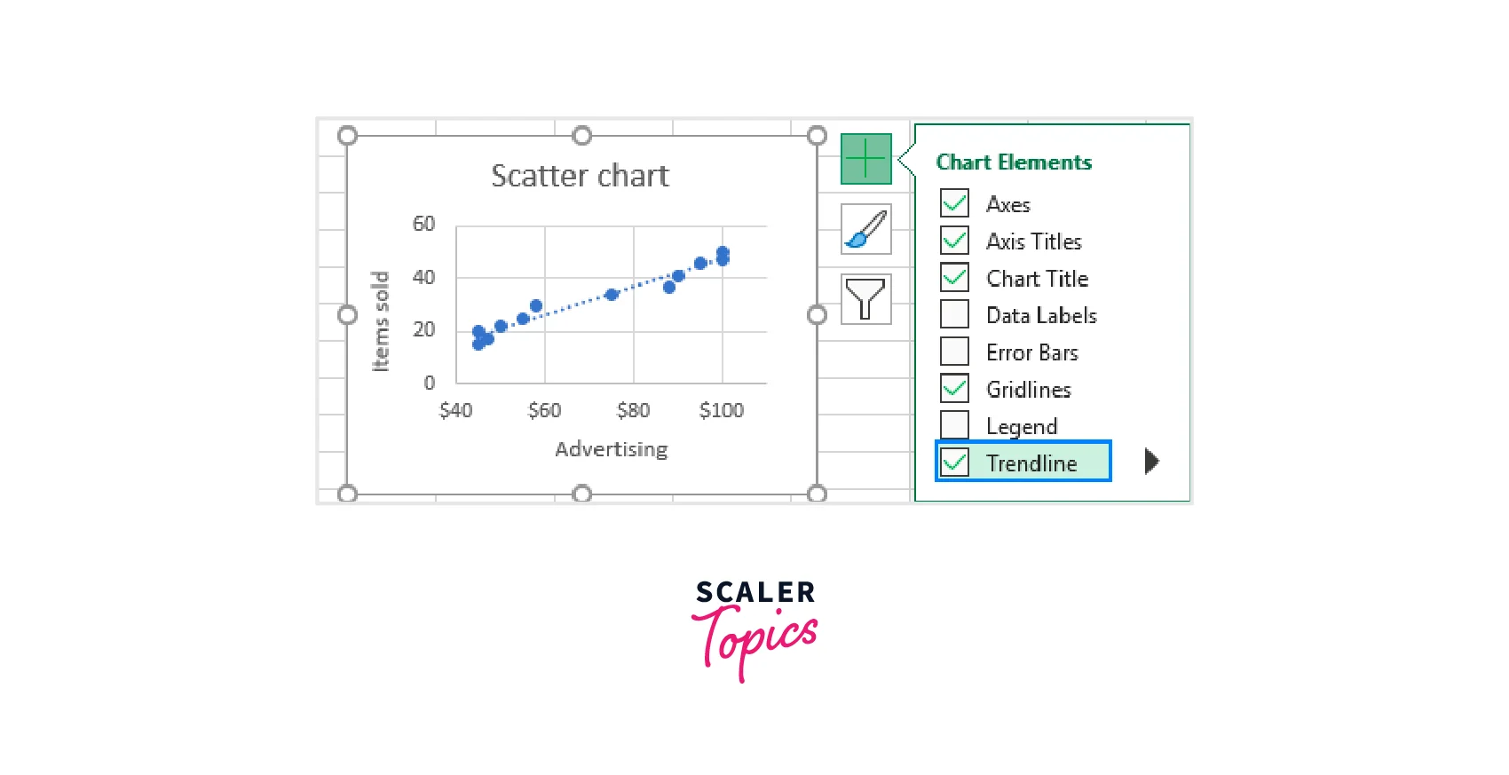
- Add a trendline: Right-click on any data point in the scatter chart and choose "Add Trendline" from the context menu. A trendline will be added to the chart.
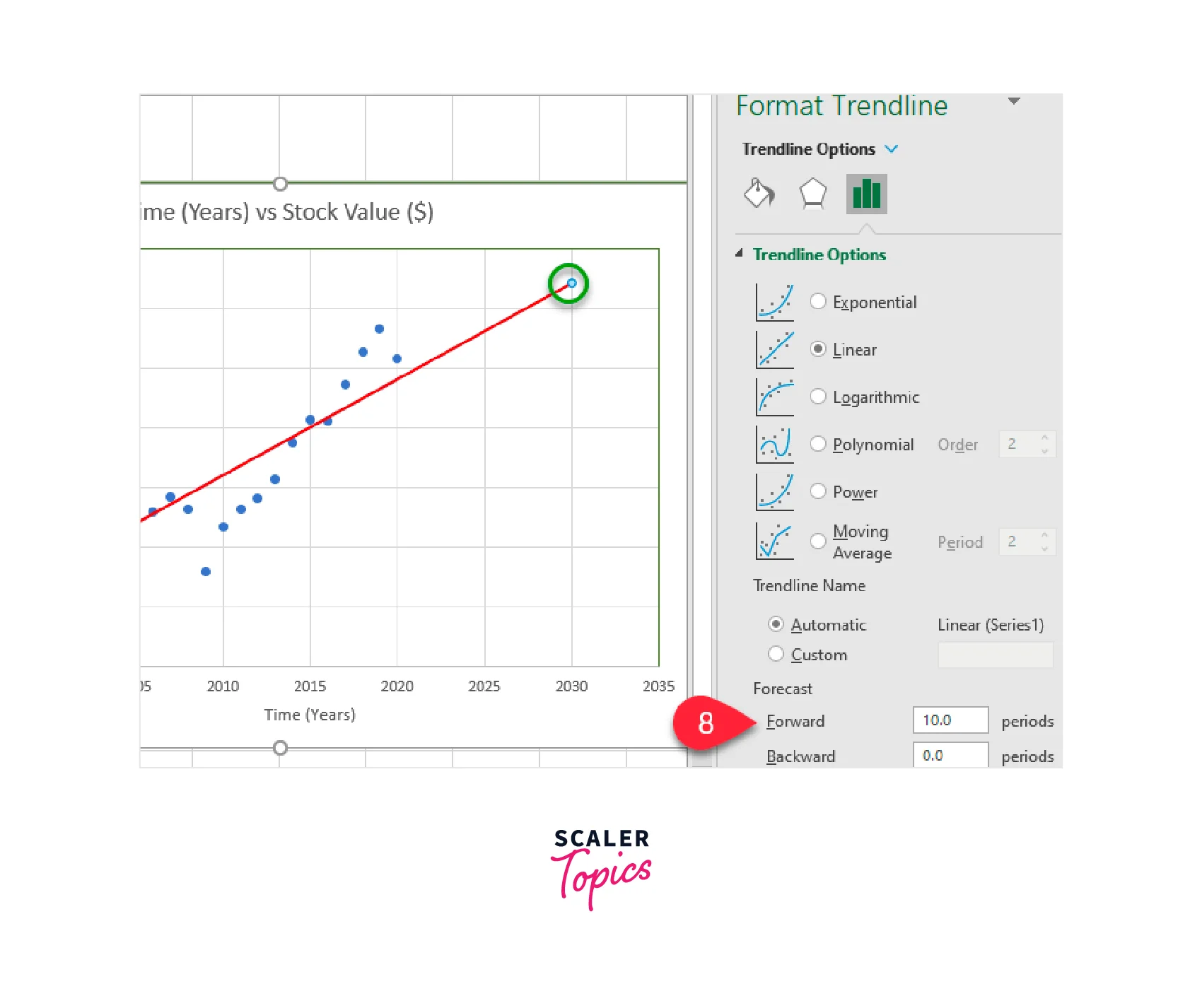
- Customize the trendline: Right-click on the trendline and select "Format Trendline" to customize its appearance. You can choose the type of trendline (linear, exponential, logarithmic, etc.), display the equation on the chart, and format the line style, colour, and thickness.
- Display the equation and R-squared value: To show the equation of the trendline and the coefficient of determination (R-squared) on the chart, right-click on the trendline, select "Add Trendline Label," and choose the desired options.
Follow the above steps on how to use a scatter chart with a trendline in Excel for linear regression.
Interpreting the scatter chart with a trendline:
- The trendline represents the linear regression line that best fits the data points.
- The equation of the trendline provides the mathematical representation of the linear relationship between the variables.
- The R-squared value indicates the proportion of variability in the dependent variable that can be explained by the independent variable(s). A higher R-squared value indicates a better fit.
- By using a scatter chart with a trendline in Excel, you can visually assess the relationship between variables and observe the direction and strength of the linear trend. This method allows for a quick and intuitive understanding of the linear regression analysis.
The intercept of the trendline represents the value of the dependent variable when the independent variable is zero. It provides a starting point or baseline for the relationship between the variables. It's important to note that the interpretation of the intercept depends on the context of the data. For example, in a study analyzing the relationship between age and income, the intercept could represent the estimated income for individuals at birth.
The R-squared value, or coefficient of determination, is another important measure to consider when interpreting the scatter chart with a trendline. It represents the proportion of the variance in the dependent variable that is explained by the independent variable(s). A higher R-squared value indicates a better fit of the trendline to the data, implying that the independent variable(s) account for a larger proportion of the variation in the dependent variable.
However, it's crucial to exercise caution when interpreting the scatter chart with a trendline. While the trendline can provide valuable insights, it does not imply causation. Other factors or variables not included in the analysis could be influencing the relationship. Additionally, the trendline assumes a linear relationship, and if the data exhibits a nonlinear pattern, alternative regression methods may be more appropriate.
Interpreting a scatter chart with a trendline in Excel allows us to analyze the relationship between variables. By examining the slope, intercept, and R-squared value, we can gain insights into the direction, strength, and proportion of variation explained in the relationship. However, it is important to remember the limitations and potential confounding factors when interpreting the results and to consider alternative regression approaches when necessary.
Follow the above steps for Interpreting the scatter chart with a trendline.
Analysis ToolPak Add-In Method
The Analysis ToolPak add-in is a powerful tool in Excel that provides additional data analysis capabilities, including linear regression. Here's a detailed explanation of using the Analysis ToolPak add-in method for linear regression in Excel:
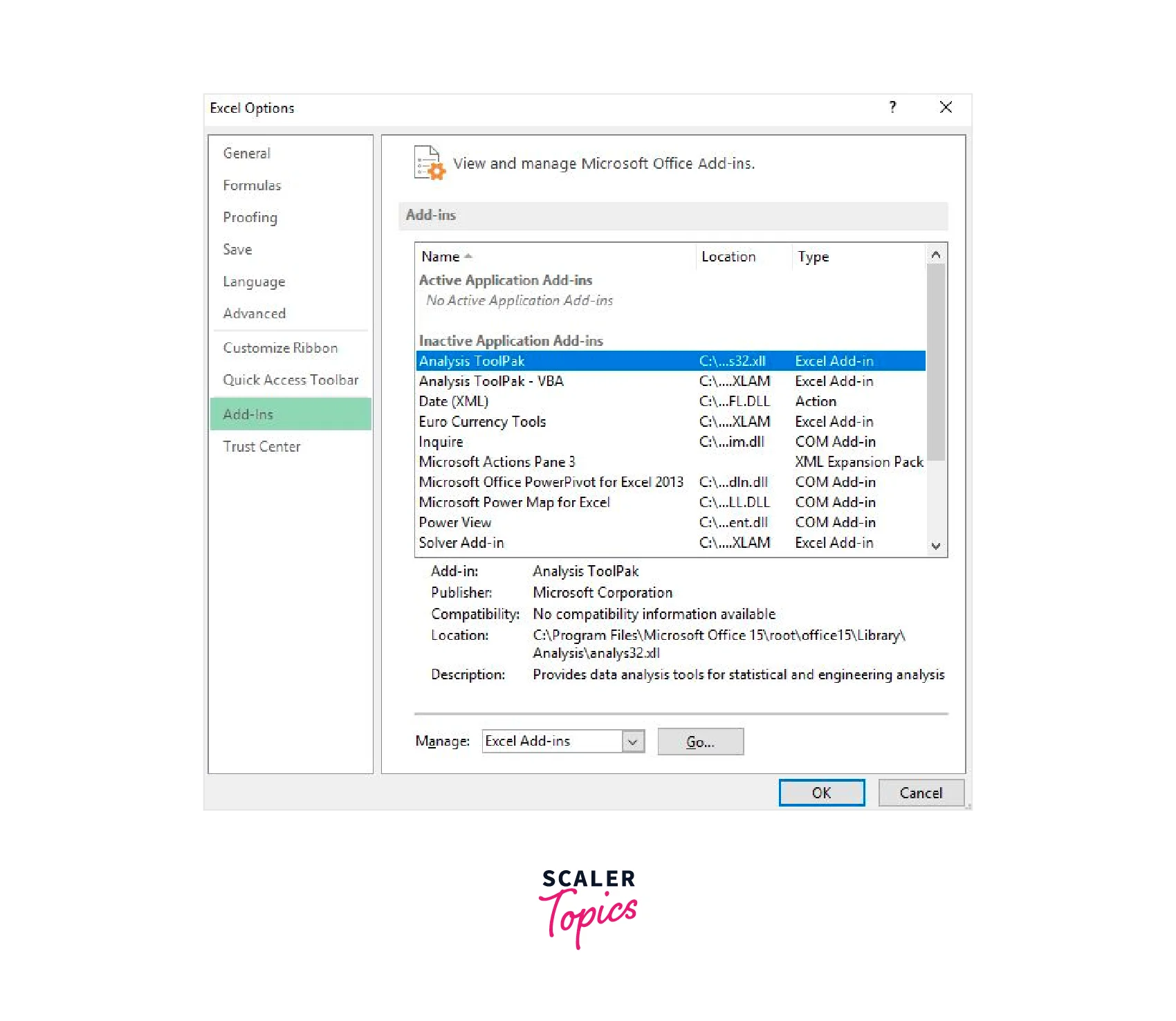
- Enable the Analysis ToolPak: If you haven't enabled the Analysis ToolPak add-in in Excel, you'll need to do so before using its linear regression feature. Go to the "File" tab, click on "Options," then select "Add-Ins." In the Add-Ins window, select "Analysis ToolPak" and click "Go." Check the box next to "Analysis ToolPak" and click "OK" to enable the add-in.
- Organize your data: Arrange your data in Excel, with the dependent variable in one column and the independent variable(s) in separate columns.
- Open the Data Analysis dialog box: Go to the "Data" tab in Excel and click on "Data Analysis" in the Analysis group. If you don't see "Data Analysis," it means the Analysis ToolPak add-in is not enabled.
- Select "Regression": In the Data Analysis dialogue box, scroll down and choose "Regression" from the list of analysis tools.
- Enter the regression inputs: In the Regression dialogue box, enter the range for your dependent variable data in the "Input Y Range" box. Then, enter the ranges for your independent variable(s) data in the "Input X Range" box. Make sure to check the "Labels" box if your data contains headers.
- Choose output options: Select the desired output options in the Regression dialogue box. You can choose to include the regression statistics, confidence level, residuals, and more. You can also specify where you want the regression output to be displayed, either in a new worksheet or on the same worksheet.
- Click "OK": After configuring the options, click "OK" to run the regression analysis. Excel will perform the linear regression and provide the results based on your inputs.
- Interpret the results: The output will include the regression coefficients (including the intercept), standard errors, t-values, p-values, and more. These statistics help assess the significance and strength of the linear relationship between the variables. You can use these results to construct the linear regression equation and make predictions.
The Analysis ToolPak method in Excel provides a straightforward way to perform linear regression analysis. By following these steps, you can utilize the capabilities of the Analysis ToolPak add-in to analyze the relationship between variables and gain insights from your data.
Examples
Example 1: Sales and Advertising Expenses When building a linear regression model to analyze the relationship between sales and advertising expenses, several key points should be considered:
- Data Collection: Gather data on sales and advertising expenses over a specific time period. Ensure that the data is accurate, complete, and representative of the target population or market.
- Define Variables: Clearly define the dependent variable (sales) and independent variable (advertising expenses). Sales will be the variable we want to predict or explain, while advertising expenses will be the predictor variable.
- Scatter Plot: Create a scatter plot to visualize the relationship between sales and advertising expenses. Plot the advertising expenses on the x-axis and sales on the y-axis. This plot will help identify any patterns or trends in the data.
- Linearity Assumption: Check if the scatter plot exhibits a linear relationship between sales and advertising expenses. If the plot shows a roughly linear pattern, a linear regression model may be appropriate. If the relationship appears nonlinear, consider using alternative regression techniques or transforming the variables.
- Correlation: Calculate the correlation coefficient between sales and advertising expenses. This will measure the strength and direction of the linear relationship. A positive correlation coefficient indicates that as advertising expenses increase, sales tend to increase as well.
- Model Building: Develop the linear regression model by fitting a line to the scatter plot. The equation of the line will be in the form of , where y is sales, x is advertising expenses, b0 is the y-intercept, and b1 is the slope coefficient.
- Slope Interpretation: Interpret the slope coefficient (b1) of the linear regression equation. A positive coefficient suggests that for every unit increase in advertising expenses, sales are expected to increase by the value of the coefficient. A negative coefficient indicates an inverse relationship.
- Intercept Interpretation: Interpret the y-intercept (b0) of the linear regression equation. The y-intercept represents the estimated sales value when advertising expenses are zero. However, it is important to note that this may not always have practical meaning, as it assumes no advertising expenses.
- Coefficient of Determination (R-squared): Evaluate the goodness of fit of the linear regression model by examining the R-squared value. R-squared represents the proportion of the variance in sales that is explained by advertising expenses. A higher R-squared indicates a better fit, suggesting that advertising expenses explain a larger portion of the variation in sales.
- Residual Analysis: Analyze the residuals (the differences between the observed sales values and the predicted values from the regression model). Check for patterns or trends in the residuals to ensure that the assumptions of linearity, constant variance, and independence of errors are met.
- Model Evaluation: Assess the overall model performance and statistical significance of the coefficients. Conduct hypothesis tests on the coefficients to determine if they are significantly different from zero. Additionally, consider using cross-validation techniques to assess the model's predictive accuracy on unseen data.
- Causal Interpretation: Be cautious when interpreting the results as causal relationships. Although the model shows an association between sales and advertising expenses, other variables or factors may influence sales that are not accounted for in the model.
Building a linear regression model to analyze the relationship between sales and advertising expenses involves data collection, visualization, model development, interpretation of coefficients, evaluation of model fit, and assessment of the assumptions. By following these steps, one can gain insights into how advertising expenses impact sales and make informed decisions regarding advertising strategies.
Example 2: Exam Scores and Study Hours Exam Scores and Study Hours are common variables used in linear regression model building to understand the relationship between the amount of time spent studying and the resulting exam performance. By analyzing these variables, we can gain insights into the effectiveness of studying and predict the potential impact of increasing study hours on exam scores. Here are some key points to consider when building a linear regression model with Exam Scores and Study Hours:
- Variable Selection: Exam Scores should be the dependent variable (y-axis) as it is the outcome we are trying to predict. Study Hours should be the independent variable (x-axis) as it is the variable we believe influences the exam scores.
- Data Collection: Collect data on Exam Scores and Study Hours for a sample of students. Ensure that the data is representative and includes a range of study hours and exam scores. The larger the sample size, the more reliable the results.
- Scatter Plot: Create a scatter plot with Study Hours on the x-axis and Exam Scores on the y-axis. Each data point represents an individual student's study hours and exam score. The scatter plot helps visualize the relationship between the variables.
- Trendline: Add a trendline to the scatter plot. The trendline represents the best-fit line that minimizes the distance between the data points and the line. It shows the general pattern or trend in the data.
- Interpret Slope: The slope of the trendline indicates the change in exam scores associated with each additional unit of study hours. A positive slope suggests that as study hours increase, exam scores also tend to increase. A negative slope indicates an inverse relationship.
- Interpret Intercept: The intercept of the trendline represents the expected exam score when study hours are zero. It indicates the baseline level of performance without any study time. In most cases, a non-zero intercept is more meaningful as it is rare for students to score zero without studying.
- Model Fit: Assess the goodness of fit of the model by examining the R-squared value. R-squared represents the proportion of variance in exam scores explained by study hours. A higher R-squared indicates a better fit of the model to the data.
- Statistical Significance: Conduct hypothesis testing to determine if the relationship between study hours and exam scores is statistically significant. This involves analyzing the p-value associated with the slope coefficient. A low p-value (typically below 0.05) suggests a significant relationship.
- Residual Analysis: Examine the residuals, which are the differences between the observed exam scores and the predicted scores from the model. Residual analysis helps evaluate the accuracy of the model and identify any patterns or outliers in the data.
- Prediction: Once the model is validated, it can be used to predict exam scores based on study hours. By plugging the desired study hours into the equation, the model can estimate the expected exam score.
- Limitations: Keep in mind that linear regression assumes a linear relationship between study hours and exam scores. Nonlinear relationships or other factors that influence exam performance may not be captured by this model. Consider exploring other regression techniques or incorporating additional variables if necessary.
Linear regression modelling with Exam Scores and Study Hours provides insights into the relationship between study time and exam performance. By analyzing the scatter plot, trendline, slope, intercept, model fit, and residuals, we can conclude the impact of study hours on exam scores and make predictions based on the model. However, it is important to be aware of the limitations of linear regression and consider other factors that may affect exam performance.
Conclusion
- Linear regression in Excel is a statistical technique used to model and analyze the relationship between variables, particularly the relationship between a dependent variable and one or more independent variables.
- Excel provides various methods to perform linear regression analysis, including the Analysis ToolPak add-in and the LINEST function.
- The Analysis ToolPak add-in offers a user-friendly interface to perform linear regression. It allows you to specify the input ranges, choose output options, and interpret the regression results
- The LINEST function is a built-in function in Excel that calculates the regression coefficients, including the intercept and slopes, based on the least squares method.
- The regression equation obtained from linear regression analysis in Excel allows you to predict the values of the dependent variable based on the values of the independent variable(s).
- Excel provides statistical measures, such as R-squared, standard error, and p-values, to assess the strength, significance, and goodness of fit of the linear regression model.
- Linear regression in Excel has various applications, including analyzing sales and advertising expenses, exam scores and study hours, and other scenarios where understanding and predicting relationships between variables are important.
- By using linear regression in Excel, you can gain insights into the relationships between variables, make predictions, and make informed decisions based on the analysis of your data.