ListTile in Flutter
Overview
The ListTile widget in Flutter provides a convenient and flexible way to display a structured list of items, such as contacts, messages, or settings, in a visually appealing and interactive manner. It offers a compact and customizable layout that includes leading and trailing widgets, along with a title and subtitle. ListTile allows developers to easily incorporate common user interface elements, such as icons, avatars, and checkboxes, within each list item. It also supports features like onTap callbacks for handling user interactions and trailing widgets for displaying additional information or actions. With its versatility and simplicity, ListTile is a powerful tool for creating well-designed and interactive lists in Flutter applications.
Introduction
The ListTile widget in Flutter is a compact and customizable way to display structured lists of items. It provides a streamlined layout with a title, subtitle, and optional leading and trailing widgets. ListTile supports various user interface elements like icons, avatars, and checkboxes. It offers onTap callbacks for handling user interactions and allows for the inclusion of additional information or actions with trailing widgets. With its simplicity and flexibility, ListTile is an essential component for creating efficient and visually appealing lists in Flutter applications.
What is a ListTile?
A ListTile in Flutter is a user interface component used to display a single item in a list or a list-like layout. It is a compact and customizable widget that typically consists of a leading widget (such as an icon or an avatar), a title, an optional subtitle, and a trailing widget (such as an icon or a checkbox). ListTile provides a consistent and efficient way to present information in a list format, making it easy to create organized and visually appealing lists in Flutter applications. It also supports various interactive features like tapping and long-pressing, allowing for seamless user interactions.
Basic Usage
The basic usage of ListTile in Flutter involves creating instances of ListTile and providing the necessary parameters such as the leading widget, title, subtitle, and trailing widget. The leading widget is typically used to display an icon or an avatar to represent the item. The title is used to display the main content of the item, and the subtitle (optional) can be used to provide additional information. The trailing widget is used to display an icon, a checkbox, or any other interactive element associated with the item. ListTile also supports various callbacks and properties to handle user interactions, such as onTap for handling taps, onLongPress for handling long-presses, and selected for highlighting the item when selected. By customizing these parameters and utilizing the available properties and callbacks, developers can create versatile and interactive lists using ListTile in Flutter.
- To use ListTile in Flutter, you first need to import the material.dart library, which contains the implementation of ListTile.
- Once imported, you can include ListTile as a child widget within a ListView or any other widget that supports a list-like layout.
- ListTile allows you to customize its appearance by providing various properties such as leading (for an icon or avatar), title (the main content), subtitle (optional secondary content), and trailing (for additional widgets like icons or checkboxes).
- You can also specify actions that trigger specific behaviors when the user interacts with the ListTile, such as onTap, onLongPress, or onCheckboxChanged.
- ListTile provides a consistent and visually appealing way to display information in a list format, making it easier to create organized and interactive lists in Flutter applications.
Advanced Features and Customization
ListTile in Flutter offers several advanced features and customization options to enhance its functionality and appearance. Some of these features include:
- Customizable Content:
ListTile allows you to customize the content within the leading, title, subtitle, and trailing sections. You can use different widgets, such as icons, avatars, images, text, or any combination of widgets, to display the desired information. - Tile Themes:
ListTile supports theming through the Theme class, enabling you to change the appearance of tiles globally or individually. You can customize properties like the background color, text color, icon color, and more. - Different Tile Variants:
Flutter provides different variants of ListTile, such as CheckboxListTile, RadioListTile, and SwitchListTile. These variants allow you to include interactive elements like checkboxes, radio buttons, and switches in the list items. - Dividers and Padding:
ListTile supports the inclusion of dividers between items to visually separate them. You can also adjust the padding around the ListTile to control the spacing and layout of the items. - Gesture Handling:
ListTile includes various gesture callbacks, such as onTap, onLongPress, and onDoubleTap, to handle user interactions. These callbacks allow you to define custom behavior when the user interacts with the tile. - Accessibility Support:
ListTile has built-in accessibility features that ensure compatibility with screen readers and support for accessibility settings. This allows users with disabilities to interact with the list items effectively.
By leveraging these advanced features and customization options, you can create visually appealing and interactive lists using ListTile in Flutter while providing a great user experience.
Working with Lists and Multiple ListTiles
Working with lists and multiple ListTiles in Flutter involves creating and managing a list of data and displaying it using multiple ListTile widgets. Here's a step-by-step overview of the process:
- Data Preparation:
Start by preparing the data that you want to display in the list. This could be a list of objects, such as user profiles, products, or any other data source. - ListView Widget:
Wrap your ListTile widgets inside a ListView widget. The ListView widget allows you to scroll through the list when it exceeds the available space on the screen. - List Building:
Use the ListView.builder constructor to dynamically build the list of ListTiles based on your data. The builder takes an itemCount parameter that specifies the number of items in your data list. Inside the itemBuilder callback, you can create a ListTile for each item in the data list, accessing the data using the index parameter. - ListTile Customization:
Customize each ListTile widget as per your requirements. You can set the leading, title, subtitle, and trailing properties of the ListTile to display the relevant data for each item in the list. - Handling List Interactions:
If you want to handle interactions, such as onTap or onLongPress, on the ListTiles, you can provide respective callbacks to define the desired behavior. For example, you can navigate to a detailed screen when a ListTile is tapped. - Adding Separators:
If you want to add dividers between the ListTiles, you can use the Divider widget or customize the ListTile's content padding to visually separate the items.
By following these steps, you can effectively work with lists and display multiple ListTiles in Flutter. This approach allows you to efficiently present data in a scrollable and interactive manner, providing a seamless user experience.
Styling and Theming
To style and theme ListTiles in Flutter, you can leverage the power of the Theme class and various properties provided by ListTile. Here are some ways to achieve styling and theming:
- Using Theme:
Wrap your ListTile with a Theme widget and customize the desired properties. For example, you can set the background color, text color, icon color, and more using the theme data provided by the Theme widget. - TextStyle:
You can apply a specific TextStyle to the title and subtitle of the ListTile using the style property. This allows you to customize the font, color, size, and other text-related properties. - IconTheme:
To style the icons within the ListTile, you can use the IconTheme widget. It allows you to set the size, color, and opacity of the icons. - Custom Content:
ListTile supports custom content within the leading and trailing sections. You can use different widgets, such as Icon, CircleAvatar, Image, or any other custom widget, to style and customize the content based on your requirements. - Dividers:
ListTile provides a divider property that allows you to add a separator between items. You can customize the divider's color, thickness, and indent using the DividerTheme widget. - InkWell and InkWellTheme:
If you want to change the ink splash effect when the ListTile is tapped, you can wrap it with an InkWell widget. InkWell provides customization options like splash color, splash radius, and more. You can also use InkWellTheme to apply a consistent ink splash effect across multiple ListTiles.
Remember that you can combine these techniques to achieve the desired styling and theming for your ListTiles. Experiment with different properties, widgets, and themes to create visually appealing and cohesive designs that match your app's overall style.
Example Application
Here's an example application that demonstrates the implementation of ListTile in Flutter:
Output:
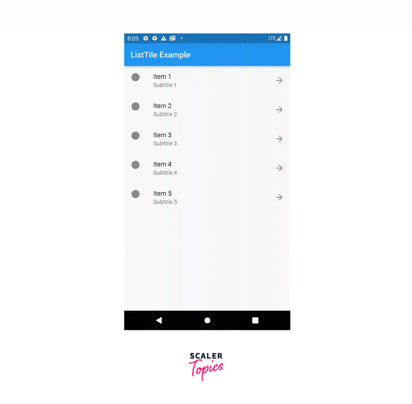
In this example, we create a simple Flutter application that displays a list of items using the ListTile widget. The MyHomePage widget is the main screen that contains a ListView.builder. Each item in the list is represented by a ListTile, which consists of a leading icon, a title, a subtitle, and a trailing icon. When a ListTile is tapped, the color of the selected item changes to blue.
You can customize the appearance and behavior of the ListTile by modifying the properties such as leading, title, subtitle, trailing, onTap, and more. Feel free to experiment and enhance this example based on your specific requirements.
Best Practices and Tips
When using ListTile in Flutter, it's helpful to keep the following best practices and tips in mind:
- Use ListTile sparingly:
ListTile is great for displaying simple and compact information in lists, but it might not be the best choice for complex layouts or custom designs. Consider other widgets like Card or custom list item layouts for more flexibility. - Keep the content concise:
ListTile is designed to display concise information, such as a title, subtitle, leading or trailing icons. Avoid overcrowding the ListTile with too much content as it can make the UI cluttered and less readable. - Utilize the leading and trailing widgets:
The leading widget is typically used for icons or avatars to provide visual context. The trailing widget is commonly used for icons representing actions or additional information. Use them judiciously to enhance the usability and visual appeal of your list. - Customize the appearance:
ListTile provides several properties for customization, such as content padding, text styles, and colors. Use these properties to align the list items with your app's overall design and branding. You can also leverage themes to apply consistent styling across multiple ListTiles. - Handle onTap and onLongPress events:
ListTile allows you to define onTap and onLongPress callbacks, which are triggered when the item is tapped or long-pressed, respectively. Utilize these callbacks to implement desired actions, such as navigation, showing a dialog, or updating data. - Consider accessibility:
Ensure that the content of ListTile is accessible to all users. Use appropriate labels for icons, subtitles, and titles for screen readers. Also, ensure proper contrast and readability of text and icons for users with visual impairments. - Optimize performance:
If you have a large number of ListTiles, consider using ListView.builder with a limited number of items to improve performance. This way, only the visible items are built and rendered, reducing unnecessary overhead. - Test and iterate:
As with any UI component, thoroughly test your implementation on different devices and screen sizes. Ensure that the ListTile layout and interaction behave as expected across various scenarios.
By following these best practices and tips, you can effectively use ListTile in your Flutter applications and create clean, user-friendly lists with ease.
Conclusion
- ListTile widget in Flutter provides a convenient and flexible way to display structured lists of items. It offers a compact and customizable layout with options for leading and trailing widgets, a title, and a subtitle.
- ListTile allows developers to easily incorporate common user interface elements like icons, avatars, and checkboxes within each list item.
- It supports features such as onTap callbacks for handling user interactions and trailing widgets for displaying additional information or actions. With its versatility and simplicity, ListTile is a powerful tool for creating well-designed and interactive lists in Flutter applications.
- By following best practices, customizing styles, and leveraging its advanced features, you can enhance the functionality and visual appeal of your lists in Flutter.