How to Make Loaders in Flutter?
Overview
Loaders are visual components in Flutter that represent ongoing processes or content loading. The built-in loaders CircularProgressIndicator and LinearProgressIndicator display circular and horizontal progress animations, respectively. Developers may personalize these loaders by changing the color and size. Additionally, leveraging Flutter’s animation capabilities, bespoke loaders may be created, providing distinctive and interesting loading animations that complement app aesthetics. Loaders improve the user experience by displaying visual feedback and guaranteeing a responsive and smooth interaction throughout time-consuming activities or data requests. The following article will dive more into the idea of loaders in Flutter.
Introduction
A loader in Flutter is a user interface element in Flutter that indicates that a task or material is being loaded. It is often referred to as a spinner or a progress indicator. A loader in Flutter aims to offer users visual feedback, reassuring them that something is occurring and preventing the UI from becoming unresponsive during activities that may take some time to complete, such as network queries or data processing. Flutter has loaders in the form of the CircularProgressIndicator widget, which by default displays a spinning circular motion. Depending on the app’s design and requirements, it may be customized with different colors, sizes, and animations.
In Flutter, here's a simple example of how to utilize the CircularProgressIndicator as a loader:

A basic Flutter app shows an AppBar and centers a CircularProgressIndicator in the body in this example. When you launch the program, the circular loader will become active and show that a process is in progress. Loaders are critical in providing a seamless and engaging user experience, especially when dealing with time-consuming activities. They keep consumers informed and patient while background chores are handled by the app, resulting in a more pleasant encounter.
Implementing Built-in Loaders
Flutter has various built-in loaders and progress indicators for displaying loading or progress data to users. The Flutter framework has built-in loaders that give a uniform and clear approach to identifying ongoing activities. Flutter's built-in loaders are classified as follows:
CircularProgressIndicator
In Flutter, this is the most prevalent form of loader in Flutter. It shows a circular spinning motion that signals progress or loading. It is often utilized when the length of a job is unclear or when asynchronous actions are awaiting completion. The CircularProgressIndicator widget in Flutter is a built-in loader or progress indicator that shows a spinning circular motion to indicate ongoing operations or loading. It is frequently used to indicate that an app is performing a job, such as making network queries or loading data. The CircularProgressIndicator is simple to add to your app and can be customized to meet your design needs. Color, size, stroke width, and other parameters are available to customize its look. In Flutter, here’s an example of how to utilize the CircularProgressIndicator:
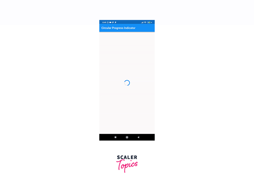
The CircularProgressIndicator is positioned in the center of the screen in this example. We altered the backdrop color, value color (the color of the animation part), and stroke width. By default, the CircularProgressIndicator rotates indefinitely. The value property may be used to display progress depending on a given value (for example, the % of a job finished). Based on the value attribute, a CircularProgressIndicator will be filled up to 70%.
The CircularProgressIndicator is a handy addition to any Flutter application that provides visual feedback to users throughout ongoing activities.
LinearProgressIndicator
This loader in Flutter displays a horizontal bar that grows from one end to the other, reflecting the progress of a job at a predetermined time. It is beneficial when you have an estimate of how long it will take to accomplish a task. The LinearProgressIndicator widget in Flutter is a pre-built loader or progress indicator that shows a horizontal bar representing the progress of a job with a defined duration. It is widely used to display the status of actions such as file downloads, uploads, or any other activity with a predetermined completion percentage. The LinearProgressIndicator is simple to use and may be customized to meet the design needs of your app. Its color, backdrop color, and height may all be changed. In Flutter, here’s an example of how to utilize the LinearProgressIndicator:
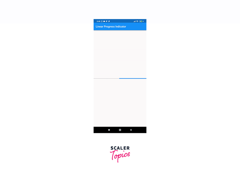
The LinearProgressIndicator is positioned in the center of the screen in this example. We changed the backdrop color and the value color (the color of the progress bar) to make it our own. The LinearProgressIndicator, like the CircularProgressIndicator, provides a value property that may be used to display particular progress depending on a number between 0.0 and 1.0. Based on the value attribute, a LinearProgressIndicator will be filled up to 70%.
The LinearProgressIndicator is a handy widget for displaying task progress and informing users about current activities in your Flutter app. It gives visual feedback, making the software more user-friendly and overall increasing the user experience.
RefreshIndicator
The RefreshIndicator widget in Flutter is used to provide the pull-to-refresh capability, which is prevalent in mobile apps and allows users to refresh the content of a scrollable display by pushing it down. To indicate that the material is being refreshed, the RefreshIndicator has a built-in loader or progress indicator. Here's an example of how to utilize Flutter's RefreshIndicator:
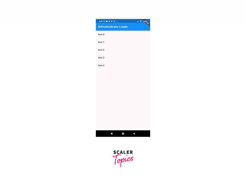
The RefreshIndicator is used as the Scaffold's body in this example. The onRefresh callback is required by the RefreshIndicator, which is invoked when the user pushes down the content to initiate a refresh. In this scenario, we use Future.delayed to mimic a network request and call _handleRefresh. This callback is often used to retrieve new data from a server or to do other asynchronous tasks. The RefreshIndicator's child is a ListView.builder, but it may be any scrollable widget like a ListView, GridView, or CustomScrollView.When the user drags down the content, the refresh loader appears, indicating that it is being updated. When the onRefresh callback completes, the loader will immediately vanish.
The RefreshIndicator is an excellent method to include the pull-to-refresh functionality into your app and give users a simple and easy way to update content. It improves the user experience by maintaining current data and delivering real-time feedback throughout refresh processes.
Creating Custom Loaders
Creating custom loader in Flutter involves utilizing the framework's animation and drawing features to create unique and interesting loading animations. Here's a step-by-step tutorial for making your loader:
-
Create a StatefulWidget:
Begin by creating a new StatefulWidget that will hold the loader animation's state. This will allow you to control and manage the animation's lifespan.
-
Add an AnimationController:
To control the animation, add an AnimationController to the _CustomLoaderState class. To ensure that the animation is related to the widget's lifetime, use vsync: this.
-
Generate the Custom Loader:
Within the build method, use the _animationController to generate custom animations. You may utilize built-in Flutter animation widgets like TweenAnimationBuilder and AnimatedBuilder, or you can use CustomPainter to build bespoke animations.
-
Using the Custom Loader:
To utilize your custom loader on any screen, simply drag the CustomLoader widget into the screen. You may put it anywhere you want the loader to appear.
In Flutter, you've now generated a custom loader. By taking this approach and experimenting with various animation approaches, you can create loaders that complement your app's style and branding. Custom loaders improve the user experience by displaying pleasant and engaging loading animations while doing lengthy or asynchronous activities.
We may also leverage pre-existing custom loaders created by other developers in the Flutter community. These loaders are available in the official Flutter package repository. The following are some of the loaders:
- flutter_easyloading: ^3.0.5
- getwidget: ^3.1.1
- flutter_spinkit: ^5.2.0
- liquid_progress_indicator: ^0.4.0
- skeleton_loader: ^2.0.0+4
All of these packages may be used to customize Flutter apps without any problems.
Example App
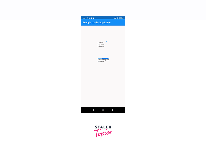
Let us look at an example application which consists of three loaders discussed above.
Output: Our Application will look like this.
Conclusion
- A loader is a user interface element in Flutter that indicates the loading of a task or material.
- It is often referred to as a spinner or progress indicator, providing visual feedback to users to prevent the UI from becoming unresponsive during activities that may take some time to complete.
- These loaders can be customized with different colors, sizes, and animations to meet the design needs of the app.
- The CircularProgressIndicator is the most prevalent form of the loader in Flutter, showing a circular spinning motion that signals progress or loading. It is often used when the length of a job is unclear or when asynchronous actions are awaiting completion.
- The LinearProgressIndicator is a pre-built loader or progress indicator that displays a horizontal bar representing the progress of a job with a predetermined duration. It is useful for displaying task progress and informing users about current activities in the Flutter app.
- The RefreshIndicator is an excellent method to include pull-to-refresh functionality into the app, providing users with a simple and easy way to update content.