Material UI Button in React
Overview
In the world of web development, creating attractive and user-friendly user interfaces is of paramount importance. One essential element in achieving this goal is using UI components that are not only visually appealing but also easy to work with. One such component is the mui button in React. In this blog, we'll delve into the mui button component, exploring its features, customization options, and how to integrate it into your React application.
What is Material UI?
Material UI is an open-source user interface (UI) framework for building web applications using the React JavaScript library. It provides a set of pre-designed UI components, styles, and design guidelines based on Google's Material Design principles. Material Design is a design language developed by Google, known for its clean, modern, and visually appealing aesthetics.
Getting Started with the Material UI Button Component
The mui button component is a fundamental element of the Material UI framework, used to create interactive buttons in your React applications. To get started with the mui button component, you need to follow these steps:
-
Install Material UI: Before you can use Material UI components, including the Button, you need to install Material UI and its associated dependencies. You can do this using npm or yarn. Here's an example using npm :
This command installs the Material UI library along with icons, which are often used in conjunction with buttons.
-
Import the Button Component: Once you've installed Material UI, you can import the Button component into your React project. In your React component file, you would add an import statement like this :
-
Use the Button Component: After importing the Button component, you can start using it in your JSX code. For example, to create a basic button, you can write:
This code will render a mui button with the label "Click Me."
Now that you have successfully integrated the Material UI Button component into your React project, you can proceed to customize its appearance and behaviour.
Material UI Button Colors
Material UI Buttons come with a variety of colour options that you can apply to match your design or convey different meanings for your buttons.
The available colour options include:
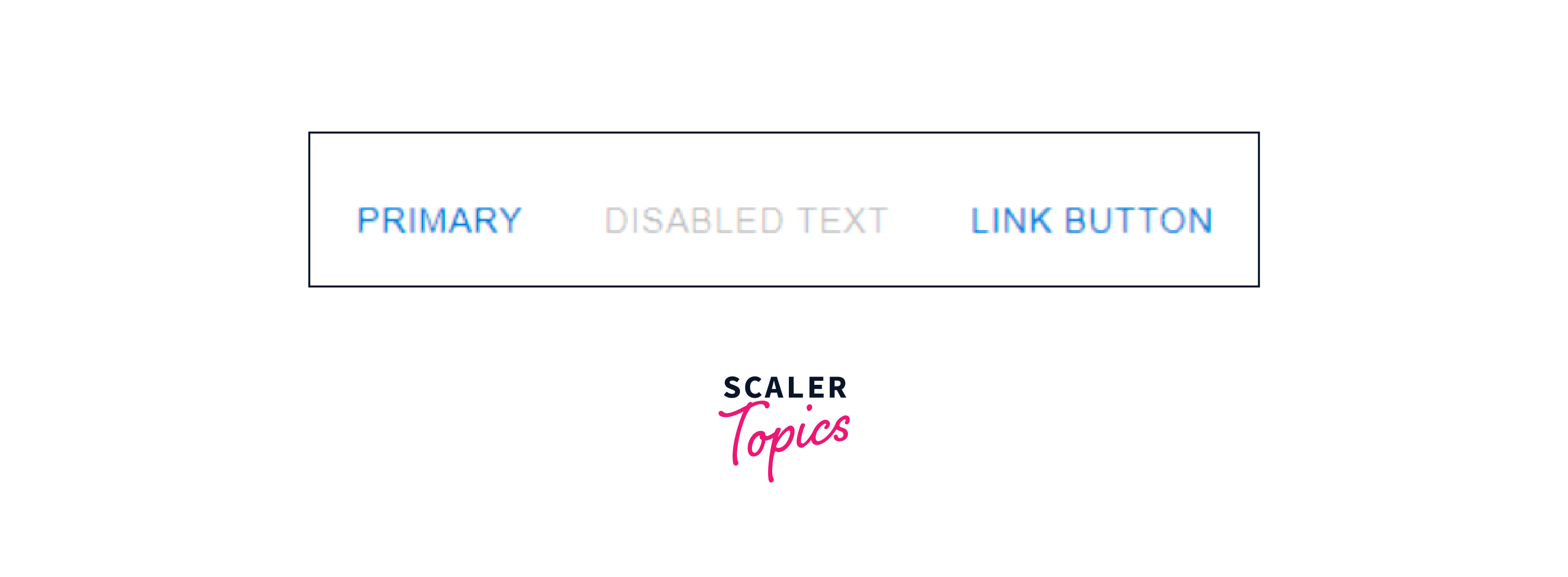
- Primary: This is typically used for the most important or primary action in your application.
- Secondary: Secondary buttons are often used for less important actions or as alternatives to primary buttons.
- Error: The error colour is used to indicate actions that may result in an error or negative outcome.
You can set the colour of a mui button by using the colour prop. Here's an example of how you can use the colour prop to create buttons with different colours:
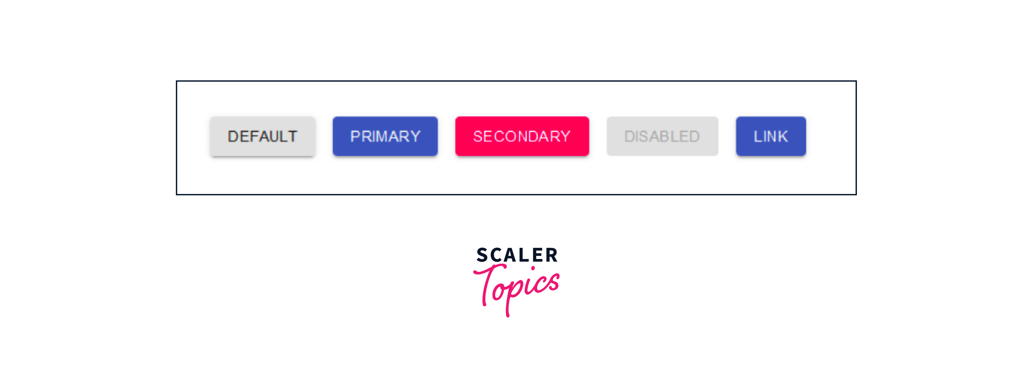
By specifying the colour prop, you can easily apply a specific colour scheme to your buttons to match your application's visual style.
Material UI Button Sizes
Material UI Buttons also offer different sizes to accommodate various layout and design requirements. You can control the size of a button using the size prop, which can be set to one of three values:
- Small: This makes the button smaller in size, suitable for compact UIs or situations where you need smaller buttons.
- Medium (Default): The default size for buttons.
- Large: This makes the button larger, suitable for prominent actions.
Here's how you can adjust the size of Material UI Buttons:
By setting the size prop accordingly, you can ensure that your buttons are appropriately sized for your application's layout and design, contributing to a more polished and consistent user interface.
How to Use Material UI Button Component in Your React Project?
Using the mui button Component in your React project involves a series of steps:
- Installation: First, make sure you have Material UI installed in your project. You can do this using npm or yarn, as mentioned earlier:
- Import Button Component: In your React component file where you want to use buttons, import the Button component:
- Usage: Now, you can use the Button component in your JSX code to create different types of buttons. Let's explore various button variants and scenarios.
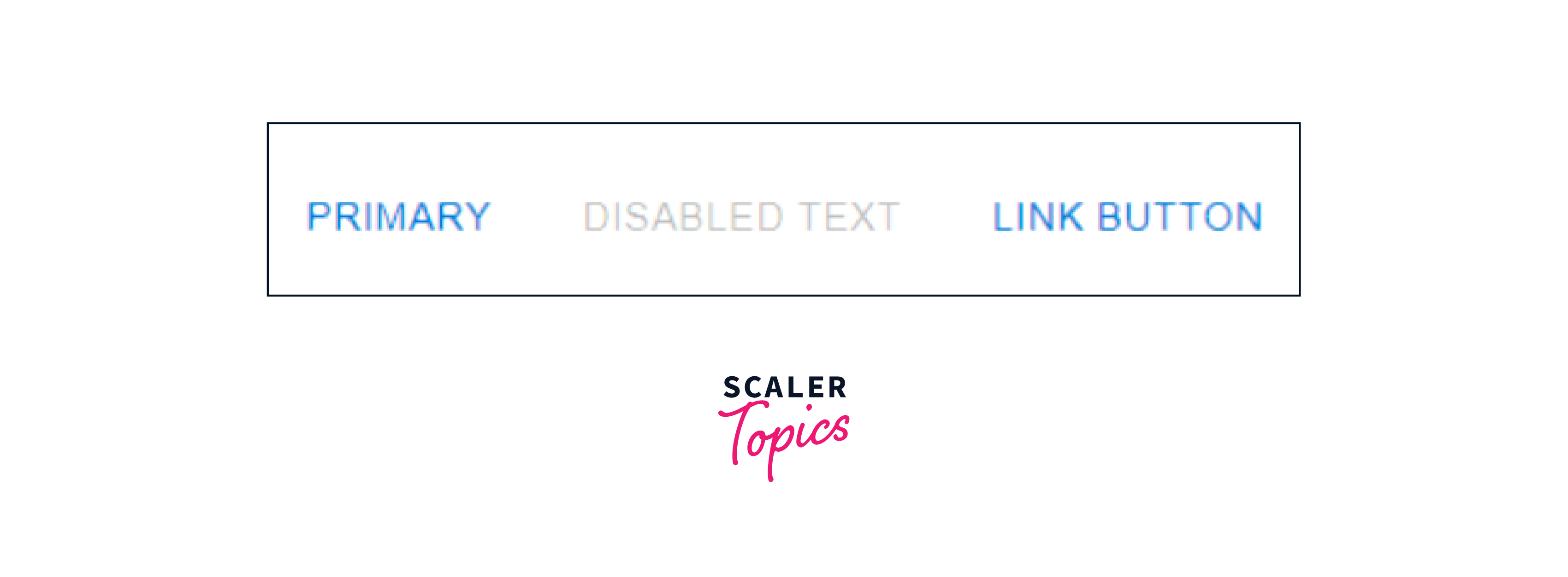
Text Button (The Default Variant)
The default variant for the mui button is the text button, which is a simple button without a background colour. It's suitable for actions that don't require much visual prominence. Here's how you create a text button:
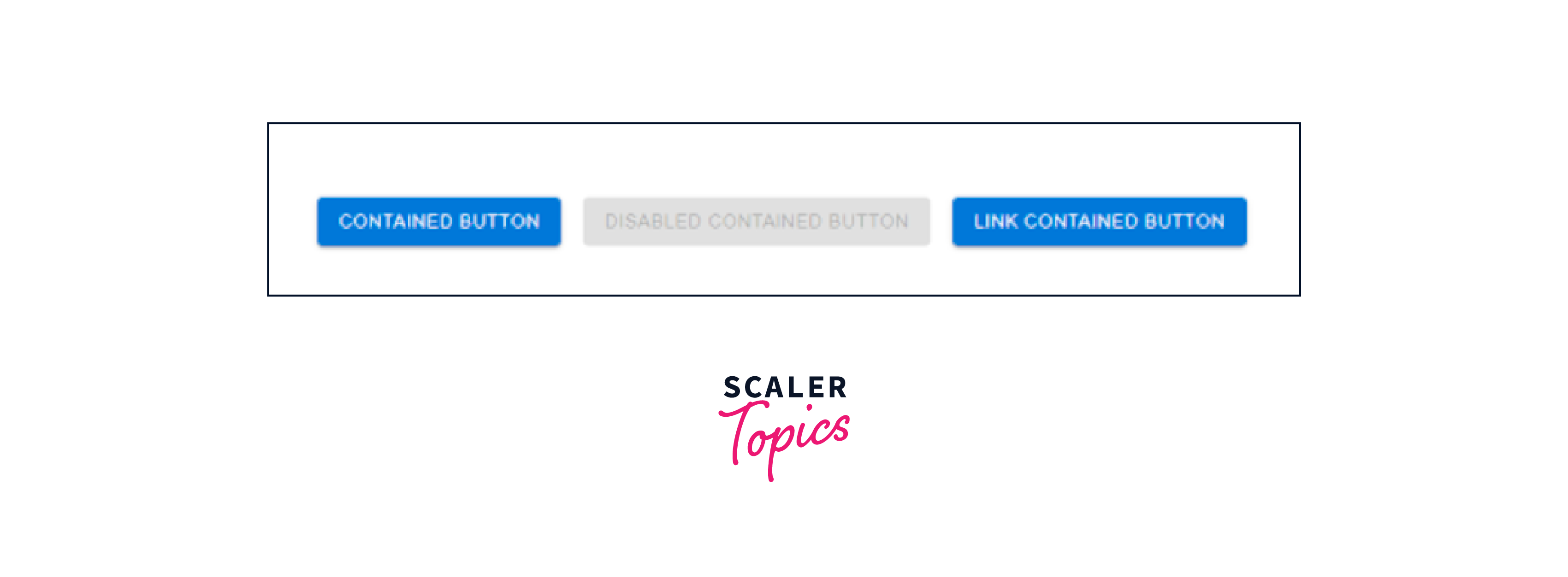
Contained Button
Contained buttons have a solid background colour and are typically used for primary actions or key call-to-action buttons. To create a contained button:
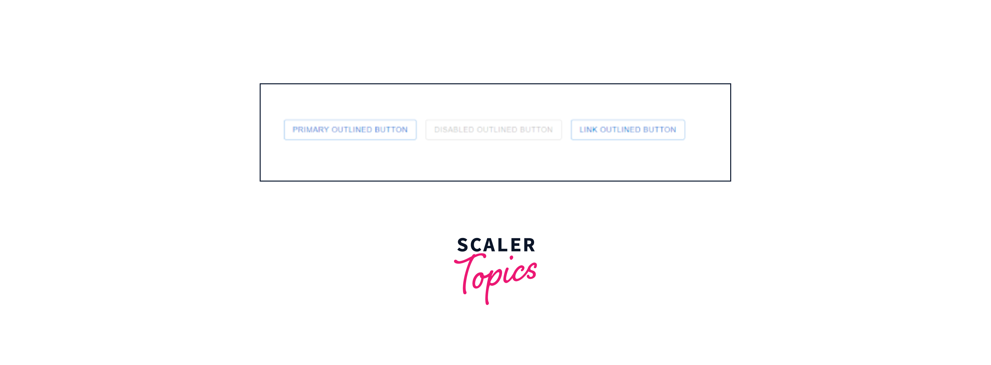
Outlined Button
Outlined buttons have a transparent background with a visible border, making them suitable for secondary actions or buttons that should stand out less. Here's how you create an outlined button:
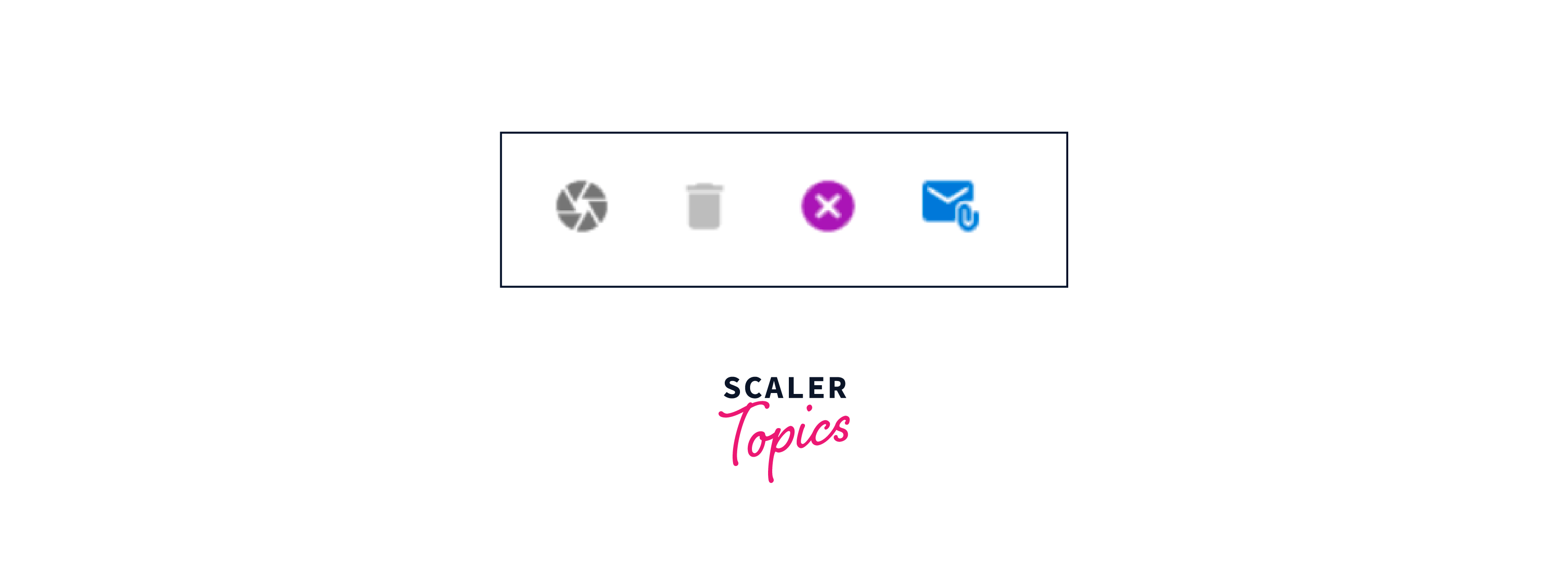
IconButton
IconButton allows you to add an icon along with the text in the button. It's ideal for compact actions that involve an icon. You can specify icons from the Material Icons library or use your custom icons. Here's an example:
Loading Button
Loading buttons are used to indicate that an action is in progress, such as submitting a form. You can disable the button and display a loading indicator when the action is ongoing. Here's an example of a loading button:
In this example, loading is a boolean state variable that determines whether the button is in the loading state.
Icon and Label Buttons
You can also create buttons that combine icons and labels to provide more context to the action. For example, adding an "Edit Profile" label with an edit icon:
By combining icons and labels, you can make the button's purpose clearer to users.
Creating a Calculator UI with Light and Dark Mode Using React Material UI Button Component
Creating a Calculator UI with light and dark modes using React and Material UI's Button Component is an exciting project that showcases how to design and implement a user interface with different themes. In this tutorial, I'll guide you through the steps to build a simple calculator with the ability to toggle between light and dark modes. We'll focus on the UI part and leave out the calculator logic for brevity.
- Step 1: Create a React Application If you haven't already, create a new React application using Create React App or your preferred React project setup method:
- Step 2: Install Material UI Install Material UI and its icons by running the following command:
- Step 3: Create the Calculator Component Create a new component for the calculator in the src folder. For this example, let's call it Calculator.js.
- Step 4: Design the Calculator UI Now, let's design the calculator UI. For simplicity, we'll create a basic layout with buttons for digits and operations. We'll also add a button to toggle between light and dark modes.
We're using the useState hook to manage the theme state, which can be 'light' or 'dark'. The toggleTheme function toggles the theme between light and dark when the button is clicked. The calculator UI is contained within a Paper component from Material UI, providing a visual card-like effect. We've left a placeholder for the calculator buttons. We'll add these buttons next.
- Step 5: Add Calculator Buttons Now, let's add the calculator buttons to the UI. We'll create a function called renderButtons that generates the button components for digits and operations.
We use a loop to generate buttons for digits , a button for 0, and buttons for basic operations (). Each button has a variant and colour prop to style it based on Material UI's design guidelines.
- Step 6: Styling and Theming
To make the calculator UI visually appealing, you can add custom CSS styles to your component. You can also use Material UI's theming capabilities to define light and dark themes in your app.
To style your calculator, you can create a CSS file (e.g., Calculator.css) in the same folder as your Calculator.js file and import it into your component.
In your CSS file (Calculator.css), you can define styles for your calculator component and customize the button appearance based on your design preferences.
For theming, you can utilize Material UI's ThemeProvider to define your light and dark themes. These themes can include custom colours, typography, and other design attributes.
We import ThemeProvider and createTheme from @mui/material/styles. We define two themes, lightTheme and darkTheme, each specifying custom colours for primary and secondary elements. The type: 'dark' property is used to specify that the dark theme should be applied. The ThemeProvider component wraps the entire calculator component, allowing you to switch between light and dark themes by changing the theme state.
- Step 7: Final Touches
You can now add the finishing touches to your calculator UI, such as arranging the buttons in a grid, handling button click events, and displaying the calculator's input and output.
Here's an example of how you might structure your calculator component:
We've added state variables input and output to manage the calculator's input and output display. The handleButtonClick function is a placeholder for handling button clicks and updating the calculator's input and output. You can implement the logic here to perform calculations based on user input. The display section is where you can show the input and output values to the user.
- Step 8: Styling and Further Customization
Now is the time to style your calculator to your liking using CSS. Customize the colours, fonts, button sizes, and layout as needed to match your design preferences.
IconButton Example and Use Case: IconButton is useful when you want to associate an icon with a button's action for better user understanding. In the example above, we use the startIcon and endIcon props to position the "Save" icon before and after the label, respectively. This is common for actions like saving, editing, or deleting items in an application where the icon adds clarity to the action's intent.
Example: Loading Button
In the Loading Button example, we use a state variable loading to track whether a process is ongoing. When the button is clicked, we set loading to true to indicate that a process is in progress, and we display a loading indicator (<CircularProgress />). After a simulated delay of 2 seconds (representing an asynchronous operation), we set loading back to false to indicate the process's completion.
Conclusion
- Material UI Button is a versatile component that enhances the user interface in React applications.
- It offers various button variants, including text, contained, outlined, and icon buttons.
- Material-UI buttons are highly customizable, allowing you to adapt them to your application's requirements.
- IconButton allows combining icons with text for compact actions.
- Loading buttons help indicate ongoing processes to users.
- Material UI's theming capabilities enable easy integration of light and dark modes.
- Material UI Button simplifies UI development by providing pre-designed, accessible, and responsive components.
- It's a popular choice for building modern, visually appealing web applications.