Create an Interactive Material UI Dialog in React
Overview
Websites have become more interactive and dynamic. One such component that adds dynamicity, is a dialog box. Material UI library can be used to create smooth and interactive dialogs. Material UI is a React-based library that can facilitate easy and faster development. In this article, we will comprehend how to create an interactive MUI dialog in React.
What are Dialogs?
Many times we come across popups that appear on the website when we initiate or terminate a process. Such popups are known as dialogs. Dialogs are models that appear on a page that ask the user for a decision or convey additional information.
Dialogs stay on the page until the user takes a required action, and confirms or dismisses it. It interrupts the flow of the page to seek attention for a specific action. The various types of dialogs include- alerts, prompts, pop-ups, modal dialogs, etc.
Setting Up a React App
React is a popular JavaScript library for creating interactive user interfaces. We can create different types of user interfaces by using various component libraries provided by React. One such library is Material UI or MUI is a React-based component library that has ready-to-use components. This reduces the efforts to write the code from scratch and also saves time.
Let us understand the step-by-step process of creating a React application first.
- First, create a folder and open it in an IDE like Visual Studio Code. Then use the given command to create a React application.
- Now move to the app created above(appname) by the following command.
- Now we will start the React application with the given command.
This creates our React application.
Creating React Dialog Component
Now that our React application is created, we will proceed toward creating an MUI dialog in React.
- The first step is to install Material UI and its dependencies.
-
We will now create a file for our dialog. Remember the naming convention for the file should be in camel case. The first letter should be in the capital. Also, the extension should be .jsx. Here, we will be creating a file called Dialog.jsx
-
Now, we will add the default template for the arrow function using the rfce command. It creates a template as follows-
- The next step is to add those components that we will be using from the Material UI library. They are- Dialog, DialogActions, DialogContent, DialogTitle, Typography, and Button.
- Now we will be writing code for each component according to us.
- Dialog- The Dialog component is a main container. It is used to wrap other components within it. The open attribute is set to true which makes it visible by default.
- DialogTitle- It is used to display the title of the dialog.
- Typography- Typography is used to ensure proper size, variant and readability for text. It also ensures that the text is adaptable to different screens and devices.
- DialogContent- This component is used to write the content for the Dialog.
- DialogActions- DialogActions component is used to render the action buttons. It is at the bottom of the dialog.
- Button- The Button component is used to create a button for a dialog. It is usually 'yes', 'no', 'cancel', 'continue', etc.
The code is as follows-
In the above code, we have created an MUI dialog. We have used the "contained" value for buttons for the variant attribute to make our buttons fill and add more emphasis. For Typography, we have used the heading as per our requirement. It can vary according to the needs. The output is as follows-

However, the above code is a static code which will not perform any actions. To make it dynamic, we need to add some events. We will add onClick events for both the buttons, when the buttons are clicked, the MUI dialog will be closed. For that, we will be creating a useState hook and defining the handlers according to our requirements.
The updated code is-
Material-UI Dialog Component DOM Elements
Document Object Model, abbreviated asDOMis an important element of web documents. DOM, in the form of a tree, represents the document. The following image displays the various DOM properties.

There are 3 DOM elements for the MUI dialog-
- Backdrop
- Container
- Paper
Backdrop is the semi-transparent background that is behind the dialog when it is active. It makes the content behind less visible and attracts attention to the dialog. Many times by clicking on the backdrop, the dialog closes automatically.
Container is the DOM element that is in-charge of centering the dialog on the screen. Irrespective of the screen, it centers the MUI dialog.
Paper is the most important part which is the main dialog. It is the background of the MUI dialog that contains all the information like- title, buttons, and content. It is usually off-white or light in color.
Based on the above information, we can divide the page into the above elements as follows-
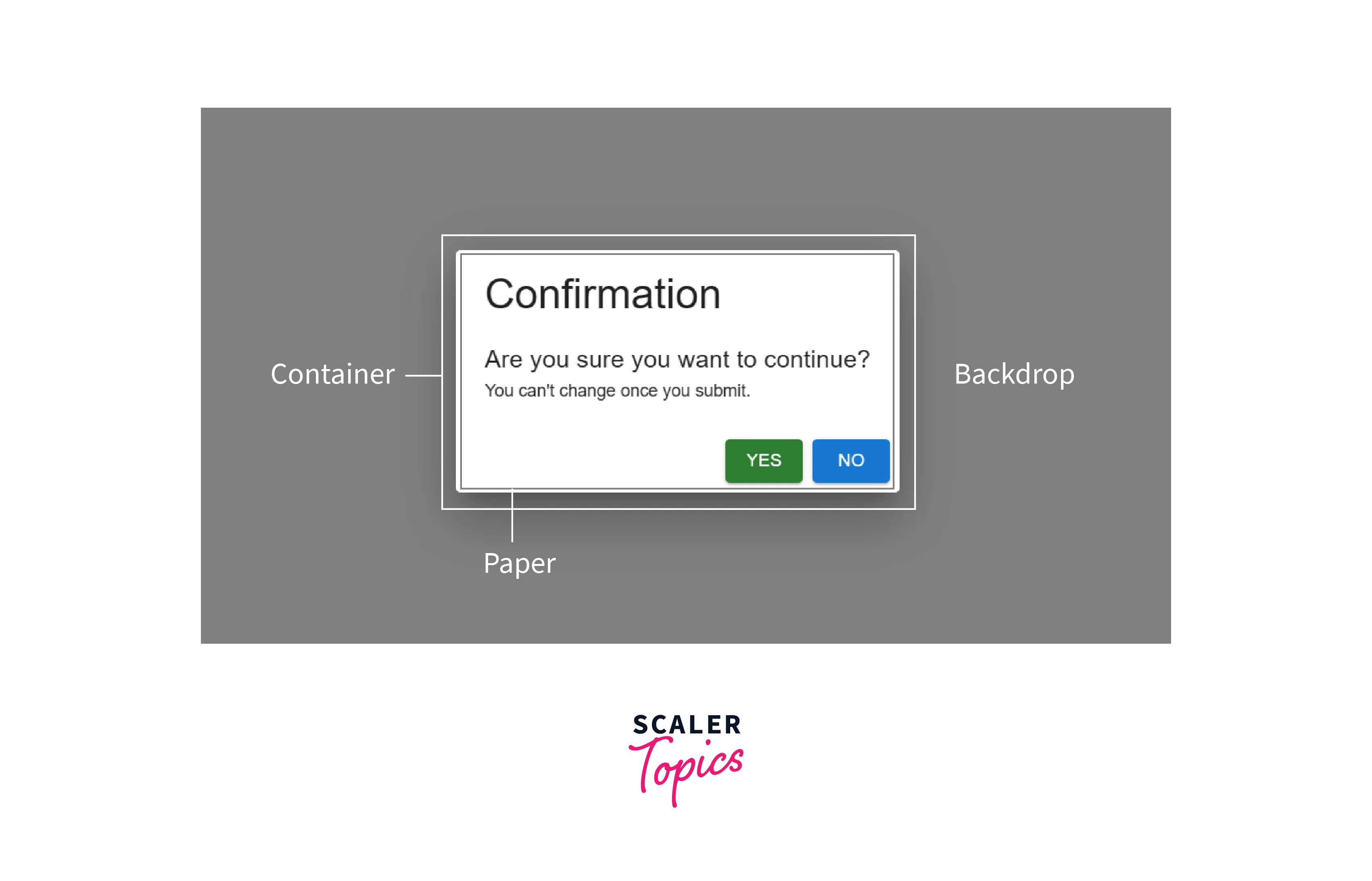
These are the three DOM elements of the MUI dialog.
Material UI Dialog Props
There are many MUI dialog props to customize behavior and appearance. It can help to modify the flow and functions of the various components of the dialog and how it interacts with the user.
There are several props provided by the MUI dialog including- onBackdropClick, onClose, disableEscapeKeyDown, PaperComponent, PaperProps, Scroll, and BackdropComponent. Let us know about each prop in detail.
Dialog onBackdropClick
The MUI dialog onBackdropClick, as the name suggests, works when the Backdrop is clicked. It is used to close the dialog when the backdrop is clicked.
It works similar to the close button.
The onBackdropClick is deprecated and it is advised that the onClose prop should be used to handle the backdrop click events.
Dialog onClose
The onClose prop is a callback used to close the MUI dialog when the backdrop is clicked. It gets triggered when the user clicks on the backdrop. It has replaced the onBackdropClick MUI dialog. It is also used to cancel a dialog when the button is clicked. In our updated code above, we have used the onClose prop.
The above code shows how we can use the onClose callback.
Dialog disableEscapeKeyDown
The Dialod disableEscapeKeyDown is used to determine whether the dialog will be closed after pressing the escape button. It is false by default and after the escape key is pressed, the MUI dialog closes. When it is set to true, the MUI dialog will not close and it will not trigger the onClose prop.
Dialog PaperComponent
Dialog PaperComponent is used to render the dialog component. The area where the elements are rendered in the MUI dialog is this dialog. It can be used for customization too.
Dialog PaperProps
These are the props for styling the paper component. For this, the Paper component and styled function.
Let us see how we can use the Dialog PaperProps.
In the above code, we have added this code-
We have changed the background colour and the width.
Output

Dialog Scroll
The Dialog Scroll feature is used to provide a scrolling feature. This feature is provided when the MUI dialog contents are longer than the user's screen and exceed the space available.
Let us look into an example where we will set a custom height so that a scroll bar appears.
Output

As the text inside the components exceeds the height, a scroll bar appears. This is the Scroll feature.
Dialog BackdropComponent
This is used to customize the backdrop element that appears behind the modal. It can also be used to change the backdrop instead of the default one.
FAQs
Q.What is the Modal component?
A. A modal component in MUI is used to create pop-ups, and dialog boxes. They are used to build components having additional information which gets shown on the web page.
Q. What is the Difference between the Menu, Popover, and Drawer components?
A. Menu The menu option is used to display the list of options on a temporary surface.
Popover- It is used to display custom content on the top of one another.
Drawer-It is used for navigation menus, sidebars, or panels that display additional content or options.
Q.What is the Difference between the Modal and Dialog components?
A. The term Modal is a generic term for a dialog box or pop-up. The purpose of a Modal is either to display forms, confirmation, or alerts.
On the other hand, Dialog is an implementation of a modal. Dialog is a kind of a modal window that can be used for various purposes. Dialogs are modals that appear on a page that asks the user for a decision or conveys additional information.
Conclusion
- Material UI library can be used to create smooth and interactive dialogs. Material UI is a React-based library that can be used to facilitate easy and faster development.
- Dialogs are modals that appear on a page that asks the user for a decision or conveys additional information.
- Dialogs stay on the page until the user takes a required action, and confirms or dismisses it. It interrupts the flow of the page to seek attention for a certain action. The various types of dialogs include- alerts, prompts, pop-ups, modal dialogs etc.
- Some of the most used components from the Material UI library are- Dialog, DialogActions, DialogContent, DialogTitle, Typography, and Button.
- There are 3 DOM elements for MUI dialog- Backdrop, Container, and Paper.
- Backdrop is the semi-transparent background that is behind the dialog when it is active.
- The container is the DOM element that is in charge of centering the dialog on the screen. Irrespective of the screen, it centers the MUI dialog.
- Paper is the background of the MUI dialog that contains all the information like- title, buttons, and content.
- There are several props provided by the MUI dialog including- onBackdropClick, onClose, disableEscapeKeyDown, PaperComponent, PaperProps, Scroll, and BackdropComponent.