React MUI Pagination API
Overview
Pagination is an essential feature in web applications, allowing users to navigate through large sets of data conveniently. In the world of React and Material-UI (MUI), building a pagination component can be made easy with the MUI Pagination API. In this article, we will provide you with an overview, guide you through importing the Pagination API, list the available props, discuss CSS rules, show the syntax, and even walk you through the process of creating a React app with MUI pagination.
Importing the Pagination API
To begin using the React MUI Pagination API in your project, you need to import the necessary components from Material-UI. This step is crucial as it allows you to access and utilize the pagination features provided by Material-UI in your React application.
Here's how you can import the Pagination component:
By adding this import statement to your code, you gain access to the core Pagination component, which forms the foundation of your pagination user interface. This component will enable you to create and customize your pagination elements, enhancing the user experience of your web application.
Props List
The React MUI Pagination API comes equipped with a set of props that you can use to customize the behavior and appearance of your pagination component. These props allow you to tailor the pagination functionality to meet the specific requirements and design of your application. Here's a list of some commonly used props:
- count: This prop specifies the total number of pages in your pagination. It helps the component determine how many page buttons to display.
- page: The page prop determines the currently active page. It allows you to control and track the currently displayed page within your pagination component.
- onChange: You can assign a callback function to the onChange prop. This function gets triggered whenever a user interacts with the pagination component, such as clicking on a page button. It provides an opportunity to handle page changes and update your application accordingly.
- color: The color prop defines the color scheme of your pagination component. You can choose between 'primary' or 'secondary' to match your application's color theme.
- size: The size prop allows you to specify the size of your pagination component. You can set it to 'small,' 'medium,' or 'large' to control the visual size of the pagination buttons.
- variant: The variant prop allows you to choose between 'text' and 'outlined' pagination styles. 'Text' displays simple text for page numbers, while 'outlined' adds a border around each page button.
- shape: The shape prop lets you define the shape of the pagination buttons. You can set it to 'round' for rounded buttons or 'square' for square buttons.
- boundaryCount: This prop determines the number of page buttons displayed at the beginning and end of the pagination component. It's useful for controlling how many buttons are visible when there are many pages.
- showFirstButton: When set to true, the showFirstButton prop displays a button to navigate to the first page.
- showLastButton: Similarly, when set to true, the showLastButton prop displays a button to navigate to the last page.
- disabled: You can disable the entire pagination component by setting the disabled prop to true. This prevents user interaction with the pagination buttons.
- hideNextButton and hidePrevButton: These props allow you to hide the next and previous page buttons, respectively, by setting them to true.
CSS Rules
While Material-UI's Pagination API provides a solid foundation for creating stylish and responsive pagination components, there may be instances where you want to apply custom CSS rules to achieve a more personalized design for your pagination elements. Material-UI's flexibility allows you to seamlessly integrate these custom styles into your React application.
Here are some approaches to applying custom CSS rules to your React MUI Pagination component:
CSS-in-JS
Material-UI supports CSS-in-JS libraries like Styled-components and Emotion. You can use these libraries to define and apply custom styles directly to your pagination component.
External Stylesheets
Alternatively, you can create an external stylesheet for your React application and define custom styles for the pagination component there. Then, apply a class or ID to your Pagination component and link it to the external stylesheet.
In your CSS file (e.g., styles.css):
In your React component:
CSS Modules
If you prefer modular CSS, you can use CSS Modules with your React components. This approach allows you to scope your CSS styles to specific components, preventing unintended conflicts.
By utilizing these methods, you can seamlessly integrate custom CSS styles into your React MUI Pagination components while maintaining the overall structure and design principles of your application.
Syntax
To implement pagination using the React MUI Pagination API in your React application, you'll need to follow a specific syntax.
Installing and Creating React app, and adding the MUI dependencies
Here's a step-by-step guide in English on how to install and create a React app while adding the Material-UI (MUI) dependencies:
Step 1: Create a New React App
Open your terminal or command prompt.
Navigate to the directory where you want to create your React app using the cd command. For example:
cd path/to/your/projects
To create a new React app, use the following command:
npx create-react-app my-pagination-app
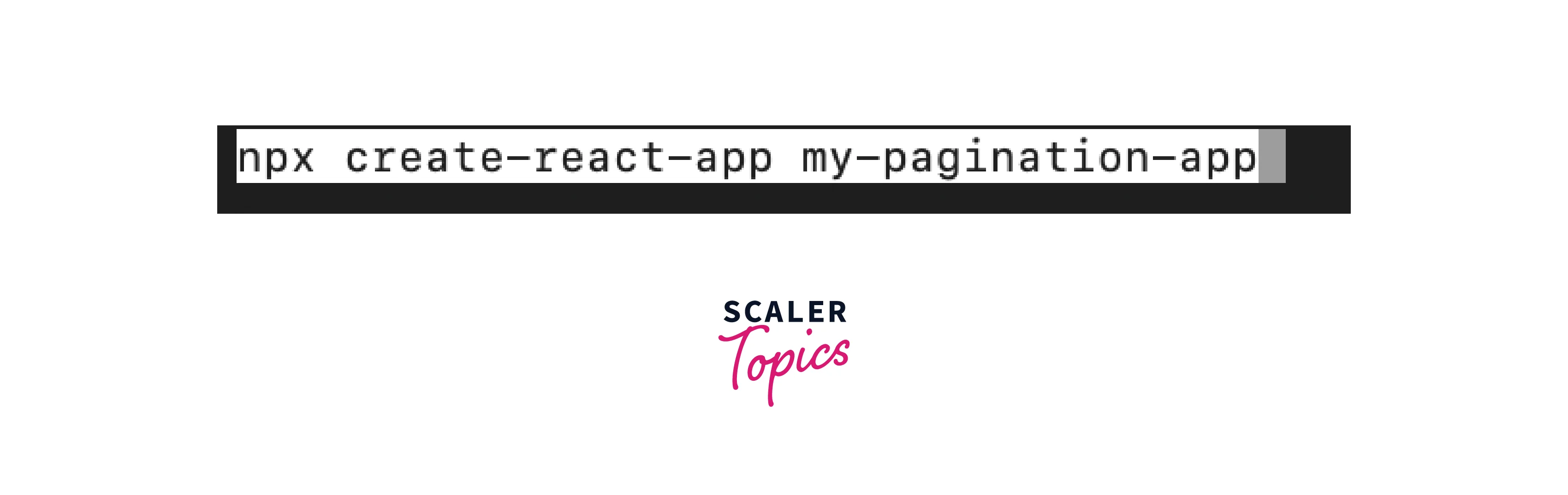
Replace my-pagination-app with the name you want for your app. This command will initialize a new React project with the specified name.
Step 2: Navigate to Your Project Directory
After the React app is created, navigate to your project directory:
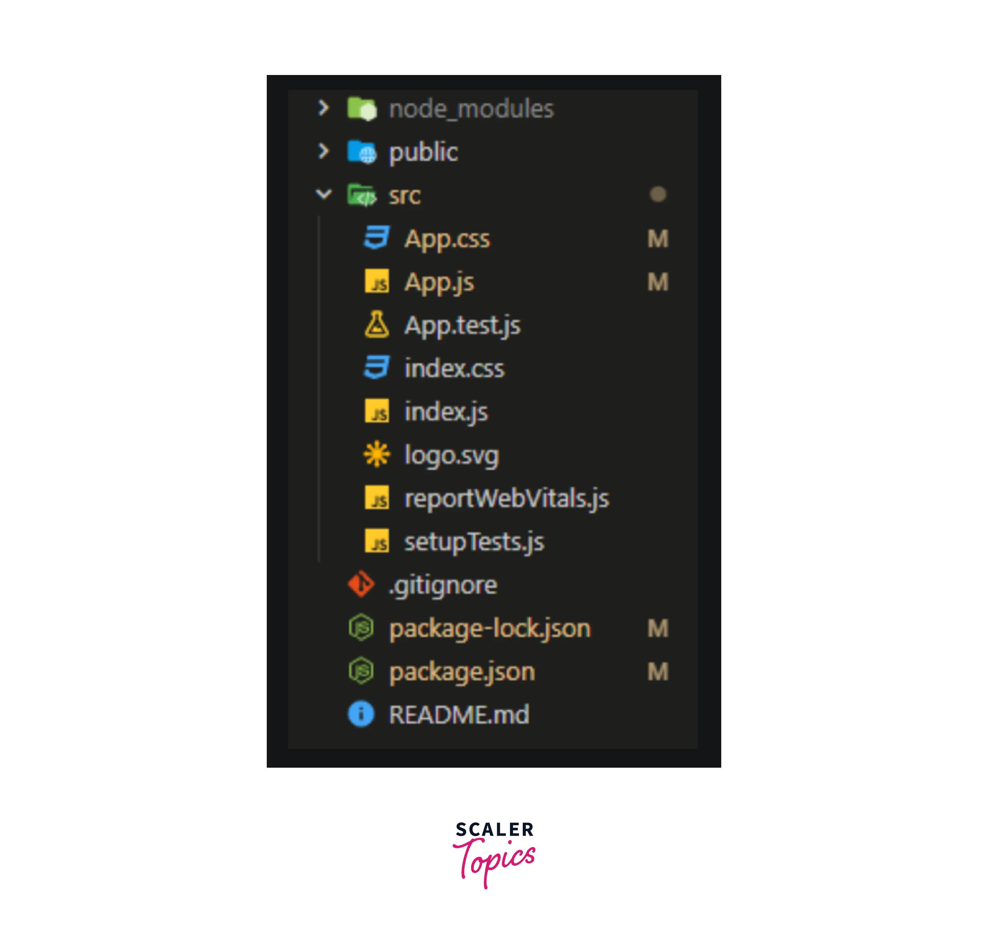
cd my-pagination-app
Replace my-pagination-app with the name you chose for your app in Step 1. Your project structure should look like this :
Step 3: Install Material-UI Dependencies
To use Material-UI components in your React app, you need to install the necessary Material-UI packages. Run the following command:
npm install @mui/material @mui/icons-material
This command installs the core Material-UI package (@mui/material) and the Material-UI icons package (@mui/icons-material), which provides a collection of icons you can use within your components.
Step 4: Start Your React App
To start your React app, use the following command:
npm start
This command will launch your app in development mode and open it in a web browser. By default, the app will be available at http://localhost:3000/.
Now you have successfully created a new React app and added the necessary Material-UI dependencies. You can begin building your application and implement features such as pagination using the React MUI Pagination API
Conclusion
- Material-UI Pagination API is a valuable tool for implementing pagination in React applications.
- Import the Pagination component and install Material-UI dependencies to get started.
- Customize pagination behavior and appearance using props like count, page, onChange, color, and size.
- Apply custom CSS styles to the pagination component to achieve a unique design.
- Implement pagination with a straightforward syntax, including state management and an onChange handler.
- Utilizing the React MUI Pagination API improves user experience by efficiently handling and displaying large datasets in your React application.