How to Use Material UI Tooltip?
Overview
In the world of web design and user experience, tooltips play a crucial role in providing helpful hints and information to users without overwhelming the interface. Material UI, a popular React UI framework, offers a versatile and easy-to-use Tooltip component that enhances user interactions. In this article, we'll dive into the details of how to effectively utilize MUI Tooltip to improve your web applications.
What is Tooltip?
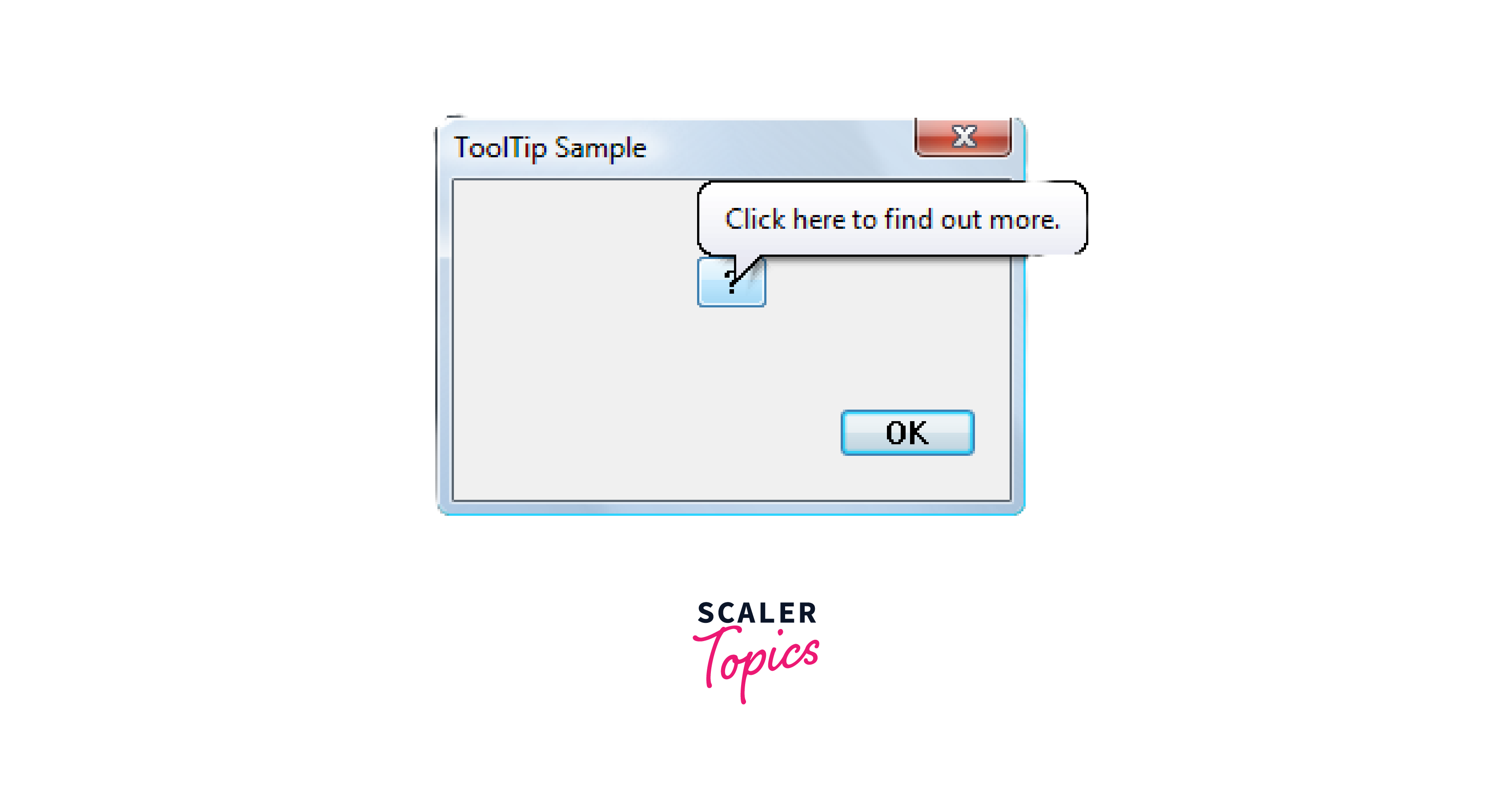
A tooltip is a small, informative pop-up box that appears when a user hovers their cursor over an element, providing additional context or information about that element. It's a concise way to offer users quick insights without cluttering the main interface. These boxes typically contain concise text, although they can sometimes include images or other forms of media.

The primary benefit of tooltips lies in their ability to enhance user experience and improve usability. They provide instant assistance by clarifying the function of an element or explaining technical terms that might not be immediately obvious to all users. This is especially valuable for new users who are unfamiliar with the interface or features of an application.
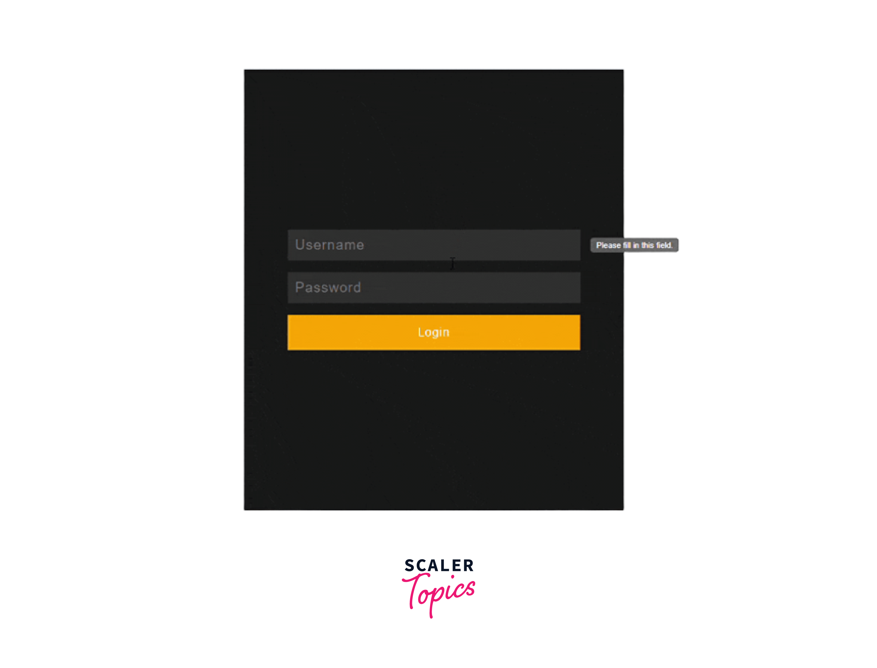
ToolTips also serves as a means to convey warnings, hints, or tips to users. For instance, they might notify users about potential errors in input fields or suggest the purpose of certain icons in a toolbar.
Getting Started with Material UI Tooltip
To start using the MUI Tooltip, you need to have a basic understanding of React and the Material UI library installed in your project. If you haven't set up your project yet, follow these steps:
-
Install Material UI:
To use the MUI Tooltip, you need to have Material UI installed in your project. Open your terminal or command prompt and navigate to your project's directory. Then, use the following command to install Material UI:
npm install @mui/material
-
Import Tooltip Component:
In the component where you want to use tooltips, import the Tooltip component from Material UI. You can do this by adding the following line at the top of your component file:
-
Add Tooltip to Elements:
Once you've imported the Tooltip component, you can easily add tooltips to various elements within your application. The basic structure for using the Tooltip component looks like this:
-
Customize Tooltip:
MUI Tooltip offers various customization options to tailor the appearance and behavior of your tooltips. You can adjust properties such as the tooltip's position, styling, arrow presence, and more.
Positioning Material UI Tooltips
Positioning Material UI Tooltips is a crucial aspect of creating a seamless and user-friendly experience within your web applications. With the flexibility provided by the Material UI Tooltip component, you can precisely control where tooltips appear about the associated elements. This ensures that users receive relevant information without obstruction.
Material UI Tooltip provides various options for positioning tooltips around elements. You can control the placement using the placement prop, which accepts values like "top", "bottom", "left", and "right". Here's an example:
Behind the scenes, the MUI Tooltip component utilizes the Popper concept to dynamically adjust positioning. This intelligent mechanism calculates the best position for the tooltip, taking into account the available space and viewport dimensions. The Popper employs strategies like flip and preventOverflow to ensure that the tooltip's content remains fully visible and easily readable, regardless of the device's screen size.
Furthermore, you can tailor your tooltips to align seamlessly with your application's design language and user interaction patterns. Through a range of props, such as enterDelay, leaveDelay, and onOpen, you can control when tooltips appear and disappear.
How to Customize Your Material UI Tooltip Component
Customizing your Material UI Tooltip component allows you to tailor the appearance and behavior of tooltips to align with your application's design and user experience goals. Let's explore several customization options that which Material UI Tooltip provides-
Arrow Tooltips
Arrow tooltips feature a small arrow that points towards the associated element. To enable an arrow tooltip, simply set the arrow prop to true:
Width Variations
Tooltips automatically adjust their width based on the content. However, you can control the width using CSS or the enterTouchDelay prop. This prop adds a slight delay before the tooltip appears, allowing it to calculate and adjust its width:
Material UI Tooltip Transitions
Material UI provides smooth and customizable transitions for tooltips. You can change the default transition using the TransitionComponent prop. This allows you to create subtle animations that enhance the user experience.
The transitions used are primarily CSS-based, which allows for efficient handling of animation effects while minimizing performance overhead. CSS-based transitions utilize the browser's built-in animation capabilities, optimizing performance by offloading animation tasks to the browser's rendering engine. This results in smoother animations without imposing excessive computational load on the JavaScript environment.
Virtual Element Placement
Sometimes, you might want to attach a tooltip to a virtual element, such as an icon inside a button, rather than the button itself. You can achieve this by using the PopperProps prop to disable the portal behavior. This ensures that the tooltip remains within the same container as the triggering element:
Material UI Tooltip Event Triggers
MUI Tooltip provides versatile event triggers that determine when tooltips appear and disappear, enhancing the user experience and delivering information at the right moment. These triggers allow you to control how tooltips interact with users and provide context when needed. Let's explore the various event triggers available:
-
Hover Trigger:
The default and most common trigger is the hover event. When users hover their cursor over an element, the tooltip appears, offering additional information. This is particularly useful for tooltips that provide quick explanations or clarifications.
-
Click Trigger:
With the click trigger, tooltips appear when users click on the associated element. This can be helpful for tooltips that contain more detailed information or options that users might want to explore.
-
Focus Trigger:
Tooltips can also be triggered when an element gains focus, such as when users navigate through elements using the keyboard. This is especially beneficial for ensuring accessibility and catering to users who rely on keyboard navigation.
-
Manual Trigger:
In situations where you want full control over when tooltips appear, you can use the manual trigger. With this trigger, tooltips only appear when you explicitly trigger them through your code. This is useful when you want to align the tooltip display with specific user interactions.
Material UI Tooltip Custom Child(ren) Elements
Material UI Tooltip offers the capability to include custom child elements within the tooltip itself. This feature enhances the versatility of tooltips by allowing you to present more complex and informative content. Let's delve into how you can leverage this feature:
-
Enhancing Content:
Instead of limiting tooltips to simple text, you can insert multiple child elements within a tooltip. This allows you to present a combination of text, icons, buttons, and other UI elements that work together to convey a comprehensive message.
-
Creating Actionable Tooltips:
With custom child elements, you can transform tooltips into actionable components. For instance, you can place buttons or links within a tooltip, enabling users to directly interact with the content or perform specific actions without navigating away.
-
Adding Icons and Visuals:
Icons and images are powerful tools for conveying information quickly. By incorporating icons into your tooltips, you can enhance user comprehension and create a more visually appealing experience.
-
Step-by-Step Guidance:
When explaining complex processes or features, tooltips with custom child elements can serve as step-by-step guides. Each child element can represent a different stage or action, making it easier for users to follow instructions.
-
Balancing Complexity:
While custom child elements enhance tooltips, it's essential to strike a balance between richness and simplicity. Ensure that tooltips remain concise and don't overwhelm users with excessive content.
Here's an example of how you might use custom child elements in a tooltip:
In this example, the tooltip contains both a MoreVert icon and a Settings icon, suggesting that users can find additional options by interacting with these elements.
Building a Login Form UI with React and Material UI Tooltip
Now let's apply the concepts we've discussed so far. By incorporating tooltips, we can guide users through the login process and provide helpful hints to enhance their experience. Here's a step-by-step guide to creating a login form UI using React and MUI Tooltip:
-
Setting Up the Project:
Start by creating a new React project using a tool like Create React App. Navigate to your project directory in the terminal and install Material UI:
npm install @mui/material
-
Import Required Components:
In your login component file, import the necessary Material UI components and the Tooltip component:
-
Create the Login Form:
Design your login form using Material UI components like TextField and Button. Add tooltips to guide users:
-
Applying Tooltip Positions:
Use the placement prop to position tooltips appropriately next to form fields and the login button:
-
Styling and Customization:
Customize the tooltip appearance and overall form styling using the class prop and Material UI's theming capabilities.

Conclusion
- Material UI Tooltip provides concise explanations upon hovering, clicking, or focusing on elements, aiding in the comprehension of buttons, forms, and links, resolving any potential confusion, and making the interface more user-friendly
- The tooltips blend seamlessly with the app's style, ensuring a consistent experience.
- With customizable options like placement, delays, and arrow display, developers can tailor tooltips to match their application's aesthetics and functionality.
- The integration of the Popper concept ensures tooltips are positioned intelligently for optimal visibility, contributing to a polished and seamless user experience.
- Custom elements in tooltips let you take actions right from the hint.
- Tooltips are adaptable to various screens, functioning effectively on all devices. Continuous improvements based on user feedback contribute to enhancing tooltips further.
