How to Create a Navigation Bar in HTML?
 FREE
FREE

Overview
A navigation bar in HTML is a set of buttons and images in either a row or a column that serve as a control site for linking certain portions of the website. It's considered to be one of the basic utilities of web design.
The navigation bar in HTML separates content from the structure as well as provides creativity to the web structure without impacting the information present in the pages.
We build a navigation bar using HTML and make it visually pleasing by using CSS. JavaScript can be used to add further functionality.
There are various ways in which we can implement a navigation bar in HTML, like horizontal, vertical, fixed, dynamic, sidebar, etc.
We will learn more about the what and how of nav bars in this article.
Pre-requisites
Before proceeding further with this article on how to create a navigation bar in HTML, it’d be good if you had the basic knowledge of the following.
- Basic knowledge of HTML and CSS: Learn about basics of HTML here and, CSS here
- For added functionality, learn more about JavaScript here
We’ve made this article beginner-friendly. Do give it a thorough read even if you fall short on the above-mentioned prerequisites.
What are We Creating?
We, as users, use nav bars on most of the websites we come across on the internet. When a site is loaded with a lot of content on a lot of different devices, these vertical and horizontal nav bars come in handy for navigating throughout the site efficiently and in an organised manner.
Based on whether these nav bars are fixed or dynamic, horizontal or vertical, or if they're text-only or graphics-only, let’s take a look at some of the different types of nav bars out there:
1. Sticky nav bar 2. Dynamic navbar 3. Search bar 4. Hoverable Dropdown 5. Shrink Navigation Menu on Scroll 6. Hide Menu on Scroll 7. Collapse Side Panel

In this article we'll be making a dynamic nav bar with a dropdown button to display the contents upon hovering, and we'll learn further how to create a responsive navigation bar using HTML for creating our base code, CSS for making it visually appealing, JavaScript for adding functionality to our navigation bar in HTML, and Media queries which allows us to make our navigation bar in HTML, responsive by creating different layouts depending upon different viewport sizes
How to Create Navigation Bar in Html?
Now let’s make a navigation bar in HTML using the following steps
Step 1: Open any text editor (provided it supports HTML and CSS) and create an HTML file, type in the starter code as follows
We start our code with a <html> tag which includes the <head> tag
A tag describes a document and imports the required complementary files.
A title 'Menu bar' (since we're creating a menu bar in HTML) is given to our code using the <title> tag inside the <head> tag.
The resulting HTML complete code obtained for menu bar in HTML is
Our menu bar in HTML looks like this

Let's improve upon this menu bar in HTML and make it visually appealing using CSS.
Continuing with CSS
CSS(Cascading Style Sheets) is a style sheet language that describes a document’s presentation which is written in HTML.
Step 1: Include CSS between <style> tag
Step 2: We then use the <div> tag, which is used as a container for HTML elements which are styled by CSS, by using a class attribute labelled as "topnav" with "mytopnav" as an ID, and then manipulated by JavaScript.
<div> tag contains the useful links that we need on our menu bar to navigate throughout our web page
Step 3: This is where CSS kicks in to add a visual layout to our web page. We use the .class selector for selecting elements with a specific class attribute, which basically selects elements with a specific class. The syntax is
and so for class "topnav" we do the following
We can also choose only certain specific elements to be affected by a class by typing out the element name followed by a period (.) which is then followed by the name of the class in which that element resides. We do this with our <a> as:
Step 4: Now, let’s change the color of links on hover from blue to white
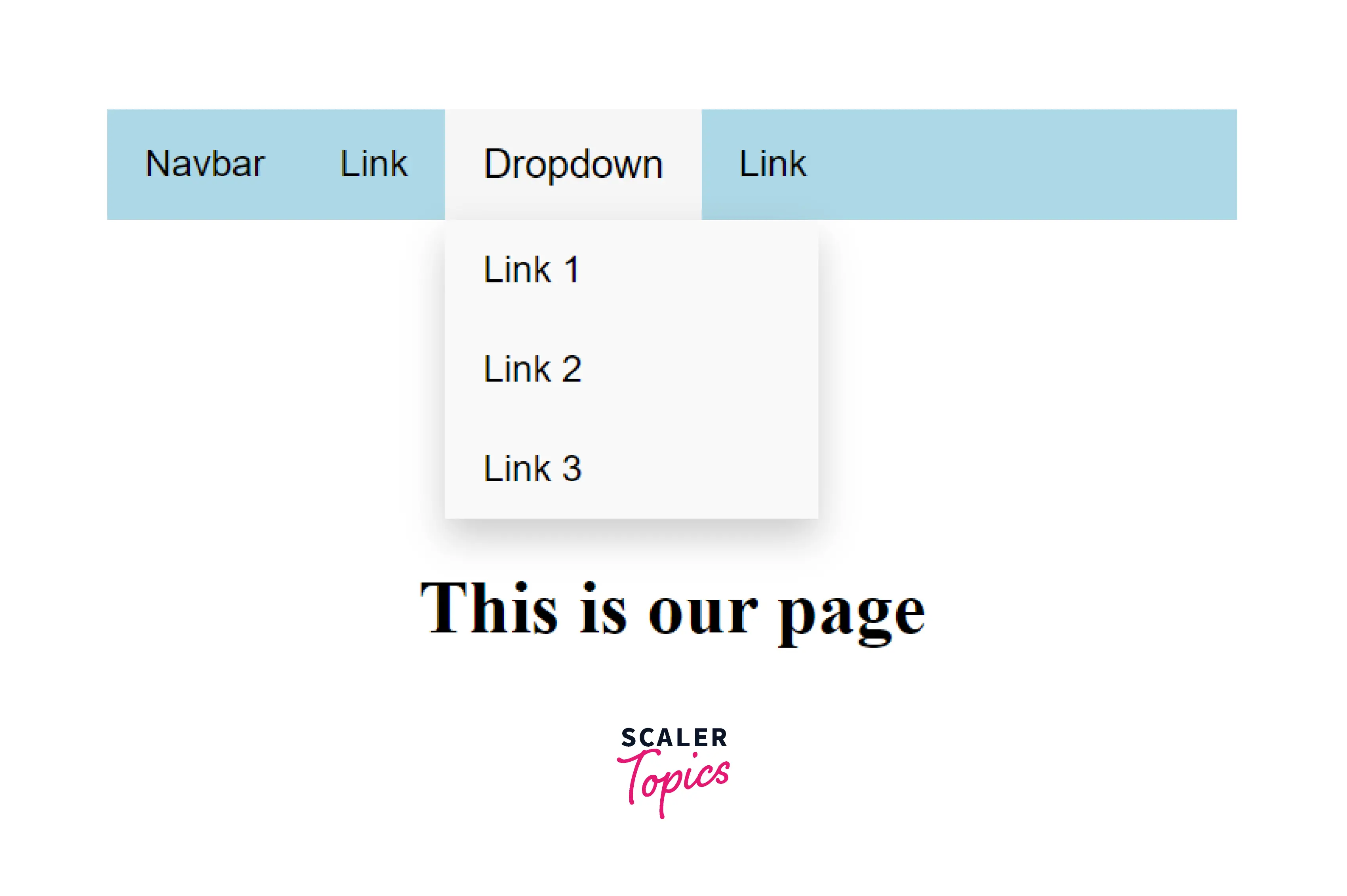
Step 5: Let's now add a dropdown to it and create a button inside our new div class for dropdown
Let's add some CSS to our class and button
In the div class labelled as dropdown-content let's create some links that'll appear when we click on the dropdown.
To make our dropdown visually appealing, we can use CSS to specify its properties like text-decoration, padding etc
Step 6: If you'd like to see a dropdown's content by just hovering over it, it can be achieved using
Now let's add a background color to the hover
The final CSS code till here comes out to be
Links in navigation bar are then styled using color, text-align, padding, etc
The links and active class upon hovering is changed to show the current link and page using
so far, our site looks like this
Creating a Responsive Navigation Bar
Since most internet users access the internet via their mobile phones, there’s a need to implement responsive navigation bars on our site, especially if the site is loaded with content and we need to store some space and make it structurally appealing.
While there are various ways to create a navigation bar in HTML using a guillotine, floating icons, tabs, etc., we’ll be using the hamburger menu in this article
Now let's make our navigation bar in HTML, responsive by adding media queries and Javascript for functionality to our existing code.
Adding media queries
Now let's add media queries
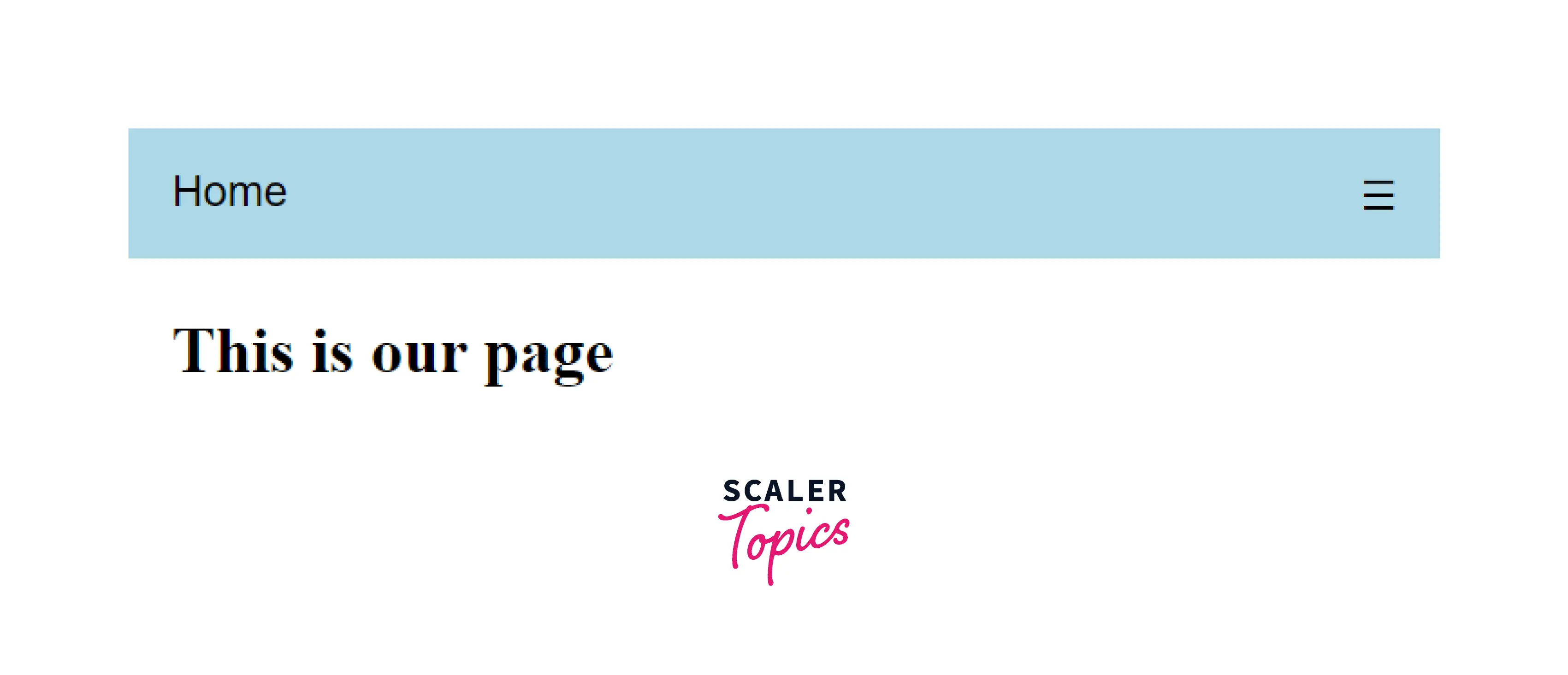
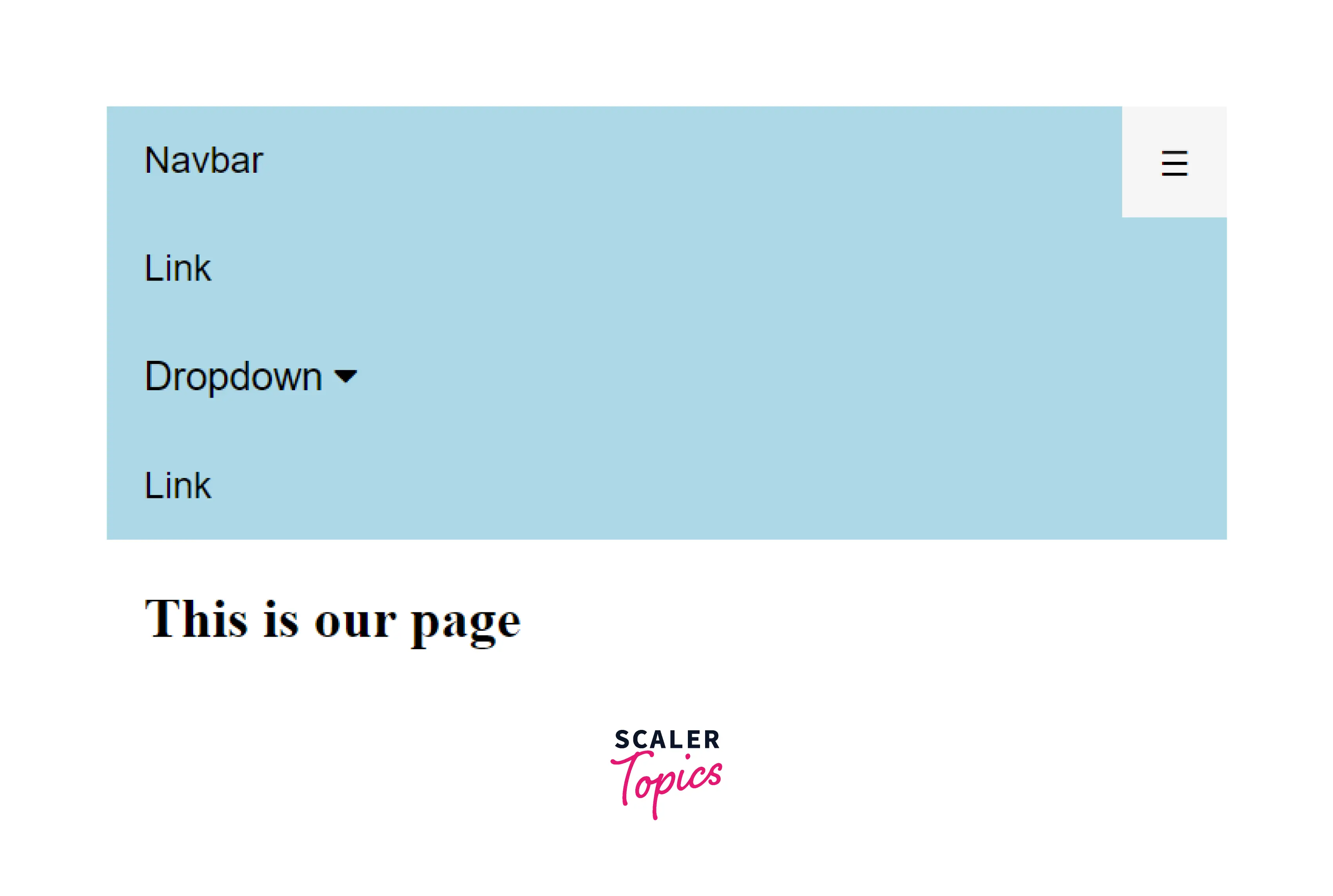
As soon as we reach our limit of 600 pixels we hide all the links except the first one
When the user clicks on the icon a responsive class is then added to the topnav with JavaScript in order to make it look visually appealing on smaller screens
Adding JavaScript Functionality
Now let's add some JavaScript for added functionality
When the user clicks on the icon, we toggle between removing and adding the responsive class to the top nav.
Our final code becomes
Let's see how it looks so far
Navigation Bar with CSS
Since we know by now that CSS adds a visual component to our web pages, let’s see if we can create a menu bar using CSS.
Since we need standard HTML as our basis for creating a navigation bar, which is basically a list of links, let's use the HTML code we had earlier in this article.
let’s use <ul> and <li> elements for the same
To remove padding, bullets and the margins from the list:
Since we don’t need list markers in our menu bar we use list-style-type: none; -to remove the bullets We then Set margin: 0; and padding: 0; for removing browser default settings
We can also create vertical and horizontal navigation bars using CSS, let's see how
CSS Vertical Navigation Bar
For the vertical navigation bar let’s style <a> elements inside the list.
Let’s see how this code works,
display: block; Here, we’ve displayed our links as block elements to make the whole area clickable and allow specification of the width, padding, margins, etc width: 60px; to specify 60 pixel width instead of having a default full width available for block elements We can set the width of <ul> for having a full width displayed for block elements
CSS Horizontal Navigation Bar
For creating a horizontal navigation bar, we have two ways:
1. Inline List Items: In addition to the previous code, specify <li>elements as inline to build a horizontal navigation bar
Let’s see how this code works, display:inline : with the <li> being block elements, we remove line breaks that occur before and after each list item in order to display them on one line
2. Floating List Items
Another way of creating a horizontal navigation bar is to float the <li> elements, and specify a layout for the navigation links:
Let’s see how this code works float: left; here we get block elements to float next to each other using float display: block; for specifying height, width, margins, paddings, etc padding: 8px; to make it visually appealing we specify padding between the <a> element background-color: #dddddd; for adding a gray background color to every <a> element We can also add background-color to <ul> for obtaining a full-width background color
Conclusion
- A navigation bar in HTML helps us easily navigate between web pages. We use CSS to beautify it.
- Navigation bars makes it easy for users to browse the site and increase retention. It separates content from the structure as well as provides creativity to the web structure without impacting the information present in the pages.
- There are various ways in which we can implement the nav bar, like horizontal, vertical, fixed, dynamic, sidebar, etc.
- HTML used for structuring CSS for making it visually appealing and JavaScript for making it responsive