R Percentiles
Overview
Percentiles in R are essential statistical measures that divide a dataset into 100 equal parts, providing valuable insights into the distribution of data points. This article explores the significance of percentiles in statistical analysis and how to calculate them in R. Understanding percentiles is crucial for data scientists, analysts, researchers, and anyone involved in data-driven decision-making. These measures are widely used in various fields, including finance, economics, healthcare, and research, to comprehend the central tendency and variability of the data.
Introduction
Before we dive into the technical aspects, let's first grasp the concept of percentiles and why they are essential in data analysis. Percentiles are specific points in a dataset that separate it into 100 equal parts. They indicate the relative standing of an individual data point within the entire data distribution. By dividing data into percentiles, we can observe how much of the data lies below or above a certain value.
One common application of percentiles is in understanding test scores. For instance, if a student scores in the 80th percentile on a standardized test, it means they performed better than 80% of all test-takers. Percentiles allow us to make comparisons and identify extreme values or outliers in a dataset.
In statistical analysis, percentiles are often used alongside other central tendency measures such as the mean and median. While the mean and median provide insights into the average and middle values, respectively, they may not fully represent the data's distribution, especially when it is skewed or contains outliers. Percentiles offer a more comprehensive view, highlighting various thresholds in the data.
Consider the following dataset representing the scores of 10 students in a math test:
Scores: 55, 65, 70, 72, 75, 80, 82, 85, 90, 98
Mean: The mean is calculated by adding up all the scores and dividing by the number of data points. In this case:
Mean =
Median: The median is the middle value when the data is arranged in ascending order. In this case, there are 10 data points, so the median is the average of the 5th and 6th values:
Median =
the data is positively skewed, meaning it is stretched towards higher values, and there is one outlier (98) that deviates significantly from the rest of the data.
The presence of an outlier (98) influences the mean (77.2), pulling it upwards and affecting its representativeness. The median (77.5) is less impacted but still doesn't fully capture the data's spread and skewness. In contrast, percentiles, like the 90th percentile (85), offer a more comprehensive view, revealing that 90% of students scored below 85 and only 10%scored equal to or higher. Percentiles provide a robust measure of central tendency, especially when outliers are present, and help understand data distribution effectively.
Calculating Percentiles in R
In this section, we will delve deeper into calculating percentiles in R using various methods and discuss their significance in different data analysis scenarios.
Method 1: The quantile() Function
The primary method to calculate percentiles in R is by using the quantile() function. This function efficiently computes sample percentiles for a given dataset.
The basic syntax of quantile() is as follows:
-
dataset:
The input data for which percentiles need to be calculated.
-
probs:
A numeric vector specifying the percentiles to be computed. This argument takes values between 0 and 1. For example, to find the 25th, 50th, and 75th percentiles, we can use probs = c(0.25, 0.50, 0.75).
-
type:
An optional parameter that determines how the percentiles are calculated. It can take values from 1 to 9, each representing a different algorithm for interpolation. The default is type = 7, which is recommended for most situations.
Let's use an example to understand how to calculate percentiles using the quantile() function:
Output:
By using the quantile() function with different type arguments, we can explore how interpolation impacts the percentile values and choose the method that best suits our data analysis needs.
Method 2: The ecdf() Function
Another method to calculate percentiles in R is through the use of the ecdf() function, which stands for Empirical Cumulative Distribution Function. The ecdf() function returns a function that, when given a value, computes the proportion of data points less than or equal to that value. To obtain percentiles from the ECDF, we can use the inverse transformation.
Let's demonstrate how to calculate percentiles using the ecdf() function:
Output:
Calculate Multiple Percentile a Vector in R
Calculating multiple percentiles allows us to gain a more comprehensive understanding of the distribution of data in a vector. R provides an efficient way to calculate multiple percentiles simultaneously using the quantile() function.
Let's explore how to calculate multiple percentiles for a vector in R:
Output:
In this example, we calculated the 10th, 30th, 50th, 70th, and 90th percentiles of the data vector using the quantile() function. The output will provide us with a set of percentile values corresponding to each specified percentile.
Explanation:
By calculating the multiple percentiles for the dataset, we obtain the following results:
- 10th percentile (P10): 25.0
- 30th percentile (P30): 35.0
- 50th percentile (P50, Median): 45.0
- 70th percentile (P70): 55.0
- 90th percentile (P90): 65.0
Identifying Outliers:
Outliers are extreme values that significantly deviate from the majority of the data points, impacting statistical measures like the mean. In this dataset, the value 1000 is identified as an outlier as it is much larger than the other data points and falls well above the 90th percentile (65.0). Calculating multiple percentiles is valuable for understanding data distribution, identifying patterns, and efficiently spotting outliers.
For an even more comprehensive analysis, we can use the seq() function to generate a sequence of percentiles and calculate their respective values. Let's see how we can achieve this:
Output:
In this example, we used seq() to generate a sequence of percentiles from 10% to 90% at intervals of 10%. We then calculated the respective percentile values using the quantile() function. This approach allows us to flexibly choose the specific percentiles we want to investigate, providing valuable insights into the dataset's distribution across various quantiles.
Calculate Percentiles in R DataFrame
In data analysis, working with data stored in DataFrames is common. R provides efficient ways to calculate percentiles for DataFrame columns and multiple columns simultaneously. Let's explore how to achieve this using the dplyr package, a popular package for data manipulation in R.
Percentile of a DataFrame Column
To calculate the percentile of a specific column in an R DataFrame, we can use the quantile() function along with the dplyr package. Here's an example:
Output:
In this example, we used the %>% operator to pipe the DataFrame df into the summarise() function, which calculates the specified percentiles (25th and 75th in this case) for the Score column using the quantile() function. The results will be displayed, providing valuable insights into the distribution of the Score column.
Percentiles of Several DataFrame Columns
To calculate percentiles for multiple columns in an R DataFrame, we can extend the previous approach using the summarise() function with mutate() to create new columns for each percentile. Here's an example:
Output:
In this example, we calculated the 25th, 50th, and 75th percentiles for both Score1 and Score2 columns using the quantile() function and created new columns in the DataFrame to store these percentile values. The resulting DataFrame, percentiles_df, will contain the desired percentiles for each specified column.
Finding Percentiles by Group
In some cases, we may need to calculate percentiles for different groups within a DataFrame. For this, we can use the group_by() function from the dplyr package in combination with summarise(). This allows us to calculate percentiles for each group separately. Here's an example:
Output:
In this example, we used group_by() to group the DataFrame by the 'Group' column and then calculated the 25th and 75th percentiles for the Score column within each group. The resulting DataFrame, percentiles_by_group, will display the percentiles for each group separately.
Visualizing Percentiles
Visualizing percentiles is a powerful way to gain a comprehensive understanding of the distribution of data. R provides various visualization techniques to plot percentiles, allowing data analysts and scientists to identify outliers, assess data spread, and compare different datasets efficiently.
Box Plots
Box plots, also known as box-and-whisker plots, are commonly used to visualize percentiles. They display the data's median, quartiles, and any potential outliers. R's ggplot2 package offers an easy and flexible way to create box plots.
Let's use the sample DataFrame from the previous sections to create box plots for Score1 and Score2:
Output:
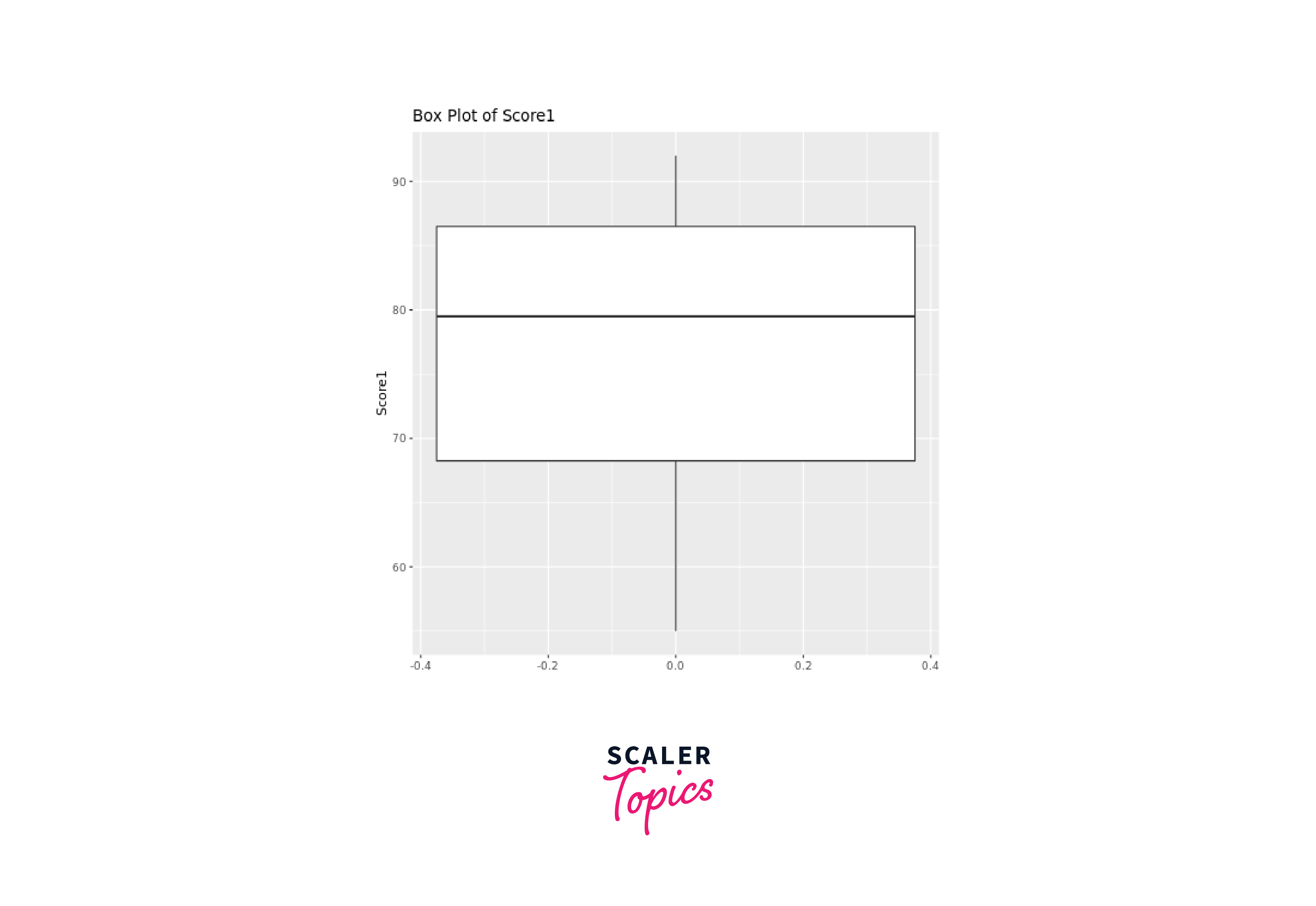
Similarly, we can create a box plot for Score2:
Output:
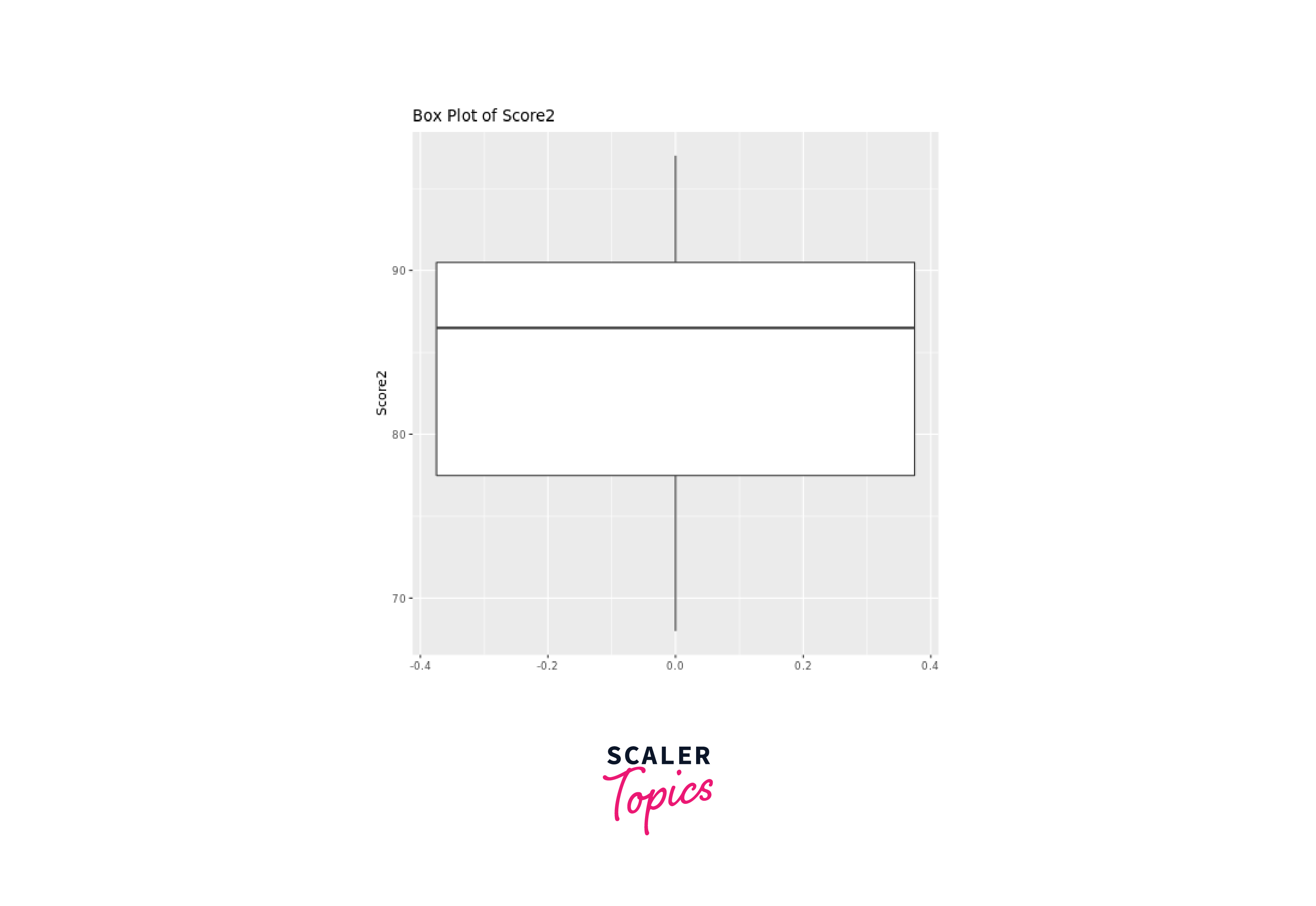
By looking at a box plot, we can easily see the distribution and spread of the data, along with key percentiles, which include the median (50th percentile) and the quartiles (25th and 75th percentiles).
Box plots visualize various quantiles efficiently: the line inside the box represents the median, dividing data equally; the box edges denote the 25th and 75th percentiles, showing the middle 50% spread (IQR); whiskers extend to data points within 1.5 times IQR, identifying potential outliers; points beyond whiskers are plotted as outliers, indicating extreme values or anomalies.
Density Plots
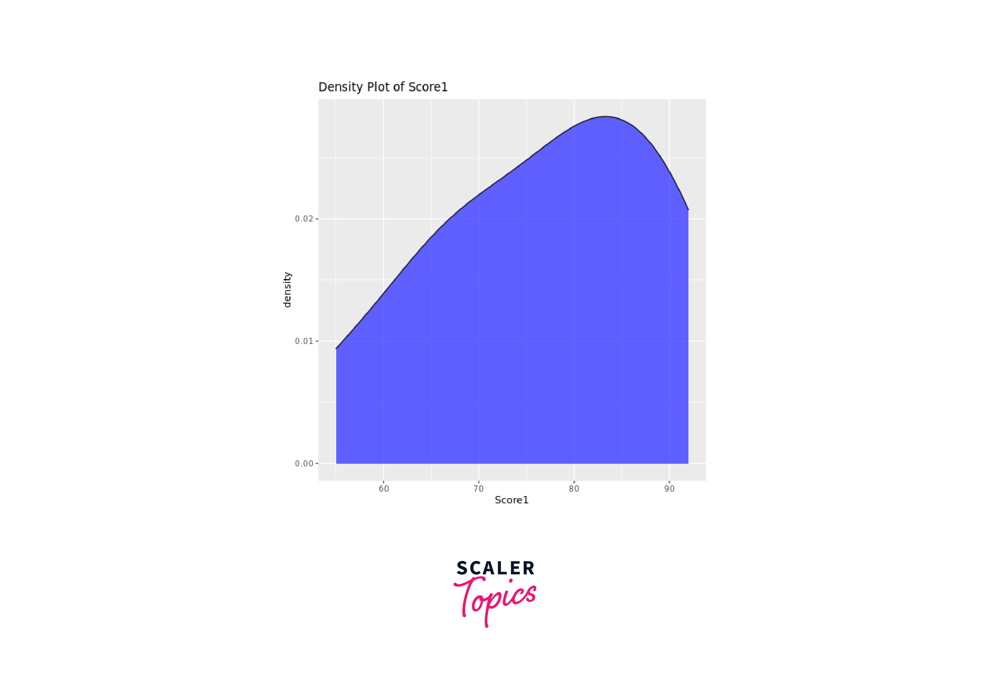
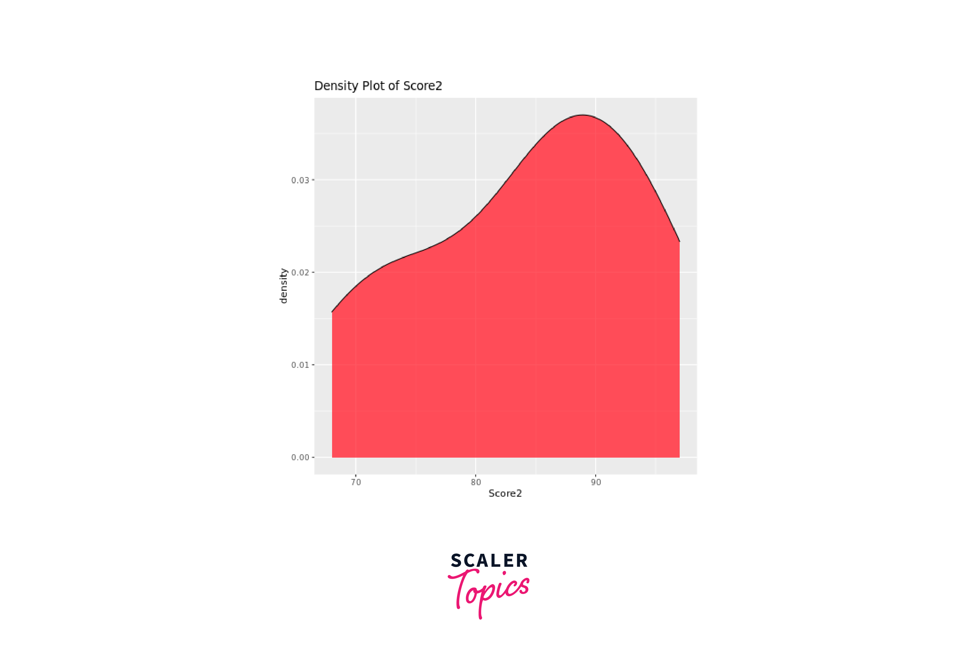
Density plots, also known as kernel density plots, illustrate the data's density distribution. The ggplot2 package can be used to create density plots, providing a smooth representation of the data's distribution.
Let's create density plots for both Score1 and Score2:
Output:
Scatter Plots
Scatter plots are useful for comparing two variables. We can use them to visualize how percentiles or quantiles of two variables relate to each other.
Let's create a scatter plot for Score1 and Score2:
Output:
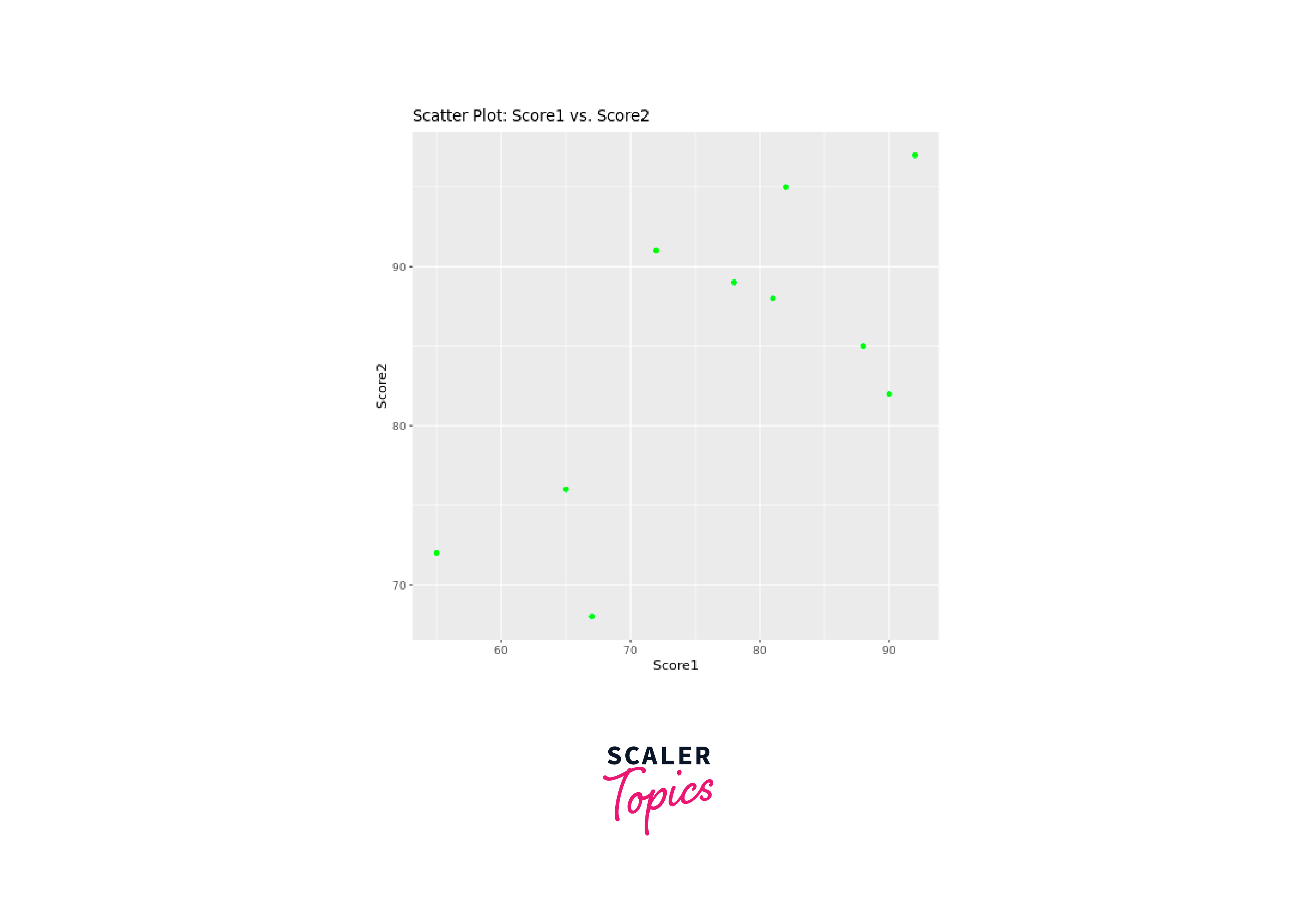
By creating a scatter plot with Score1 on the x-axis and Score2 on the y-axis, we can observe how the quantiles of these variables relate to each other. The scatter plot helps identify patterns in the distribution of quantiles, such as whether they follow a diagonal line or exhibit changes as values increase or decrease. Additionally, outliers can be spotted, indicating extreme quantile values that deviate from the main cluster of data points.
Conclusion
- Percentiles in R are crucial statistical measures that divide data into equal parts, aiding in understanding data distribution, spread, and central tendency.
- R provides the quantile() function as the primary tool for calculating percentiles, with various interpolation methods to choose from.
- Calculating percentiles for DataFrame columns or multiple columns in R is made easy using the dplyr package, enabling efficient data manipulation and analysis.
- Visualizing percentiles using box plots, density plots, and scatter plots in R empowers data analysts to identify patterns, outliers, and relationships in data distributions effectively.
- By calculating percentiles and visualizing them, analysts can compare multiple datasets and draw valuable insights to make informed decisions.
- Understanding percentiles in R enhances the ability to make data-driven choices across various domains, such as finance, healthcare, social sciences, and more.
