Pivot Charts
Overview
Understanding the significance of pivot charts in Excel and how pivot charts are essential to comprehending pivot charts in Excel. For big data sets, pivot tables are used to summarise the information and produce totals, averages, and other statistical measures. Pivot charts may then be made to display the data. Pivot charts are a crucial tool for data analysis in Excel because of their visual aspect, which makes it easier for users to see trends, patterns, and outliers.
What are Pivot Charts?
Pivot charts in Excel are used to help users analyze large amounts of data and identify trends, patterns, and outliers in the data.
Pivot tables are used to summarize large amounts of data into a more manageable format. They allow users to group, filter, and sort data by different criteria, such as dates, regions, or products. Pivot tables also provide users with various summary functions, such as sum, average, and count, which can be used to calculate totals and averages for each group.
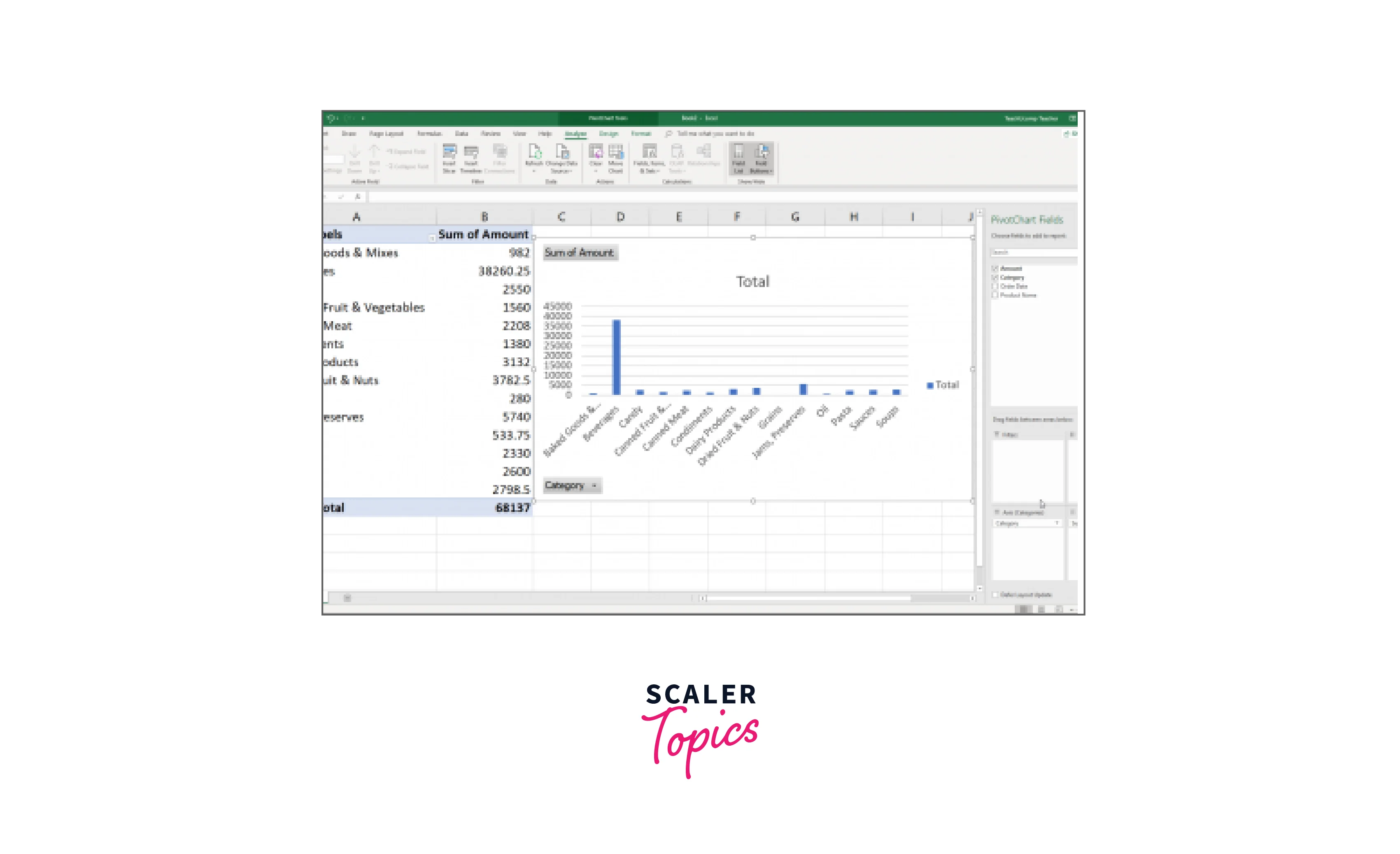
Once the pivot table has been created, a pivot chart can be created from the pivot table. Pivot charts allow users to visually represent the data in the pivot table in different chart types such as bar charts, line charts, and pie charts. Pivot charts can be created by selecting the data in the pivot table and then clicking on the appropriate chart type from the chart options.
Pivot charts can be customized to meet the needs of the user. Users can change the chart type, color scheme, and chart elements to create a chart that is visually appealing and easy to understand. Pivot charts also allow users to drill down into the data by clicking on specific data points in the chart. This drill-down feature enables users to analyze the data at a more granular level.
How to Create a Pivot Chart in Excel?
Let us deep dive into the steps for creating Pivot Chart in Excel:
Step - 1: Organize your Data
Before you create a pivot chart, you need to have organized data in a table format. Ensure that your data has a clear structure, with columns containing relevant information that you want to analyze.
Step - 2: Create a Pivot Table
Once your data is organized, you can create a pivot table to summarize and analyze the data. To do this:
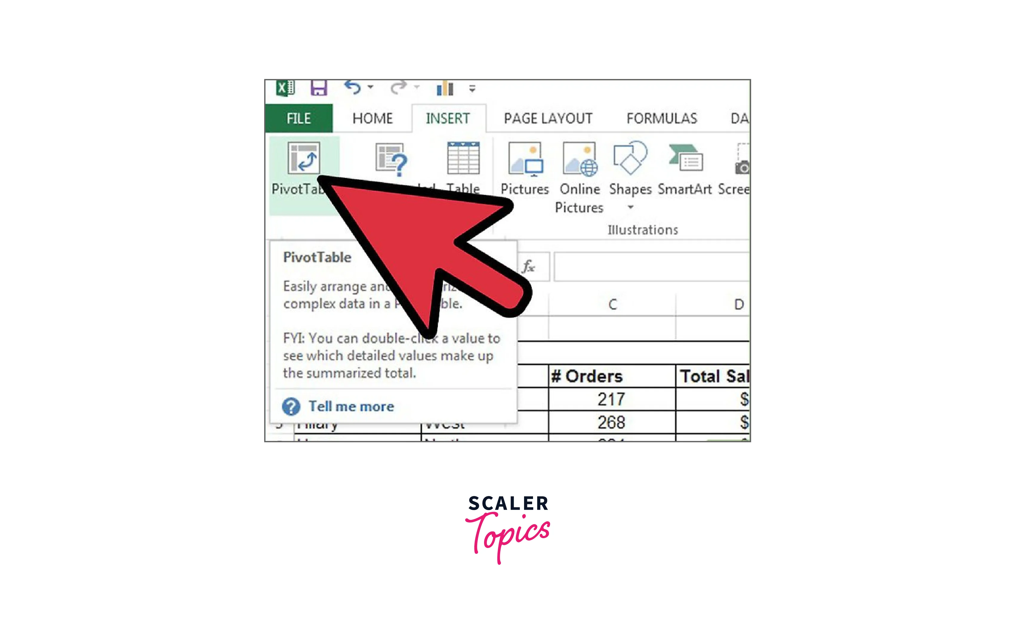
- Select any cell in your data range
- Go to the Insert tab and click on "PivotTable" in the Tables group
- In the Create PivotTable dialog box, ensure that the data range is correct and select where you want to place the pivot table
- Click on "OK"
- Excel will create a blank pivot table on a new sheet.
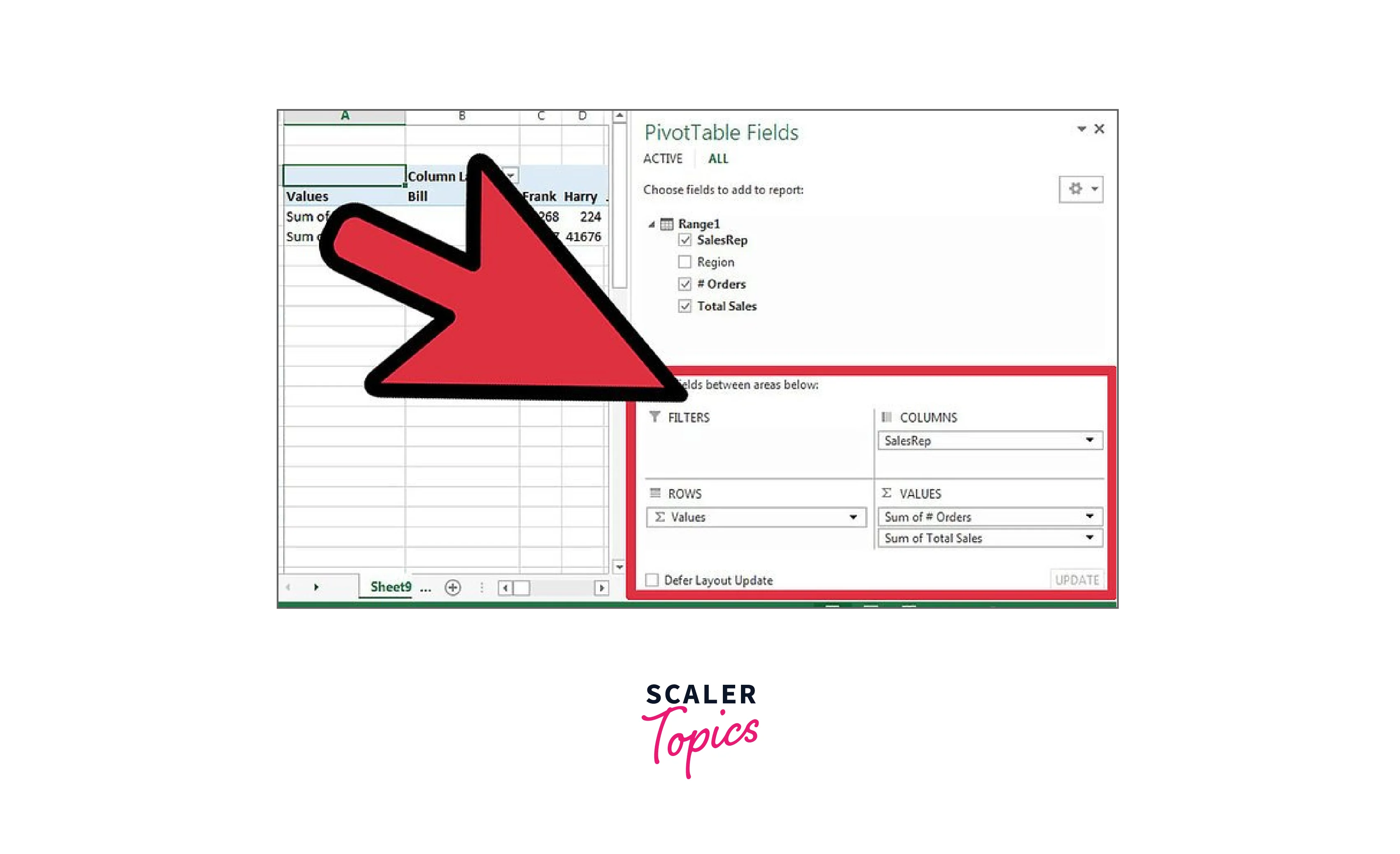
Step - 3: Choose your Pivot Table Fields
To add fields to your pivot table:
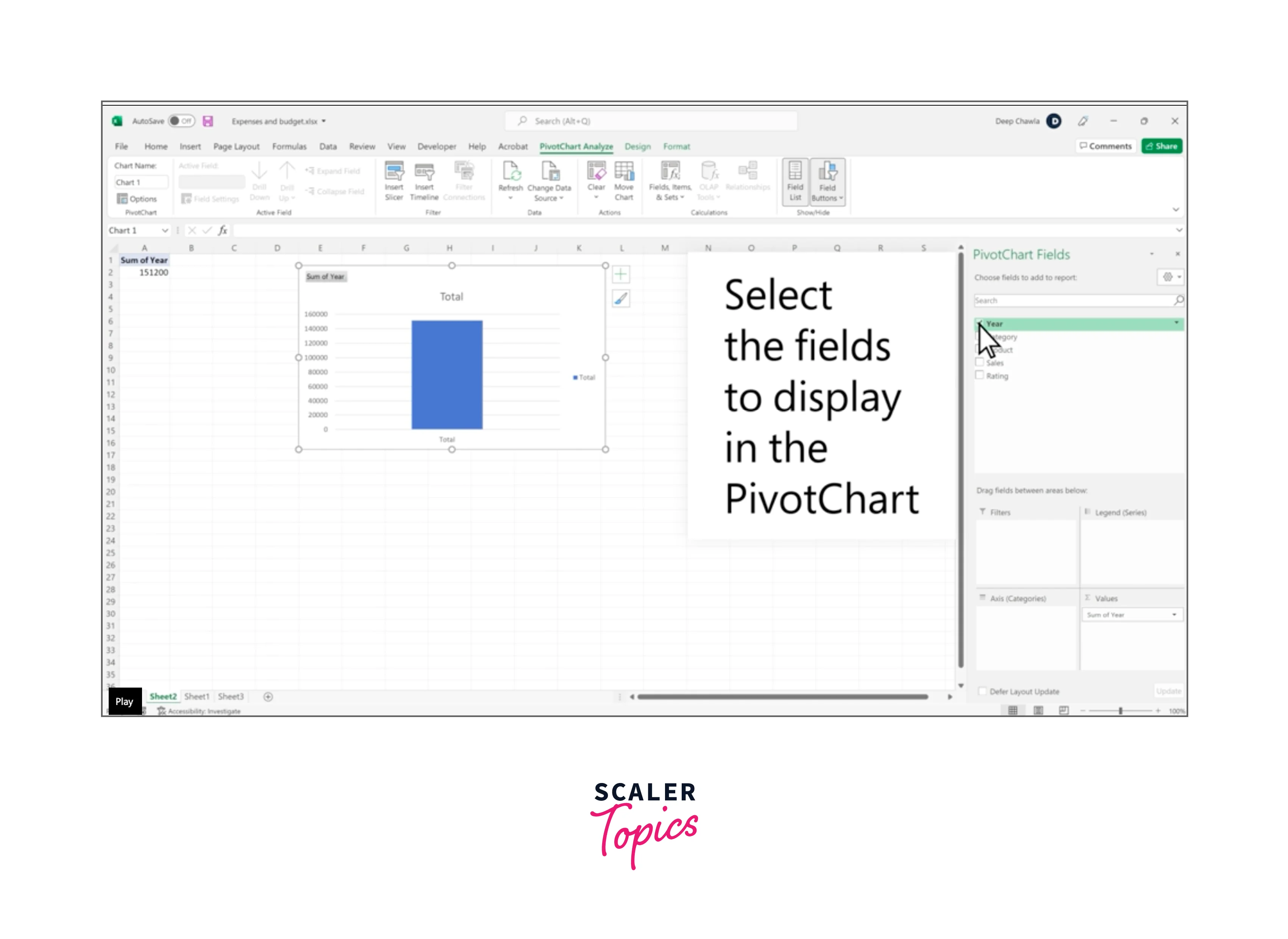
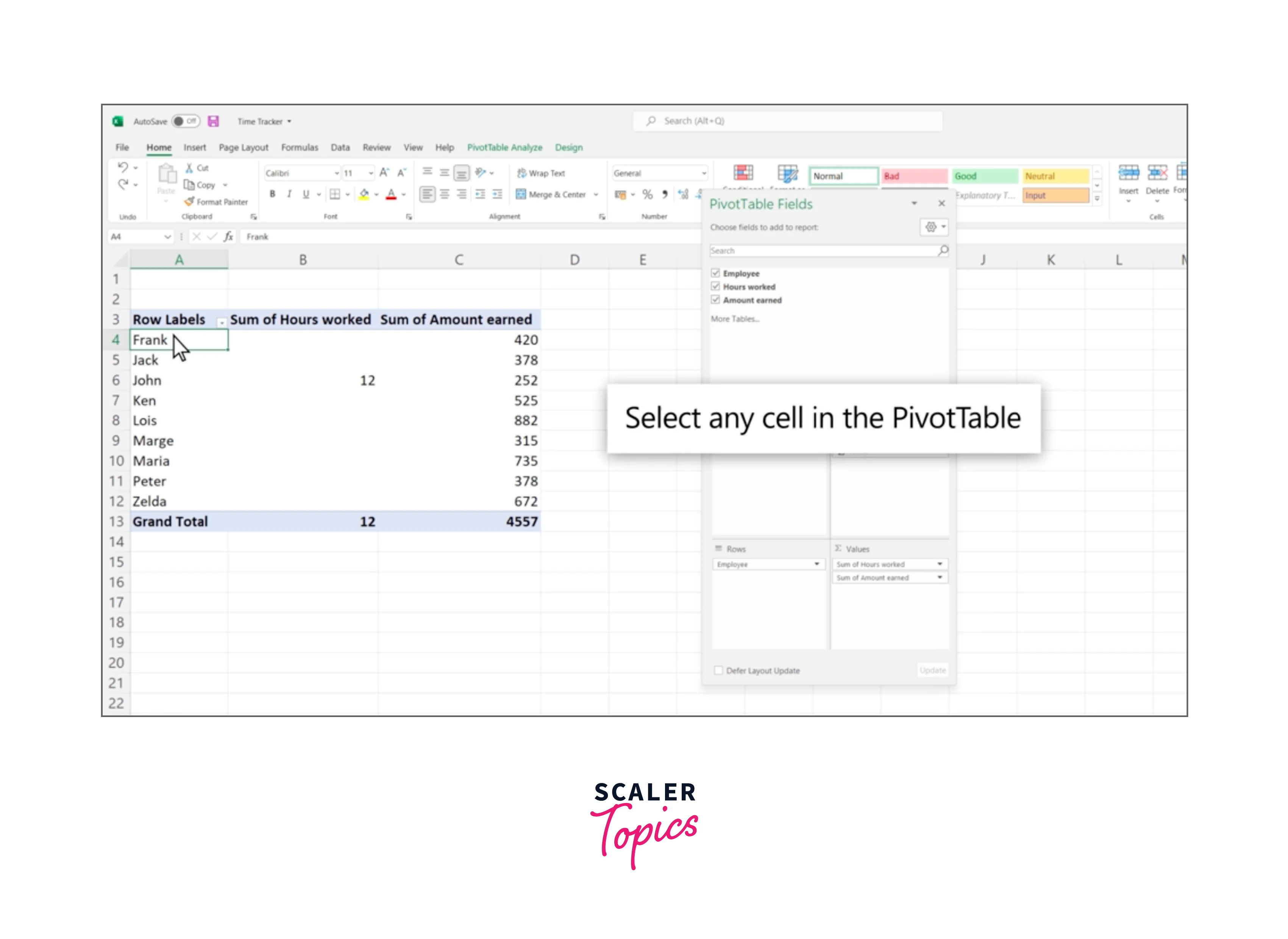
- In the PivotTable Fields pane, drag and drop the fields you want to summarize into the "Rows" and "Values" areas Arrange them in the order you want them to appear in the table.
Step - 4: Format your Pivot Table
To format your pivot table, you can use the Design tab in the PivotTable Tools menu. Here you can select a predefined table style, apply filters, add totals and subtotals, and customize other aspects of the table.
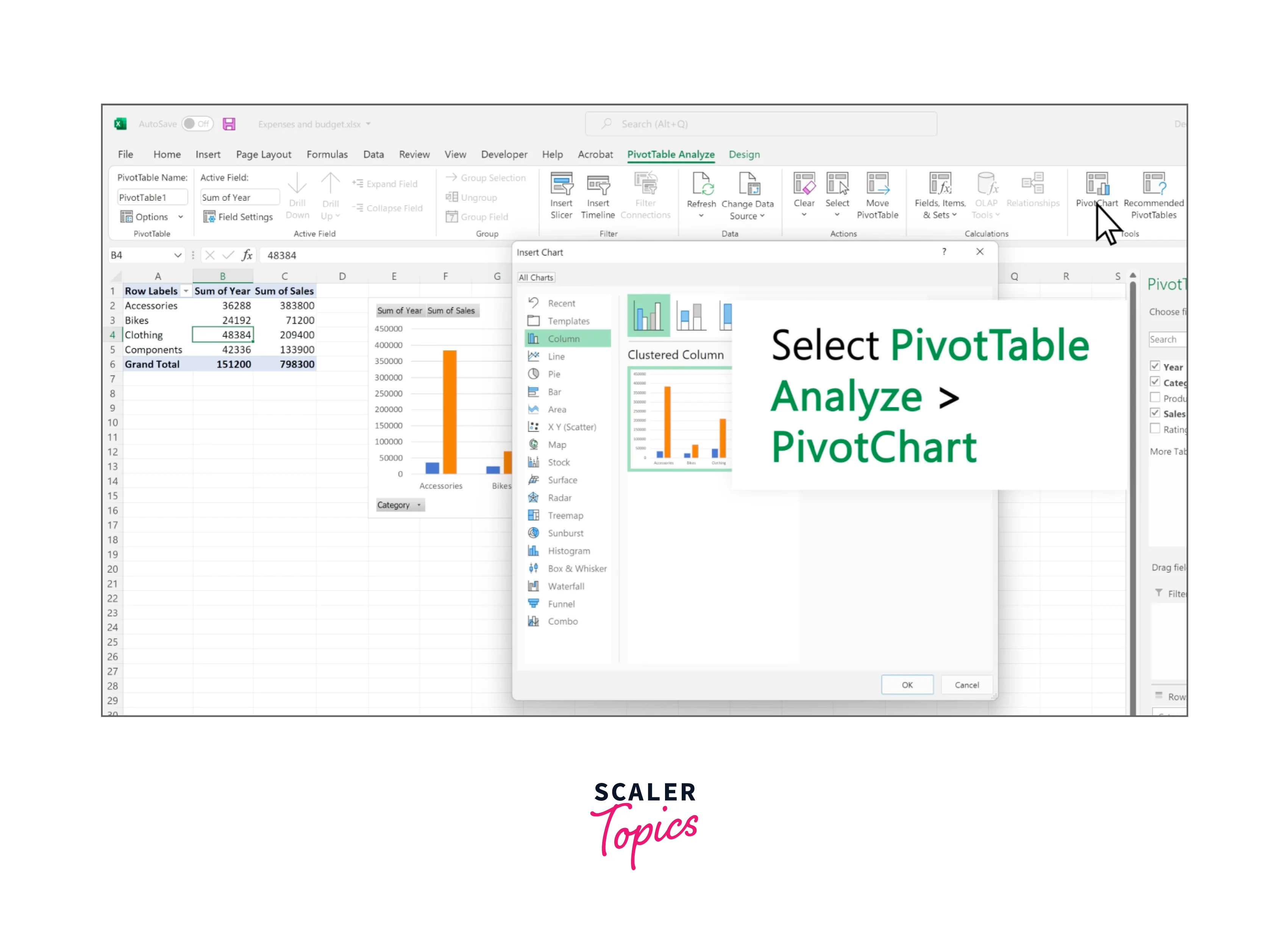
Step - 5: Create a Pivot Chart
To create a pivot chart:
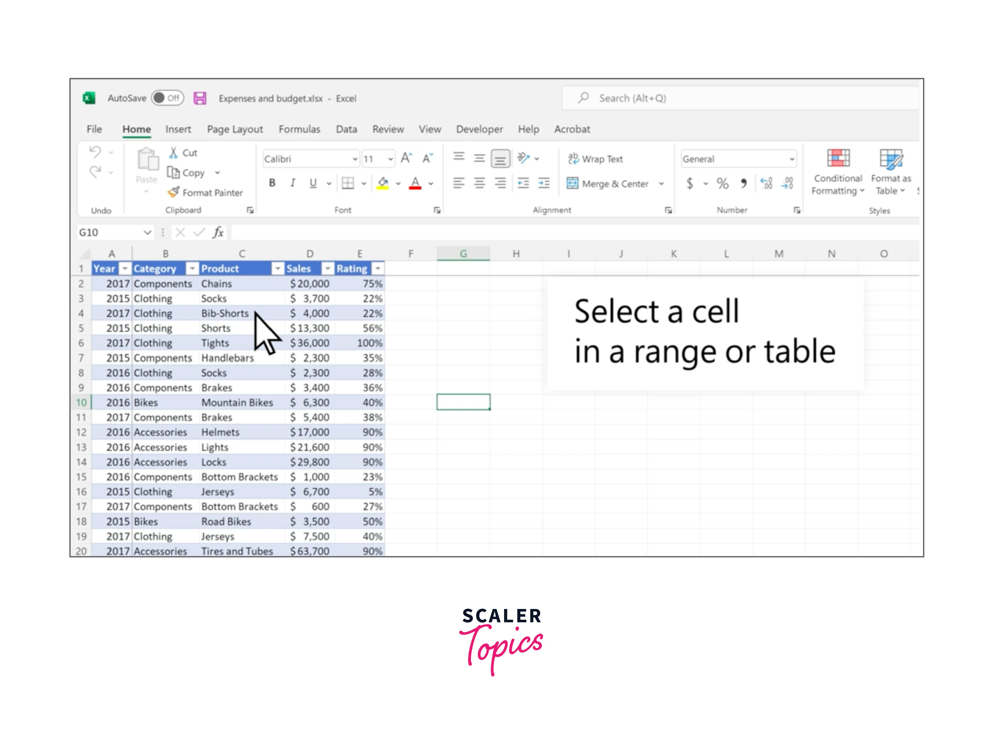
- Select any cell in your pivot table
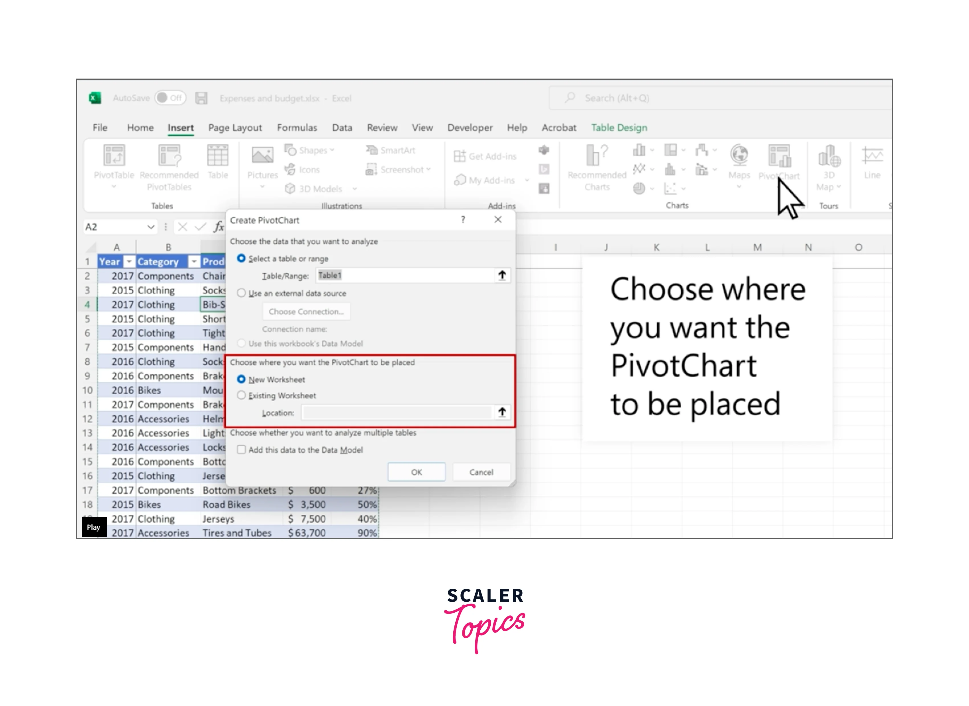
- Go to the Insert tab and click on the chart type you want to create in the Charts group
- Excel will create a blank chart on a new sheet
Step - 6: Customize your Pivot Chart
To customize your pivot chart, you can use the Chart Tools menu. Here you can select a different chart type, change the colors, add chart elements, and more.
Step - 7: Refresh your Pivot Chart to Apply Changes
If you make any changes to the pivot table data, you will need to refresh the pivot chart to update it. To do this, right-click on the pivot chart and select "Refresh" from the context menu.
How to Create a Chart from a Pivot Table?
Let us deep dive into the steps for creating a chart from Pivot Table in Excel:
Step - 1: Create a Pivot Table
The first step is to create a pivot table that summarizes the data you want to display in the chart. To create a pivot table:
- Select the data you want to use in the pivot table.
- Go to the Insert tab and click on "PivotTable" in the Tables group.
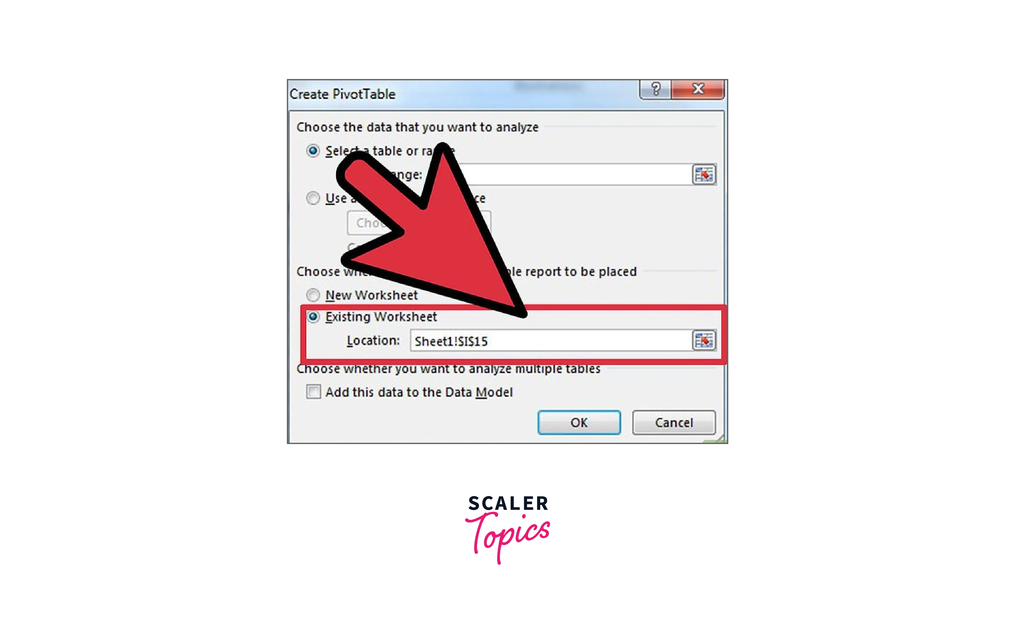
- In the Create PivotTable dialog box, select the range of cells that contains the data and choose where to place the pivot table.
- Click " OK."
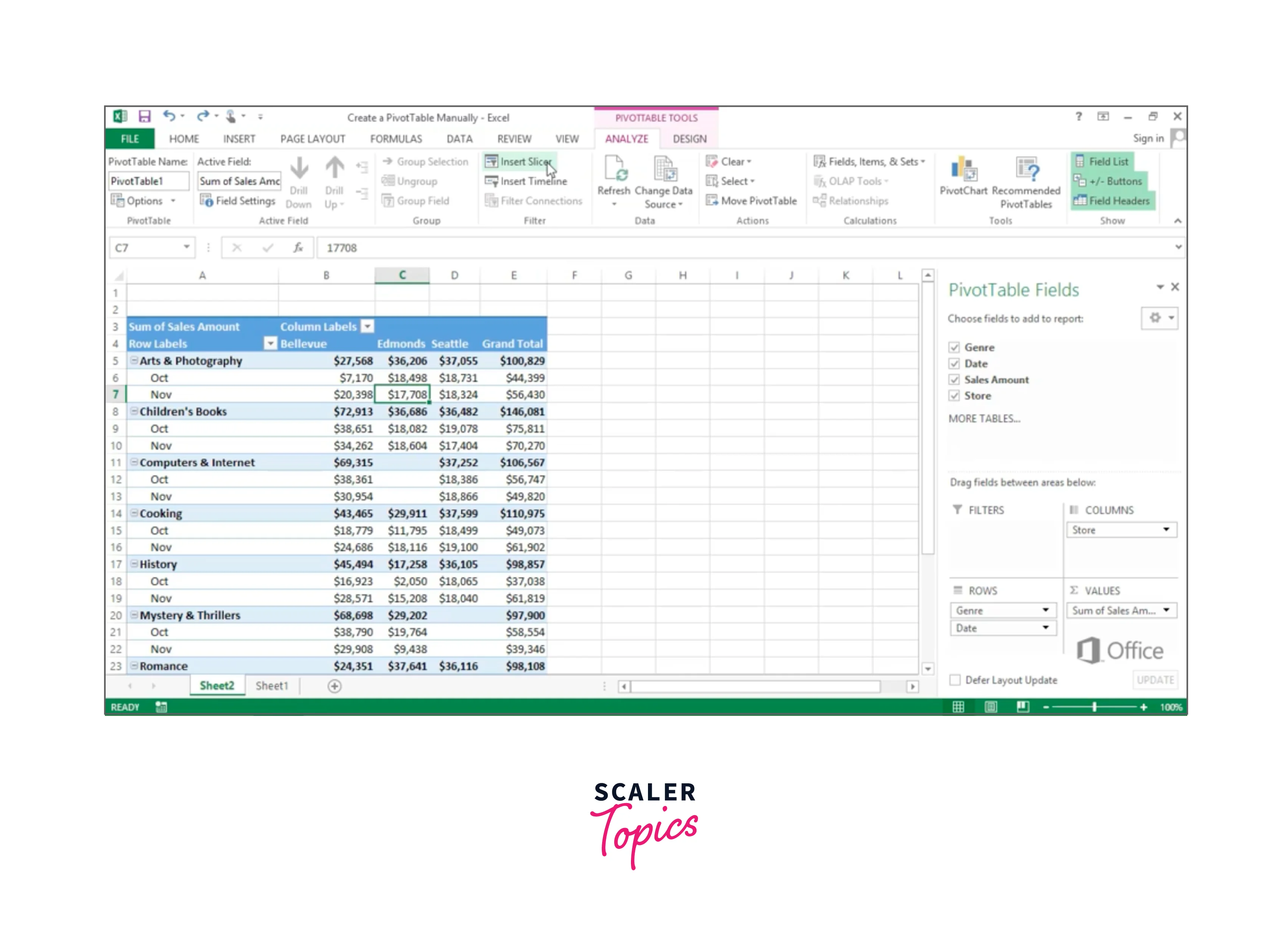
Step - 2: Add Data to the Pivot Table
Once you have created a pivot table, you can start adding fields to it. To add data to the pivot table:
- Drag the fields you want to use from the PivotTable Fields list to the Rows, Columns, and Values sections of the pivot table.
- For example, if you want to display gross annual sales by region, you would drag the "Region" field to the Rows section and the "Sales" field to the Values section.
Step - 3: Format the Pivot Table
To format the pivot table, you can use the Design tab in the PivotTable Tools menu. Here you can choose a predefined table style, apply filters, add totals and subtotals, and customize other aspects of the table.
Step - 4: Create the Chart
Once you have created and formatted the pivot table, you can create a chart based on the data in the pivot table. To create a chart:
- Click on any cell within the pivot table.
- Go to the Insert tab and click on the chart type you want to create in the Charts group. For example, select a Column chart.
- Excel will create a blank chart on a new sheet.

Step - 5: Format the Chart
You can format the chart using the Chart Tools menu. Here you can select a different chart type, change the colors, add chart elements, and more.
Step - 6: Update the Chart
If you make any changes to the pivot table data, you will need to update the chart to reflect those changes. To do this, right-click on the chart and select "Refresh" from the context menu.
And that's it! With these steps, you can create a chart from a pivot table in Excel and customize it to suit your needs.
Filter Pivot Chart
Filter in a pivot chart in Excel allows you to focus on specific data in your chart by displaying only the information you want to see.
Let us look at the step-by-step process of creating a Filter in the Pivot Chart:
- Open Microsoft Excel and create a pivot chart based on your data. To do this, select the data you want to include in your chart, go to the "Insert" tab, and click "PivotChart."
- Once your pivot chart is created, you'll see a "PivotTable Fields" pane on the right-hand side of your screen. This page shows all of the fields included in your pivot chart.
- To filter your pivot chart, select the field you want to filter by from the "PivotTable Fields" pane. For example, if you have a sales data pivot chart, you might want to filter by "Product Type" to see sales for a specific product.
- Drag the field you want to filter by from the "PivotTable Fields" pane to the "Report Filter" section of the "PivotChart Fields" pane.
- A drop-down menu will appear in your pivot chart, allowing you to select which values you want to include or exclude from your chart. For example, if you're filtering by "Product Type," you might choose to only include data for "Widgets" and "Gadgets."
- Your pivot chart will now only show data for the values you've selected in the filter.
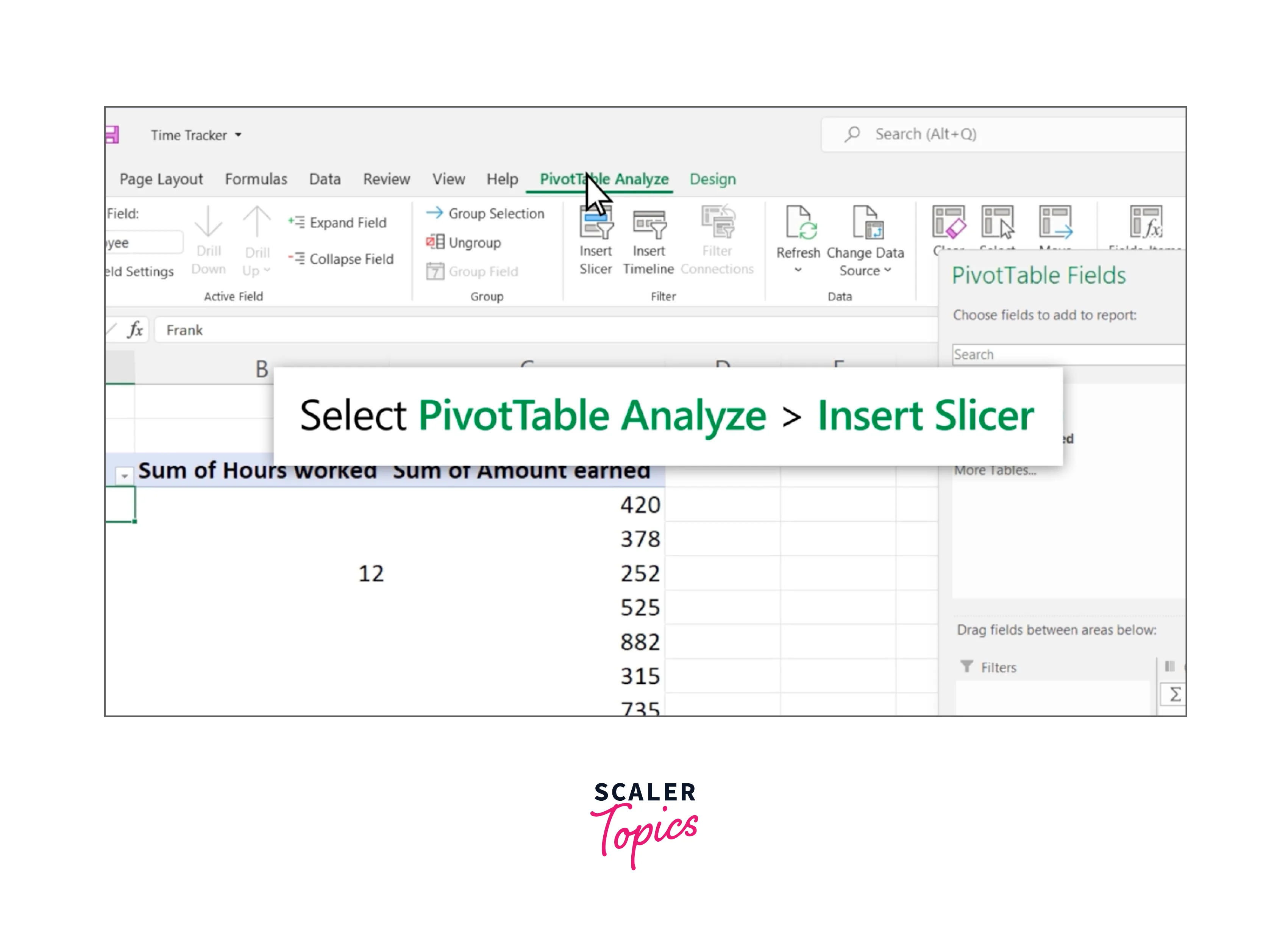
How to Create a Pivot Table Slicer in Excel?
Let us look at the step-by-step guide to creating a Pivot Table Slicer in Excel:
- First, create a pivot table in Excel by selecting the data you want to include in your table and going to the "Insert" tab in the ribbon.
- Once you've created your pivot table, select any cell within the pivot table to activate the "PivotTable Analyze" tab in the ribbon.
- From the "PivotTable Analyze" tab, select "Insert Slicer."
- In the "Insert Slicers" dialog box, choose the field you want to use for your slicer by checking the box next to it. You can select multiple fields if you want to create more than one slicer.
- Click "OK" to create your slicer(s).
- Use your slicer to filter your pivot table by selecting the items you want to display. Your pivot table will update automatically to reflect your selections.


Change Pivot Chart Type
Let us look at the step-by-step guide to changing Pivot Chart Type for further customization:
- Open the Excel workbook that contains the pivot chart you want to modify.
- Click on the pivot chart to select it. You should see a "PivotChart Tools" tab appear in the ribbon.
- In the "PivotChart Tools" tab, click on the "Design" tab.
- In the "Type" group, you will see a dropdown menu labeled "Change Chart Type". Click on this dropdown menu.
- The "Change Chart Type" dialog box will appear. This dialog box will display all the chart types available in Excel.
- Select the chart type you want to use from the list on the left-hand side of the dialog box.
- Once you've selected a new chart type, you can customize its appearance using the options on the right-hand side of the dialog box. For example, you can change the chart's layout, data series, and chart elements.
- When you're done making changes, click the "OK" button to apply the new chart type to your pivot chart.
Conclusion
- Pivot charts in Excel and pivot tables are powerful tools in Excel that allow you to analyze and visualize large data sets.
- Pivot tables allow you to summarize and manipulate data flexibly and dynamically, without altering the original data.
- Pivot charts can be created based on pivot tables, providing a visual representation of the summarized data.
- Changing the chart type can help you present your data in a more meaningful way, depending on the type of information you want to convey.
- Excel offers a wide range of chart types, including bar charts, line charts, scatter plots, and more.
- Filters are useful for narrowing down the data displayed in your pivot table and chart, allowing you to focus on specific subsets of your data.
- Slicers are interactive controls that allow you to filter your data in real time, providing a dynamic and user-friendly way to analyze your data.
- Slicers are particularly useful when working with dashboards or other interactive reports.
- Excel also allows you to customize the appearance of your pivot charts, including font styles, colors, and formatting options.
- Overall, pivot charts, pivot tables, changing chart types, filters, and slicers are essential tools for data analysis and visualization in Excel, providing a flexible and powerful way to work with large data sets.