R plot() Function
Overview
The R plot() function is a versatile and fundamental tool for creating visualizations in data analysis and visualization tasks. With just a few lines of code, it generates various types of plots, such as scatter plots, line plots, histograms, and bar charts, among others. This function allows users to customize the appearance of plots by adjusting colors, labels, titles, and axes. Suitable for exploratory data analysis and data communication, plot() facilitates quick insights and communication of patterns and trends within datasets, making it an indispensable function in the R programming language for data visualization tasks.
The plot() Function
Syntax
In R, the syntax for the plot() function is as follows:
Here's an overview of the main parameters:
- x: The data for the x-axis, either a numeric vector or a formula.
- y: The data for the y-axis, either a numeric vector or a formula.
- type: Specifies the type of plot to be created. Common types include:
- "p": Points (scatter plot)
- "l": Lines (line plot)
- "b": Both points and lines
- "h": Histogram
- "bar": Bar chart
- "box": Box plot
The ... represents additional optional arguments that can be used for customization, such as main for the main plot title, xlab and ylab for axis labels, and col for color choices, among others.
Parameters
The plot() function in R has several parameters that allow you to customize and control various aspects of the plot. Here are some of the main parameters:
- x: The data for the x-axis, either a numeric vector or a formula.
- y: The data for the y-axis, either a numeric vector or a formula.
- type: Specifies the type of plot to be created. Common types include:
- "p": Points (scatter plot)
- "l": Lines (line plot)
- "b": Both points and lines
- "h": Histogram
- "bar": Bar chart
- "box": Box plot
- "pie": Pie chart
- And more...
- main: The main title of the plot.
- xlab: The label for the x-axis.
- ylab: The label for the y-axis.
- xlim: A vector of length 2 specifying the limits of the x-axis.
- ylim: A vector of length 2 specifying the limits of the y-axis.
- col: The color of points, lines, or bars in the plot.
- pch: The symbol or character used for plotting points.
- lty: The type of line used in line plots.
- lwd: The width of lines in the plot.
- cex: A numerical value indicating the size of plotted text and symbols.
- bg: The background color for points.
- las: The orientation of axis labels.
- ...: Additional optional arguments for customization.
These parameters, along with others not listed here, provide great flexibility in creating a wide range of visualizations to explore and communicate data effectively in R.
Example
Here's an example of using the plot() function in R to create a simple scatter plot:
Output:
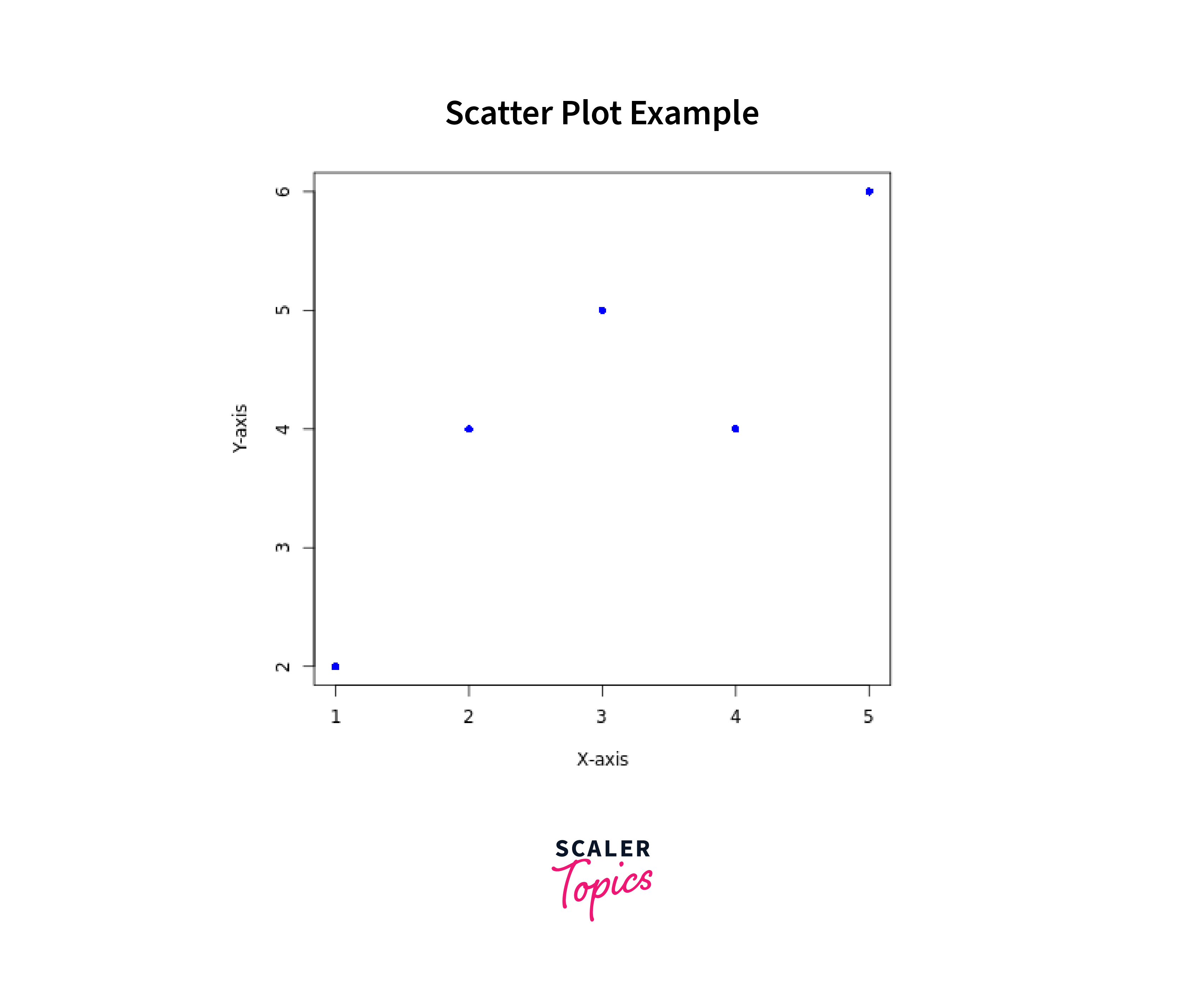
In this example, we have two vectors x and y, representing the data points to be plotted on the x-axis and y-axis, respectively. We use type = "p" to specify that we want to create a scatter plot. The main, xlab, and ylab parameters are used to set the main title and axis labels. We've set the color of the points to blue with col = "blue", and pch = 16 is used to specify the symbol for plotting points as circles.
Different Plot Types in R
In R, the plot() function is a powerful tool that can create various types of plots based on the specified type argument. While plot() is versatile and handy, more advanced and customized plots often require packages like ggplot2. Here are some common plot types that can be generated using the plot() function in R:
- Scatter Plot (type = "p"): A plot of points representing individual data observations.
Syntax:
- Line Plot (type = "l"): A plot of points connected by lines, commonly used for time series data or continuous functions.
Syntax:
- Point and Line Plot (type = "b"): A combination of points and lines in the same plot.
Syntax:
-
Histogram:
A histogram (type = "h") is a graphical representation of the distribution of numerical data. It displays the frequencies of data within specified intervals (bins). However, please note that in the base plot() function, type = "h" does not refer to histograms. For histograms, the hist() function is generally used.
Syntax:
-
Bar Chart:
A bar chart (type = "bar") represents categorical data with rectangular bars. The height or length of each bar is proportional to the values they represent. Nevertheless, type = "bar" is not a valid type for the plot() function. Instead, for plotting bar charts, the barplot() function is typically utilized.
Syntax:
- Box Plot (type = "box"): A graphical representation of the data's distribution through quartiles, providing information on the median, range, and possible outliers.
Syntax:
- Pie Chart (type = "pie"): A circular chart divided into slices, each representing a proportion of the whole.
Syntax:
-
Area Plot (type = "s" or type = "S"):
An area plot is an extension of the line plot, where the area under the lines is filled, making it useful for representing accumulated data. However, please be aware that the type = "s" or type = "S" option for creating an area plot is not valid in the base plot() function. To create density or area plots, you would typically need to use functions from other packages like ggplot2, which provides more advanced plotting capabilities in R.
Syntax:
-
Density Plot (type = "density"):
A density plot is a visualization that shows the estimated probability density function of a continuous random variable. It allows us to visualize the distribution of data as a smooth curve. However, please note that the type = "density" option is not directly available in the base plot() function. To create a density plot, you might use plot(density(data)) as a workaround or utilize advanced plotting packages like ggplot2, which offers extensive support for density plots and various customization options.
Syntax:
-
Heatmap:
A graphical representation of data where individual values are represented as colors on a grid, commonly used for visualizing matrices or two-dimensional data.
Syntax:
These are just a few examples of the plot types available in R. The plot() function offers a wide range of customization options, making it a versatile tool for data visualization and exploration. Additionally, R has various specialized packages, such as ggplot2, lattice, and plotly, that provide even more sophisticated and specialized plotting capabilities.
Choosing the Right Types of Plots: Considerations and Guidelines
When selecting the appropriate type of plot, it's essential to consider the nature of the data and the specific insights you want to convey. Different types of plots are better suited for visualizing different types of data and relationships. Here are some guidelines on when to use each type of plot:
- Scatter Plots: Scatter plots are ideal for visualizing the relationship between two continuous variables. They display individual data points as dots on a graph, where each dot represents a data observation. Scatter plots are excellent for identifying patterns, trends, correlations, and outliers in data. They are particularly useful when you want to observe how two variables interact with each other.
- Bar Charts: Bar charts are best suited for representing categorical data. They use rectangular bars of varying lengths to visualize the distribution of data across different categories. Bar charts are excellent for comparing discrete data or showing the frequency of occurrences in each category. They are commonly used to display survey results, product sales, or any data with distinct categories.
- Line Plots: Line plots are suitable for displaying trends over time or a sequence of data points. They are commonly used in time-series data to show how a variable changes over a continuous period. Line plots can also be used to demonstrate continuous data trends or changes in a continuous variable.
- Histograms: Histograms are effective for visualizing the distribution of continuous data. They group data into intervals (bins) and display the frequency or count of data points within each bin. Histograms are useful for understanding the shape and spread of data and identifying patterns like skewness or central tendency.
- Area Plots: Area plots are great for visualizing accumulated data over time or a continuous range. They are an extension of line plots, with the area under the lines filled. Area plots are useful for showing cumulative changes and comparing the contribution of different variables to the overall total.
- Density Plots: Density plots show the estimated probability density function of continuous data. They are useful for understanding the underlying distribution and the concentration of data in different regions. Density plots are particularly valuable when dealing with large datasets and provide a smooth representation of data distribution.
By considering the characteristics of your data and the specific insights you want to communicate, you can choose the most suitable type of plot that effectively presents your data and enhances understanding for your audience.
Examples of Plotting Data in R Programming
1. Plot One Point
To plot a single point in R programming, you can use the plot() function with the type = "p" argument and provide the x and y coordinates of the point as input. Here's an example:
Output:

In this example, we set x to 2 and y to 3 to specify the coordinates of the point we want to plot. The type = "p" argument is used to create a scatter plot with points, and pch = 16 is used to set the symbol of the point (in this case, a filled circle). The col = "red" parameter is used to set the color of the point to red. The main, xlab, and ylab parameters are used to set the plot title and axis labels.
When you run this code, you'll get a plot with a single point located at coordinates (2, 3), marked as a red circle.
2. Plot Multiple Points:
Output:
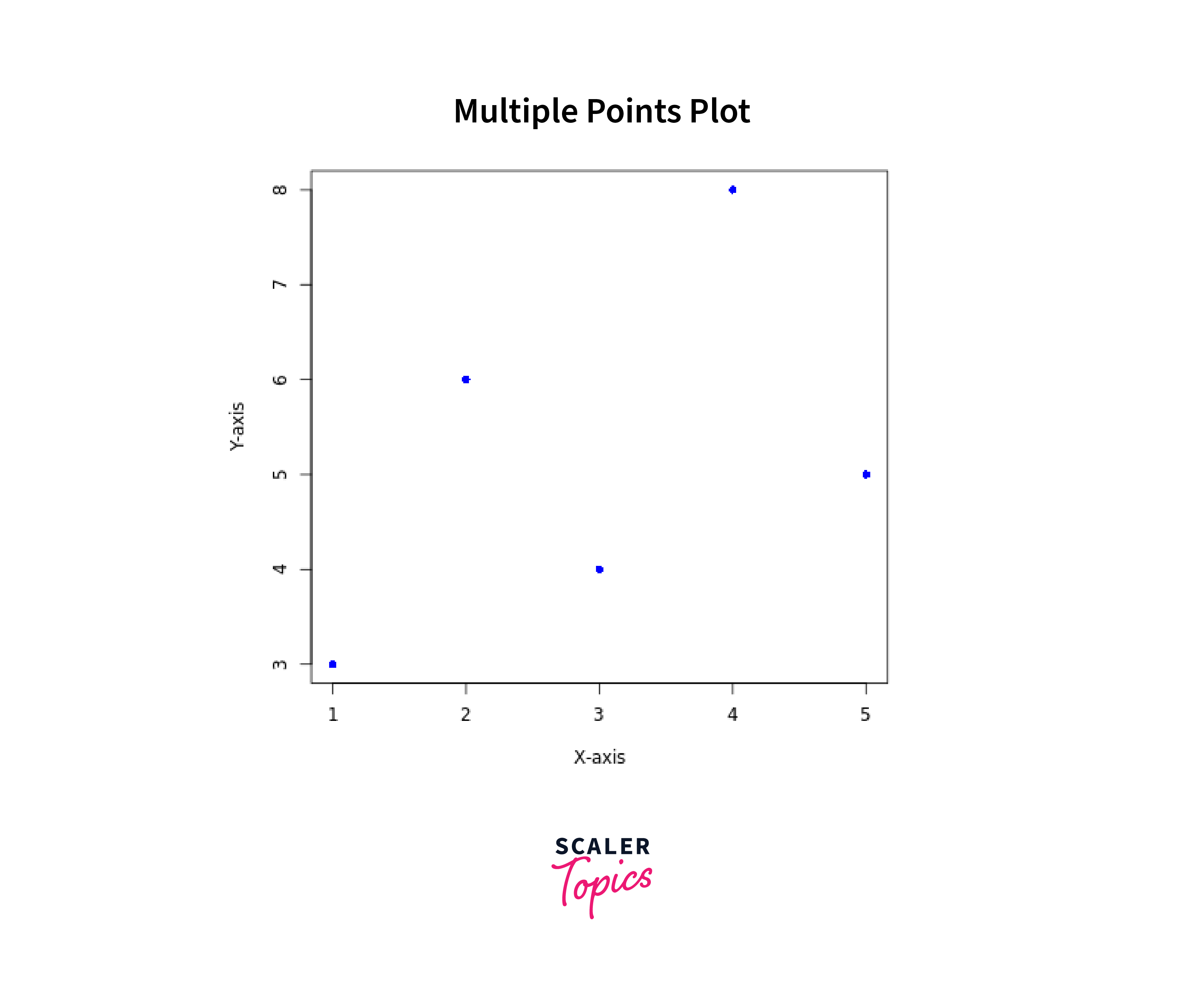
In this example, we have two vectors x and y, each representing the coordinates of multiple points. We use type = "p" to specify that we want to create a scatter plot. The main, xlab, and ylab parameters are used to set the main title and axis labels. We set the color of the points to blue with col = "blue", and pch = 16 is used to specify the symbol for plotting points as circles. The resulting plot will display five points at coordinates (1, 3), (2, 6), (3, 4), (4, 8), and (5, 5).
3. Plot Sequence of Points:
Output:

In this example, we generate a sequence of points for the x-axis from 1 to 10 and calculate their corresponding y-values as squares of the x-values. We then use plot() with type = "p" to create a scatter plot. The resulting plot will display 10 points forming a parabolic shape on the graph, where each point corresponds to the x-value and its squared y-value.
4. Draw a Line:
Output:
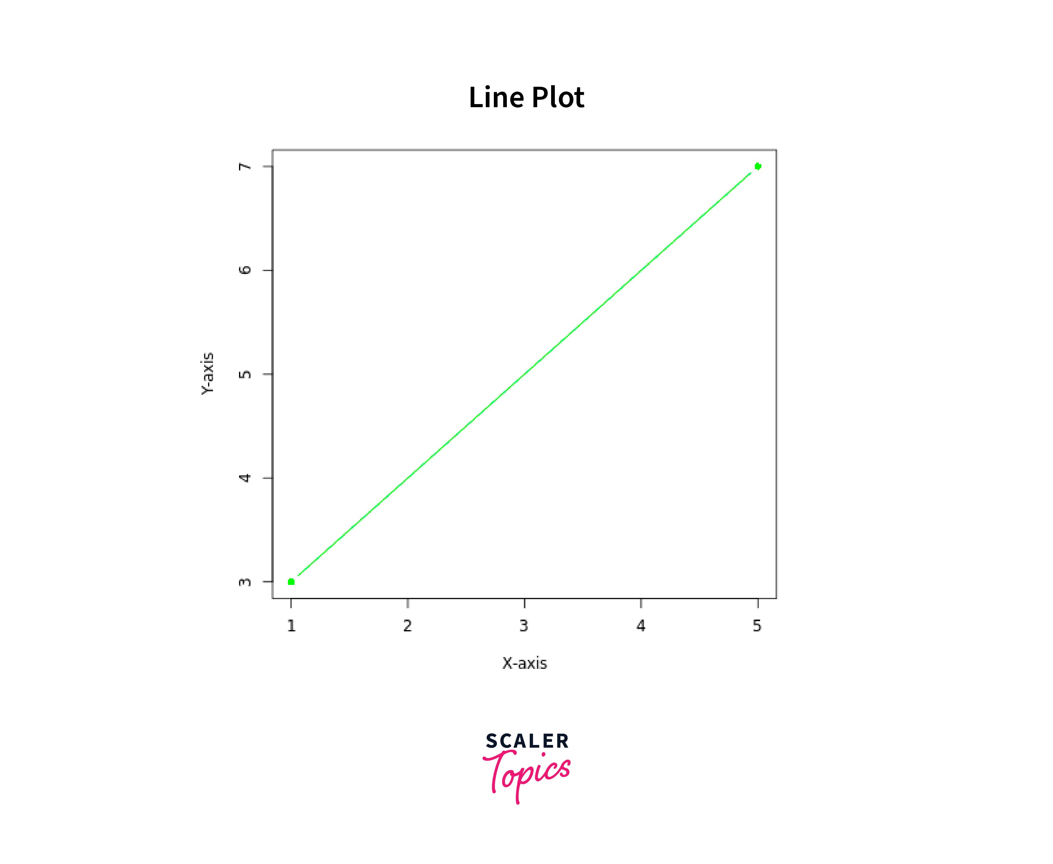
In this example, we have two vectors x_line and y_line, representing two data points (1, 3) and (5, 7). We use type = "b" to create a plot with both points and lines. The resulting plot will display the two points on the graph, and a line will connect them, forming a diagonal line segment from (1, 3) to (5, 7).
5. Plot Labels:
Output:
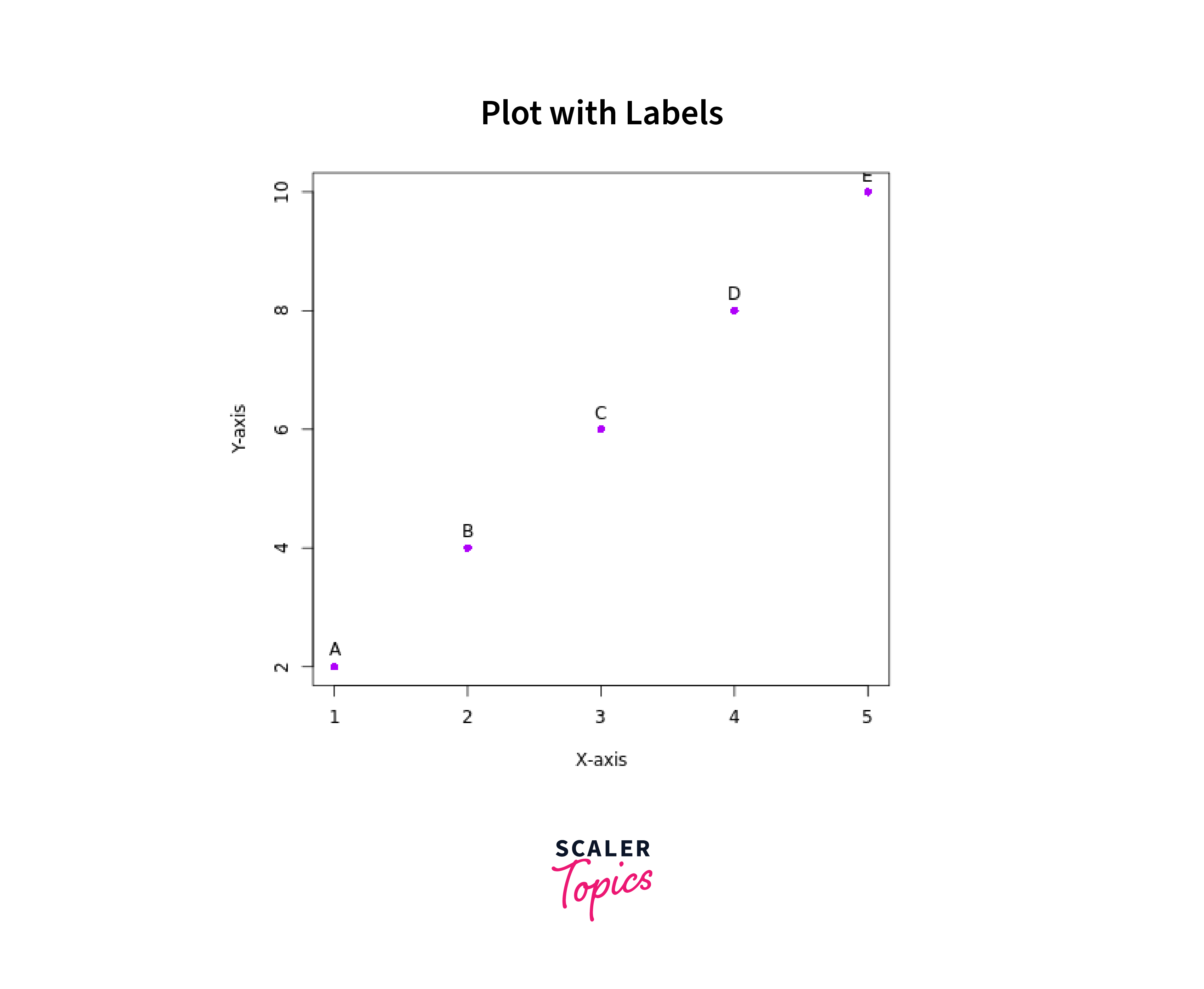
In this example, we have three vectors: x_labels and y_labels representing the coordinates of five points, and labels containing the corresponding labels "A", "B", "C", "D", and "E" for each point. We use type = "p" to create a scatter plot. The text() function is used to add text labels to the points (pos = 3 means the labels will appear above the points). The resulting plot will display five labeled points, each labeled with a letter from "A" to "E". The points' coordinates are (1, 2), (2, 4), (3, 6), (4, 8), and (5, 10).
6. Change Graph Appearance
-
Customizing Color:
Output:
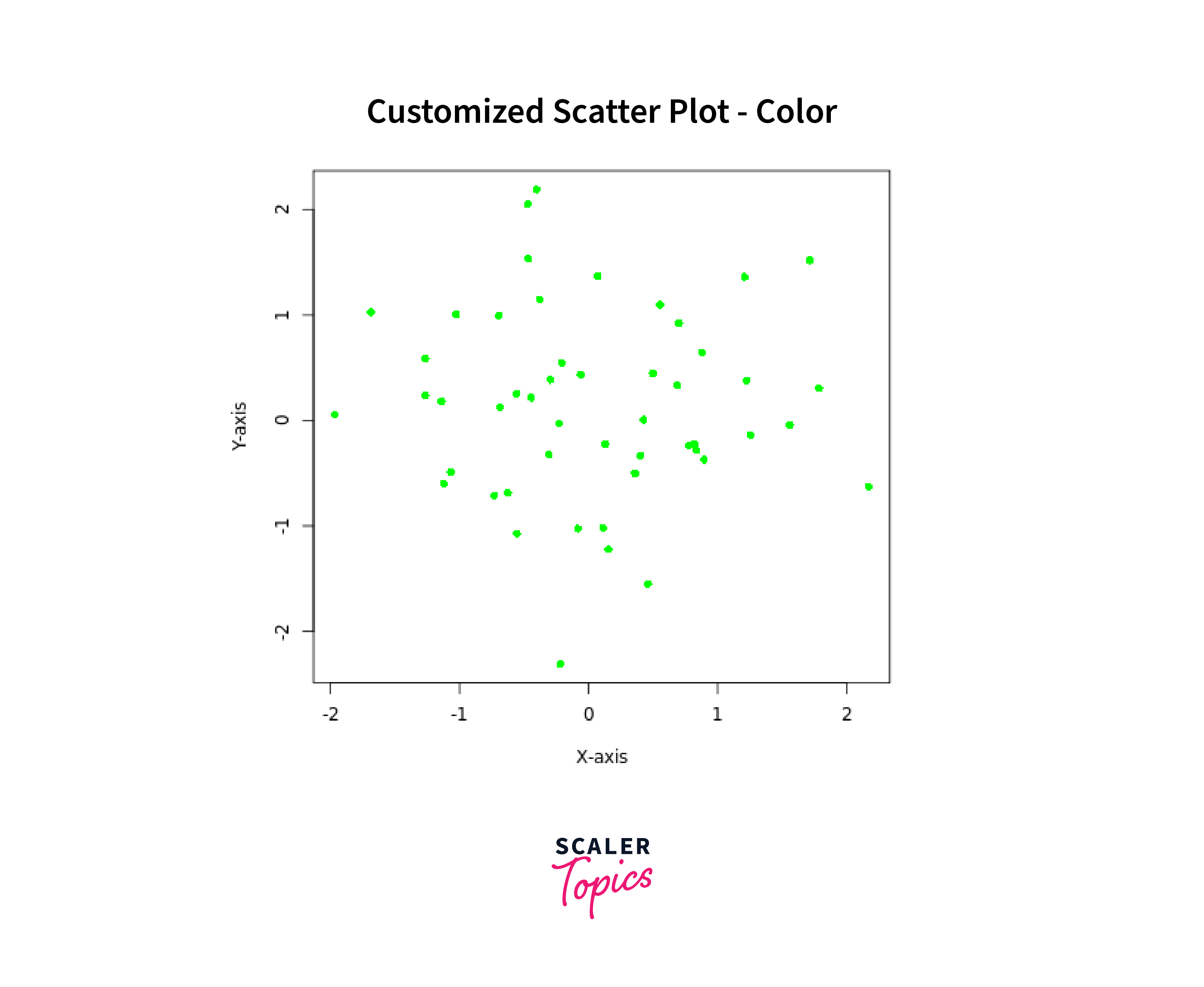
In this code snippet, we begin by setting a random seed with set.seed(123) to ensure reproducibility of random data. Then, we generate 50 random data points from a standard normal distribution for the x and y axes using x <- rnorm(50) and y <- rnorm(50). The plot() function is used to create a scatter plot with the generated data points. We customize the appearance by setting the plot title to "Customized Scatter Plot - Color" using main, and the x and y axis labels with xlab and ylab respectively. The color of the points is set to green using col = "green", and the point shape is set to circles with pch = 16.
-
Customizing Size:
Output:
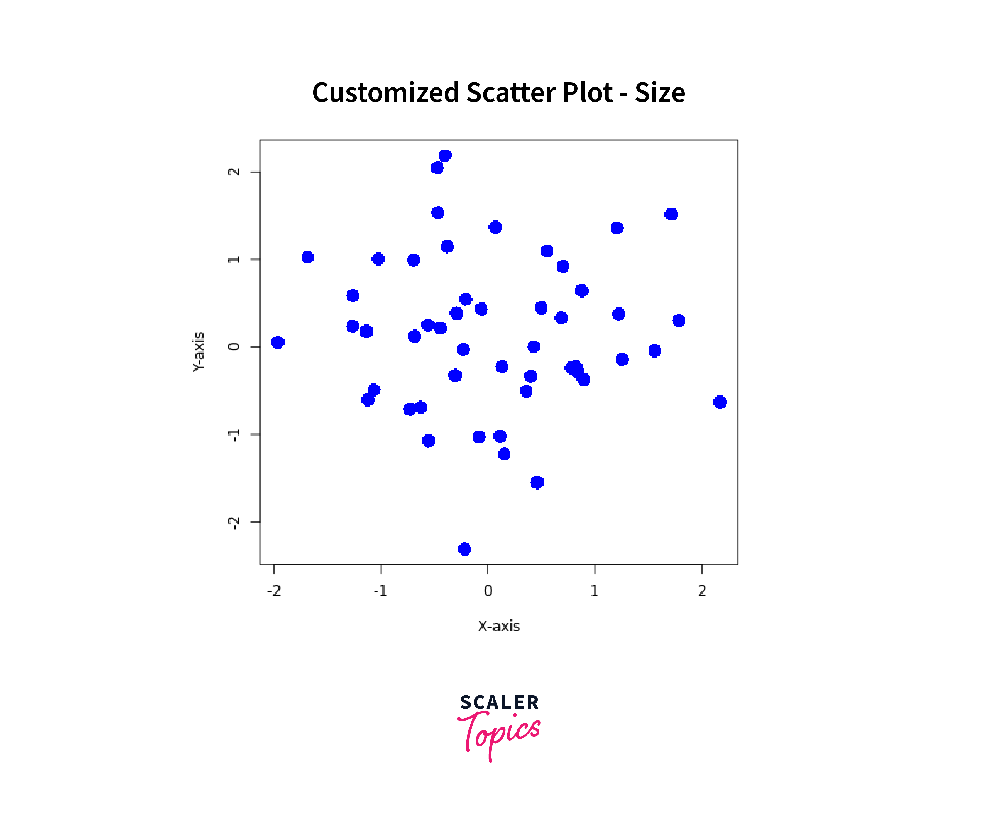
Similar to the previous snippet, this code generates random data points for x and y and creates a scatter plot. However, this time we customize the size of the points. The plot() function is called with cex = 2 to set the size of the points to be twice the default size. As a result, the scatter plot displays blue circles with larger points compared to the first plot.
- Customizing Point Shape:
Output:
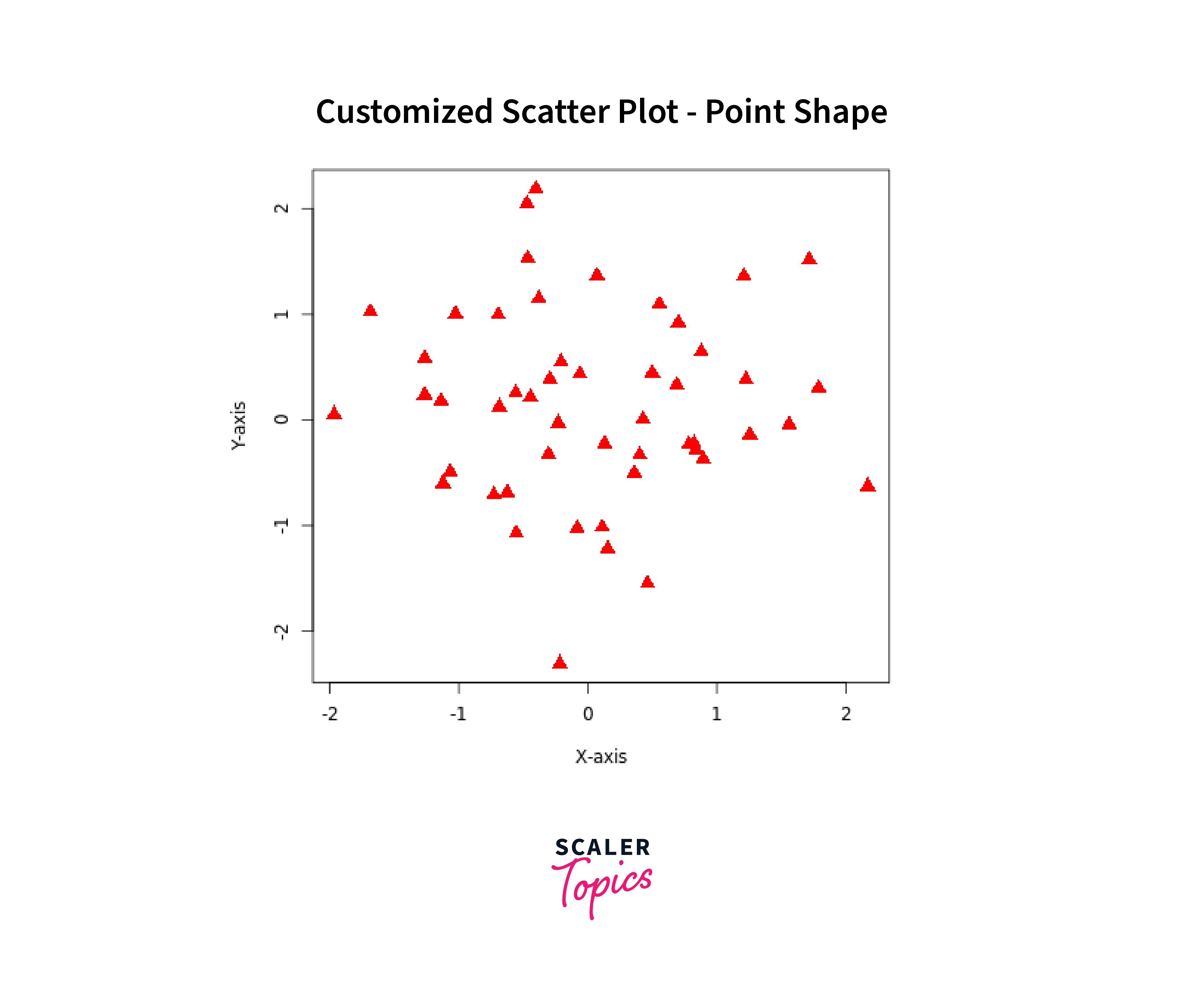
Again, we start by generating random data points for x and y and create a scatter plot. In this snippet, we focus on customizing the point shape. Using pch = 17 in the plot() function, we change the shape of the points to triangles. Additionally, we set the color of the points to red with col = "red". The points in the scatter plot will now be displayed as red triangles, and their size remains at the default value.
7. Add Title and Label Axes Here's an example of how to plot data in R programming while adding a title and labeling the axes:
Output:
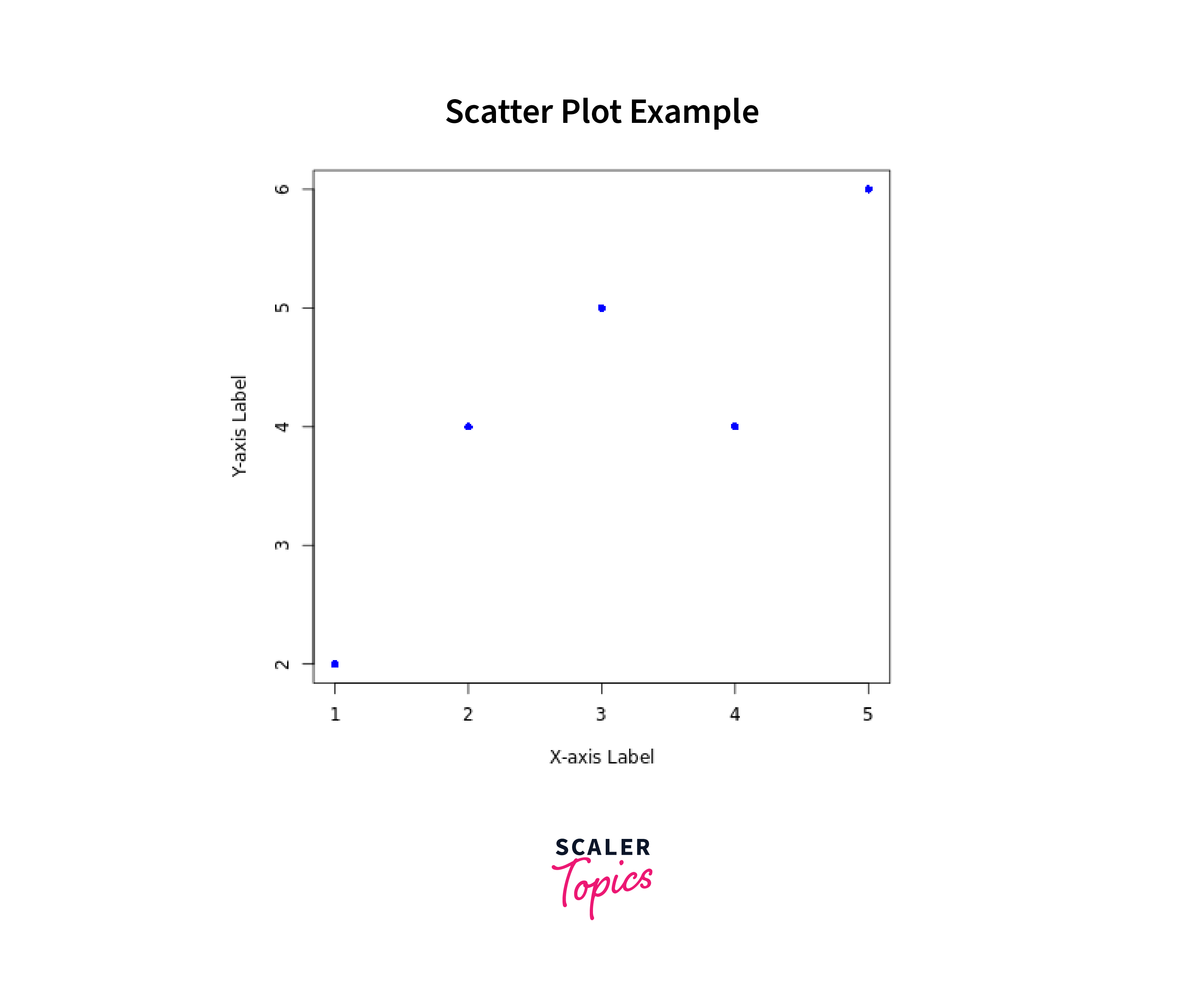
In this example, we have two vectors x and y, representing the data points to be plotted on the x-axis and y-axis, respectively. We use type = "p" to specify that we want to create a scatter plot.
The main parameter is used to add a title to the plot, and we set it to "Scatter Plot Example". The xlab and ylab parameters are used to label the x-axis and y-axis, respectively. In this case, we set xlab to "X-axis Label" and ylab to "Y-axis Label".
Conclusion
- The plot() function is a fundamental and versatile tool for creating various types of plots in R, making it essential for data visualization tasks.
- It allows users to generate scatter plots, line plots, histograms, bar charts, box plots, and more, enabling effective data exploration and communication.
- The function provides extensive customization options, enabling users to adjust colors, labels, titles, symbols, and axes, tailoring plots to specific requirements.
- With just a few lines of code, users can create informative and visually appealing plots for data analysis and presentation.
- R's plot() function, along with specialized plotting libraries like ggplot2, lattice, and plotly, caters to the diverse needs of data visualization, enhancing the richness and depth of data analysis in R.