Styling a Portfolio Using CSS - CSS Projects

Overview
One of the great ways to demonstrate our abilities is to prepare a compact and compelling portfolio for our interview. In the previous article, we learned to build the basic skeleton of the portfolio website using HTML.
Let's walk through the entire process of styling a portfolio using CSS.
What are we Building?
Introduction
Portfolios are used to demonstrate the expertise and accomplishments of individuals or organizations in a particular field.
It could include a resume, a summary of qualifications, projects, a sample of our design work, audio, video, charts, and schematics. Portfolios may also include self-assessments, awards for various projects, references, and certificates acknowledging achievement. Additionally, visitors can find general information about its owner, such as contact details.
- It helps us to keep track of our best work and monitor how we can improve our craft.
- It complements our resume and cover letter with a robust and visual demonstration of skills and projects.
- It helps the interviewer access the capabilities of an applicant.
- An organization's portfolio establishes a company's market presence, attracts more customers, and demonstrates the company's uniqueness among competitors.
Pre-requisites
Make sure you understand the following fundamental ideas of HTML & CSS before continuing :
- Flex-box
- pseudo elements
- CSS Combinators
- CSS Animations
- CSS Grid
- CSS media queries.
- Hamburger menu CSS.
- Building a Portfolio using HTML - HTML Projects (Projects)
How are we Going to Build the Portfolio Website?
There are numerous ways to design a portfolio, depending upon the profession and our ultimate goal.
In this article, we will style a single-page academic portfolio using CSS.
- A professional portfolio is an ideal way to present our work to potential employers and display the skills that make us fit for a particular position.
- We can organize our academic and professional experiences and accomplishments in an academic portfolio.
- It can be helpful when freelancing or searching for a job.
Approach :
We will style the following primary sections one by one:
- Hero section.
- Responsive Navigation Menu.
- About section.
- Skills section.
- Projects Section.
- Experience Section.
- Blogs section.
- Contact section.
- Footer.
Learn how to build the skeleton of a portfolio and all the sections that make up a portfolio in detail by reading "Building a Portfolio using HTML — HTML Projects."
Final Output
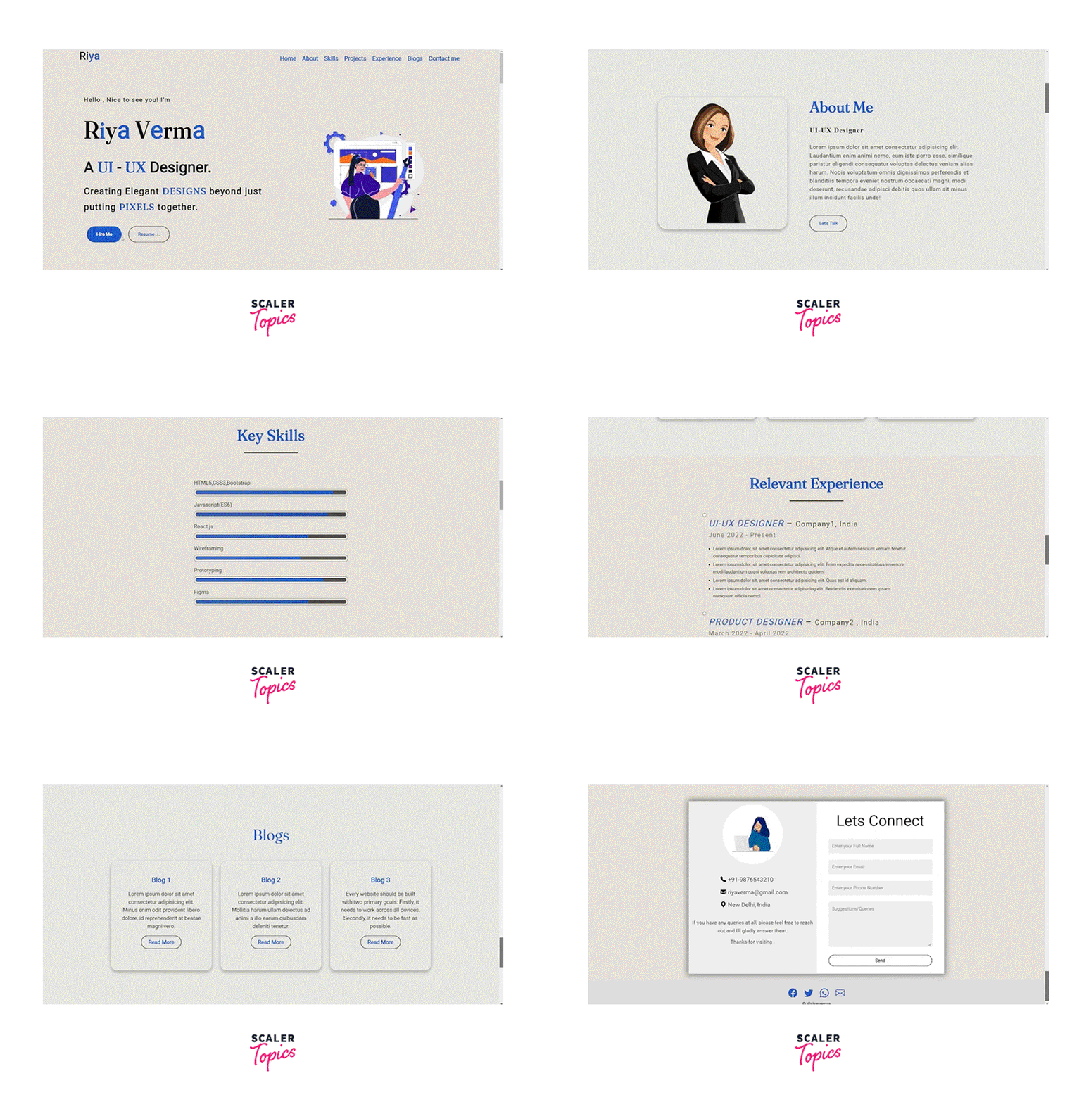
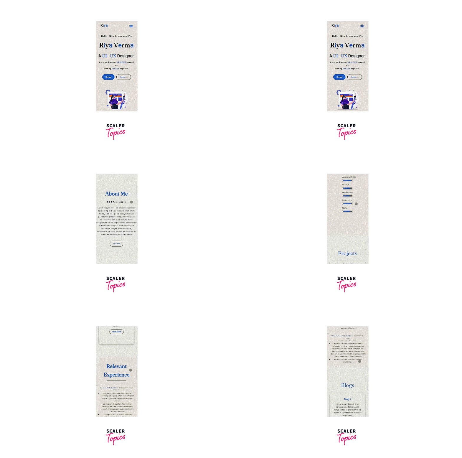
After styling the portfolio page using CSS, we would arrive at something like this :
-
Desktop View :
-
Responsive View :
Styling the Single Page Portfolio Using CSS
1. The Portfolio Structure
Refer to the previous article to learn about the components of a portfolio website.
HTML Code :
Output :
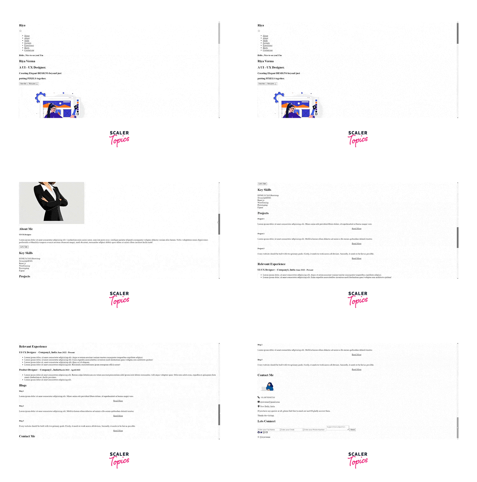
Now let's focus on styling the portfolio.
2. Adding the Basic CSS
The below code includes the necessary CSS. We have imported a Google font and a CDN for using icons. The @import rule enables us to import another style sheet into our style sheet.
3. Styling the Navigation
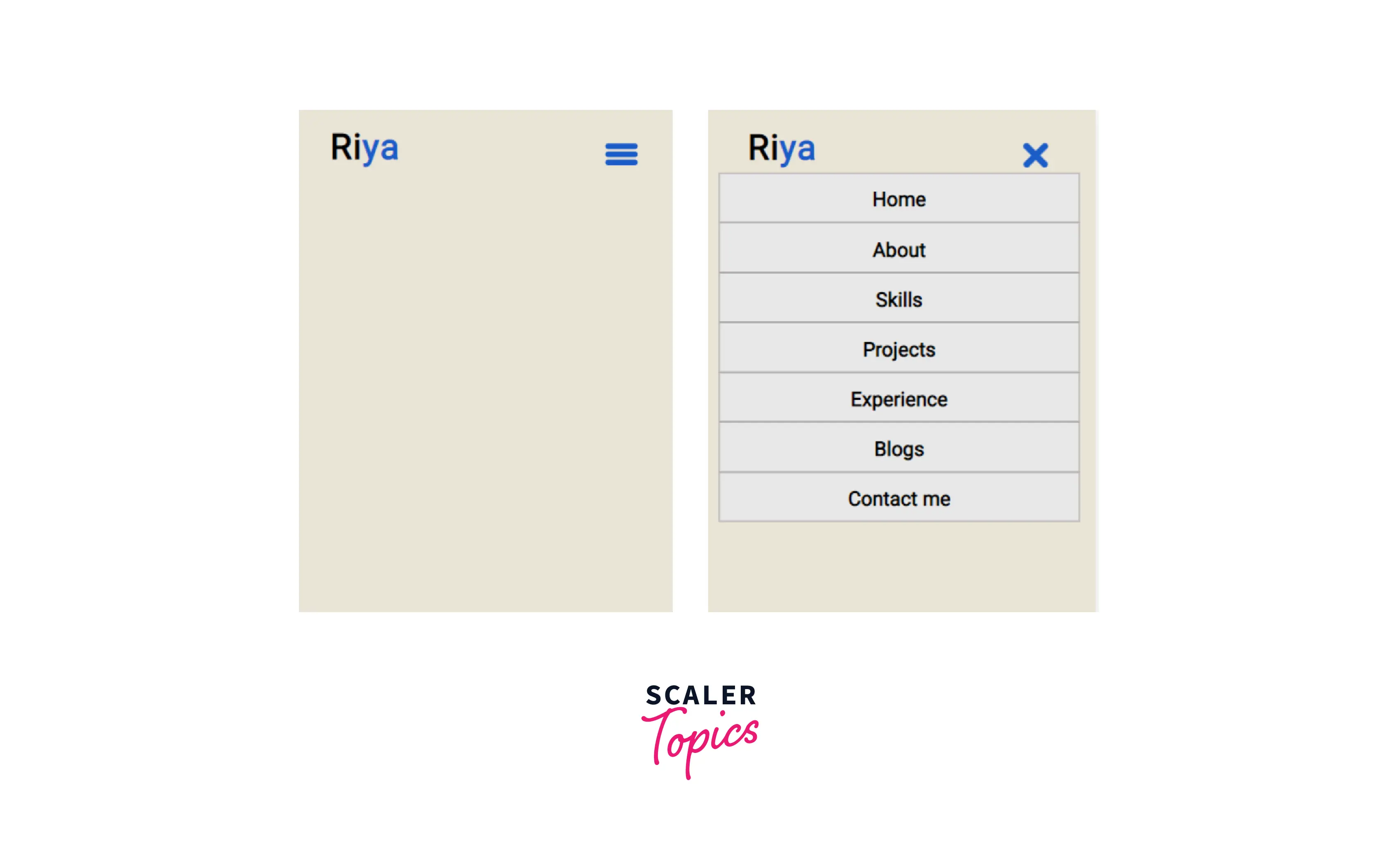
- Styling the Responsive Hamburger Menu with CSS :
- We will style the main menu nav and the hamburger menu button container.
- To draw the three lines for the hamburger icon, we’ll use the ::before and ::after pseudo-elements.
- We can add a logo on the left-hand side, followed by the menu on the right.
The CSS for this is :
-
Adding Functionality to the Hamburger Menu with CSS :
- We will move the top and bottom bars or lines of the icon to the position of the middle line.
- We will hide the middle line.
- Lastly, we will rotate the top and bottom lines 45 degrees in opposite directions to create a cut/cross icon.
The hamburger icon will be visible once we make the design responsive. We will add suitable media queries for the devices in the later sections of the article.
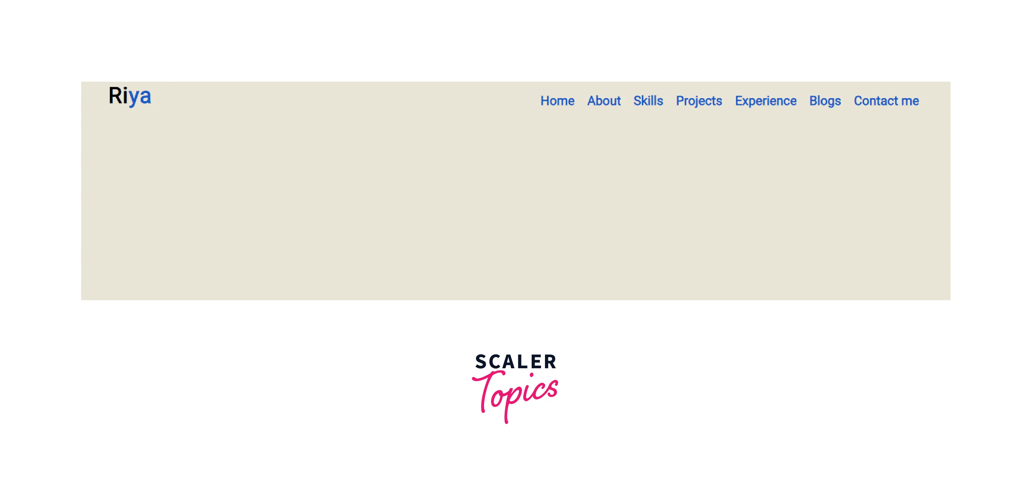
Output :
- Desktop View :
- Smaller Devices :
4. Styling the Hero Section
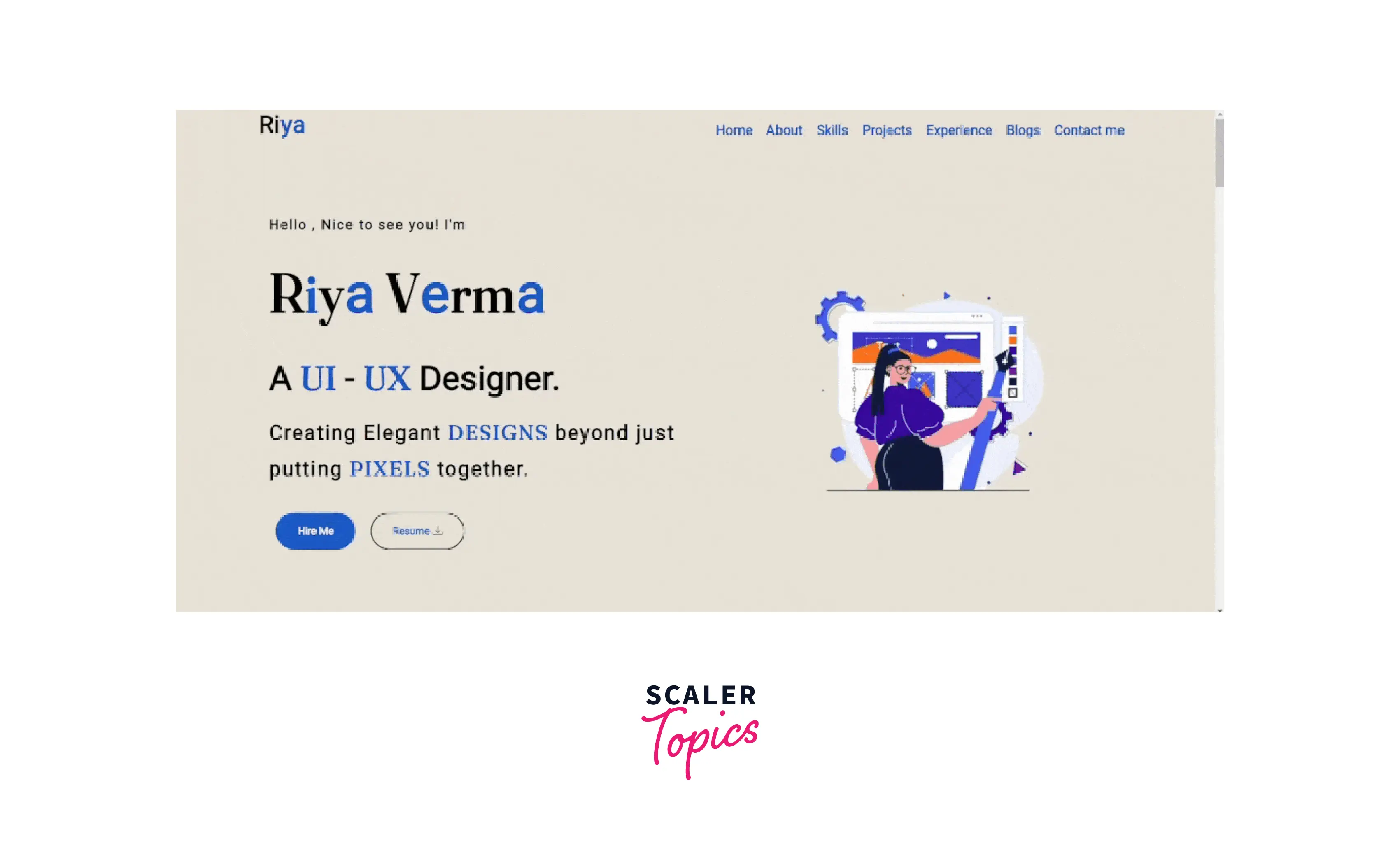
- We'll make use of the flexbox to design our hero section.
- We will display the tagline and description on the left, with the hero image on the right.
- To highlight the essential elements of our design, we'll use the blue color.
- To make the image more memorable in the user's mind, we will animate it using CSS keyframes and transform.
Output :
5. Styling the About Me Section
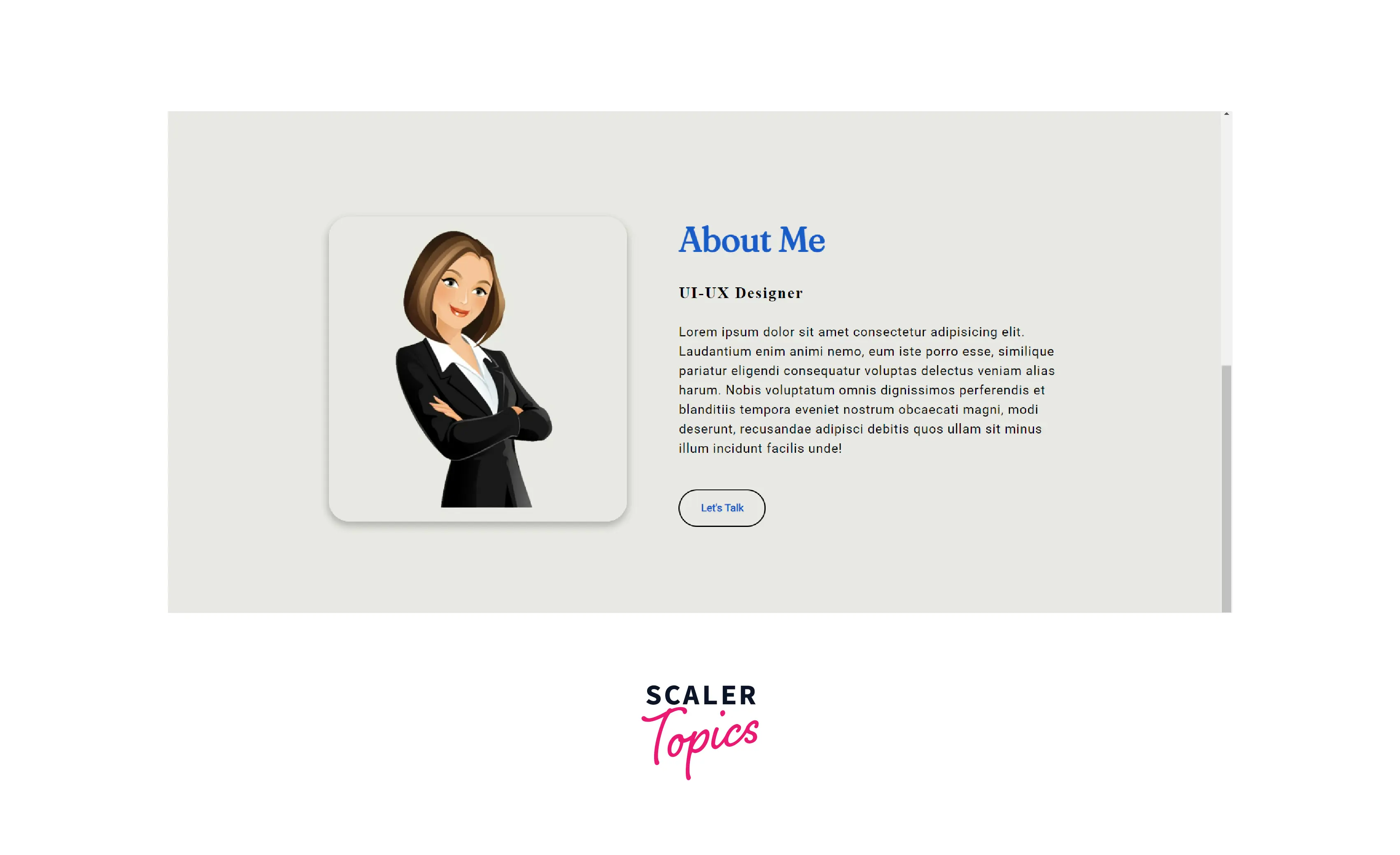
- We will position a professional photograph on the left with all the content on the right using a flex-box.
- The Let's Talk button follows the same design as the buttons from the hero section.
Output :
6. Styling the Skills Section
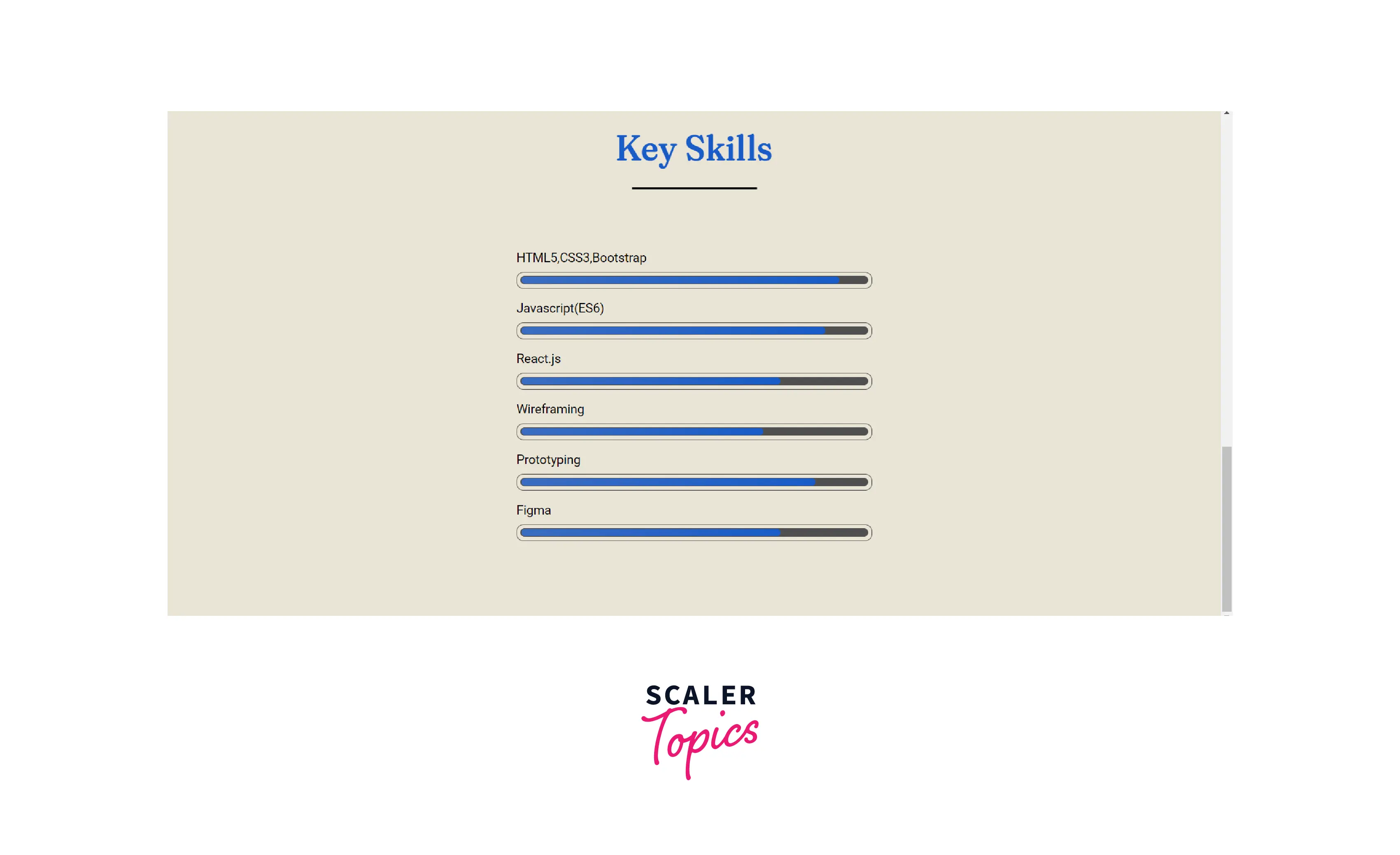
- We will use the ::after pseudo-element to create a horizontal bar beneath the title.
- We will use progress bars to indicate the degree of proficiency in a particular skill.
- Here, we have a div with class skills-content, which aligns its contents in the center using the flex properties.
- The div with a class bar consists of two containers with classes info and a progressBar, respectively. They indicate the type of skill and the degree of proficiency.
- To create a bar, we will add a border and padding to the container with a class progressBar.
- We will create a similar structure inside the progress bar using another container with a class line.
- We will fill the above container up to a certain width according to the proficiency by using the ::before pseudo-element.
Output :
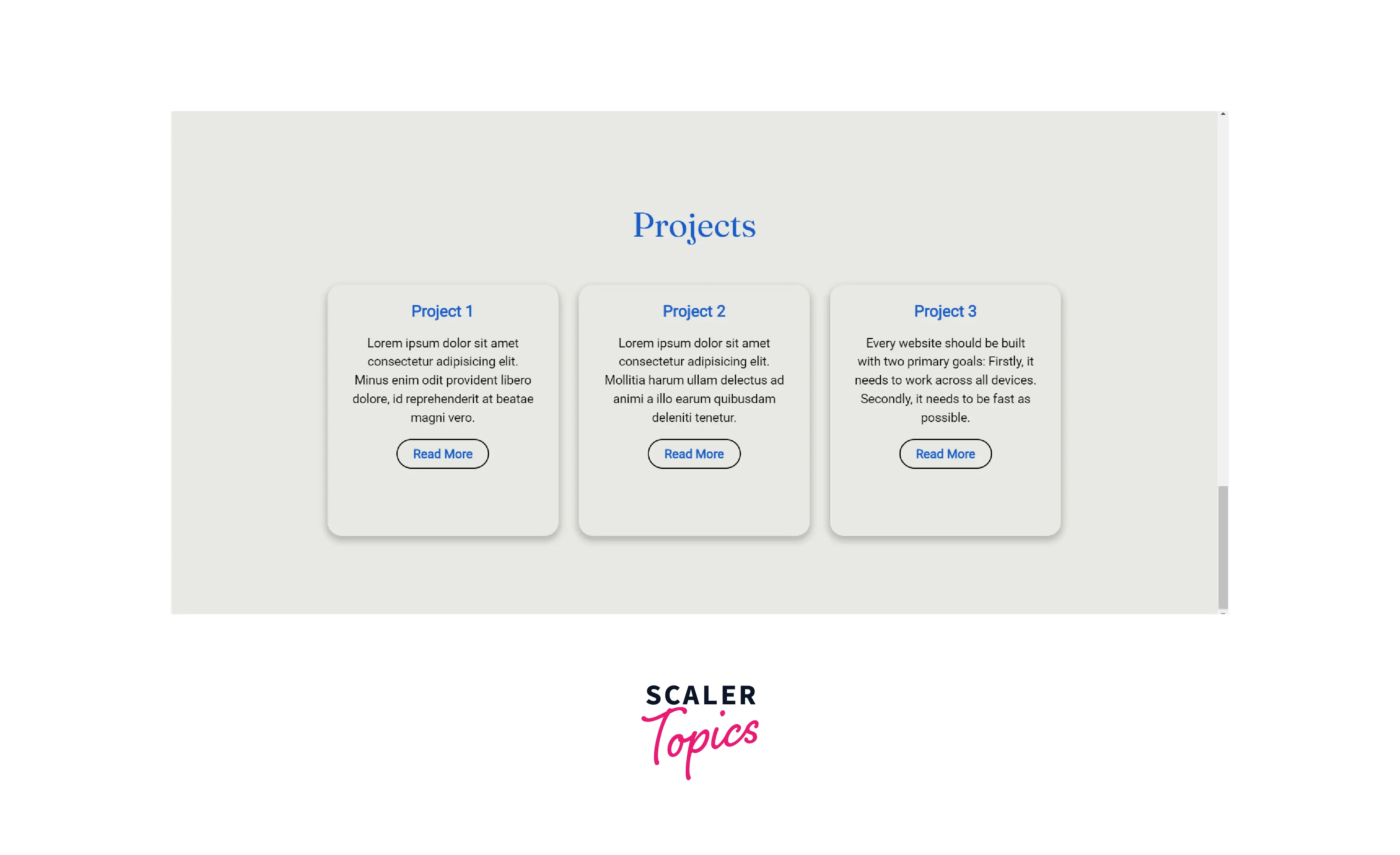
7. Styling the Projects and Blogs Section
The blog and the project sections both share the same styling. Therefore, we will introduce common classes to design the Projects and Blogs section's elements.
- We will display the projects and the blogs in cards.
- We will use the box-shadow property to cast a shadow from the frame of each card.
Output :
8. Styling the Experience Section
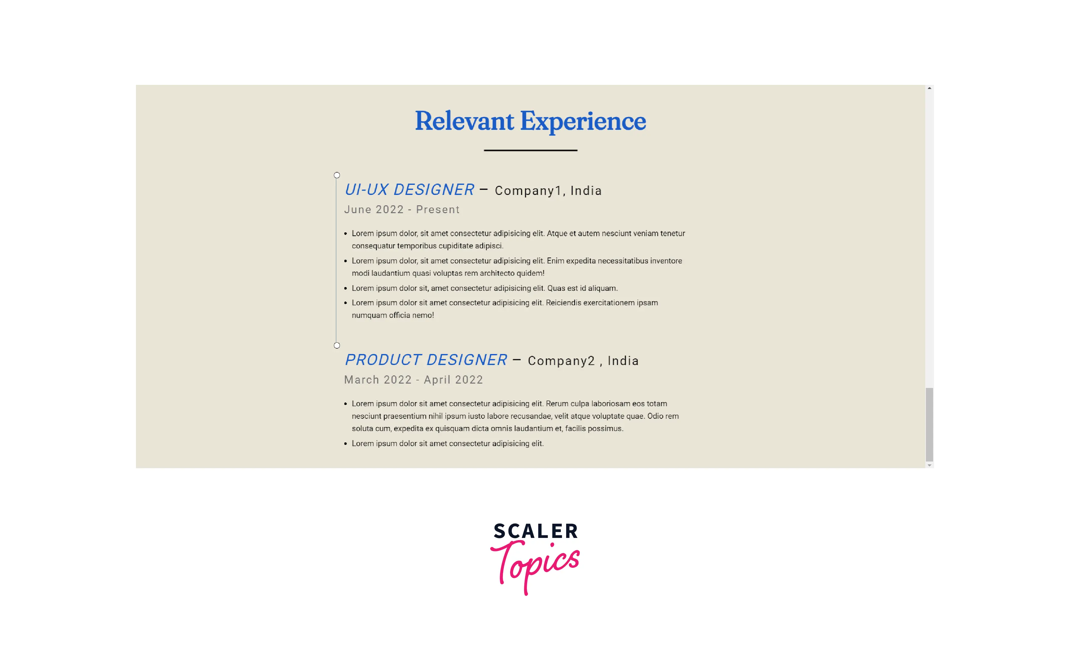
We will create an impression of the experience section as it appears in our resume with the job/internship title, timeline, name of the company, and a brief description.
- Here, we have a div with a class cv-timeline that consists of the experiences .
- We will use the :first-of-type and :last-of-type selector to specify the two experiences.
- For easier reading, we'll add a connecting line between the experiences. It allows the reader to jump to the next experience easily and understand the timeline.
Output :
9. Styling the Contact Me Section
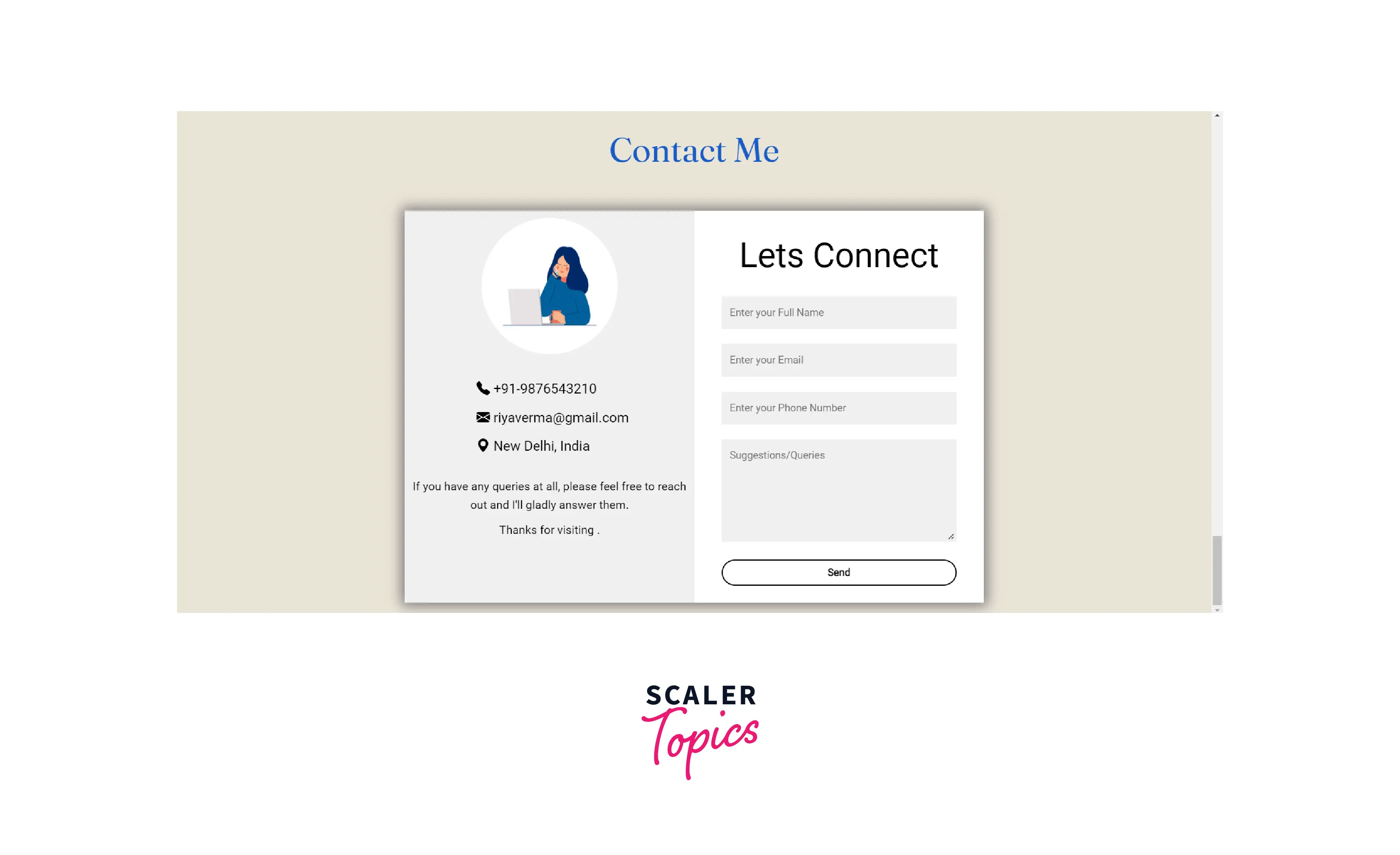
- Using a CSS grid, we will divide the div container contact-box into two parts.
- Contact-left and contact-right containers display contact details and contact form, respectively.
- We will use icons to enhance the aesthetic appeal.
Output :
10. Styling the Footer Section
- The footer includes social icons followed by the copyright.
- We will align the contents of the footer centrally.
Output :

11. Making Our Webpage Responsive
- We will add the CSS media queries to make our portfolio responsive.
- We must select a screen width that will toggle a full-width menu and the responsive CSS hamburger menu.
- We will make the most of our content centrally aligned for smaller devices.
Final CSS Code :
Conclusion
- Portfolios demonstrate the expertise and accomplishments of individuals or organizations in a particular field.
- It helps the interviewer access the capabilities of an applicant.
- An organization’s portfolio establishes a company’s market presence, attracts more customers, and demonstrates the company’s uniqueness among competitors.
- Portfolio sections include Navigation, Hero, About, Skills, Experience, Blogs, Contact, and Footer.
- Create your portfolio creatively and engagingly to highlight your expertise.
- Keep your color scheme consistent.
