Custom Visuals For Power BI
Overview
In the exciting world of data analysis and visualization, Power BI stands out as a powerful tool. But custom visuals for Power BI can take your visualizations to the next level. Custom visuals for Power BI allow you to create stunning and unique graphs, charts, and interactive elements that can make your data stories aesthetically appealing. In this article, we'll dive into the basics of custom visuals for Power BI, exploring how they work and how you can download them into your Power BI desktop. Whether you are a beginner or an experienced data enthusiast, custom visuals are a gateway to unleashing your creativity and making your insights stand out.
Custom Visuals in Power BI
Custom visuals are user-created extensions that expand Power BI's visualization capabilities beyond its built-in options. These visuals, designed by developers and data enthusiasts, introduce a wide range of new chart types, interactive features, and creative designs. By seamlessly integrating these custom visuals into your Power BI reports and dashboards, you can bring your data to life in ways that align precisely with your storytelling goals.
For example, the Word Cloud custom visual in Power BI displays the frequency of words in a captivating and intuitive manner and transforms textual data into visual art. Larger words represent higher frequency, making it easy to identify trends and patterns in text-based information.
Organizational Visuals
Within any company, there is a set of behind-the-scenes tools and methods that keep the business running smoothly and profitably. Microsoft Power BI comes to the rescue by letting you create special visuals meant for internal use. These visuals help showcase your organization's data trends and important findings in a way that's easy to understand.
Power BI administrators are responsible for setting up and overseeing the unique visuals that match your organization's needs. Then, users who create reports and analyses using Power BI Desktop can grab these custom visuals and include them in their work. It's like adding a touch of your organization's unique flavor to every insight you share.
Market Visual
In the Power BI custom visuals marketplace, Microsoft, along with its community of experts, has meticulously tested and given the green light to a collection of creative images. Using AppSource, you gain the ability to create your very own custom Power BI visualizations and seamlessly share them. This opens up fresh possibilities for Power BI users, allowing them to uncover new dimensions within their data through these personalized visuals.
When you explore Microsoft AppSource, you can explore many tailor-made visuals. You can effortlessly access and incorporate these custom Power BI Desktop visuals that match your precise requirements and tastes. The simple steps outlined in the subsequent sections act as your guide, helping you seamlessly integrate these visuals to illuminate your data journey.
Steps To See The Available Power BI Custom Visuals
Using the below step-by-step guide, you can explore various available custom visuals for Power BI from the Microsoft AppSource marketplace:
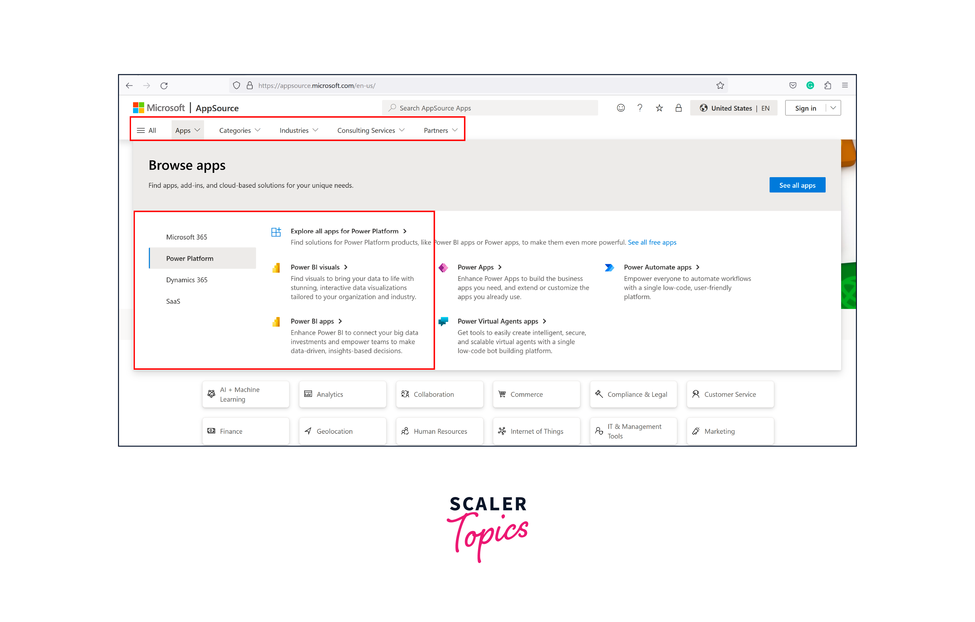
Step 1. Start by going to the Microsoft AppSource website. When you do this, a new window will appear on the AppSource homepage, as shown in the figure below.

Step 2. While you're on the Microsoft AppSource website, go ahead and click on "Apps," then choose "Power Platform," and finally select "Power BI Visuals", as shown in the below figure.
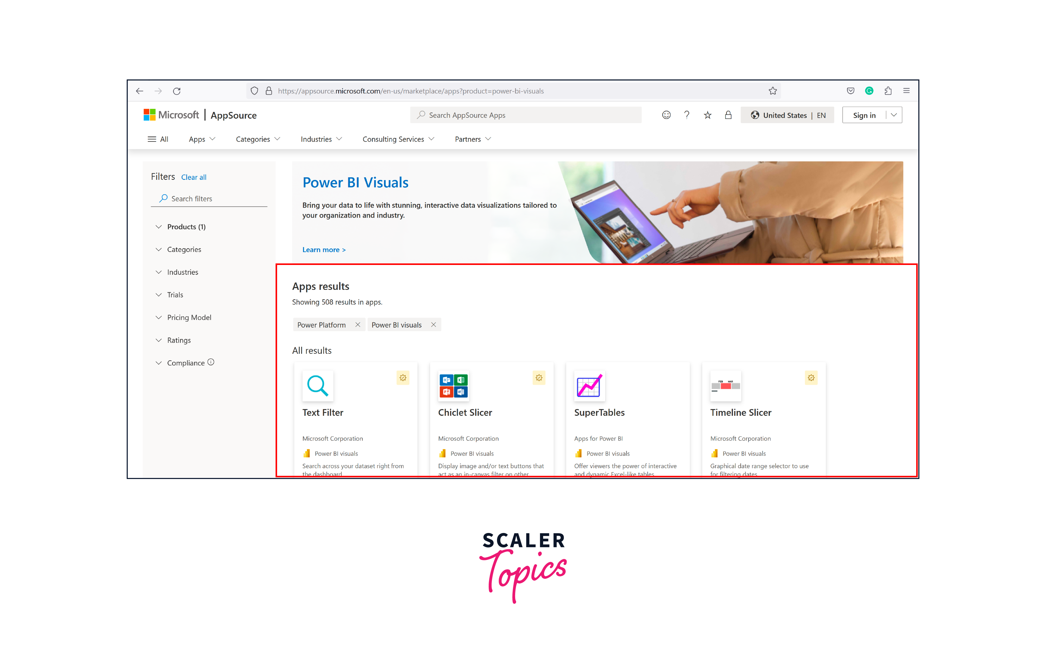
Step 3. After clicking on the Power BI visuals, you'll find Power BI-related visuals displayed on the center screen, as shown in the figure below.
Steps To Download Custom Visuals in Power BI Desktop
Let’s explore the steps to download or import custom visuals for Power BI, as mentioned below:
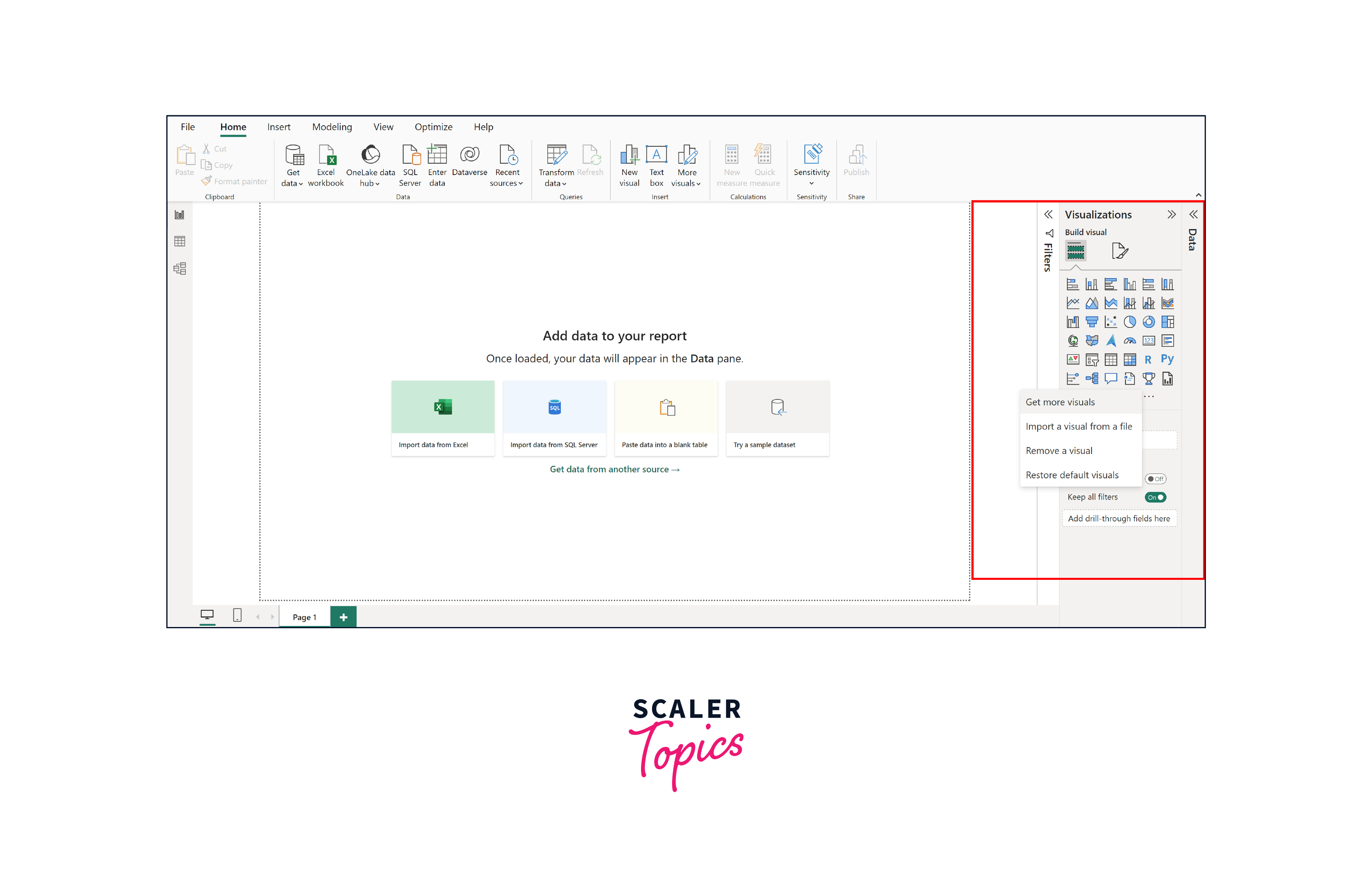
Step 1. In Power BI Desktop, open it up and then click on the three dots (...) in the Visualization pane. After that, select "Get more visuals," just like you can see in the picture.
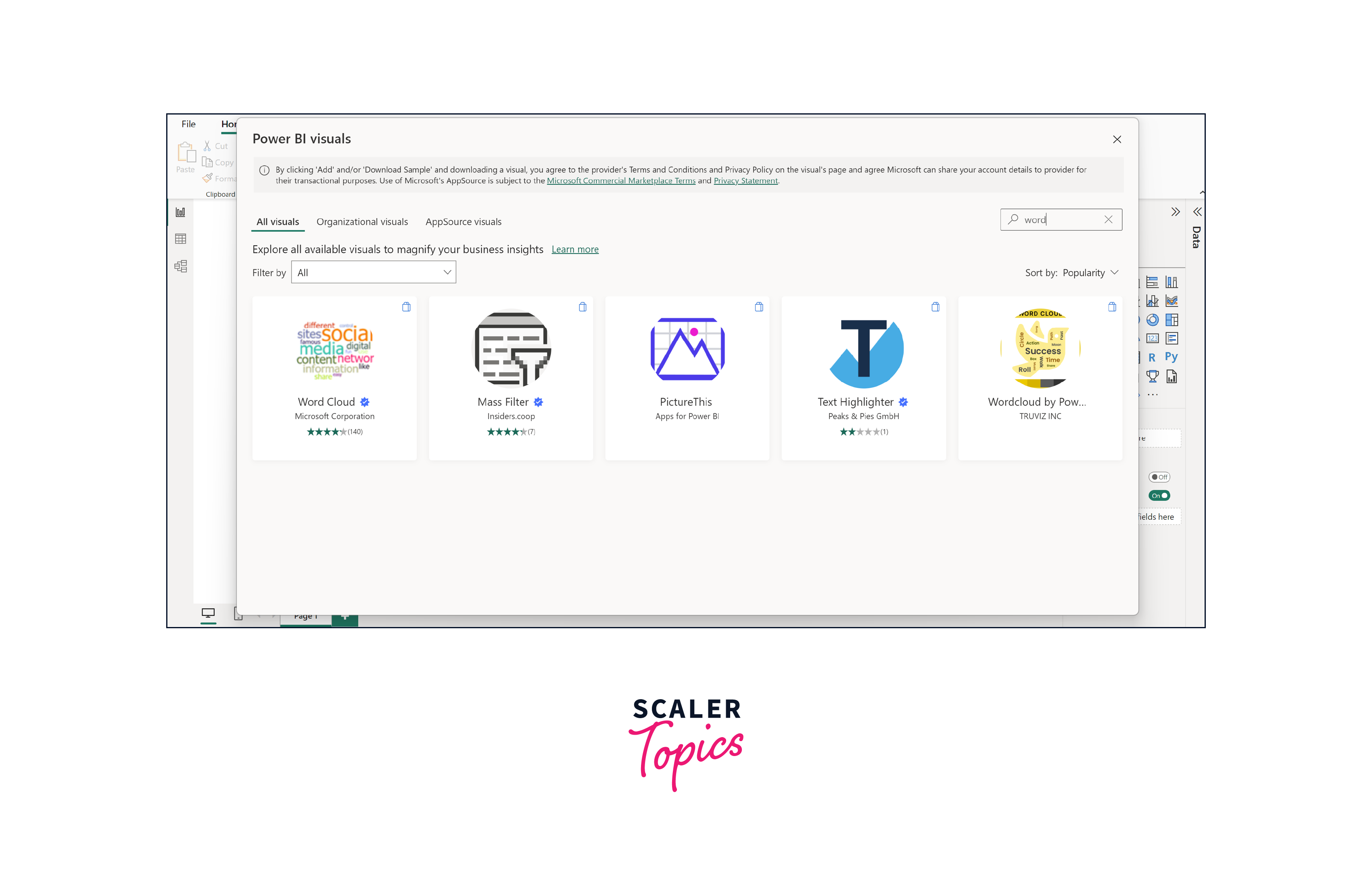
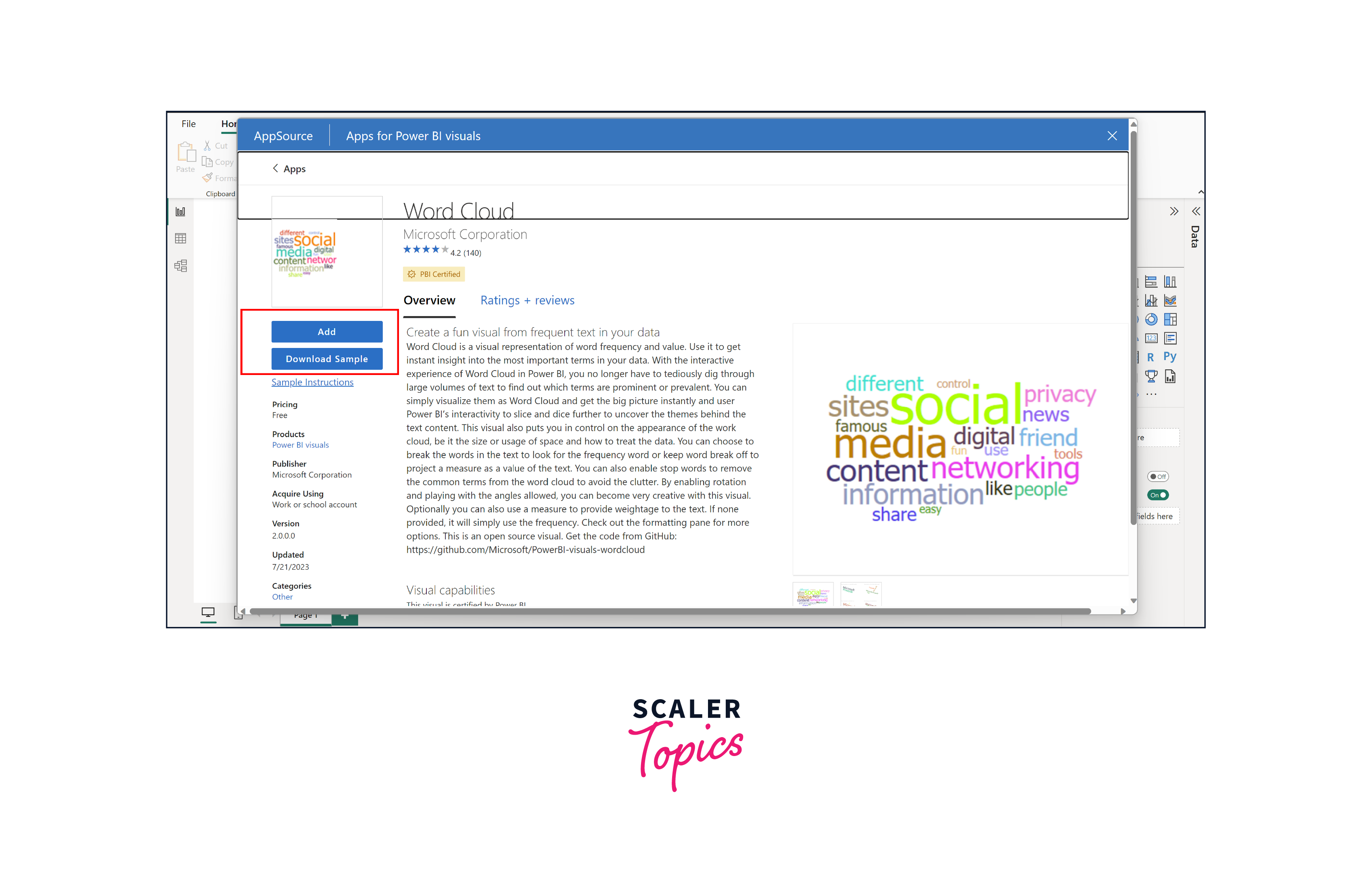
Step 2. You can use the search bar to look for the visuals you want and then simply click on the one you're interested in. In our case, let's search for custom visuals related to word clouds as an example.
Step 3. Click on the "add" option, as shown in the figure below. If you're curious to learn more about the visual, you can read all the details provided.
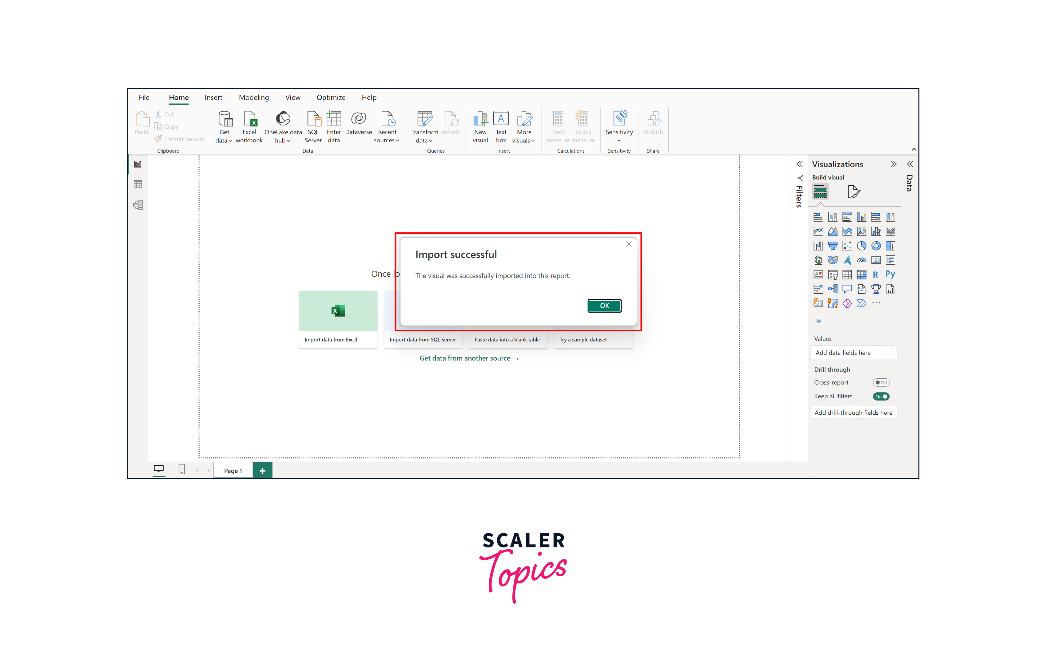
Step 4. Once the import is completed, you'll see a message that looks like the one in the picture below. The imported visual can be accessed from the Power BI visualization pane.
Top 5 Custom Visuals in Power BI
In this section, we'll take a closer look at the top 5 custom visuals designed for Power BI. These custom visuals enhance the aesthetic appeal of your reports and provide a unique way to convey complex data insights with clarity and impact.
Advance Card
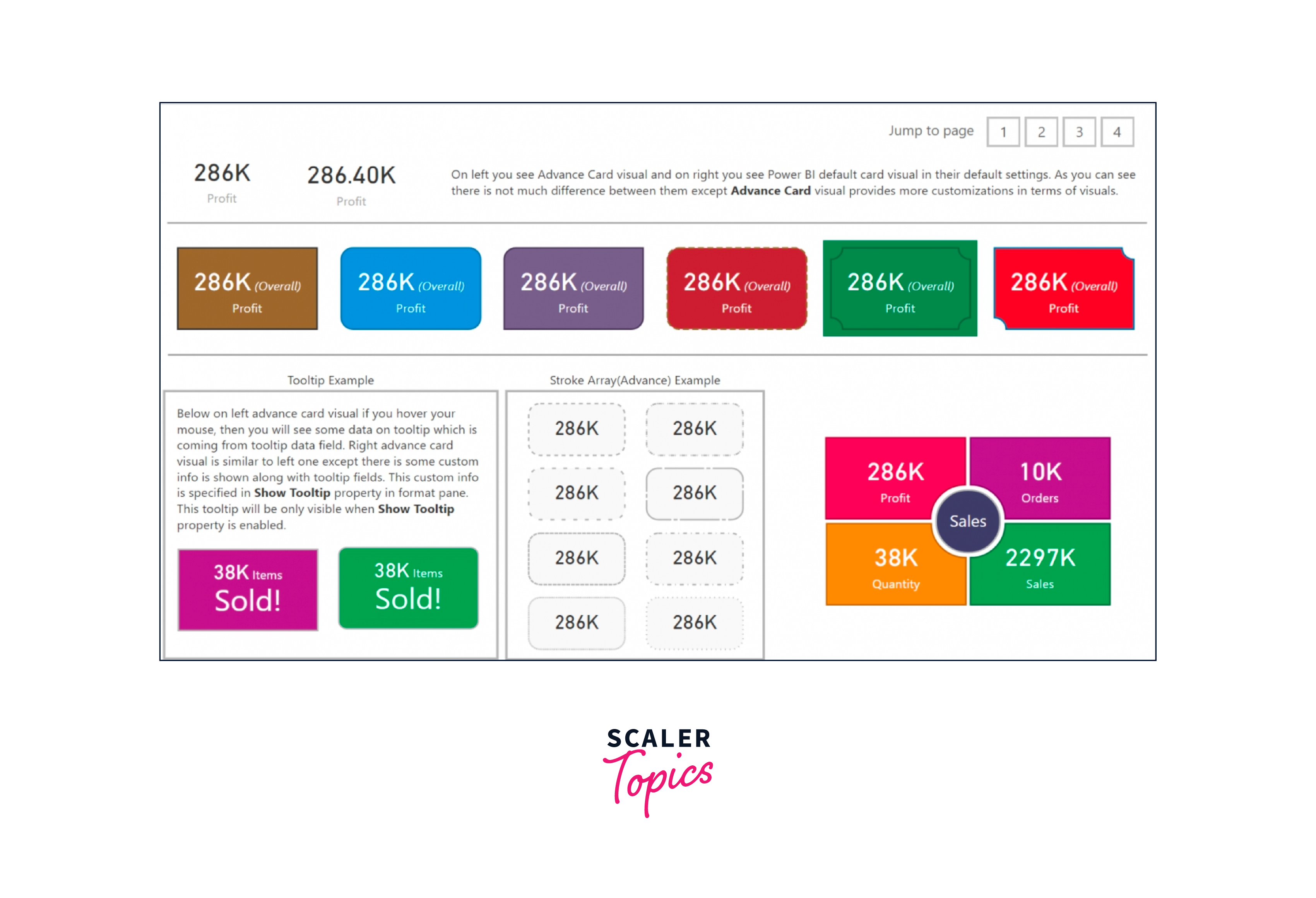
The advanced card visual in Power BI provides a range of additional features that go beyond the default visualization settings. With attributes such as start and end labels, conditional formatting, tooltips, etc., the advanced card adds extra dimensions to your visualizations.
Some key features of the Advanced Card Visual include the following -
- Flexibility with conditions-based formatting.
- Support for prefixes and postfixes.
- Abundant formatting choices for content alignment - center, left, or right.
- Helpful tooltips to provide extra information.
- Compatibility with background images.
- Options for enhancing appearance through borders and highlights.
It is ideal for showcasing measurable aspects of your organization's financial health, such as sales volume, share price, or bottom-line figures. This visual tool fits perfectly, whether a single numerical value or a quantified measurement. Furthermore, this versatile visualization can be used to create detailed reports, create engaging data FAQs, or even design a customized report editor.
Animated Bar Graph
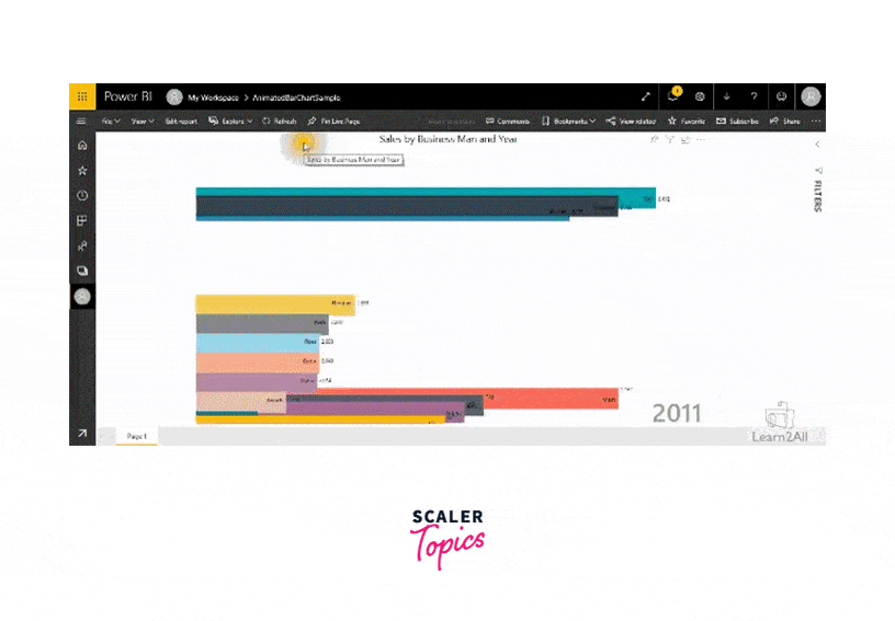
Animated bar graphs have gained immense popularity, particularly on social media platforms, as they offer a captivating way to convey comprehensive data insights through clear and easily understandable visuals. The animated bar chart feature brings data trends to life by showcasing their changes over time. There are two engaging ways to employ this feature - a standalone mode with autoplay for automatic animation or a ranking bar chart that can be integrated into reports, allowing looping through various options. Moreover, this chart offers customization options, including colors, display settings, and the inclusion of multiple labels and indicators.
When used for visualization purposes, animation breathes new vitality into data, making it particularly effective for both exploratory analysis and presentations. Unlike static visuals, animated data visualization captures the audience's attention more effectively. This approach enables tracking changes seamlessly, such as observing transitions between different stages of data evolution.
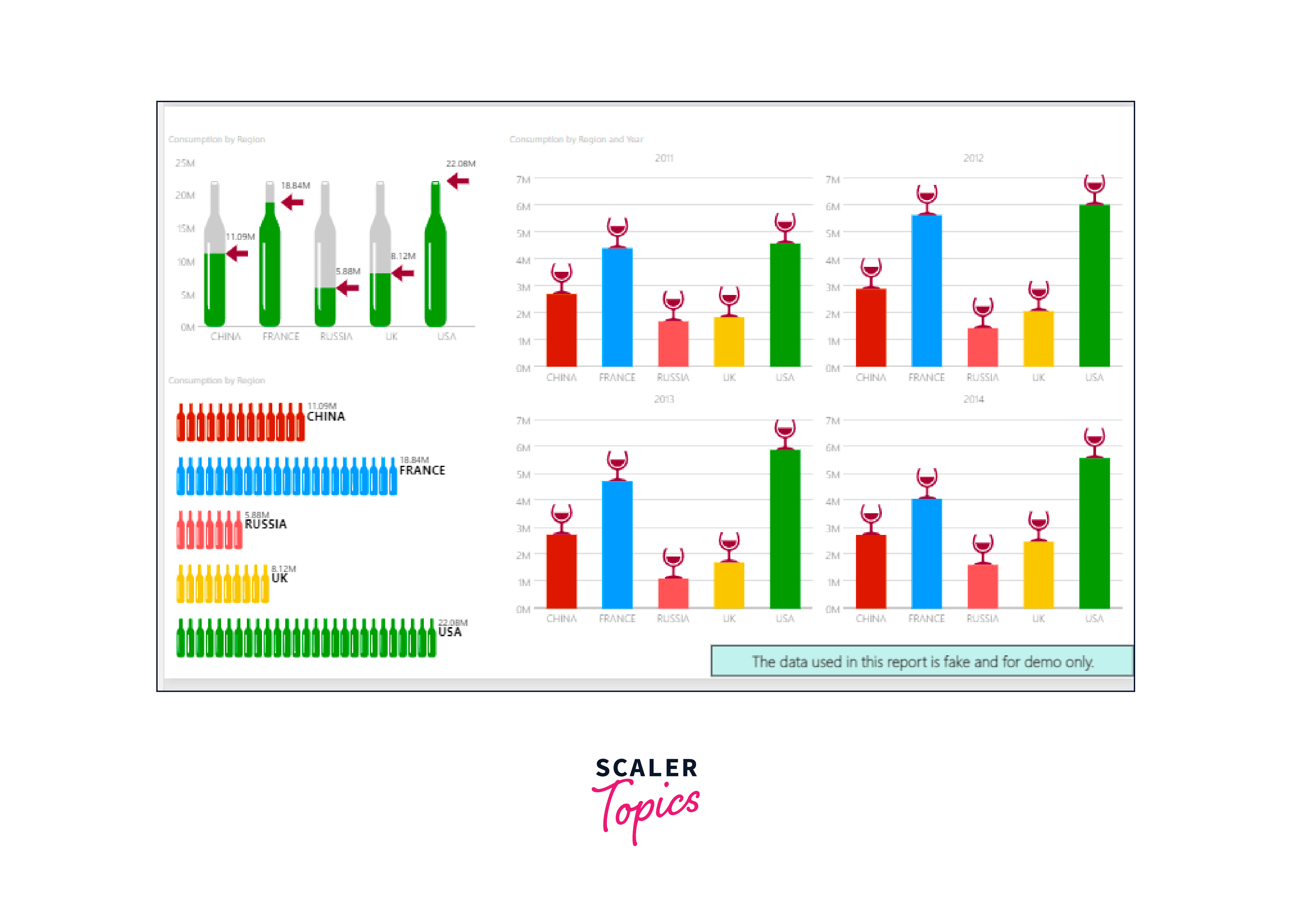
Word Cloud
The word cloud visual is a captivating and intuitive way to transform textual data into a visually appealing representation. In this visualization, words are displayed in varying sizes, with larger words indicating higher frequency or importance within the text. It provides an instant snapshot of the most prominent themes or keywords present in a text collection, making it easier to grasp key insights at a glance.
Word cloud visuals find immense value in various scenarios. For instance, in social media sentiment analysis, they can help identify prevailing sentiments and frequently mentioned topics. In market research, word clouds can highlight customer feedback and preferences. Furthermore, they are employed in content analysis to extract key themes from large bodies of text, aiding in summarizing complex information concisely. The word cloud visual's ability to transform textual data into a visually striking format is a powerful tool for enhancing communication and understanding in a wide range of contexts.

Infographic Designer
This tool empowers you to go beyond conventional visualizations and create visually appealing infographics. You gain precise control over shapes, colors, and the arrangement of lists, bar charts, and column charts. By leveraging this custom visual, you can present data in a manner that effectively conveys its significance. With the Infographic Designer, you can create simple pictograms and intricate, fully personalized visuals. The option to integrate unique shapes and images that correspond to your data adds an extra layer of depth. This custom visual provides an array of layout and graphic modification choices, allowing you to transform raw data into informative visuals.
Infographics offer a captivating alternative to lengthy paragraphs or bullet-point lists when presenting information. They excel in simplifying complex data, translating abstract concepts into easily comprehensible visuals. The Infographic Designer custom visual enhances engagement and understanding through its visual elements, making it a powerful tool for communicating insights, whether you're delivering a presentation, sharing reports, or conveying data-driven narratives.
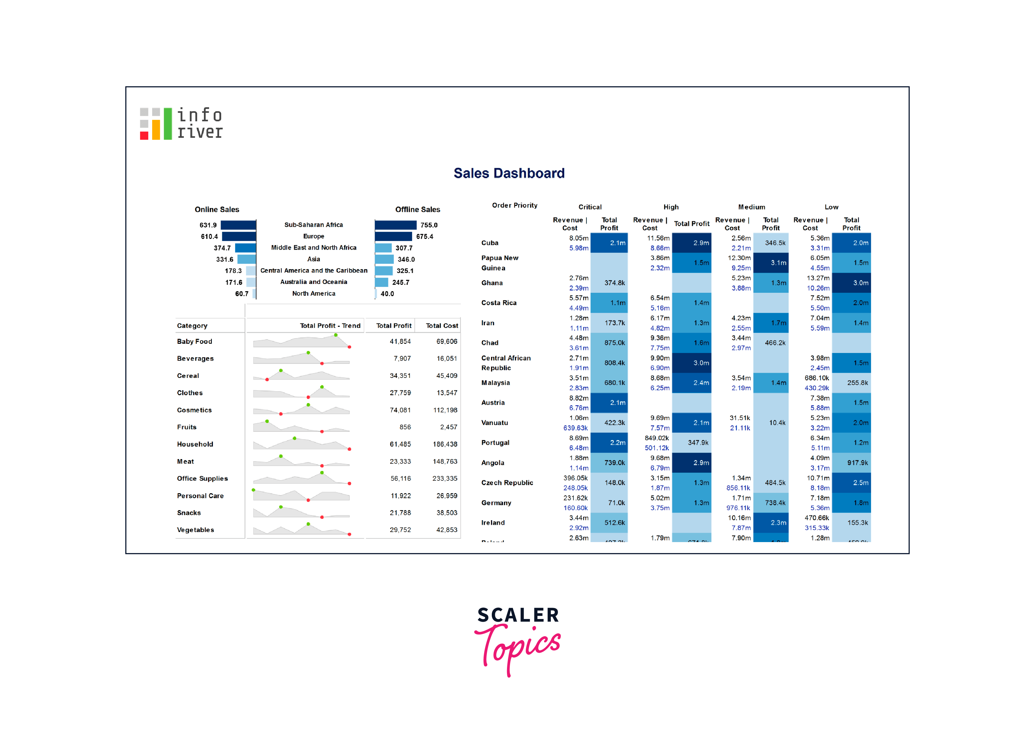
Inforiver
Inforiver is your solution for simplifying complex financial reporting tasks without needing to master DAX or IT skills. Thanks to its integrated visual formula engine, Inforiver lets you swiftly create detailed financial statements, P&L reports, management insights, and variance reports. Whether you're dealing with Reporting, Visualization, or Analysis, Inforiver's Professional Edition has you covered.
The creative built-in toolbar enhances the experience further, offering end-users self-service capabilities, engagement, and collaboration. From precise alignment to one-click styling and versatile formatting options, this toolkit ensures seamless interactions. Tailored for financial statement creation, the Professional Edition supports IBCS-compliant visualizations, variance reports, and P&L/financial statements - all achievable with just a single click.
Conclusion
- Custom visuals for Power BI empower users to go beyond standard graphs, creating engaging and impactful visualizations that enhance data storytelling.
- From animated bar graphs to word clouds and infographics, these custom visuals offer various options to cater to diverse data presentation needs.
- Infographics, Inforiver, and advanced cards streamline complex information, enabling users to grasp insights at a glance and fostering deeper understanding.
- With these tools at your disposal, you can transform raw data into dynamic narratives, delivering data-driven insights that captivate and inform audiences.