Data Formatting in Power BI
Overview
In the world of data analytics and visualization, Power BI, a business intelligence tool developed by Microsoft, stands as a beacon of innovation and efficiency. Among its many capabilities, data formatting is a crucial aspect that often determines the clarity and effectiveness of your reports and dashboards. In this article, we'll dive into the art of data formatting in Power BI, exploring techniques, best practices, and tips to transform raw data into insightful visuals that drive decision-making. Whether you're a beginner or an experienced user, mastering data formatting in Power BI is an essential skill for harnessing the full potential of this powerful tool.
Formatting Data Types in Power BI
This section will delve into the fundamental aspect of data formatting: how to correctly format data types, such as date format in Power BI, to ensure your visualizations are accurate, visually appealing, and informative.
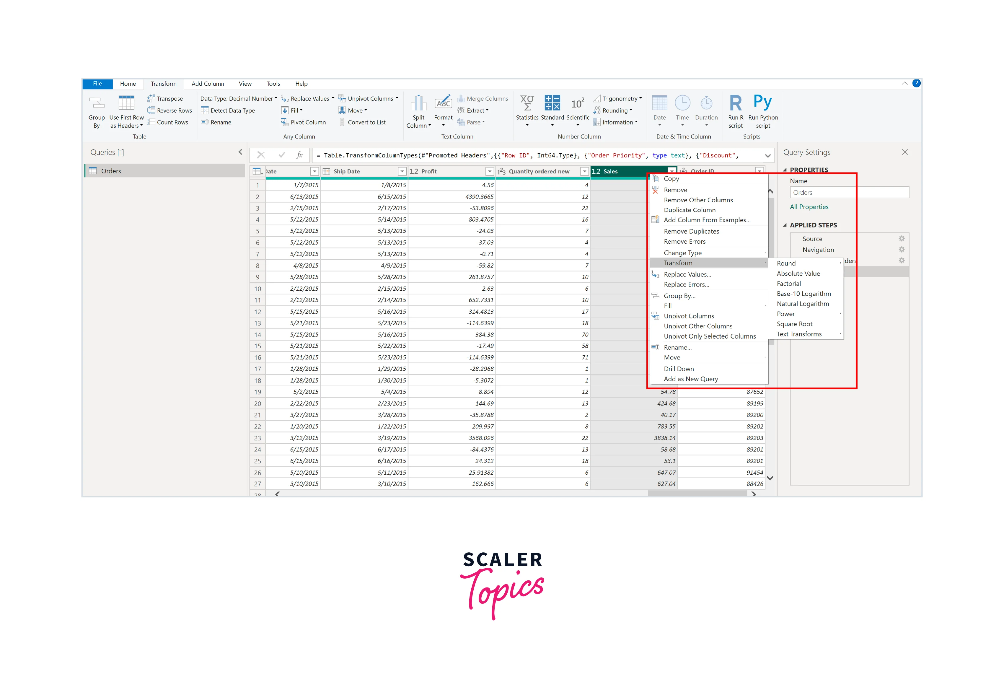
Numeric Data Formatting
Numeric data formatting and unit conversion are vital aspects of data presentation in Power BI. They allow you to customize the display of numbers, making them more human-readable and relevant to your audience. To achieve this, follow these steps:
- In Power Query Editor, choose the numeric column you want to format.
- Right-click on the selected column and go to the "Transform" menu.
- From the Transform menu, you can choose the formatting type that suits your data, such as rounding of the numbers, absolute values, factorial, logarithmic, etc.
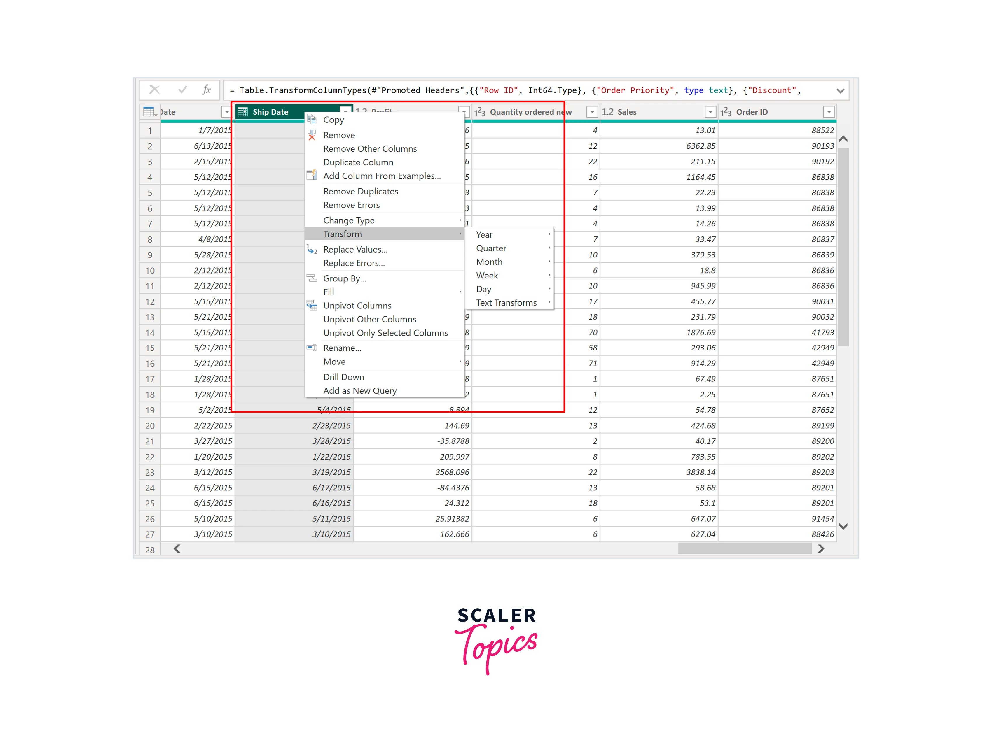
Date and Time Data Formatting
Accurate presentation of time data and date format in Power BI is essential for meaningful analysis and reporting. Transform Data feature equips you with the tools to effectively transform time data and date format in Power BI. Here are the steps to achieve this, by following these steps, you can ensure that your date and time data is presented in a user-friendly and meaningful way, enhancing the clarity and effectiveness of your Power BI reports and dashboards.
- In Power Query Editor, choose the column containing date or time data.
- Right-click on the selected column and navigate to the "Transform" menu. You'll find "Date" or "Time" formatting options here.
- Power BI offers various date and time formats, such as year, month, day, etc., to match your reporting requirements.
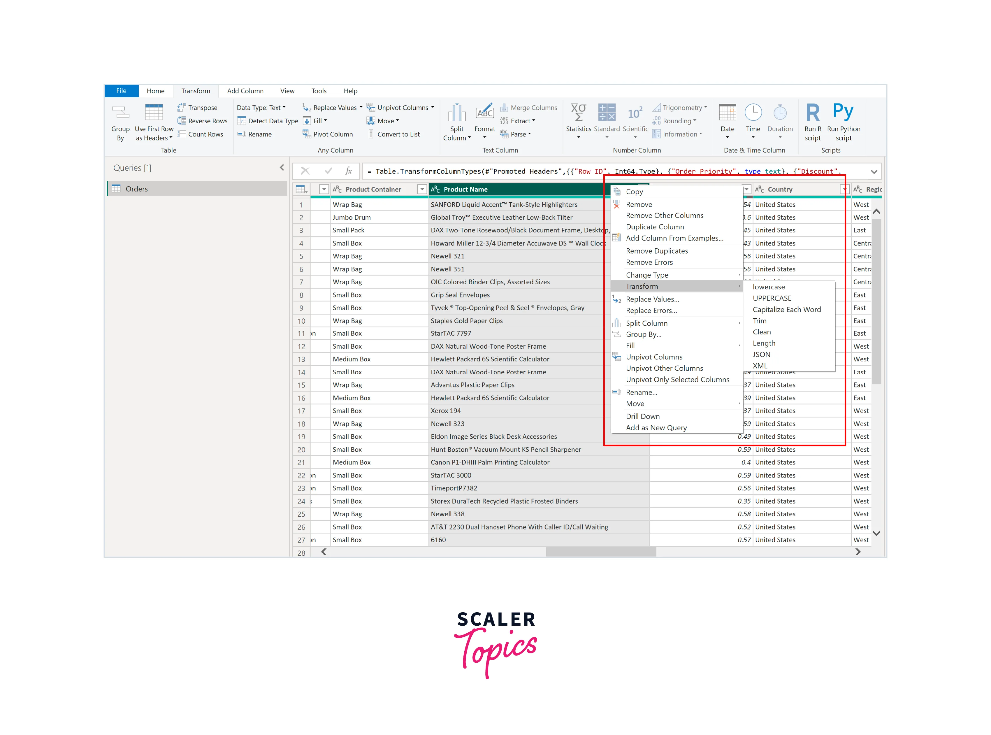
Text and String Data Formatting
Formatting text and string data is vital to ensure that your data-driven narratives are clear and consistent. Power BI's Transform Data feature provides the means to format text and string data effectively. By following these steps, you can ensure that your text and string data are well-structured and consistent, improving the overall quality of your Power BI reports and visualizations.
- In Power Query Editor, choose the column containing text or string data that requires formatting.
- Right-click on the selected column and go to the "Transform" menu. Look for text formatting options.
- Utilize functions such as "Trim," "Proper," or "Replace Values" to clean and standardize text data. You can also set casing preferences, remove special characters, or extract specific substrings as needed.
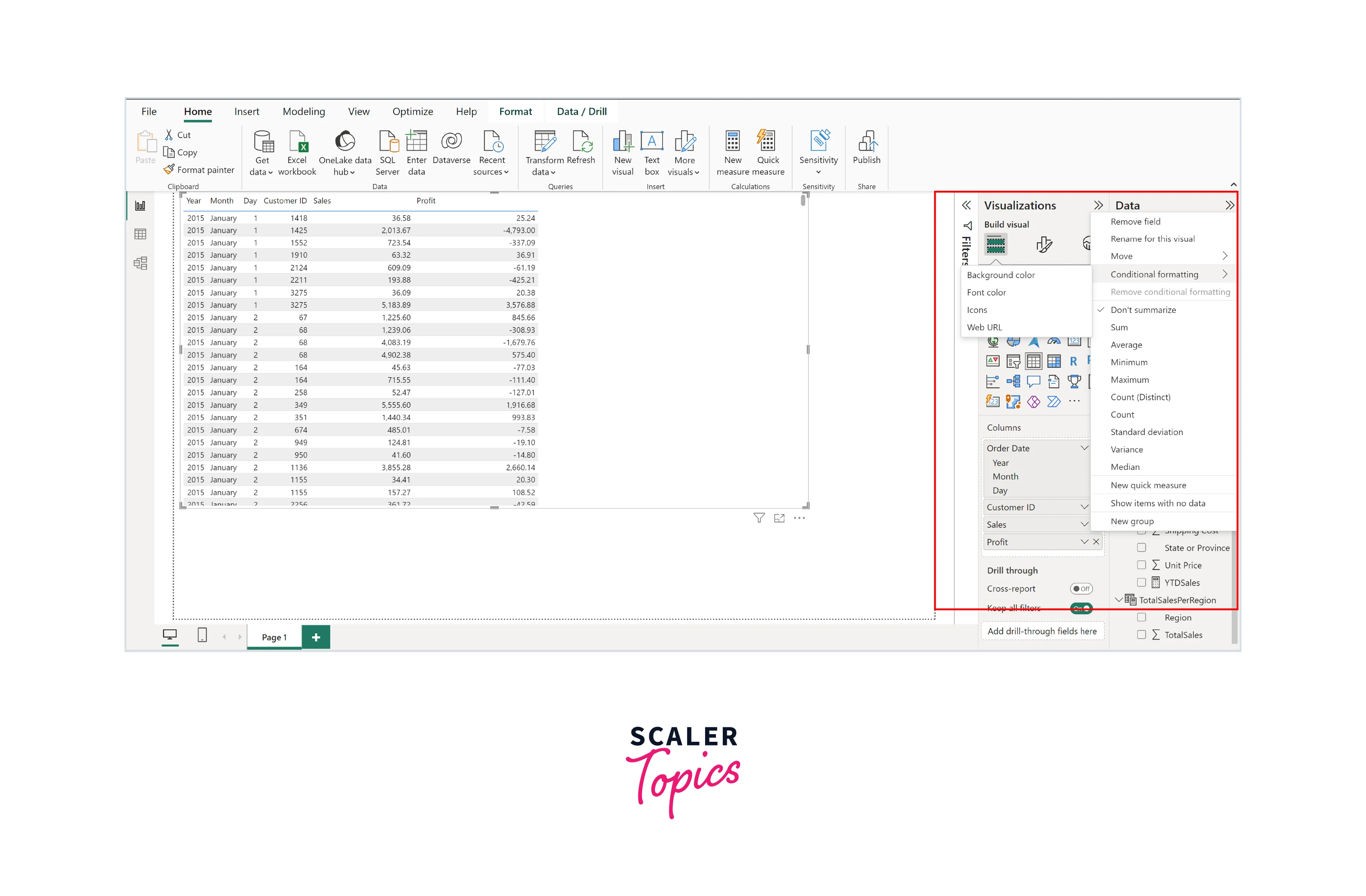
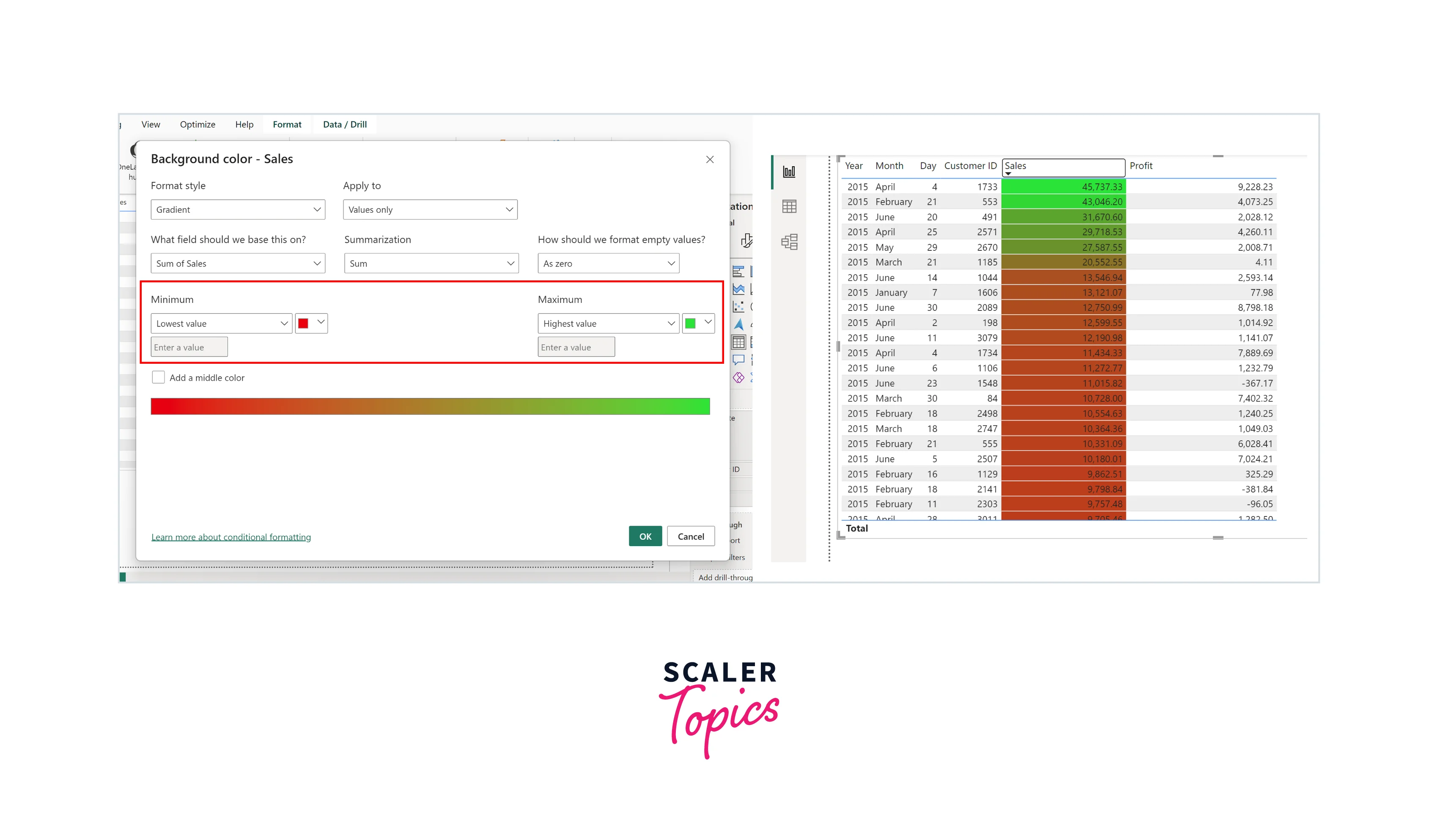
Conditional Formatting in Power BI
Conditional formatting in Power BI is a powerful feature that allows you to dynamically change the appearance of data visuals based on specified conditions or rules. It enhances data visualization by highlighting important insights, improving readability, and customizing visuals to make reports and dashboards more engaging. Users can set rules to change visual elements such as colors, fonts, and styles based on data values, percentages, or ranges, creating a more interactive and informative data presentation. It is essential for several reasons:
- Highlighting Insights:
Conditional formatting helps draw attention to critical data points, making it easier for users to identify trends, outliers, or important information within large datasets. - Enhancing Readability:
By applying formatting rules, you can improve the readability and clarity of your reports and dashboards, making them more accessible to a wider audience. - Customizing Visuals:
It enables you to tailor visualizations to your audience's preferences and needs, providing a more personalized and engaging user experience.
To achieve conditional formatting in Power BI, you can follow the steps mentioned below:
-
Begin by selecting the data visual (e.g., a chart or table) to which you want to apply conditional formatting.
-
In the formatting pane on the right-hand side, navigate to the "Conditional formatting" section. Here, you can choose the specific aspect of the visual (e.g., background, font color, etc.) that you want to format conditionally.
-
Define the rules or conditions that will trigger the formatting changes. For example, you can set rules based on values, percentages, or data ranges.
Formatting Labels, Titles, and Annotations
This section will explore the significance of formatting labels, titles, and annotations in Power BI visualizations. Effective formatting of these elements is essential for providing context, guiding interpretation, and enhancing the overall narrative of your data-driven presentations.
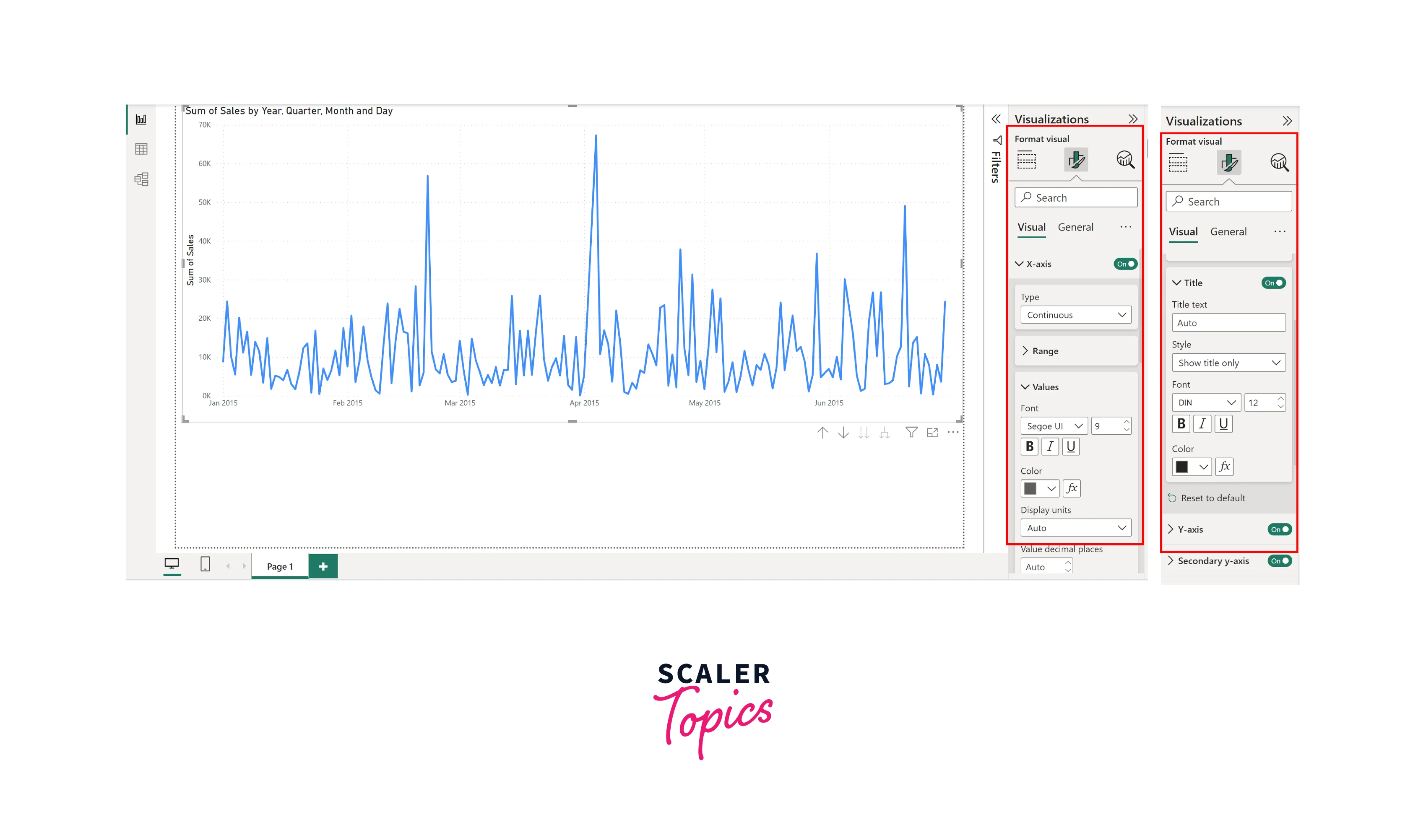
Formatting Axis Labels and Titles
In Power BI, formatting axis labels and titles is crucial for creating clear and visually appealing data visualizations. By carefully formatting axis labels and titles in Power BI, you can improve the overall readability and comprehension of your data visualizations, helping your audience better understand your insights. Here is how you can do it:
- Click on the chart or visualization that you want to format.
- In the Format Visual pane on the right, go to the "Visual" section. Here, you can customize various aspects, such as font size, font color, etc., for both axes, i.e., the X and Y axes.
- To format axis titles, navigate to the "Title" section within the formatting pane. You can change the title's font, size, and alignment.
- For axis labels, use the "Labels" section to adjust properties like label display units (e.g., auto, thousands, millions), number format, and label position.
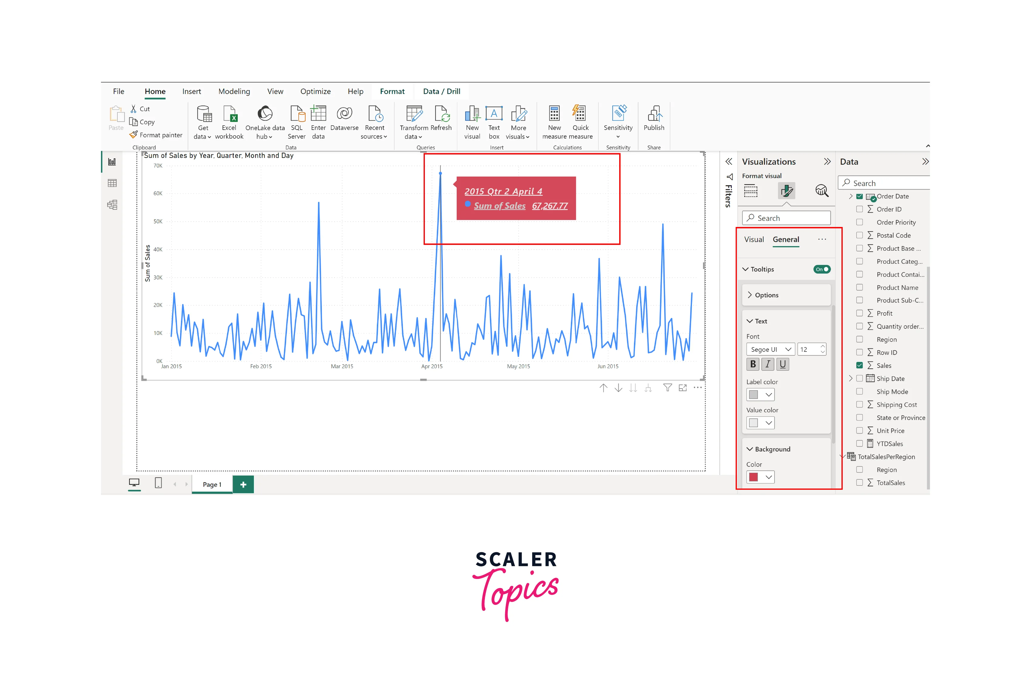
Customizing Tooltip Information
Customizing tooltips in Power BI allows you to provide additional context and details when users hover over data points in a visual. Customizing tooltips enhances the interactivity and information accessibility of your Power BI reports, allowing users to gain deeper insights by simply hovering over data points of interest. Here is how you can do this:
- Choose the data visual where you want to customize the tooltip. In the Format Visual pane, navigate to the "Tooltip" section under the General section. Here, you can define the tooltip's content and appearance.
- Customize the tooltip's formatting by adjusting font styles, colors, and other visual elements.
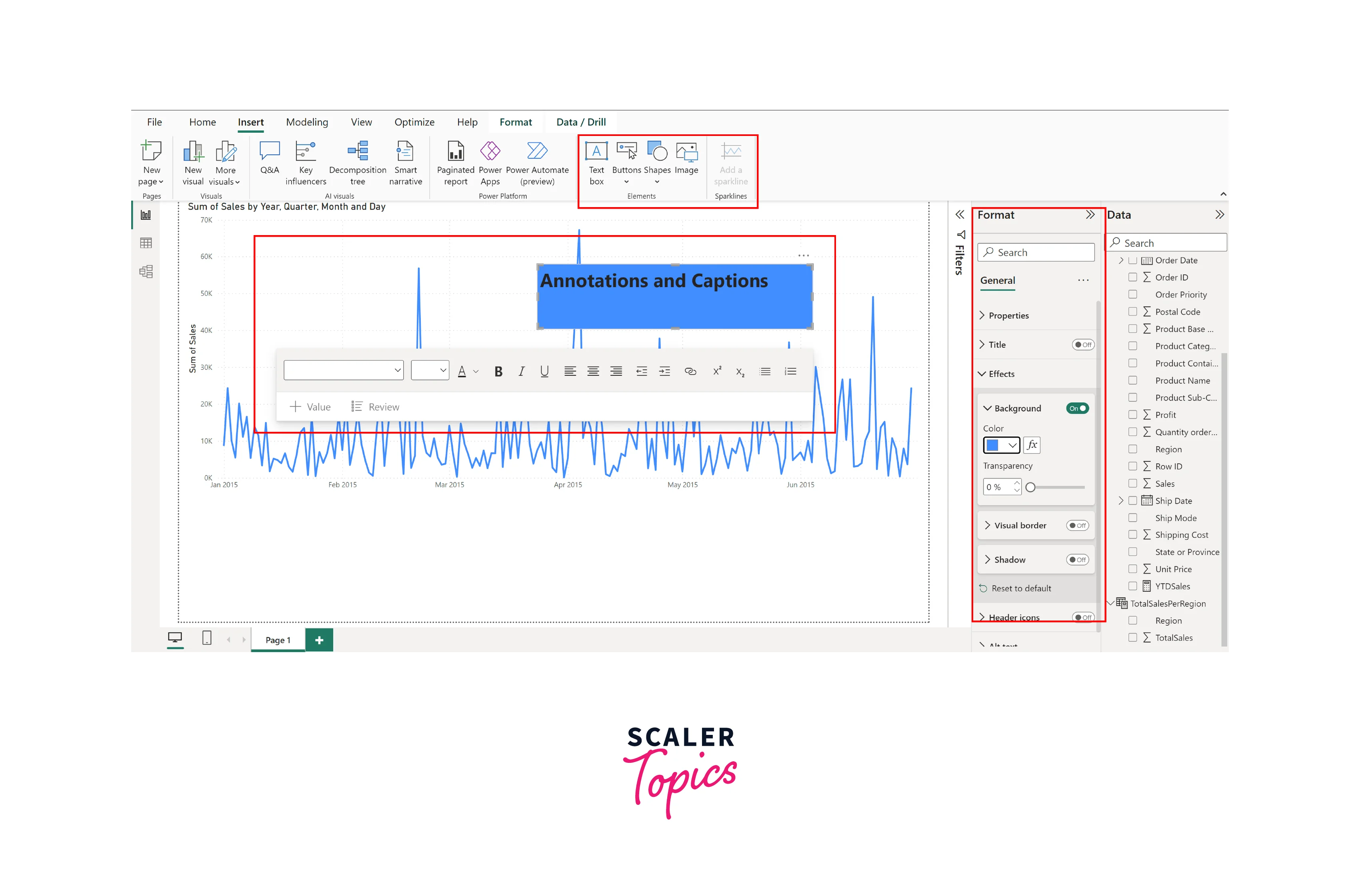
Adding Annotations and Captions to Visualizations
Annotations and captions in Power BI serve as explanatory elements within visualizations, providing essential context and insights. Annotations and captions enhance the clarity and impact of your Power BI reports by providing valuable insights and guiding viewers' attention to key points within your visualizations. To add them:
- Choose the data visual where you want to include annotations or captions.
- For annotations and captions, you can add text boxes, lines, or shapes directly onto the visual. These can contain explanations, callouts, or additional information.
- Adjust the positioning and styling of annotations and captions to ensure they complement your visualization.
Formatting Visualizations in Power BI
This section explores the essential aspects of formatting data visualizations within Power BI. Effective formatting improves aesthetics and enhances the communicative power of your reports and dashboards. We will delve into various techniques and options for customizing visuals, ensuring your data is presented as compellingly and insightfully as possible.
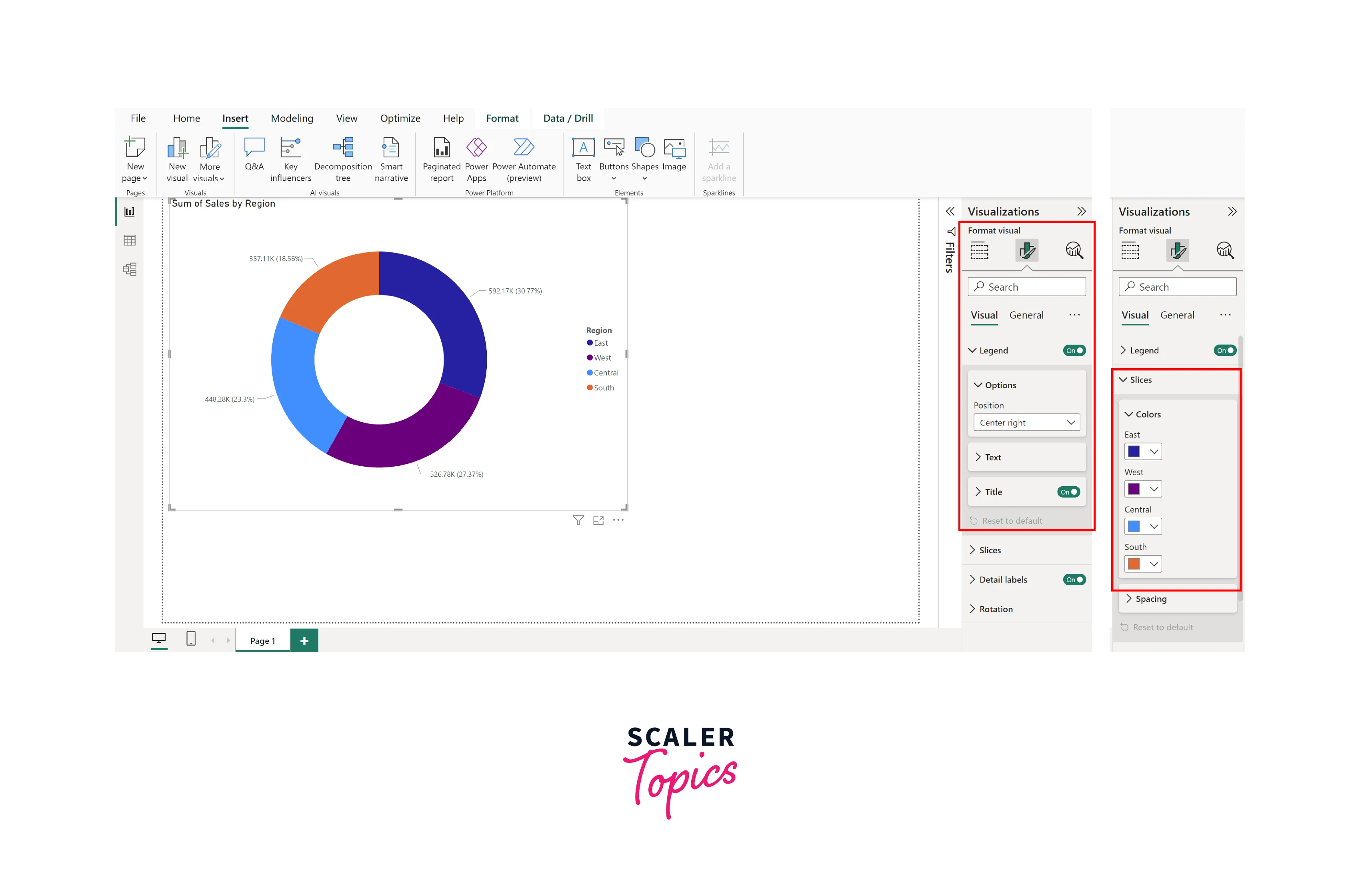
Formatting Colors and Legends
Formatting colors and legends in Power BI is essential for visual clarity and data interpretation. By formatting colors and legends effectively, you can make your Power BI visualizations more engaging and understandable, facilitating easier data analysis and decision-making. Here's how to do it:
- Choose the data visual that you want to format.
- To format legends, navigate to the "Legends" section in the Format Visual pane. You can also control how legends are displayed, such as changing their position, font size, or visibility.
- To format colors, go to the respective section in the Format Visual pane, such as slices in a donut chart, bars in a bar chart, etc. You can also create custom color palettes to ensure consistency and alignment with your brand or reporting standards.
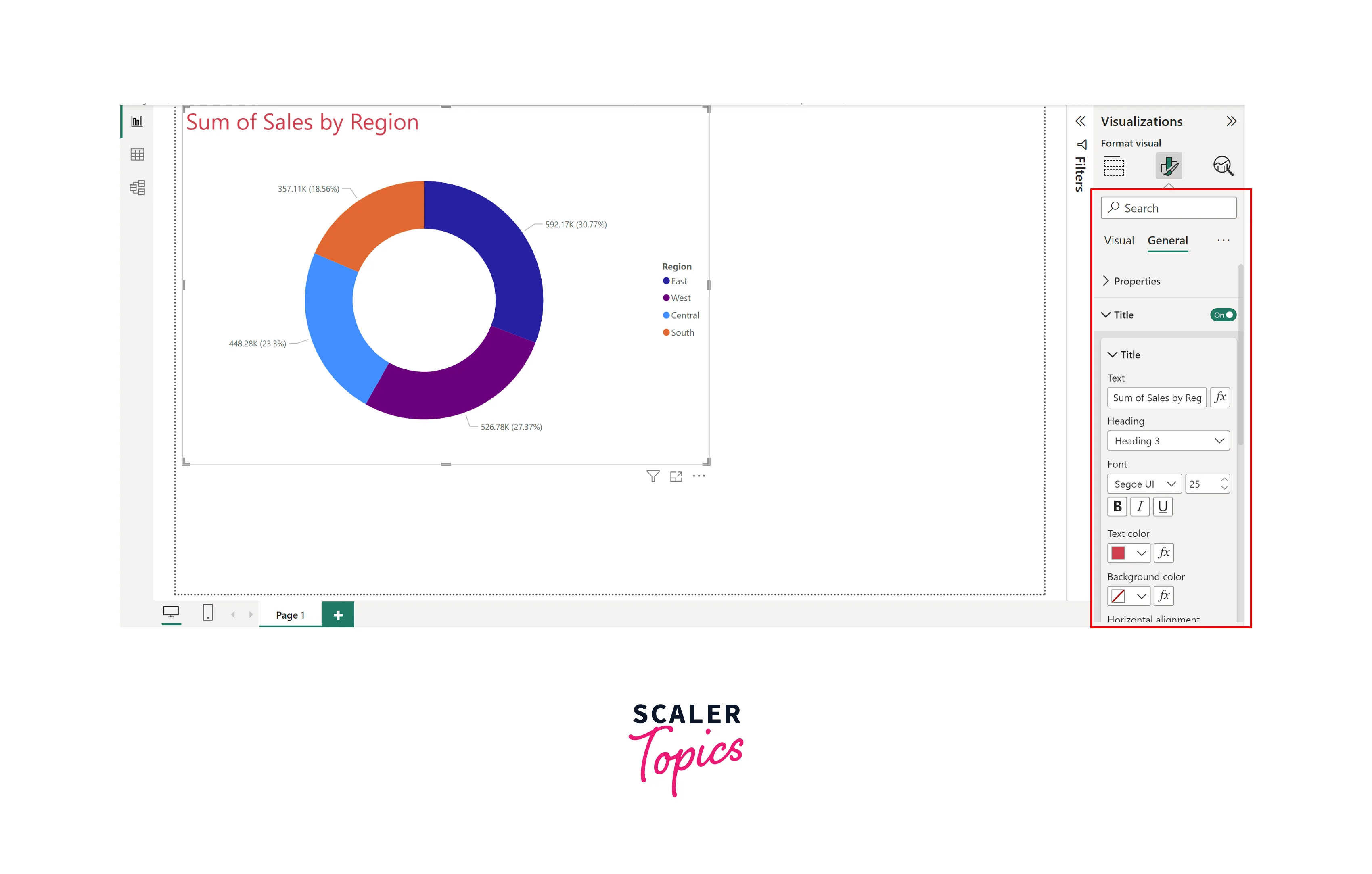
Adjusting Fonts and Text Styles
In Power BI, adjusting fonts and text styles is crucial for enhancing the readability and aesthetics of your data visualizations. By adjusting fonts and text styles in Power BI, you can create visually appealing and informative reports that effectively convey your data-driven insights to your audience. Here's how to do it:
- Choose the data visual where you want to adjust fonts and text styles.
- In the Format Visual pane, navigate to the respective fields, such as Text, Title, Legend, etc., depending on what you want to format.
- You can change font styles, sizes, colors, and alignment within these sections to match your reporting or branding requirements.
Controlling Size and Alignment of Visuals
Controlling the size and alignment of visuals in Power BI allows you to optimize the layout and presentation of your reports. By controlling the size and alignment of visuals in Power BI, you can optimize the layout of your reports and dashboards for better visual storytelling and data comprehension. Here's how to do it:
- Choose the data visual that you want to adjust in terms of size and alignment.
- Click and drag the edges or corners of the visual to resize it according to your layout requirements.
- Use the alignment tools in the Power BI canvas to align visuals vertically or horizontally, ensuring a neat and organized presentation.
- You can also enable the "Snap to grid" option to align visuals automatically, making your report look polished and professional.
Conclusion
- In Power BI, data formatting is a fundamental skill that transforms raw data into powerful insights. It is the key to creating visually compelling and informative reports and dashboards.
- Effective formatting, whether for data types, labels, colors, or visual elements, enhances the clarity of your message, making it easier for your audience to understand and act upon your data.
- Power BI's versatile tools for formatting empower you to customize every aspect of your visuals, ensuring they align with your brand, reporting standards, and the specific needs of your audience.